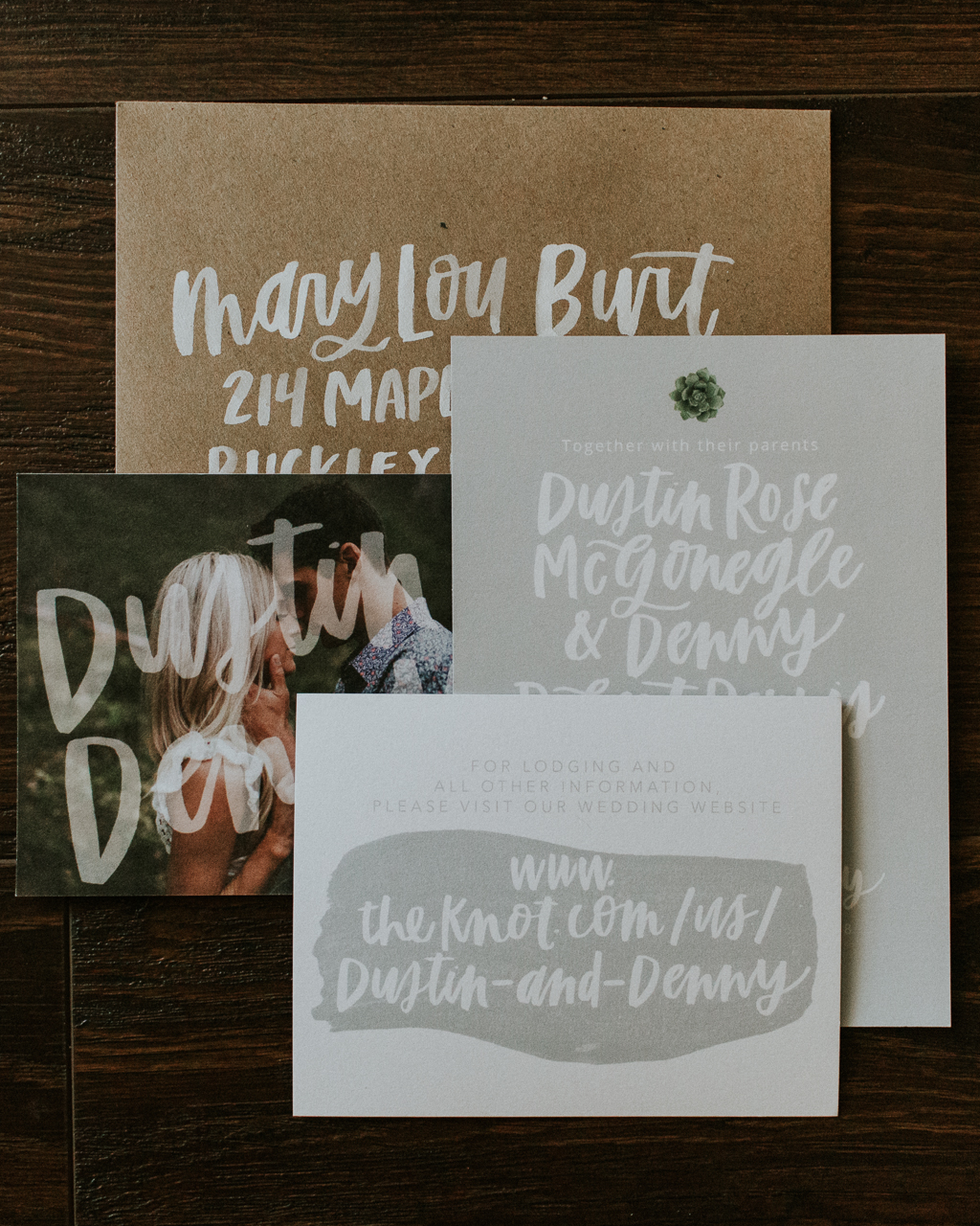
A rustic gray and green color palette. Nature-inspired textures. Beautiful brush hand lettering throughout. Gina of Eleven and West created these rustic succulent-inspired gray and green wedding invitations for a summer wedding in the Pacific Northwest. Gina stuck to a simple color palette to allow the natural hand lettering and stunning engagement pictures to shine through, and incorporated the bride’s love of succulents throughout the invitation suite. And seriously, how gorgeous are those brush lettered kraft paper envelopes??
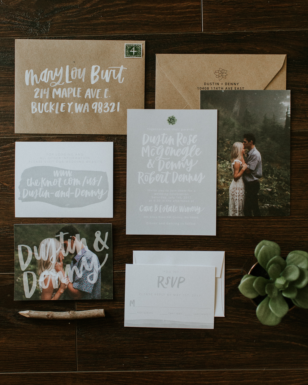
From Gina: When designing Dustin and Denny’s wedding invitations, Dustin really left a lot of creative freedom to me. She did mention that she loved succulents and was going to be incorporating those into her wedding day and would like to see them in her wedding invitations, too. We worked to create a natural and simple design that went along with her other wedding elements.
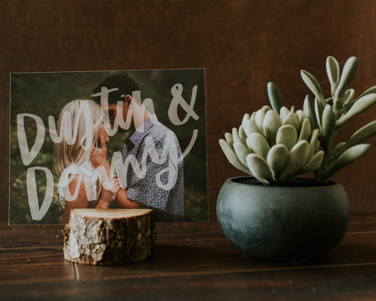
I love incorporating engagement photos into invitation suites, I think it adds an even more personal touch for wedding invitations to really make them unique and special. When she sent over these gorgeous photos from Annamae Photo, I knew we had to incorporate them somehow! We actually ended up using two of them in the suite!
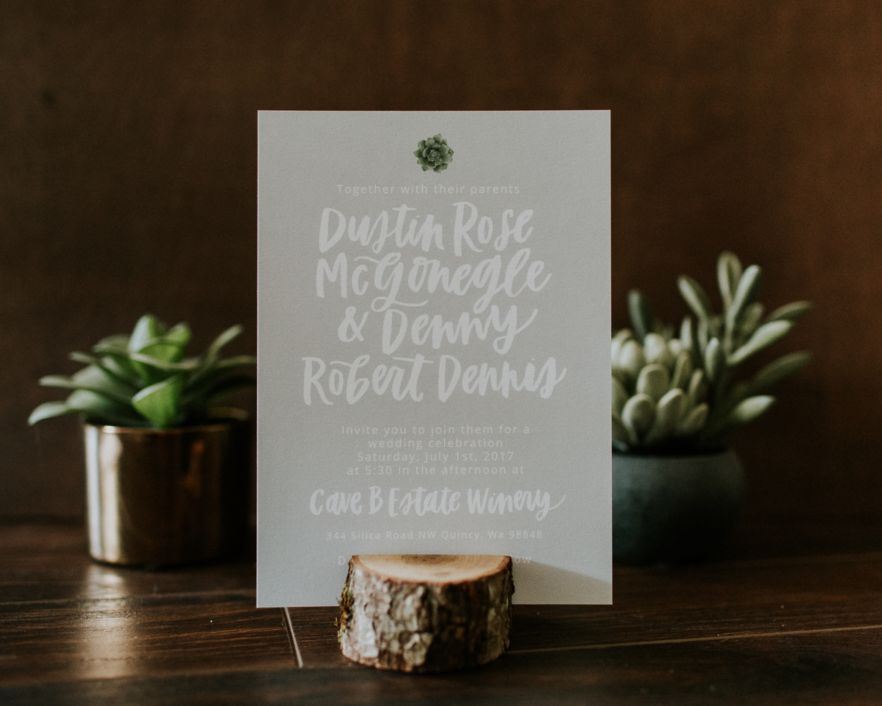
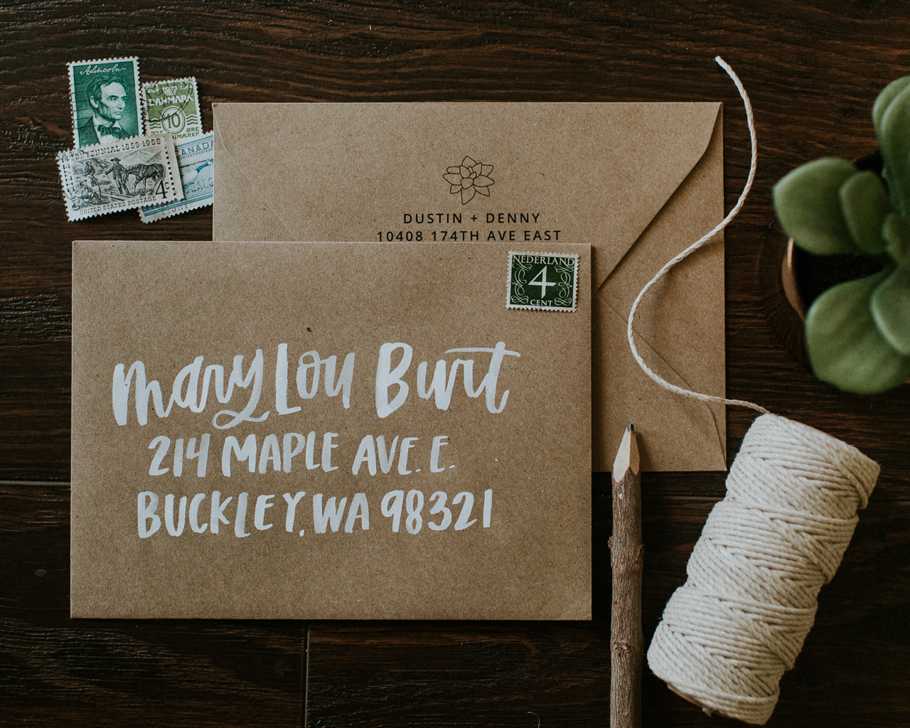
We incorporated hand lettering into every piece of this invitation suite, with gray watercolor swashes as accents and small watercolor succulents. The lettering style is using my natural hand, nothing tight or too formal in its overall look. The kraft paper envelopes further incorporated that natural and earthy feel. I hand lettered all of her guest addresses in white paint and we had her return address printed on the flap with a small succulent design.
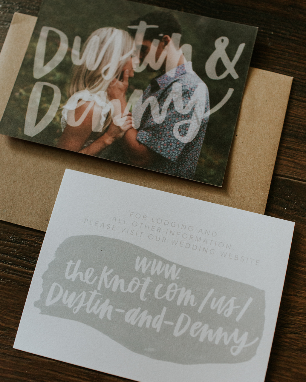
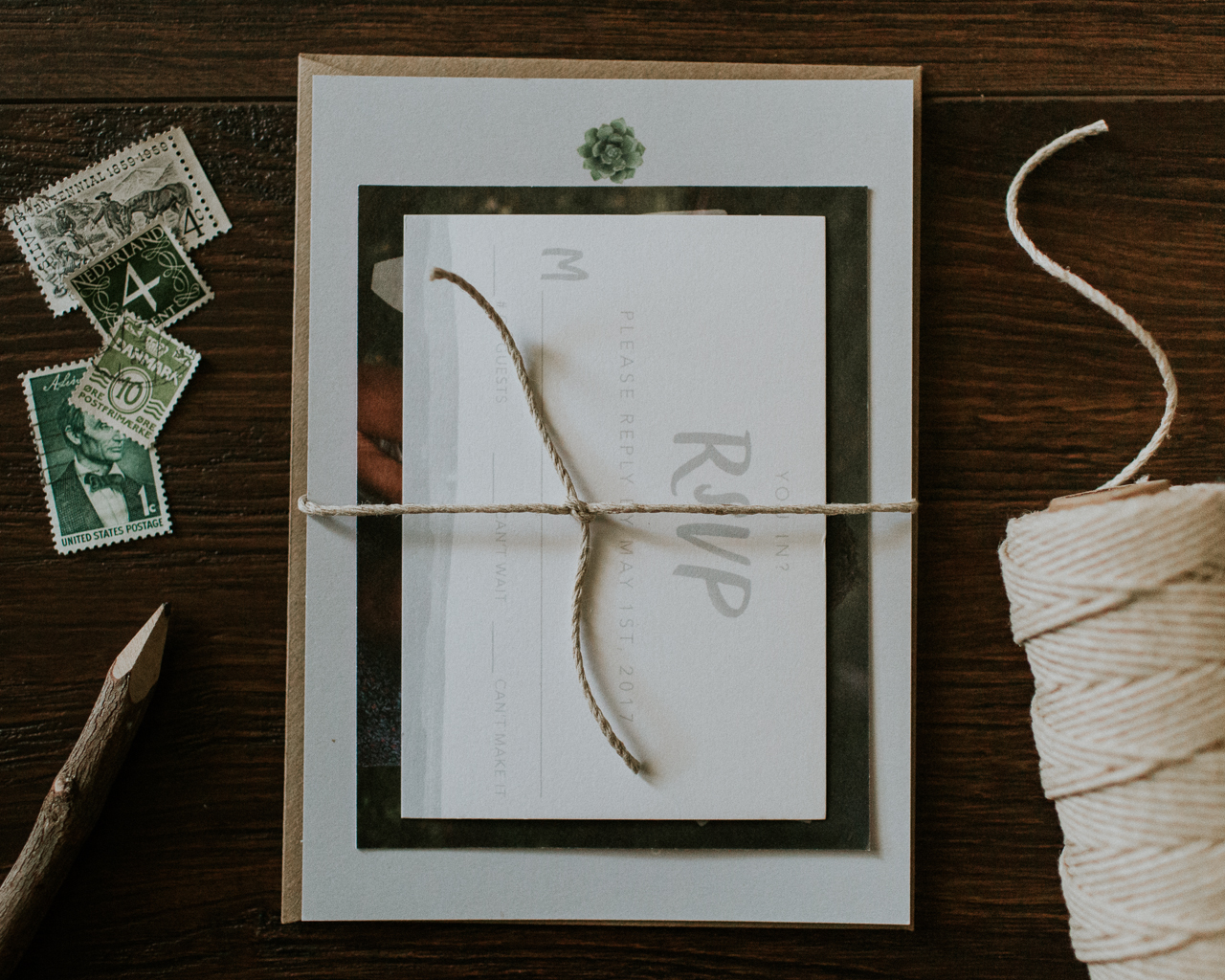
With wedding websites being so popular, we added a detail card that pointed guests to their wedding website for all of their information. We added another engagement photos on the back of it and I incorporated a hand lettered overlay of their names to add a graphic touch to their suite. We kept the RSVP simple with just a white card and light gray hand lettering and we printed a small watercolor detail along the bottom.
A piece of twine helped tie the invitation suite all together. This adds not only a more tangible aspect to the piece but also builds on the overall texture of the suite. Overall, we kept everything simple with a personal and natural feel to the suite.
Thanks Gina!
Design & Lettering: Eleven and West
Paper: Mohawk 120# Uncoated
Photos in Invitation Suite: Annamae Photo
Check out the Designer Rolodex for more talÂented wedÂding inviÂtaÂtion designÂers and the real inviÂtaÂtions gallery for more wedding invitation ideas!
Photo Credits: Gina Paulson Photography
