During a busy season filled with packing, wrapping and shipping (not to mention parties) I welcome the brief lull of holiday festivities within the sample studio. I need those moments to recalibrate and get back into my favorite routines. It was during one of those reprieves that I came upon the brand refresh of Vancouver’s luxury boutique, Boboli. In this installment of Finding the Paper, we’ll see how Glasfurd & Walker updated and unified a brand through the use of its paper and print techniques. – Jill of Parse & Parcel

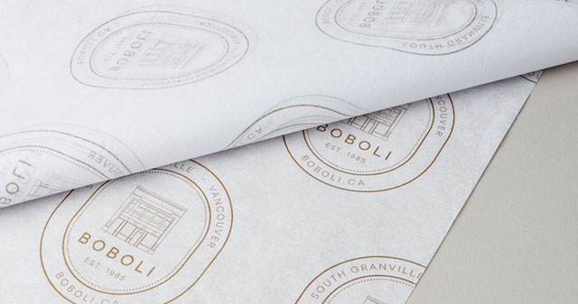
Established in 1985 and situated in Vancouver’s South Granville Shopping District, Boboli is a luxury boutique known for its exquisite collection of clothing and accessories for women and men. The team at Glasfurd & Walker were tasked with updating the existing brand across an extensive number of touch points including packaging, stationery and signage as well as some bespoke interior elements.
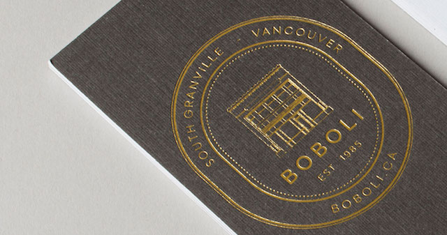
Glasfurd & Walker drew inspiration for the design from the original logo (which had the building in it and had been in existence since their launch in 1985), with an updated more modern typographic system featuring a classic, minimalist sensibility to compliment the many brands that Boboli showcases.
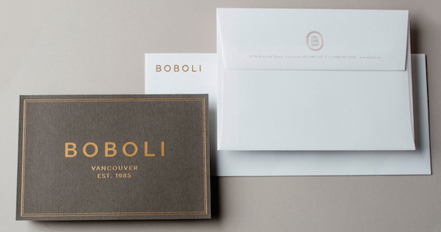
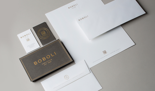
All of the print elements are unified in look and feel, with the logo and crest featuring a stunning a gold foil stamp. The letterhead, business cards, thank you notes and envelopes are all printed offset on Classic Linen Recycled 100 Bright White stock with Pantone 405 as the flood of gray or type.
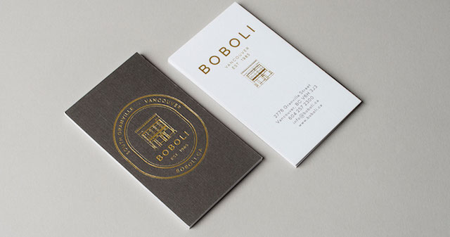
The business cards are actually two 80# Cover sheets laminated together to create a custom duplex sheet, lending some nice heft and stature to reinforce the brand’s classic style. The letterhead follows suit, using 100# Text as the paper stock, imparting a feel of importance coupled with the tactile hand of the linen finish.
The minimalist design lends itself beautifully to the print techniques and papers selected, the gold foil of the crest on the envelope makes one do double take, closely resembling engraving. The stationery suite is a great example of how minimal paper specifications paired with the right print production techniques can have maximum impact on a project.
