Navy and pale pink is just such a great color combination. It was the color palette for this year’s Paper Party invitations back in May – and I’ve been a fan ever since! These wedding invitations from Designed by Jaclyn were created for Jaclyn’s sister and combine a modern sans serif typeface with whimsical script and beautiful line illustrations! I’m also loving the navy and pink color palette for a fall wedding!
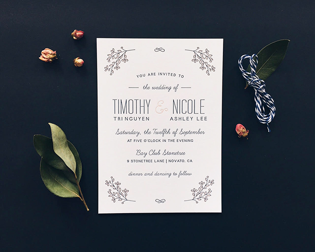
From Jaclyn: A light and airy invitation design with hints of floral touches and modern typefaces set the tone for the event. We used a clean sans serif typeface paired with a whimsical script to create a playful feeling to the invitation. We were lucky to have the main invitation letterpress printed by a lovely local studio, Dependable Letterpress, which added a touch of texture and luxury to the suite.
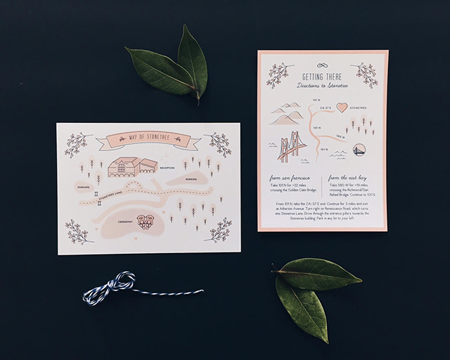
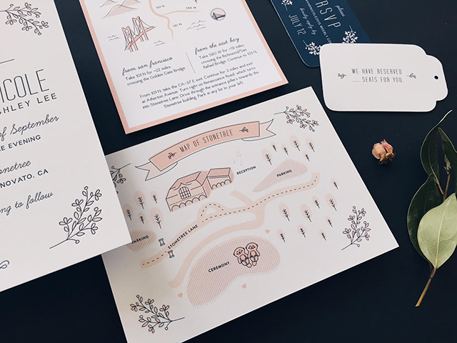
Along with the invitation, we included an illustrated map of the venue. Inspired by a few of the couple’s favorite things, I tried to incorporate a few subtle personal touches to the map illustrations that would add personality without overshadowing the information, like the Golden State Warriors logo (the groom’s favorite team) and an illustration of two otters holding hands (the bride’s favorite animal).
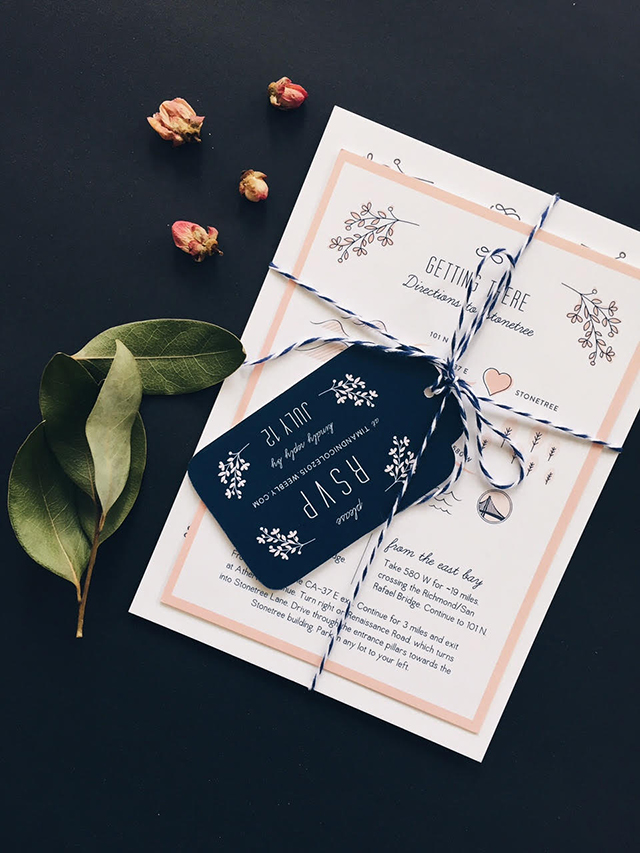
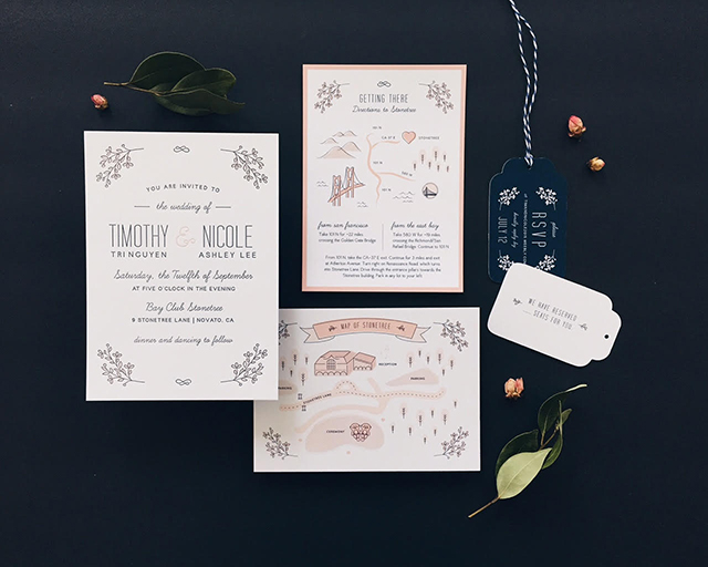
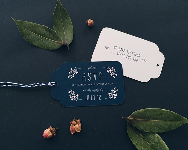
To complete the suite, a RSVP tag and navy baker’s twine was used to tie the invitation pieces together and add a pop of color. My sister and her now-husband absolutely loved their invitation as it reflected both their personalities and the spirit of their wedding day.
Thanks Jaclyn!
Design: Designed by Jaclyn
Printing:Â Dependable Letterpress
Check out the Designer Rolodex for more talÂented wedÂding inviÂtaÂtion designÂers and the real inviÂtaÂtions gallery for more wedding invitation ideas!
Photo Credits:Â Designed by Jaclyn
