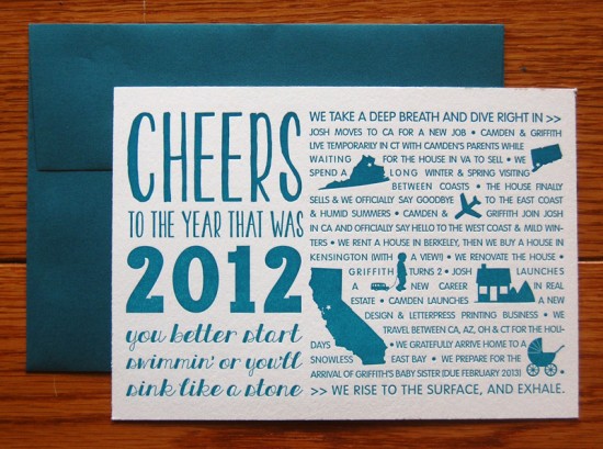
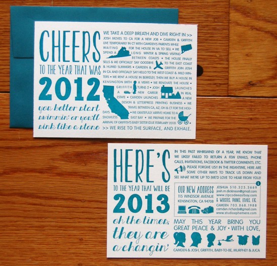
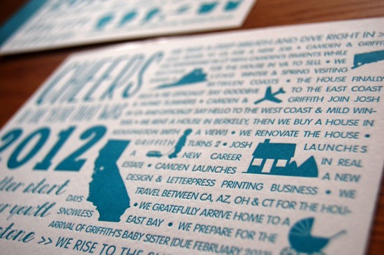
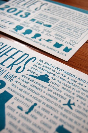
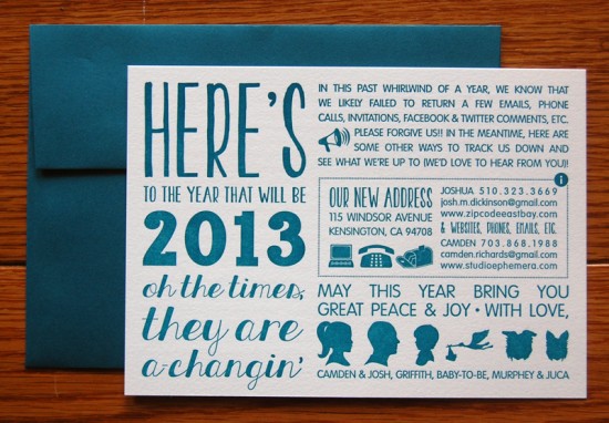
I’m a big fan of Year in Review cards – particularly for families that have undergone major changes that year, from big moves to welcoming a new family member. Camden from Studio Ephemera recently relocated her family to the Bay Area in California, so she combined her annual holiday card with a moving announcement and big update on her family’s recent changes. For the design, Camden chose a mix of fun typefaces with a few graphic icons scattered throughout to help anchor the text.
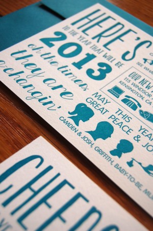
From Camden: Our family has had a really busy year. We went through a long period of transition from the East Coast to the West Coast, as well as to new careers, so there was a lot to catch people up on. I decided to make our card two sided: the front a recap of the past year and hints for what awaits us next year, and the back an apology for falling out of touch and a summary of our new address and contact information.
I used lyrics from the Bob Dylan song “The Times They Are A ‘Changin'” to tie both sides together thematically. Because there was so much information to convey, I decided to keep the card typographic in nature, using graphic icons and symbols to create visual interest and break up/balance the text.
For the type, I wanted something lighthearted but easy to read with a bit of a retro feel, so I used a combination of typefaces that I felt complemented one another (albeit in a quirky/non traditional way): KG Two is Better than One and KG All Things New, by Kimberly Geswein, Carton by Nick McCosker, and VAG Rounded by Gerry Barney.
For the color, I chose a deep teal on white to keep things streamlined, clean and fresh – a good way to recap the old and welcome the new! Matching envelopes kept everything tied together. Because I really wanted the cards to convey a handmade, quality feel, I letterpress printed them onto Rives BFK using a Vandercook (special thanks to Peter of Peter Koch Printers for letting me use his press!)
Thanks Camden!
Photo Credits: Studio Ephemera

