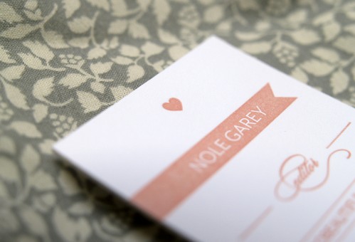
Hi there everyone! If you’re reading this, hopefully that means that you’ve found me on the new url. I hope you like the updated look – it’s been in the works for quite a long time and I’m very happy to finally be able to share it with all of you. So as an introduction to the updated look, I thought I’d share my new business cards with you!
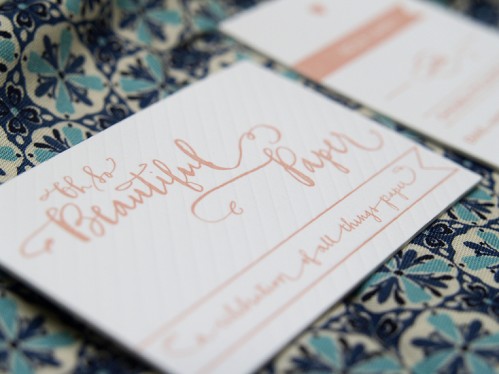
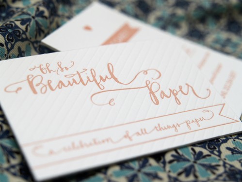
As you may have noticed, I have a new logo that was created for me by the immensely talented Bryn from Paperfinger. In addition to being featured in the new blog navigation bar, I made sure to incorporate the logo into a new set of business cards before heading up to the National Stationery Show a couple weeks ago:
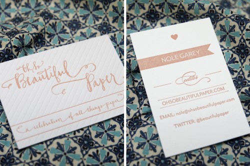
The cards were printed for me by my newest sponsor, Studio on Fire – we went with a double-sided card with a horizontal orientation on one side and vertical on the other:
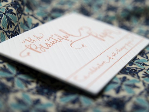
Of course, my signature light pink as the main ink color and a diagonal stripe blind impression on the side with the new logo:
I love my new cards! And speaking of business cards, I have an awesome giveaway coming up a bit later today – so check back soon!
{image credits: all photographs by Oh So Beautiful Paper}

looks great Nole! i’m sure this is so exciting and we are all excited with you:) have a happy Tuesday!
love the new site and your biz cards are so cute!
I adore your new cards! Studio on Fire’s work is consistently jaw-dropping… how awkward to be wiping up drool every time I visit their blog (and now yours!).
I love the new site and your business cards are stunning! Congratulations! 🙂
The site looks terrific and your new branding is gorgeous. Congrats!
Congrats Nole!
beautiful!!
the new site looks beautiful, Nole! And I love your new cards (of course!!).
Love the new layout and the new logo!
Nole everything looks fabulous! I’m so happy for you! I heart your business card, and have it on my desk because it’s just too pretty to file away.
LOVE the new look and new logo! And the new stationary is lovely! =)
Gorgeous, lovely new website! Congrats and best of luck! I’ve updated your url on Decorology!
Bryn is the master. These look terrific.
ooh la la, this is oh so beautiful. welcome to the new site. i just love it. and i’ve been silently ADORING your posts on NSS. thanks for always keeping us up to date. this is why we are all huge fans. xo.
i adore the new branding 🙂 congrats on a lovely new look!!
Beautifully done. Congrats!
Looks great, Nole! Congrats!!!!
Congrats it looks fabulous!!
It looks grand, nole!! congrats!
Your new cards are so sweet, i love the new look logo and website! I’ve just updated your link in my blogroll to point here too 😉
Nole,
The website is absolutely beautiful and so are your business cards.
Good luck to you in your “new address”.
from your friends at Someday Designs
the new site is stunning!! Congrats!!
business card envy. the site and the cards are just beautiful <3 and the light pink is sooo pretty!
The new site looks lovely and the new logo very good.
Helen
And it’s Oh So Beautiful indeed!!! LOVE.
I can’t imagine the decisions involved when having to choose business cards for a site that celebrates all things paper! I think it’s called “fun stress.” : ) You chose wonderfully!!! They’re beautiful. Congrats on your new look!!!!
Love, love, love the look! Your business cards are soooo pretty.
xoxo
kristi