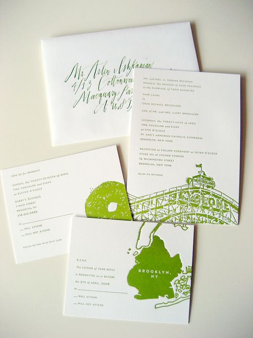
This week, I’ve asked one of my very favorite wedding bloggers – the amazing Vané from Brooklyn Bride – to share her invitations with us!  As I’m sure you all know, Vané had a distinct modern and Brooklyn-inspired aesthetic for her wedding this past April.  Vané worked with Viñas Design to letterpress her invitations in a crisp green and white color palette, and with Betsy Dunlap on the calligraphy for both the invitations and table signs.
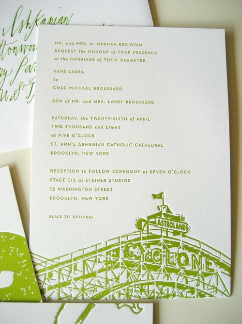
From Vané:  Since the wedding had a distinct Brooklyn theme, it was only natural that iconic Brooklyn and NY images were used on the invitations and all paper goods. We (Jaime Viñas of Viñas Design and I) used some photos I had of the Brooklyn Bridge, the wheel from Coney Island, and a water tower outside my window for some of the pieces.
The map of Brooklyn came from our save the dates, and the bagel was actually scanned on a scanner and brought down to size. Â Having them letterpressed was great because all the sesame seeds on the bagel popped up.
For the font, Jaime used Neutra, which was great because it was designed by the architect Richard Neutra (and my husband just happens to be an architect!), and he used the perfect shade of green for everything on the crispest white card I’ve ever seen…the pieces had such a presence just with their thickness, I loved it!
I love the way the invitations coordinate perfectly with all the other elements from her gorgeous wedding:
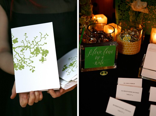
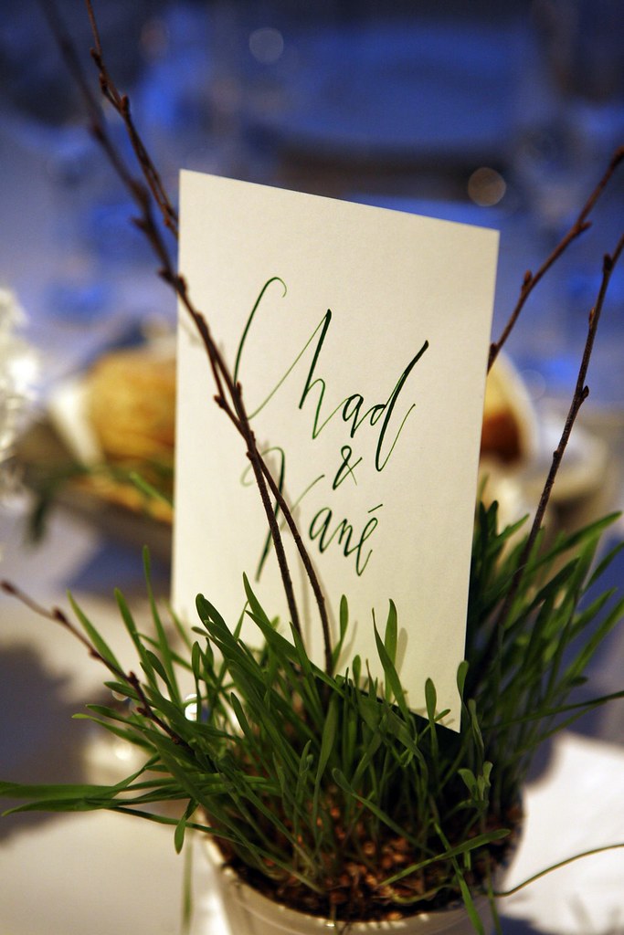
Thanks Vané for sharing your beautiful invitations with us!  Invitations by Vané and Viñas Design, calligraphy by Betsy Dunlap.
Check out the Designer Rolodex for more talÂented wedÂding inviÂtaÂtion designÂers and the real inviÂtaÂtions gallery for more wedding invitation ideas!
{all images by Bethalee Photography via Brooklyn Bride}

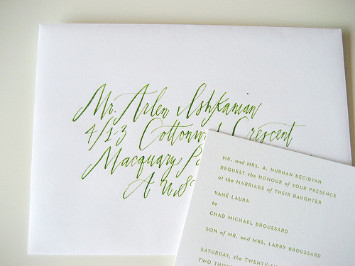
This bright, snappy green is a fresh and welcome ink color. I love how it looks on the ecru paper. It seems perfect for an outdoor wedding or even something happening in a farm on on a mountaintop. It evokes summer air and green grass. Bravo!