
Search Results for: kraft paper
Thirteen Beautiful 2019 Calendars
I’ve had calendars on the brain the last couple of weeks, so I thought we’d start the week with a round up of thirteen beautiful 2019 calendars! We’ve got everything from food puns and an animal swimsuit calendar (!!) to delicate floral illustrations and colorful abstract shapes. In many ways, this round up is a reflection of some of the major design trends we’ve seen over this past year. Oh, and I feel like stationers finally heard everyone begging for more space to write appointments on their calendars, since there are more appointment calendars this year than ever before – let’s take a look!
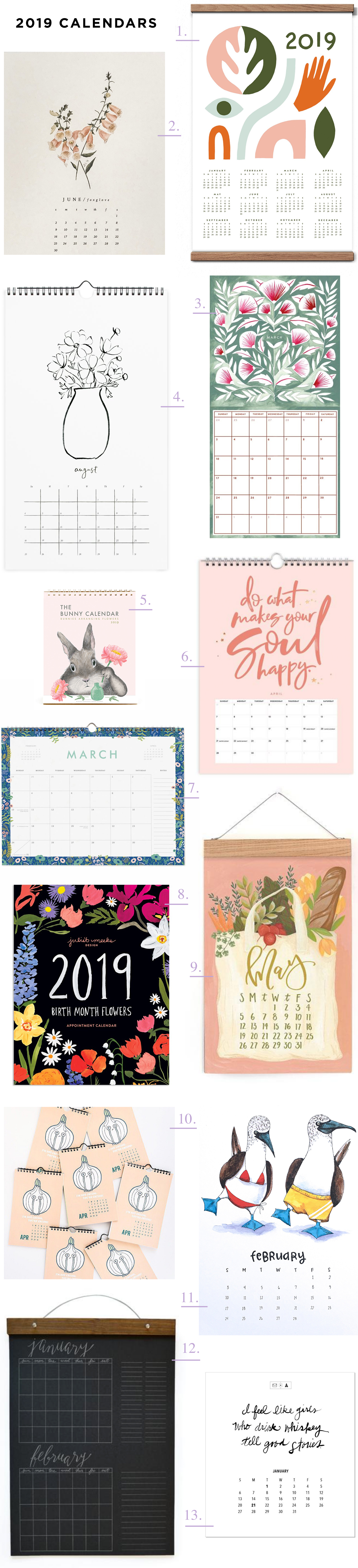
1. Love, love, LOVE the colors in this abstract shapes wall calendar from Worthwhile Paper. You can even order it with the wood frame kit!
2. Loving the delicate illustrations on this botanical calendar from Esther Clark Co.
3. A colorful monthly wall calendar from Katharine Watson featuring a different gouache painting inspired by her traditional block print work and stationery designs.
4. Loving the simplicity of the floral line drawings in this year’s calendar from Our Heiday – and plenty of space for notes and appointments!
5. Each year, Dear Hancock produces the cutest calendar featuring illustrations of their signature bunny. This year, bunny is arranging flowers! So cute.
6. Add an extra dose of positivity to your day with this Positivity wall calendar from Fox & Fallow! Rose gold foil on alternating pink and black pages. They also have a more traditional floral appointment calendar!
7. Rifle Paper Co. is always a safe bet for beautiful calendars. I’m particularly fond of this garden party floral appointment calendar.
8. I cannot resist a birth month floral calendar, and this beauty from Juliet Meeks is no exception! Each month features a unique floral pattern hand painted by Juliet and representative of that month’s birth flower.
9. If you prefer your calendar to double as wall art, look no further than this XL calendar from One Canoe Two! They also have a beautiful appointment calendar and illustrated desk calendar.
10. Food puns from ilootpaperie! I mean, can you think of a more perfect calendar to hang in your kitchen?? I think not.
11. This animal swimsuit calendar from Paper Wilderness CRACKS ME UP. Each month features a different watercolor illustration with an animal wearing a swimsuit, from a bikini-wearing shark to a bear hanging out in a swan pool float. Ha!
12. This big write-in calendar from Wild Ink Press makes my mom heart so happy. Two months at a glance, with plenty of space for notes, chore charts, special events, and more! Available in black (just use a white gel pen or paint marker) or kraft paper.
13. A beautiful desk calendar from Page Stationery x Atticus – each month features one of his poems in a different lettering style!
Inspiring Calligraphers: Li Ward Calligraphy
Hey everyone! It’s been a hot summer in many places so I thought it only fitting to pull some inspiring calligraphy work with a true summertime vibe. Here’s a look at the work of Li Ward Calligraphy. I love the mix of her lettering work and watercolor and illustration, and how each wedding suite looks so fitting for the destination. With that, let’s grab a lemonade and check out Li’s beautiful calligraphy! – Jen

Photo Credit: Cambria Grace Photography

On how she got her start, Li shares:
I started calligraphy about 6 years ago, using traditional pens with nibs that you dip into ink. I started doing spot lettering for other stationery designers whose clients requested some hand lettering for their invitations. Two years ago when I began dabbling in watercolors, I decided to go “full service†with invitation design: I would take care of not just lettering, but full design which would include watercolor illustrations, hand lettering, envelope liner design, paper choice, and printing.


What inspires Li? She gets inspiration from Jane Austen, scratchy old-fashioned script, Edward Gorey’s irreverent sense of humor, Matisse’s bold color palettes, stained glass designs — just to name a few. “I’m still really new to this and constantly trying new things out,” says Li.

“One of my favorite suites is the Catskills wedding suite (Zoe and Sam), which included Save the Dates, folded maps, and illustrated menus,” says Li. “The couple had already commissioned Happy Menocal to design their crest. Happy just happens to be one of my favorite artists, so I was really thrilled when they asked me to design the rest of the suite that would complement Happy’s design. I took inspiration from Edward Gorey’s illustration style and Happy’s of course, threw in block font mixed with cursive, went with a more is better frame of mind. And it’s kind of been the basis of my style going forward. I’m definitely all about bold colors and shapes!”


As much as I love Li’s illustration work, I’m also a big fan of this kraft brown wedding suite she designed. The white lettering on kraft brown paper has a modern organic vibe that feels casual, yet cool.


Another favorite style? Li loves to do “seamless” designs. “If you were to put two cards side by side, the design from one card would match up with the design on another,” says Li.
Big thanks to Li Ward for sharing a a peek into her world of lettering!
All photos by Li Ward, except where noted
Want to be featured in our calligraphy column? Reach out to us at submissions [at] ohsobeautifulpaper [dot] com with the subject line “Calligraphy Feature†for more details!
NSS 2018 Sneak Peek: Wild Ink Press
Ready for another NSS 2018 Sneak Peek?? Great! This one comes to us from Rebekah at Wild Ink Press (booth 1633!), who will be traveling to NYC with her four month-old baby in tow! I can’t decide if I’m more excited for the stationery or to meet little Charlotte. I mean, just look at how adorable she is! Okay okay, back to the paper. This year, Rebekah collaborated with Alcohol Ink artist Heidi Stavinga to create a series of greeting cards and alcohol ink gift wrap sheets. The cards all feature Rebekah’s lovely hand lettering over Heidi’s animal illustrations, while the gift wrap sheets have more minimalist designs. Wild Ink Press is also adding nine new cards to their popular colorful Happy Cards collection, including a little something for the guys!
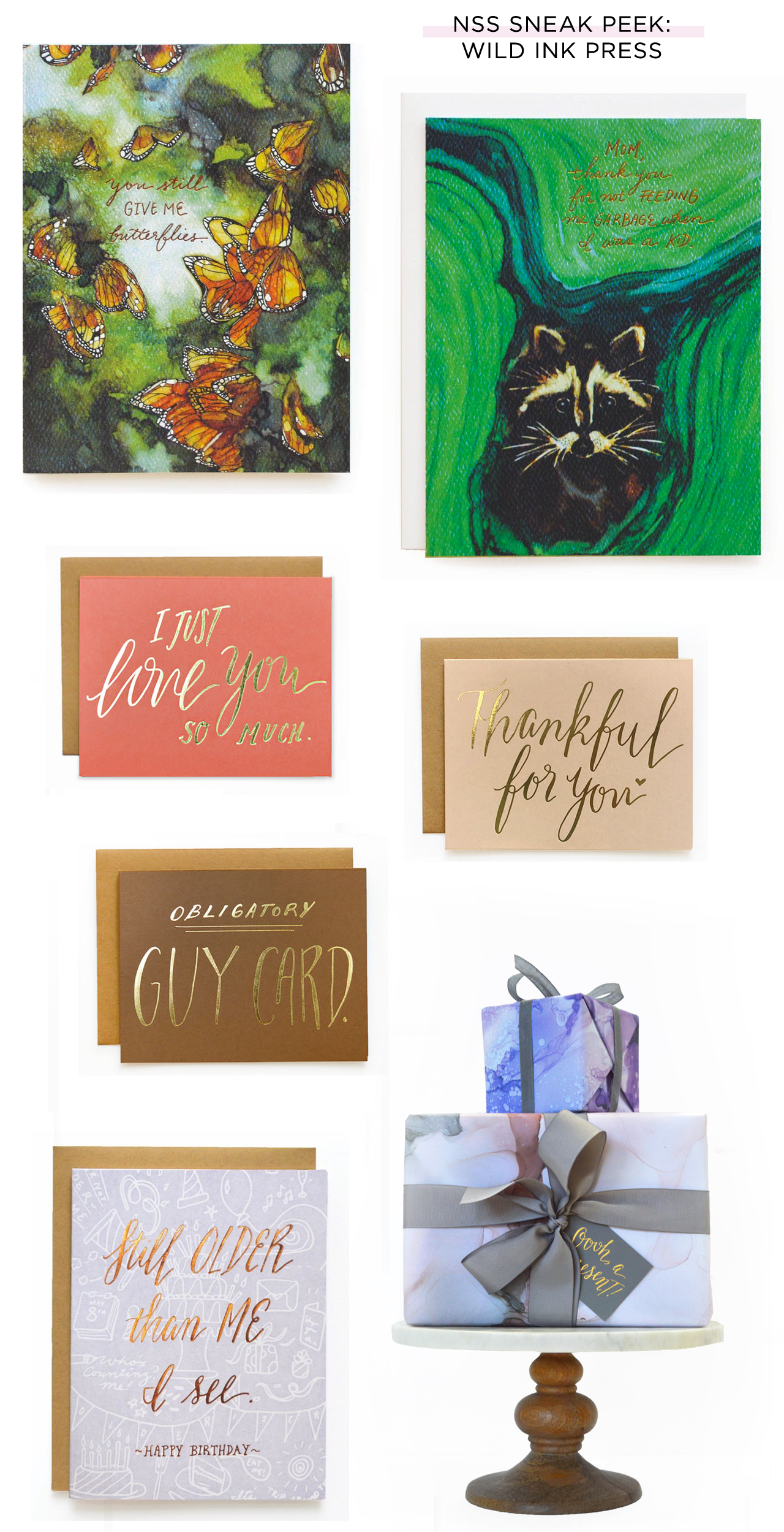
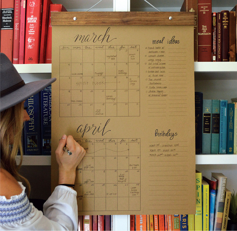
Oh, and check this out: a BIG Kitchen Write-in Calendar! I’m personally just so excited for this. We love using a large format calendar to keep track of appointments and events, and this is perfect! I’ll let Rebekah explain the inspiration and details:
The kitchen is the heart of the home and the place where everything comes together. I searched to find an attractive solution to keep all of our families happenings in one place (where the kids could see them too!) and this calendar was the answer: 18 x 25.5 inches, two months at a time, with plenty of space for menu planning, grocery lists, birthdays, chore charts, love notes, you name it. It’s letterpress printed on heavy Kraft or black (for that chalkboard feel) stock, and comes ready to hang with our handcrafted wooden hanger.
You can see more from Wild Ink Press right here, and if you’ll be at the show be sure to visit them in booth 1633!
Quirky Camping-Inspired Watercolor Wedding Invitations
There’s nothing more quirky and adorable than a watercolor illustration of woodland creatures on a mountain lake canoeing adventure! Designer Rolodex member Amanda of Wide Eyes Paper Co. dreamt up these quirky camping-inspired watercolor wedding invitations for a woodsy wedding in the Pacific Northwest. The invitation features a folded 4-panel design, including a custom watercolor illustration with the bride and groom’s beloved pets (so sweet!), keepsake map, and perforated RSVP card!

From Amanda: In the lingering months of winter, it’s time to start enjoy your buffalo check flannel a few more times and enjoy all the hot cocoa as you start organizing the details of your upcoming wedding. Let the adventure begin! was the motto that this Portland outdoorsy couple chose to tell their story and we loved the idea of creating an invitation that guests would cherish even after the wedding.


Mary and Adam were adamant about sending something to their guests that would both stand out in the mail and truly capture the quirky essence of who they are as a couple. This four-paneled format allowed them to express their wedding adventure as a creative narrative, all while keeping everything organized on one piece of elegant paper. You may choose to see the whole, unfolded invitation as one canvas, or treat each panel as its own snapshot. Mary and Adam wanted to be sure to have a custom watercolor that walked their guests through the wedding details in a fun and whimsical way, with the custom watercolor of their pets in a canoe as the beginning panel and the second panel opening up to complete a more classic 5×7 invitation.

With four panels over two sides, the couple was able to customize up to eight different panels. The option to add vintage perforation allows for a portion to be torn off and mailed back without the hassle of keeping several different pieces of paper together (I know I am guilty of losing a rsvp card or two before they even make it to the mail).


One of the panels is a custom watercolor map created to highlight the important spots of the wedding day while keeping the adventure fun and fresh just like a treasure hunt or trail guide. The map will become a memorable keepsake for their guests as they help the happy couple write their love story on their special day.

Inspired by Wes Anderson’s Moonlight Kingdom we hand-painted the couple with portraits in a quirky camp inspired motif. Adam even had his own Davy Crockett hat! We finished off this set by creating a custom logo for Mary + Adam which is printed on the rustic brown kraft envelopes and custom watercolor envelope liners.

Thanks Amanda!
Design: Wide Eyes Paper Co.
Printing: Paper Jam Press
Wide Eyes Paper Co. is a member of the Designer Rolodex – you can see more of their beautiful work right here or visit the real inviÂtaÂtions gallery for more wedding invitation ideas!
Photo Credits: Amanda Franz