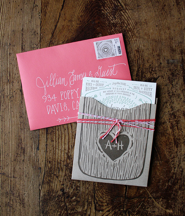
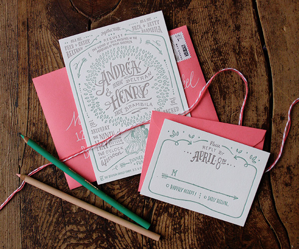
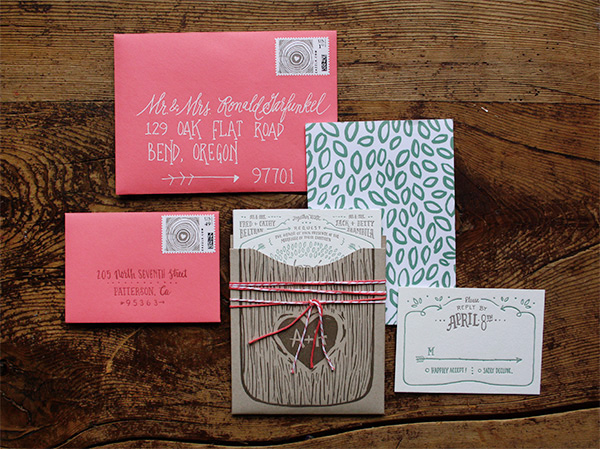
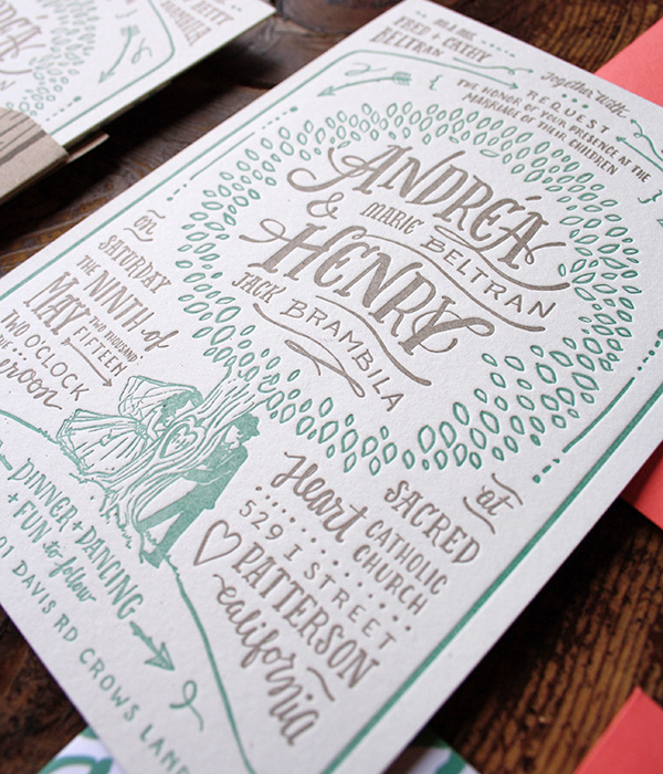
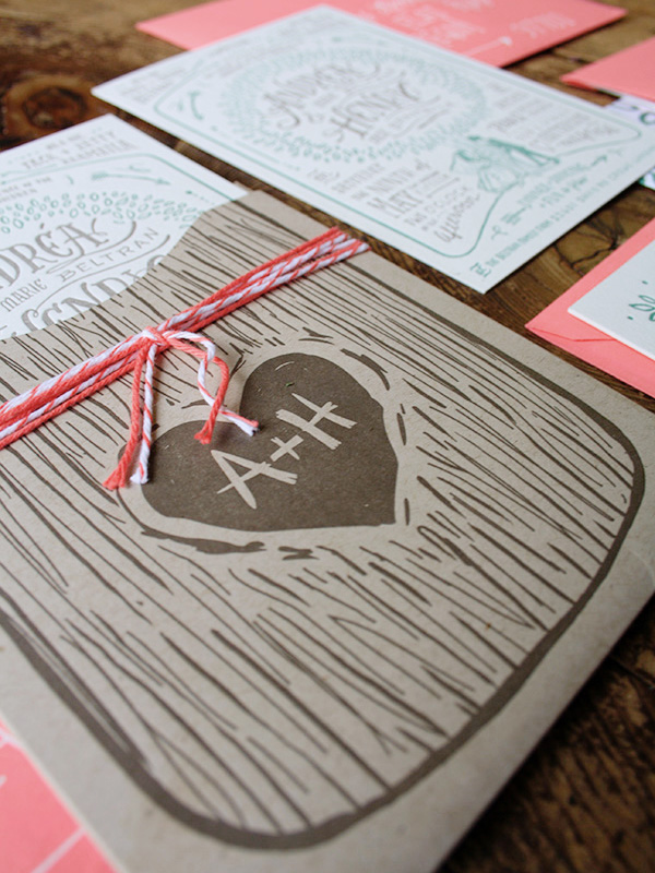
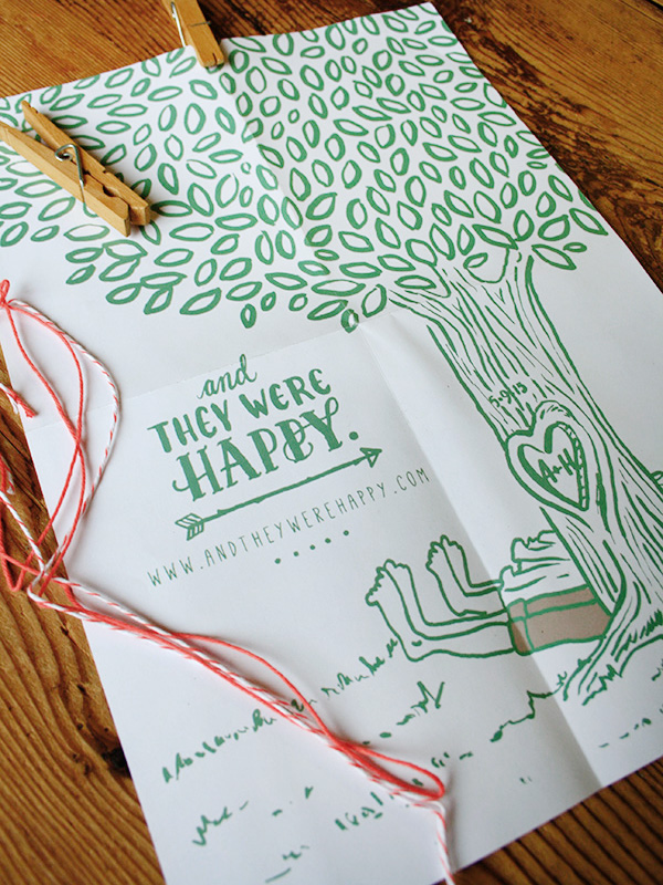
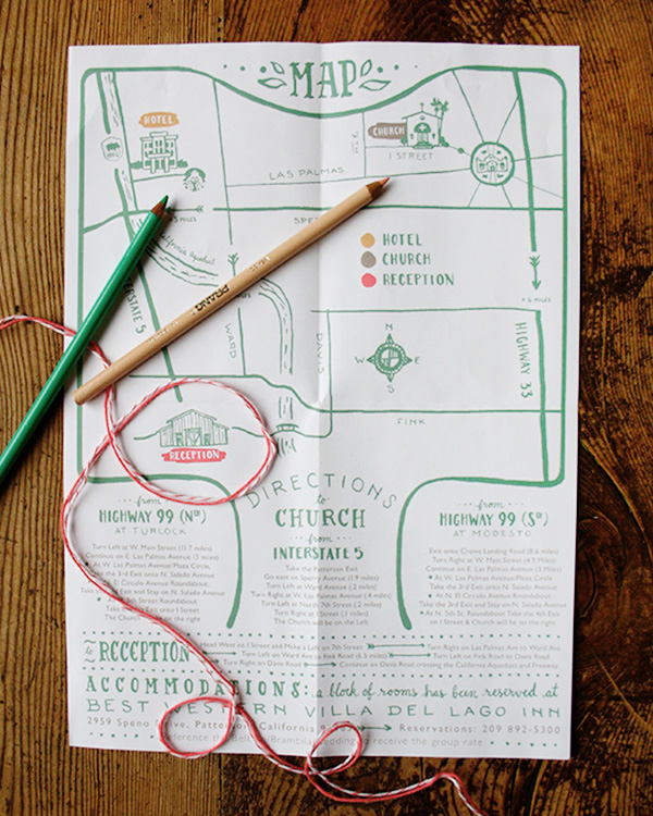
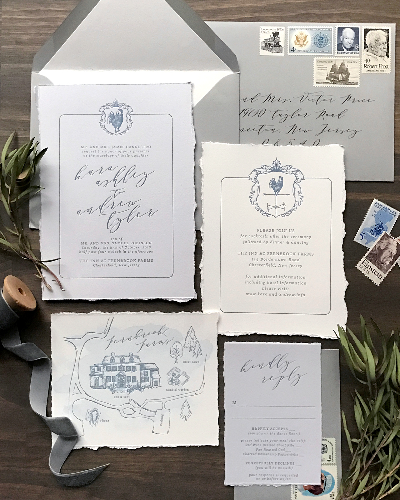
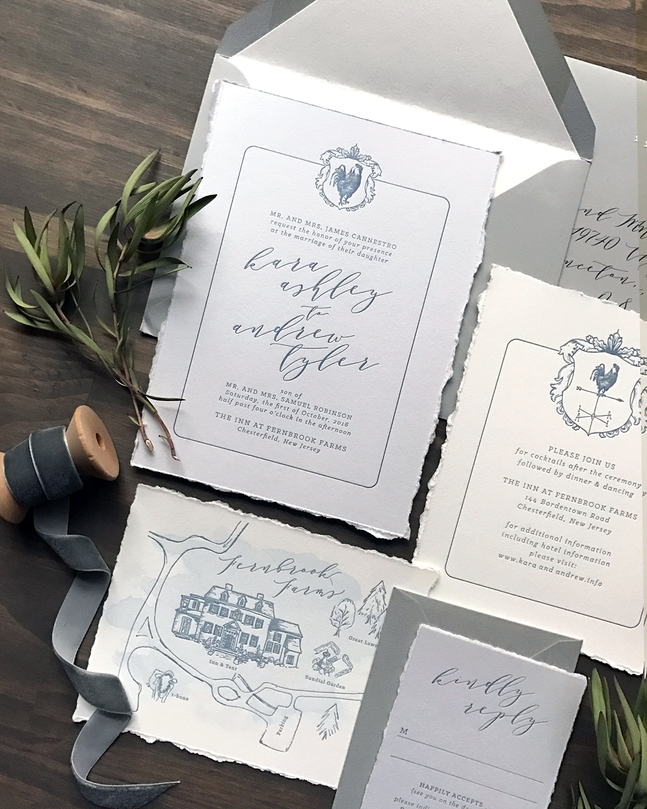
Romantic elegance will never go out of style! These classic gray and french blue letterpress wedding invitations from Lauren of Darling + Pearl feature a custom crest illustration, an illustrated map of the wedding venue, and elegant type selections – all letterpress printed on cool gray and white paper with hand torn edges. We’re loving the combination of classic serif type with an elegant script that conveys the look of modern, organic calligraphy. What a lovely, and classic, invitation suite!
From Lauren: I find that clients with a clear, cohesive vision are just as much fun to work for as the clients that really want to put the creative power directly in my hands. Both creative “scenes” are the birthplace for beautiful design that really, in the end, reflect each couple and stationery that fits their history as well as their event.
Kara first contacted me with a very clear vision for her wedding invitations. Kara and her fiancé, Andrew, were planning their October 2016 wedding at Fernbrook Inn and Farms in central New Jersey. Fernbrook is a stunning farmhouse style wedding and event venue and we really wanted to encompass an organic and classy experience within their wedding stationery. The venue is a gorgeous 1750s Georgian Manor House in the middle of a 250 acre active farm with tented reception area.
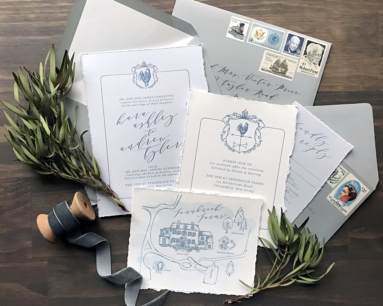
The list of Kara’s must haves in regards to their invitations included: mature modern style script, torn edges, and the cherry on top was an illustrated map of the grounds complete with parking areas, outlines of several ceremony options, the reception area, and T-Bone, the farm mascot.
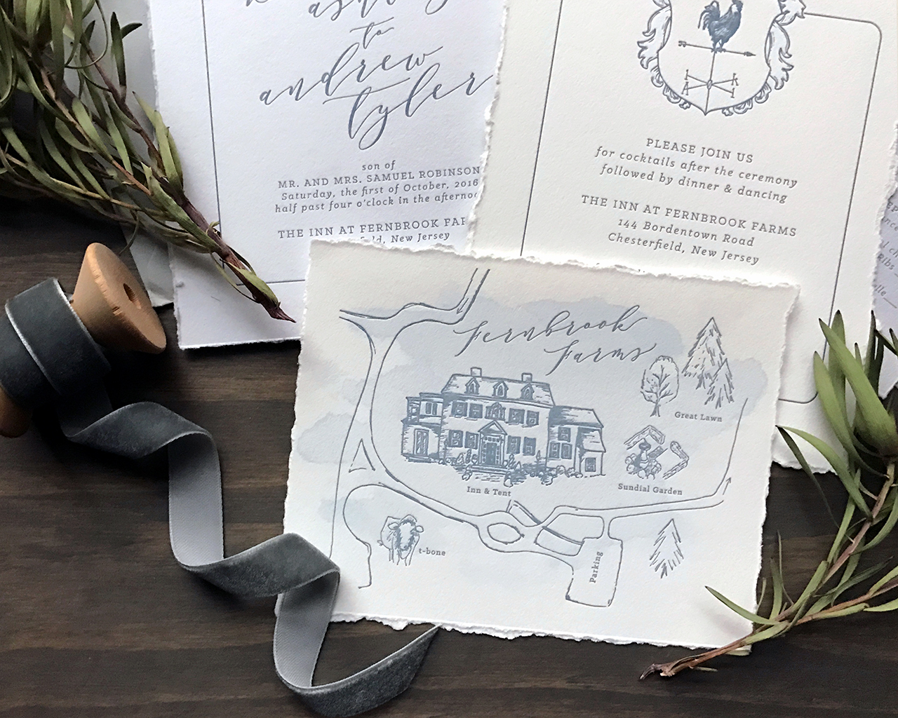
The weather vane crest was taken in part from the groom’s own artwork. We added a more detailed and textured rooster and they both couldn’t have been more blown away with the final result. Not to mention, I really enjoy that little guy looking towards the future, how fitting for a union of two amazing people!
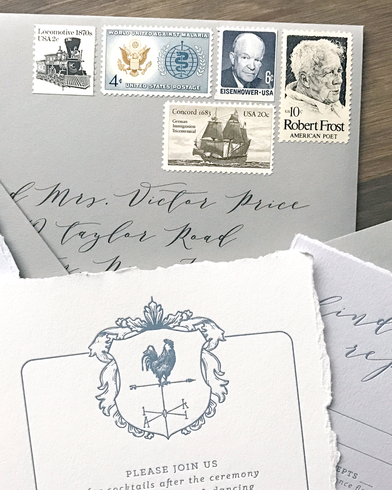
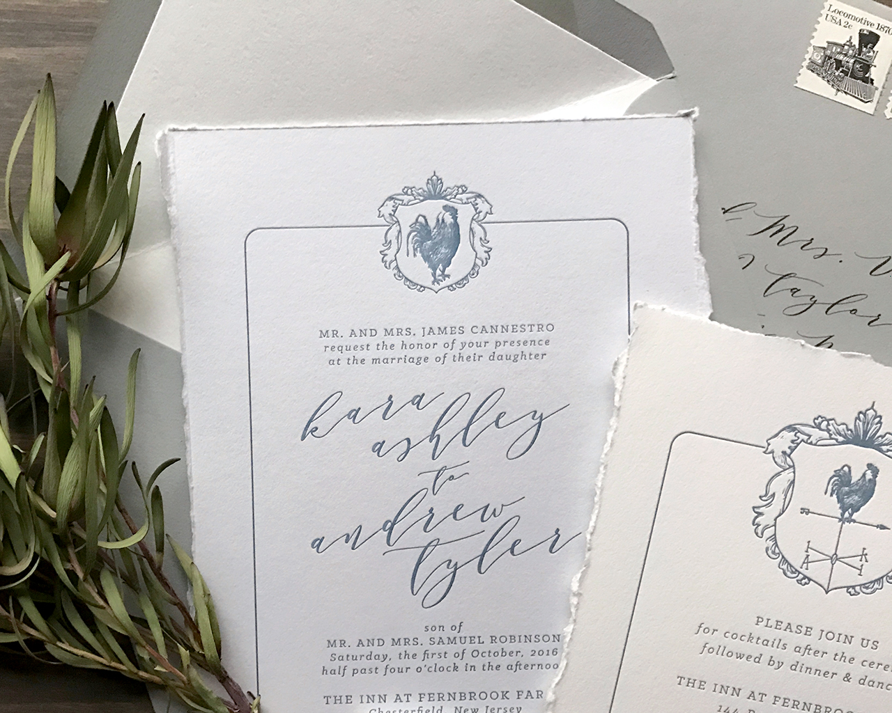
The entire wedding invitation suite was letterpress printed with french blue ink on a combination of cool grey and natural white 100% cotton stock. And naturally, ALL the edges were hand torn. These were an absolute pleasure to design, have on press and see through for the final result. Congrats Mr. and Mrs. Robinson!
Thanks Lauren!
Design: Darling + Pearl
Map Illustration: Erin Niehenke
Darling + Pearl is a member of the Designer Rolodex – you can see more of their beautiful work right here or visit the real inviÂtaÂtions gallery for more wedding invitation ideas!
Photo Credits: Lauren Reed of Darling and Pearl

