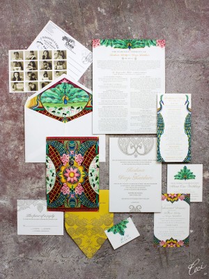
The stunning Reshma Shetty, a star on the hit show “Royal Painsâ€, is of Indian descent. Naturally, she wanted her wedding invitations to mirror her rich background. Of course we were glad to rise to the challenge, creating a custom painting for her invite that included details such as gorgeous pink lotus flowers, henna-inspired embellishment and the word “Om†in the center. It is literally a work of art! All of her accessories, like menus and programs, were designed to match.
Search Results for: indian
Vibrant Floral Summer Wedding Invitations
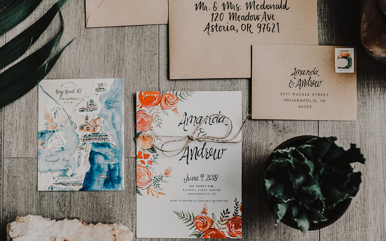
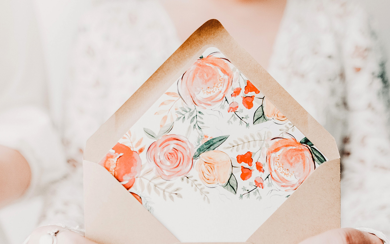
I’m always in favor of vibrant floral wedding invitation designs, but especially in the summer! These gorgeous and vibrant floral summer wedding invitations from Designer Rolodex member Amanda of Wide Eyes Paper Co. combine beautiful floral illustrations with whimsical hand lettering for a bright and cheerful midwestern wedding. And seriously, how gorgeous is that envelope liner??
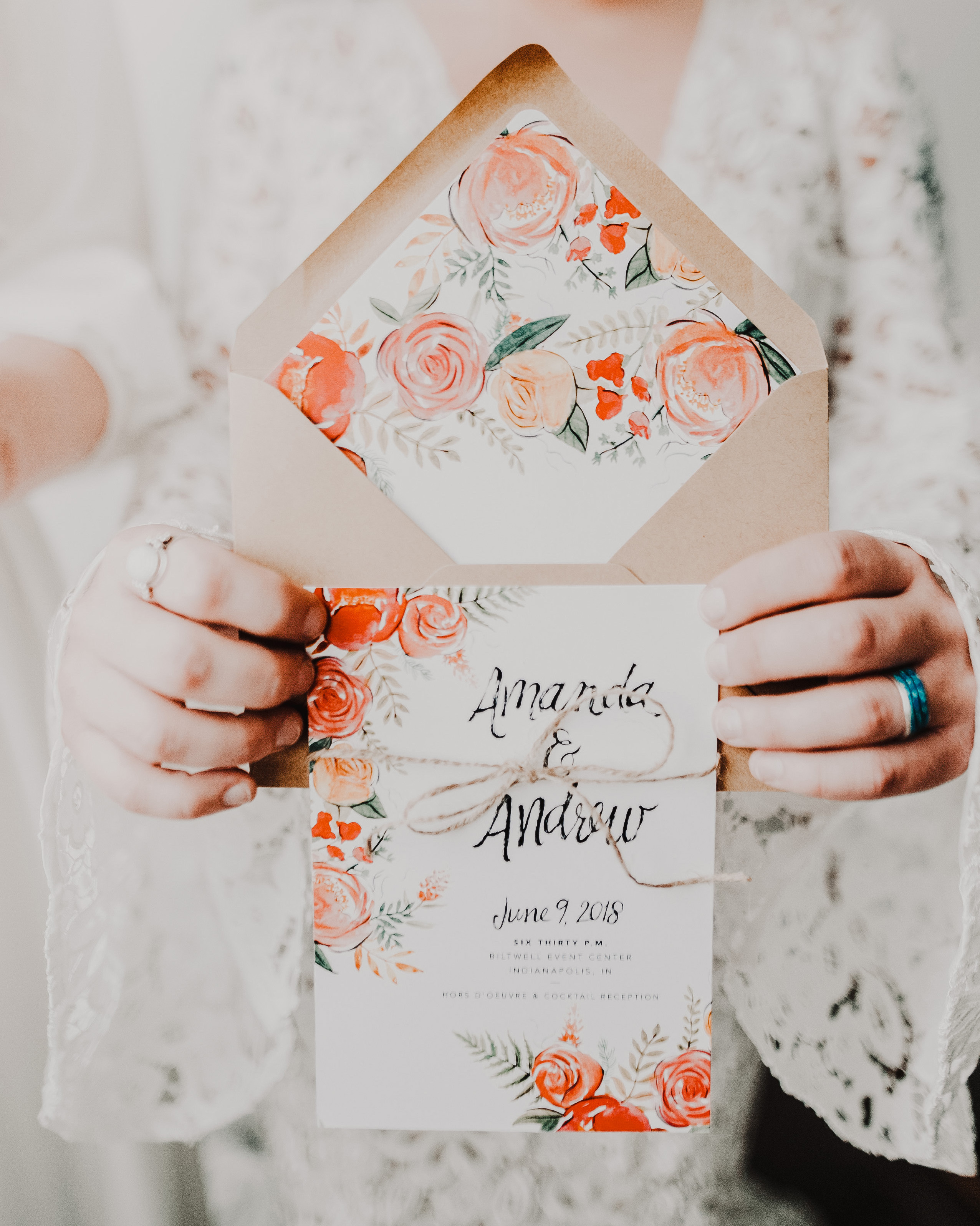
From Amanda: Less is definitely more in this vibrant floral summer wedding invitation suite. Andrew and Amanda had a vision of bright, cheerful, and whimsical with a minimal inspired flare. We utilized a striking color palette of pinks, oranges and reds which is perfect for the summer wedding in Indianapolis. The bride wanted to tie in her floral arrangement with the paper goods so we created a custom watercolor floral design that adds a pop of whimsy but still keeping the aesthetic fresh.
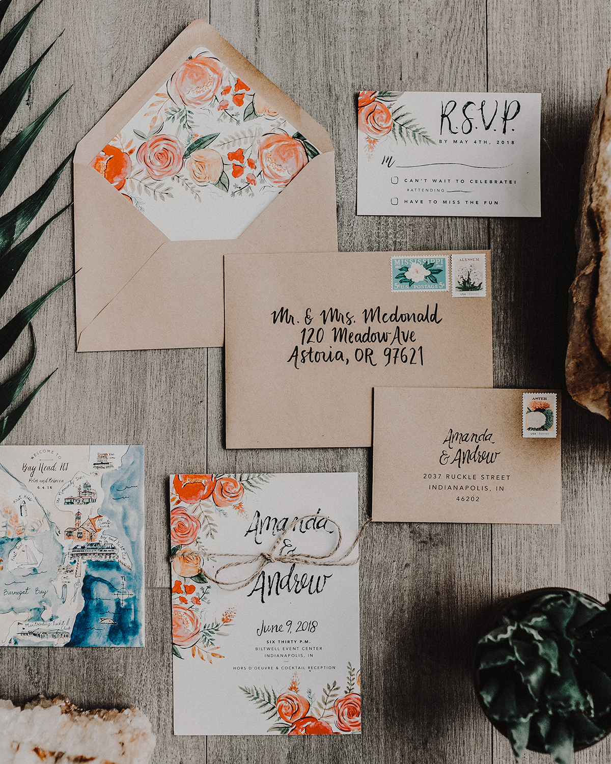
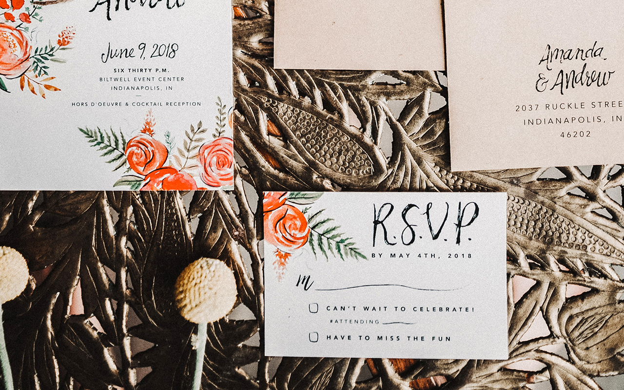
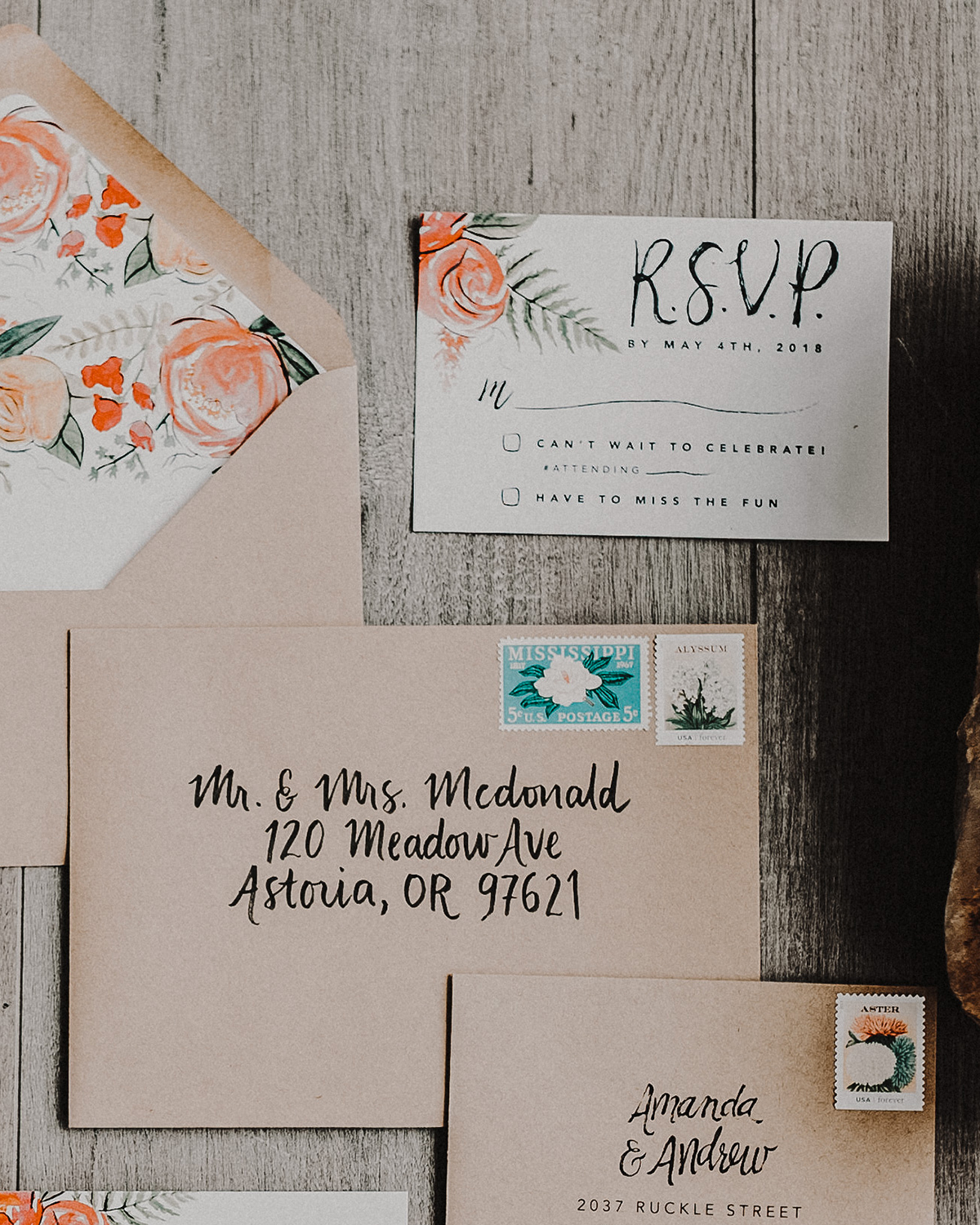
The simple wording of this invitation showcases a whimsical hand lettered font for the couples’s names and a simple sans serif font for the remaining important details. The hand-painted design carries over to the RSVP card. We love putting the invitation and RSVP card next to each other as the floral elegance is carried between the two.
The tiny details are what make each set an individual work of art. Customizing each invitation set to perfectly align with the couples unique love story is what makes our job so special. One of our favorite parts of the design process is the custom map card we get to paint, highlighting all of the special spots near and dear to the lovebirds’ hearts.
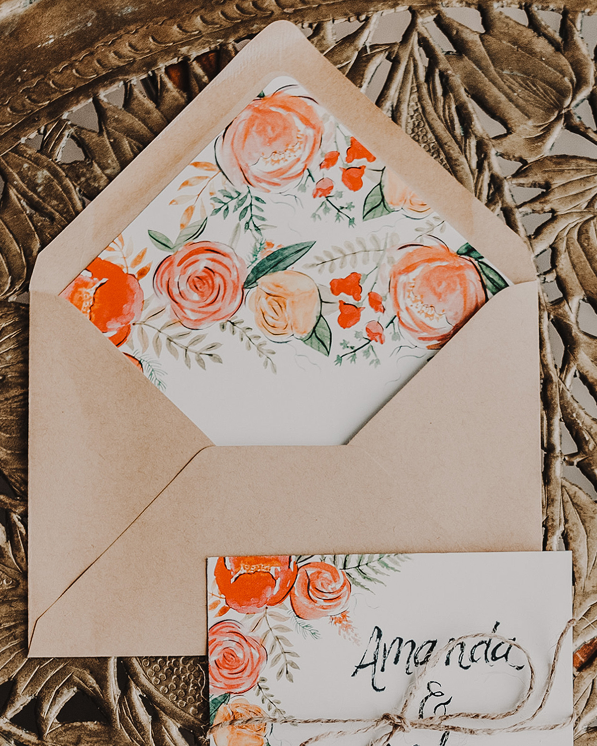
For the envelope liners, we carried over the custom florals used throughout the set to add even more whimsical charm. Yes, they match the invitation and bring the whole set up a notch, the real cherry on top. We ALWAYS recommend liners to do just that. Finally, each envelope features hand lettered calligraphy which also ties in the unique hand crafted nature of the invitation suite.
Wide Eyes Paper Co. is a member of the Designer Rolodex – you can see more of their beautiful work right hereor visit the real inviÂtaÂtions gallery for more wedding invitation ideas!
Photo Credits: Swiss Dot Photography
Inspiring Calligraphers: Anna Lora Whitley of Silt and Pine Calligraphy
Hey everyone! We’re into the summer swing of things… which means summer soirées and summer weddings! We’re celebrating these long summer days with some gorgeous calligraphy and hand lettering work from Anna Lora Whitley. Her calligraphy work as Silt and Pine is a sweet find (much like stumbling on a good lemonade in the summer). – Jen
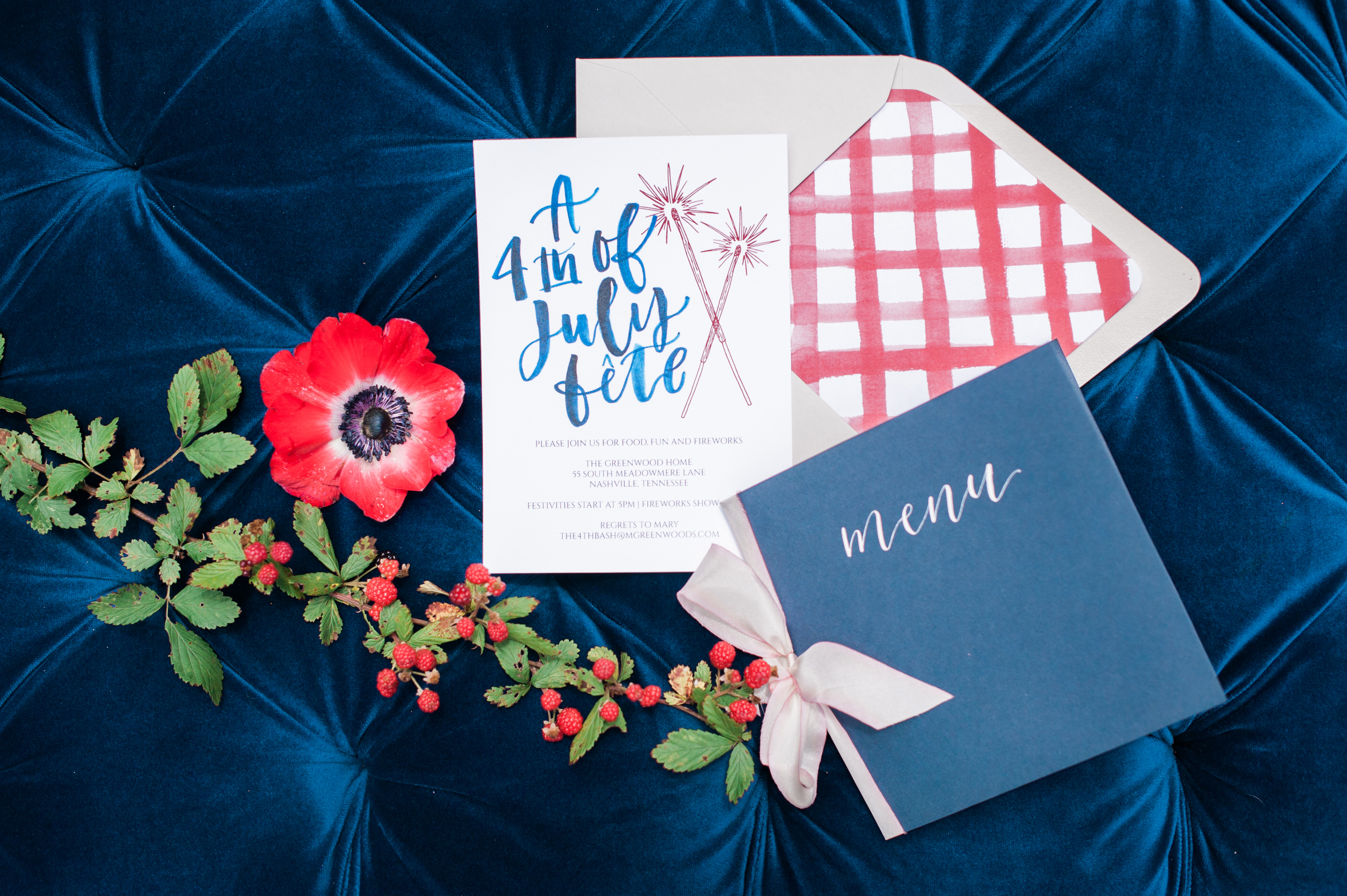
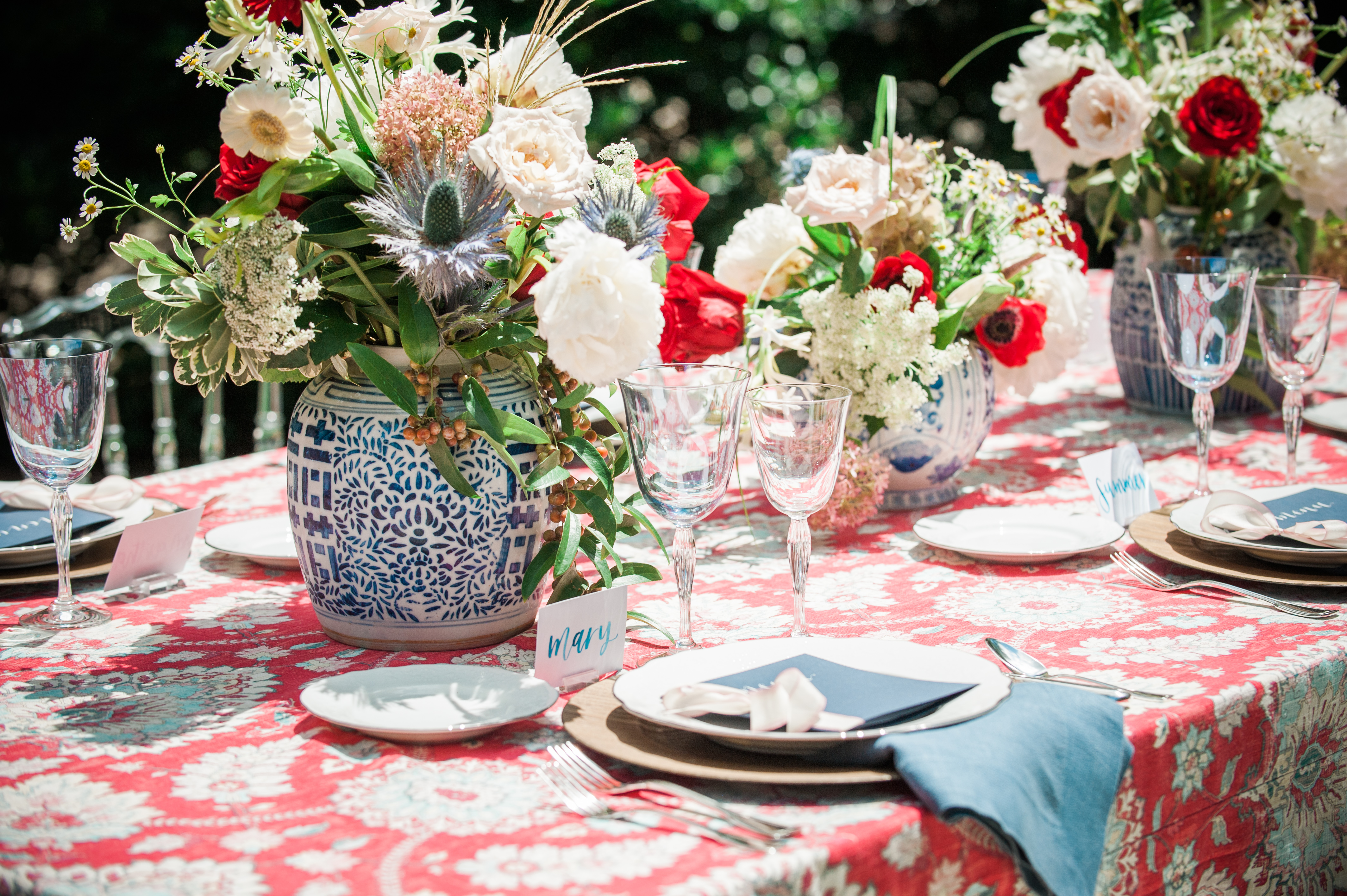
Photo Credits: Anna Rebecca
On her calligraphy style, Anna Lora says: My lettering style is honestly a version of my own handwriting. When I first started calligraphy, I kept getting so frustrated trying to do the traditional calligraphy styles. I quickly realized that it was much more important to me to create my own style.
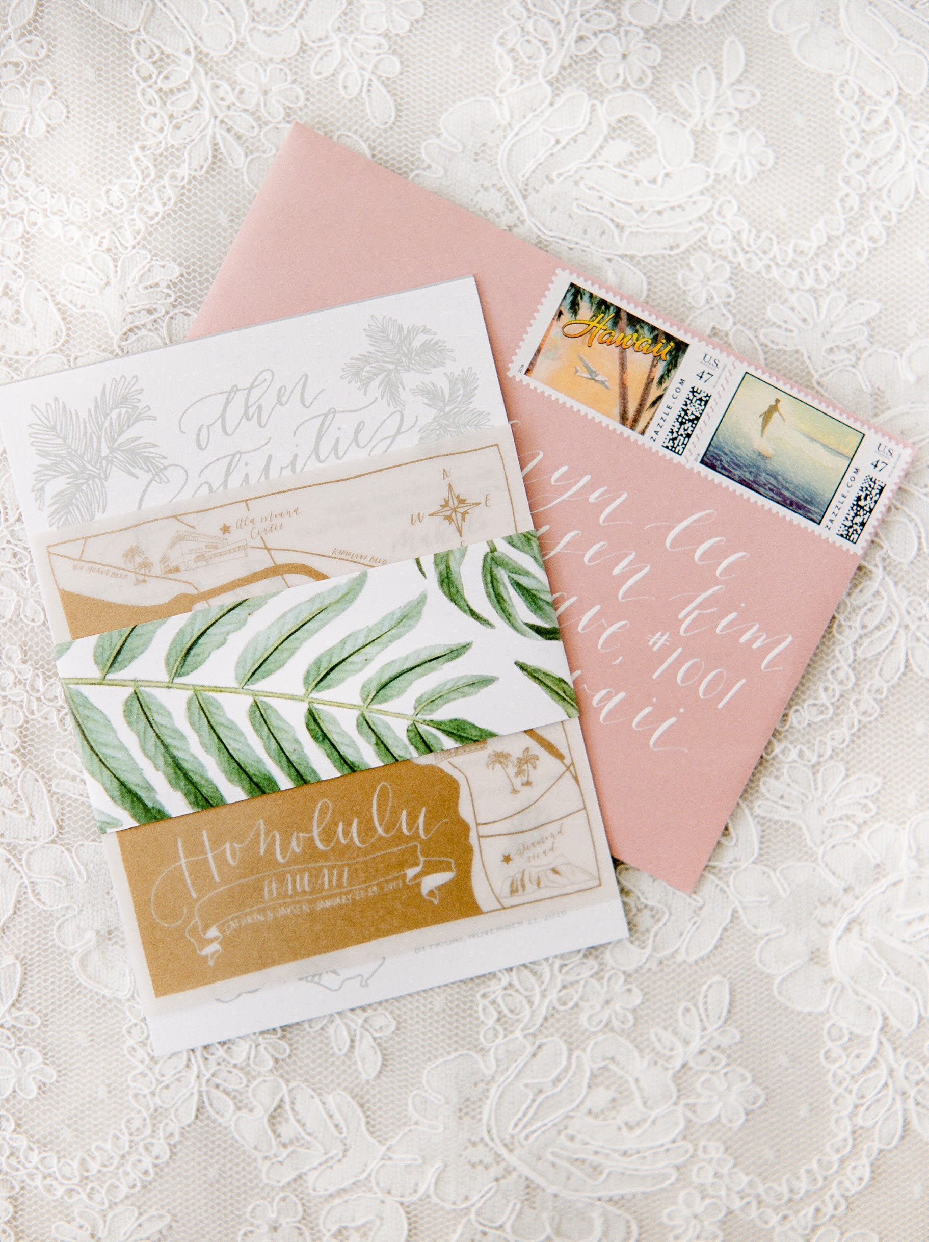
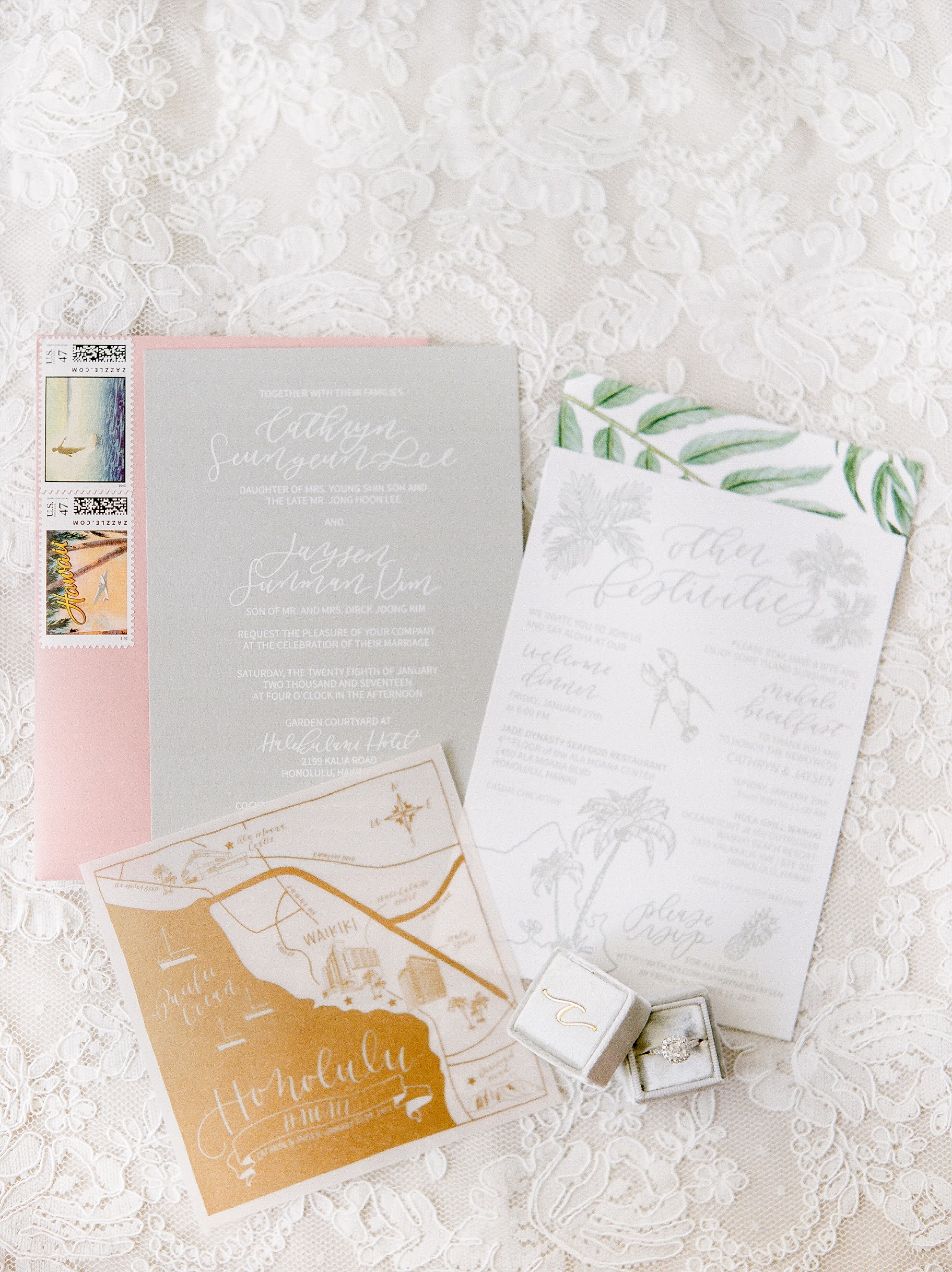
Photo Credits: Ashley Goodwin Photography
Her calligraphy style feels just right with this Hawaiian themed invitation suite.
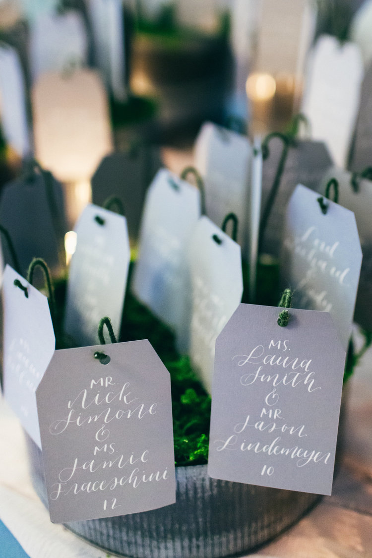
Photo Credit: Justin Johnson Photography
What a pretty way to display place cards!
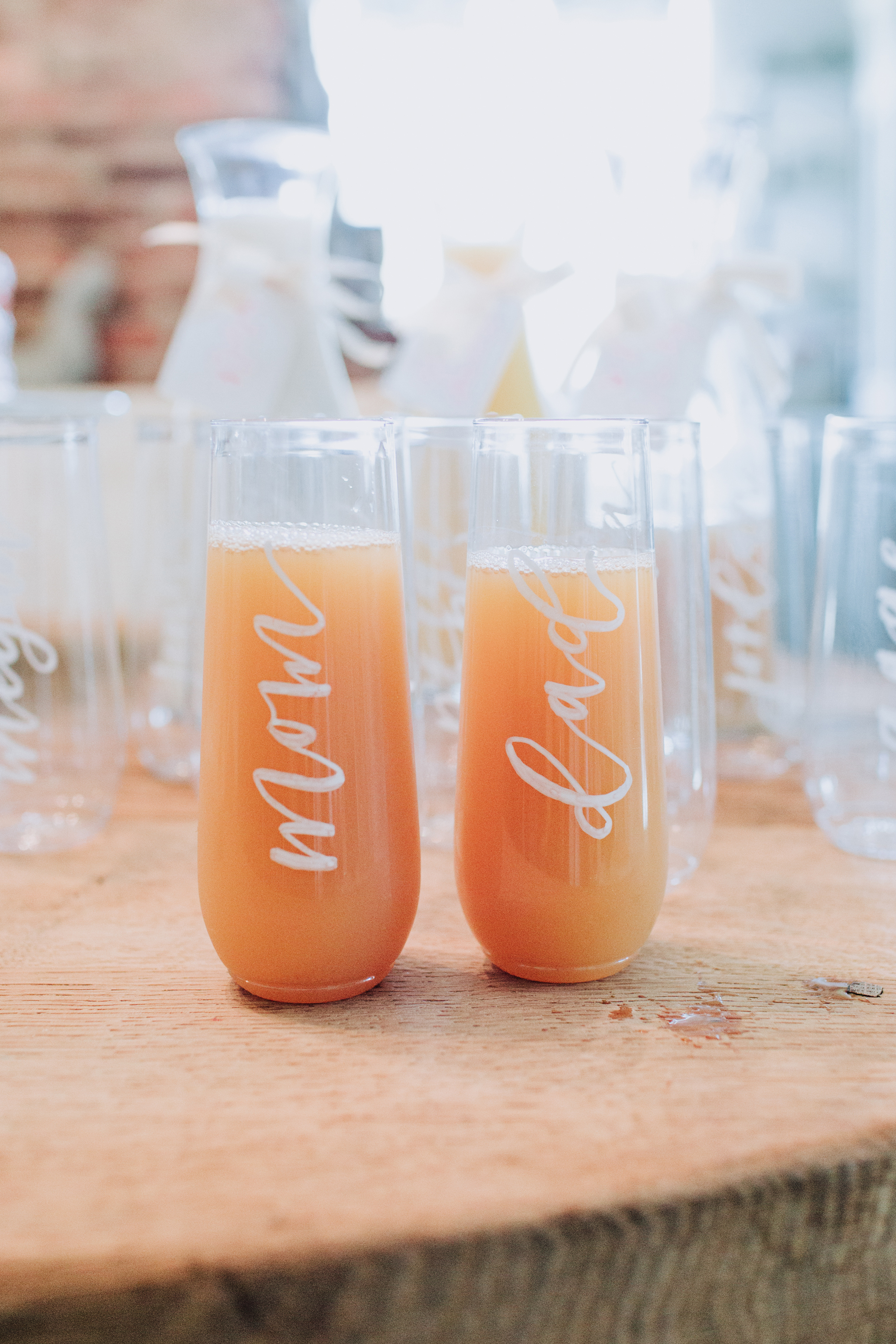
Photo Credit: Laurie Dicus Photography
Mimosas, anyone?
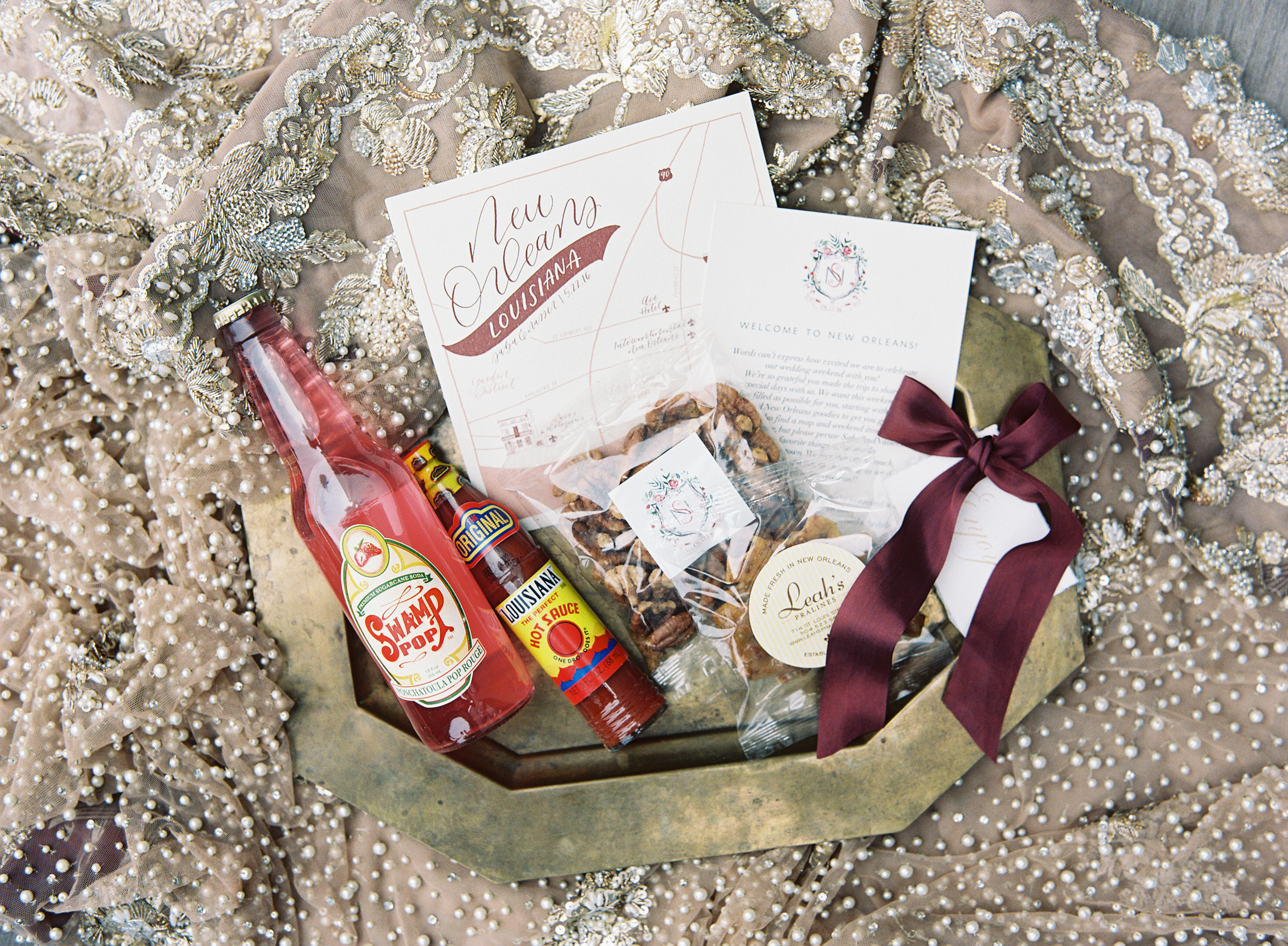
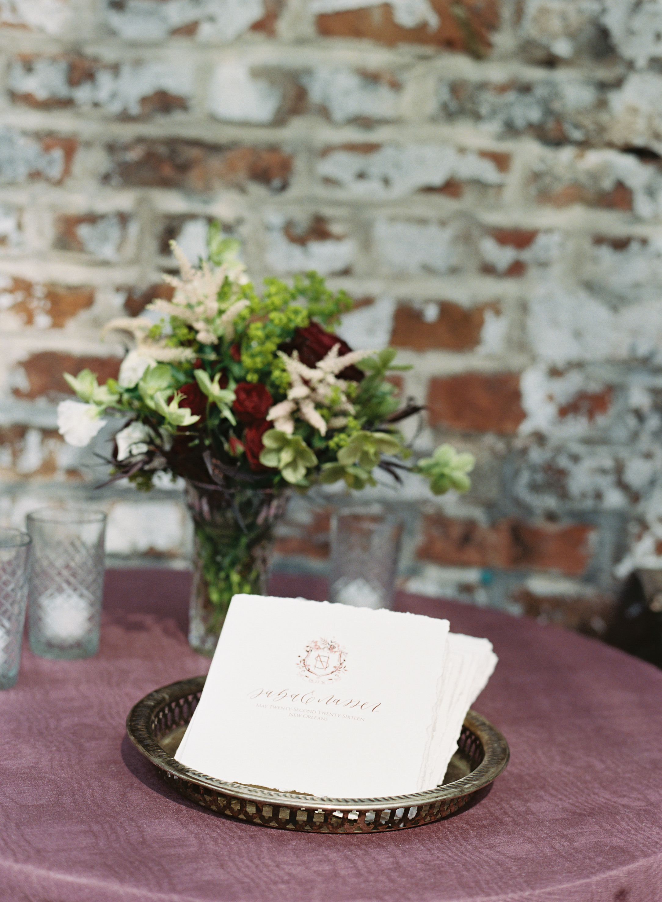
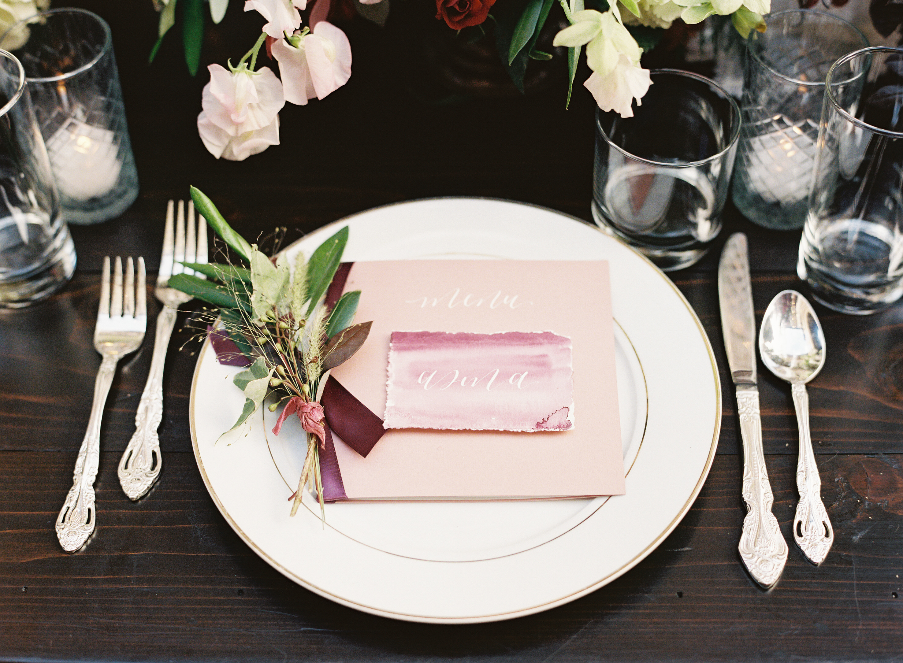
Photo Credits: Tec Petaja
On a favorite project she’s worked on: I got to work on was a New Orleans + Indian fusion wedding. I am partial to New Orleans because my husband and I got married there, but I was so excited to work on this particular wedding because of the blending of cultures, beautiful color palette that the wedding planners, The Nouveau Romantics, created for the wedding and the absolutely stunning venue. It is hands down the most inspiring project I have worked on so far!
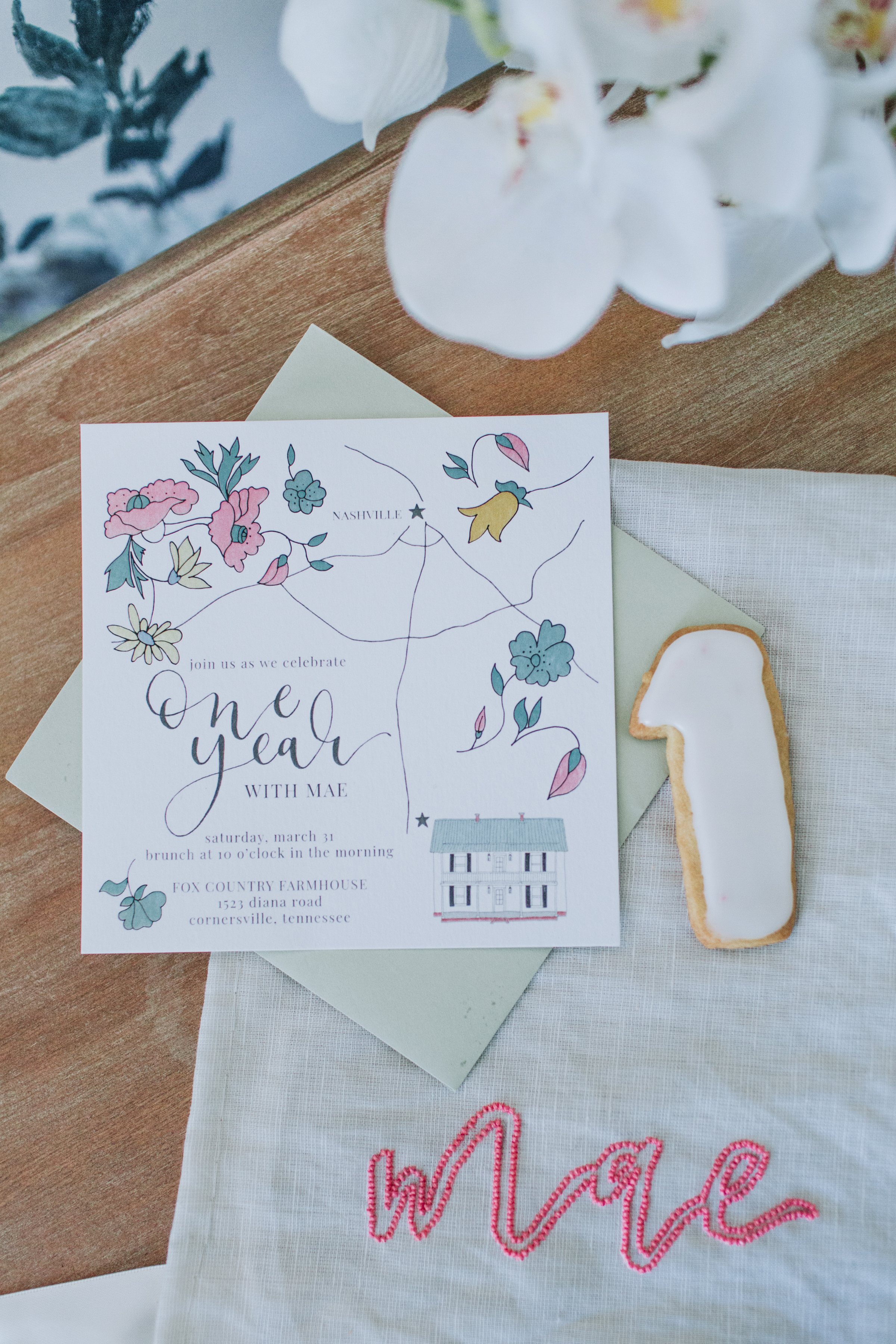
Photo Credit: Laurie Dicus Photography
On non-traditional surfaces, she shares: My favorite non-paper surface that I have worked on would be mirrors, but I have a feeling I’m about to have a new favorite. I have a fun wedding coming up where I get to write on acrylic and agate slices. The seating chart will be an 8-foot tall piece of acrylic. It is going to be such a fun project to work on.
A big thanks to Anna of Silt and Pine for sharing a peek at her work!
Behind the Stationery: Heartell Press
I’m so excited to introduce our first hand-carved woodblock designer that we’re featuring on the Behind the Stationery column! Rachel from Heartell Press is here to take us through her processes – from the intricacies of designing and carving each block, to growing her business, to ensuring her team is self-sufficient enough for her to take some time to adjust to being a new mom. She started Heartell Press in Brooklyn, but has since moved to Indiana with her husband and into a beautiful spacious studio. Here’s Rachel! —Megan Soh
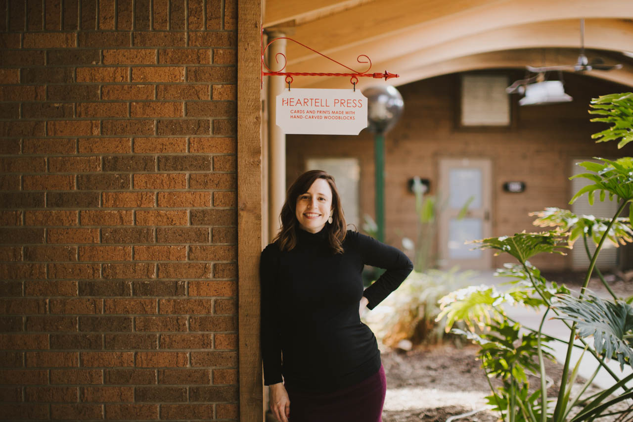
From Rachel: Heartell Press cards are printed from hand-carved woodblocks. Woodcut was always my favorite of the printmaking processes, and the folksy look of the carved images and the organic textures created by the woodgrain are a good fit for our warm, sincere designs and messages. There are great designers who use linoleum blocks (Katharine Watson, Ghost Academy, and Kaibelle Designs are my favorites), but as far as I know we are the only line printed from wood. It has taken lots of trial and error to learn to print our blocks consistently and at scale using letterpress equipment, but I think our customers appreciate that each card is truly handmade on every level.
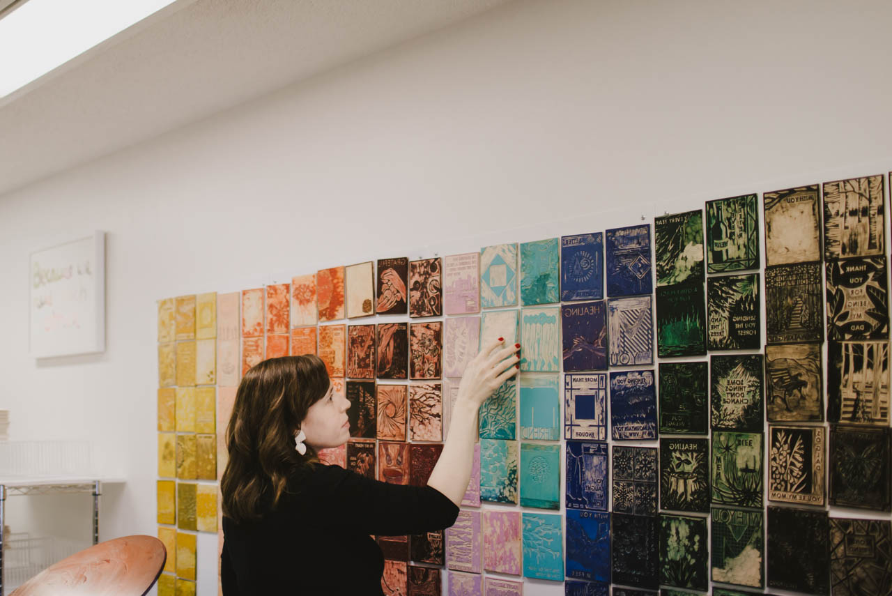
The carving is time-consuming, especially because each color we add to a design means carving a separate block. I’m always working on ways to preserve the look and feel of what we make while streamlining the process for producing our products. For the new spring collection we’re working on now, I’m carving the key block — the part of the image that has the most detail and information — and experimenting with photopolymer plates to add lots of additional color. I’m excited because if it works we’ll be able to release new cards with lots of color and add new types of products to our line more frequently while still offering cards and prints that are true to the Heartell aesthetic and unique in our industry.
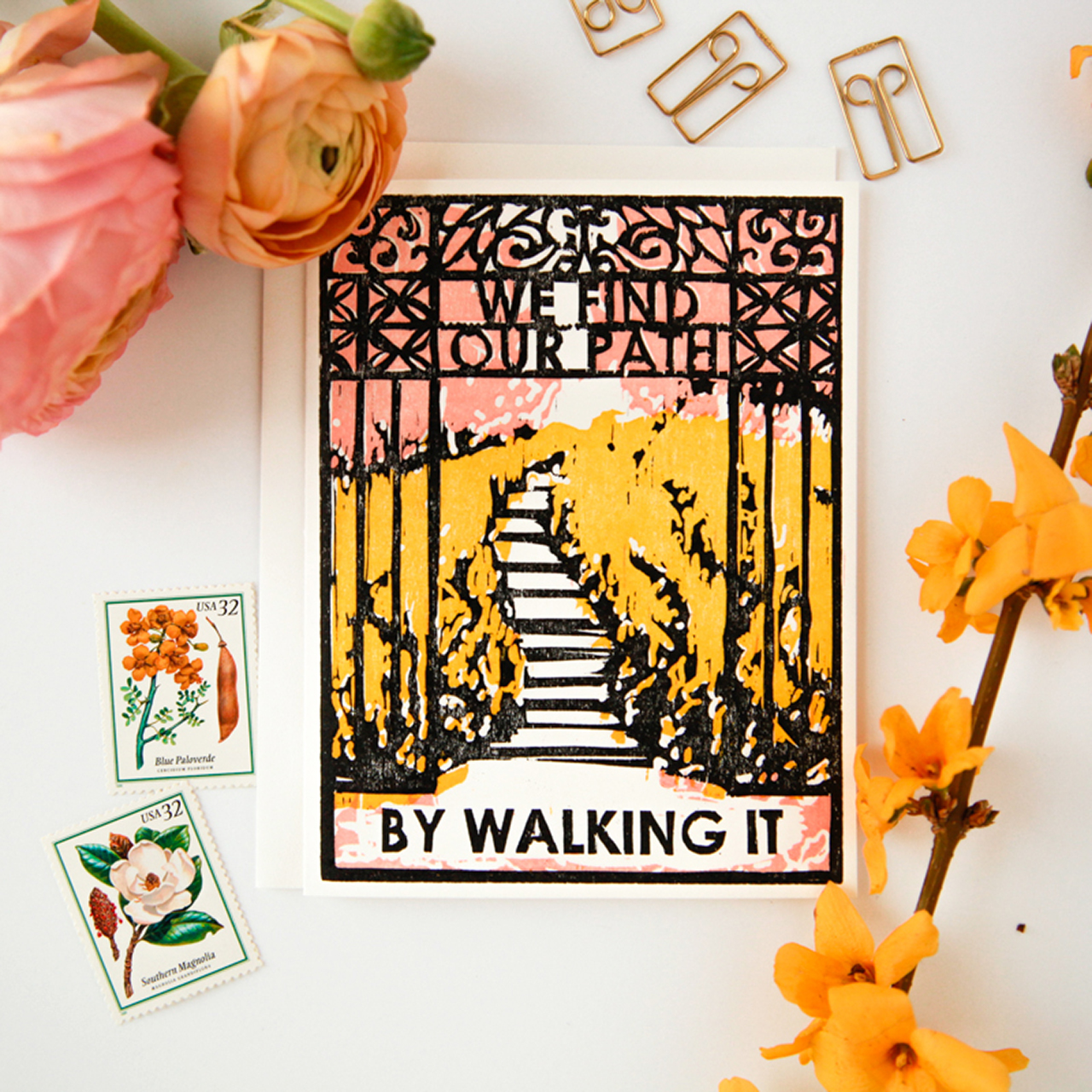
My path to stationery was long and winding. It took doing a lot of the wrong things to find the right thing. I went to grad school twice, first to earn an academic degree in religion and art history from Yale Divinity School and then an MFA in printmaking from the School of the Art Institute of Chicago. After I finished school in 2009, I moved to New York and cobbled together a living with multiple part-time jobs. I worked in a church, as a nanny, and eventually ran a non-profit. All the while I was renting a (super expensive and tiny) art studio in Gowanus, Brooklyn, and trying to squeeze in as many hours per week there as possible making paintings and prints. I had a few shows in Brooklyn and Manhattan, but it was tough trying to build an art career and pay rent in New York.
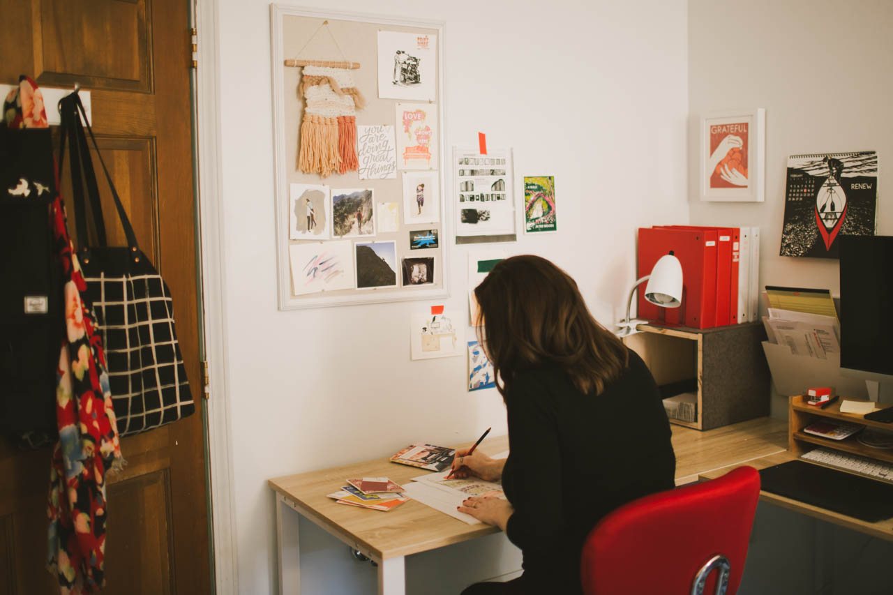
In 2012 my mom was diagnosed with cancer, and that experience made me question the chaotic existence I was living and inspired me to find a way to do the creative work I love full time. Since I was having a hard time finding sympathy cards that I liked enough to send to my mom between visits, I started having ideas for making my own cards. People in my life and my community in Brooklyn were responding to them in a way that made me think there might be something there.
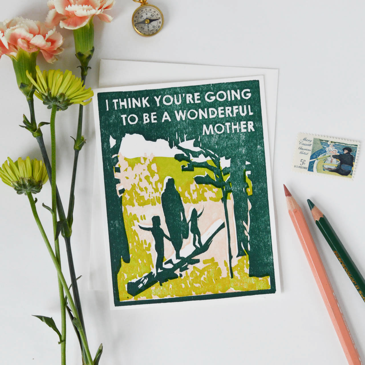
I began to look more closely at the stationery industry, and when I discovered that there was a wholesale market for handmade stationery, especially at the National Stationery Show (through the OSBP blog!), the idea for Heartell Press was born. I did research and worked on developing my line and launched the website in 2014. I exhibited for the first time at NSS in 2016 and that is when the wholesale part of Heartell took off and I was able to leave my day jobs and focus on the business full time.
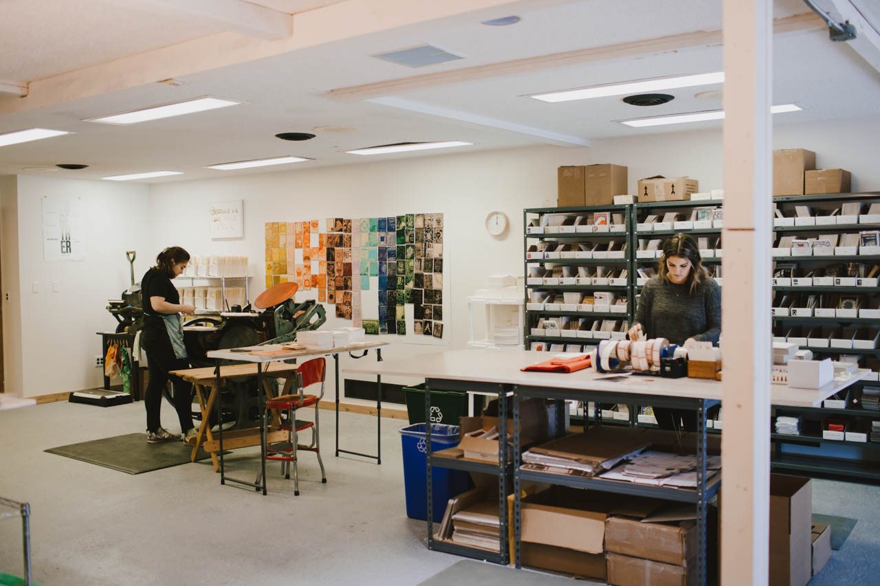
In 2016, my husband and I decided to leave Brooklyn and move to Fort Wayne, Indiana, where he grew up. The move has been great for us and for Heartell, giving me lots more time and space to devote to it. In November 2017, we moved the business into a new studio space here in Fort Wayne. It is two-thirds less expensive than the space I rented in Brooklyn and eight times bigger! We have room for our presses, including a new (to us) 10×15 Chandler and Price that we added to our shop when we moved, as well as inventory, a shipping and fulfillment space, office space for me to do my designing and carving, and plenty of storage. The building has a beautiful atrium full of tropical plants that is like a greenhouse, and I love being able to walk around it when I need to think or stretch after lots of drawing or carving.
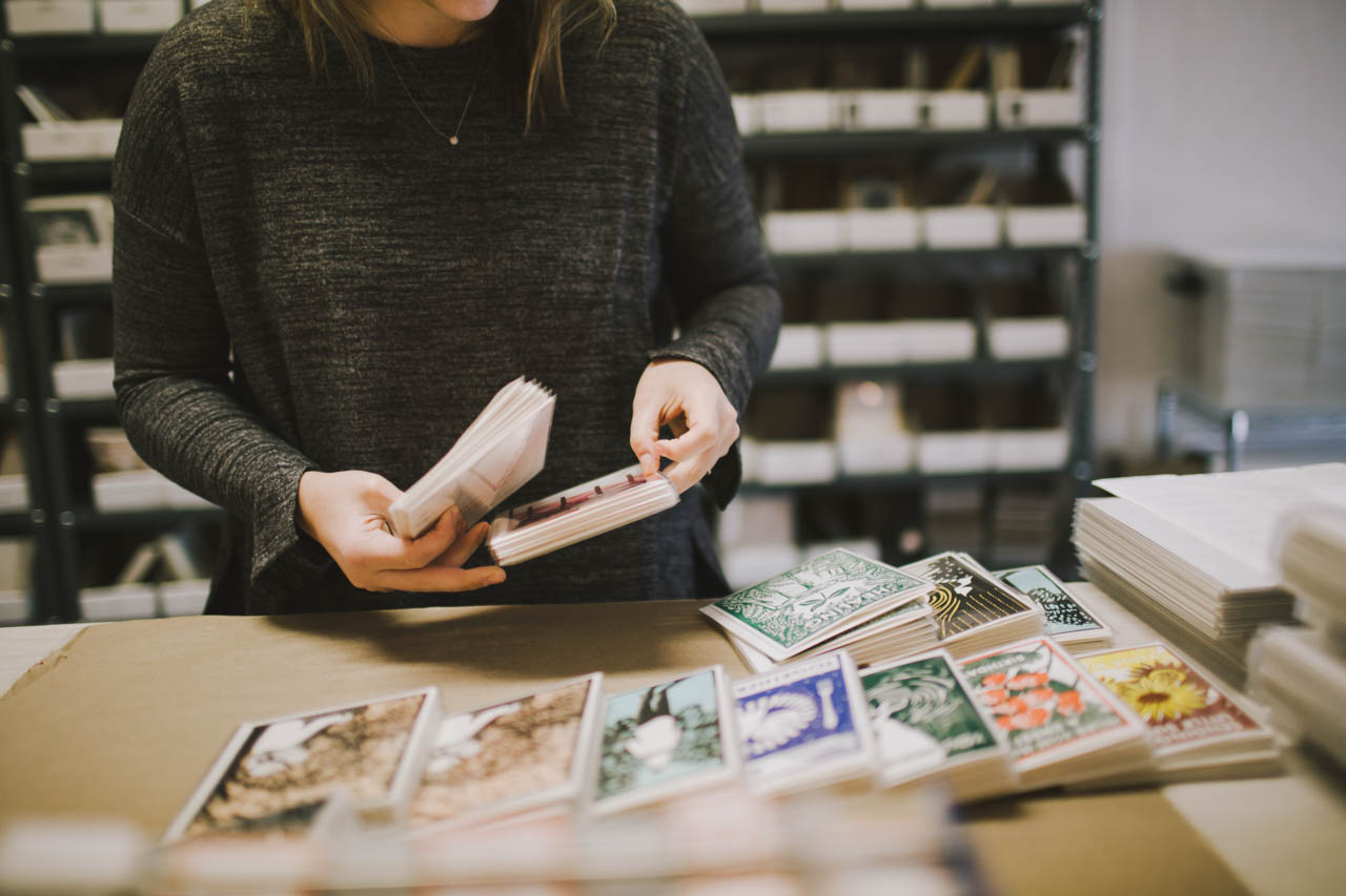
Heartell designs start with bits of text or images that I collect in lists for each card and product category (I use Trello for organizing all my lists, plans and tasks). My best cards are inspired by experiences I’m having in my own life and relationships. The earliest Heartell cards are all sympathy, love, and encouragement cards that I made when my mom first got sick. It will be pretty obvious when the new collection comes out that many of the designs I’m working on now have been inspired by the experience of being pregnant (and also watching friends and family members who have had children).
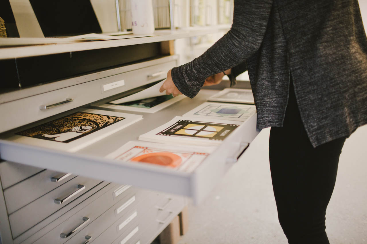
I try to make cards that I would genuinely want to give or receive. There are lots of funny cards right now about all the (sometimes unwelcome) changes that come when you have a baby, like having to deal with tons of poo, and those definitely serve an important purpose in the process of preparing to be a parent. Funny isn’t really my forte though, and I tend to swing toward more sincere, emotional messages. When I do retail markets I almost always have a customer tear up at my booth at some point during the event. I’m not sure if making people cry is something I should be proud of but I’m glad that I’ve found a way to put all my feelings to good use!
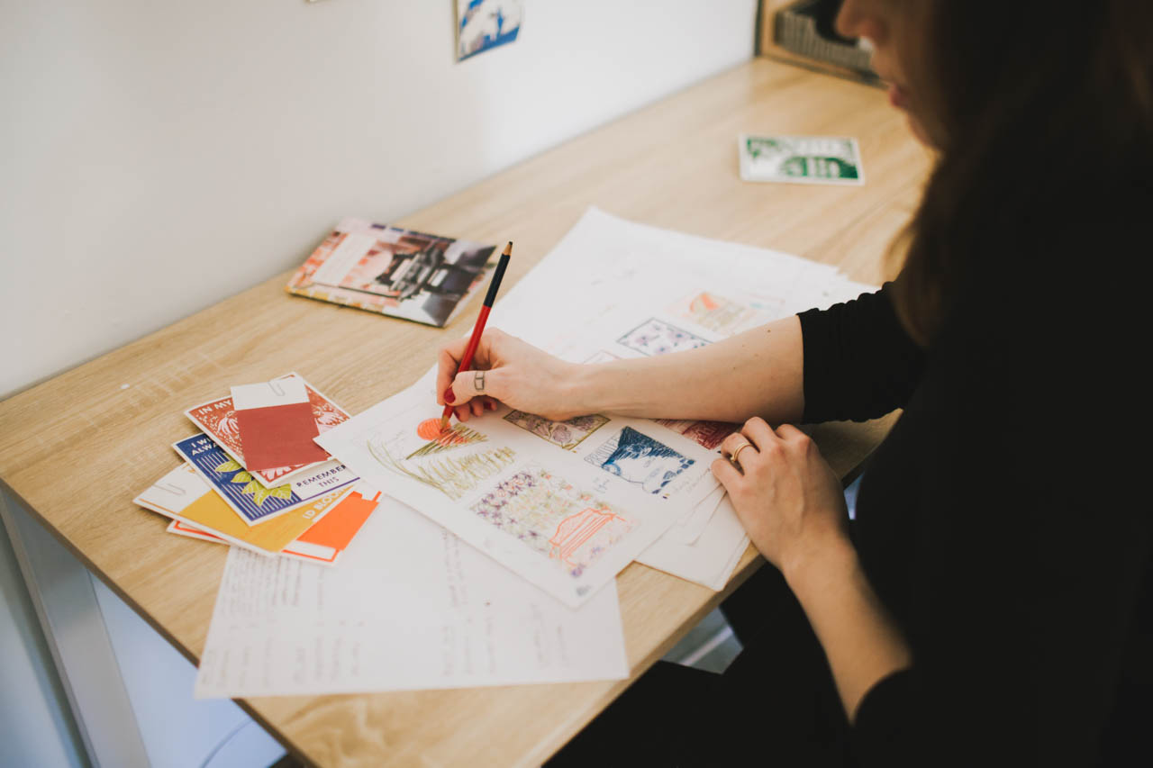
When I’m ready to design a new collection, I go through our current catalog to see which parts of our line could use fleshing out or freshening up. Then I comb through my stockpile of ideas and draw thumbnails with colored pencils to begin mapping out new designs. Once I have an idea of the collection as a whole, I use my Wacom tablet and Photoshop and Illustrator to draw the full scale images and lay out the text. I used to do this with pencils and markers on vellum, doing lots of tracing and scanning to come up with the final designs, but the tablet has made the process much faster and more fun.
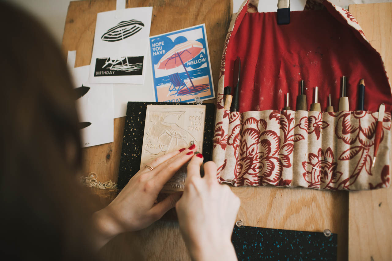
When the designs have been edited and vetted by as many people as I can get to look at them and I’m satisfied with my plans, I print guides using a laser printer and transfer them to blocks of Shina plywood (a wood that is both soft for easy carving and strong enough to hold detail that is harvested sustainably in Japan specifically for printmaking). I use Japanese carving tools to carve the blocks, and then we mount them in the presses for printing.
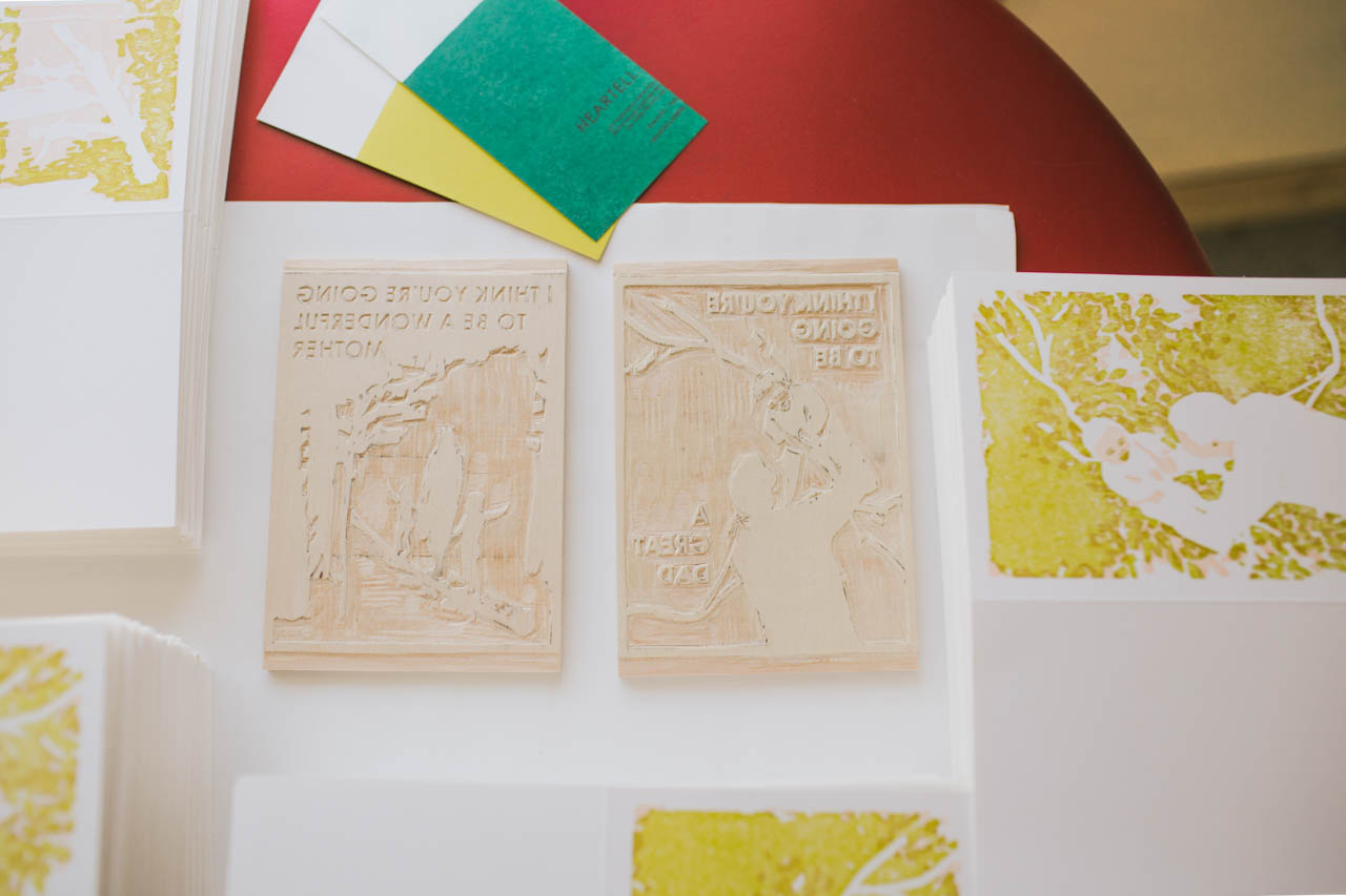
Since there is a separate block for each color, including the scoring run, some cards pass through the press up to four times! I love seeing the new designs printed for the first time. It is always a thrill to see something I’ve dreamed up become a finished product.
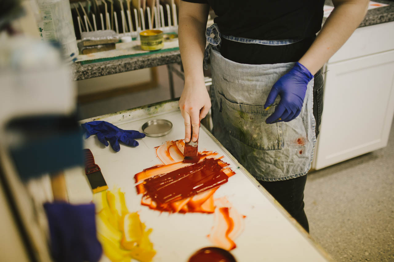
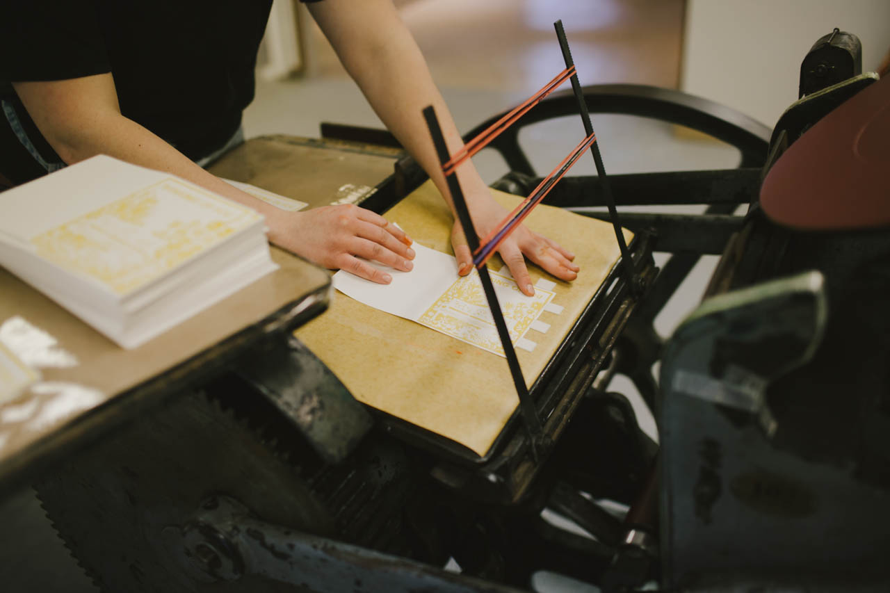
Like many of the business owners I’ve read about in this column, I spend a lot of my time these days running the business end of things. Fortunately I’ve discovered that I enjoy communicating with customers, managing cash flow, looking at numbers and planning for growth. But now that I have help with fulfillment and printing, I am finding lots more time for drawing and designing and carving blocks for new products, which are my favorite parts of my job. I love working on marketing projects too, and I do all our product photography, design our catalogs, and prepare for trade shows.
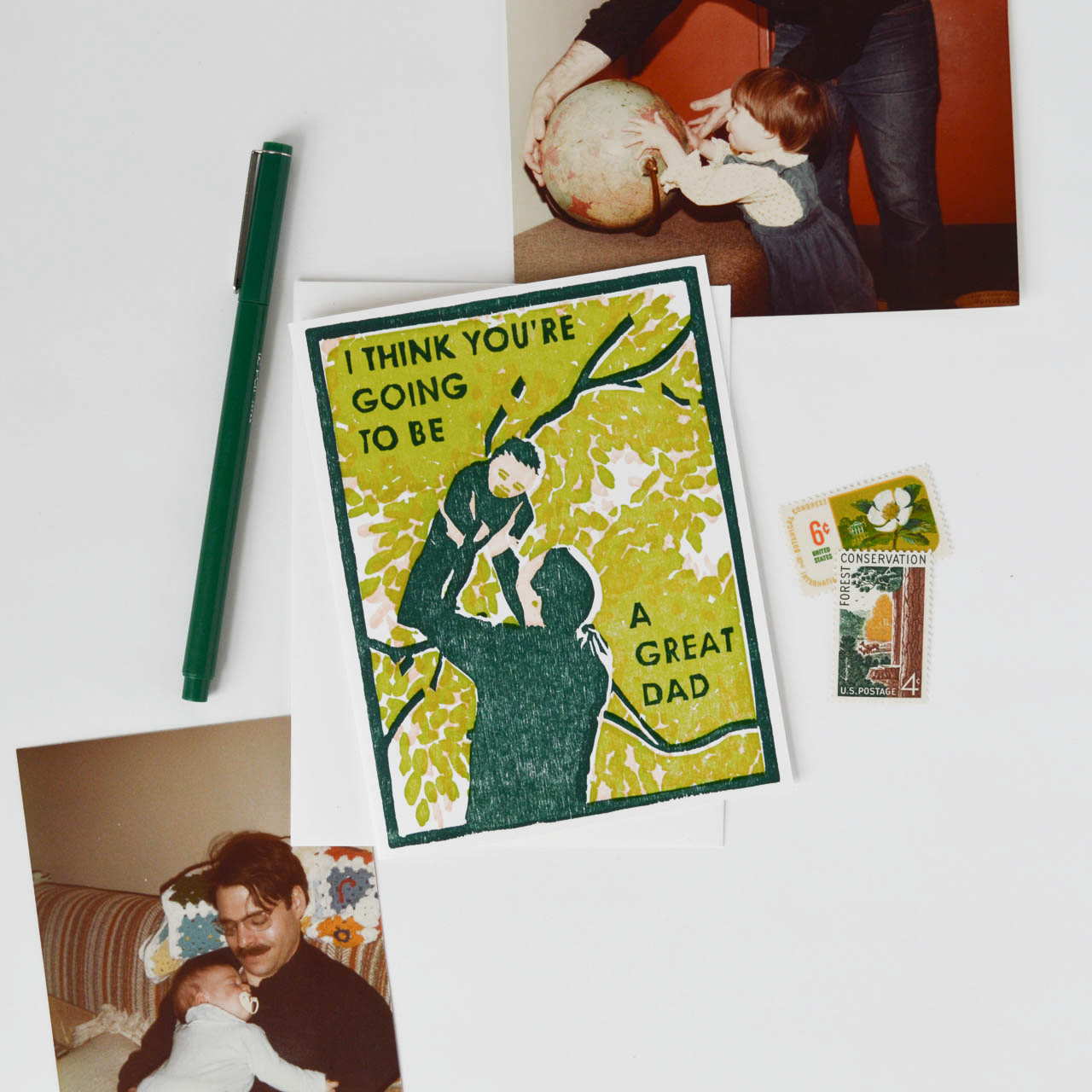
I set different goals for each year, and my big one for 2018 is to get Heartell ready to run without my constant attention for a few months while I take some time to welcome our new baby and adjust to being a parent. I feel grateful to have lots of inspiration from other business owners in our field (Nole included!) who have families, and while I’m sure it will be a big transition I feel confident that we’ll be able to find a good equilibrium over time.
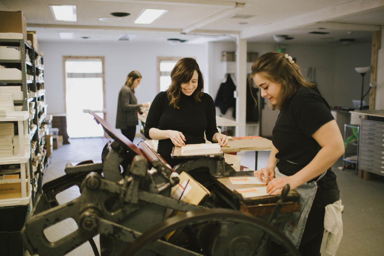
I’ve come to find that stationery is a better fit for me than fine art for a lot of reasons, but one of the things I love most about this industry is how generous and open people are. The fine art world in New York has a deeply competitive culture, and it has been a gift for me to connect with other designers and retailers who are willing to share information, encouragement and support. The more variety there is in terms of design, the more letters people will write and the more connected they’ll be to each other. It feels like we are all part of something that is bigger than any one company or store individually and I love looking at things that way.
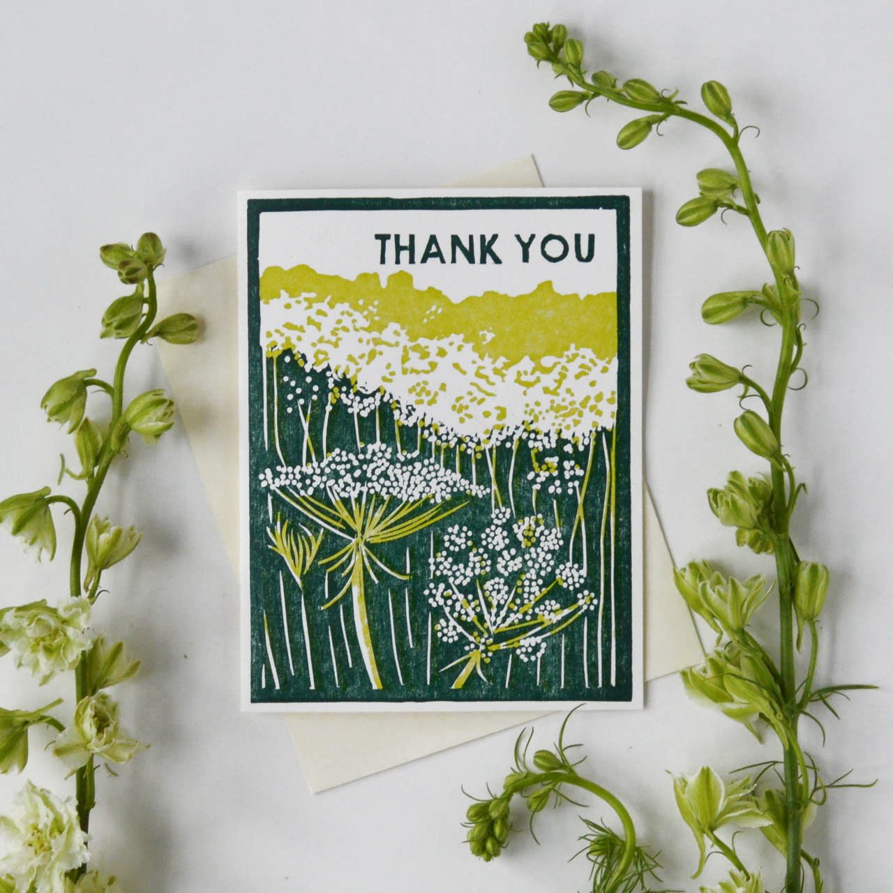
Photo Credits: Product photos by Heartell Press // Studio photos by Ruth Yaro.
Want to be featured in the Behind the Stationery column? Reach out to Megan at megan [at] ohsobeautifulpaper [dot] com for more details.
Wedding Stationery Inspiration: Acrylic Details
A few years ago, we did a really fun DIY neon acrylic menu tutorial – and these days, acrylic is everywhere! And it totally makes sense. Acrylic (aka plexiglass) is super versatile (especially for weddings), inexpensive, and can be customized to suit any color palette. Make signs, menus, place cards, cake toppers… you name it! – Annie
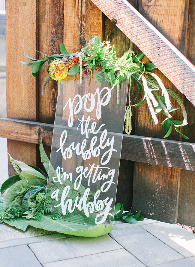
Welcome guests with a graphic acrylic sign. I love the addition of florals and greenery. | Photography: Yasmin Sarai, Design: Abby of Beijos Events, Signs: Meghann Miniello via Inspired By This
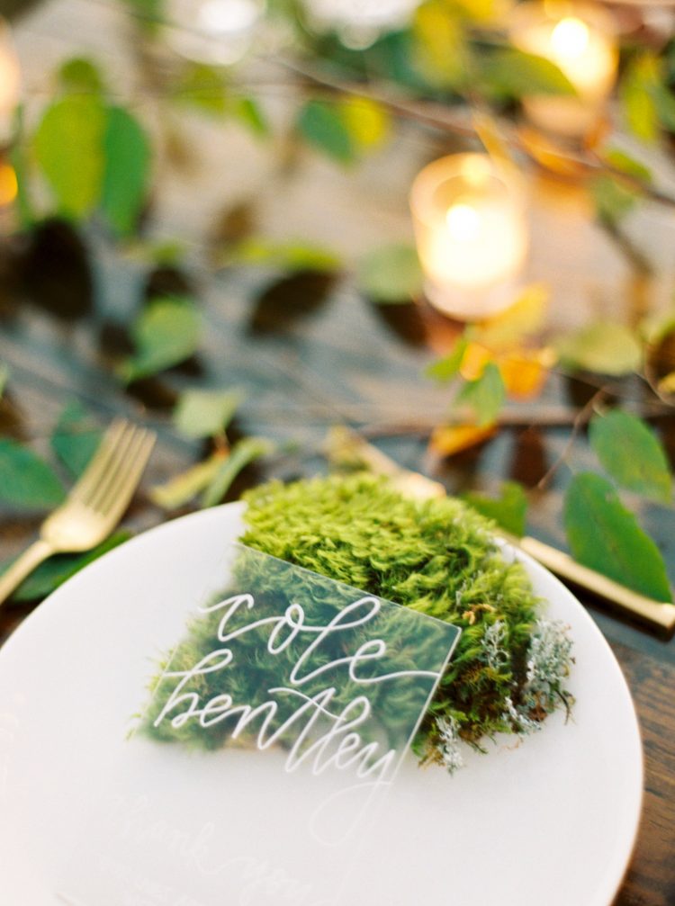
The white calligraphy on this acrylic place card really pops against the moss! | Photography: Erich McVey, Event Design & Planning: We Tie the Knots via Once Wed
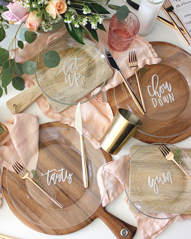
Look familiar? Of course I had to include these plates featured a few years ago! They could also double as place cards. | Printable Artwork: Lauren Saylor of A Fabulous Fete for Oh So Beautiful Paper
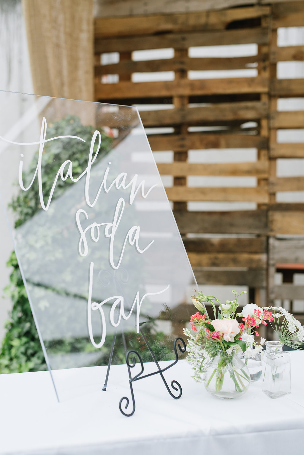
An acrylic bar sign looks sleek and doesn’t clutter up your bar. | Photography: Jessica Kettle, Calligraphy: Lavender + Pine via Rachael Ellen Events
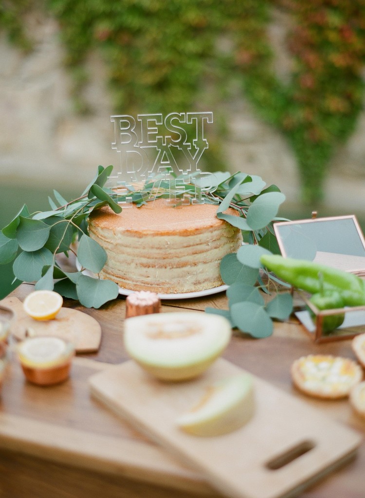
I love the contrast of the acrylic cake topper and naked cake. | Photography: Greg Finck Photography, Planning & Design: Majenia via Green Wedding Shoes
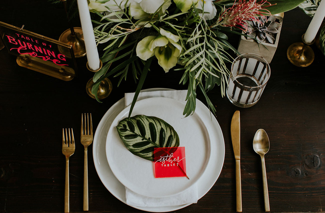
These colorful acrylic signs are a modern way to add color to your place setting. | Photography: Hazelwood Photo, Event Design & Planning: Something Borrowed PDX, Signage: Letters & Dust via Green Wedding Shoes
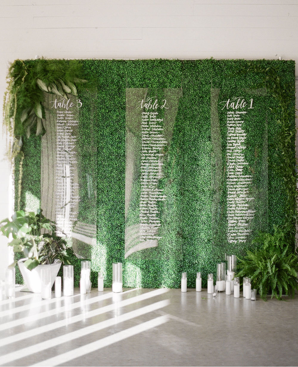
Hang seating charts in front of greenery, making them easier to read. | Photography: Matthew Moore Photography, Event Design & Planning: BW Theory, Paper Goods: Dear Darling Calligraphy via Green Wedding Shoes
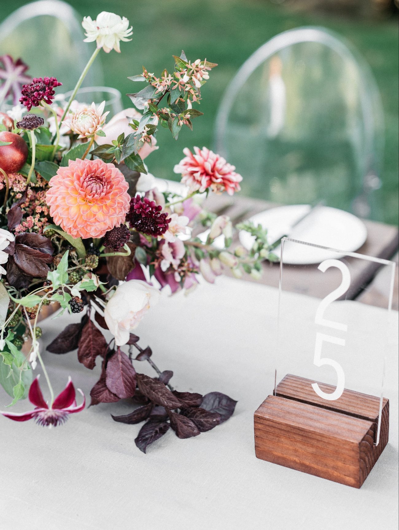
Acrylic table numbers don’t distract from the rest of your table decor. | Photography: Kate Holstein, Design: Joy Thigpen via Once Wed
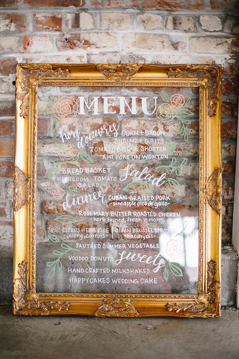
A gold frame gives this acrylic menu a more traditional look. | Photography: James Christianson, Planner: Calluna Events, Calligraphy and Signage: Whimsy Design via Calluna Events
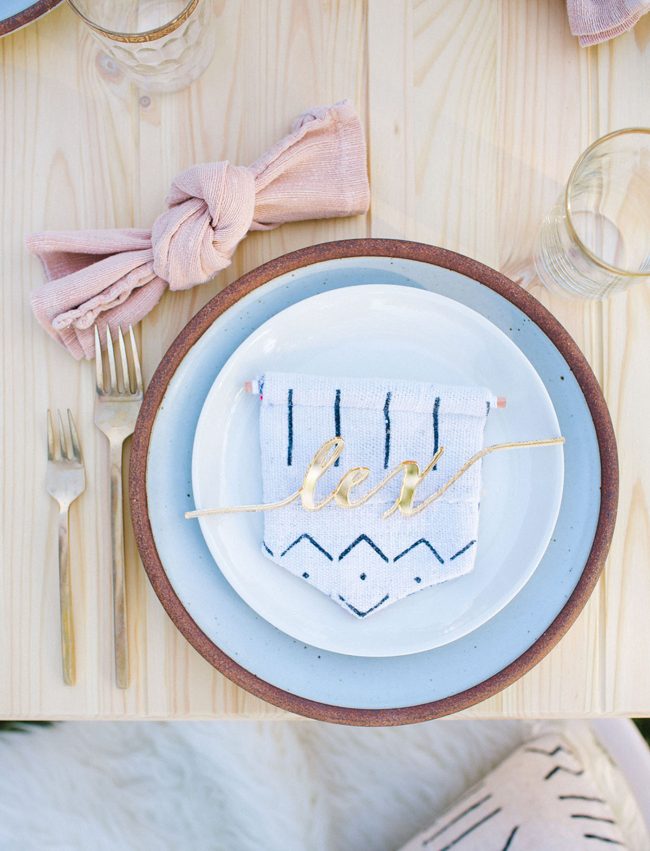
How amazing are these laser cut names?! | Photography: Ally Burnette, Acrylic Place Cards: De Lovely Details via Green Wedding Shoes
Did any of you incorporate acrylic elements into your wedding? Or are any of you planning to use acrylic elements in your wedding? Let us know in the comments!

