More creative invitations from Studio on Fire – this time in the shape of a belt buckle!


I’m loving the creative method of packaging the invitation without using glue or tape. Check them out over at Beast Pieces.
{images via Studio on Fire}
More creative invitations from Studio on Fire – this time in the shape of a belt buckle!
I’m loving the creative method of packaging the invitation without using glue or tape. Check them out over at Beast Pieces.
{images via Studio on Fire}
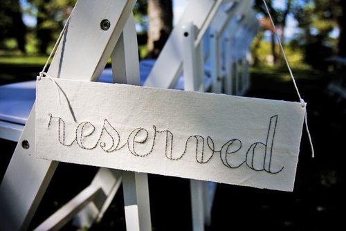
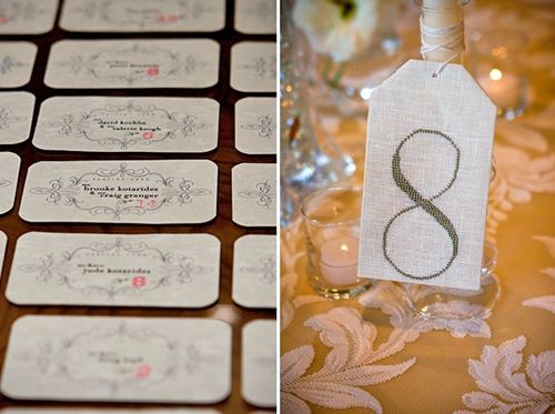
I’ve been holding out on all of you – I hope you’ll forgive me. But I am so excited about these real invitations that I wanted to save them until today – the best for last, right? Anyway, I first fell in love with Laurel & Jedd’s wedding after seeing the hand-stitched signs that Laurel created:
{photo by Rob Garland Photographers via snippet & ink}
I asked Laurel if she’d be willing to share the paper ephemera from her wedding, and she very kindly obliged. Here’s what Laurel had to say about her invitations:
Creating my invitation suite was, I’m ashamed to say, probably the most important part of my wedding. I just really, really wanted these to be perfect and elegant and appeal to all of our guests – from my creative friends to some of our elderly relatives – and I wanted to make sure each piece obviously fit into my style.
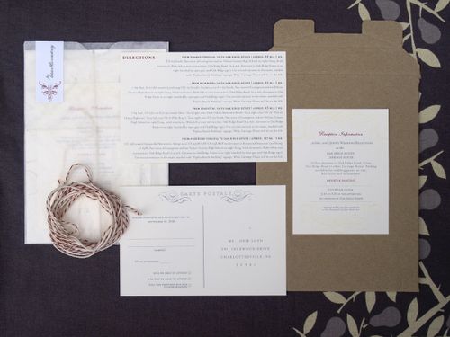
Laurel’s invitation suite included a stand-alone invitation, rsvp postcard, information card with directions and accommodation information, and a reception card, all of which were assembled using red & white baker’s twine in a glassine envelope:

I don’t think I could have created an invitation with any other kind of color grouping – it just wouldn’t have been me. Glassine envelopes are all over my business‘ packaging – I feel like they are an interesting way to tie printed items together – so I leaned naturally toward including those. I love creams and browns and neutrals and I felt like the pop of red introduced a little vintage country into the design.
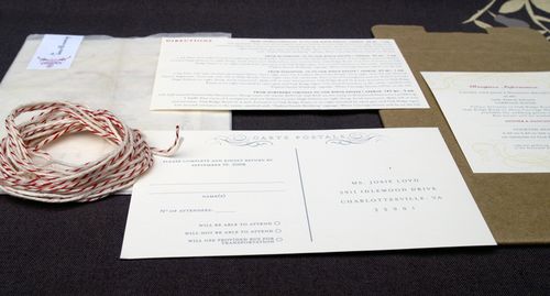
{the additional elements from Laurel’s invitation suite}
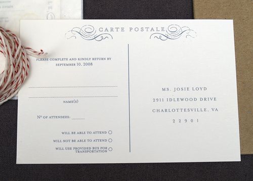
{the rsvp postcard}

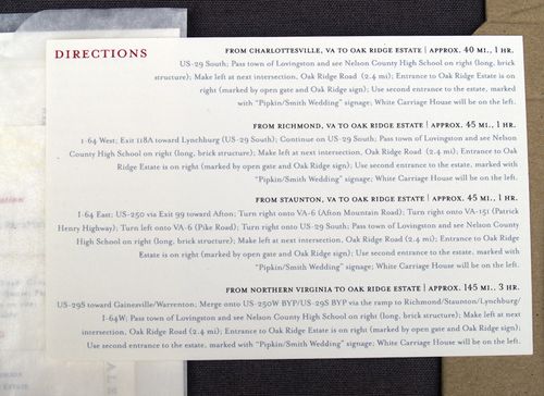
{the double-sided enclosure provided guests with accommodation information on one side and directions on the other}

{the reception card enclosure}

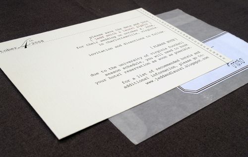
{the fully assembled invitation, ready for mailing}
Laurel also created and printed her own Save the Dates, also enclosed in a glassine envelope, and thank-you cards:
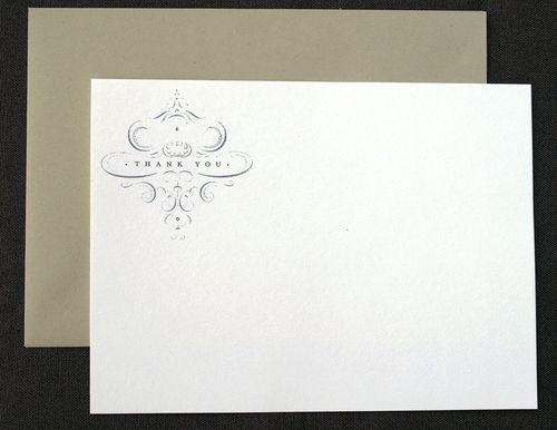
{thank you cards}
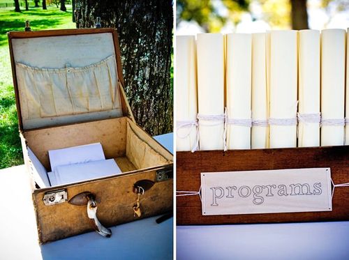
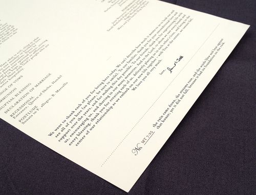
For her ceremony programs, Laurel incorporated the design graphic from the thank-you cards and printed each program on a long single sheet of linen texture paper:
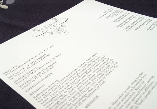
Guests found their programs behind more hand-stitched signs:
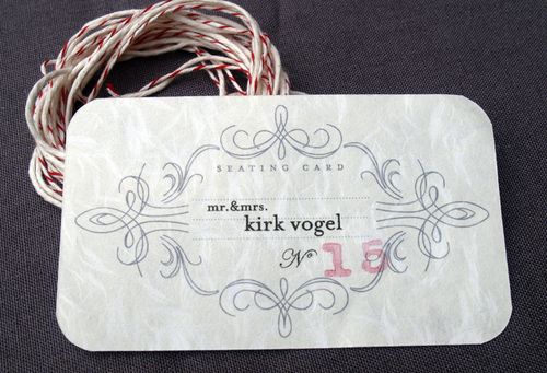
For the reception, Laurel printed the guests’ escort cards on obanai tissue paper:
{photo by Rob Garland Photographers via snippet & ink}
Here’s a bit more from Laurel about the inspiration behind her designs:
I started an inspiration folder for the printed materials I think about 5 minutes after Jedd proposed! I love the idea of found paper and not having anything be “matchy matchy” (I think that might have been the theme of my wedding – NO matchy matchy!). Though it’s hard to get your style just right since each piece still has to fit together!
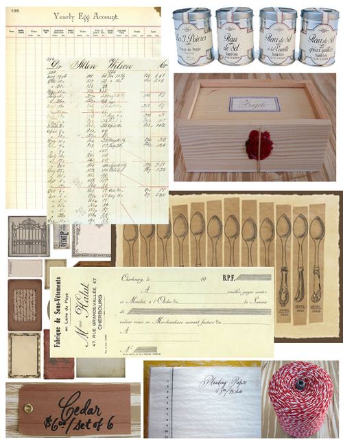
I pulled so much inspiration from Minhee and Truman‘s wedding invitation suite and, oddly enough, home items – like the details found on the ends of silverware, the softness and textures of fabric and wallpaper design.
I also love old office supplies and found inspiration for the labels and the font there. The colors are, well, just me.

{wooden tags via Bell’occhio}
Some of my happiest accidents – like figuring out how to print the escort cards on obanai paper with the hand-stamped numbers, and the program design – happened really quickly. Sometimes when you just have to make a decision or else, the best design is produced!
Thanks so much Laurel, for sharing your invitations and design inspiration with us! And it’s so true, sometimes just taking a deep breath and letting things go is the best way to find the right design. If you haven’t already seen them, definitely head on over to snippet & ink for more photos from Laurel & Jedd’s absolutely gorgeous wedding!
{except where otherwise noted, all photographs by me}
I just found out {via Paper Crave} that Pistachio Press is offering 15% off all invitation orders through the month of March. This is a great opportunity for gorgeous wedding invitations at a great price, so head on over to the Pistachio Press website to check out more from their wedding portfolio:


{images via Pistachio Press}
I'm back with more of the beautiful wedding paper ephemera from Liesl & Jeremy's gorgeous wedding, this time focusing on some of the printed wedding details and online material:
Despite a million other things to do, we decided to put a lot of time
into designing most of our own printed and online materials. This was a
great collaboration, with Liesl having a ton of creative design ideas
and Jeremy with the computer and graphics skills to make it happen.
It
also ended up being a key part of our wedding because it was through
all this stuff that our personalities really showed through – making
the whole wedding seem very us and very unlike a typical wedding. Just
what we were going for!
In addition to the Save the Date postcards, the list of elements that Liesl and Jeremy co-designed is quite extensive:
Wedding web site.
We spent a long time putting this all together and giving it the right
feel. We wanted people to know this was a party, not a boring formal
occasion:
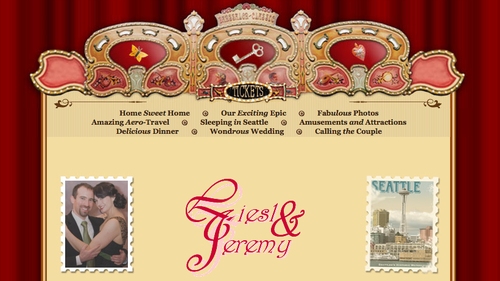
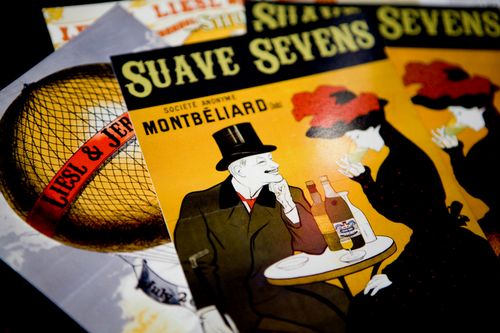
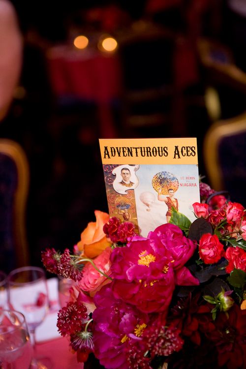
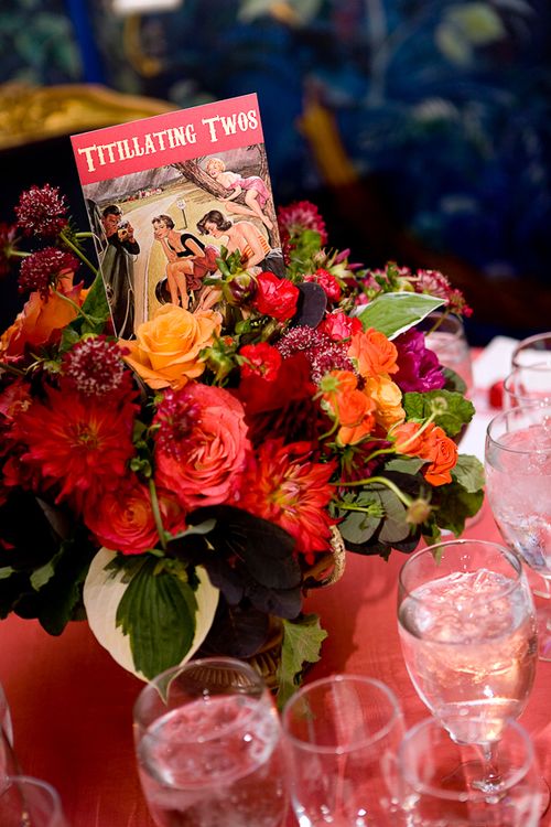
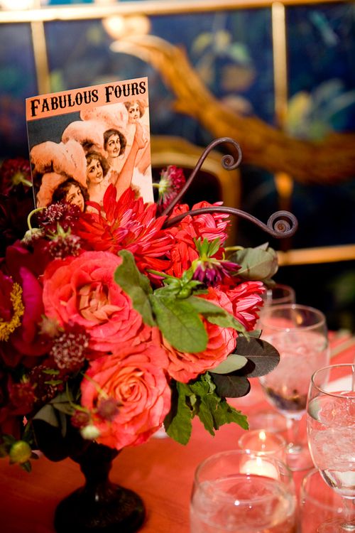
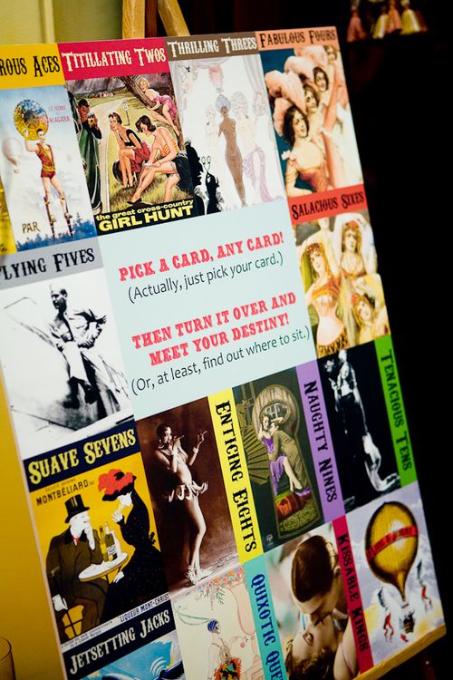
Table name cards. Our reception had 13
tables which, coincidentally, is also the number of ranks in a standard
deck of playing cards. We decided to name each table after a card rank
(Adventurous Aces, Quixotic Queens, Suave Sevens, etc.):
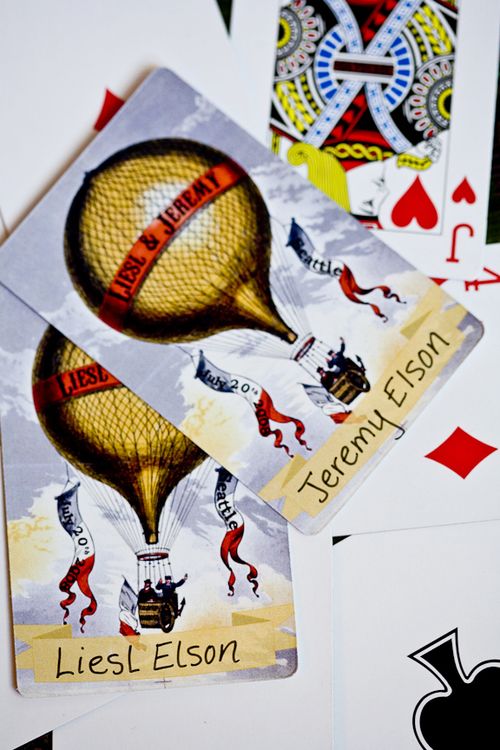
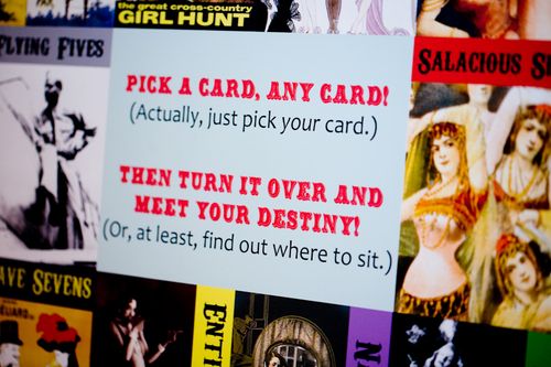
Escort playing cards. First, we got
several decks of custom playing cards printed up. We based it on a
print we found of a hot-air-balloon with someone's name on it; we photoshopped out the old name and replaced it with "Liesl and Jeremy."
We also added a space to write each guest's name:
Seating Chart. The guests would find
the playing card with their name on it and turn it over to reveal the
table where they would be sitting.
Postcards
for out-of-town guests. Each guest received a gift basket with various
goodies (candies, champagne, etc.) and we also enclosed 2 postcards
with custom “Liesl and Jeremy" designs on them:

{bottom photograph by Liesl & Jeremy Elson}
Shuttle
information for out-of-town guests. A simple sheet telling hotel
guests how to use the shuttle between the venue and the hotel; we
decided to print something beautiful and thematic rather than a boring
old photocopied black & white sheet:

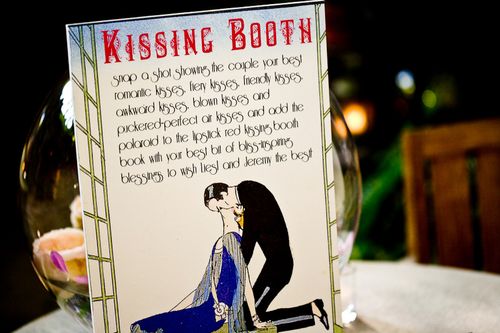
Kissing Booth Sign. We designed a sign that directed people to our photo "kissing" booth to take their best kissing shot for us to put into our guest book:
We
didn't have one unifying inspiration for our wedding, but rather an
overall feel we wanted to create. We really wanted to avoid any and
all "traditional" wedding themes and ideas because it seemed to us that
so many weddings get lost in formalities and trivial details that can
suck the joy out of the whole experience. We also really wanted it to
be unique so we worked extra hard to break with tradition whenever
possible. So we thought about what was most important to us for our
wedding and we decided that it should be stress-free, incredibly fun,
and wildly inappropriate. A fabulous party for everyone help us
celebrate in style.
We drew most of our inspiration from
vintage French cabarets, burlesque and can-can dancers, the sensational
larger-than-life circuses of the 1920's and 30's, and a bit of the Mad
Hatter's tea party to keep things interesting and unexpected. We had
so many subtle inspirations, many of them very different from each
other, but all with the common art deco theme, even my vintage 1920's
wedding ring. We wanted to do the same for our music so we hired a
traditional Klezmer band (accordion, clarinet, brass) to evoke the
exotic gypsy-esque music played for Jewish wedding celebrations in the
1920's. We chose The Ruins for our venue so it could feel like we'd
descended into our our rabbit hole to a rare undiscovered place. The
backdrop of The Ruins provided a vibrant, eccentric and timeless
setting, and like us, a bit over the top with a few surprises.
We picked out mostly art deco styled ephemera to keep with the classic
vintage feel, but made sure to use the sauciest and most amusing
artwork we could find to create a really wildly entertaining
atmosphere. We wanted to be sure that everywhere our guests looked,
they'd want to laugh and remember that we aren't following any
proscribed set of wedding rules or etiquette, we aren't taking
ourselves too seriously, and we clearly want people to have a good time
WITH us, not around us.
I hope you've all enjoyed Liesl & Jeremy's wedding ephemera as much as I've enjoyed sharing it with you! I love how every design element just oozes a sense of fun and playfulness – while still maintaining a cohesive design approach! For more photos from Liesl & Jeremy's gorgeous wedding, check out the La Vie Photography blog here and here. Thank you so, so much to Liesl and Jeremy for sharing their designs with us – and to Kim at La Vie Photography for sending over so many gorgeous photographs!
{unless noted otherwise, all photographs by La Vie Photography}
I’m super-excited about today’s real invitations – I’ve been hoping to feature the paper ephemera from Liesl & Jeremy’s wedding ever since I fell in love with Liesl’s gorgeous wedding dress after seeing photos from their wedding on Once Wed back in October. Liesl and Jeremy, as well as Kim from La Vie Photography, have been kind enough to send over tons of photographs and background behind the paper ephemera from their wedding.
First up, Liesl and Jeremy’s Save the Date postcards and gorgeous wedding invitations:
Our save-the-date card was the first thing a lot of people saw — it featured an iguana (Hank) climbing the Space Needle, and the exhortation, “Save the date! Or else the city will be destroyed by a giant iguana!!” The design drew from the World’s Fair as well as the classically comical monster movies of old Hollywood:


{design and image via Liesl & Jeremy Elson}
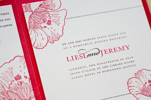
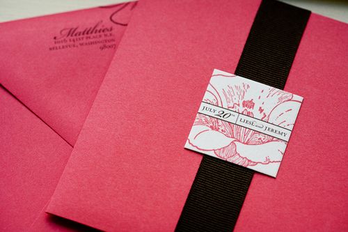
Liesl & Jeremy worked with a local stationer in Seattle to select their wedding invitations. They settled on a beautiful booklet fold-out layout, with the main wedding invitation on the left and an invitation to their rehearsal dinner on the right. RSVP cards were enclosed inside with matching envelopes:
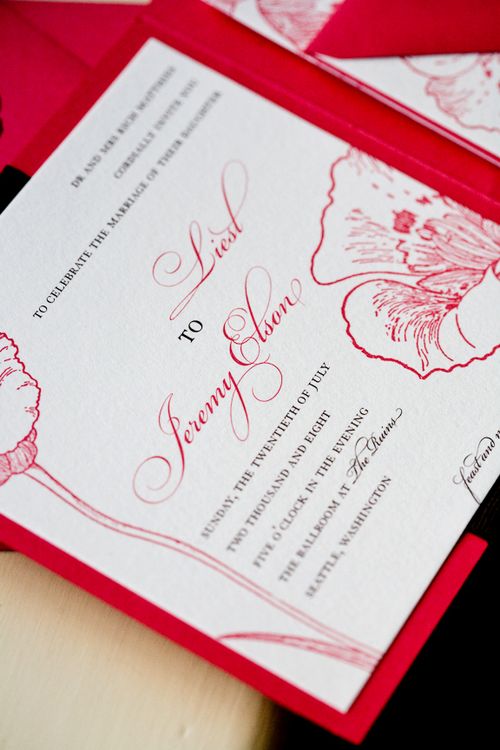
From Liesl: The wedding invitations were a beautiful coral red color inspired by my secret desire to walk down the aisle in Scarlett O’Hara’s sexy red velvet dress from Gone With the Wind.
{photos by La Vie Photography}
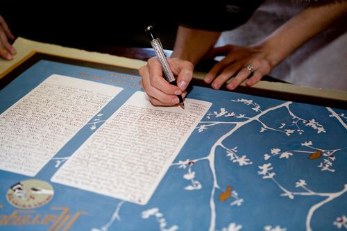
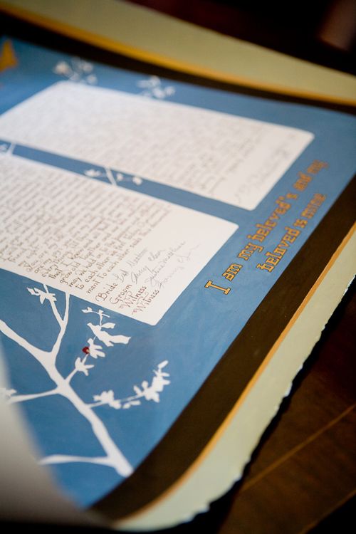
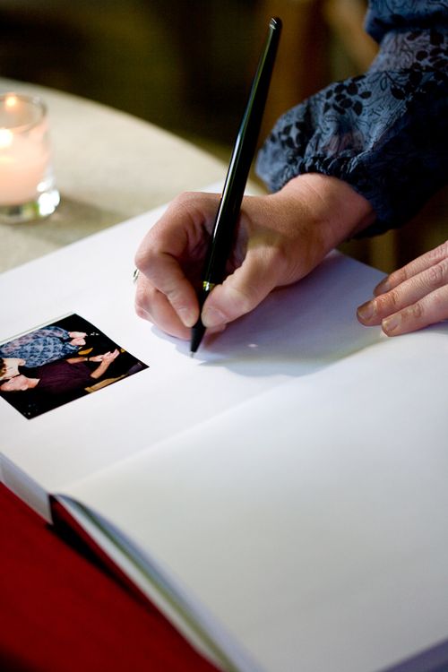
I also completely adore the custom Ketubah and polaroid guest book that Liesl and Jeremy incorporated into their wedding:
I’ve got lots more lovely ephemera from Liesl & Jeremy’s wedding to share with you – so check back a bit later for more photos and design inspiration!
{except where noted, all photographs by La Vie Photography}