Letterpress Engagement Book

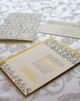
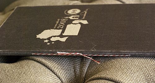
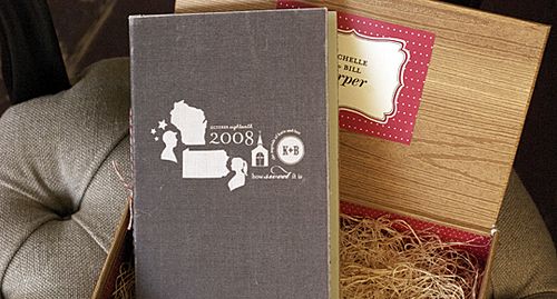
Studio on Fire, a letterpress studio based in Minneapolis, recently launched a blog called Beast Pieces to share photos of recent projects – and it has quickly become one of my daily addictions.  Studio on Fire produces some truly amazing work, from wedding invitations to business collateral and, now, this lovely letterpress engagement book:

Studio-On-Fire-Letterpress-Engagement-Book

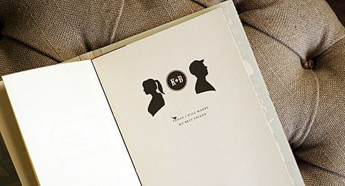
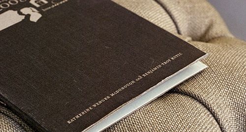
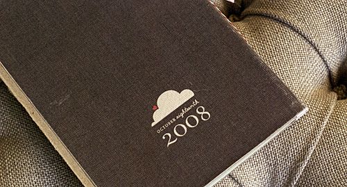
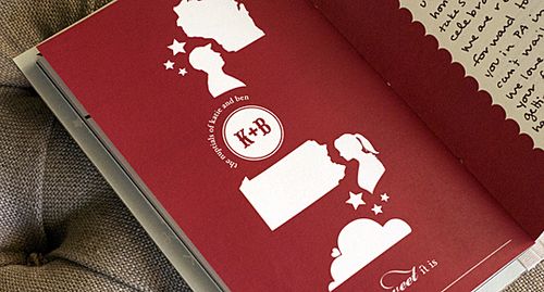
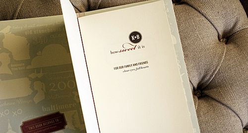
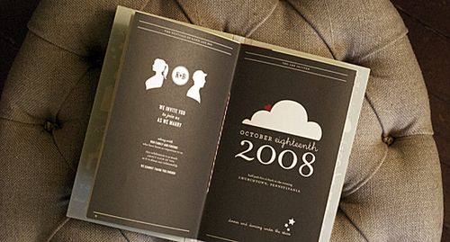
The groom behind this incredibly sweet gesture worked with Studio on Fire to create a small letterpress book comprised of various emails between the couple over the past four years, collected, bound and side sewn together.

Studio-On-Fire-Letterpress-Engagement-Book

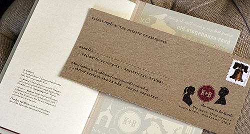
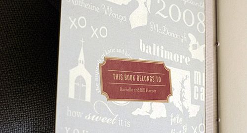
Here are the production details from Studio on Fire: The gut of the book is digitally printed in black text.  The pages have a single hit of blind letterpress on the french folded edge.  The pages are side sewn together and tuck into a custom hard bound book cover with black book cloth.  We printed a custom liner on the cover interior with silver ink on black paper.  The cover of the book and the title page are also letterpress printed in silver ink.  The paper is 100 percent cotton Crane Lettra 80 lb text.

Studio-On-Fire-Letterpress-Engagement-Book

Studio-On-Fire-Letterpress-Engagement-Book

Studio-On-Fire-Letterpress-Engagement-Book

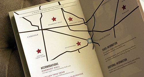
I know most of you are already engaged, but I think the concept behind this gorgeous book could easily be applied to other wedding elements, like the guestbook.  E-mails and love notes (or at least the portions that you’d be willing to share with guests) could be complied and used to create a custom guest book either via an online printing service like Blurb or by working with a bookbinder on Etsy – like Elvie Studio, Grimm, and Brooklyn Bookbinder.  In the meantime, don’t forget to head on over to Beast Pieces for more photos of this engagement book as well as other recent projects from Studio on Fire.

{images via Beast Pieces}

p.s. For all of you fol­low­ing along over the past cou­ple of weeks — I had my French test yes­ter­day, and I passed!  I’m def­i­nitely breath­ing a huge sigh of relief today.  Thank you all so much for your good luck wishes, and to Kathryn and Chelsea for giv­ing me some extra study­ing time.  I’m on my way out to LA right now for my nephew’s Bar Mitz­vah, but I’ll be back in full swing on Mon­day — and I’ve got some fab­u­lous invi­ta­tions that I can’t wait to share with all of you!

Inspiring Packaging

The Dieline is a blog that's all about packaging – new designs, new products, and why the packaging works or doesn't work. To be honest, I almost never read the text – I just scroll through the photos. And every once in awhile there's something that really inspires me – that I could just see translated into a wedding invitation or party favors or a birthday gift. Here are some of my favorites…

Belvoir

Belvoir Fruit Farms via The Dieline. Don't you think the angled label, and the font, along with the simple floral illustration would be lovely as an address on invitations?

Mccraws

McCraw's Confections via The Dieline. I love how retro this is, while at the same time clean and modern. I think the colors would be nice for a stationery set, maybe with a monogram inspired by the company's logo.
Mastbros

Mast Brothers Chocolate via The Dieline. Wouldn't you love to see envelopes lined in paper like this? It would be a great way to dress up an otherwise simple invitation or note. Or maybe favors wrapped in a variety of fancy papers and displayed together. Okay, and I'd really like to try this chocolate, too…

Tara + Michael’s Illustrated Jewish Wedding Invitations

I just love seeing the way that real couples and designers work together to produce an invitation design that represents the bride and groom as a couple and suits their unique wedding style.  Today’s real wedding invitations were created by Tara, half of the design duo behind Paperwink, for her own wedding in 2006.  The invitation design is based on the Jewish concept of Besheret, a concept that definitely played a role in my own wedding last year.  I just love the way that Tara used the images of a flower and bulb throughout the invitation suite as a visual representation of the concept.

Inv_Besheret_1

Tara’s invitation suite conveys the Jewish concept of Besheret, or fate – in Tara’s case, the fate that brought the bride and groom together originally, as well as the fate that would bring their loved ones together on their wedding day.  The invitation also included a quote, which says “man and wife ‘are the roots to one complete soul’.”

Inv_Besheret_2

The quote served as the inspiration for the mail visual elements of the invitation design. Paperwink used a hand-drawn flower and bulb as the central design elements throughout the invitation suite to visually represent the concepts of roots and fate.  The invitations were letterpress printed on ultra-thick coaster stock to add an organic texture.

tara-paperwink-besheret-wedding-invitation

In addition to the main invitation, the suite included a custom map of the area and rsvp card.  In the map, the roots of the bulb were converted into the highways and streets of Atlanta, giving out-of-town guests a sense of the city as well as taking guests on a journey through Tara and Michael’s relationship and places that brought them together:

tara-paperwink-besheret-wedding-invitation-roots

The rsvp card even chimes in with a “It was meant to be. Were you meant to be there?” Guests were given two reply options – “It’s Besheret, I’ll be there” or “I’ll be there in spirit:”

tara-paperwink-besheret-wedding-invitation-rsvp

Finally, the concept of Besheret and the visual image of a bulb was carried through to the wedding itself.  The ceremony programs incorporated design elements from the invitation suite:

BE_Beshseret_3

Escort cards (actually small boxes) played double duty as favors, containing flower bulbs for guests to take home and plant.  Tara placed color-coded hand-drawn flowers on the outside of the boxes to indicate the guests’ previously chosen entree preferences:

tara-paperwink-besheret-wedding-invitation-favors

Can I just say how much I love this invitation suite?!  The entire suite is so beautiful, and I love the way Tara incorporated the concept of Besheret throughout the invitations and wedding – creating a meaningful design that represents Tara and Michael as a couple as well as their new life together.  To see more of the incredible creativity over at Paperwink, click here to head on over to the Paperwink wedding collection.

{images via Paperwink – thanks Tara!!}

Katie + Ben’s Silhouette Booklet Wedding Invitations

If only I’d known about these invitations last week!  Kathryn posted this gorgeous wedding on Saturday, and I love, love the silhouette-inspired hard-bound invitation books that the couple created for their guests! The bride, Katie, is a stationery designer, so I happily clicked over to her stationery website, Chellé Paperie, and flickr page to learn more about the invitations and Save the Dates.

Kb_silo

From Katie and Ben’s flickr page: The invitation is a hard cover book. We printed a full bleed on this beautiful oyster colored bookcloth and flush mounted it to the hinged covers.

Kb_author

Kb_backcover

The invitation was an 8 page hand-stitched signature, bound with red & white bakers twine.

Kb_spine

The reply card is a perforated postcard.  Each book was personalized with a bookplate for the recipient, as well as a handwritten note to every guest on the last page of our book.

Kb_colophon

Kb_endsheets

Kb_letter

Some of the invitations were hand-delivered in boxes wrapped in woodgrain paper.

Kb_box

In addition to the post card rsvp and hand-written letter to each guest, the invitation book contained the main invitation, a map and directions, and weekend itinerary:

Kb_opening

Kb_invite

Kb_invite_map

Kb_invite_attire

In addition to these gorgeous invitations, Katie also created a double-sided Save the Date poster, sent via custom mailing tubes:

Kb_SD_mailingtube

Kb_SDset

Kb_SDposter

Kb_SD_map

Gorgeous!!  I love the personalized details throughout the entire package – and the overall design is just so, so lovely… swoon.

Photo Credits: Katie McDonough-Kutil of Petal and Print