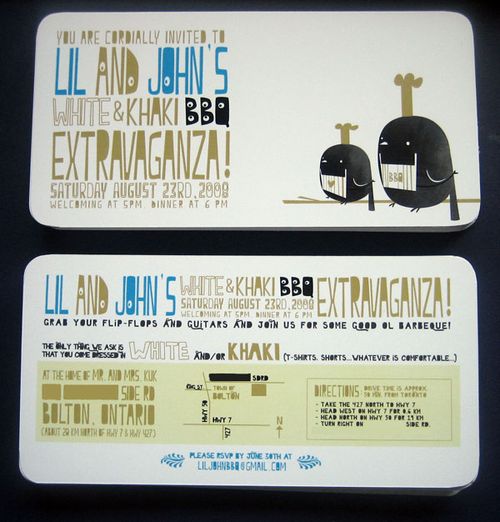
Illustrator and animator Lillian Chan created these fabulous invitations for her BBQ wedding reception – I love the way her animation skills shine through in the design:


Illustrator and animator Lillian Chan created these fabulous invitations for her BBQ wedding reception – I love the way her animation skills shine through in the design:

I love the combination of chartreuse green and charcoal gray – particularly when done in a wonderful whimsical style like these letterpress invitations:
The illustrated scroll designs were hand drawn by the bride (and designer), Kelly. The full invitation suite included a stand-alone invitation, reception card, rsvp card and envelope (love the matching scroll on the rsvp envelope) as well as an inner and outer envelope. Gorgeous! Check out more over at keg design.
{images via keg design}
This week’s real invitations are some of the most distinctly personal DIY wedding invitations that I’ve featured here to date – and I hope you all love them as much as I do!  The invitations come to us from Haley, whose save the dates you might remember from here.  I’ve had the pleasure of getting to know Haley a bit better since I featured her save the dates in April, and her invitations suit her personality perfectly!
From Haley: When it came to the wedding invitations, I didn’t have to think twice about making my own.  I had so much fun designing the save the dates that there was no way I would pass up the invites.  Plus, I’m probably more picky about stationery than anything else and I don’t think even the most patient designer would want to deal with my paper particulars.
At first I Â had trouble, thinking my invitations had to be more formal than my save the dates (formality is not my strong suit). Â As my wedding planning progressed it was clear that every aspect was going to be pretty DIY and I wanted the invites to reflect that. Â I love to draw and I love to hand letter, but I don’t use pencil and I don’t use rulers, haha, so I must have made a billion versions until I finally had one I wanted.
I wasn’t sure how I was going to get it printed. Â I really had my heart set on letterpress (my love) but had trouble finding someone to do it. Â Eventually my co-worker set me up with a printer friend of hers and she wonderfully accepted the project. Â She did a beautiful job and printed everything in the AS220 Community Printshop here in Providence.
Haley had her invitations printed in a light seafoam color ink on an off-white linen texture paper backed in charcoal gray (see below), while the enclosed rsvp cards were printed in gray ink on light blue paper. Â I love how Haley used a consistent color palette of blues, creams, and grays throughout the invitations, from the gray rsvp envelopes (complete with a stamp of Edgar Alan Poe!) to the blue invitation envelopes. Â Haley packaged everything together in a half-moon enclosure envelope like these from Paper Source.
I’m also completely crazy for all of the amazing hand-lettering that Haley did for her invitations!  I can only imagine how effort Haley put into creating the design – although I’m sure it was a labor of love.  Just incredible.  You can see more of Haley’s unique hand lettering in her etsy shop right here.  Thanks so much Haley!
{all photos by Oh So Beautiful Paper}
As promised, I have more inspiration boards from the finalists of the Save the Date contest from Delphine! Here are the next three finalists (again, in no particular order):
My fiance, Lee, and I live in Providence, RI, but are getting married next May in Fairhope, Alabama (close to my family and friends). Lee and I are having to pay for the majority of the wedding, and because of extra costs such as traveling and hotels, our budget is tight. I feel that the Savannah style fits perfectly with my wedding. We are getting married at The Fairhope Inn. It is a small charming bed and breakfast and restaurant in Fairhope, AL. We will have both the ceremony and the reception in the garden courtyard. I want my wedding to be fun and springy and green and fresh. I love botanical anything, and I love, love the Savannah invitations and Save the Dates! They would fit so perfectly with the theme!
We chose the Fairmont Copley as our venue because of its beautiful architecture, intricate gold detailing and cozy, warm ambiance. We picked the month of October for its rich autumn hues and seasonal food offerings. From there we began focusing on the little details: stacked corks to hold the seating cards, wooden wine crates to give depth and height to our antipasto display, olive oil favors to honor my fiancé's Greek heritage. We started thinking about the flowers; clustered vases with full garden roses, submerged orchids, dripping crystals and floating candles. We want our wedding to reflect the romance and beauty of the California vineyards. We see the candlelight as being reminiscent of the wine cellars with their antique candelabras and cool cement walls. The colors that we chose; gold, champagne, ivory, peach and cream play to the peaceful elegance of the area and the cascading crystals add that sexiness that permeates everything in Napa Valley.
Like many of you, I was completely smitten with this gorgeous 1920s-inspired wedding on Once Wed yesterday (love, love, love that the bride, Ginny, used a vintage library card file as her guest book!). Â And as much as I loved each and every detail from this wedding, I just had to focus in on the wedding invitations for a minute:
We’ve all seen lots of postcard RSVP cards, but this couple used a postcard as their entire wedding invitation.  Printed by Greenwich Letterpress in a single color on both sides, the invitations refer the guests to a website containing all the additional information that would normally be included in a full invitation suite, such as accommodation information, additional weekend activities, or directions.
Not only was this telegram-style postcard completely perfect for their 1920s wedding style, but it’s a fabulous way to stay within budget while still having gorgeous letterpress wedding invitations.  I think the etched heart detail on the reverse side is my favorite part…
{photos via Once Wed}