Tie the Knot Bridal Shower Invitations

Suann from simplesong was a guest blogger on Black*Eiffel last week, where she posted this sweet letterpress bridal shower invitation that she recently printed:

Simplesong-bridal-shower
This particular invitation was for a wedding shower hosted by Maria from ritzy bee for her sister – so I'm not surprised that these invitations are some of the cutest I've ever seen.  I particularly love the fabric envelope and typewriter font.  Read more over at Black*Eiffel, and you can check out more of Suann's work over at simplesong design.
{photo by suann via black*eiffel}

Grace Edmands Calligraphy

Good morning everyone! I’m so excited to welcome Grace Edmands Calligraphy as my newest sponsor! Grace is a relatively new calligrapher, having just started her calligraphy business a year and a half ago, but her beautiful work speaks for her enormous talent as a calligrapher:

Grace-Edmands-Calligraphy1

Grace-Edmands-Calligraphy2

Grace-Edmands-Calligraphy3

Grace-Edmands-Calligraphy4

Grace-Edmands-Calligraphy5

I love Grace’s calligraphy style – it strikes a perfect balance of classic calligraphy and modern whimsy. You can visit Grace’s website to see more examples of her work, learn more about her calligraphy process, and request rate information.

I also just wanted to say “thank you!” to Lynette from Lucky Magazine for mentioning this little ol’ blog on the Lucky Mag website today – I’m honored!  And to any new readers who might have found me on Lucky, welcome!  I hope you’ll take a minute to browse around, particularly through the real invitations gallery and wedding invitation portfolio features, and I look forward to seeing you back here again soon!

Photos by Grace Edmands

Hello again! And thank you.

Hi Everyone – I’m back!  And before I say anything else I just want to send the biggest “thank you!” to Alyson and Maddy for being such wonderful guest bloggers last week!  I hope you all loved reading their posts as much as I did!

Mint-thank-you
{thank you cards via hello tenfold}

So, since I’m still trying to catch up from last week, I thought I’d start off with a quick round-up of some of my favorite posts from last week:

Paper-feathers
{paper feathers via alicia lynn}

  • katy had an amazing vacation in Maine – now I have the strongest urge to go antiquing and spend some time at the beach!
  • very cool cross-stitch bowls by panier percé over at seesaw designs
  • amy + jason’s awesome wood + stitched + gocco invitations on brooklyn bride
  • beverly + neil’s lovely hand-made letterpress invitations were featured on mint:

Beverly-and-neil
{beverly + neil’s invitations from here}

  • Did you hear about this fabulous DIY contest going on over at Classic Bride?
  • For anyone in the DC area – Maria from ritzy bee is partnering with jcrew for an event on August 9 – click here for more info!
  • Finally – a solution to all those paper scraps that I never want to throw away over on design sponge
  • I love these invitations that Jordan designed and letterpress printed for a 50th wedding anniversary party:

50th-anniversary-invitations
{invitations via oh happy day}

Those are a few of my favorites from last week – I’ll be back with some more goodies a bit later!

{images from their respective sources}

Trimming the Budget without Sacrificing the First Impression

Labels

Images from Martha Stewart Weddings (right styled by Rebecca Thuss)

Hello, everyone! It's Maddy from the Inspired Bride blog, here to once again fill in for Nole.

Everybody is thinking of ways to save money nowadays, and the first things to go are the ones that aren't in the "absolutely necessary" column. For a lot of brides, that means sacrificing hand calligraphy – while it's gorgeous, it also can rack up quickly if you have lots of guests. Here are some suggestions on how to cut the calligraphy without losing the great first impression it makes.

Make an investment in a commercial calligraphy face and print your envelopes. Please don't go down the free font route! I've pleaded this case on my blog before because, as a graphic designer, it can be a little painful to see. There's a reason they're free – typographically, they're generally not up to par with pay fonts, and when that craftsmanship is not there from the get go, you won't be leaving the impression with your guests that you want. There are plenty of typefaces available for affordable prices, and I've covered some on the Inspired Bride. A great resource for affordable fonts is MyFonts – I would recommend you start there. Remember that the more you use the fonts, the better deal you're getting, so consider using them on favors, place cards, and programs, as well – anywhere you would have originally considered using calligraphy.

Do the wrapping label. Normally, it's considered a faux pas to put labels on an invitation, and in most cases I'd agree – however, the trend of making a wrapping label (as shown above), I think, is incredibly modern and gives an added element of "specialness". Plus, it just looks great – I loved the look so much, I nixed the hand calligraphy on the envelopes of my escort cards and used wrap labels instead in my own wedding two months ago.

DIY, literally. I came across a brilliant idea a few months back, but I definitely would recommend this only for those of you with steady hands and a heck of a lot of time and patience. This blogger had the brilliant idea to print her envelopes with a slightly darker ink on dark envelopes to use as a "trace line". She then went back over the slightly visible letters with an opaque white ink pen to give the quirkiness of hand calligraphy to the letters without being a trained professional.

Secrets to a Standout Invitation

[Ed note: Hi everyone!  This week's first post comes from Maddy from The Inspired BrideMaddy is a talented graphic designer and art director based in Minnesota, and a recent newlywed!  At The Inspired Bride, Maddy focuses on the "how to" part of wedding planning, from color palettes to etsy finds to details and personal touches.  I'm so excited to have her here on Oh So Beautiful Paper this week!]


Invite
 

invitation from Kristina's wedding at Lovely Morning via Love Jenna

Just like Nole, I'm a paper connoisseur. As a wedding blogger, I'm delighted to see invitations daily from designers and couples alike. The more I see, the more I notice recurring details among invitations that really stand out to me. Here is my short list of design elements that will wow and make your invitation unique.

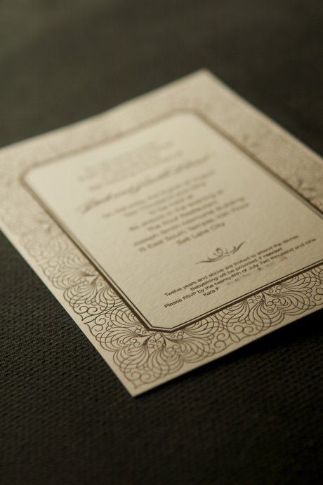
Blind Debossing: a great feature if you're going letterpress. Instead of printing with an ink, the plate makes an impression into the surface of the paper and the dimension left behind becomes the design element. This works beautifully with patterns in particular – the dimensional effect won't have as great an impact in larger graphic images. [Ed note: this process is also referred to as blind stamping]

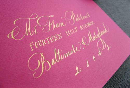
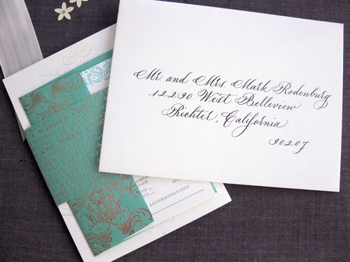
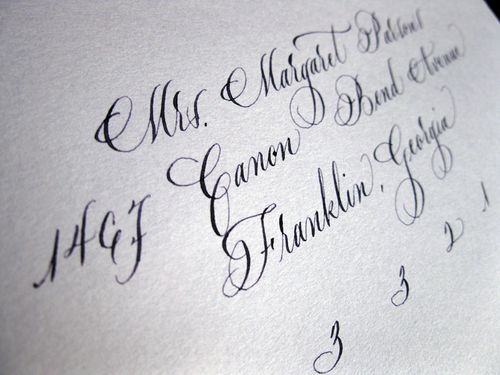
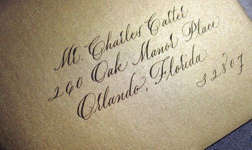
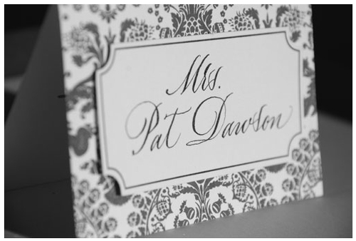
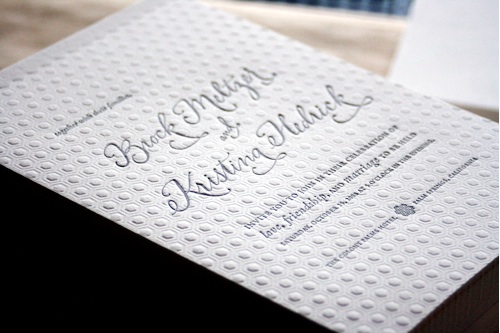
Modern Calligraphy: I'm a fan of well done calligraphy in all forms, but I've seen a lot more invitations move to something a little bolder like Jenna Hein's work. It combines the right balance of elegant and contemporary to give an invitation a really fresh look.

Edgepaint 

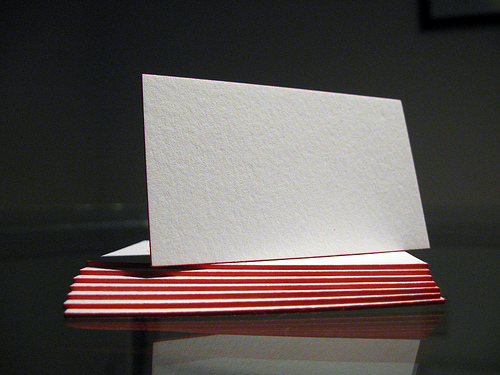
photo via Dolce Press


Edge Painting: add a pop of color and fun in a more non-traditional way. Edge painting only pays off on thicker stocks like a 300 gsm or 600 gsm duplex, but it looks fantastic!

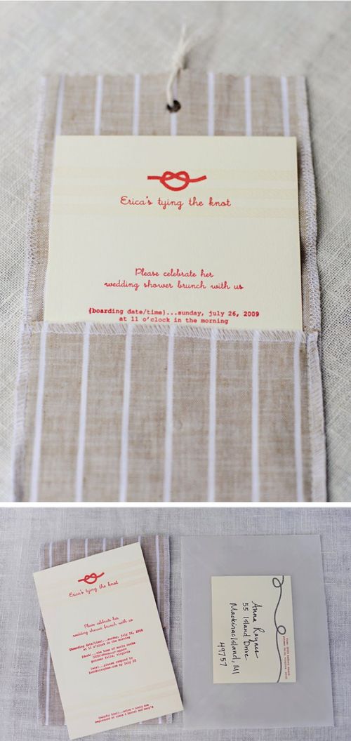
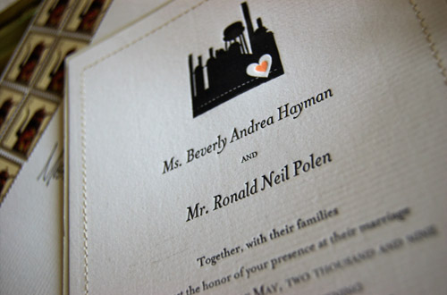
Stitching: a detail that's becoming more and more popular, and with good reason! This simple, handmade touch makes invitations feel more personal and precious. The tactile nature of stitching is great to give a little more dimension to offset printing.

Books: instead of a suite, consider compiling it all into one place – your directions, your RSVP post card, your accommodations, and every other card you'd otherwise stuff in your envelope. It's a great opportunity to tell a story as a couple while also informing your guests of all the details! It's certainly a more unique than your standard invitation, but consider your budget before going down this route.