Marcus + Jillian’s Whimsical Kraft Paper Letterpress Wedding Invitations

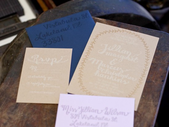
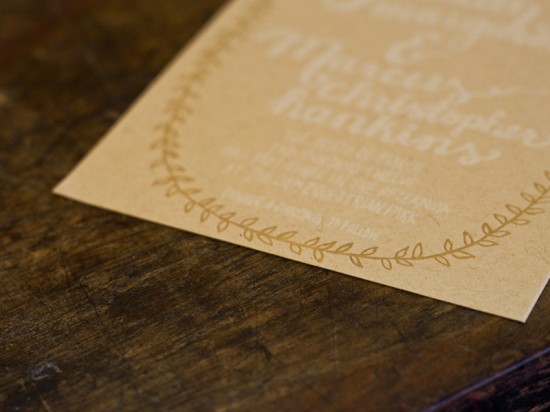
I love the whimsical design elements and natural color palette in these kraft paper wedding invitations, sent over by Matthew from A Fine Press.  Designed by Laura Helm of Ashton Events, the invitation features hand drawn illustrations and hand lettering – all letterpress printed in soft white and gold by Matthew – and accompanied by navy and lavender envelopes for a fun pop of color.

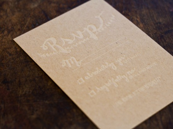
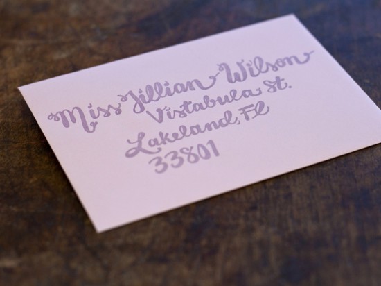
From Matthew: We did a tone-on-tone theme for these invitations, using a transparent white ink for the return address, a shimmery lavender ink for the RSVP envelopes, and white and gold inks for the invitation and RSVP.  The whole invitation was printed on French Paper (Muscletone 140# kraft paper, Construction nightshift blue A7 envelopes, and Pop-Tone grapesicle 4-bar envelopes).

This is a great example of the compatibility between letterpress printing and  hand-drawn illustrations.  Laura created the illustrations in black ink on white paper, at which point they were scanned and sent for platemaking. 

Thanks Matthew!

Design: Ashton Events

Letterpress Printing: A Fine Press

Check out the Designer Rolodex for more tal­ented wed­ding invi­ta­tion design­ers and the real invi­ta­tions gallery for more wedding invitation ideas!

Photo Credits: Matthew R Photography

p.s. Don’t forget to enter the save the date giveaway from Delphine!  Check out details right here!
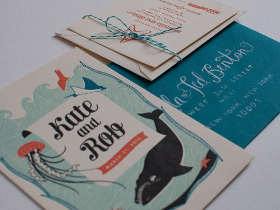
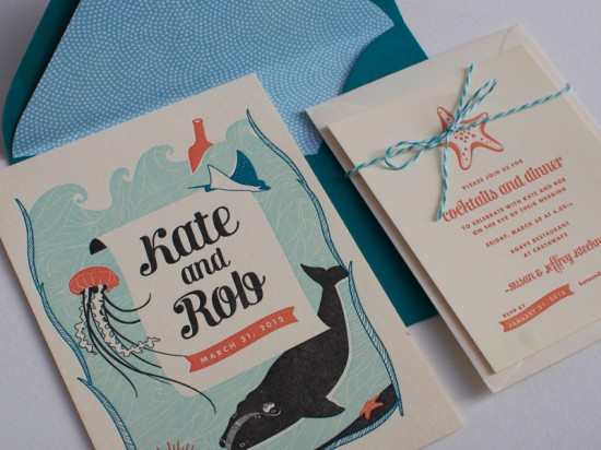
Kate + Rob’s Sea Creature Letterpress Wedding Invitations

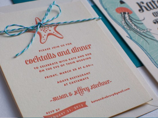
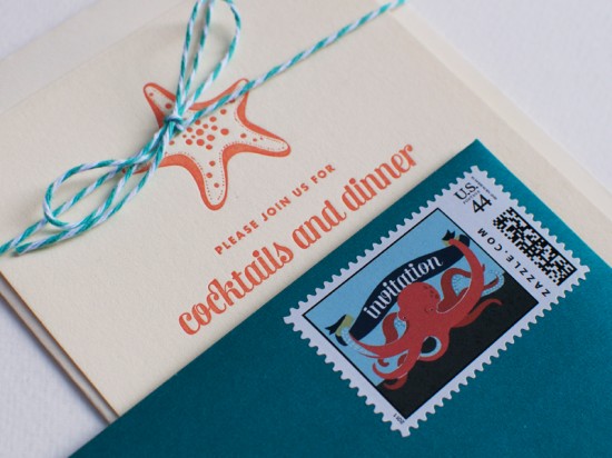
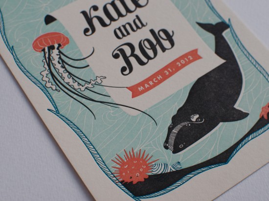
Kseniya from Thomas Printers sent over this totally adorable wedding invitation for an upcoming beach wedding in New Zealand.  Designed by Katie from Rocket Ink, the invitation features a four-color illustration of native New Zealand marine life on one side and text on the other, along with a reception card and other enclosures.  So pretty!

From the bride, Kate: We will be married on New Zealand’s northern west coast overlooking a black sand beach – it’s one of my favourite stretches of beach and such a magical place.  We both love the ocean and wanted an ocean theme to our wedding.   Rob and I are both advertising creatives (copywriters) so doing some lovely artwork was really important to us; our invitations include illustrations of native New Zealand marine life.

From the designer, Katie Gastley of Rocket Ink:  Kate and Rob wanted to incorporate indigenous creatures into their wedding invitations.  I did a lot of research on the typical New Zealand wildlife and illustrated them throughout their pieces.  This particular design was definitely a pet project!

From Kseniya of Thomas Printers:  This invitation is almost like a book jacket illustration, with the beautiful underwater scene on one side and all the wedding details on the other.  The four colors of the design are so harmonious together: bright and cheerful without being overpowering.

The jellyfish was my favorite; I loved his delicate tentacles and beautiful brown-black color.  Katie and her client wanted a very substantial paper, so we used 220# cotton Lettra in a warm ecru, which was heavy enough that the letterpress impression could be palpable on both sides. 

Thanks Kseniya!

Design: Rocket Ink

Letterpress Printing: Thomas Printers

Check out the Designer Rolodex for more tal­ented wed­ding invi­ta­tion design­ers and the real invi­ta­tions gallery for more wedding invitation ideas!

Photo Credits: Rocket Ink

*Thomas Printers is one of my fab­u­lous spon­sors; for more on my edi­to­r­ial poli­cies please click here.

Printable Papel Picado Wedding Invitations from EM Papers

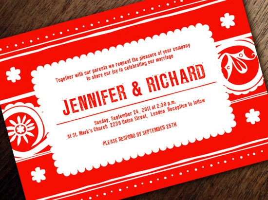
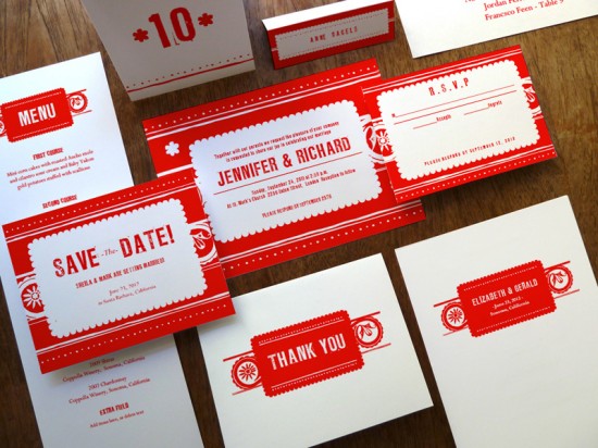
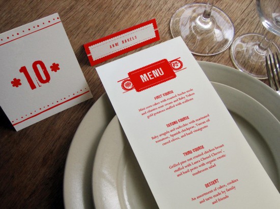
It’s always so fun to hear the story of how a designer was inspired to create a particular design.  Today, Eleanor from EM Papers is sharing the story behind one of her printable wedding invitation designs – a gorgeous red and white invitation suite inspired by the traditional Mexican folk art known as papel picado.  I love the bold red and white color palette and hand drawn motifs!

From Eleanor: Several years ago, when she turned 30, my sister decided to throw herself a ‘Treintañera’ since she had never had a Quinceañera.  I designed the invitations for her, using traditional design elements found in papel picado and native Mexican folk art motifs, and my dad printed them letterpress. I later turned the invitation into a blank card but always felt that the design was ripe to be extended into a full wedding suite.

One of the challenges when designing my download and print wedding stationery, is that I have to anticipate all of the constraints my customers might have.  For example, not everyone has a home printer than can do borderless printing, so I don’t use full bleeds on items like programs and table numbers.  This design had so many little elements, like the hand drawn lines and sun/starburst figure that it was easy to pick them up throughout the line and keep the whole suite coherent.

Thanks Eleanor!

EM Papers is a member of the Designer Rolodex – you can see more of Eleanor’s beautiful work right here or visit the real invi­ta­tions gallery for more wedding invitation ideas!

Photo Credits: EM Papers

*EM Papers is one of my fab­u­lous spon­sors; for more on my edi­to­r­ial poli­cies please click here.


{happy weekend!}

In all the hubbub of Alt last week, I kind of forgot about an important personal milestone – the anniversary of my husband’s deployment to Iraq.  He’s now been home as long as he was deployed, but I still wake up every day feeling grateful that he’s here.  Everything felt so chaotic and overwhelming this time last year; a feeling that continued up until the day he came home.  So if you know of anyone with a spouse or family member deployed overseas, give them a few extra hugs – I’m sure they would appreciate it.  I’m looking forward to enjoying a weekend here in DC before heading up to NYC on Sunday for the New York International Gift Fair and to help judge the 2012 Louie Awards.  But in the meantime…

…a few links for your weekend!

This week on Oh So Beautiful Paper:

A big welcome to the newest Designer Rolodex members!

As usual, we have a fun cocktail coming up for you this afternoon, so check back a bit later for the recipe!  I hope you all have a wonderful weekend, and I’ll see you back here on Monday with some favorite finds from the Gift Fair! xoxo

Photo Credit: Madelene Lindqvist

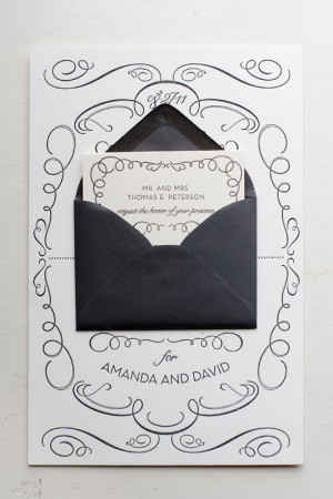
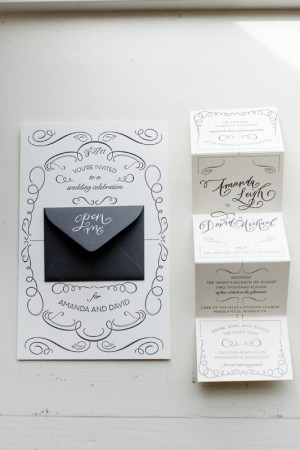
Amanda + David’s Whimsical Accordion Fold Wedding Invitations

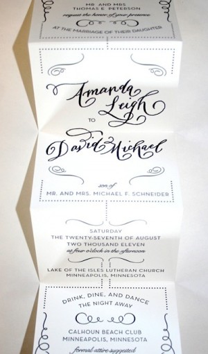
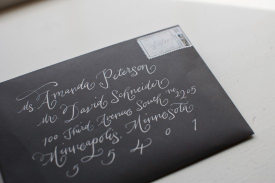
Amanda sent over the invitations from her wedding in Minnesota last summer – I absolutely adore the whimsical calligraphy and accordion fold layout!  Amanda worked with local stationers Watermark Stationery to create an invitation that was elegant yet non-traditional, ultimately settling on a sophisticated design with a playful pop-out for the main invitation.  The entire suite was letterpress printed in a single color and embellished with gorgeous calligraphy from Crystal Kluge.  So pretty!


From Amanda: The invitation sets the tone for a wedding, so we wanted to show our invited guests what type of event we had planned: formal, fun, glamorous and somewhat whimsical.  I worked with Gretchen Berry of Watermark Stationery in Excelsior, Minnesota to come up with a fun, unique way to present our wedding invitation.  We knew we didn’t want a traditional invitation; we wanted something unique, different and fun.  


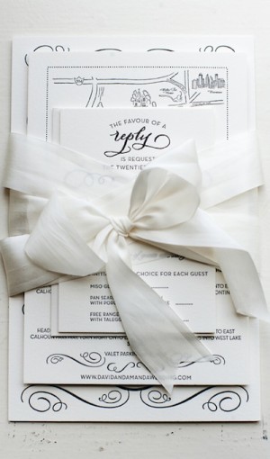
Once we came up with a design that we loved, we had some of the text elements custom done by local calligrapher, Crystal Kluge.  We loved the combination of the whimsical, yet formal letterpress calligraphy paired with our over-sized main invitation.  The invitation was paired with a mini envelope and fold-out accordion invitation, reply and direction cards, and a dark gray outer envelope with white ink calligraphy – all tied together with a white silk ribbon.  It was truly our dream wedding invitation.

Thanks Amanda!

Design and Letterpress Printing: Gretchen Berry, Watermark Stationery
Calligraphy: Crystal Kluge

Check out the Designer Rolodex for more tal­ented wed­ding invi­ta­tion design­ers and the real invi­ta­tions gallery for more wedding invitation ideas!

Photo Credits: Matt Blum Photography