DIY Western Reception Wedding Details, Part I

The details are part of the fun of creating an event – be it a wedding, dinner party or bridal shower.  Those details make the event special, unique, and totally you!  Remember the Western Save the Date & Invitation DIY we did a few months ago?  It was one of our favorite tutorials… so we decided to expand on the theme and offer up some ideas for how to embellish a Western reception. – Bailey and Emma of Antiquaria

Western Wedding Detail Ideas and Inspiration

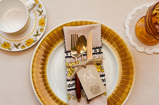
A simply set, color appropriate place setting is ready for your guest as they approach the table.  Kraft tags tied around the napkin, are embellished with a monogram and serve as place cards for this casual, fun fete.

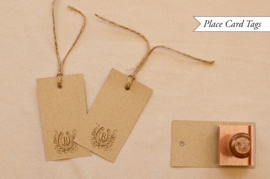
Western Wedding Detail Ideas and Inspiration - Place Cards

To make the place card yags: Ink your monogram stamp (we used our Vintage Horseshoe Initial Monogram) and center it on the bottom of a kraft paper gift tag (or manilla shipping tag).  Press stamp down moderately and remove from surface.  Set aside to dry.  Once dry, write your guests’ names on the tag.  We love the way that the opaque white calligraphy ink looks on kraft paper.  Next, cut about 2 feet of rustic twine and wrap it around a pressed napkin.  Tie in a knot, thread the tag on to one loose in, and then tie the twine in a bow.

Western Wedding Detail Ideas and Inspiration

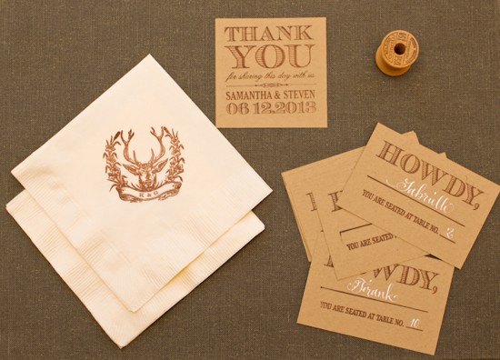
A collection of goodies for the reception.  They all look so cute together!

Western Wedding Detail Ideas and Inspiration

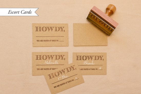
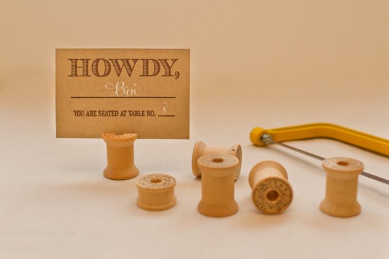
How to make the stamped escort cards: Our escort card stamps are some of our new faves in the shop.  For this western themed card, cut kraft paper into 3.75″ x 2.5″ inch rectangles.  Ink your stamp (we used our Howdy Escort Card Stamp) and center over the card.  Press down moderately, using the handle as the main point of pressure.  Remove stamp and let dry.  Once you have your final seating arrangement, fill in the cards accordingly.  We repeated the white ink for the names to have continuity throughout the event.

p.s.  Ed Note: Confused by the difference between escort cards and place cards?  Escort cards are typically displayed together at a central location near the reception entrance and include the guest’s name and table number, guiding your guest to the appropriate table where they can then find their seat.  A place card with the guest name then sits at the individual table place setting, indicating an assigned seat where a guest should sit at their table.

Western Wedding Detail Ideas and Inspiration

We racked our brains to figure out a cute and unique way to display all those howdy escort cards to no avail… until we stumbled across Emma’s mother’s vintage wooden spool and bobbin collection.  Perfect!

Western Wedding Detail Ideas and Inspiration - Wood Spool Escort Card Display

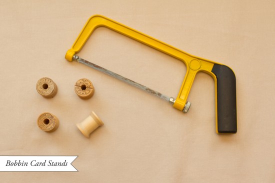
Bobbin Card Stands: Troll the internet or thrift stores for vintage wooden spools or bobbins (bobbins will be smaller).  Once you acquire the number that you need, you’re ready to start converting them into escort card holders.  Lightly draw a pencil line across the diameter of the top of the spool. With a small hand saw, saw down about an eighth to a quarter inch (so that the card can slide in).  Now your ready to set them all up and put them to work directing your guests to their tables!

We’ll be back with more Western wedding detail ideas in our next post!

Materials:

Vintage Horseshoe Initial Monogram Stamp

Howdy Escort Card Stamp

Stamp Pad (in Chestnut)

Metal Eyelet Gift Tags in Kraft

Rustic Twine

White Calligraphy Ink

Kraft Card Stock

Ruler and x-acto blade

Wooden Spools and Bobbins

Hand Saw

Photo Credits: Intertwyned for Antiquaria

Erin + Blake’s Gold Foil and Letterpress Wedding Invitations

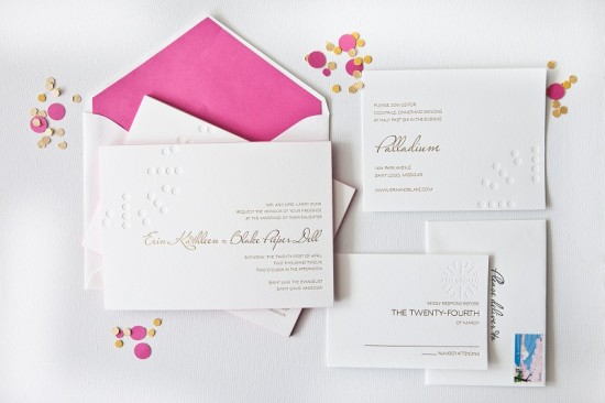
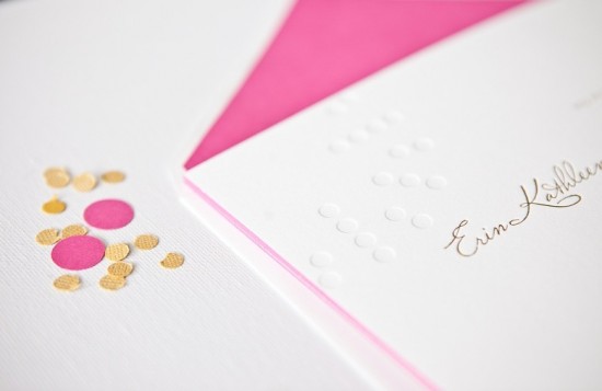
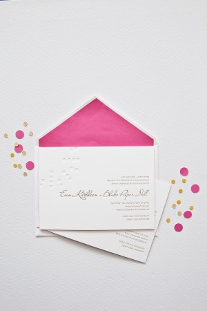
The resurgence of metallics – and gold foil in particular – has been one of my favorite design trends over the last couple of years.  I love the subtle way gold foil text is paired with a letterpress blind impression (no ink) pattern in these wedding invitations from Courtney Callahan Paper.  Modern, fresh, and sophisticated all at the same time!

Gold-Foil-Blind-Impression-Letterpress-Wedding-Invitations-Courtney-Callahan-Paper (9)

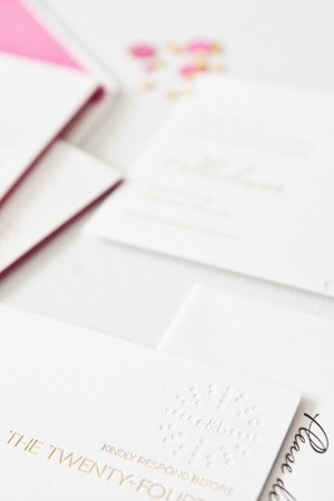
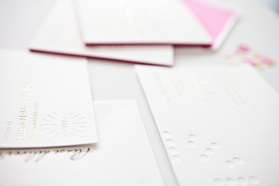
From Courtney:  Erin and Blake are a modern couple with a keen sense of style, and they each had opinions on how they wanted their invitation suite to look.  For the blind impression pattern, we decided to mimic the circles used in the logo of their wedding venue, the Palladium; this element was carried throughout each piece of the suite and the materials used on their wedding day.

Gold-Foil-Blind-Impression-Letterpress-Wedding-Invitations-Courtney-Callahan-Paper (6)

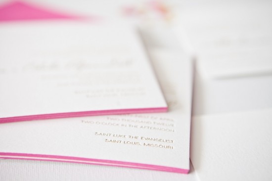
Printed on Crane’s Lettra in pearl, the invitation suite was produced using metallic gold foil stamping and a letterpress blind emboss.  The suite included an invitation with hot pink edge painting, along with a reception card and response card with a custom monogram detail.  Inner envelopes were lined in hot pink to match the edge painting on the invitation.

Gold-Foil-Blind-Impression-Letterpress-Wedding-Invitations-Courtney-Callahan-Paper (2) Gold-Foil-Blind-Impression-Letterpress-Wedding-Invitations-Courtney-Callahan-Paper (3)

Gold-Foil-Blind-Impression-Letterpress-Wedding-Invitations-Courtney-Callahan-Paper (1)

Gold-Foil-Blind-Impression-Letterpress-Wedding-Invitations-Courtney-Callahan-Paper (7)

Thanks Courtney!

Design: Courtney Callahan Paper

Letterpress Printing: Accucolor

Check out the Designer Rolodex for more tal­ented wed­ding invi­ta­tion design­ers and the real invi­ta­tions gallery for more wedding invitation ideas!

Photo Credits: Jennifer Kathryn Photography

Black + White Stripe Birth Announcements for Baby Felix

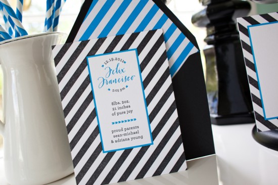
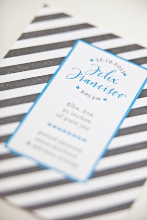
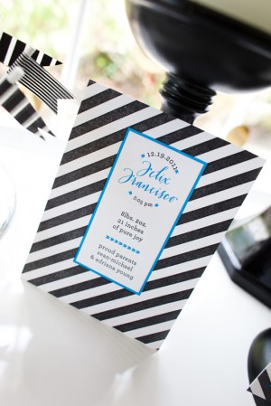
I’ve always had special affection for fun and creative baby announcements, but of course these days I’m paying extra special close attention to baby-related stationery.  I was thrilled when my friend Claudia from Fig. 2 Design Studio sent over the announcements that she created for her new baby nephew!  Claudia is known for her love of super bright colors and patterns, and for these announcements she went with graphic black and white stripes paired with bright blue neon accents.  I love the playful yet masculine design – perfect for a baby boy!

From Claudia:  I designed this baby announcement for my nephew Felix.  Inspiration came partly from the baby shower invitations I designed earlier, where we used a chevron pattern.  My sister and  brother-in-law like graphic patterns, however, I decided to go with stripes to vary things and not make it too matchy-matchy.  I’ve been feeling black and white patterns a lot lately and was dying to try neon blue ink!


I’ve also had a thing for arrows recently and I thought using arrowheads was friendly enough for a baby announcement, while still having that masculine feel.  I was so touched when my good friend and super talented calligrapher Michele of Meant To Be Calligraphy offered to do his name as a gift to my sister!  It was the sweetest touch and now little Felix has lovely letterpress printed personal stationery.

So awesome!  Thanks Claudia!

Design: Fig. 2 Design Studio

Calligraphy: Meant To Be Calligraphy

Styling: My Simple Details

Fig. 2 Design Studio is a member of the Designer Rolodex – you can see more of Claudia’s fabulous work right here!

Photo Credits: Mary Kate McKenna

Wedding Invitations from Blackbird Letterpress

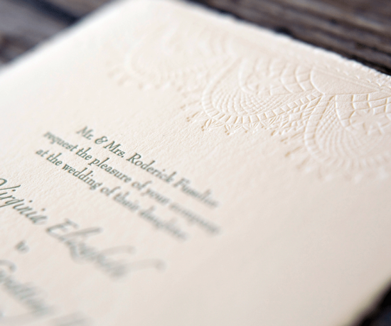
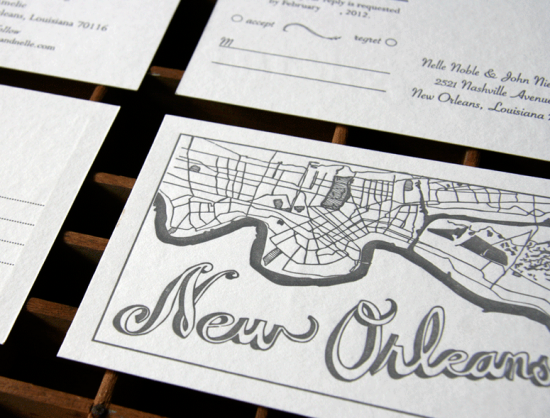
I’m a huge fan of the custom wedding work from Kathryn of Blackbird Letterpress.  Kathryn has created some of my all-time favorite wedding invitations, from Riley and Robert’s modern New Orleans-inspired invitations to Margie and Morgan’s fabulous Art Deco postalgram wedding invitations.  Kathryn recently released a gorgeous wedding invitation collection that reflects her unique mix of whimsical illustrated elements with classic design.  Here are a few of my favorites from the collection…

Congrats Kathryn!  Check out the full collection and lots of additional photos here.

Black­bird Let­ter­press is a mem­ber of the Designer Rolodex – you can see more of Kathryn’s beau­ti­ful work and custom wedding invitations right here!

Photo Credits: Ben Christensen for Blackbird Letterpress

Christina + Tristan’s Illustrated Western Wedding Invitations

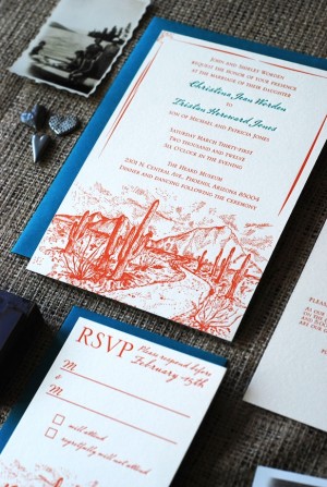
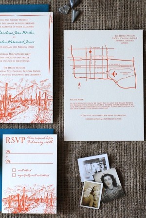
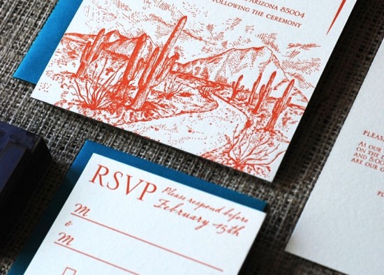
Today’s wedding invitations feature the beautiful desert landscape of the bride and groom’s home state of Arizona.  Richele from Richie Designs worked with illustrator Serena Chang, balancing the Western motif with a modern blue and orange color palette and classic typography.  I love the majestic mountains in the illustration – so pretty!

From Richele: Christina and Tristan were married in their home state of Arizona.  They wanted to incorporate the landscape of Arizona as the motif for their wedding invitations.  Illustrator Serena Chang created the desert mountain illustration, which we used throughout the wedding stationery.


The main invitation was letterpress printed in two colors, while the additional pieces were digitally printed.  Christina and Tristan used Arizona parks and other noteworthy landmarks as table names for their reception.  It was a fun project to put together!

Thanks Richele!

Design and Printing: Richie Designs

Illustration: Serena Chang

Richie Designs is a member of the Designer Rolodex – you can check out more of Richele’s work right here or visit the real invi­ta­tions gallery for more wedding invitation ideas!

Photo Credits: Richie Designs