Calligraphy Inspiration: Hardink Calligraphy

Something I’ve really enjoyed about social media is the ability to stubble upon new and talented people. Case in point: I first came across the work of Elizabeth Hardin of Hardink Calligraphy through Instagram. After ogling and liking her posts for months, I decided it was time to share it with you! (Though some of you may have seen her work featured in countless wedding magazines and websites!) Her writing style is a perfect mix of playful aspects of modern calligraphy with refined elements of the traditional, which I’m sure suits the style of many of our readers to a T! – Julie

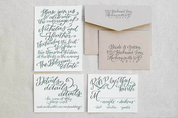
Hardink Calligraphy - Calligraphy wedding suite

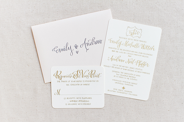
Hardink Calligraphy - Calligraphy wedding invitation suite

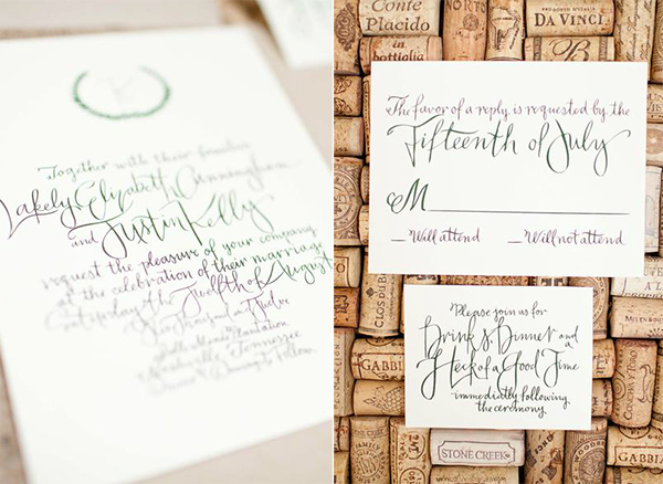
Hardink Calligraphy - Calligraphy wedding invitation details

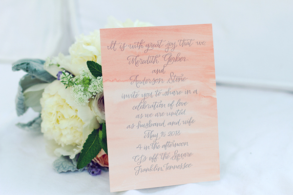
I love the way Elizabeth’s calligraphy utilizes space. It almost feels like thread or ribbon streaming across the page.

Hardink Calligraphy - Calligraphy & watercolor invitation

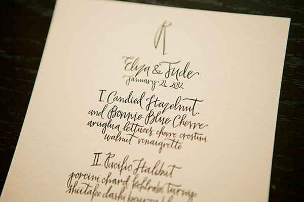
Hardink Calligraphy - Calligraphy menu

Less is more with these dinner menus. Elegant and simple, they prove that all you need is a touch of calligraphy.

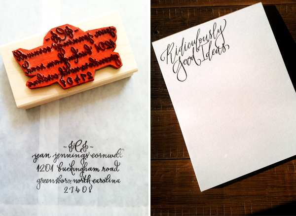
Hardink Calligraphy - Shop - Stamp & Notepad

Hardink Calligraphy also has a shop where you can purchase a range of goods, from custom calligraphy stamps to prints to notepads!  Still want more? Check out Elizabeth’s blog and her work in collaboration with Bella Figura.

Photo credits: 1, 2, 4 – Amy Nicole Photography; 3 l+r – Donald Yeager; 5 – Phindy Studios; 6 l+r – Elizabeth Hardin

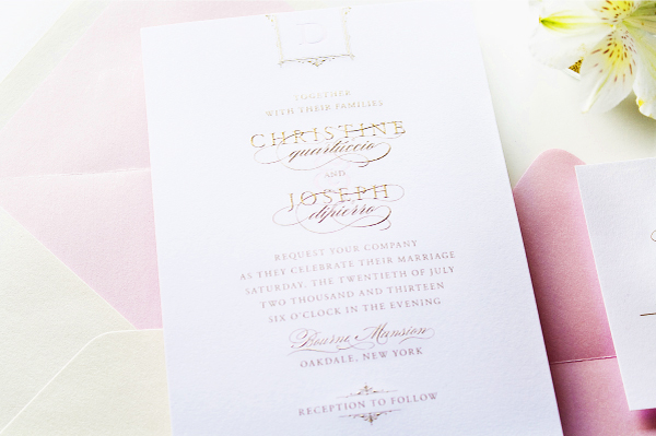
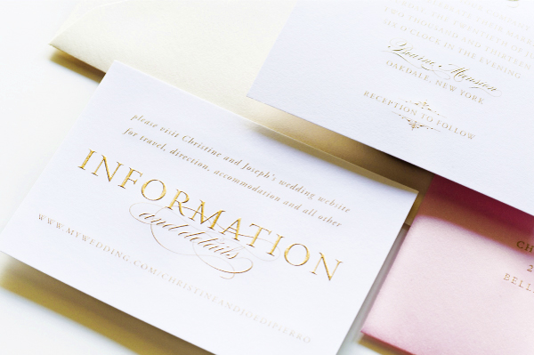
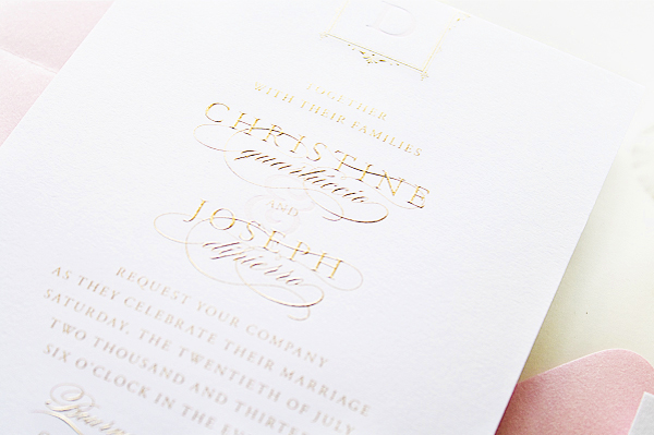
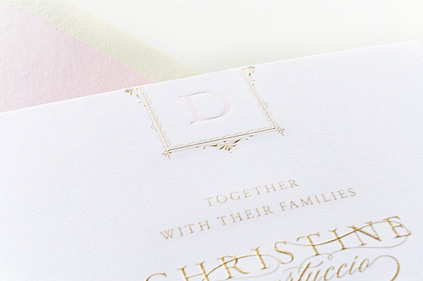
Christine + Joseph’s Classic Pink and Gold Engraved Wedding Invitations

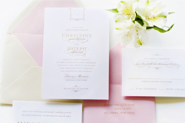
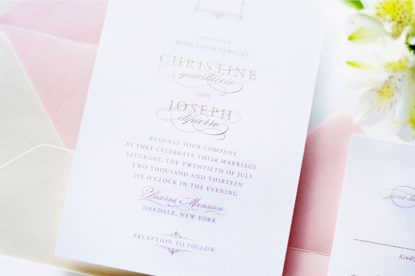
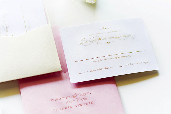
When designing the invitations for her cousin’s glamorous vintage-inspired wedding, Jackie of Sincerely, Jackie knew that she wanted to do something really special. The answer? An elegant invitation design with beautiful gold engraving and soft pink letterpress printing. Absolutely stunning!

Glam-Gold-Engraved-Pink-Letterpress-Wedding-Invitations-Sincerely-Jackie2

From Jackie: I created these invitations for my cousin, Christine, who’s also one of my best friends. Christine’s wedding took place just a few weeks ago was in a gold coast mansion on the Great South Bay of Long Island, New York. With such a breathtaking location, I knew the invitations needed to truly set the stage for the guests.

Glam-Gold-Engraved-Pink-Letterpress-Wedding-Invitations-Sincerely-Jackie

Glam-Gold-Engraved-Pink-Letterpress-Wedding-Invitations-Sincerely-Jackie6

The wedding was inspired by all things vintage, romantic, and glamorous, with lots of gold and pink, so I knew immediately that I wanted to create a gold and pink invitation done with specialty printing. While I love, love, love gold foil, for Christine’s invitations I really wanted to go with something a little more unique and true to the feel of the venue.

Glam-Gold-Engraved-Pink-Letterpress-Wedding-Invitations-Sincerely-Jackie3

Glam-Gold-Engraved-Pink-Letterpress-Wedding-Invitations-Sincerely-Jackie8

We decided to do a mix of printing methods: burnished gold engraving and soft pink letterpress accents. The gold engraving turned out to be the absolute perfect method for printing the invitations, and the contrast between the raised gold and the touches of soft pink letterpress is just divine.

Glam-Gold-Engraved-Pink-Letterpress-Wedding-Invitations-Sincerely-Jackie7

Glam-Gold-Engraved-Pink-Letterpress-Wedding-Invitations-Sincerely-Jackie9

Thanks Jackie!

Check out the Designer Rolodex for more tal­ented wed­ding invi­ta­tion design­ers and the real invi­ta­tions gallery for more wedding invitation ideas!

Photo Credits: Sincerely, Jackie

James + Daniel’s Masculine Letterpress Wedding Invitations

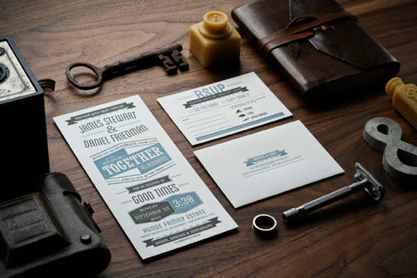
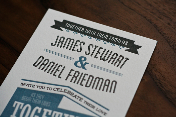
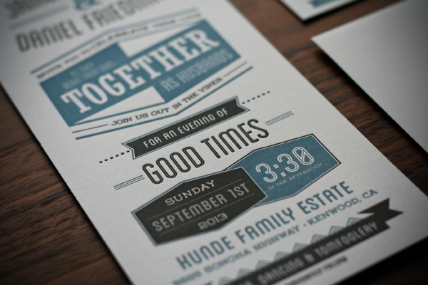
James and Daniel approached designer Chase Kettl looking for a masculine design for their wedding invitations. Chase created a modern two-color design with bold typography-inspired elements. Blue edge painting was the perfect finishing touch!

Masculine-Wedding-Invitations-Dependable-Letterpress

From Chase: James and Daniel contacted me looking for a masculine feel for their wedding invitations. Being a wedding of two men, they wanted to have a masculine feel as opposed to something flowery and frilly. I was thrilled to work with them! We decided to go with a two-color letterpress with bold design elements. We also decided to invest in blue edge painting to really give it a clean, dapper finish.

Masculine-Wedding-Invitations-Dependable-Letterpress3

Masculine-Wedding-Invitations-Dependable-Letterpress7

Masculine-Wedding-Invitations-Dependable-Letterpress5

Thanks Chase!

Design: Chase Kettl

Letterpress Printing: Dependable Letterpress

Check out the Designer Rolodex for more tal­ented wed­ding invi­ta­tion design­ers and the real invi­ta­tions gallery for more wedding invitation ideas!

Photo Credits: Chase Kettl

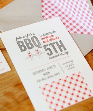
Adrienne + Dillon’s 5th Anniversary BBQ Party Invitations

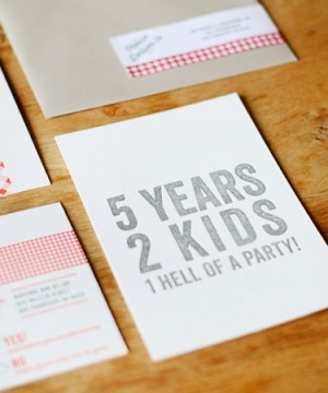
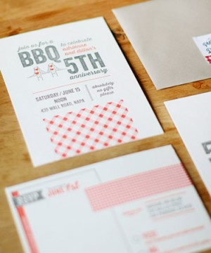
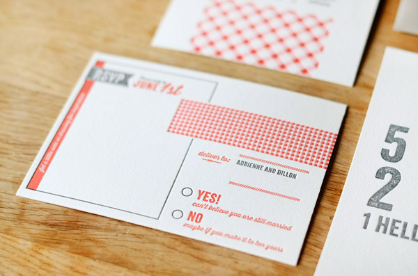
More than all the details and pretty invitations, the thing that I really love about parties is that they’re an excuse to get all of your favorite people together in one place. So naturally, I’m loving the spirit behind these 5th anniversary party invitations from Lisa at Good on Paper! Lisa incorporated gingham patterns and an icon of the Golden Gate bridge (which she originally used on their wedding invitations five years ago!), all letterpress printed by the talented team at Paper Monkey Press.

5th-Anniversary-BBQ-Party-Good-on-Paper

From Lisa: From their wedding invitation design to birth announcements for their second child, Adrienne and Dillon Rogers are the definition of repeat clients. For their 5th anniversary BBQ in Napa, I designed a modern rustic letterpress invitation set.

5th-Anniversary-BBQ-Party-Good-on-Paper15 5th-Anniversary-BBQ-Party-Good-on-Paper14

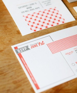
Graphic details included a pink and red gingham pattern, wood type fonts, and the San Francisco bridge + hearts icon originally used on their wedding invitations.

5th-Anniversary-BBQ-Party-Good-on-Paper13 5th-Anniversary-BBQ-Party-Good-on-Paper7

Guests were encouraged to write or draw a little inspiration on the RSVP postcard. I also designed gingham envelope liners, custom wraparound address labels, place cards, menus, and wood mounted party signs.

5th-Anniversary-BBQ-Party-Good-on-Paper4

Thanks so much Lisa!

Design: Good on Paper

Letterpress Printing: Paper Monkey Press

Good on Paper and Paper Monkey Press are members of the Designer Rolodex – you can see more of beautiful work from Good on Paper here and from Paper Monkey Press right here!

Photo Credits: Good on Paper

Kristen + Austin’s 1950s-Inspired Lake Tahoe Wedding Invitations

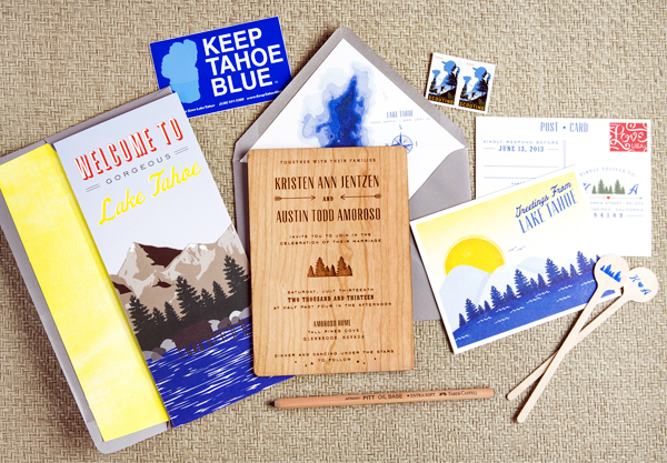
Ooooh, laser engraved wood wedding invitations! For these destination wedding invitations, Courtney from Swiss Cottage Designs paired the wood invitation with colorful accents inspired by the venue – Lake Tahoe! With her fabulous eye for detail, Courtney incorporated lots of cute and quirky elements into the day-of wedding stationery, from custom camp-inspired patches to welcome tote bags.
Wood-Lake-Tahoe-Wedding-Invitations-Swiss-Cottage-Designs

From Courtney: This suite was inspired by 1950s Lake Tahoe with a modern twist: so think Rat Pack, martinis and camping in retro cabins under the stars. Lake Tahoe is notoriously blue so it was natural to have cobalt blue be the star of the show. The bold yellow color complemented the blue and helped play into the ’50s inspiration.
Wood-Lake-Tahoe-Wedding-Invitations-Swiss-Cottage-Designs3

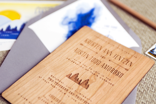
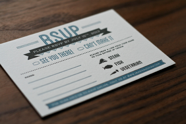
When it came to the invitation, Kristen wanted to do something with wood to represent the nature of Tahoe. I found an amazing vendor to laser engrave these on double thick wood. It was a great touch and the invites actually smelled a bit like firewood which was an awesome bonus element! With the RSVP card, we wanted it to feel like a post card you would grab when traveling through the area on vacation.
Wood-Lake-Tahoe-Wedding-Invitations-Swiss-Cottage-Designs2

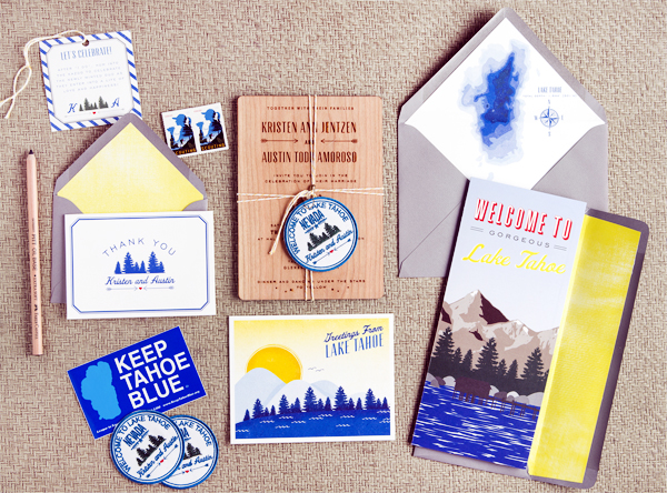
Since this was a destination wedding, we wanted the save the date to act as an incentive package to guests. I created a two fold brochure filled with fun facts about Tahoe as well as travel details, hotel info. and more. With destination weddings, the save the dates always end up being a bit more important as guests need to book early. As an extra element to help tie suite together, we came up with the idea of doing an actual patch like you might get at camp. I ended up working with a great vendor who created the patches (2.5″ x 2.5″) with iron-on material on the back. Some guests even showed up with the patches adhered to their outfits. Brilliant!
Wood-Lake-Tahoe-Wedding-Invitations-Swiss-Cottage-Designs5

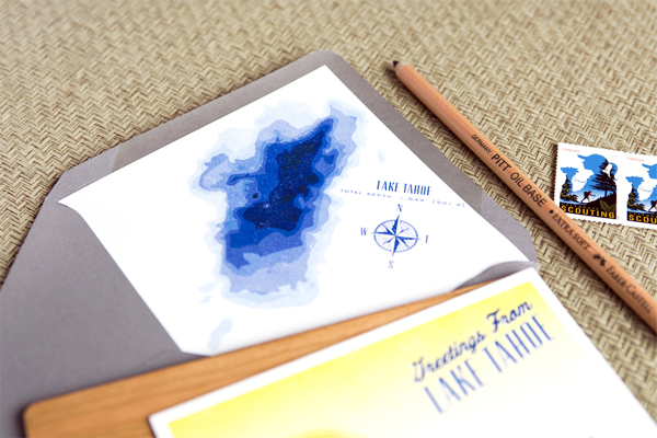
My favorite element is the envelope liner. Lake Tahoe is the second deepest Lake in the country so I thought it might be cool to highlight that with a depth chart. Depth charts aren’t exactly the most exciting thing but by using different shades of cobalt and placing it against the clean white paper, it was a great design element that really added to the suite.
Wood-Lake-Tahoe-Wedding-Invitations-Swiss-Cottage-Designs6

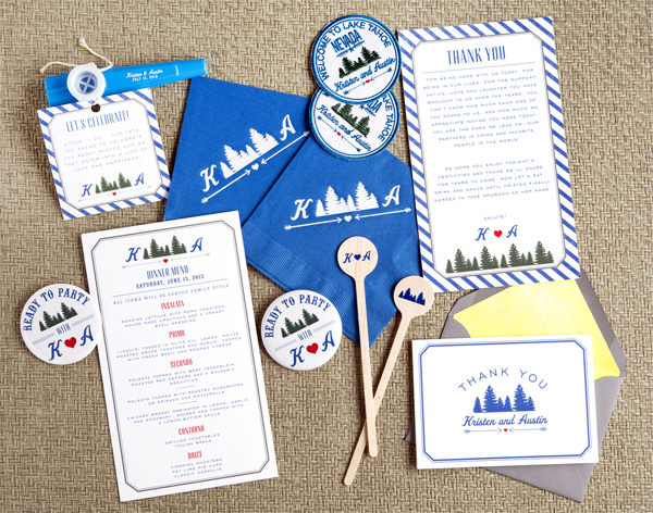
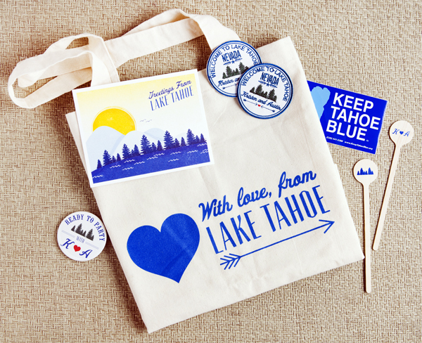
For the day of elements, we played with cocktail napkins, drink stirrers, buttons, custom kazoos (weird, but fun!), “Keep Tahoe Blue” stickers, and silk screened tote bags.  I’m a firm believer that the day of elements really help round out the event. It’s such a fun way to bring all the great details from your save the date and invitation into the big day!
Wood-Lake-Tahoe-Wedding-Invitations-Swiss-Cottage-Designs4

Thanks Courtney!

Design: Swiss Cottage Designs
Swiss Cottage Designs is a member of the Designer Rolodex – you can see more of Courtney’s amazing work right here or visit the real invi­ta­tions gallery for more wedding invitation ideas!
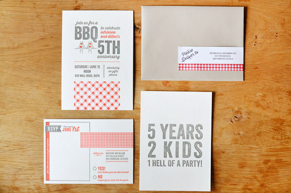
Photo Credits: Courtney Jentzen | Swiss Cottage Designs