Happy Friday everyone! It felt wonderful to get back into the swing of things this week! Sadly, I managed to come down with a slight cold this week, which is probably my body’s way of letting me know not to rush too fast back into a hectic schedule. So I’m off to rest and enjoy the weekend… I hope you all can do the same! But in the meantime…
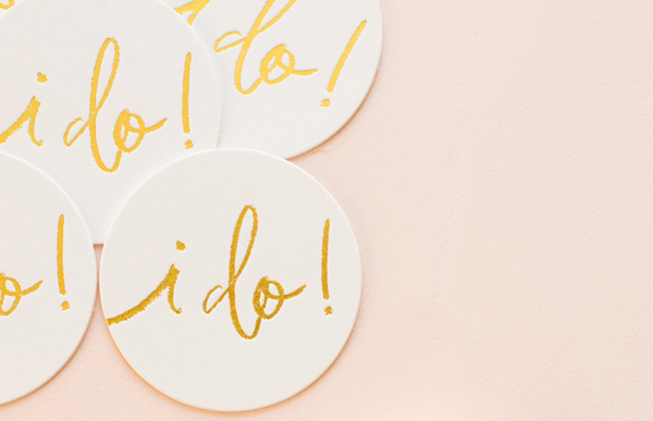
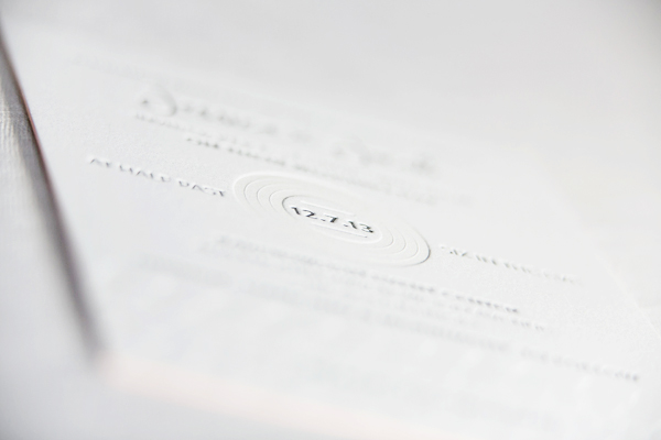
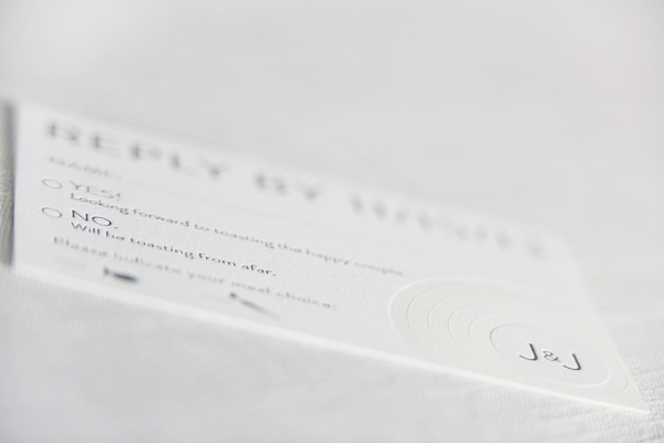
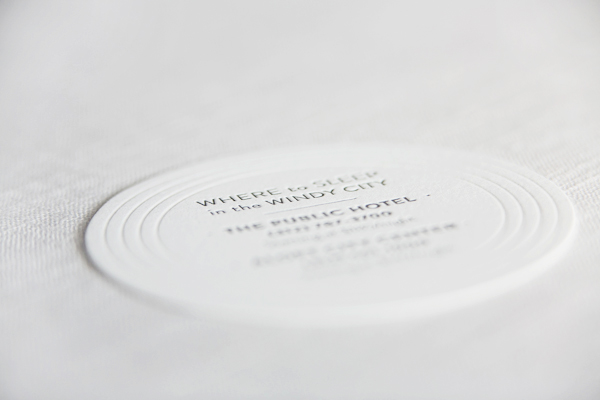
Photo Credit: Sugar Paper for J.Crew
…a few links for your weekend!
- Adorable Juna’s beautiful baby announcements!
- But what if I fail? You will.
- Love this: I wish someone had told me…
- You are my everything
- PSA: Postage rates go up at the end of the month!
This week on Oh So Beautiful Paper:
- Colorful citrus and olive tree wedding invitations
- Soft and ethereal modern winter wedding invitations
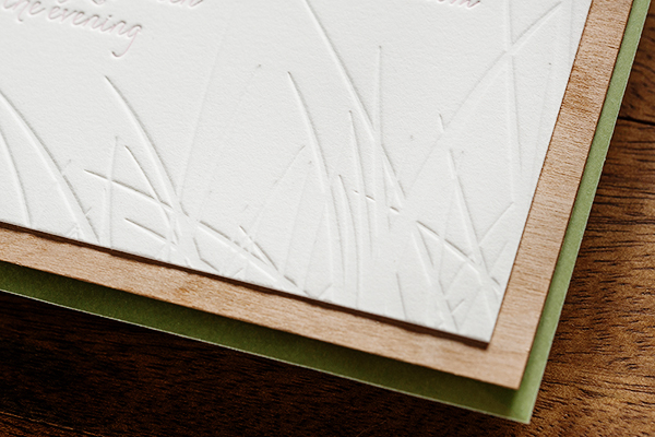
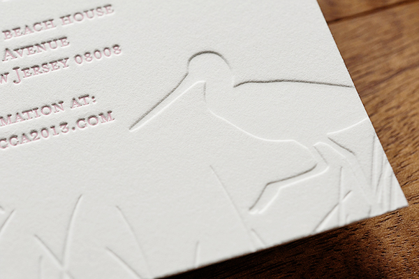
- Rustic etched wood barn save the dates
- Hello, Brick + Mortar: Trends, Unsolicited Advice, and Wild Ideas
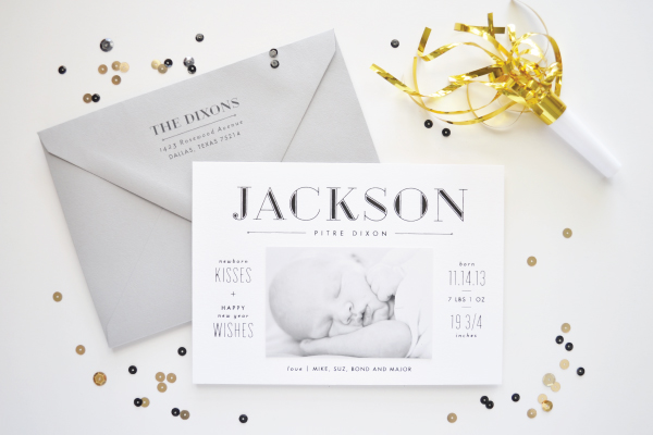
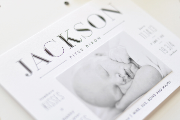
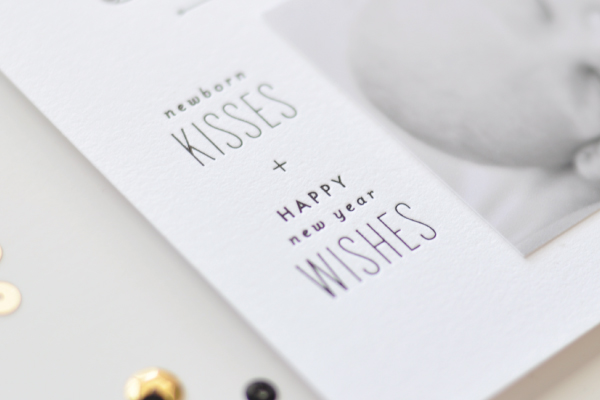
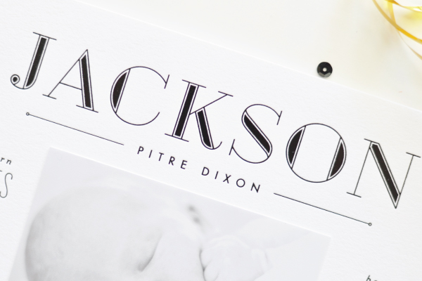
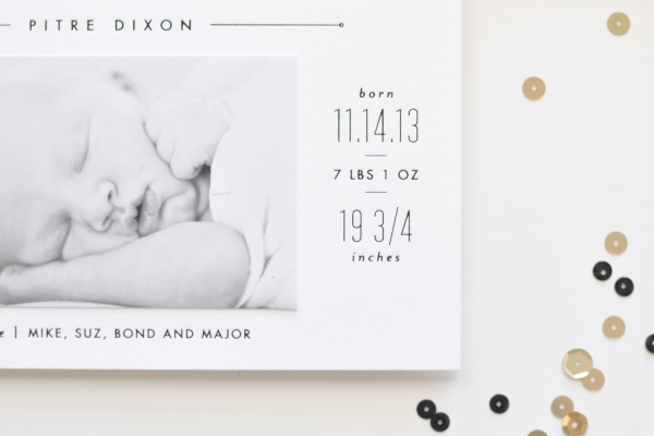
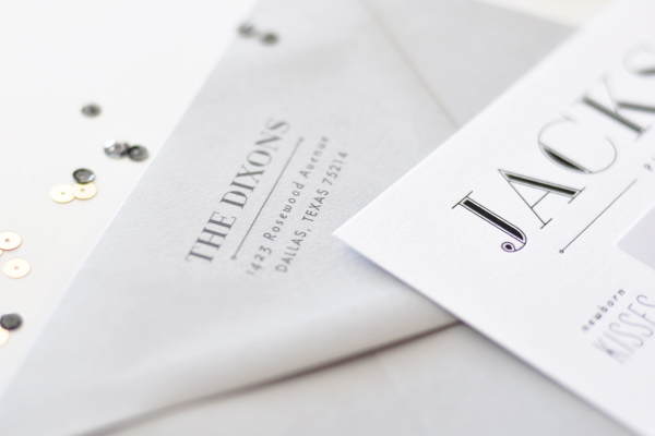
- Jackson’s sleek black + white birth announcements
- Party Paper: Radiant Orchid!
- Stunning and inspiring work from Anne Robin Calligraphy
- Well Said Type: Velik
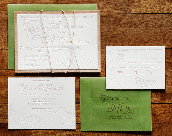
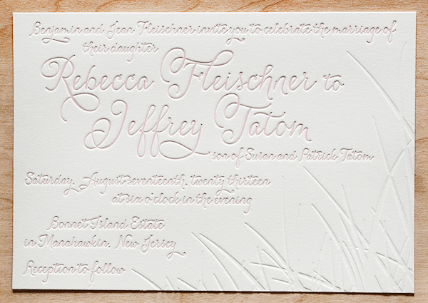
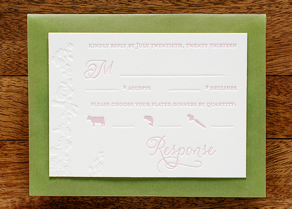
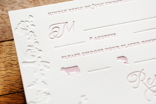
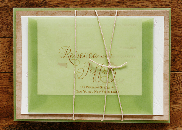
- Rebecca + Jeffrey’s windswept wedding invitations
- Pretty + Paper: Feeling inspired by Paris
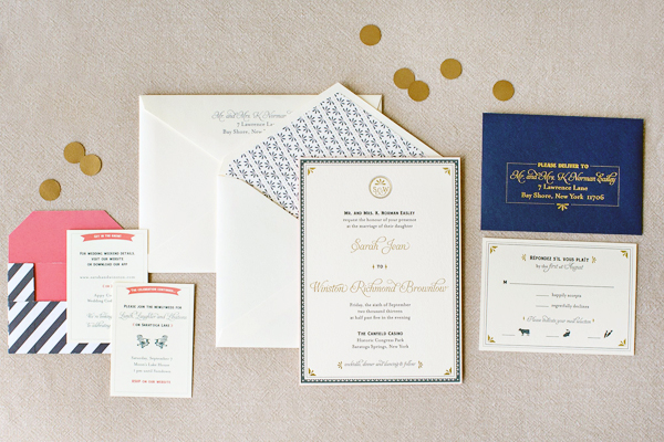
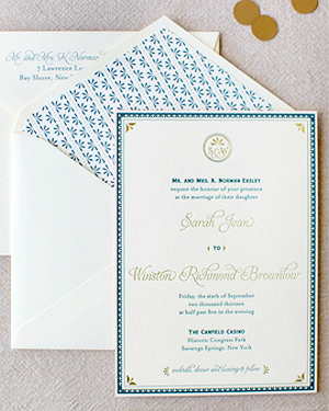
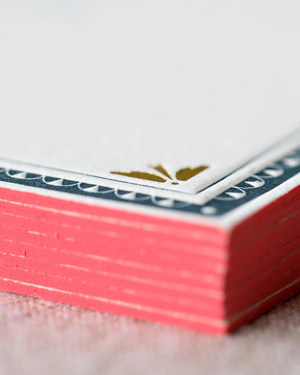
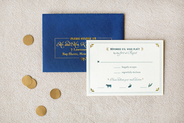
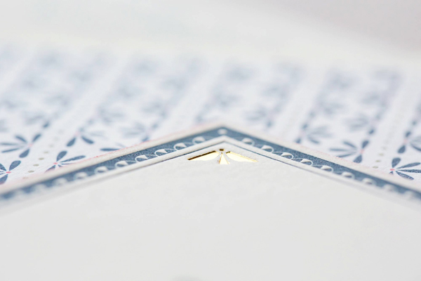
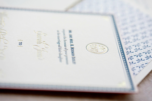
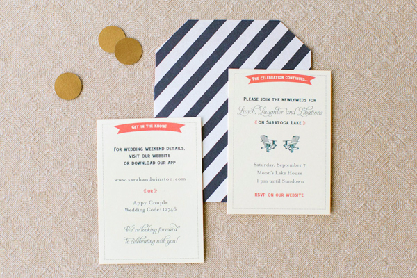
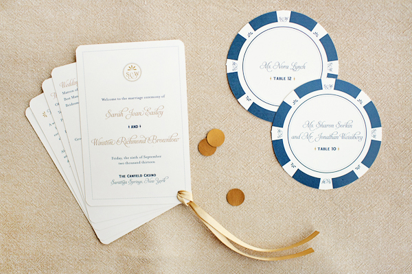
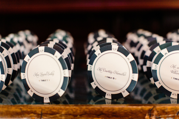
- Classic navy + gold wedding invitations with modern pops of coral
- Quick Pick: Sugar Paper for J.Crew
- FN Dish: 2014 Calendars Good Enough to Eat
- Thinking about visiting DC? Here are a few fun things to do during winter!
Check back soon for this week’s cocktail! I hope you all have a wonderful weekend, and I’ll see you back here next week! xoxo