Sophie + Henry’s Vibrant Garden Party Wedding Invitations

Happy Monday everyone – I hope you had a great weekend! I love the concept of a garden party wedding, and vibrant watercolor invitations to match? Even better! Sarah from Santiago Sunbird created these custom watercolor invitations for a summer garden wedding with colors inspired by the bride’s bouquet!

Vibrant-Garden-Party-Wedding-invitations-Santiago-Sunbird3

From Sarah: Sophie and Henry got in touch with us to create custom watercolor invitations and day-of stationery that represented their garden party wedding. The suite was inspired by Sophie’s bridal flowers, which included an array of vibrant colors in shades of red and green.

Vibrant-Garden-Party-Wedding-invitations-Santiago-Sunbird2

The floral garden party theme was carried across all the wedding stationery – including confetti cones, table numbers, rsvp, info cards, menu, map, and paddle fan ceremony programs perfect for the hazy summer wedding date!

Vibrant-Garden-Party-Wedding-invitations-Santiago-Sunbird6

Vibrant-Garden-Party-Wedding-invitations-Santiago-Sunbird4

Vibrant-Garden-Party-Wedding-invitations-Santiago-Sunbird5

Vibrant-Garden-Party-Wedding-invitations-Santiago-Sunbird7

Vibrant-Garden-Party-Wedding-invitations-Santiago-Sunbird8

Vibrant-Garden-Party-Wedding-invitations-Santiago-Sunbird9

Vibrant-Garden-Party-Wedding-invitations-Santiago-Sunbird10

Thanks Sarah!

Check out the Designer Rolodex for more tal­ented wed­ding invi­ta­tion design­ers and the real invi­ta­tions gallery for more wedding invitation ideas!

Photo Credits: Santiago Sunbird

Happy Weekend!

Well, hello August! My dad is coming down this weekend to help with some pre-baby house projects – and he’s staying all week, such a treat! I’m excited for Sophie to get some Grandpa time, which sadly doesn’t happen nearly often enough. I’m heading out to prepare for a few projects and (ahem) tidy up the house a bit, but in the meantime…

White-Blush-Pink-Bouquet-KTMerry-McKenziePowell-MSW

Bouquet by McKenzie Powell / Photo by KT Merry via Martha Stewart Weddings

…a few links for your weekend:

This week on Oh So Beautiful Paper:

Check back soon for this week’s cocktail! I hope you all have a wonderful weekend, and I’ll see you back here next week! xoxo

DIY Modern Color Splash Save the Dates

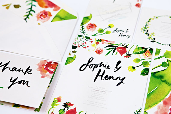
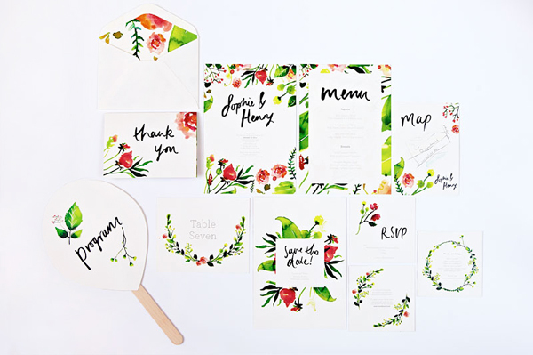
We’ve been up to our ears with floral patterns and soft pastels all summer. Don’t get us wrong, we love it – but we were craving something fresh! We dreamt up this new stamp collection and DIY project with a modern edge and bold, classic type, and we’re in love. The palette of black, white, and kraft was craving a pop of color so we added in a fun swash of turquoise as icing on the cake. – Bailey and Emma of Antiquaria
DIY Tutorial: Modern Save the Date with a Splash of Color by Antiquaria for Oh So Beautiful Paper

DIY Tutorial: Modern Save the Date with a Splash of Color by Antiquaria for Oh So Beautiful Paper

Step One: Stamp your save the date (we used our Modern Type Save the Date stamp) on an A6 kraft card. You’ll want to use a permanent ink, such as Color Box archival, so that it doesn’t bleed when the second color is added. Press firmly but moderately when printing on a flat surface, using your hands to make sure that the entire stamp has been printed. Let dry.

DIY Tutorial: Modern Save the Date with a Splash of Color by Antiquaria for Oh So Beautiful Paper

Step Two: To add our pop of turquoise color, we “splashed” a small cat eye stamp pad down the design, ending slightly below the wording. If you don’t get the coverage you’re looking for, you can touch it up as after your first pass. The benefit to using a small stamp pad vs. paint is that the water content in paint tends to warp the paper as it dries.

DIY Tutorial: Modern Save the Date with a Splash of Color by Antiquaria for Oh So Beautiful Paper

Step Three: Stamp your return address (we used our Modern Type Return Address stamp) with turquoise ink on a cream A6 envelope. We stamped the return address on the back in the lower left hand corner.

DIY Tutorial: Modern Save the Date with a Splash of Color by Antiquaria for Oh So Beautiful Paper

Step Four: For a bold graphic element, we added an envelope liner made with our Brushed Geo, No.2 Patterned paper cut to a 5.75″ x 6.25″ rectangle. Install the liner by taping it in right below the gum line using double sided tape.

Materials

Modern Type Save the Date Stamp

Modern Type Return Address Stamp

Brushed Geo, No.2 patterned paper, in text weight

A6 Notecards in Paper Bag (or other kraft paper A6 flat cards)

A6 Envelopes in Natural

Stamp Pads (full size) in archival black and pigment turquoise

Stamp Pad (small cat eye) in Aqua

Scissors

Double Sided Tape

Anti­quaria is a mem­ber of the Designer Rolodex – you can see more of their beau­ti­ful work right here!

Photo Credits: Antiquaria for Oh So Beautiful Paper

Perpetually Chic’s Letterpress + Calligraphy Business Stationery

I love love love a beautiful business card – who doesn’t?!? So I was thrilled when Sarah from Studio SloMo sent over the letterpress and foil stamped business cards and custom business stationery that she designed for her friend Lauren of Perpetually Chic. I love the crisp navy and white color palette – and of course the beautiful calligraphy logo by Julie Song Ink!

Blue-White-Calligraphy-Letterpress-Stationery-Studio-SloMo-OSBP3

From Sarah: My good friend Lauren Craig of Perpetually Chic came to me for help in redesigning her blog from logo to stationery to website. She loves all things simple and timeless which comes across well in this paired down set of business stationery. We used a white and navy duplexed paper with letterpress printing on one side and white foil stamp on the other for her business cards. The clean letterpress printed notecard showcases the “Perpetually Chic” logo Julie Song so beautifully hand lettered. Lauren typically uses a metallic gold pen to address the deep navy envelopes.

Blue-White-Calligraphy-Letterpress-Stationery-Studio-SloMo-OSBP

Blue-White-Calligraphy-Letterpress-Stationery-Studio-SloMo-OSBP2

Blue-White-Calligraphy-Letterpress-Stationery-Studio-SloMo-OSBP4

Blue-White-Calligraphy-Letterpress-Stationery-Studio-SloMo-OSBP5

Thanks Sarah!

Logo Design: Julie Song Ink

Stationery Design + Printing: Studio SloMo

Studio SloMo is a member of the Designer Rolodex – you can check out more of Sarah’s beautiful work right here!

Photo Credits: Studio SloMo

Ashley + Eric’s Classic Black and White Wedding Invitations

Some things just never go out of style. Elegant black script and text paired with soft white paper is a timeless combination. Becca of Suite Paperie took that classic combination in these black and white invitations and kicked it up a notch with gold details – including gold edge painting, gold twine, and a gold doily envelope liner!

Classic-Black-White-Wedding-Invitations-Suite-Paperie-OSBP6

From Becca: This double-ply black on soft white letterpress wedding invitation is the epitome of classic elegance. Matching rehearsal dinner, direction/accommodation card, and RSVP card are digitally printed in black ink to match the invitation suite. Finished with gold edging, wrapped in metallic twine and tucked into a gold doily-lined envelope, this suite is classic perfection.

Classic-Black-White-Wedding-Invitations-Suite-Paperie-OSBP

Classic-Black-White-Wedding-Invitations-Suite-Paperie-OSBP4

Classic-Black-White-Wedding-Invitations-Suite-Paperie-OSBP2

Classic-Black-White-Wedding-Invitations-Suite-Paperie-OSBP3

Classic-Black-White-Wedding-Invitations-Suite-Paperie-OSBP5

Thanks Becca!

Check out the Designer Rolodex for more tal­ented wed­ding invi­ta­tion design­ers and the real invi­ta­tions gallery for more wedding invitation ideas!

Photo Credits: Lindsay Nathanson