Angel + Arthur’s Spring Floral Wedding Invitations

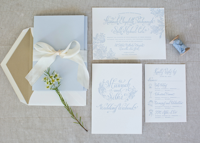
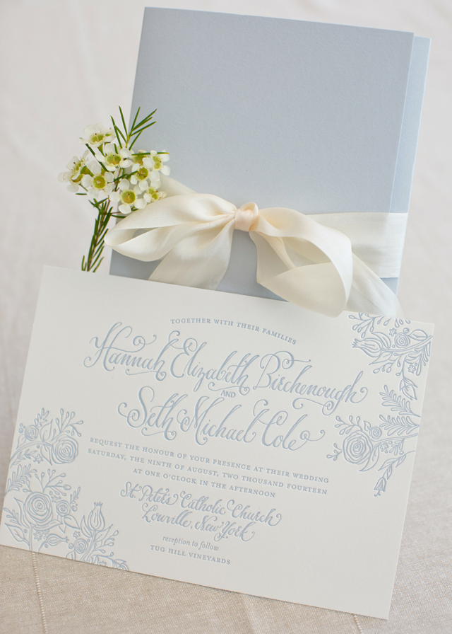
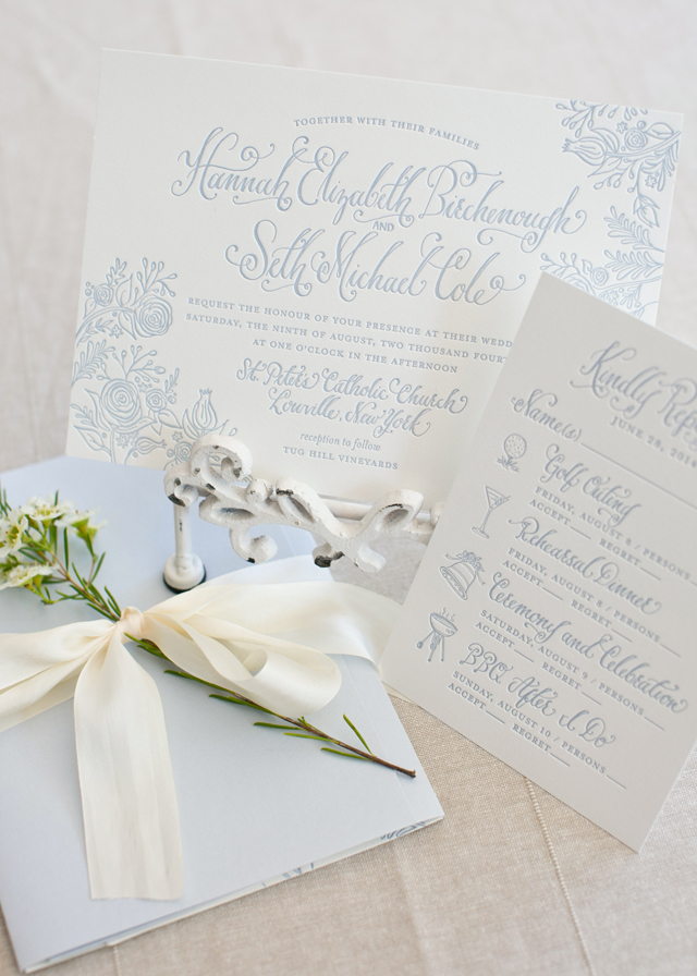
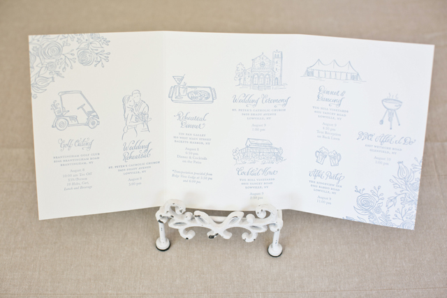
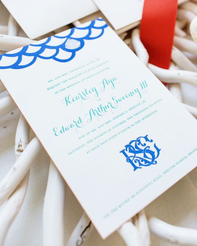
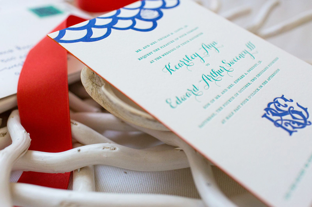
I’m a big fan of floral-inspired wedding invitations any time of year, but especially for a spring wedding! These invitations from Amanda at Wide Eyes Paper Co. combine simple line illustrations with a floral watercolor envelope liner. So pretty!

Spring-Floral-Wedding-Invitations-Wide-Eyes-Paper-Co-OSBP7

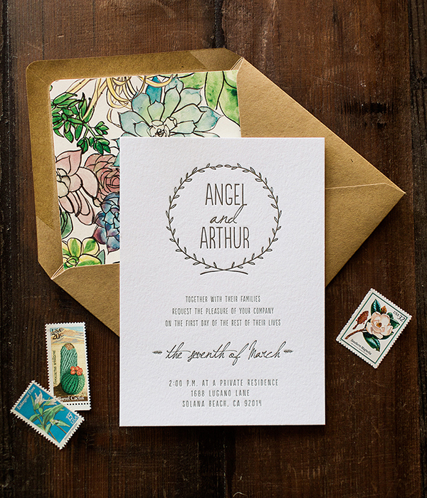
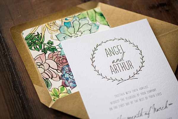
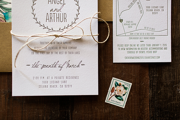
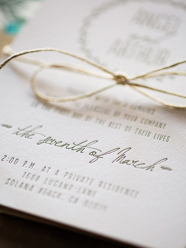
From Amanda: We created this invitation suite for a couple getting married in Sunny San Diego, California. The bride and groom are both surfers and love the outdoors. They wanted their wedding invitations to reflect their personalities and the location of their wedding in Solana Beach. They wanted something simple, elegant, and nature inspired. I hand illustrated the wreath around their names and mixed in whimsical typography.

Spring-Floral-Wedding-Invitations-Wide-Eyes-Paper-Co-OSBP5

Spring-Floral-Wedding-Invitations-Wide-Eyes-Paper-Co-OSBP2

They also wanted their guests to know how to properly get to their wedding venue. I created a custom illustrated map to go alongside this vision which is a fun way to showcase directions versus just writing them out.

Spring-Floral-Wedding-Invitations-Wide-Eyes-Paper-Co-OSBP6

Spring-Floral-Wedding-Invitations-Wide-Eyes-Paper-Co-OSBP3

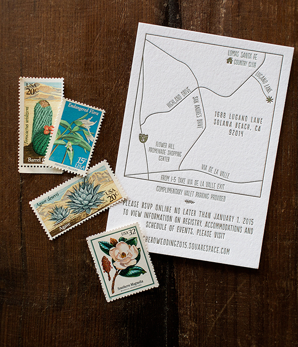
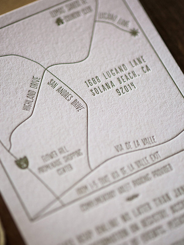
The invitation and map feature letterpress printing to complement the simplicity and elegance of the set.​ Angel and Arthur wanted to stick with the “natural look” so we included a painted floral envelope liner and paired it with our natural kraft envelopes to tie it all together.

Spring-Floral-Wedding-Invitations-Wide-Eyes-Paper-Co-OSBP4

Thanks Amanda!

Design: Wide Eyes Paper Co.

Watercolor Envelope Liner Pattern: Chau Matser

Letterpress Printing: Clove St. Press

Wide Eyes Paper Co. is a member of the Designer Rolodex – you can see more of Amanda’s work right here or visit the real invitations gallery for more wedding invitation ideas!

Photo Credits: Let’s Frolic Together

Hannah + Seth’s Illustrated Summer Wedding Invitations

A New York wedding with a bit of Southern charm? Sounds like the perfect combination to me! Created by Kara Anne Paper, this wedding invitation suite features whimsical calligraphy and beautiful illustrations to complement their beautiful outdoor wedding venue – all in the most beautiful shade of powder blue!

Illustrated-Southern-Wedding-Invitations-Kara-Anne-Paper-OSBP

From Kara: Hannah and Seth wanted an illustrated wedding suite that had a chic, Southern charm feel to it. Hannah loved the idea of mixing whimsical calligraphy, floral illustrations and a traditional serif font. We used a powder blue letterpress ink for her paper suite to match the color of her bridesmaids dresses. The fresh color and lovely silk ribbon was the perfect touch for their outdoor New York summer wedding at Tug Hill Vineyards.

Illustrated-Southern-Wedding-Invitations-Kara-Anne-Paper-OSBP2

Illustrated-Southern-Wedding-Invitations-Kara-Anne-Paper-OSBP3

Illustrated-Southern-Wedding-Invitations-Kara-Anne-Paper-OSBP4

Illustrated-Southern-Wedding-Save-the-Dates-Kara-Anne-Paper-OSBP

Illustrated-Southern-Wedding-Invitations-Kara-Anne-Paper-OSBP5

Illustrated-Southern-Wedding-Invitations-Kara-Anne-Paper-OSBP6

Illustrated-Southern-Wedding-Invitations-Kara-Anne-Paper-OSBP7

Illustrated-Southern-Wedding-Invitations-Kara-Anne-Paper-OSBP8

Illustrated-Southern-Wedding-Invitations-Kara-Anne-Paper-OSBP9

View More: http://jedphoto.pass.us/hannahseth

View More: http://jedphoto.pass.us/hannahseth

View More: http://jedphoto.pass.us/hannahseth

Thanks Kara!

Design: Kara Anne Paper

Letterpress Printing: Patrick Masterson

Invitation Photos : Colorbox Photographers / Wedding Day Photos: Jessica Eileen Drogosz 

Happy Weekend!

Happy Friday everyone! We arrived back in DC on Monday (after spending the Easter weekend with Sophie’s grandparents and cousins) to find the cherry blossoms and magnolias in bloom and bright yellow daffodils all over the city. Yay! Spring is my favorite season here in DC and I wish I could hang onto it forever. For now, I’m cherishing the pale pink blossoms while anxiously awaiting the lilacs and peonies. But in the meantime…

Floret-Flower-Narcissus-Instagram

Narcissus by Floret Flower via Instagram

…a few links for your weekend!

This week on Oh So Beautiful Paper:

Check back this afternoon for this week’s cocktail recipe! Have a wonderful weekend, and I’ll see you back here on Monday! xoxo

DIY Blue and Gold Embossed Save the Dates

In our last DIY post, we shared a gorgeous free pattern download for envelopes liners and place cards. We thought it would be fun this week to actually use the pattern as a launching point and design an awesome save the date that utilizes it in the design. The mixed shades of blue feels fresh and spring-y and we used our favorite embossing technique to incorporate lots of gold into the design (our favorite if you haven’t noticed). The result is a stunning and custom looking suite which can all be easily accomplished on your own with a few key materials! –Bailey and Emma of Antiquaria

DIY Blue and Gold Wedding Save the Dates by Antiquaria for Oh So Beautiful Paper

Materials

Laurel Wreath Save the Date Stamp

Laurel Wreath Return Address Stamp

Embossing Stamp Pad

Embossing Heat Tool

Embossing Powder in Gold

A2 Cards (we used Lake)

A2 Envelopes (we used Bluebell)

Gold Dot Washi Tape

Gold Glitter Heart Stickers

Liner (free download, printed on white text weight paper)

Envelope Liner Templates

Pencil and Scissors

Stick Glue or Double Sided Tape

Gold Calligraphy Ink

Vintage Postage

DIY Blue and Gold Wedding Save the Dates by Antiquaria for Oh So Beautiful Paper

DIY Blue and Gold Wedding Save the Dates by Antiquaria for Oh So Beautiful Paper

Step One: We embossed our Laurel Wreath Save the Date stamp and our Laurel Wreath Return Address Stamp for this save the date design. All of the pieces were embossed with our favorite gold embossing powder which gives lovely, fine results. Simply stamp your design on your card (Lake A2) and envelope (Bluebell A2) (either in matching ink or with Versamark glue ink, as pictured), dust the powder over it, tap off the excess, and heat set the print. For more information about how to emboss using stamps, please watch this instructional video.

DIY Blue and Gold Wedding Save the Dates by Antiquaria for Oh So Beautiful Paper

DIY Blue and Gold Wedding Save the Dates by Antiquaria for Oh So Beautiful Paper

Step Two: To add personality to the design, we added an envelope liner made from our latest free pattern download. It really helps dress up the whole suite! Print the pattern out on your home printer using a high quality text weight paper, then trace the A2 envelope liner template onto the paper and cut it out with scissors. To install, simply use stick glue or double sided tape to adhere them into your envelope.

DIY Blue and Gold Wedding Save the Dates by Antiquaria for Oh So Beautiful Paper

Step Three: All that’s left now is the finishing touches! We addressed them using our favorite gold calligraphy ink and a dip pen – but your could also use a gold gel pen and your prettiest cursive to achieve a similar look. We added gold polka dot washi tape, a glitter heart sticker and vintage postage to tie everything together and make the envelope just as gorgeous as the save the date.

DIY Blue and Gold Wedding Save the Dates by Antiquaria for Oh So Beautiful Paper

We know your guests will love getting these beauties in the mail!

All artwork © 2015 Antiquaria, with DIY tutorials created exclusively for Oh So Beautiful Paper. All artwork is made available for personal use only. Anti­quaria is a mem­ber of the Designer Rolodex – you can see more of their beau­ti­ful work right here!

Photo Credits: Antiquaria for Oh So Beautiful Paper

Kearsley + Edward’s New England Quahog Wedding Invitations

Well this is fun! A collaboration between artist Kearsley Lloyd and Albertine Press, these invitations feature a bright and colorful color palette with a regional New England Quahog inspired design – and some beautiful watercolor illustrations to boot. Pretty!

New-England-Quahog-Wedding-Invitations-Kearlsey-Lloyd-Albertine-Press-OSBP5

From Kearsley: Having designed custom wedding monograms and crests for years, I was especially eager to craft an invitation suite for my own wedding. All of my designs begin by hand with an original watercolor and gouache illustration, which I then manipulate digitally. The watercolor painting is preserved for use on stationery and paper goods while the digital version can be converted to any color scheme to feature on embroidery, screen printing, stamping, and other decorative uses for weddings…and well beyond.

New-England-Quahog-Wedding-Invitations-Kearlsey-Lloyd-Albertine-Press-OSBP2

Our save the date was flat printed to preserve the unique appearance of the watercolor, and then invitations were letterpress printed by Albertine Press. It introduced and established the colorful theme and playful impression that carried through the invitation and entire sequence of wedding events.

New-England-Quahog-Wedding-Invitations-Kearlsey-Lloyd-Albertine-Press-OSBP3

New-England-Quahog-Wedding-Invitations-Kearlsey-Lloyd-Albertine-Press-OSBP7

Our wedding was to take place at my family’s home on the Rhode Island coast, so we chose to feature the well-recognized Rhode Island Quahog (also known as a cherrystone clam) in our theme. Since my husband and I live in Bermuda, a British colony, the Hog Penny had become a symbol of our new life together and a fun secondary theme. Finally, a little research turned up a handy coincidence: my fiancé’s Celtic family crest indeed featured wild boars! You can imagine what fun we had, once the ‘Qua-Hog’ theme was established!

New-England-Quahog-Wedding-Invitations-Kearlsey-Lloyd-Albertine-Press-OSBP6

I love taking a twist on traditional letterpress printing by infusing it with unusual colors and pattern. Echoing the fish scale pattern of our save the date card, I introduced an intertwined monogram design that served as the central theme of our wedding day décor. The painted edge on the invitation tied the color palette together beautifully. To that, I added a colorful tri-fold schedule of weekend events, as well as custom postage for the outer and RSVP envelopes. The design from the back of the dave the date greeting became the perfect pattern for the envelope liner, and my vibrant watercolor map design was a handy travel guide, included in a welcome bag for out-of-town guests.

New-England-Quahog-Wedding-Invitations-Kearlsey-Lloyd-Albertine-Press-OSBP

New-England-Quahog-Wedding-Invitations-Kearlsey-Lloyd-Albertine-Press-OSBP4

New-England-Quahog-Wedding-Invitations-Kearlsey-Lloyd-Albertine-Press-OSBP8

New-England-Quahog-Wedding-Invitations-Kearlsey-Lloyd-Albertine-Press-OSBP9

Thanks Kearsley and Abby!

Design: Kearsley Lloyd

Letterpress Printing: Albertine Press

Styling: Abby Capalbo

Calligraphy: Deanna Wiles

Custom Postage: Zazzle.com

Albertine Press is a member of the Designer Rolodex – you can see more of their fabulous work right here!

Photo Credits: Erin McGinn