Elegant Monochromatic Calligraphy Wedding Invitations

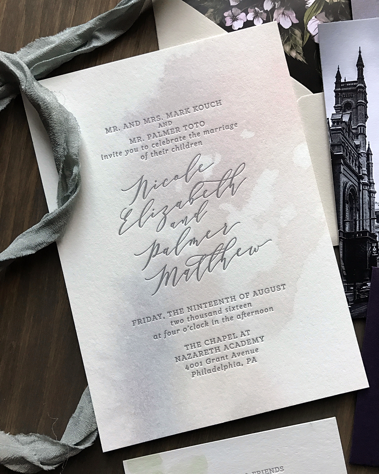
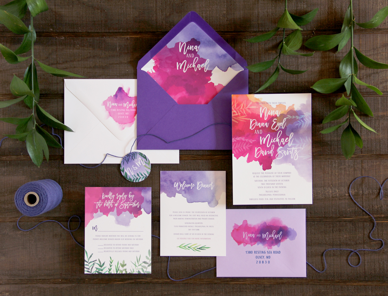
This is the second time this year we’ve featured invitations inspired by The Hotel Emma in San Antonio! These elegant monochromatic calligraphy wedding invitations by Nicolette of Lazywood Lane feature custom illustrations of the hotel, along with Nicolette’s modern and organic calligraphy and vintage-inspired serif type selections. Add in a dusty blue envelope liner made from handmade paper and a gorgeous white wax seal, and you’ve got one seriously stunning invitation suite.

Elegant Monochromatic Calligraphy Wedding Invitations by Lazywood Lane

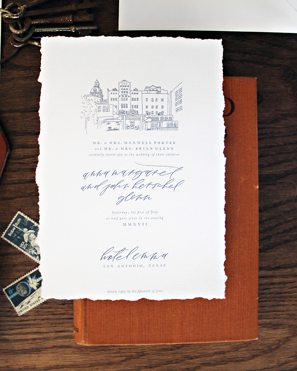
From Nicolette: The Hotel Emma has quickly become a landmark in San Antonio, inspiring me to create this invitation suite and illustrate the face of the building, which was once a 19th century brewery. The design was printed on a cotton paper with hand deckled edges.

Elegant Monochromatic Calligraphy Wedding Invitations by Lazywood Lane

Elegant Monochromatic Calligraphy Wedding Invitations by Lazywood Lane

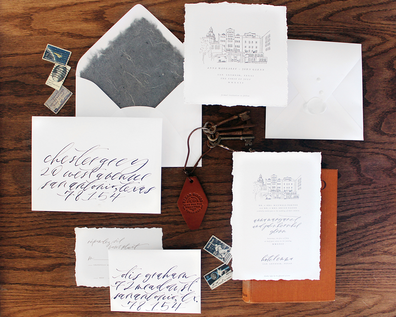
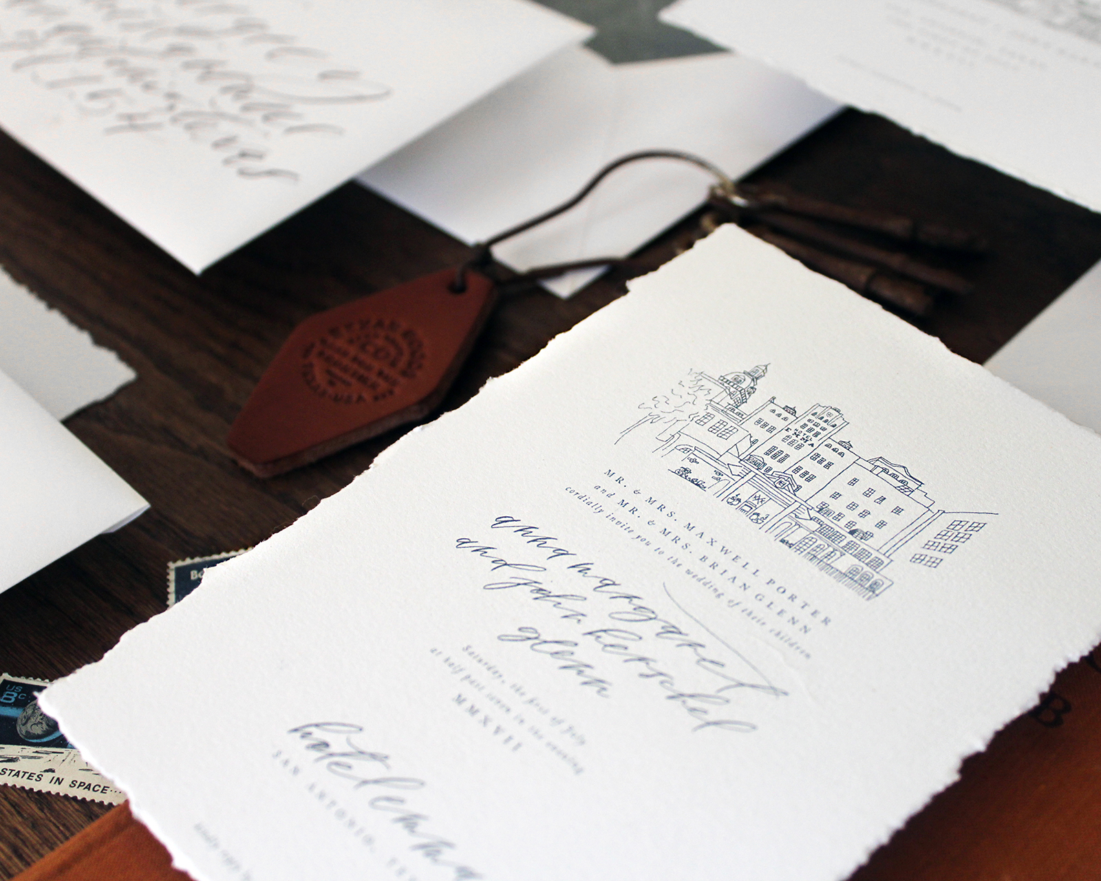
I carried the illustration through both the save the dates and the wedding invitation. The illustration was the main focus of the square save the dates, so I kept the rest of the design simple and used a typeface inspired by the original font family that was used to print the classic works of Voltaire. The hotel has a charming library with classic industrial decor, in which I imagine these historical specimens would fit comfortably.

Elegant Monochromatic Calligraphy Wedding Invitations by Lazywood Lane

Elegant Monochromatic Calligraphy Wedding Invitations by Lazywood Lane

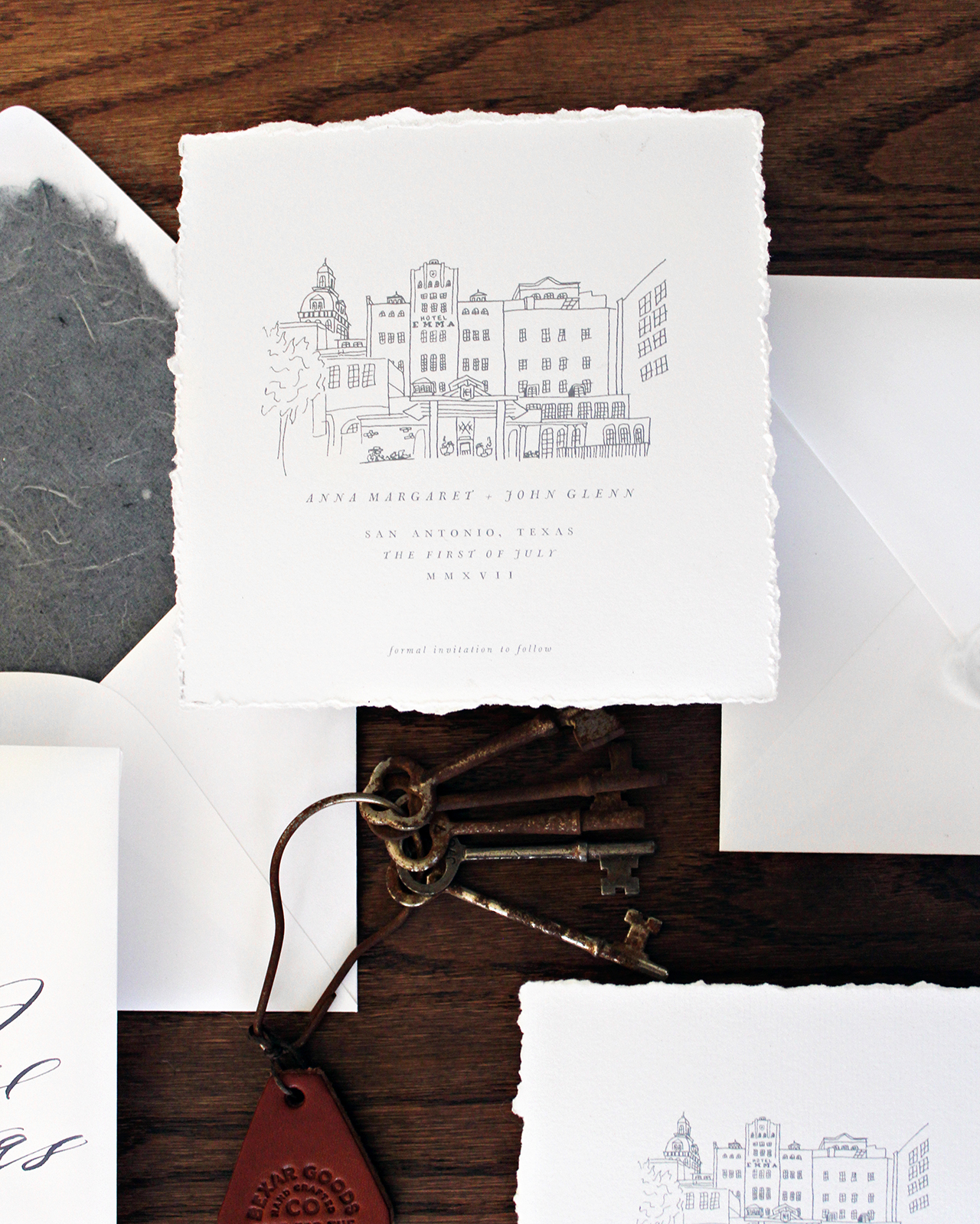
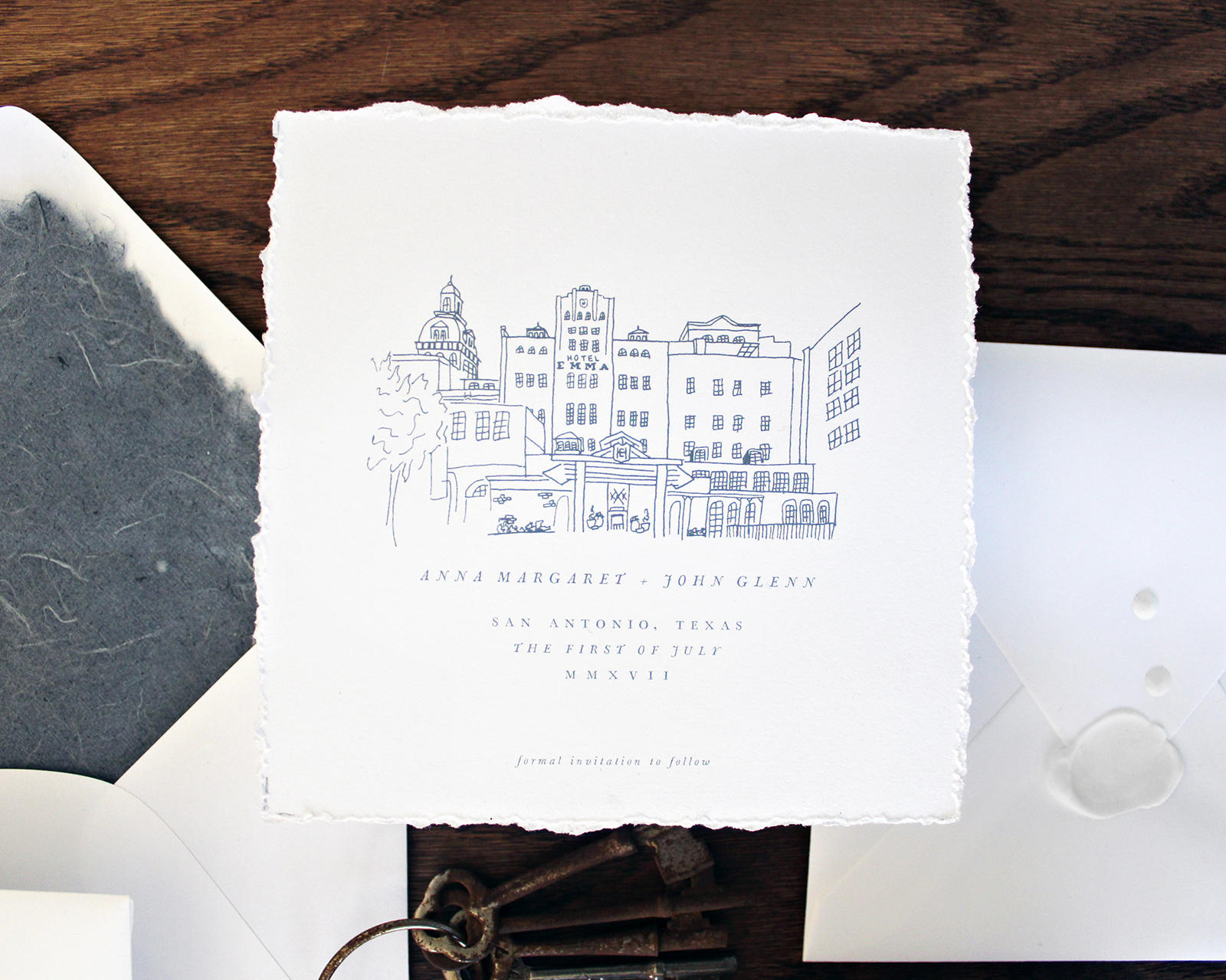
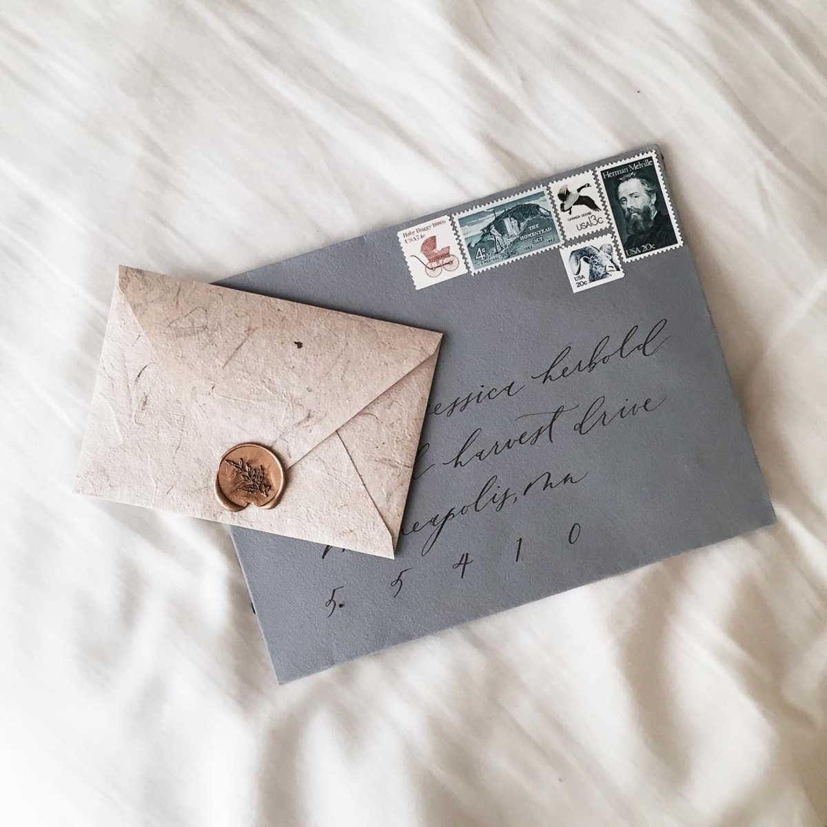
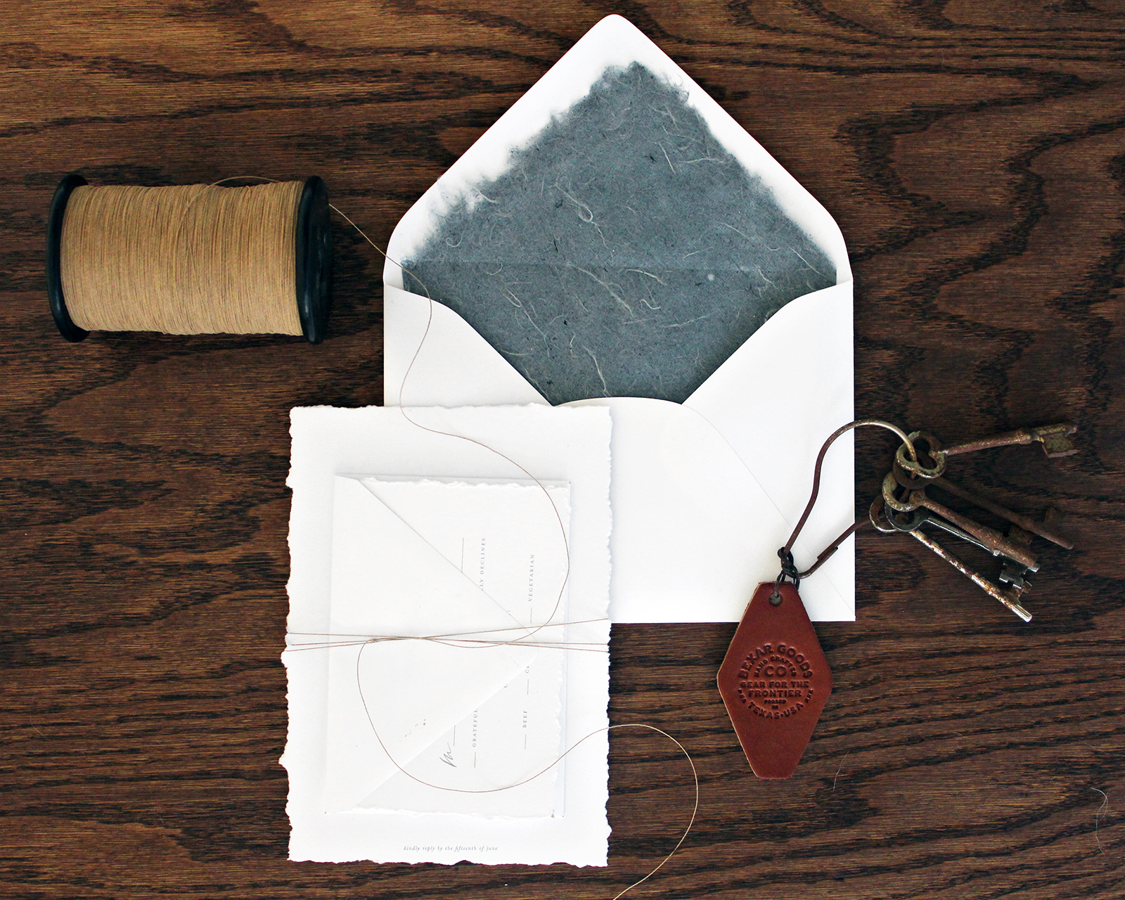
The Hotel Emma has custom seersucker robes in their rooms, so when I saw this matching shade of chambray blue handmade paper from Share Studios, I knew it would make the perfect envelope liners. They made for a pop of color that was both neutral and refreshing. The entire design is very simple, focusing on my calligraphy and the venue illustration, so I decided to leave the natural deckled edge on the liners.

Elegant Monochromatic Calligraphy Wedding Invitations by Lazywood Lane

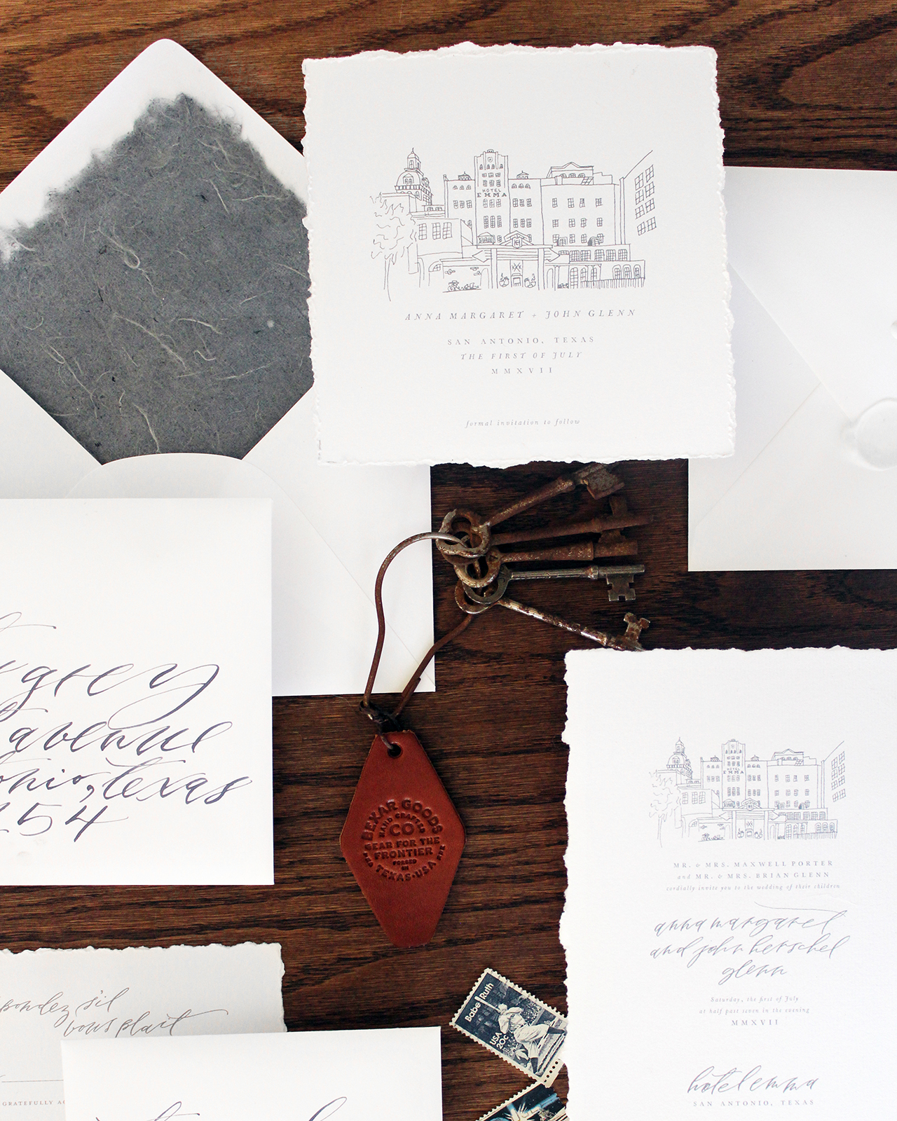
The white envelope was sealed with matching white wax and a blank seal. Again, to keep the focus on the simplicity of the design and the shade of dusty blue inspired by their bathrobes and the hotel tile that was chosen by the American design firm, Roman and Williams.

Elegant Monochromatic Calligraphy Wedding Invitations by Lazywood Lane

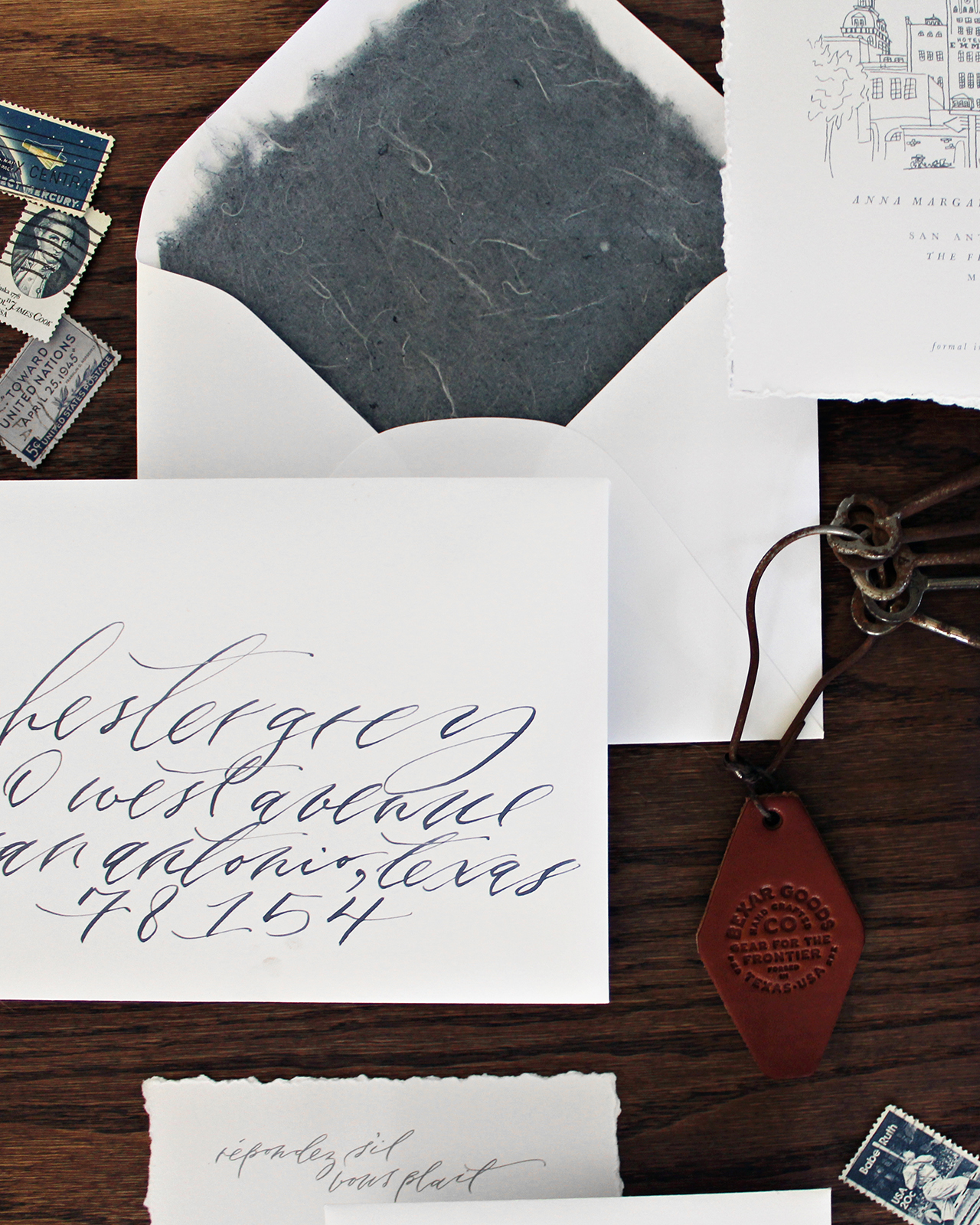
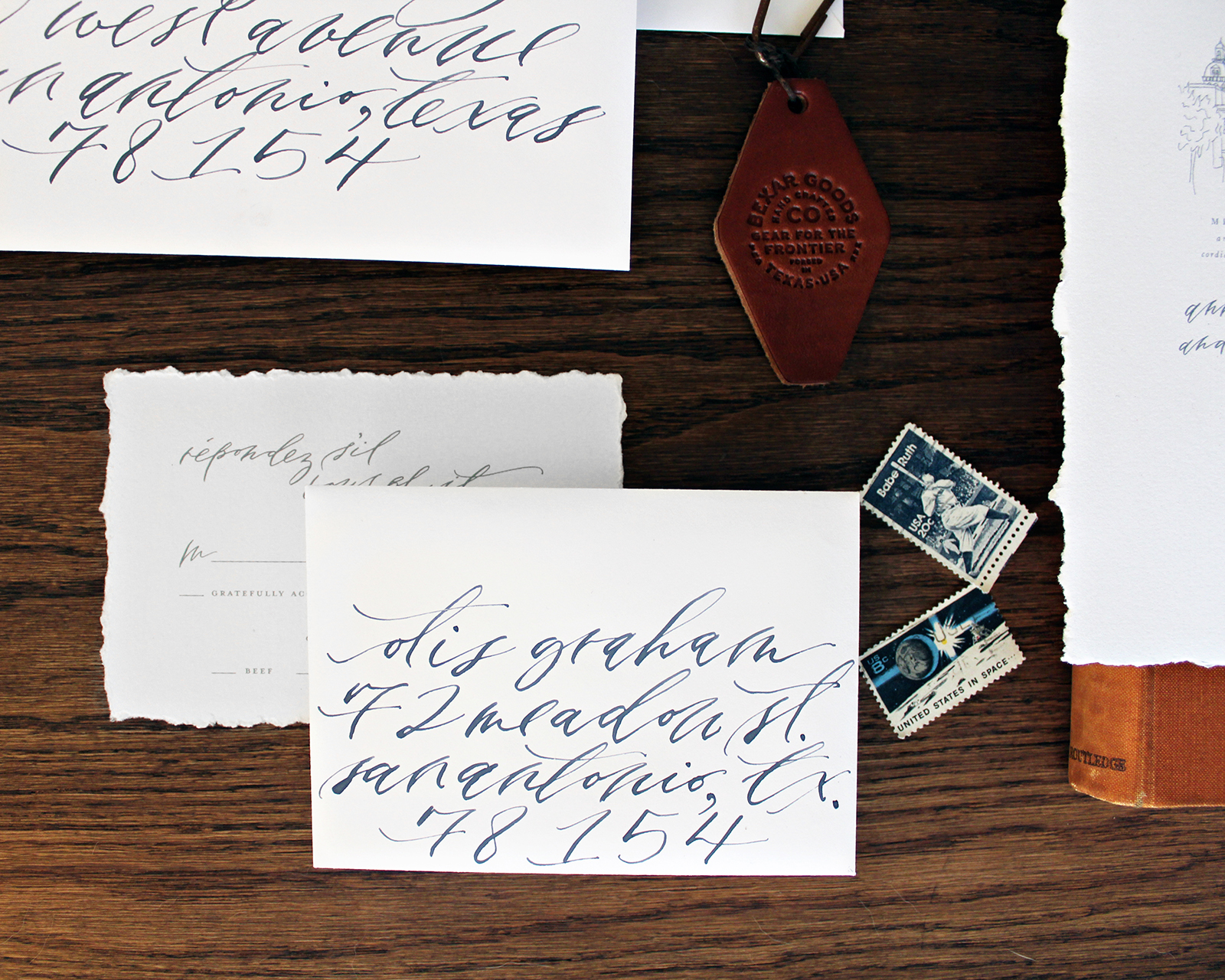
The envelopes were addressed in custom mixed blue-gray ink and lettered in an organic, perfectly imperfect calligraphy hand. I strive to make my hand feel authentic, yet refined. This is my signature calligraphy style, which I wanted to appear delicate and effortless.

Elegant Monochromatic Calligraphy Wedding Invitations by Lazywood Lane

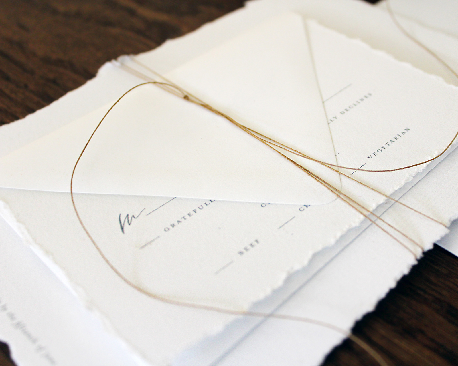
To complete the natural, delicate feel of these invitations, I tied everything up with fine kraft paper twine which I wrapped around the suite in an intentionally imperfect way.
Elegant Monochromatic Calligraphy Wedding Invitations by Lazywood Lane

Elegant Monochromatic Calligraphy Wedding Invitations by Lazywood Lane

Thanks Nicolette!

Design: Lazywood Lane

Paper: Share Studios

Check out the Designer Rolodex for more tal­ented wed­ding invi­ta­tion design­ers and the real invi­ta­tions gallery for more wedding invitation ideas!

Photo Credits: Nicolette Selman

Purple and Gray Watercolor Wash Wedding Invitations

Watercolor and letterpress printing are such a fabulous combination. Lauren of Darling + Pearl designed these gorgeous purple and gray watercolor wash wedding invitations for a wedding in Philadelphia with the juxtaposition of hard and soft in mind. Other special touches, like the floral envelope liner, perfectly curated vintage postage, and the print of city hall, pull everything together in such a beautifully cohesive way!

Purple and Gray Watercolor Wash Wedding Invitations by Darling and Pearl

From Lauren: The inspiration for Nicole and Matthew’s wedding invitations was heavily drawn from their Philadelphia venue, Front + Palmer, a modern loft style venue in the city that was renovated from an old barrel factory. How rad is that? We wanted to emphasize the balance between masculine and feminine, hard and soft, and color and neutral (which is usually my aim as I piece together the elements of my work anyway, so it was definitely a win-win.)

Purple and Gray Watercolor Wash Wedding Invitations by Darling and Pearl

Purple and Gray Watercolor Wash Wedding Invitations by Darling and Pearl

It was ridiculously fun seeing all these elements come together! The suite was letterpress printed in grey with varying watercolor elements throughout. The main invitation had a patina-esque background wash that picked up some of the lavenders from the STUNNING floral print envelope liner and the backside of the information card.

Purple and Gray Watercolor Wash Wedding Invitations by Darling and Pearl

Purple and Gray Watercolor Wash Wedding Invitations by Darling and Pearl

Nicole and Matt LOVED the idea of representing the city within their wedding stationery. We included a black and white print of iconic Philadelphia city hall that I’m sure has now made for an awesome keepsake for many of their guests. We used dark purple reply envelopes so we could letterpress print their return address in silver.

Purple and Gray Watercolor Wash Wedding Invitations by Darling and Pearl

The icing on the cake for the invitation design was certainly the vintage postage we curated. Vintage stamps can really pull everything together even more when they’re chosen effectively. It’s really inspiring to check out all of the postage that’s still available out there.

Purple and Gray Watercolor Wash Wedding Invitations by Darling and Pearl

Purple and Gray Watercolor Wash Wedding Invitations by Darling and Pearl

For their day-of stationery we letterpress printed small thank you notes that were placed at each table setting. Nicole and Matt were able to express a sweet sentiment to their guests and also introduced some new watercolor elements that lead back to the originality of their invitations, but in a refreshing and cohesive way.

Purple and Gray Watercolor Wash Wedding Invitations by Darling and Pearl

Thanks Lauren!

Design: Darling + Pearl

Darling + Pearl is a member of the Designer Rolodex – you can see more of their beautiful work right here or visit the real invi­ta­tions gallery for more wedding invitation ideas!

Photo Credits: Lauren Reed

Playful Mountain-Inspired Wedding Invitations

We’re loving these cheerful, whimsical, and playful mountain-inspired wedding invitations from Alison of One + Only Paper, from the circle puzzle save the date (so fun!) to the whimsical calligraphed envelopes. Alison incorporated photography throughout the invitation suite, and the various images add just the right amount of texture to this flat printed suite. The real showstopper is the bellyband that also serves as a map and poster – all in one!

Playful Mountain-Inspired Wedding Invitations by One and Only Paper

From Alison: Melissa and Phil were married in late summer in Asheville, North Carolina, a fun mountain town with its own unique vibe. Melissa and Phil both love puzzles and games, and their fun loving, relaxed vibe set the tone for a super fun wedding suite.

Playful Mountain-Inspired Wedding Invitations by One and Only Paper

We started with their save the date, and decided to make it extra special; we created a circle puzzle for their guests to solve. It was the perfect way to communicate to guests that this would be no ordinary wedding.

Playful Mountain-Inspired Wedding Invitations by One and Only Paper

Playful Mountain-Inspired Wedding Invitations by One and Only Paper

I worked closely with Gabrielle of Quietude Co. on the invitations. As Phil and Melissa are personal friends of ours, we wanted to be sure to do something spectacular and perfectly them for their invitations. The showstopper of the invitation suite was their welcome map. It functioned as a belly band in the envelope, and unfolded to an illustrated map of Melissa and Phil’s favorite spots in Asheville on one side, and a poster that guests could interact with during the wedding weekend on the other. We encouraged guests to visit the spots on the map, and take a photo of their poster, stating that they had #phunwithphilissa, Phil and Melissa’s wedding hashtag.

Playful Mountain-Inspired Wedding Invitations by One and Only Paper

Playful Mountain-Inspired Wedding Invitations by One and Only Paper

We kept the invitation clean and simple, with everything else going on in the suite, we wanted it to call attention in its simplicity. The backside featured their monogram. Another special touch was that all of the pieces for this suite were double sided, as we wanted it to feel fun and unexpected, like a surprise.

Playful Mountain-Inspired Wedding Invitations by One and Only Paper

Playful Mountain-Inspired Wedding Invitations by One and Only Paper

Something else unusual for this suite was the use of photography. We felt it would be another unique touch, and add color and texture in a more effective way than just using flat colors. We used succulents on the back side of the reply card to tie in the succulents that Melissa and Phil planned to grow and use as centerpieces at the wedding, and the mountains were evocative of the beautiful mountain views throughout Asheville.

Playful Mountain-Inspired Wedding Invitations by One and Only Paper

The entire suite was enclosed in an oversize navy envelope, with fresh white calligraphy on the front, a more formal touch, but the movement and beauty of the calligraphy kept it feeling fresh and modern.

Playful Mountain-Inspired Wedding Invitations by One and Only Paper

Thanks Alison!

Design: One + Only Paper

Calligraphy: Quietude Co.

Check out the Designer Rolodex for more tal­ented wed­ding invi­ta­tion design­ers and the real invi­ta­tions gallery for more wedding invitation ideas!

Photo Credits: Mikkel Paige

Purple and Fuchsia Watercolor Wedding Invitations

I’m always on board for bold watercolor washes with vibrant colors, and these purple and fuchsia watercolor wedding invitations from Lea Robinson of Lattice Tree Studio are no exception. Lea paired abstract watercolor patterns with festive hand lettering to create this bright invitation suite. We’re loving the depth that the watercolor adds to the suite and the fun envelope liner that ties the whole suite together!

Purple and Fuchsia Watercolor Wedding Invitations by Lattice Tree Studio

From Lea: Nina and Michael wanted their invitations to reflect their personal style as well as their wedding venue. They were married at a restaurant in Philadelphia, Talula’s Daily, which has a pretty whimsical style. The restaurant has modern meets rustic decor, with beautiful wooden farm dining tables. The couple also wanted to incorporate bold colors in the design. To achieve this look, I hand painted bright watercolor swashes and paired these with some hand painted leafy elements to bring in that natural/rustic feel from the restaurant’s decor. The typefaces (sans serif and script) were carefully chosen to reflect this whimsical style.

Purple and Fuchsia Watercolor Wedding Invitations by Lattice Tree Studio

Purple and Fuchsia Watercolor Wedding Invitations by Lattice Tree Studio

The main invitation is printed front and back, with the couple’s names on the back overlaid on a bright watercolor wash. This watercolor wash is also used for the couple’s return address on the outer envelopes. Their invitation suite uses inner and outer envelopes so we could incorporate envelope liners that would be both functional and add an element of surprise for the guests. I often tell my brides that envelope liners only work when the guests actually have a chance to see the liners. Often times, if the liner is used on an outer envelope, the flap is sealed and when the guest opens the envelope, they rip it at the top seam. This causes them to miss the envelope liner entirely. To avoid this, we used inner and outer envelopes, making the inner envelopes a beautiful deep purple color that would add a pop of color to the suite.

Purple and Fuchsia Watercolor Wedding Invitations by Lattice Tree Studio

Purple and Fuchsia Watercolor Wedding Invitations by Lattice Tree Studio

The RSVP cards and the accommodations/welcome dinner cards also utilized different colors of watercolor washes as well as leafy elements. The couple was having a welcome dinner before the wedding day so they wanted to include information about that, as well as the accommodations on one card (printed front and back). To add even more interest to this bright invitation suite, we mix and matched the colors of the envelopes, so the response envelopes were a beautiful lavender. This variation in colors provided a nice contrast to the entire suite.

Purple and Fuchsia Watercolor Wedding Invitations by Lattice Tree Studio

To complete the suite and to hold all of the pieces together, a tag with the couple’s initials was tied around the entire piece. I hand painted all of the watercolor elements to create a truly one of a kind design for all of my clients.

Purple and Fuchsia Watercolor Wedding Invitations by Lattice Tree Studio

Thanks Lea!

Design: Lattice Tree Studio

Invitation Printing: Printswell

Envelope Printing: Indigo Ink

Check out the Designer Rolodex for more tal­ented wed­ding invi­ta­tion design­ers and the real invi­ta­tions gallery for more wedding invitation ideas!

Photo Credits: Lea Robinson

Happy Weekend!

Happy Friday everyone! Since we usually travel for the Thanksgiving holiday, we’re just now getting our Christmas decorations out and getting our home into the holiday spirit. Alice still has no idea what all the fuss is really about, but Sophie is so excited to decorate! We’re getting our Christmas tree this afternoon from a fundraiser at Sophie’s school, and I’m sure we’ll spend the rest of the night stringing lights and hanging ornaments. With a two year old and four year old in the house, I finally bought a set of shatterproof ornaments and will set our breakable glass ornaments aside for a few years. I’ll be sure to share our tree on Instagram later tonight or tomorrow! But in the meantime…

Esther Clark Co. via Instagram

Image by Esther Clark Co. via #dailydoseofpaper

…a few links for your weekend!

This week on Oh So Beautiful Paper:

That’s it for us this week! Have a fabulous weekend, and I’ll see you back here next week! xoxo