Mother’s Day Brunch Inspiration

Nikki from Akula Kreative sent over this lovely brunch that she and her family put together to celebrate her mother’s 60th birthday. Nikki and her co-conspirators drew inspiration from her mom’s favorite activities – cooking and reading – to create this library-inspired brunch. And not only is it a beautiful birthday party, but with Mother’s Day coming up it also provides some fabulous Mother’s Day brunch inspiration!
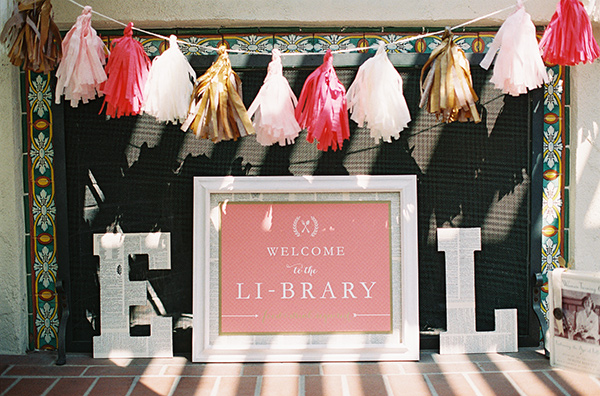
Mothers-Day-Brunch-Ideas-Akula-Kreative

From NikkiAs far as hobbies go, my mom loves two things: cooking and reading. We (her kids) always joke about how “fancy” her book club is because the ladies spend WEEKS preparing to host. Each meeting is centered around a multi-course dinner in which the food, décor, and even music corresponds to that month’s book. So, when it came time to think of a surprise for her, I decided on a “brunch party” set on the library patio of a local inn. Over the fireplace, we hung tassel garland in gold and pink (the colors of the party). Under it, we placed a framed sign that read, “Welcome to the Li-brary :: food and drink required.” (Our family name is Li.) Flanking the frame we placed my mom’s initials: giant wood letters covered with pages of a vintage dictionary.

Mothers-Day-Brunch-Ideas-Akula-Kreative2

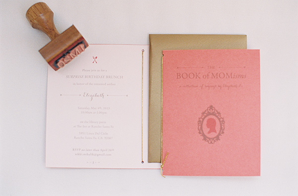
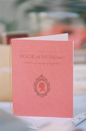
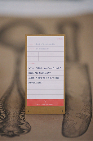
For the invitation, I made a mini book titled “The Book of Momisms.” On the inside cover, I defined “momism” as “a mother’s spoken phrase or word (real or invented) that provides endless entertainment to her children.” In other words…if my mom isn’t making up a new word, she’s making up a new definition for an existing word or saying something ridiculous. It’s endearing, frustrating, and funny all at the same time, and my brother and I record them on a regular basis.

Mothers-Day-Brunch-Ideas-Akula-Kreative4Mothers-Day-Brunch-Ideas-Akula-Kreative3

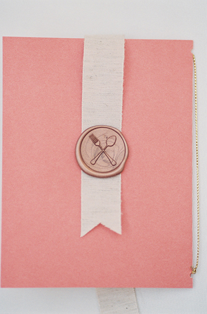
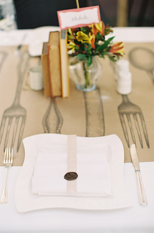
On subsequent pages of the invitation, I included brunch details, a map, and a few prime examples of momisms. One of my favorite details is the custom wax seal of a fork and spoon. We glued these to ribbons that guests could use as bookmarks for cookbooks.

Mothers-Day-Brunch-Ideas-Akula-Kreative12

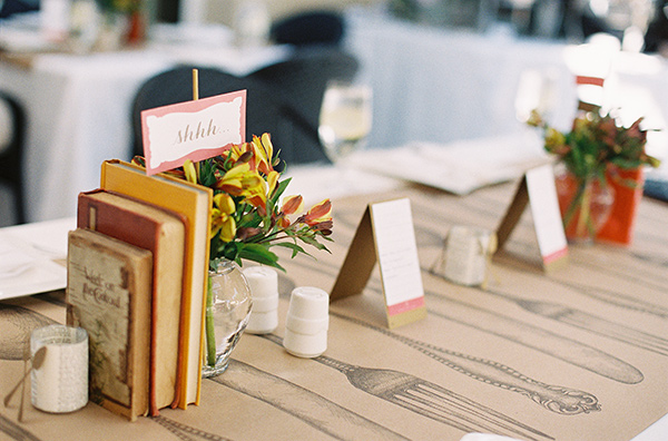
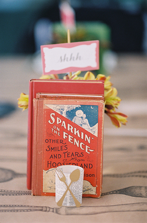
On the tables, we used a kraft paper runner printed with giant silverware. On top, we placed small groupings of vintage books (borrowed from the library) next to the existing vases of flowers at the inn. Inside each vase was a stick-mounted sign that read “Shhh” on one side and “Less talking, more eating” on the other.

Mothers-Day-Brunch-Ideas-Akula-Kreative11Mothers-Day-Brunch-Ideas-Akula-Kreative10

Sprinkled throughout were votives (also mod-podged in vintage dictionary pages) and the fork-and-spoon motif cut from gold paper.
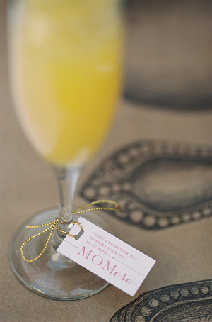
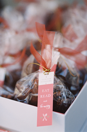
Table tent cards were designed to mimic library cards, each highlighting a classic momism. For favors, my aunts baked homemade biscotti. Attached to each bag was a mini tear-off bookmark that read “Eat, read, and be merry.” Last but not least, we splurged on tray-passed Mom-osas.

Mothers-Day-Brunch-Ideas-Akula-Kreative5Mothers-Day-Brunch-Ideas-Akula-Kreative8

Mothers-Day-Brunch-Ideas-Akula-Kreative9Mothers-Day-Brunch-Ideas-Akula-Kreative6

Thanks Nikki!

Photo Credits: Caroline Tran

Swiss Cottage Designs: Day of Wedding Stationery Inspiration

image 4.1A Post 4 Banner

I can’t believe it’s already our final blog post of this week – time is just flying by these days. It’s been a great week posting here on Oh So Beautiful Paper! Thank you to all the lovely readers for stopping by and a big thanks to Nole for the great content. We’ve had a blast! – Courtney of Swiss Cottage Designs

Back to the paper! With the summer wedding season upon us, many of our conversations have been moving towards the topic of day of elements. What are those you ask? These are all the little bits and pieces that really help make your wedding day special. You can go traditional and create lovely menus, place cards and table numbers that match your wedding theme or you can get creative with unique cocktail napkins, tote bags, custom buttons or even rub-on tattoos. The possibilities are endless! I really believe that the day of items are almost just as important as your wedding suite. They help create the look and feel of your big day while leaving your guests with something to remember. Below are some fun ideas and inspiration for brides planning their big day:

image 4.1Coasters & Matches

Photo by Edyta Szyszlo Photography via 100 Layer Cake

Coasters and matchbooks make great little take-home pieces for guests. They’re useful around the house without being cumbersome in the least and serve as a fun reminder of the special celebration.

image 4.2 Cocktail Napkins

Photo by Hello Love Photo

Cocktail napkins make an awesome day of item. They’re the perfect blend of design and function (so long as you don’t mind them getting a little dirty!). I’ve even seen people use them as pocket squares at weddings – creative!

image 4.3 Table Signage

Photo by Kristen Marie Photography via 100 Layer Cake

A well-styled wedding is all in the details. Custom table signage may seem like a small consideration, but goes a long way to unify the style and mood of the occasion.

image 4.4 Welcome Bag + Accessories

Photo by Joe Mikos

Welcome bags are a lovely gift and greeting to guests who have come from near and far. They also establish the tone of the festivities to come. A personalized tote, travel mug, water bottle and custom map of the area are just a few of the items you can include.

image 4.5 Tent Banner

Photo by Joe Mikos

I love this idea – fly your flag high and proud on your big day! Banners are an adorable day of addition, especially for outdoor tented occasions. Plus, they can serve as a signal to guide a wayward guest back towards the party!

image 4.6 Photo Guest Book

Photo by Max Wagner via 100 Layer Cake

People always say your wedding day will fly by and they’re right! This great idea takes the standard guest book to the next level with credit card sized photos and personal messages. Re-living your guests excitement and well wishes is a priceless gift.

image 4.7 Menu Setting

Photo by Trent Bailey

Guests may not notice every detail, but you can bet they’ll be looking at the menu! Such a key part of the reception is a perfect place to provide both information and continue the aesthetic of the celebration. This menu was designed so you can place the napkin over the content but the pattern still pops out on the sides.

image 4.8 Anchor Tote Bag

Photo by Hello Love Photo

Tote bags make an excellent day of item. Guests will inevitably have lots of bits and bobs to carry around during the weekend and will appreciate the extra help. I personally like making the design more neutral so guests are able to use it after the wedding weekend.

image 4.9 Temporary Tattoos

Photo by Weddings by Two

Remember how fun it was to put on temporary tattoos when you were a kid? Now you can bring that awesomeness to your big day! Tattly has tons of fun designs to choose from for weddings of all kinds. I made custom ones for my big day and they were for sure the sleeper success of my wedding.

image 4.10 Brooklyn Mugs

Photo by Weddings by Two

I love when a favor is something that your guests can use again and again, it makes it worth the effort! I’m obsessed with mugs and created custom ones for my wedding favor. Perfect for coffee, tea, or water on those days when everything else is in the dishwasher. Your guests will always remember your big day when they use it.

image 4.11 Bride + Groom Pins

Photo by Weddings by Two

As a teenager, pins were arguably the best way to let everyone know what we liked, from music to brands. Guests can don these little guys are the reception or take them home for later. We used them to break up “Groom” vs. “Bride” (though some guests picked Switzerland to be neutral).

image 4.12 Programs

Photo by Joe Mikos

 Programs are one of the most traditional day of elements. I am all about making pieces that will work for you again. I like to make the investment count! If you do an illustrated program, you’ll have this art as a way commemorate your big day for years to come.

We hope these ideas have your creative ideas flowing! Thank you again for letting us share our two cents over here on Oh So Beautiful paper, see you next time!

{images via their respective sources}

Wedding Stationery Inspiration: Pastels

I think a lot of us find a special little place in our hearts for pastels come spring, no? They’re a nice little refresher between the dark hues of fall and winter and the vibrant shades of summer. When done right these pale colors can look sweet and sophisticated, and be the perfect complement to your springtime wedding! —Kelly

Day-of Wedding Stationery Inspiration: Pastels

Photo by Delbarr Moradi Photography, Welcome Sign by Enjoy Events Co. via 100 Layer Cake

Day-of Wedding Stationery Inspiration: PastelsDay-of Wedding Stationery Inspiration: Pastels

Photo by Harwell Photography, Place Cards by Erica Loesing via 100 Layer Cake (left), Photo by Delbarr Moradi Photography, Place Cards by Enjoy Events Co. via 100 Layer Cake

Day-of Wedding Stationery Inspiration: Pastels

Photo by Rachel Peters Photography, Drink Menu by Kim Roach Designs via Wedding Chicks

Day-of Wedding Stationery Inspiration: PastelsDay-of Wedding Stationery Inspiration: PastelsDay-of Wedding Stationery Inspiration: PastelsDay-of Wedding Stationery Inspiration: Pastels

Photo by Mike Colon, Menu by Papermade Designs via Wedding Chicks (left), Photo by Rachel Peters Photography, Drink Menu by Kim Roach Designs via Wedding Chicks (right)

Day-of Wedding Stationery Inspiration: Pastels

Photo by Sarah Gawler via Style Me Pretty

Day-of Wedding Stationery Inspiration: PastelsDay-of Wedding Stationery Inspiration: Pastels

Photo by City Love Photography, Menu by Chykalophia Design via Style Me Pretty (left), Photo by Kelly Braman Photography, Menu by Lindsay Letters via Every Last Detail (right)

Day-of Wedding Stationery Inspiration: PastelsDay-of Wedding Stationery Inspiration: Pastels

Photos by Gladys Jem Photography, Escort Cards and Programs by Charmed Events Group via Style Me Pretty

{images via their respective sources}

Gold Foil Hand Lettered Wedding Invitations

Happy Monday everyone! Before I head off for a few days in the sun, I just had to share these gorgeous wedding invitations from Arley-Rose and Morgan of Ladyfingers Letterpress! Created for a wedding in the Dominican Republic, these invitations feature Arley-Rose’s signature hand lettering in stunning metallic gold foil, a beautiful rainbow roll sunset, architectural laser cut details, and a pop of bright neon edge painting. Love, love, love!

Neon-Gold-Foil-Hand-Lettered-Wedding-Invitations-Ladyfingers-Letterpress6

From Arley-Rose and Morgan: It didn’t take long for Michelle and Geoff to knock us off our feet and inspire us to make some of our most favorite invitations we’ve ever made! Influenced by their correspondence through adorable hand-written cards, genuinely sweet emails, and giddy phone calls filled with excitement and pure joy, we put our heads together to come up with some invitations fit for some of the sweetest clients we’ve ever had!

Neon-Gold-Foil-Hand-Lettered-Wedding-Invitations-Ladyfingers-Letterpress5

Since their wedding is going to be held in the Dominican Republic, they wanted an invitation suite that reflected the excitement and love they have for each other, while relaying the modern simplicity of their beautiful ocean-side venue. 

Neon-Gold-Foil-Hand-Lettered-Wedding-Invitations-Ladyfingers-Letterpress

Their hand-lettered invitations were hot foil stamped in bright gold foil onto thick, 220lb cotton Crane Lettra paper. On the backside of the invitation, a drawing of the sunset from the Casa Kimball infinity pool was rendered as a dual-split letterpress rainbow roll. Hot pink edge painting was applied to the edge of each piece, giving just the perfect amount of pop for each invitation!

Neon-Gold-Foil-Hand-Lettered-Wedding-Invitations-Ladyfingers-Letterpress4

Neon-Gold-Foil-Hand-Lettered-Wedding-Invitations-Ladyfingers-Letterpress9

The design for their enclosure mimics a pattern found in one of the architectural features at the venue. The pattern was then laser cut out of a Shimmer Ice paper and assembled with a pocket in the back to hold the RSVP card and envelope.

Neon-Gold-Foil-Hand-Lettered-Wedding-Invitations-Ladyfingers-Letterpress10

Neon-Gold-Foil-Hand-Lettered-Wedding-Invitations-Ladyfingers-Letterpress2

Their bright gold outer envelope is lined with a soft blue paper that was letterpress printed with a serene ocean design, and a letterpress return address. In the end, we were sad to see these invitations leave our studio, but happy to know that they were going to a good home. Sure enough, every time we come across the extras that we made here in the studio, we think of Michelle and Geoff and are reminded how fortunate we are to be able to make beautiful things for wonderful people!

Neon-Gold-Foil-Hand-Lettered-Wedding-Invitations-Ladyfingers-Letterpress7

Thank you so much ladies!

Ladyfingers Letterpress is a member of the Designer Rolodex – check out more of their beautiful work right here or visit the real invi­ta­tions gallery for more wedding invitation ideas!

Photo Credits: Ladyfingers Letterpress

Hello Brick & Mortar: Order Up!

If you’re in the mood for a simple nuts & bolts post, here it is: Ordering. Namely, how to get your retailers to do more of it. Assuming you like that sort of thing. ~ Emily of Clementine.

OSBP-Hello-Brick-and-Mortar-Clementine-by-Emily-McDowell-Illustration

Illustration by Emily McDowell for Oh So Beautiful Paper

Let’s get gushy for a second: I love ordering. I devour your catalogs and squirrel them away. I take you to the beach and pull you out in front of the fire. At my shop, I’ll gladly fawn over issuu when I have 18 other things to do. Ordering is the dinner & dancing of our relationship. It’s where I commit and you send me a beautifully wrapped box. It’s the most fun.

Yet there are enough trips and starts in the ordering process that some orders are never started and others go unfinished. Let’s break it down and see how to get those orders coming in.

When and why do I make orders?

  • I make an opening order when: I fall for your cards & I think they will sell. Often, this is because you reached out personally (and maybe because you kept in touch).
  • I make a re-order when:
    • I run out of a several things that have sold well.
    • A customer requests something that has sold out.
    • A holiday is coming up (maybe).
    • You find a way to entice me.
    • You check in.
    • Your line fits and offers something new to customers.

ClementineBirthdayCards

A display of Birthday cards at Clementine. Color, size, variety. I often order based on how your line would complement my existing lines.


Your Catalog. Your Calling Card: 

The best catalogs (paper or online) have nice, bright photos and clear terms. Retailers are different, so ideally you have a paper and online option. Here are some pros and cons of each option:

  • Paper Catalog:
    • Pros: Well, we all love paper, so there’s that. Flipping, circling, dog-earring. I like them best when they’re mailed to my shop. I like them least when I’m lugging them through Penn Station.
    • Cons: I have to have it with me to order and I still have to write the order down and send it to you. Also, it seems to be standard for catalogs to have terms and prices in the front or back. This means I have to flip back and forth frequently (especially if you have cards, card sets, gift tags, prints….) This takes a while and is the #1 reason it takes forever to fill out an order.

NSS catalogs

Some of the catalogs that traveled home with me from NSS 2013. Pretty, but pretty doesn’t carry itself.

  • Issuu: Most of you use issuu, so I’m assuming most are familiar. I like it. I dont’ love it, but I like it.
    • Pros: It’s online so I can pull it up anytime. Your updates are instant. I don’t have to dig in my files. I can send you a quick order. You can link to it easily in emails to me.
    • Cons: I still have to write/email out my order and it’s harder to “flip” through if the prices/quantity requirements are at the back. Also, sometimes the format gets wonky, especially on an ipad.
  • Online: If you have good photos and an easy website, this is pretty much just a pro except that many (myself included) do love a tangible catalog. That aside, let’s look at several online options:
    • A wholesale site just for retailers. Shopping online is my ideal form and results in my most frequent orders, because it’s quick. Especially, if you have a large line.
    • Etsy Wholesale. Did you know Etsy has a wholesale site? I’m pretty smitten because it’s a one stop shop for me. You have to apply, but I think it’s a great option if you’re not ready to build your own online shop. Also, if you already have an Etsy site, I believe transferring products is pretty easy. (Don’t quote me on that, but I think the fabulous ladies of Etsy will be checking in on this post today, so feel free to ask questions!)
    • Your existing retail site with a wholesale code. If you sell online and haven’t built a wholesale shop, a great in-between step is to simply send your retailers a wholesale code for 50% off. You may still have to work out shipping, that’s ok.

Stop the presses! What haven’t you heard from me?

  • I have to fax something in. (Wait, I’m genuinely curious, do any of you receive orders by fax?) Requiring forms that I have to fill out and send is going to delay my order. Find a way to be flexible in gathering credit card and tax IDs so that all I have to do is hit ‘submit’ or wait for your call.
  • I like you too much. Counterintuitive, I know, but  I have several lines that I liked so much it took forever to complete the order because I was trying to whittle it down. This is why it’s so important to be in contact. Silence does not always mean I’m not interested. Personal contact or an incentive can put you at the top of the stack.
  • Your line is very large. Similarly, if you have 25 pages of product, deciding what to get can take a while.
  • Your photos aren’t great/Your terms aren’t clear. Look at your own website and have a friend critique it too. A tiny, dark or fuzzy photo wont sell itself even if the card is great in person. Similarly, if I can’t find terms or contact info clearly, I may delay.
  • Your order minimums are too high and/or are inflexible. I generally order in 6s (singles) and 3s (packs/prints) even when you don’t require, because your colleagues have conditioned me to do so. Ask around, see what’s standard. But also make sure minimums and terms make sense for your business. If you are ok with orders of any size, say so.
  • I never hear from you. When should you reach out? I covered that topic at length here. In short: ask each retailer what they prefer, and always be in contact a few times a year. If you are always too busy to reach out to your retailers, it might be time to hire a rep.

What makes me order (more frequently)?

  • Flexibility. If you accept orders via web, email and/or over the phone, I’m more likely order. I mean, I’m probably never going to call in an order, but making it clear that you’re flexible sends a message and I’m more likely to email you a quick order because I know you’re open to it.
  • You’re responsive and open to dialogue. This isn’t for everyone, but if you’re open to the idea of turning a card into a print, or altering your existing products, it could lead to a dialogue between us that strengthens our relationship and gives me a new stake in your products. Obviously not all ideas are good ones and retailers should never direct your creativity, but they can offer insights into what might sell that could help your brand grow.

LLwoodlandset

Letter & Lark’s Woodland animals were singles. Colleen responded immediately to retailers’ desire to have them as a set. 

SHCOantlers

Scout’s Honor Co’s Antlers, was originally a card. I requested it as a print and Annemarie didn’t miss a beat saying yes. Also, take a page from this lady when you’re sending notes to retailers. 

  • Online, online, online. Look, I’m in the process of moving my shop, so I understand the feeling of being (incredibly) overwhelmed. If you don’t have an online wholesale shop, don’t fret. But I do make online orders far more frequently. I like to see the cards together and be able to adjust quantities in a cart. That’s something a paper linesheet can’t do (plus, the math).
  • Good photographs. I understand the ease of drawing your cards, but sketches are often very different from a letterpress card. Whenever possible, take a (nice, well lit) photo and upload at a visible size.
  • Social Media. I’ve been on the fence about how much social media affects my buying, but over the last few months I can say, without a doubt, that I’ve made orders based on sneak peeks or incentives I’ve seen (primarily on instagram, a bit on facebook).

MaconYorkInstagram

Macon York’s Can’t Get Enough of Your Love Card which I saw on Instagram, had to have, and essentially started the order there.

  • I think you’re fantastic. I know, this is somewhat intangible, but my favorite lesson of the last few years is that I want to have business relationships based on kindness, humor, generosity and a bit of bravery. If you like a retailer’s aesthetic, be in touch. Don’t be turned off if they don’t reply to your intro packet, if they make a first order and then don’t re-order. I’ve built great relationships with people even when their line isn’t right for my shop, I love those conversations and I am always happy to talk about how a line may become right for my shop, or someone else’s. Stay in touch. We’re all busy. If you believe in your product, keep going.

Have another question about orders? Post it below! Also, are you getting excited for the Stationery Show? I am! But if you’re not going, I have a post for that too. Next time…

xo! Emily