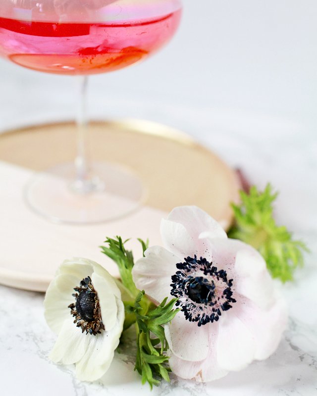
Pastel Marbled Wedding Invitations

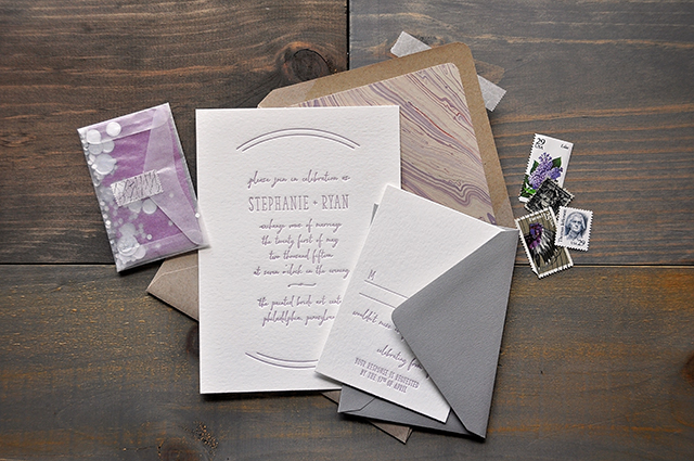
Pastels are having a major moment this fall – especially shades of pale lavender and lilac! Today we’re getting even more gorgeous pastel inspiration with these wedding invitations from Lauren at Darling + Pearl Letterpress. I’m especially in love with the lavender script text and pastel-colored marbled envelope liners!

Pastel Marbled Wedding Invitations by Darling and Pearl / Oh So Beautiful Paper

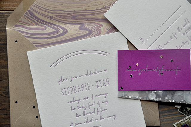
From Lauren: These invitations were originally created for The Big Fake Wedding in Philadelphia. The inspiration for these invitations was a mood board created by Ashley Buzzy Lettering and Press: a whimsical and dream-like scene with an array of pastel colors. It was really interesting working with visual inspiration that was not at all paper related. This process was much more organic and more about the feel and emotion of the event. Working through the design from that avenue was so enjoyable!

Pastel Marbled Wedding Invitations by Darling and Pearl / Oh So Beautiful Paper

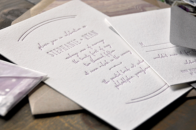
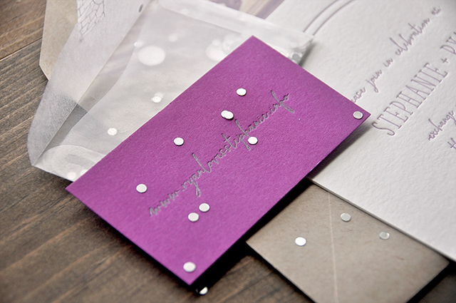
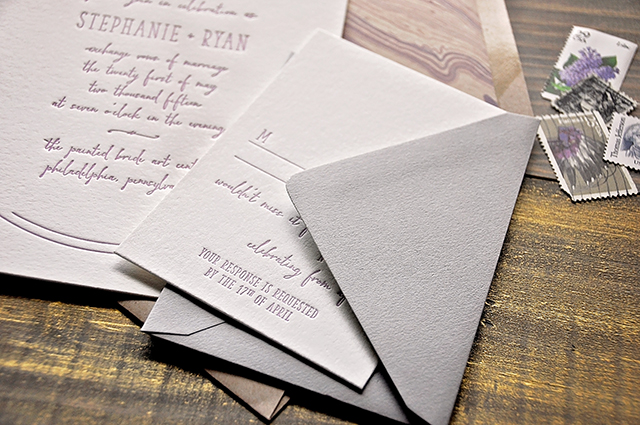
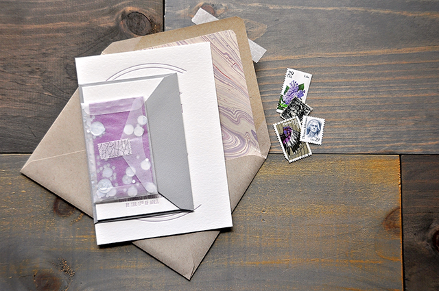
This entire suite was letterpress printed. The invitation and response cards were printed in lavender ink on double thick cotton stock. The website card was printed in silver on bright plum paper and set into a tiny vellum envelope along with silver confetti and sealed with some silver crackle washi tape. The light kraft envelopes were lined in beautiful pastel handmade marble paper that really tied the entire suite together. The warm gray response envelope added to the depth of the entire design.

Whimsical Marbled Wedding Invitations by Darling and Pearl / Oh So Beautiful Paper

Whimsical Marbled Wedding Invitations by Darling and Pearl / Oh So Beautiful Paper

I enjoy finding typefaces that complement each other and – every once in a while – I like the idea of letting the script take the “back seat” and handle the body text while the serif handles the name text. It’s a less traditional concept, but the aesthetic totally stands out. 

Whimsical Marbled Wedding Invitations by Darling and Pearl / Oh So Beautiful Paper

Whimsical Marbled Wedding Invitations by Darling and Pearl / Oh So Beautiful Paper

Thanks Lauren!

Design and Letterpress Printing: Darling + Pearl

Check out the Designer Rolodex for more tal­ented wed­ding invi­ta­tion design­ers and the real invi­ta­tions gallery for more wedding invitation ideas!

Photo Credits: Darling + Pearl

Rustic Watercolor Colorado Wedding Invitations

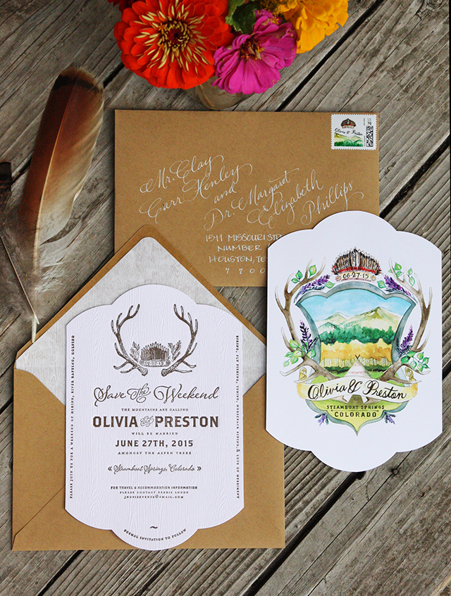
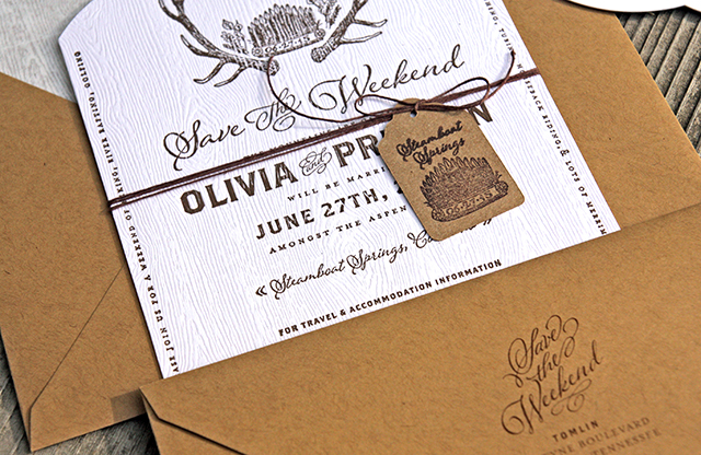
We’re starting to get some wonderful fall foliage here in DC – so I can only imagine what the mountains must look like this time of year! Bonnie and Currier from Tenn Hens Design sent over these beautiful rustic watercolor invitations designed for a wedding in Colorado this past summer, complete with a gorgeous watercolor illustrations, antler motif, and woodgrain paper. The perfect fit for a wedding weekend in the mountains!

Rustic Watercolor Colorado Wedding Invitations by Tenn Hens Design / Oh So Beautiful Paper

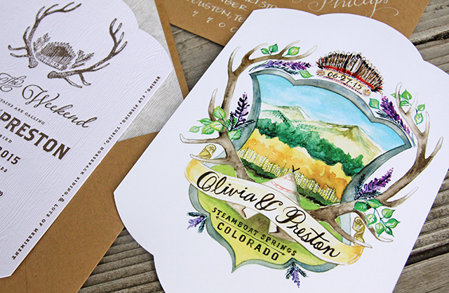
From Bonnie and Currier: Earlier this year, we got the opportunity to work on a custom wedding invitation and it was a true labor of love. The wedding called guests to the mountains of Steamboat Springs, Colorado and promised a weekend of outdoor events that were not to be missed. The bride wanted the suite to reflect her Native American heritage and the beauty of the natural setting so we created a watercolor “crest” touching on those elements.

Rustic Watercolor Colorado Wedding Invitations by Tenn Hens Design / Oh So Beautiful Paper

The save the dates were letterpress printed on woodgrain paper as a nod to the beautiful aspen trees that would surround the ceremony site.

Rustic Watercolor Colorado Wedding Invitations by Tenn Hens Design / Oh So Beautiful Paper

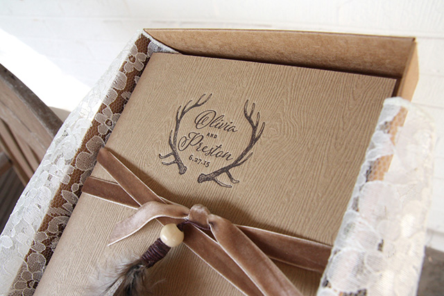
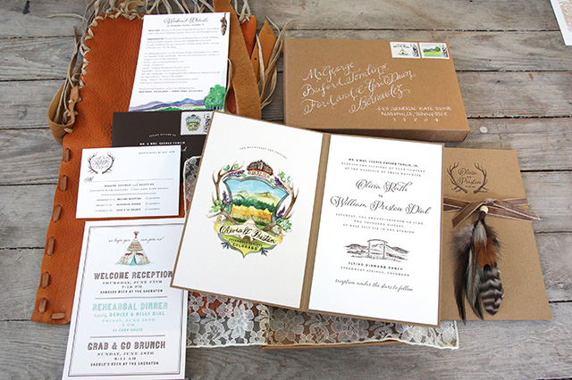
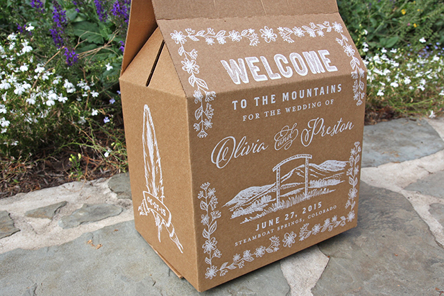
For the invitation suite we made woodgrain booklets that were carefully wrapped with handmade feather tassels and set inside a kraft box with lace. Very elegant, but with a relaxed and authentic feel of the West. The folders and invitations were letterpress printed and the watercolor pieces were digitally printed to show off all the color.

Rustic Watercolor Colorado Wedding Invitations by Tenn Hens Design / Oh So Beautiful Paper

Rustic Watercolor Colorado Wedding Invitations by Tenn Hens Design / Oh So Beautiful Paper

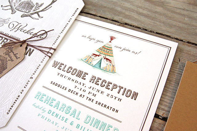
Since this was a destination wedding there was also a party card and an information card for the guests. We created watercolor illustrations to add colorful details and make each piece stand out.

Rustic Watercolor Colorado Wedding Invitations by Tenn Hens Design / Oh So Beautiful Paper

Rustic Watercolor Colorado Wedding Invitations by Tenn Hens Design / Oh So Beautiful Paper

Thanks Bonnie and Currier!

Design & Illustration: Tenn Hens Design

Calligraphy: Val Cole calligraphy

Photo Credits: Tenn Hens Design

Apple-Cinnamon Calvados Old Fashioned

Keeping with our apple theme this month, here’s one of the simplest recipes that incorporates apples into a cocktail: a Calvados Old Fashioned. It’s a tart, fun play on the classic that’s perfect for fall. – Andrew

Apple-Cinnamon Calvados Old Fashioned Cocktail Recipe / Liquorary for Oh So Beautiful Paper

Apple Cinnamon Calvados Old Fashioned Cocktail Recipe Card / Illustration by Shauna Lynn for Oh So Beautiful Paper

Illustration by Shauna Lynn for Oh So Beautiful Paper

Apple-Cinnamon Calvados Old Fashioned

2 oz Calvados
1 tsp Cinnamon Bark Syrup
2 dashes Angostura Bitters

To make the cinnamon bark syrup: combine a cup of raw sugar, a cup of water, and three cinnamon sticks (pulverized into little bits) in a sauce pan and simmer over low heat, stirring frequently, until the sugar is melted. Remove the pan from the heat and cover, letting the syrup sit to infuse for another 20-30 minutes. Then strain out the cinnamon bits and bottle the syrup.

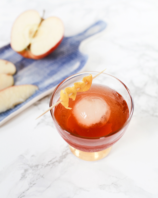
Combine the Calvados, syrup, and bitters with ice in a mixing glass and stir well. Strain into a lowball glass filled with fresh ice – the bigger the ice the better. Garnish with a piece of lemon peel, thinly peeled to avoid the bitter white pith, by twisting it over the drink and then dropping it into the glass. Enjoy!

Apple-Cinnamon Calvados Old Fashioned Cocktail Recipe / Liquorary for Oh So Beautiful Paper

Calvados is an aged apple brandy made in the Normandy region of France. It’s a rustic spirit, with a long tradition of being distilled and aged by the farmers growing the apples. So it’s a bit on the wild side, with some rough edges and a wonderfully tart, puckery apple center.

Apple-Cinnamon Calvados Old Fashioned Cocktail Recipe / Liquorary for Oh So Beautiful Paper

Using Calvados in an Old Fashioned mellows out those rougher edges, using the warm spice of the cinnamon syrup and Angostura bitters to turn the drink into a smooth cocktail perfect for fall. There’s nothing quite like checking out the changing leaves while sipping this warm, tart, wonderful cocktail.

(Don’t forget to follow us on Instagram, where we’ve been posting our experiments before they make their way onto this column!)

Glassware by Liquorary

Photo Credits: Nole Garey for Oh So Beautiful Paper

The Jane Rose

I grew up in Upstate New York, outside Syracuse, so fall means apples for me. So we’re switching gears from last month’s Smashes to talk about all the fun ways you can incorporate apples into your fall cocktails. We’re starting with a play on the classic apple-based Jack Rose cocktail with a fun and bubbly Jane Rose. – Andrew

The Jane Rose: Sparkling Apple Cider Cocktail Recipe / Liquorary for Oh So Beautiful Paper

The Jane Rose Apple Cider Cocktail Recipe Card / Illustration by Shauna Lynn for Oh So Beautiful Paper

Illustration by Shauna Lynn for Oh So Beautiful Paper

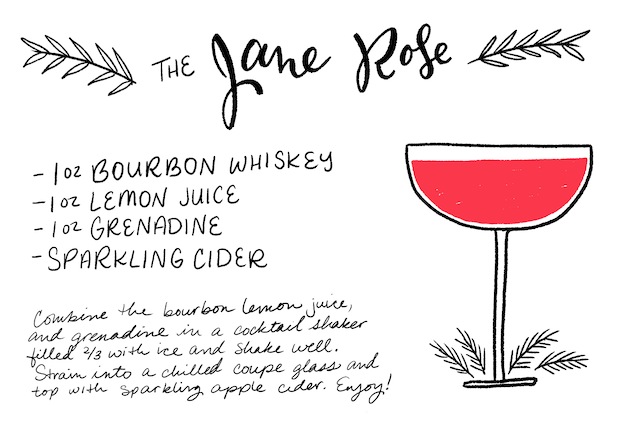
The Jane Rose

2 oz Bourbon Whiskey
1 oz Lemon Juice
1 oz Grenadine
Sparkling Apple Cider

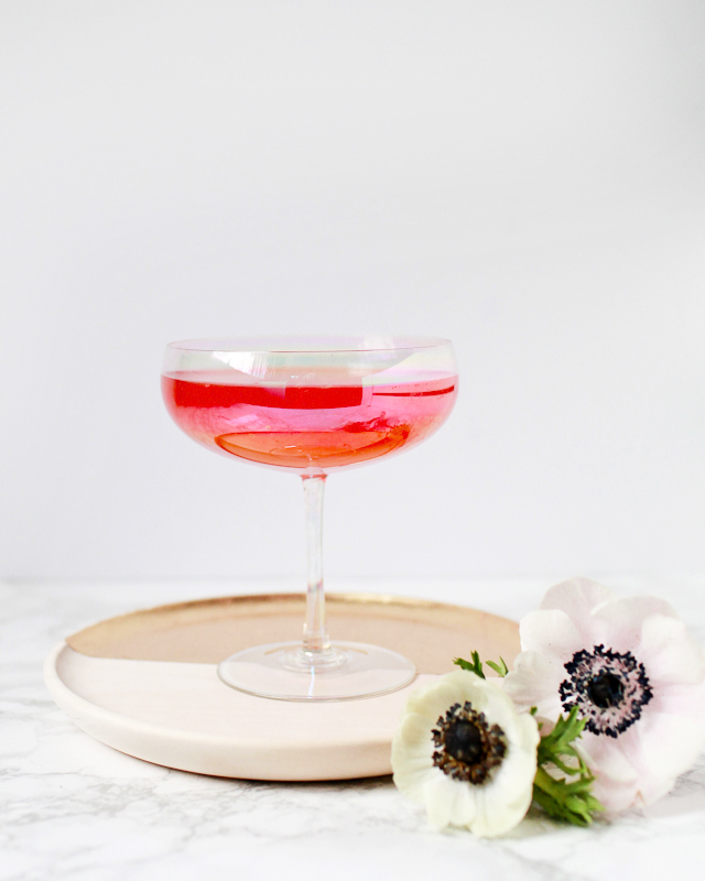
Combine the bourbon, lemon juice, and grenadine in a cocktail shaker filled two-thirds with ice and shake well. Strain into a chilled coupe glass and top with sparkling apple cider. Enjoy!

The Jane Rose: Sparkling Apple Cider Cocktail Recipe / Liquorary for Oh So Beautiful Paper

The Jane Rose swaps out the Jack Rose’s apple brandy for bourbon and instead incorporates apples through the sparkling cider. This version still has the original’s brightly tart fruit flavors and rich, oaky backbone, and adds in a fizzy effervescence from the cider that makes this a fun party drink.

The Jane Rose: Sparkling Apple Cider Cocktail Recipe / Liquorary for Oh So Beautiful Paper

Sparkling cider comes in a lot of forms. Some are basically just carbonated apple juices, minimally fermented with some champagne yeast. (I once accidentally made some of this by leaving a bottle of apple juice in the fridge for too long.) Some are fully fermented, with alcohol contents comparable to beers. These tend to be drier, so which one you use will have a big effect on how your drink turns out. A sparkling cider will be much sweeter, so use a bit less grenadine, and have no effect on the proof of your drink. A hard cider will be much drier, so use a bit more grenadine, and will bump up the alcohol content of your drink. So plan accordingly.

(Don’t forget to follow us on Instagram, where we’ve been posting our experiments before they make their way onto this column!)

Glassware by Liquorary

Photo Credits: Nole Garey for Oh So Beautiful Paper


Brick + Mortar: How “No” Can Help Grow Your Business

As an independent retailer, I receive product submissions daily. I say no often: In my head, in emails, in person. It’s uncomfortable, confrontational, and I would love to avoid it. But lately my relationship with no is changing. Though no can feel like a door closing, it also offers you the ability to carve your own path and to hone in on what you do best. If you let it, no can be the sharpest tool you have to help your business grow. ~ Emily of Clementine
Hello Brick + Mortar: How "No" Can Help Grow Your Business / Emily Blistein of Clementine for Oh So Beautiful Paper

Illustration by Emily McDowell for Oh So Beautiful Paper

I’ll set the scene:  You’re a designer, I’m a small retailer. You are excited about your line. You put together a great submission. You ship or email it to me. I say no, or worse, you don’t hear from me (oof, I’m sorry, email again!). Here are the top reasons why I say no:

  • Your work isn’t a fit for my shop.  Clementine is mine; I get to trust my gut as it screams yes or winces no. The yeses are fun, the nos are hard. There isn’t always a clear reason – maybe your style isn’t for me or maybe too many other shops have picked you up and it feels like you’re everywhere. These are the nos that make trade shows or your follow up emails hard: I love meeting each of you and watching your lines grow, but it can feel like the interaction rides on my yes or no. I’m working to see this moment differently. Rather than saying no with apology, I try to remember it is the unique combination of my yeses and nos that make my store mine. The same is true for your business. No is not a comment on your talent, or your future. A no from one shop might mean you’re ready for far bigger things. If you really want to grow your wholesale line, these are the nos you should be seeking out; they are the glacier that carves the path to stores and customers who will say yes.
Hello Brick + Mortar: How "No" Can Help Grow Your Business / Emily Blistein of Clementine for Oh So Beautiful Paper

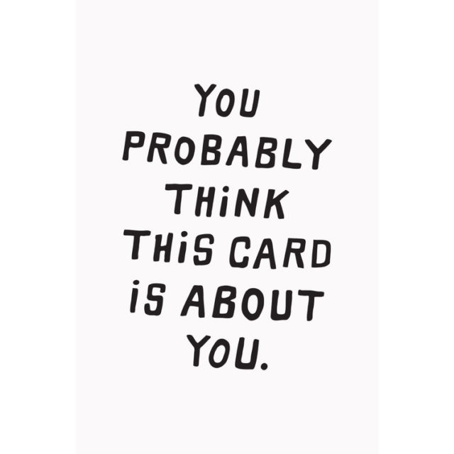
Scout’s Honor Paper reminds you: you probably think each “no” is about you, but it may not be.

  • Your work doesn’t stand out/You are growing. Maybe I have too many hand lettered lines or maybe you haven’t found your voice yet. Either way, I want each line I carry to have a consistent, unique voice. I may see something really great in what you’re doing, but I know you need time to develop. If you listen closely, this isn’t a no, it’s a “call me in a few years.”
Hello Brick + Mortar: How "No" Can Help Grow Your Business / Emily Blistein of Clementine for Oh So Beautiful Paper

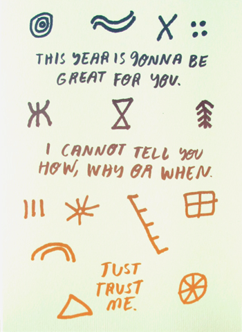
People I’ve Loved with precisely the vague encouragement I want to give to many submissions I receive.

  • Your work feels too much like someone else’s. Pretty touchy subject right? We could go down the slippery slope of copyright, but instead, here’s a story: Recently, I received a submission from a new designer. One of their cards was very similar to a card I already carried. I emailed my current seller to let them know that I was concerned. Rather than being angry or defensive, they simply said yes, it did look “inspired by” theirs but “designers see each others work often and copying is not always intentional, we’ll keep an eye out to make sure it’s only a one time thing.” I loved this response. As a retailer, it’s not my job to adjudicate copyright infringement. It is my job to make sure each line I have has a place and adds something to my store. As a designer, it’s your job to be inspired and to make (and also be sure you made it first.)
  • Your work needs work. A lot of people seem to be starting stationery lines. I applaud this. But hey, a lot of people seem to be starting stationery lines. Now more than ever, lines are launching with founders who lack traditional design or fine art experience. You don’t always need traditional training (but sometimes you do.) You should follow your dream, but if you want me to sell your dreams they need to be well designed, well printed + packaged, and distinctly your own.
Hello Brick + Mortar: How "No" Can Help Grow Your Business / Emily Blistein of Clementine for Oh So Beautiful Paper

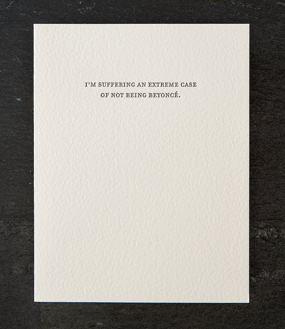
Sapling Press’s Beyonce Card: We’re all supposed to feel not like Beyonce sometimes.

  • I don’t have the space/money. This is totally not about you! At last count, I had 64 stationery lines. I would love to add more, but we’re full. Sometimes submissions come in and I think: I love it, I need it, I can’t buy it now. To these submissions I always try to say: keep in touch! And I mean it.
  • Your understanding of wholesale is a bit wonky. Sometimes I love a line, but the pricing or minimums are way off. This is common for lines that are new to wholesale. After all, without a mentor, how would you know what’s standard? Each industry is different. Luckily, a tactful email to a designer you admire, or google search will get you far (and I’ll do another post on this soon.)
Hello Brick + Mortar: How "No" Can Help Grow Your Business / Emily Blistein of Clementine for Oh So Beautiful Paper

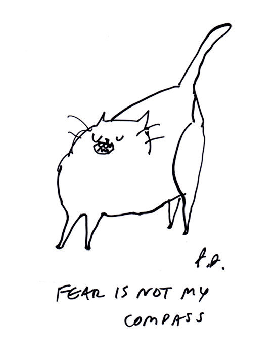
This Dancing Cat print should be your compass as you reach out to wholesale accounts.

Those are some of the reasons I say no. Now I want to try to shift your relationship with no a little more. I want you to consider inviting it in to your business. Stay with me. If you invite no into your business, you also invite more opportunities we have to hear yes. Here are a few ways I’ve seen that happen:

  • “No” can help hone your line: Stationery brands may try on several styles before finding their own. This is great for figuring out what you do best. My no, in this case, means I’m waiting to figure out who you are. But if your first catalog shows several discordant styles, I may be wary to establish a relationship with you right now. Luckily, people grow, lines develop (even after you find your voice, keep finding it)! Your voice shouldn’t be static, but it should be clear: mix your gut, your inspirations, the yesses and nos to find your style. Let nos give you permission to shed your old skin, drop the cards you don’t love, prune your line to make it stronger. Reflect on your voice and delve deeper into your style and your unique voice. (Still not sure what your voice is? There are some great podcasts, blog posts and courses that can help, I’ll share my favorites soon!)
  • “No” is an opportunity to ask for feedback. I often procrastinate saying no because every no is different: not now, not ever, not until you find your voice, I’m excited to see what you do next, I love what you’re doing but I can’t afford it. Based on the quantity of submissions I get, the quality of my replies has diminished. I want to tell you more, but I just don’t have time. Honestly, my dream job would involve having these conversations with emerging lines each day. I’m not suggesting retailers always have the time to reply, or have a clear answer why they said no, but if you’re willing to ask for more feedback, you might get some really valuable advice. How? Simply thank the retailer for replying and tell them you’d love to hear their thoughts on why it’s not a fit, or what you can do to grow your line. Don’t want to start with retailers? Ask friends and colleagues what they like about your line, push past “it’s all great!”
  • “No” helps you find your people. No doesn’t feel good until you get some yeses. When you do, you start building your identity, your brand, and your tribe. Your first wholesale submissions should cast a wide net. They should grow more tailored as you understand the landscape. Some stores may take several submissions before you get a yes. Some will never say yes. But as your line evolves, no will become something you rely on to help spur you further and relieve you from the places you shouldn’t be.
Hello Brick + Mortar: How "No" Can Help Grow Your Business / Emily Blistein of Clementine for Oh So Beautiful Paper

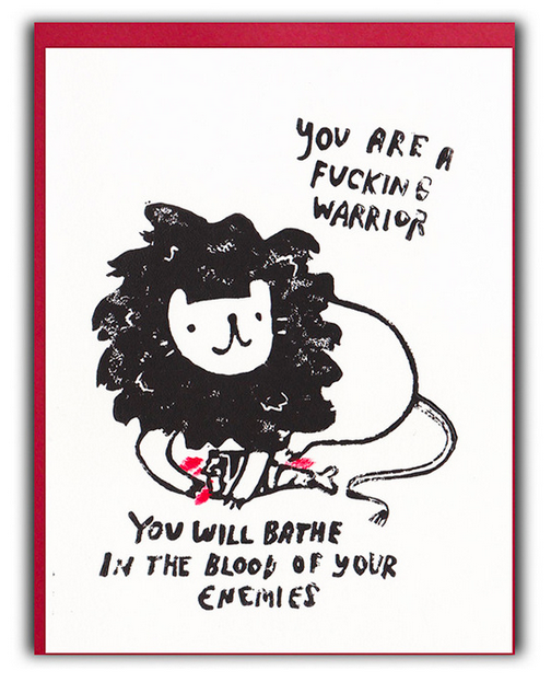
Ghost Academy’s Warrior Card ~ for the days that “no” has you down, remember….

I own Clementine, in large part because of some big nos I’ve been dealt. Yet, some days I’m still not brave enough to say no to others. This post is to remind me to embrace no too. When I avoid no, emails go unanswered, thoughtful submissions pile up, we stay stagnant. Instead let’s make a space to give and receive everything no has to offer.  I know that no feels weighty, but it doesn’t have to be a barrier. If you’re open to hearing no, you can help determine how it guides you. That’s powerful stuff.

You know? (Now I’d love to hear your stories of no)