Modern Gold and Plum Watercolor Wedding Invitations

It’s been a minute since we featured some gorgeous wedding invitations, so let’s jump right back in the saddle with these modern gold and plum watercolor wedding invitations from designer and calligrapher Ash Bush! These stunning invitations highlight her gorgeous lettering and painterly skills. And can we talk about the navy outer envelopes for a moment, please? A sweep of gold paint, modern lettering, and a vintage stamp collage!

Modern Gold and Plum Watercolor Wedding Invitations

From Ash: Talk about dream project! Working with Laura and Doug on their custom watercolor wedding invitations was so life-giving. They were getting married at the Springs Preserve in Las Vegas, a beautiful, botanical oasis. Her colors were jewel-toned berry and deep navy blue, along with some pops of plum and glittery gold. The minute I heard her vision was the minute I fell in love with this suite.

Modern Gold and Plum Watercolor Wedding Invitations

I went very modern and painterly for the style and feel of the whole suite as well as the custom lettering. The outer envelope totally stole the show. They were a beautiful deep blue, and we contrasted that with a bright gold brushstroke across the front. The gold was topped with some white lettering, and the white lettering carried over onto the back return address flap. We also carried the gold lettering over onto the rsvp envelopes, but in a subtle way.

Modern Gold and Plum Watercolor Wedding Invitations

Everything was paired with paint splatters and tons of gorgeous texture. Laura opted for curated vintage stamps on her envelope, and that was totally the cherry on top of an already delicious sundae! To really complete the suite I designed a custom envelope liner in a subtle gradient of her colors, paired with some watercolor texture. And then I went through and hand-speckled the invites and envelopes with gold splatters, totally worth it!

Modern Gold and Plum Watercolor Wedding Invitations

Her day-of details consisted of the most amazing dip-dyed escort cards. I dipped them all by hand in a custom berry ink, and blue watercolor mixture, and then paired it with gold lettering. The event planner then hung them all along with greenery to create a stunning visual at the reception. I also made some custom signs for her food tables and bar settings.

Modern Gold and Plum Watercolor Wedding Invitations

I don’t think I’ll ever stop dreaming about this wedding suite, and the photos from the day show how beautifully it all came together to create a bohemian and modern high-end style.

Modern Gold and Plum Watercolor Wedding Invitations

Watercolor Wedding Escort Card Display

Thanks Ash!

Design: Ash Bush
Paper: French Paper Co.
Envelopes: Cards & Pockets
Event Planning: Scheme Events 

Check out the Designer Rolodex for more tal­ented wed­ding invi­ta­tion design­ers and the real invi­ta­tions gallery for more wedding invitation ideas!

Photo Credits: Gaby J Photography

Behind the Stationery: And Here We Are

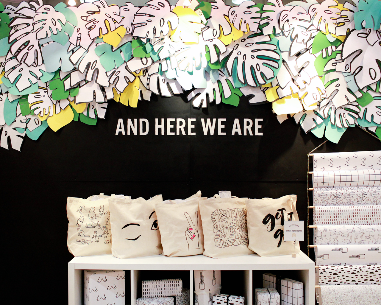
Everyone has such unique stories about how they came into the stationery world and Meghan from And Here We Are is no exception. Meghan eased into the stationery industry after designing and printing her own wedding invitations, and after 9 years in New York, moved her Brooklyn studio to Columbus, Ohio where she recently moved (again!) to an industrial space. Walking us through her design process from brainstorming and sketching to printing techniques, here’s Meghan! —Megan Soh

Behind the Stationery: And Here We Are

From Meghan: Hi there! I’m Meghan, owner and founder of And Here We Are, a design & letterpress printing studio based in Columbus, Ohio. I went to school for graphic design – and back again for typeface design – and in past lives have worked as a textile designer, a designer in a traditional firm, an in-house designer for a PR firm, and finally, a print designer at a television network. I live in the Short North neighborhood here in Columbus with my husband, John, our son Wiley, and our dog Martha.

Behind the Stationery: And Here We Are

And Here We Are launched in 2012 out of our apartment in Greenpoint, Brooklyn. It started after I went a little nuts on our personal wedding invitations and paper goods, and the press led to several more custom wedding commissions. I always loved letterpress printing, which I’d discovered in college, and was really excited about the idea of getting my hands dirty again!

Behind the Stationery: And Here We Are

I worked nights and weekends for about a year before I officially left my day job to purse paper goods full time. At first I was working out of the corner of our living room, meeting clients in coffee shops and renting letterpresses at a local studio in Brooklyn. We bought our first letterpress in 2015, and moved out here to Columbus (after 9 years in New York) in search of affordable space. We were lucky to find an adorable little Victorian house just north of Downtown with a 400 square foot sun room that made a perfect home studio.

We worked out of this studio until it was just about bursting at the seams; we recently moved all of our equipment and product stock out into a 1,000 square foot space across town. Being in this industrial space will allow for more (and heavier) equipment, and I plan to host events and workshops, too.

Behind the Stationery: And Here We Are

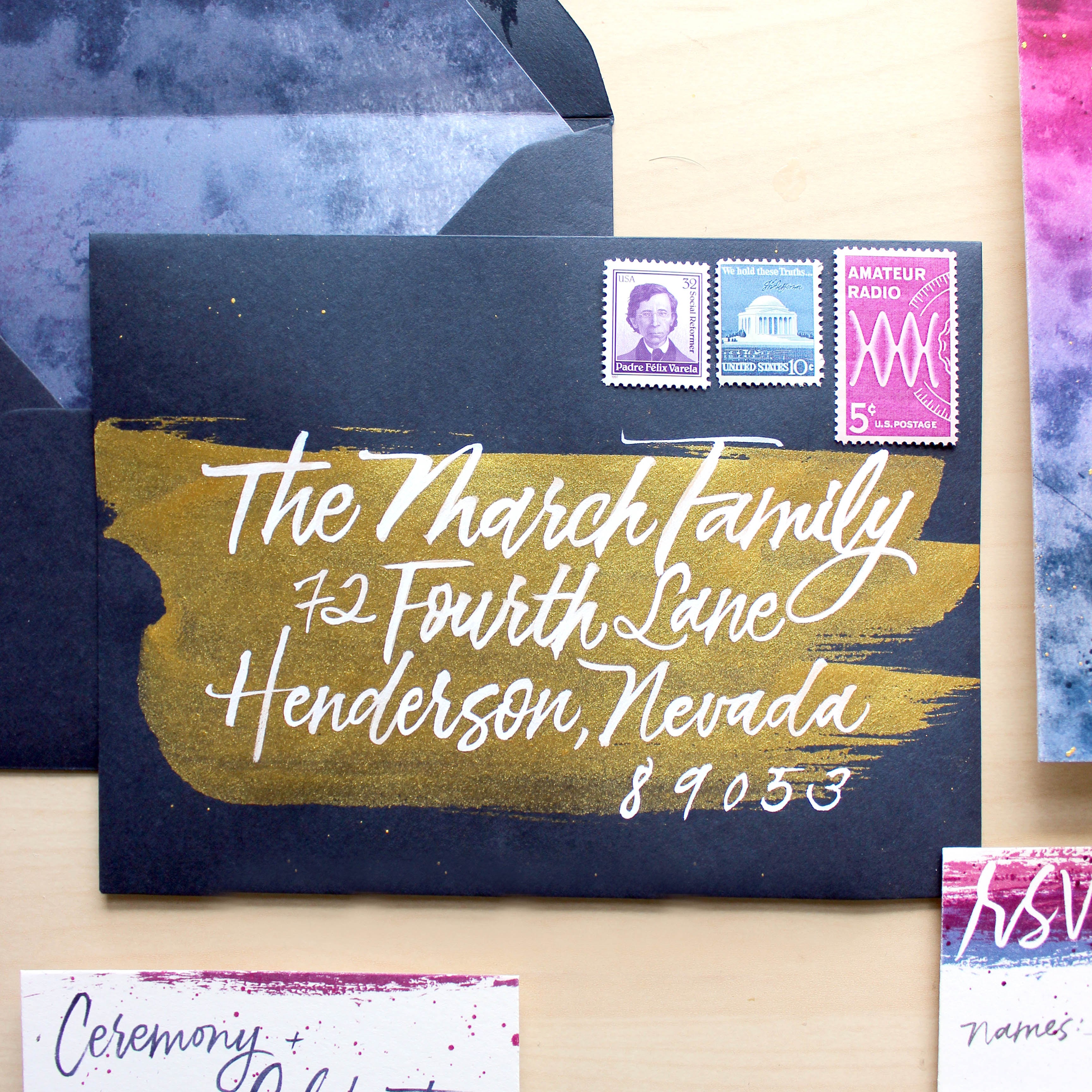
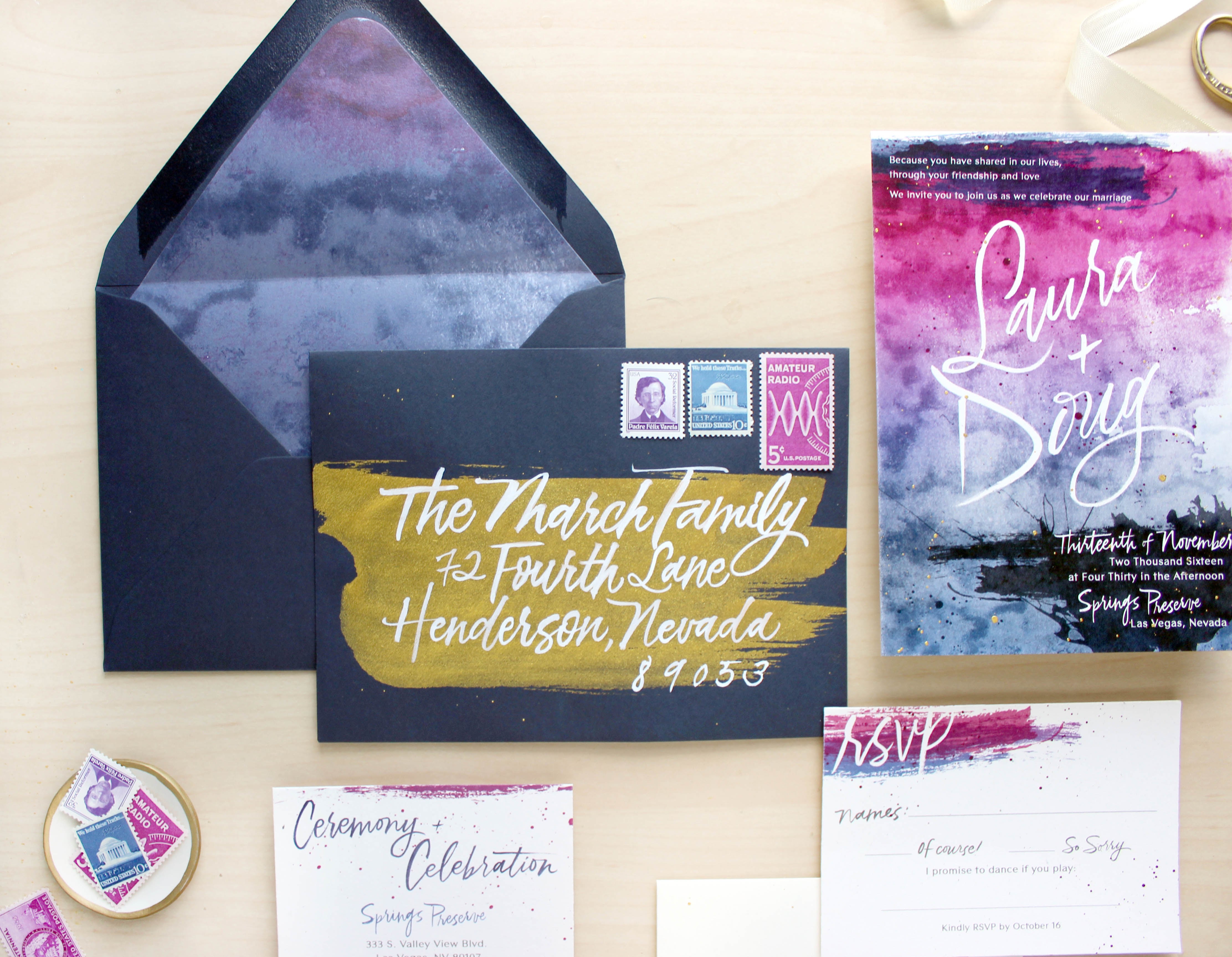
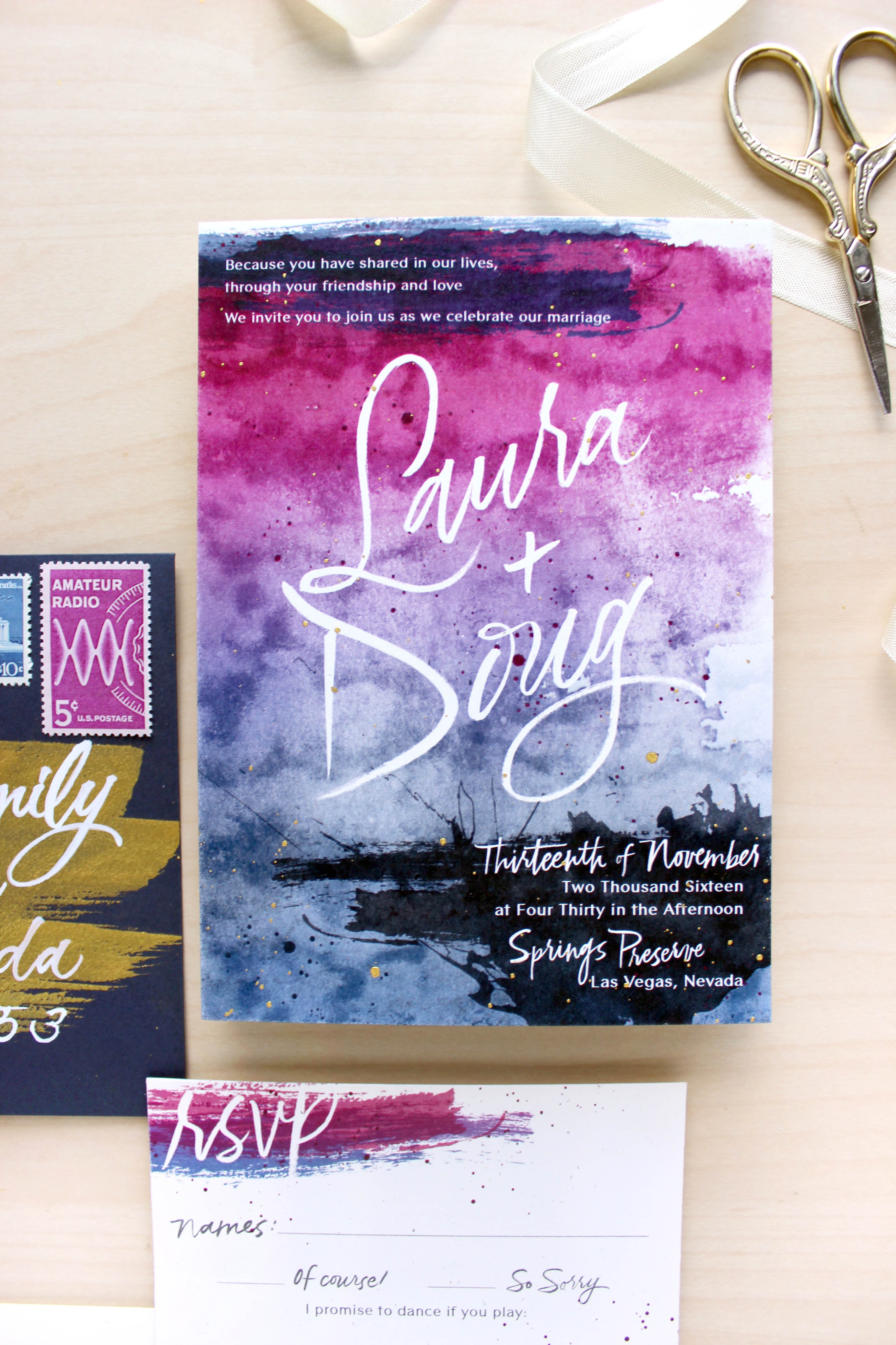
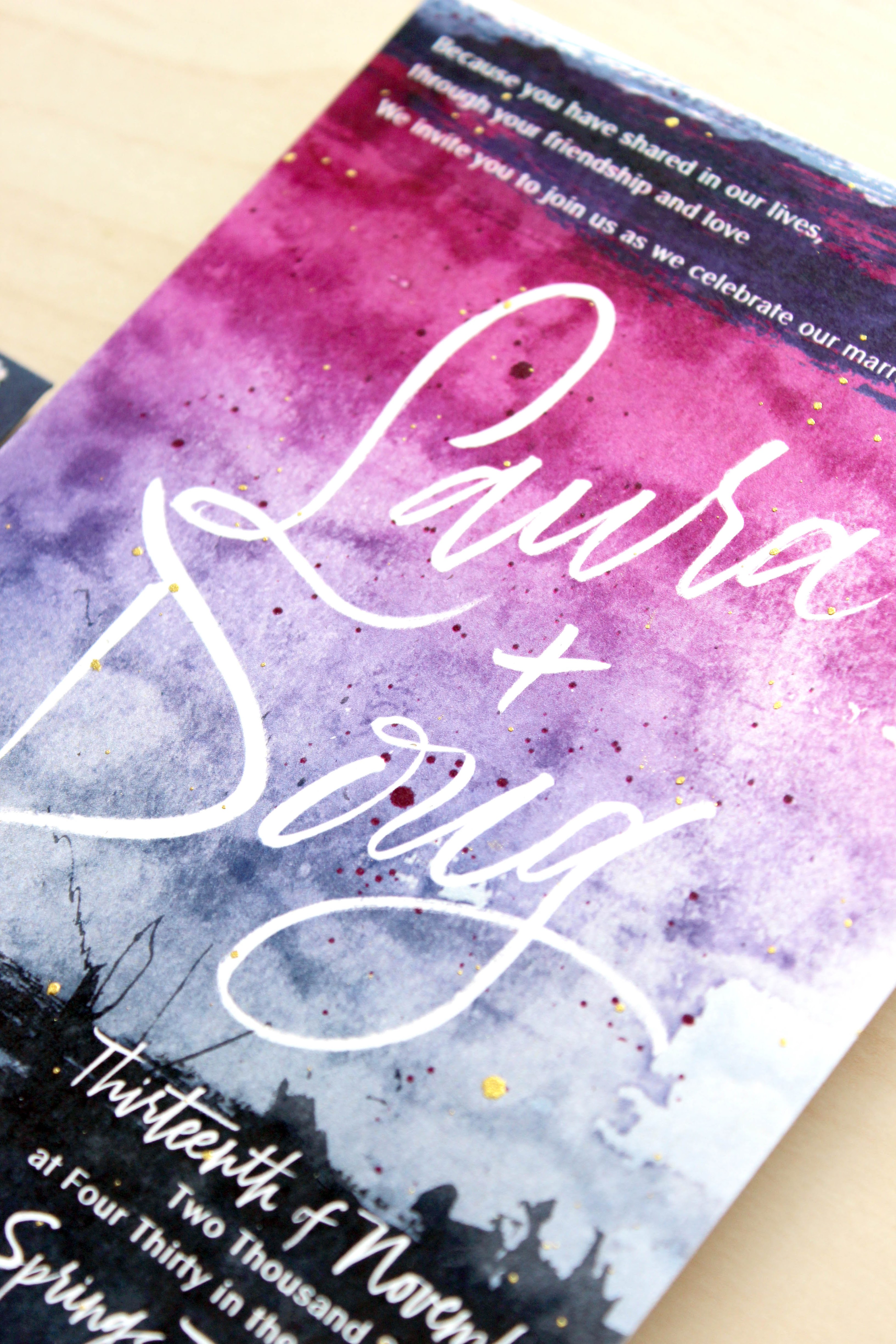
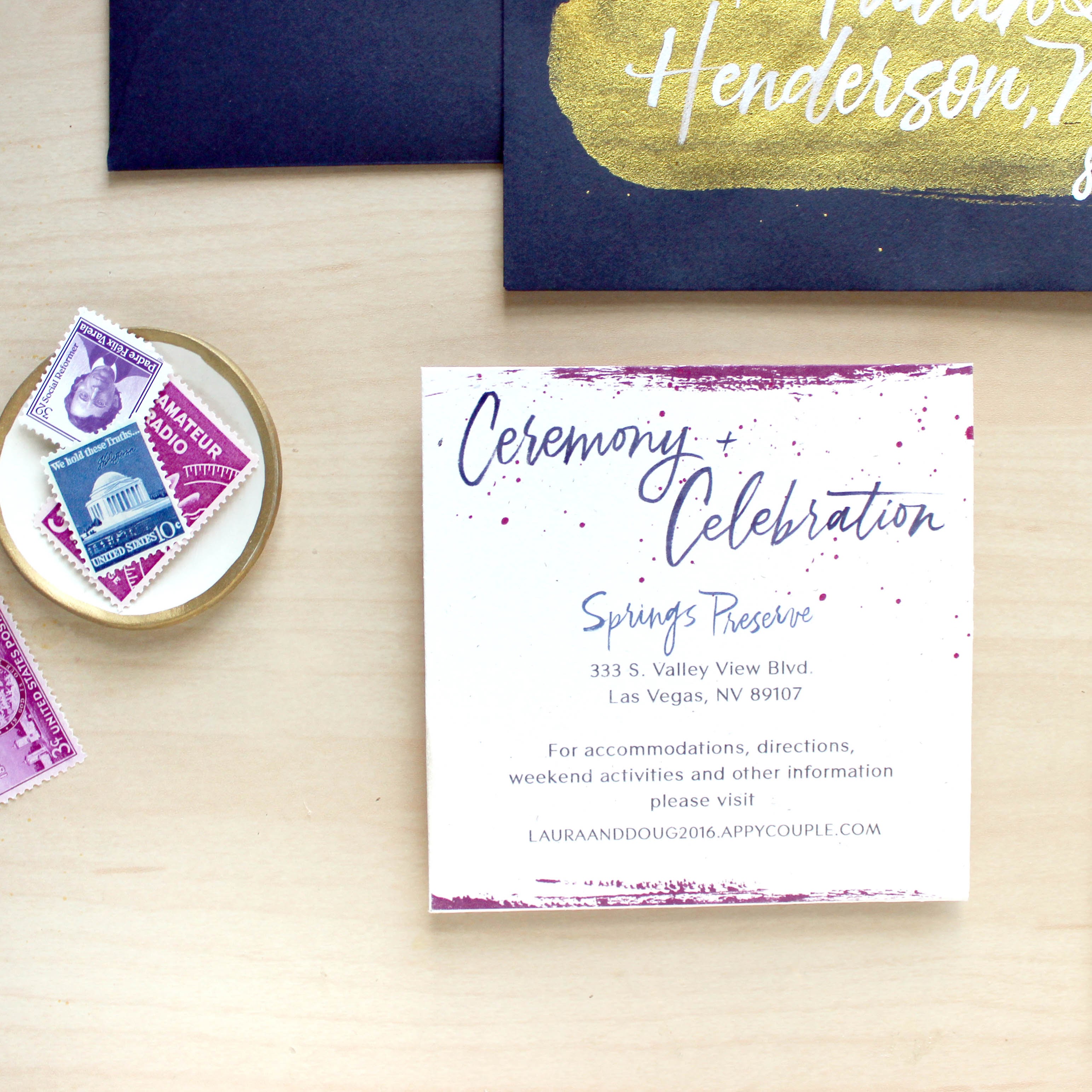
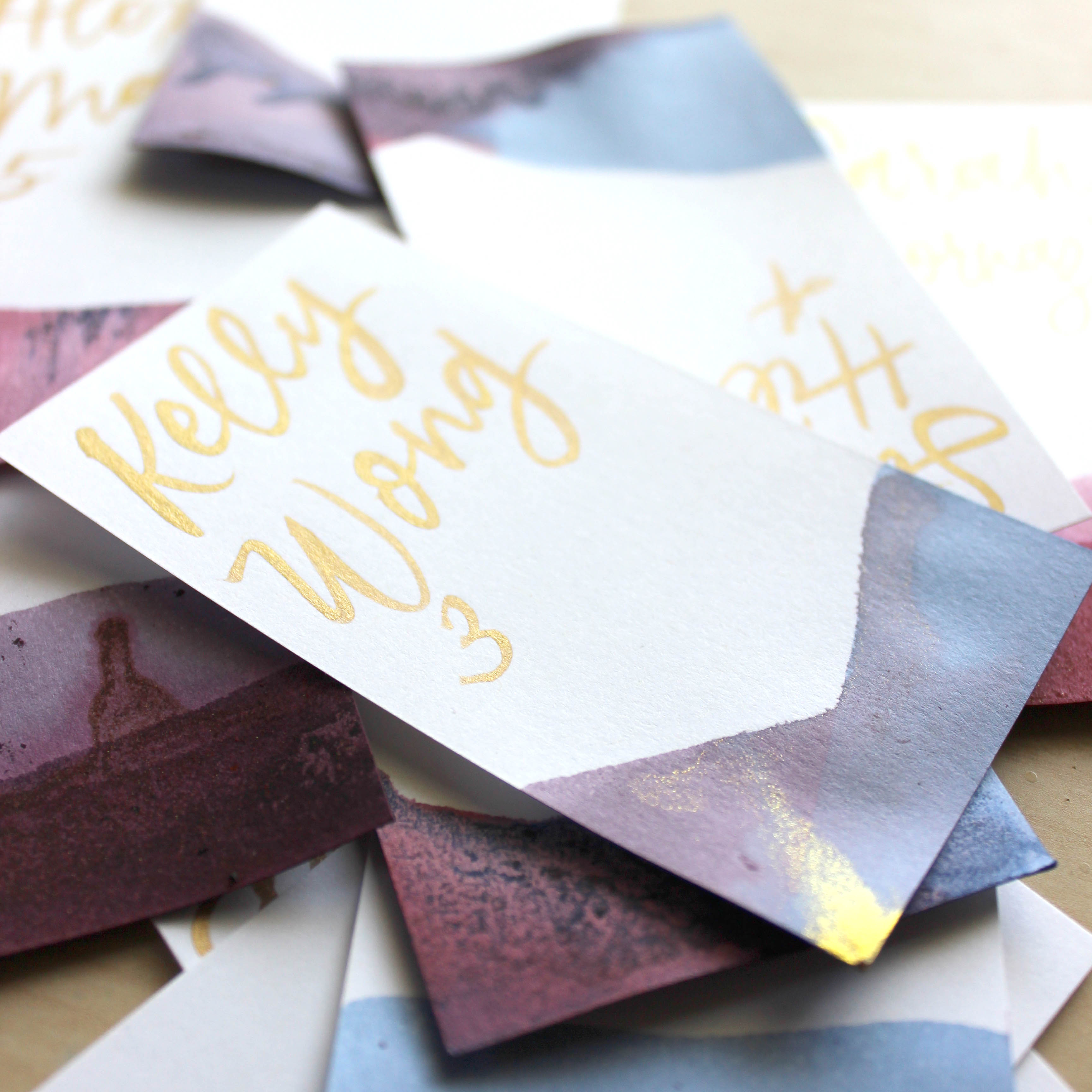
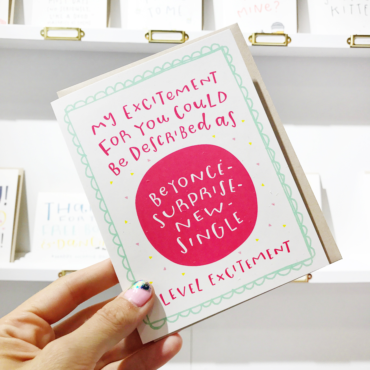
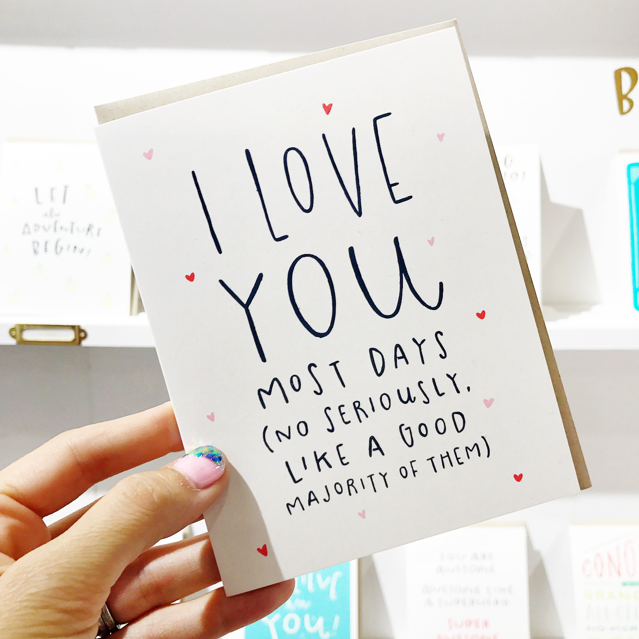
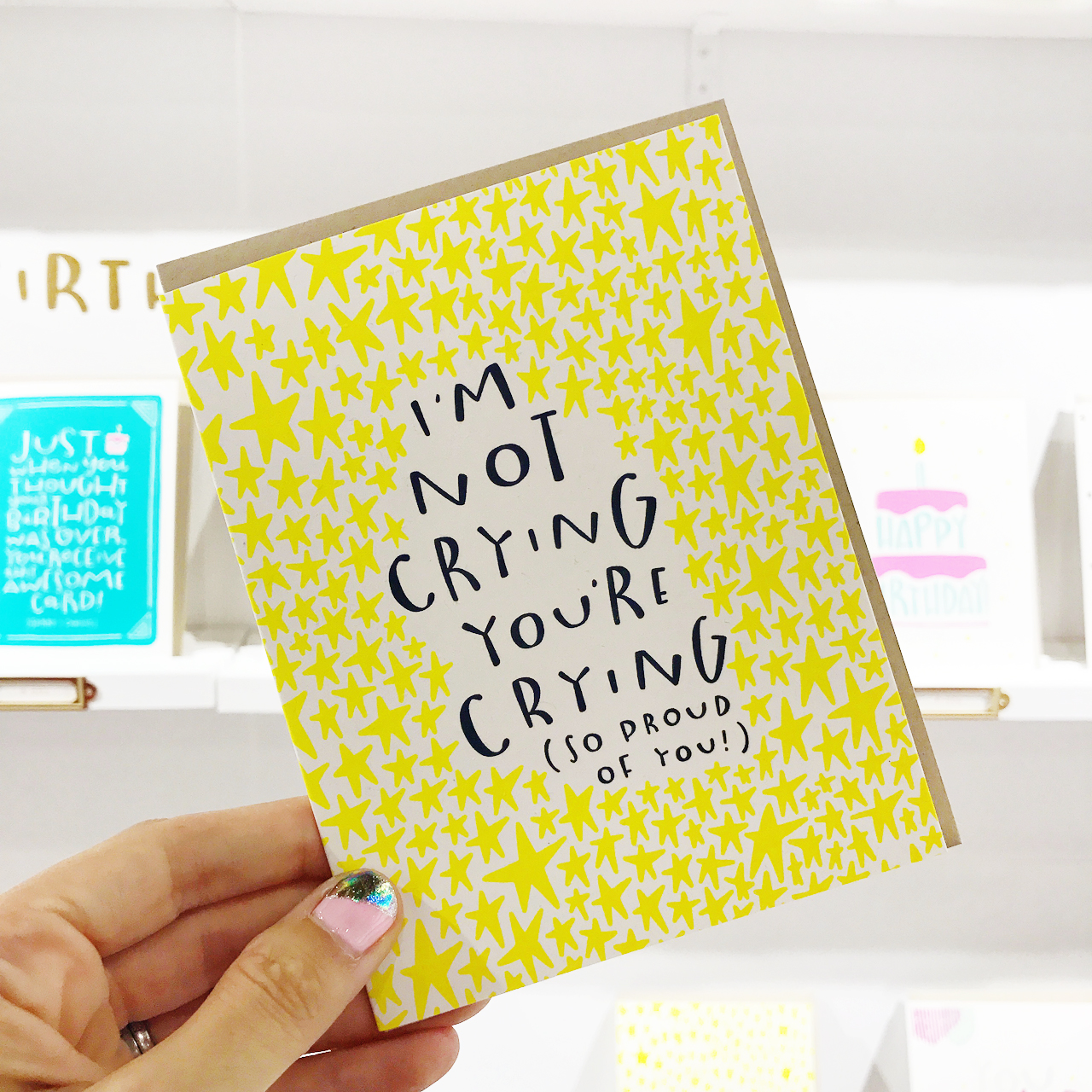
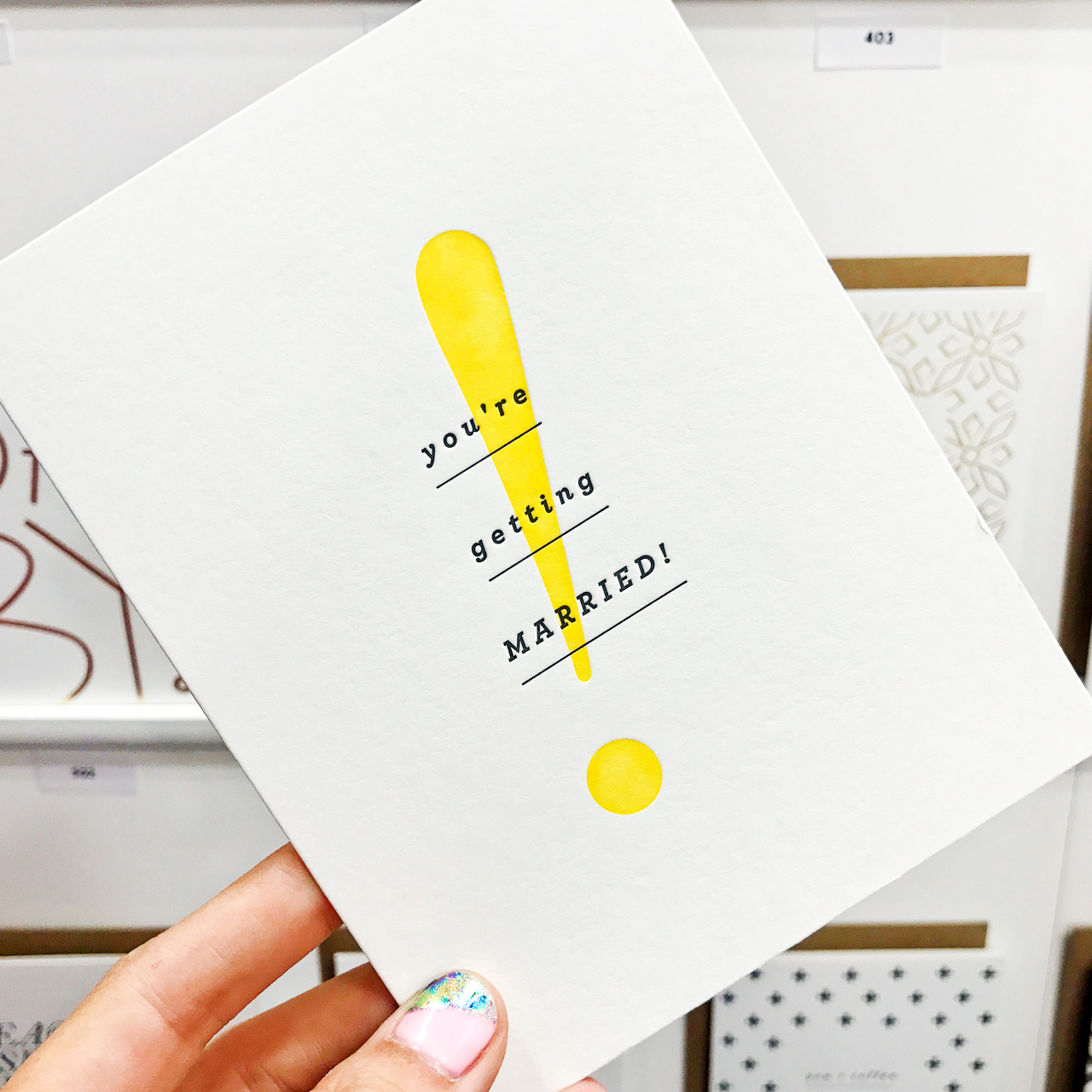
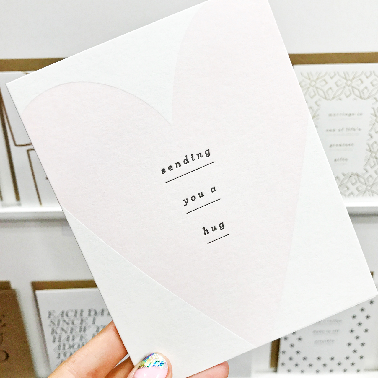
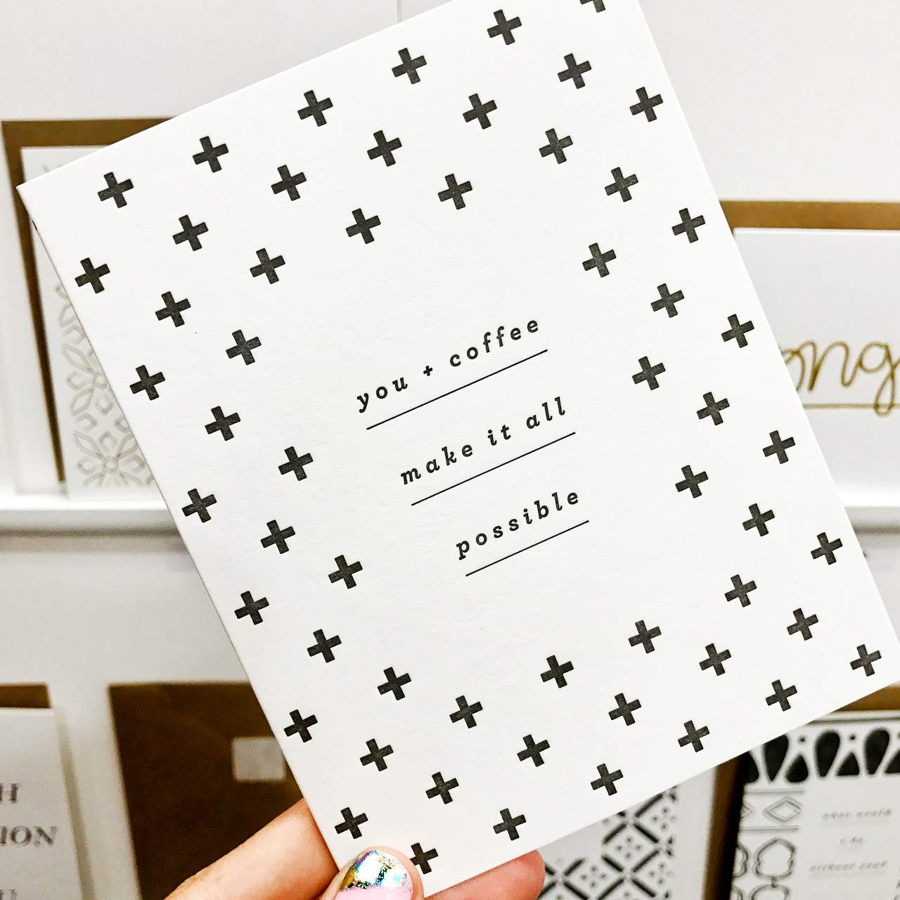
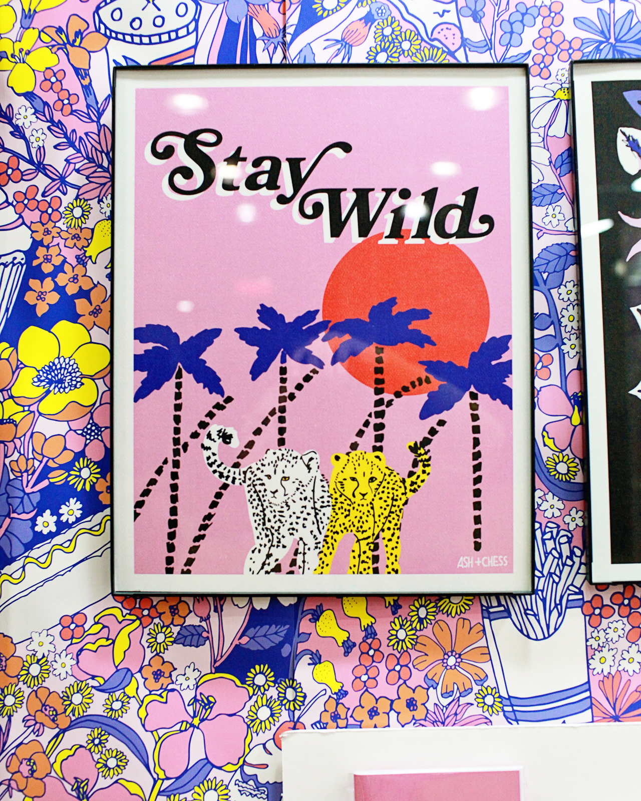
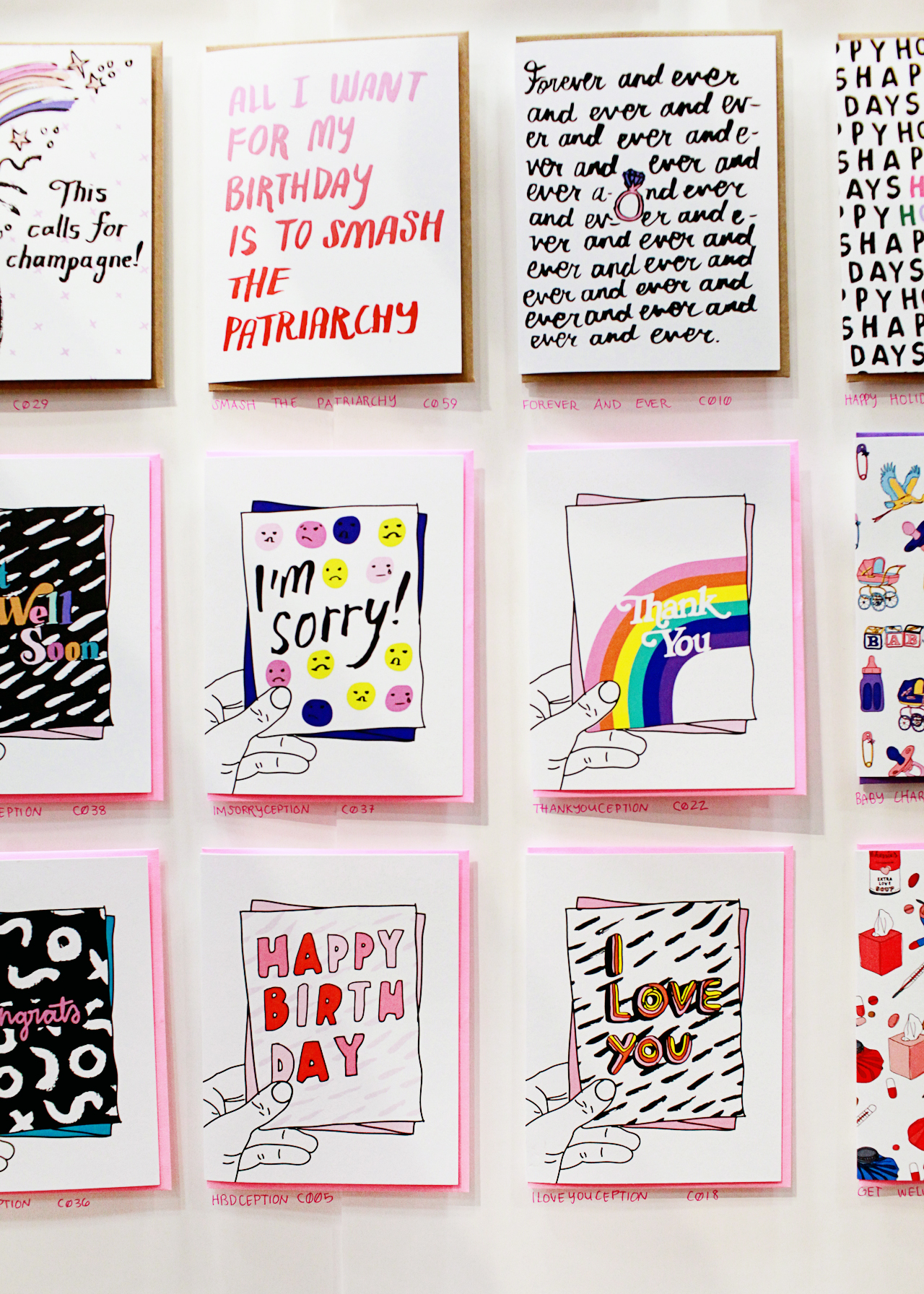
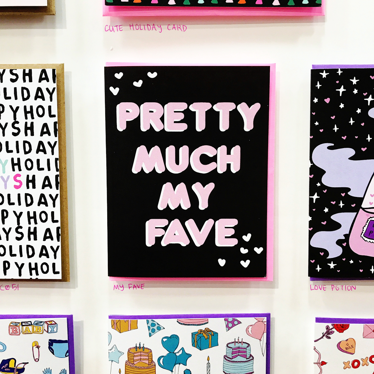
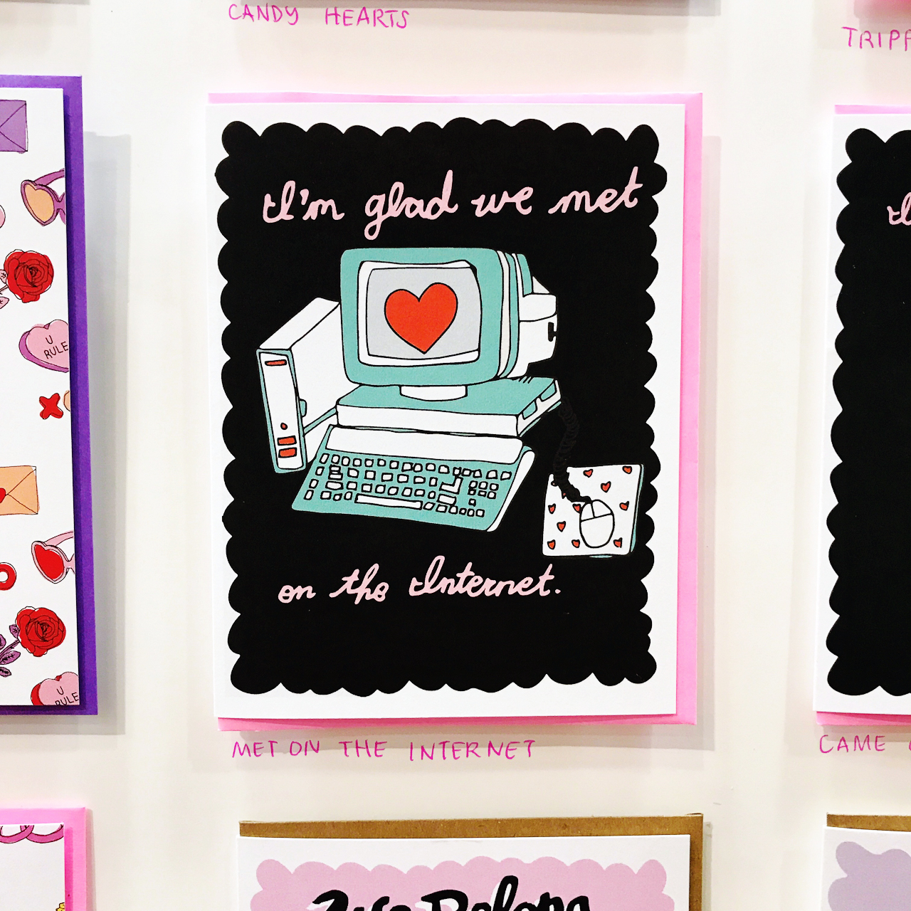
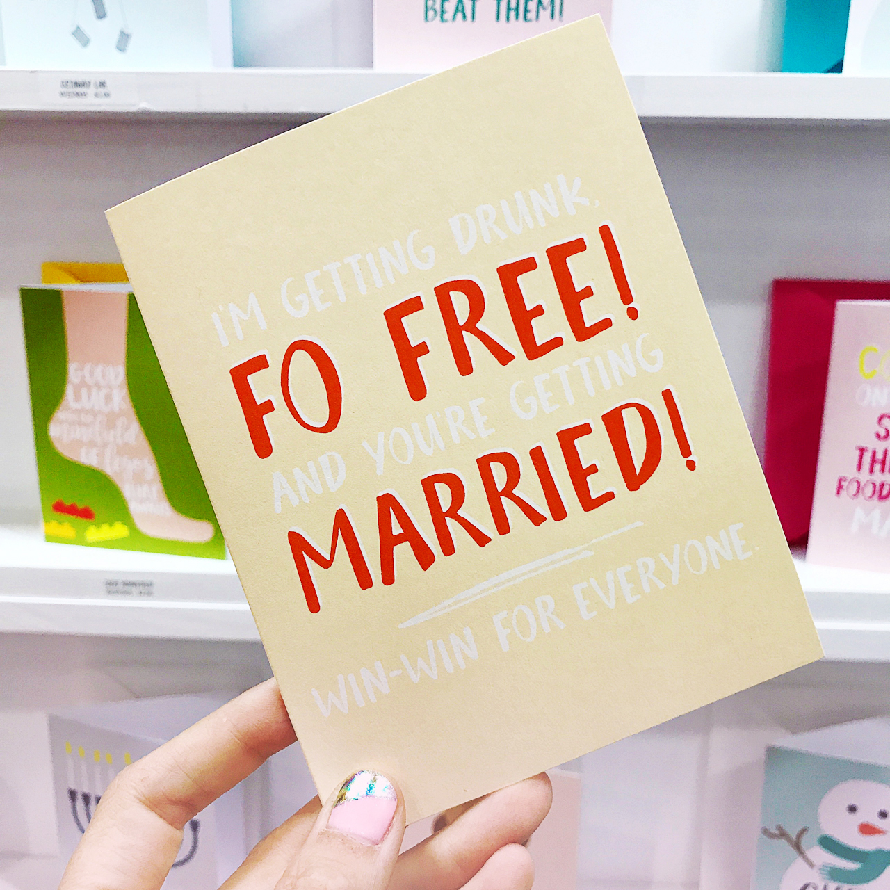
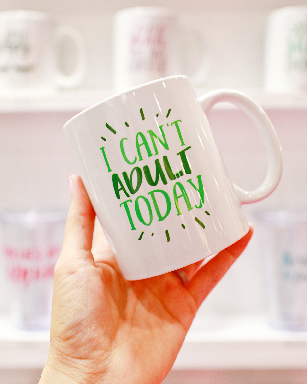
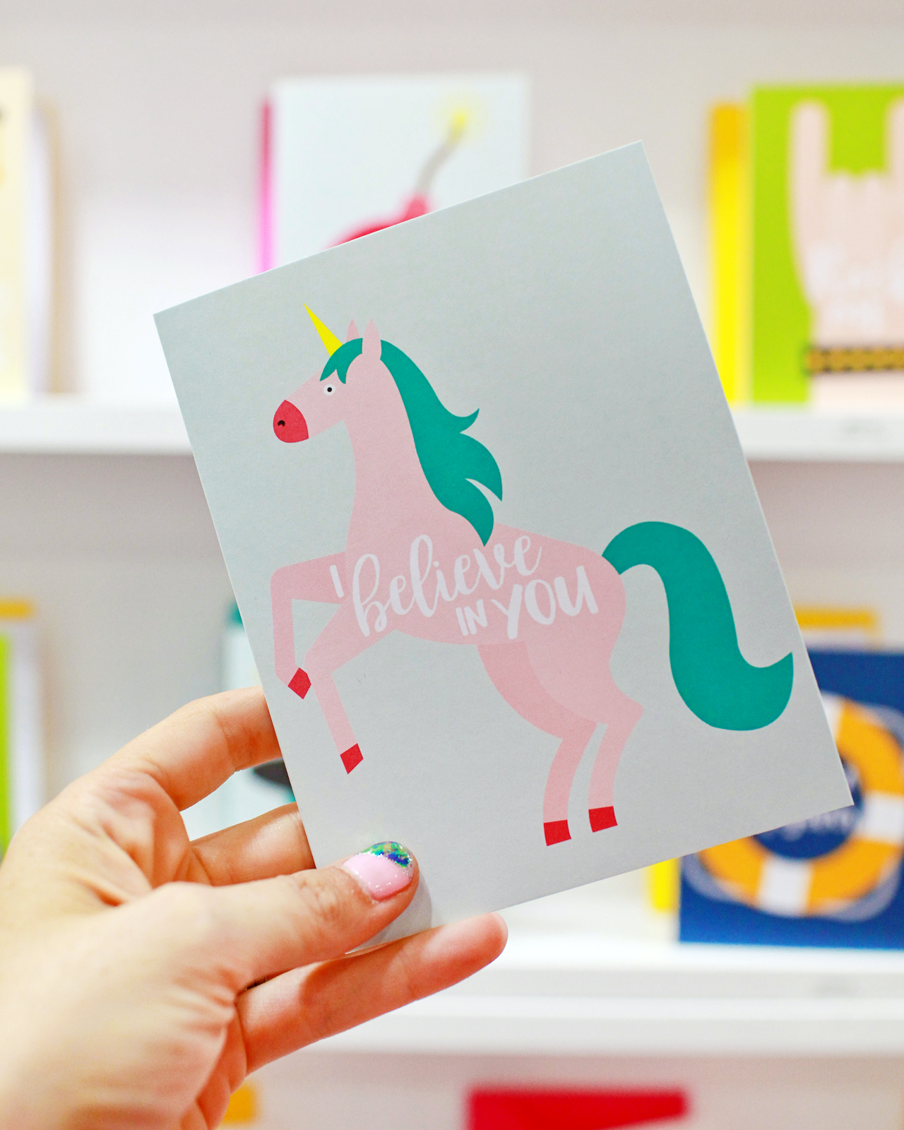
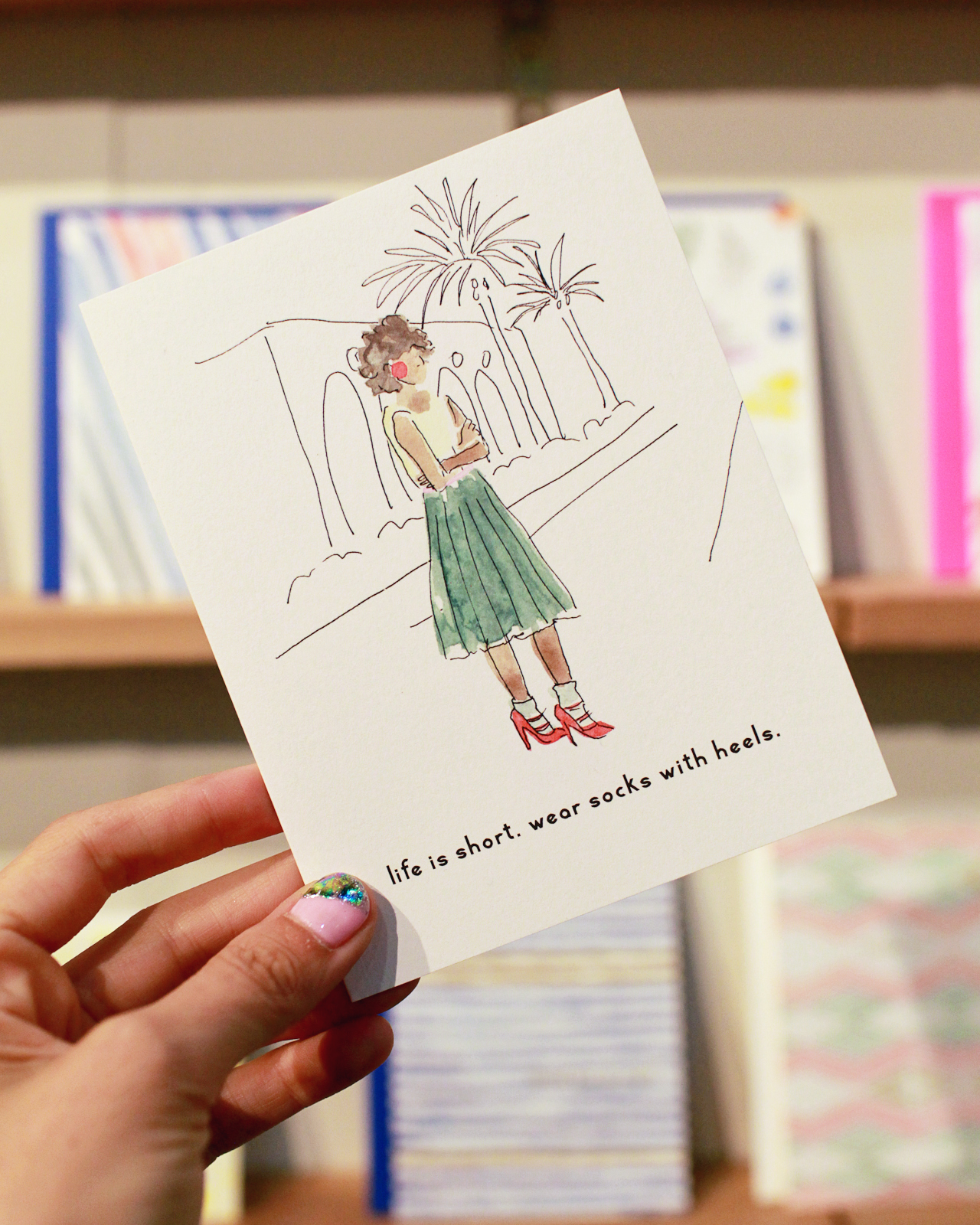
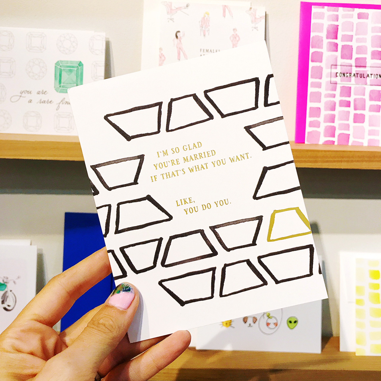
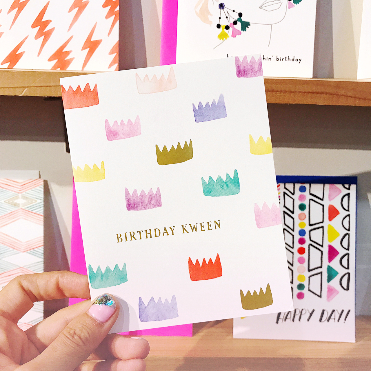
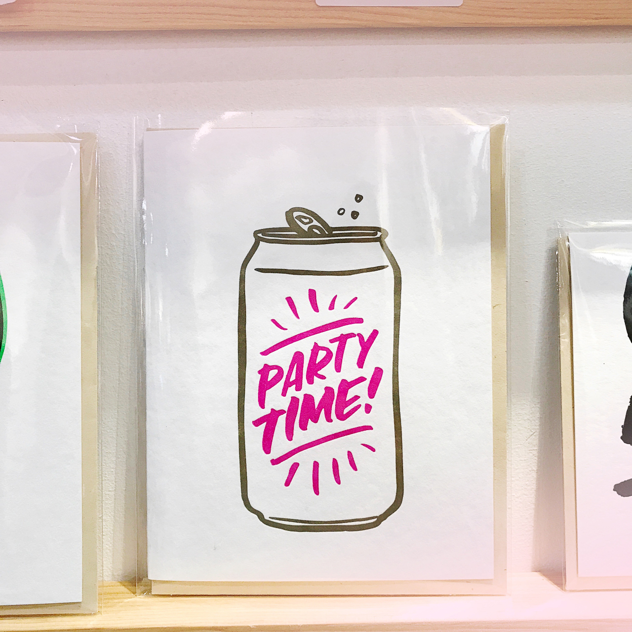
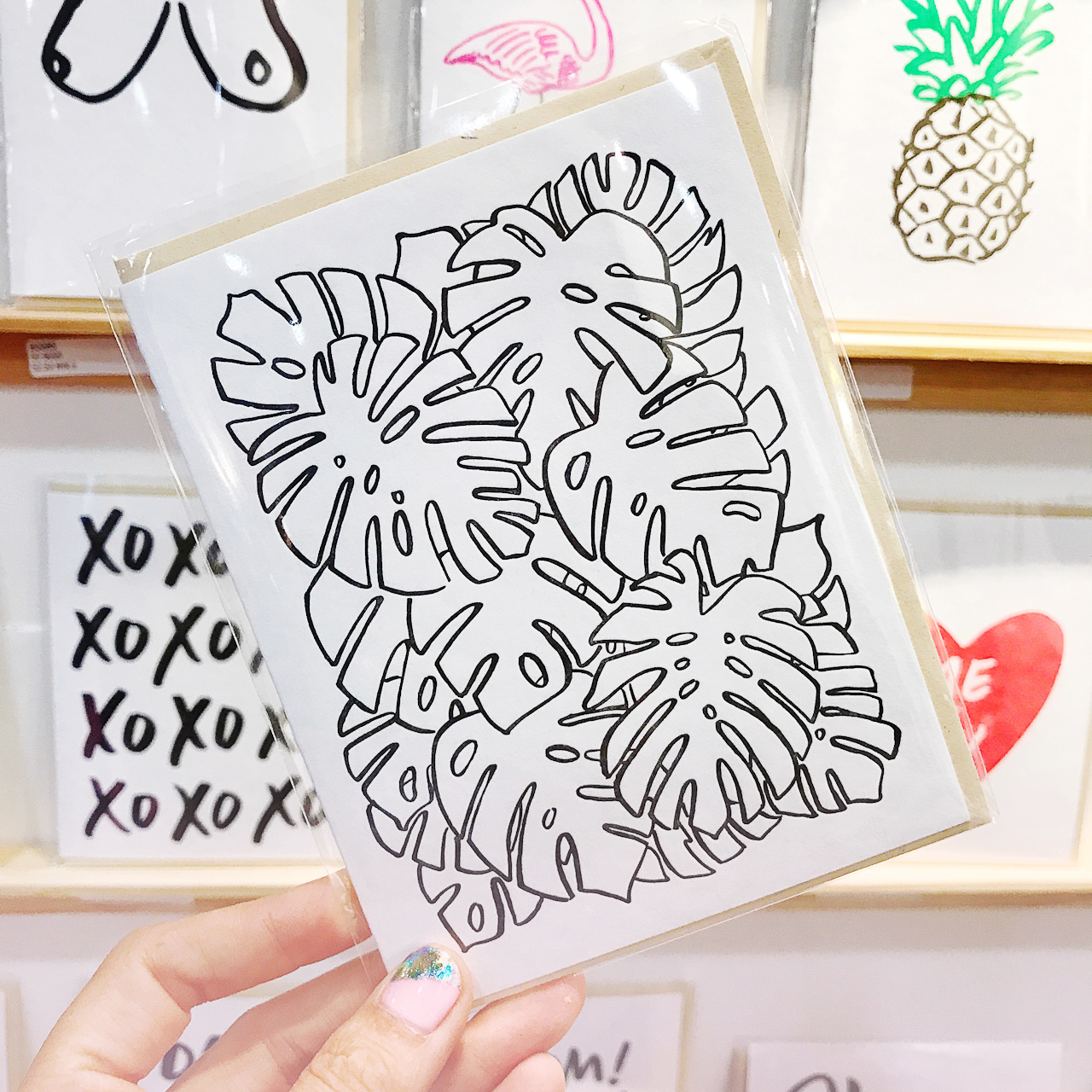
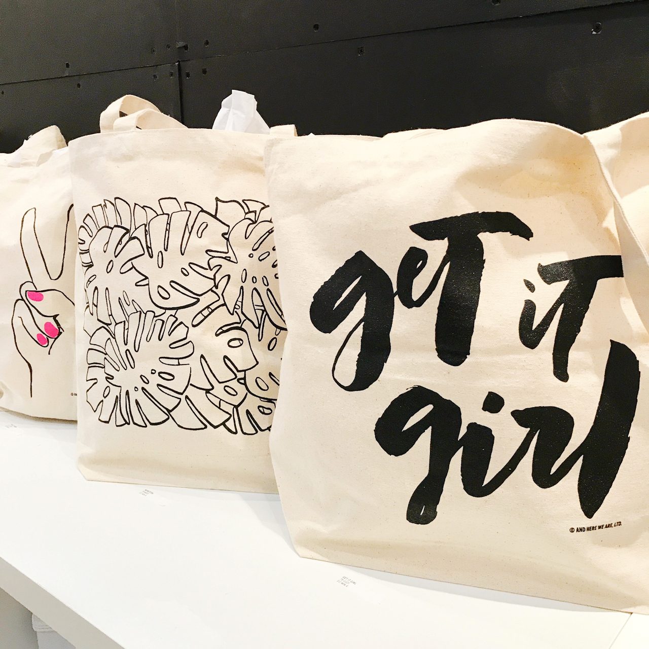
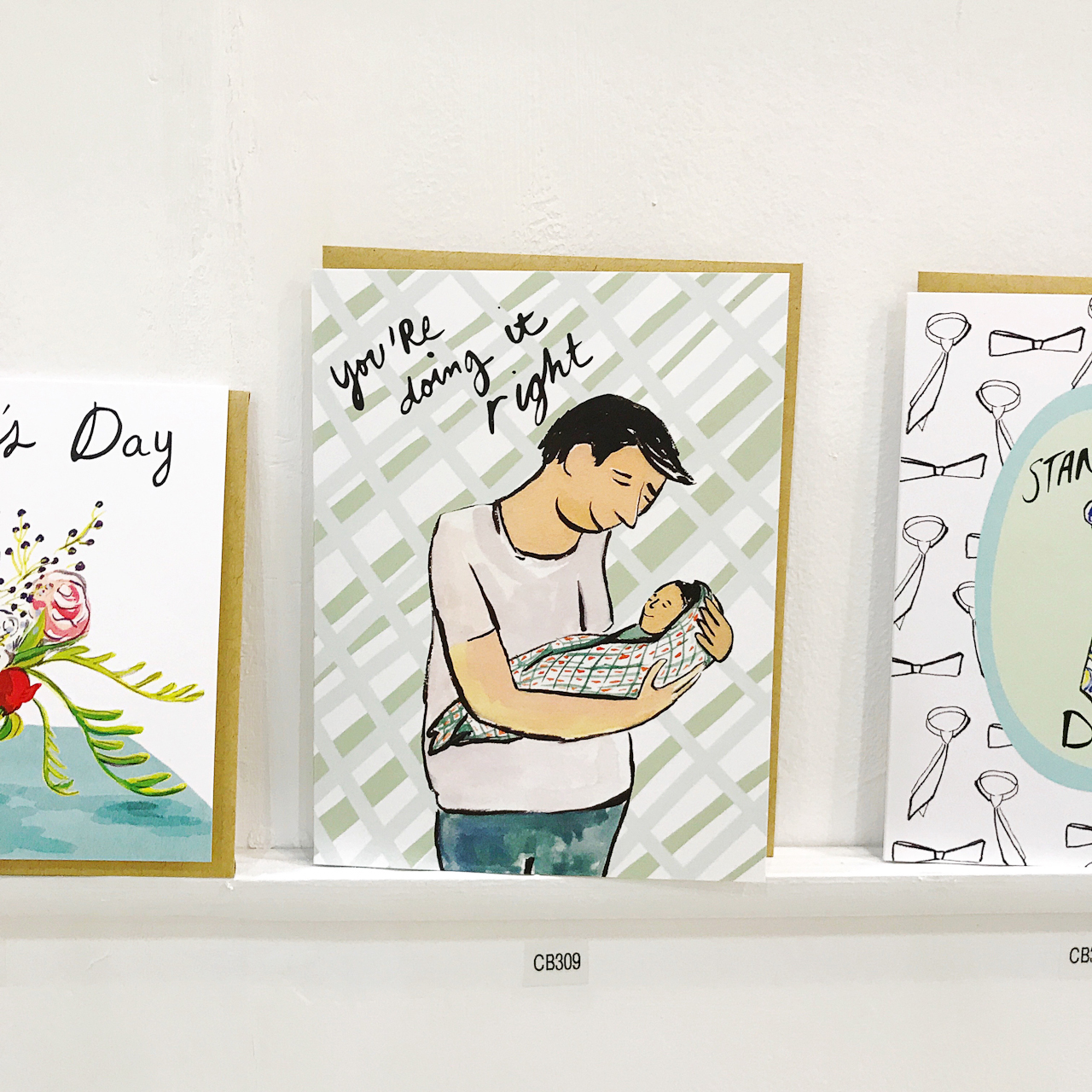
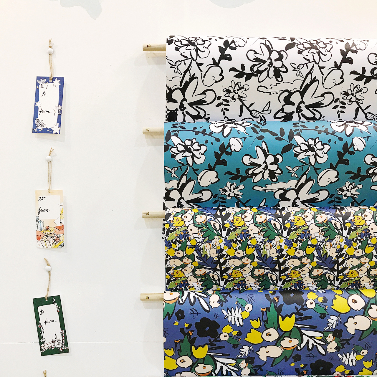
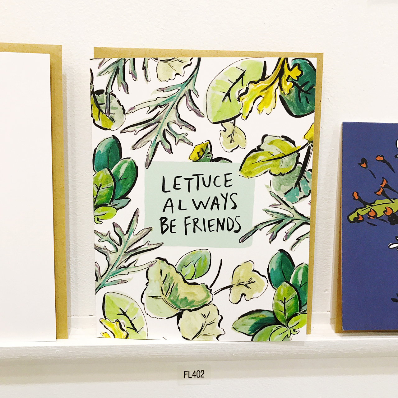
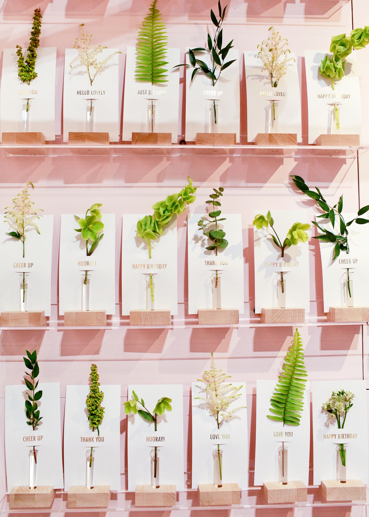
In addition to custom design and printing, we have a full line of letterpress printed greeting cards and accessories that we sell both retail and wholesale (we exhibited in our first National Stationery Show this Spring). We do all of our letterpress printing in house, but offer all sorts of printing methods through our network of trusted vendors here and back in New York. We often combine letterpress printed pieces with foil stamping, digital printing or die cutting.

Behind the Stationery: And Here We Are

Behind the Stationery: And Here We Are

We currently have a Vandercook SP-15 letterpress, which carries about 90% of the load, and a C&P pilot press which we use mostly for coasters and some smaller items. We trim on a Challenge Triumph hydraulic trimmer. A Windmill or Kluge letterpress is probably not too far off in the future, and I’d like to bring foil-stamping in house too.

Behind the Stationery: And Here We Are

Behind the Stationery: And Here We Are

From 2014-16, my husband John was also working with me, but went back to a day job last year when we found out we had a baby on the way. So for now, I’m working by myself again, with the occasional part time or temp helpers. Now that we’ve moved into our new space I’m hoping to bring on 1-2 members to join the team.

Behind the Stationery: And Here We Are

There really isn’t such a thing as a typical day when you run a business and have an 8-month-old; most days we’re up at 6:30, having breakfast and taking a long walk before heading into the studio. Around 8:30, I drop the baby off at day care or bring him with me, depending on the day of the week. I could be drawing, printing, trimming, filling orders, or writing estimates and invoices (the most glamorous part of the job). There’s always a lot more emailing and administration than I’d like, but I’m often able to tackle those tasks at home after the little one’s gone to bed.

Behind the Stationery: And Here We Are

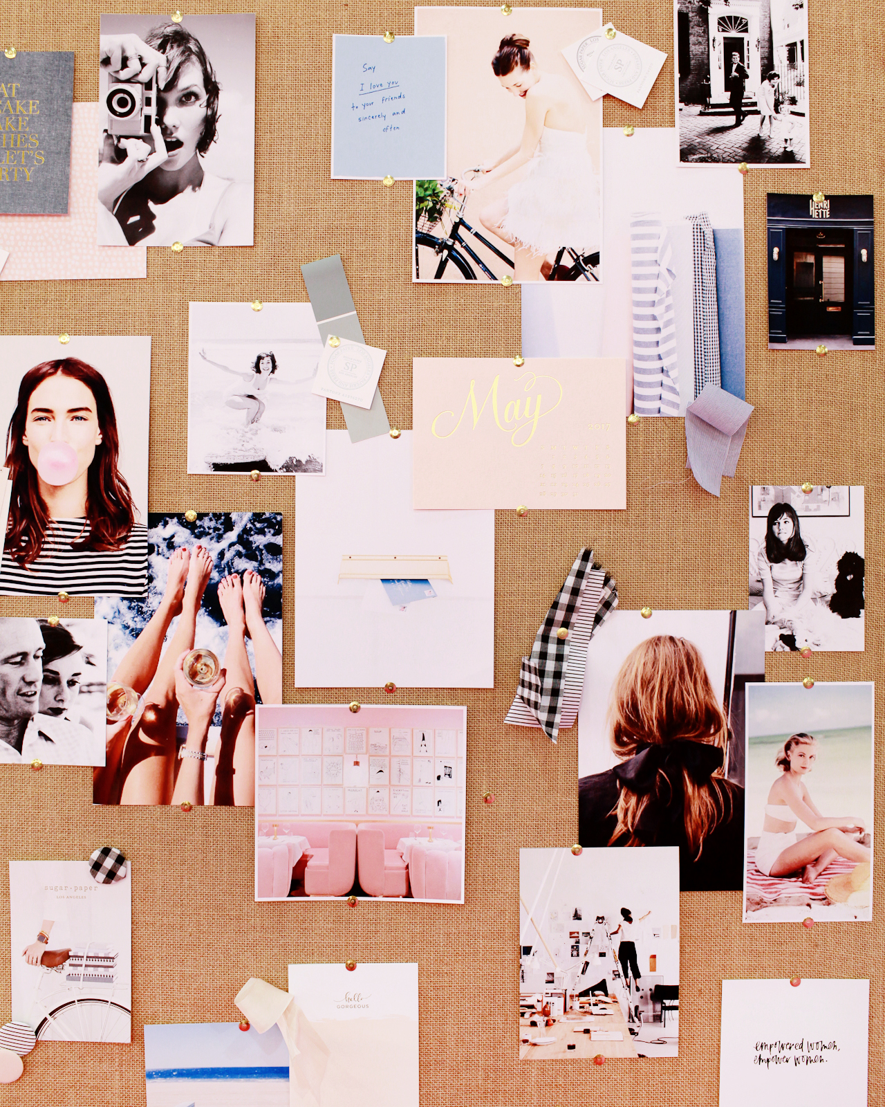
Even when I’m not in the studio, I’m almost always carrying a notebook or sketchbook to jot down new ideas, doodles or notes. I usually start with just a list of words that I keep on my phone, which I then distill into a few categories and then every month or two I’ll block out a few solid days to sketch out some lettering and illustrations, and then spend another week or two refining those.

Behind the Stationery: And Here We Are

I usually move from pencil sketches to brush and ink or brush pens, often drawing and redrawing an idea through layers of tracing paper to distill it down to the simplest form possible. Sometimes I work backwards from an ink color I really want to use, or a print method I want to try. Then the drawings get scanned into the computer, cleaned up and digitized. I assign ink colors on the computer (although I often change my mind when I’m on the press!), prep the files for letterpress printing, and send the art out to have plates made.

Behind the Stationery: And Here We Are

Often, I start with art prints, then extend the artwork through other items like totes, coasters or cards. I usually release new collections about once a quarter.

Behind the Stationery: And Here We Are

Custom work is a whole other monster. These start with a client meeting and idea board; then I’ll ruminate on it a bit and pull some visual examples into a Pinterest board. I keep my sketchbook handy and usually in a week or two I’ll hit on an idea that I can get excited about (and when I’m lucky, the client is excited about it too!). Totally custom jobs usually go through about 3-4 rounds of design before we hit the press. Since we had the baby, I’ve been shifting the focus of And Here We Are toward the retail and wholesale side of the business, but do still take a limited amount of custom projects each season.

Behind the Stationery: And Here We Are

And Here We Are is a member of the Designer Rolodex – see more of their beautiful work right here!

Follow along with And Here We Are on Instagram and Twitter.

Studio photos by Adam Lowe Photography; others by And Here We Are.

Interested in being featured on the Behind the Stationery column? Reach out to Megan for more information at megan[at]ohsobeautifulpaper.com.

NSS 2017: New Exhibitors, Part 1

There are always a slew of new exhibitors at every National Stationery Show, and this year was no exception! Some of the new exhibitors have been on my radar for years but just made their trade show debut this year, while others are new-to-me businesses (always a pleasant surprise at the show!), and even others are just launching their businesses. Today I thought I would introduce you to a few of those new exhibitors – with a few more to come tomorrow. Let’s start with the playful hand lettered greeting cards from Pinwheel Print Shop, definitely one of my faves from this year’s show!

NSS 2017: Pinwheel Print Shop

NSS 2017: Pinwheel Print Shop

NSS 2017: Pinwheel Print Shop

Pinwheel Print Shop (see the full booth here!)

I love the clean, elegant aesthetic of these cards from Bred & Butter Paper Co. – those pops of color are so good paired with classic black text!

NSS 2017: Bred & Butter Paper Co.

NSS 2017: Bred & Butter Paper Co.

NSS 2017: Bred & Butter Paper Co.

Bred & Butter Paper Co. (see the full booth here!)

It was hard to miss the bold, colorful style of Brooklyn-based Ash + Chess, for good reason! Their illustration and hand lettering style is so fresh and unique.

NSS 2017: Ash and Chess

NSS 2017: Ash and Chess

NSS 2017: Ash and Chess

NSS 2017: Ash and Chess

Ash + Chess (see the full booth here!)

I love cards that make me laugh! The Lovebird Paper booth was full of bold, sassy humor – from greeting cards to notepads and mugs. So fun!

NSS 2017: Lovebird Paper Co.

NSS 2017: Lovebird Paper Co.

NSS 2017: Lovebird Paper Co.

Lovebird Paper Co. (see the full booth here!)

So many beautiful gems in Party Sally’s debut at the National Stationery Show! Each design is created from an original watercolor painting or illustration, with plenty of shiny gold foil sprinkled throughout the collection.

NSS 2017: Party Sally

NSS 2017: Party Sally

NSS 2017: Party Sally

Party Sally (see the full booth here!)

I’m a huge fan of the bold, graphic style of And Here We Are. Gotta love those monstera leaf illustrations and pops of neon!

NSS 2017: And Here We Are

NSS 2017: And Here We Are

NSS 2017: And Here We Are

And Here We Are (see the full booth here!)

Ivy House was a surprise find at this year’s show – I just love her illustration style and sweet sentiments! Designer and illustrator Rachel Cohen previously worked in textile design and art education, which definitely shines through her loose, nature-inspired patterns and illustrations.

NSS 2017: Ivy House

NSS 2017: Ivy House

NSS 2017: Ivy House

Ivy House (see the full booth here!)

I literally stopped and did a u-turn after spotting these colorful pencils from UK-based I Am A out of the corner of my eye. Isn’t this unicorn set (with rainbow foil!!) the CUTEST??? I also love the cheerful emoji cards and scratch off cards – with a secret emoji hidden underneath!

NSS 2017: I Am A (London)

NSS 2017: I Am A (London)

I Am A (London)

I Am A (see the full booth here!)

I mentioned Tokketok in the round up of beautiful booth designs, and the products inside were equally gorgeous! I particularly love these gold foil notepads, which come with a variety of messages in rainbow colors. Keep a couple of notepads at the office to write out quick thank you notes or birthday notes to colleagues, or even at home to leave little love notes for your spouse or kids!

NSS 2017: Tokketok

NSS 2017: Tokketok

Tokketok (see the full booth here!)

That’s it for today! You can browse all the booths from this year’s show right here, and I’ll be back with more new exhibitors tomorrow!

Photo Credits: Nole Garey for Oh So Beautiful Paper

NSS 2017: Beautiful Booth Designs

Yay! Today I’m finally kicking off my recaps from the 2017 National Stationery Show (aka NSS 2017) – but starting this year I’m doing things a wee bit different! Instead of doing long recaps with every photo in a series of posts stretched out over a couple of months, you can find ALL the photos from this year’s National Stationery Show in our brand new trade show gallery! Here on the main page, I’ll be doing a few highlight recaps based around a particular theme. We’ll be highlighting some of the new exhibitors, a few design trends, and a few product round ups. It’ll be so fun!

NSS 2017: Tokketok

Tokketok – see more from the Tokketok booth here!

For those of you who have been reading for a while, you know that I normally do these super long recap posts right after the show with all the noteworthy exhibitors from that year’s show. The National Stationery Show isn’t open to the public, and I want to give you the experience of being there by sharing a ton of photos! But the last couple of years I’ve been wanting to change things up a bit. The big recaps can be kind of a slog to get through, and those of you who follow me on Instagram already get a real-time sneak peek of the show while it’s happening. So! I’ve been working with my developer to create a gallery with every single exhibitor that I visited at the show each year. You can visit the gallery, pick an exhibitor, and browse the images in slideshow format – or scroll below the slideshow to view all of the images from that booth in thumbnail form. I’ve been busy uploading all of my photos from this year’s show (all 99 booths!), so there’s plenty of eye candy to browse. You can also browse the 2016 exhibitors, and eventually we’ll get previous years up there, too!

NSS 2017: One Canoe Two

One Canoe Two – see more from the One Canoe Two booth here!

Today we’re kicking things off with one of my favorite things about any trade show: booth designs! Now, obviously the most important element of any trade show booth is the product inside the booth (and we’ll get to that soon), but good booth design is absolutely essential for catching the attention of busy retailers walking the show and getting them into your booth! Being the amazing artists that they are, National Stationery Show exhibitors do an amazing job creating the most beautiful booths, but there are always standouts each year. Let’s take a look at a few of them!

NSS 2017: Tokketok

NSS 2017: Tokketok

Tokketok – see more from the Tokketok booth here!

Tokketok made their trade show debut at this year’s National Stationery Show, and their booth was easily one of my favorites from the entire show! The booth was constructed to resemble a green house, which prominently featured this amazing wall of flower notes. Just gorgeous!

NSS 2017: One Canoe Two

One Canoe Two – see more from the One Canoe Two booth here!

When painting is a big part of your line, make it a major feature of your booth design! One Canoe Two set up a feature wall with an original painting of their twilight landscape art print. Such a beautiful focal point!

NSS 2017: Moglea

NSS 2017: Moglea

Moglea – see more from the Moglea booth here!

I’m still in awe of the Moglea booth, which displays a curated selection of new products on the pegboard-inspired wood dowel shelves and houses the full Moglea catalogue in the lower cabinets. Total genius.

NSS 2017: Sugar Paper

NSS 2017: Sugar Paper

Sugar Paper – see more from the Sugar Paper booth here!

The Sugar Paper booth felt like walking into a beautifully curated stationery store. Also, all trade show booths should come with inspiration boards – don’t you think?

NSS 2017: Our Heiday

Our Heiday – see more from the Our Heiday booth here!

NSS 2017: Amy Heitman

Amy Heitman – see more from Amy Heitman’s booth here!

Wallpaper for the win! Both Our Heiday and Amy Heitman turned their designs into wallpaper for a feature wall in their booths. I’ll just move right in, okay?

NSS 2017: Richie Designs

Richie Designs – see more from the Richie Designs booth here!

NSS 2017: My Little Day

My Little Day – see more from the My Little Day booth here!

Balloons are such a fun way to decorate a trade show booth! Richie Designs commissioned Wild Child Party to create a balloon installation along the top of her booth for an extra dose of color, while My Little Day created an entire wall made with their printed balloons for big visual impact.

NSS 2017: And Here We Are

And Here We Are – see more from the And Here We Are booth here!

Vibrant paper monstera leaves lining the top of the And Here We Are booth! Such a great way to make a visual impact without sacrificing precious product display space.

NSS 2017: ilootpaperie

ilootpaperie – see more from the ilootpaperie booth here!

It’s hard to tell from this photo, but ilootpaperie decorated their entire booth to look like a piece of cake! See the frosting along the top and bottom edges, and the strawberries? So fun!

So what are you thinking about the new trade show gallery? Do you like having all the images in one place? Or did you prefer the long recaps on the main page? Should I even still be doing NSS recaps on the blog, or just stick to highlights on Instagram? I’ve been thinking about the way I cover these trade shows a LOT these past few weeks, so I really do want to hear your opinion! 

I’ll be back tomorrow with another recap from the 2017 National Stationery Show!

Peach Basil Whiskey Cobbler

There’s something of a misnomer that fruit found its way into cocktails during Prohibition, when bartenders used produce to mask the taste of low-quality hooch, maybe by way of someone’s bathtub. This isn’t true! Fruit had a place in cocktails from the very beginning, and many of the oldest drinks – cobblers, smashes, juleps, and the like – were practically drenched with fresh fruit.  Which makes a lot of sense when you think about alcohol as an agricultural product, made from produce grown on the same sorts of farms that also grow all the other things we can throw into a drink. Like goes with like. We decided to celebrate summer and all it’s bounty with two of our favorite in-season ingredients: a Peach Basil Whiskey Cobbler. – Andrew

Peach Basil Whiskey Cobbler Cocktail Recipe

Peach Basil Whiskey Cobbler Cocktail Recipe

Peach Basil Whiskey Cobbler Cocktail Recipe

Peach Basil Whiskey Cobbler

2 oz Bourbon Whiskey
1/2 oz Simple Syrup
1/2 oz Lemon Juice
1/4 Peach or Nectarine, sliced
1 sprig Basil

Combine the peach slices, basil, syrup, and lemon juice in a shaker and muddle them together. Fill the shaker two-thirds with ice, add the whiskey, and shake well. Double-strain (using a tea strainer or sieve in addition to a regular strainer to remove any pulp) into a highball glass filled with crushed ice. Garnish with more fresh peach slices and basil sprigs. Enjoy!

Peach Basil Whiskey Cobbler Cocktail Recipe

Peach Basil Whiskey Cobbler Cocktail Recipe

And this is why we put fresh fruit in our drinks: cold and fresh and fruity and a little zesty, perfect for the summer. This drink has big round peach flavors and a bit of herbaceous zing from the basil, plus a nice chewiness from the whiskey. We wanted to keep this one simple, the sort of thing you could throw together if you had some peaches and basil left over from making dinner. Did I mention perfect for the summer?

Peach Basil Whiskey Cobbler Cocktail Recipe

Peach Basil Whiskey Cobbler Cocktail Recipe

Glassware by Liquorary

(Don’t forget to follow us on Instagram!)

Photo Credits: Nole Garey for Oh So Beautiful Paper

This post contains affiliate links. By clicking on these links, you’ll help support Oh So Beautiful Paper while also purchasing some fantastic products. We only recommend products that we truly love and trust that you’ll love, too. Our full disclosure policy can be found here.