NSS – Booth round-up, part four

I'm heading out for some early anniversary celebrations (one year on Monday!) with my husband, but before I do, I wanted to share a few more photos from the NSS. 

First up, the jam-packed booth of Small Square Design:

SmallSquareDesign1

SmallSquareDesign2

SmallSquareDesign4

SmallSquareDesign5

SmallSquareDesign8

SmallSquareDesign9
{I love these small book notes journals!}

I also loved the unusual presentation at the twig + fig booth…

Twig+fig1

Twig+fig2

Twig+fig5

…and twig + fig's wonderful line of Bar + Bat Mitzvah invitations (in addition to some pretty amazing wedding invitations):

Twig+fig8

Twig+fig7

Twig+fig14

Twig+fig12

Twig+fig13

Next up, some gorgeous new cards + invitations from our friends over at Copper Willow:

CopperWillow1

CopperWillow6

 CopperWillow9

CopperWillow12

CopperWillow13

CopperWillow14

CopperWillow16

CopperWillow15
{this last set of invitations is letterpress printed on BOTH sides on super-thick paper – so that green + brown bird pattern? that's actually the reverse side of the invitation. gorgeous!}

I was also absolutely delighted to meet the husband + wife design team behind Embellished Ink, a new DC-based (yay!) design studio that made their official launch at this year's NSS:

EmbellishedInk1
 
EmbellishedInk4

EmbellishedInk9

EmbellishedInk7

EmbellishedInk10
{how gorgeous is this foil-stamped holiday card?!?}

And finally, at least for this segment, the cuteness was in full effect over at the Dee & LaLa booth:

Dee+Lala1

Dee+Lala10  

Dee+Lala9

Dee+Lala12

Dee+Lala14

Dee+Lala15
{I absolutely LOVE the card with the skunks – too cute!}

I've still got a few more booths to share with you, so check back for the rest of my coverage from NSS '09!

{photos by Oh So Beautiful Paper}

NSS – Booth round-up, part two

Happy Friday everyone!  I don’t know about you all, but I’m definitely looking forward to some much-needed rest over the holiday weekend.  But first, more from NSS ’09!

I absolutely adored the Night Owl Paper Goods booth, which was chock full of their lovely letterpress and wood veneer stationery:

NightOwl2

NightOwl3
{see that square print in the center? it’s letterpress and absolutely gorgeous! they’re part of a limited edition, but you can find the few left right here}

NightOwl5

NightOwl6

NightOwl9

NightOwl18

NightOwl19

NightOwl8

On the other side of the design spectrum, but equally as charming, was the Fugu Fugu Press booth:

FuguFugu2

FuguFugu3

FuguFugu4

FuguFugu8

FuguFugu7

FuguFugu6

Fugu Fugu Press

FuguFugu10
{isn’t the new baby card above the cutest thing ever?}

Next up, the booth from Portland-based Old School Stationers – the fun mix of pattern + color made this booth one of my NSS favorites:

OldSchoolStationers1

OldSchoolStationers4

OldSchoolStationers8
{love these letterpress art prints – the pig is my favorite!}

OldSchoolStationers9
{I know you can’t see the details in this photo – but this calendar is absolutely gorgeous! It’ll definitely be part of my calendar round-up later in the year}

OldSchoolStationers10

OldSchoolStationers13
{I tried to get as much detail on this “Merry Christmoose” card as possible – the letterpress color field makes the white snowflakes pop up. Love it!}

I also had a ton of fun chatting with Tianyi from Tiselle:

Tiselle2

Tiselle12

Tiselle4

Tiselle11

Tiselle13
{these letterpress self-mailers are such a great idea!}

I showed you a couple of photos from the Enormous Champion booth earlier this week, but I loved their booth so much I just had to show you the rest!

EnormousChampion3

Enormous-Champion

EnormousChampion12
{LOVE those textiles and the wooden animal figurines!}

EnormousChampion6

EnormousChampion7

EnormousChampion13

Stay tuned for part three of the NSS booth round-up!

{all photos by Oh So Beautiful Paper}

My Business Cards – and new sponsor introduction!

As I get ready to head up to the National Stationery Show this weekend, I figured it was about time to have some business cards made up for myself.  I jumped at the chance to work with Suann from simplesong design.  Suann really went above and beyond for this little project, creating an absolutely gorgeous set of business cards and matching letterpress note cards:

Oh-so-beautiful-paper-business-cards
The business cards were printed in soft gray ink with a blind stamped patterned background on Crane’s 110# bright white cotton lettra paper, while the note cards were printed on pearl white 110# lettra:

I love, love them – and I’m very much looking forward to sending some notes on my new stationery!  Thanks so much Suann!

I’m also very excited to announce that simplesong designs is my newest sponsor here at Oh So Beautiful Paper!  As you can tell, I truly adore Suann’s work – from her readymade cards to her custom wedding invitations, baby announcements, and business collateral:

simplesong-letterpress-baby-announcements

simplesong-handwriting-letterpress-invitation

simplesong-coral-letterpress-wedding-invitations

simplesong-banner-letterpress-wedding-invitation

Check out more of Suann’s work at the simplesong designs portfolio here, etsy shop here – and of course on Suann’s lovely blog!

{business card + note card photos by me, all other images via simplesong designs}

Allison + Mark’s Vibrant and Modern Wedding Invitations

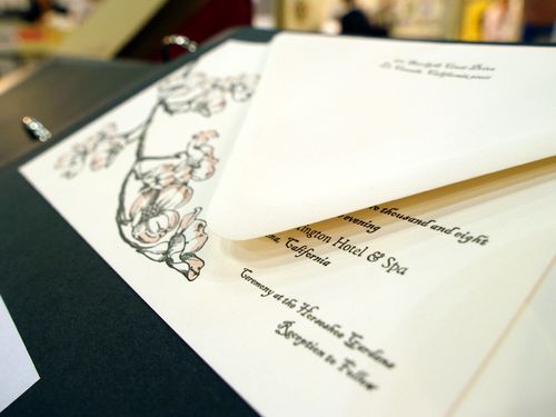
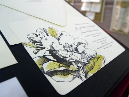
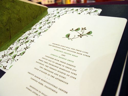
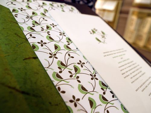
I’m completely thrilled to be featuring this week’s set of real invitations.  Allison and Mark were married last July, and when I saw their wedding on Snippet & Ink a couple of months back I immediately fell in love with their unique wedding programs, and so I asked if they would be willing to share their invitations as well.  Allison and Mark’s wedding was just brimming with creativity, and their wedding invitations and ephemera are definitely a reflection of their combined creative talents!

I_1133

From Allison: We got married at Atwood Ranch, a horse ranch in Glen Ellen, California surrounded by mountains and trees (including wandering cats) and had our reception in the property’s barn (filled with chirping swallows).  Since the location was such an important part of the day, it seemed only natural that our elements really reflect the spirit of the ranch, the warmth of the day and just the genuine joy the both of us felt about each other.

UED_0896


We didn’t start out with a theme or an idea, and because each piece was done at different time during our planning the variety became part of the charm and the colors and hand-lettering tied it all together.  All we knew was that we weren’t into anything that looked too perfect or “designed” or into just stamping our monogram onto each piece.

UED_0927

UED_0940


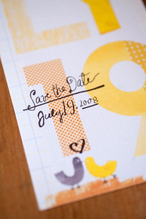
Originally we started out with a tighter color palette of yellows and greys, but the fabric we bought to use for the table runners became a big part of our designs and our color palette grew to include about every shade of yellow and orange and some gray. We chose about 10 different fabrics to be sewed into table runners and we scanned them to use on the save the dates as part of the letterforms and they became the envelope liners for the invites.

I_1553

hand-lettered yellow gray wedding menu


All the hand-lettering was done by both of us, which is why not all of it matches.  Also, we designed so many things so close to our wedding date, hand-lettering was our only option in terms of time and budget!

yellow and red wedding ceremony programs

I_1204

UED_0952

hand lettered wedding ceremony programs

UED_0962


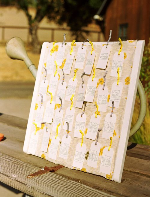
When we got to the chair labels, we decided upon a loopy cursive because we hadn’t done that type of lettering before and it was faster to write than the painstakingly printed escort cards we had made earlier (in the week!).

I_0514

I_1623


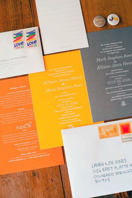
Mark and I are graphic designers, but we also do a lot of copywriting, so we paid a lot of attention to how everything was written so that it sounded like us (meaning there was some humor or sweetness in everything).  For instance, the brunch invites were designed and worded exactly like the wedding invites except our names were reversed and Mark’s parents’ names were put first since they were hosting it.

UED_0898

wedding invitation text bird illustration

yellow wedding invitation envelope with vintage stamps


However we also made other cute changes that you had to read it carefully to notice (on the wedding day invitation my parents invited guests to the wedding with “happy hearts” while Mark’s parents invited guests to the brunch with “hungry hearts.”  It also featured a stack of pancakes instead of hearts.

wedding favor buttons

yellow wedding table numbers


Designing all of our materials was probably one of the most stressful parts of our wedding, but we wouldn’t have been happy with anything that didn’t have our stamp on it.  Everyone commented that the wedding really felt like us and I think it did.

I definitely agree Allison!  I love how the design throughout the wedding stationery, from the Save the Dates to the invitations to the programs and seating cards, feels completely personal while maintaining a consistent, even if slightly mis-matched, design approach.  Everything is just so, so lovely.

If you haven’t already seen the photos from Allison and Mark’s wedding, don’t forget to swing by Snippet & Ink to check out the rest of the beautiful photos.

{all photos by Shelly Kroeger from Union Photography – thanks so much Allison and Shelly!}

Lilacs + Anemones

By now, you might have figured out my love for lilacs.  They were the main flower of my bouquet in my wedding last year, and also featured prominently in our centerpieces:

_MG_8027 _MG_8229

Photos by Punam Bean

This past weekend my husband and I took a trip down to Mount Vernon, where the lilacs were in full bloom and just absolutely resplendent.  And while I love the lilac + sweet pea combination that I chose for my wedding, I also love this lilac + anemone bouquet from Artfool in the latest issue of Martha Stewart Weddings:

Artfool - Lilacs + Anemones
Photo via Artfool for Martha Stewart Weddings

While the lilacs are blooming down at Mount Vernon, they haven’t yet made their way to our local farmer’s market (where I collect my flowers for the week), so this week I had to content myself with a small bouquet of red and purple anemones.  But hopefully I’ll see lilacs next week.  I can’t wait!