Seasonal Stationery: Holiday Photo Cards

If you’re planning to send out custom holiday cards or holiday photo cards this year, it’s time to get started! There are so many amazing options out there these days, including beautiful gold foil and letterpress holiday cards. I love that holiday photo cards have come so far over the past few years – you can send a card with a beautiful family photo to send to your friends and family without sacrificing on the design! So for those of you looking for a bit of holiday card inspiration, I thought I’d highlight a few of my favorites today!

Seasonal Stationery: Custom Holiday Cards and Holiday Photo Cards / Oh So Beautiful Paper

1. Rifle Paper Co. custom illustrated portrait holiday cards

2. Artifact Uprising

3. Sugar Paper

4. Linda & Harriett for Paperless Post

5. Rifle Paper Co. for Paperless Post

6. Dixie Design Collective

7. Mink Cards

8. Minted letterpress holiday photo cards

9. Smock

10. Dahlia Press

11. Minted foil pressed holiday photo cards (love the rose gold foil on navy!)

Also, many stationers will create custom holiday cards – including photo cards – if you get in touch with them early enough! So if you have a favorite stationer, but don’t see photo cards listed on their website, I’d shoot them a quick email anyway just to ask!

Behind the Stationery: Sapling Press

Our next designer is one of my favorites because whenever I need a good laugh, Sapling Press is there. Lisa’s simple cards with a bold and clever sense of humor are right up my alley – and I particularly look forward to her new offerings each year. Lisa has grown her business from a one-woman show to leading and managing a staff and working with other local businesses. I am so honored to share their story today. Here’s Lisa! –Megan

Behind the Stationery: Sapling Press / Oh So Beautiful Paper

Before starting Sapling Press in 2003, I worked in Baltimore as a full-time graphic designer for a small firm. I became interested in letterpress printing and I contacted the letterpress professor at MICA and she was nice enough to give me a 4-hour personal lesson out of her home studio. I fell in love with printing and within a few months I found a studio space, bought my first press, and registered to exhibit at the National Stationery Show. I had no plan, zero product, and absolutely no idea how to run a business – I just went for it.

Behind the Stationery: Sapling Press / Oh So Beautiful Paper

I dedicated as much time as I had to printing and growing my business while working my 9-5. Two years later, my husband and I moved to Pittsburgh and I made Sapling Press my full-time gig. However, shortly after moving I had 2 kiddos back to back, started a side wedding stationery business with a friend, and just took some time to reevaluate my product, plans, and goals for Sapling Press. Those years were crazy hard, but I was in it to win it. In 2010, I basically started over and re-introduced Sapling Press with the look and vibe that we’re known for today.

Behind the Stationery: Sapling Press / Oh So Beautiful Paper

I’ve moved my shop three times within the last five years all within the city of Pittsburgh. Our shop is currently located in a 3-story building in the borough of Lawrenceville, close to lots of great shops and other small businesses. The first floor is dedicated to printing, production, and classes, while the middle floor is reserved for packaging, shipping, and meetings. I rent out the 3rd floor to my husband who has his own design firm.

Behind the Stationery: Sapling Press / Oh So Beautiful Paper

While we don’t sell any products out of the space, we have a retail store front where our presses sit front and center. Having people stop and stare and seeing kid’s faces pressed against the window definitely took some time to get used to, but we love watching people watch us and the presses in action.

Behind the Stationery: Sapling Press / Oh So Beautiful Paper
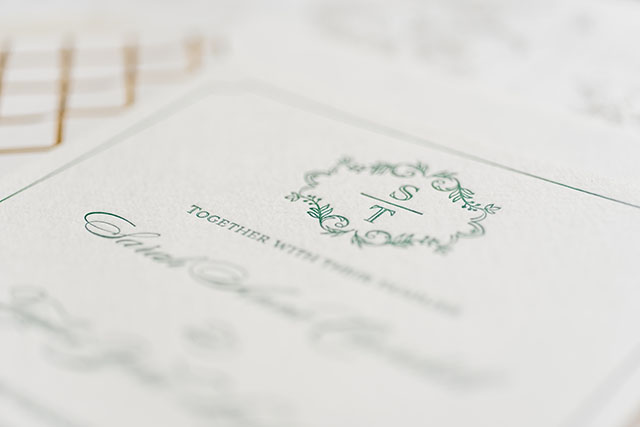
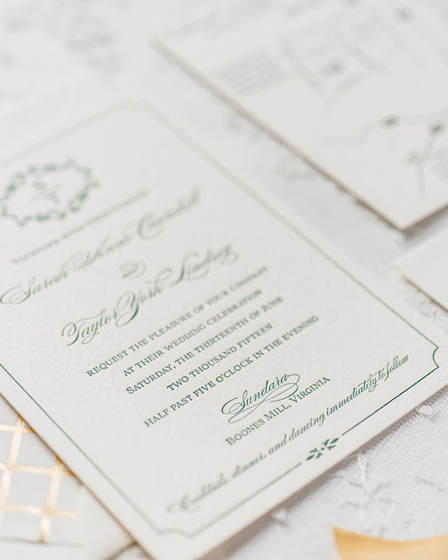
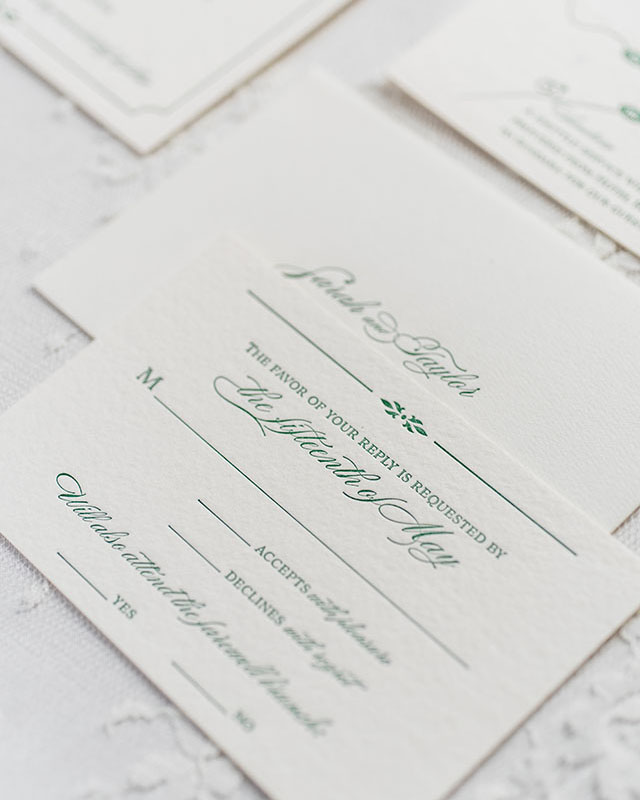
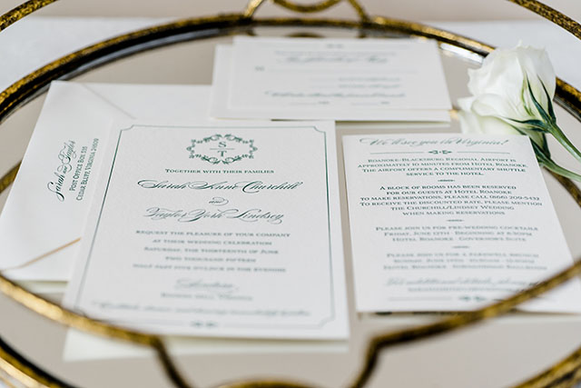
Everything we do is letterpress printed in house. While there are a ton of great letterpress stationery companies out there, I think our minimal design and copywriting sets us apart from some of the others. Smart words on a page – that’s our thing. Humor has also been known to be our calling card. 99% of our products have no real sentiment or intention other than to make someone laugh. A few years ago, I started reaching out to folks in the hopes of collaborating on some cards. The collaborations have lead to great friendships, lasting partnerships, and have resulted in some of our best selling cards. Working with others is something that we’ll always do.

Behind the Stationery: Sapling Press / Oh So Beautiful Paper

I hired my first full-time employee almost four years ago. There are now seven of us here, and everyone has their own role in the business. The shop employs 3 printers, 2 packagers, and a project coordinator who runs everything else behind the scenes. We meet every Monday to go over the week in regards to deadlines, meetings, custom orders, etc…and then we each go our separate ways and do our thing throughout the week.

Behind the Stationery: Sapling Press / Oh So Beautiful Paper

Behind the Stationery: Sapling Press / Oh So Beautiful Paper

Behind the Stationery: Sapling Press / Oh So Beautiful Paper

As the business has grown, I’ve found myself sitting more behind the desk than behind the press, which has been my biggest adjustment within the business. These days I play the role of creative director, head of product development, social media maven, and all the other non-glamorous jobs that come along with owning a business. When I’m not here at the shop, I’m busy being a mom and shopkeeper at Sapling & Sons, a separate retail shop I opened almost one year ago. I like to stay busy.

Behind the Stationery: Sapling Press / Oh So Beautiful Paper

I struggle with time management more than anything else. Because I’m a night owl, I sometimes count all 24 hours in the day as possible working hours. I’m a lot better than I used to be, but I still enjoy an all nighter every once in a while. The majority of my ideas, designs, and scheming are all done after midnight. My inspiration comes from anywhere and everywhere. I love watching sketch comedies. I like pop culture. The wordsmiths of ’90s hip hop. I love people watching. When something gives me pause, or I find myself laughing at something, I make a note of it on my phone. Why did I laugh, what memory did that spark, who did that make me think of, and so on. That rabbit hole usually leads me to a new idea which is always just one card.

Behind the Stationery: Sapling Press / Oh So Beautiful Paper

Because I design in complete collections instead of individual SKUs, I think about how we could expand on that one card. In the end, the result is usually about 8-12 cards within that collection. As time goes on, I’ve realized we seem to have a bit of a formula. A caffeine reference, a grammar reference, a pop culture reference, and so on. I write what I can, keep what I think is good, and then reach out to my collaborators to see what they can add.

Behind the Stationery: Sapling Press / Oh So Beautiful Paper

Once I go through their ideas, I filter them down a bit, and then share them with the team. The ideas are printed out, and everyone is asked to read them on their own and simply make a note as soon as one makes you laugh out loud. Those are always our winners. Designing this way has us expanding our line by about 40-50 new cards a year, keeps us current, and continues to help the business grow in every direction possible. Our next endeavor is a brand new website, product lines that go beyond stationery, and a collaboration between some of our favorite local designers on a new line of Sapling Press wedding stationery. Gotta love the hustle!

Behind the Stationery: Sapling Press / Oh So Beautiful Paper

Photos by Matt Dayak

Interested in participating in this column? Reach out to Megan at megan(at)ohsobeautifulpaper.com for more details about Behind the Stationery.

How to Use Vintage Stamps

I love, love, LOVE using vintage postage stamps on envelopes. They add a little something special to everything from wedding invitations to dinner and cocktail party invitations to baby announcements. Vintage stamps offer a wonderful opportunity to represent your personal style, whether chosen thematically or by color palette. And since unused postage never expires, there are endless options to suit every type of occasion – from a formal black tie wedding to a casual backyard gathering. Here are a few of my tips for how to use vintage stamps – plus, I put a collection together with some of my favorite vintage stamps that you can use in your own projects!

How to Use Vintage Stamps / Oh So Beautiful Paper for eBay

How to Use Vintage Stamps / La Happy

Photo Credit: La Happy Design & Calligraphy

1. Add it Up

First things first: vintage postage must add up to current postage rates. While searching and shopping for stamps, make sure that you have one stamp worth at least 25¢ (or more!). Wedding invitations and birth announcements mailed in a larger envelope usually require a minimum of 71¢ postage. The 3¢ and 8¢ stamps are great for rounding out a color palette or subject theme, but you’ll need a 29¢ or 33¢ stamp in the mix to make up the difference in the total postage amount.

How to Use Vintage Stamps / Wondrous Whimsy

Photo Credit: Diana McGregor Photography / Calligraphy by Wondrous Whimsy

How to Use Vintage Stamps / Anne Robin Calligraphy and Underwood Letterpress

Photo Credit: Stephanie Collins Photography / Calligraphy by Anne Robin / Vintage Postage by Underwood Letterpress

2. Plan it Out

Plan your stamp arrangement ahead of time to make sure you leave room for an address – and to maximize visual impact. Some stamps look best in a straight row across the top of an envelope, while others look best in a puzzle piece arrangement in the corner. It all depends on the stamps you select!

How to Use Vintage Stamps

Calligraphy: The Weekend Type / Floral Styling: The Moss & Rose / Styling: Two Be Wed / Photo Credits: Korie Lynn Photography

How to Use Vintage Stamps / Anne Robin Calligraphy and Underwood Letterpress

Photo Credit: Stephanie Collins Photography / Calligraphy by Anne Robin / Vintage Postage by Underwood Letterpress

3. Color Theory

The easiest way to group vintage stamps together? By color! Let your wedding color palette guide your vintage stamp selections and your envelopes will shine! You can even address the envelopes using ink in a complementary color to make your envelopes even more special and complete the overall look.

How to Use Vintage Stamps / Antiquaria Design

Photo Credit: Antiquaria Design Studio

4. Personal Geography

I love it when couples share a glimpse of their personal history – and geography! – in their vintage stamp selections. It can be as simple as a stamp with the city or state where the couple met, along with stamps of their home state. Perhaps they grew up in Montana and Texas but met in college in DC. When placed together on an envelope, these stamps tell such a fun story!

How to Use Vintage Stamps / Coral Pheasant

Photo Credit: Coral Pheasant

How to Use Vintage Stamps / Lauren Chism Fine Papers

Photo Credit: Lauren Chism Fine Papers

5. Stick to a Theme

Love science? Have a passion for architecture? Maybe you’re both crazy for horses, or you met while working on a political campaign. Whatever your interests, let them shine in your envelope postage! You can find vintage postage stamps for practically any topic or theme, from travel to modern art.

How to Use Vintage Stamps / Blue Eye Brown Eye Calligraphy

Photo Credit: Blue Eye Brown Eye Calligraphy

6. Pretty Botanicals

If themes aren’t your thing, go with flowers! My favorite vintage stamps feature floral designs – and they look so incredibly beautiful when grouped together on a wedding invitation envelope! My favorite floral stamps are the Mississippi and Alabama statehood stamps, along with this love stamp.

p.s. Where to find (and buy) vintage stamps and more inspiration for mixing vintage stamps

This post was created in partnership with eBay. All content and opinions are my own. Thank you for supporting the sponsors that make Oh So Beautiful Paper possible!

Timeless Green and Gold Foil Wedding Invitations

These classic letterpress wedding invitations from designer Amanda Day Rose feature elegant typography paired with organic elements I’m loving the combination of dark green ink and gold foil!

Timeless Green and Gold Foil Wedding Invitations by Amanda Day Rose / Oh So Beautiful Paper

From Amanda: The bride and groom really wanted their invitations to reflect the natural yet timeless look of their wedding celebration. I designed a custom monogram with a minimal, organic wreath to tie in the overflowing greenery they planned to incorporate in their wedding celebration. I chose really elegant typography to ensure the look would be one they would fall in love with all over again in 50 years!

Timeless Green and Gold Foil Wedding Invitations by Amanda Day Rose / Oh So Beautiful Paper

I then added small touches of organic elements for a completely customized look. The entire invitation suite was printed on a beautiful, creamy Italian cotton paper for a luxurious, yet natural feel. We chose gold foil envelope liners to enhance the timeless look as soon as guests open the envelopes, and to tie in the gold elements they used throughout their wedding day celebration.

Timeless Green and Gold Foil Wedding Invitations by Amanda Day Rose / Oh So Beautiful Paper

Timeless Green and Gold Foil Wedding Invitations by Amanda Day Rose / Oh So Beautiful Paper

We tied in the remaining elements of their day-of stationery with the dark green ink and monogram throughout their wedding day, and even added a custom monogrammed wax seal to the escort cards and programs for an additional timeless feel.

Timeless Green and Gold Foil Wedding Invitations by Amanda Day Rose / Oh So Beautiful Paper

Timeless Green and Gold Foil Wedding Invitations by Amanda Day Rose / Oh So Beautiful Paper

Timeless Green and Gold Foil Wedding Invitations by Amanda Day Rose / Oh So Beautiful Paper

Thanks Amanda!

Design: Amanda Day Rose

Printing: Page Stationery

Check out the Designer Rolodex for more tal­ented wed­ding invi­ta­tion design­ers and the real invi­ta­tions gallery for more wedding invitation ideas!

Photo Credits: Caroline Lima

Stationery A-Z: For the Cat Ladies

Happy National Cat Day everyone! You didn’t think I could let such a momentous occasion go by without rounding up a few favorite cat cards, did you?? I actually found so many great cards that I created an entire page in the Market List dedicated to our favorite feline companions – you can find it right here! Now go snuggle a cat somewhere and send one of these cards to your best cat lady!

National Cat Day Card Round Up / Oh So Beautiful Paper

1. Ladyfingers Letterpress

2. Sapling Press

3. Hello!Lucky

4. Rifle Paper Co.

5. Lucky Horse Press

6. Sue Jean Ko

7. Gold Teeth Brooklyn

8. Hartland Brooklyn

9. Grey Moggie

10. Amy Heitman

11. The Good Twin

12. Dancing Cat Art