Trendspotting: Terrazzo

If you follow interior design trends, then you already know that terrazzo has been making a major comeback over the last couple of years. For those of you not familiar with this material, terrazzo is a composite material of stone fragments (usually marble, quartz, granite) set into cement and polished to give it a smooth surface. Terrazzo originated in 16th-century Italy as a way to reuse stone offcuts, became popular again during the midcentury design era, and is now enjoying another resurgence today! The pattern made from all the little stone fragments kind of looks like oversized abstract confetti – and I like it! It’s fun and whimsical, but also sophisticated and European all at the same time. I figured it was past time for a terrazzo-inspired stationery round up!

Trendspotting: Terrazzo


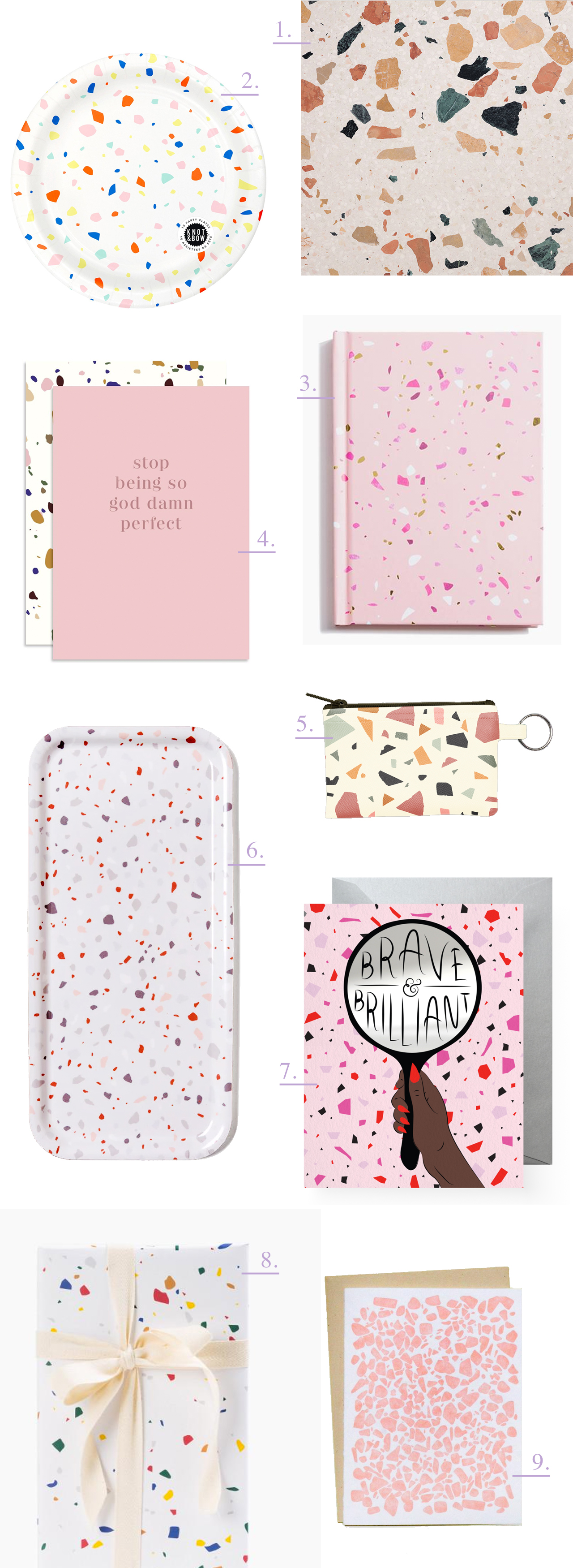
1. Terrazzo sample via Elle Décor UK

2. Rainbow paper party plate by Knot and Bow

3. Pink terrazzo notebook by Poketo

4. The Social Type uses terrazzo-inspired envelopes throughout their snarky new card line, Anti

5. Lots of cute terrazzo-inspired goodies in this collection from Talking Out Of Turn, including this key ring pouch, this tote bag, and these glassess (!!). 

6. Terrazzo-inspired tray by Micush

7. Boss Dotty uses several terrazzo-inspired background designs in her cards. This one is a favorite.

8. Terrazzo wrapping paper by Poketo

9. Lots of fun terrazzo-inspired patterns from And Here We Are, including this letterpress printed card and gift wrap!

New Giveaway! Legion Paper Colorplan Paper!

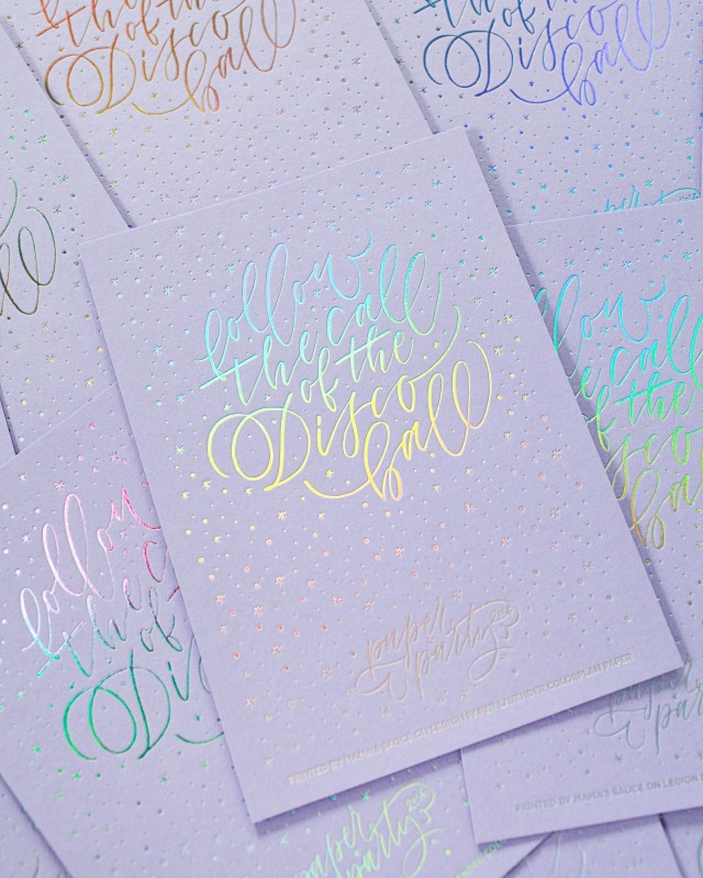
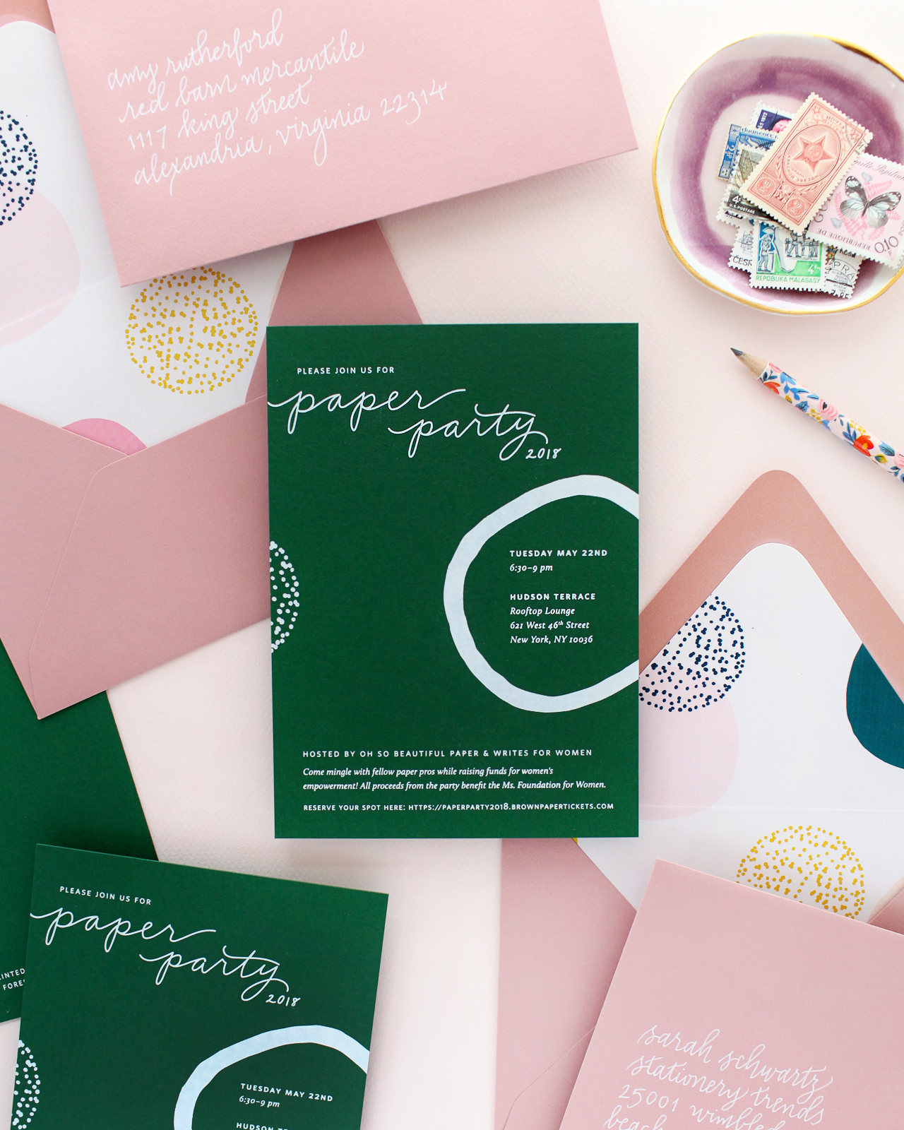
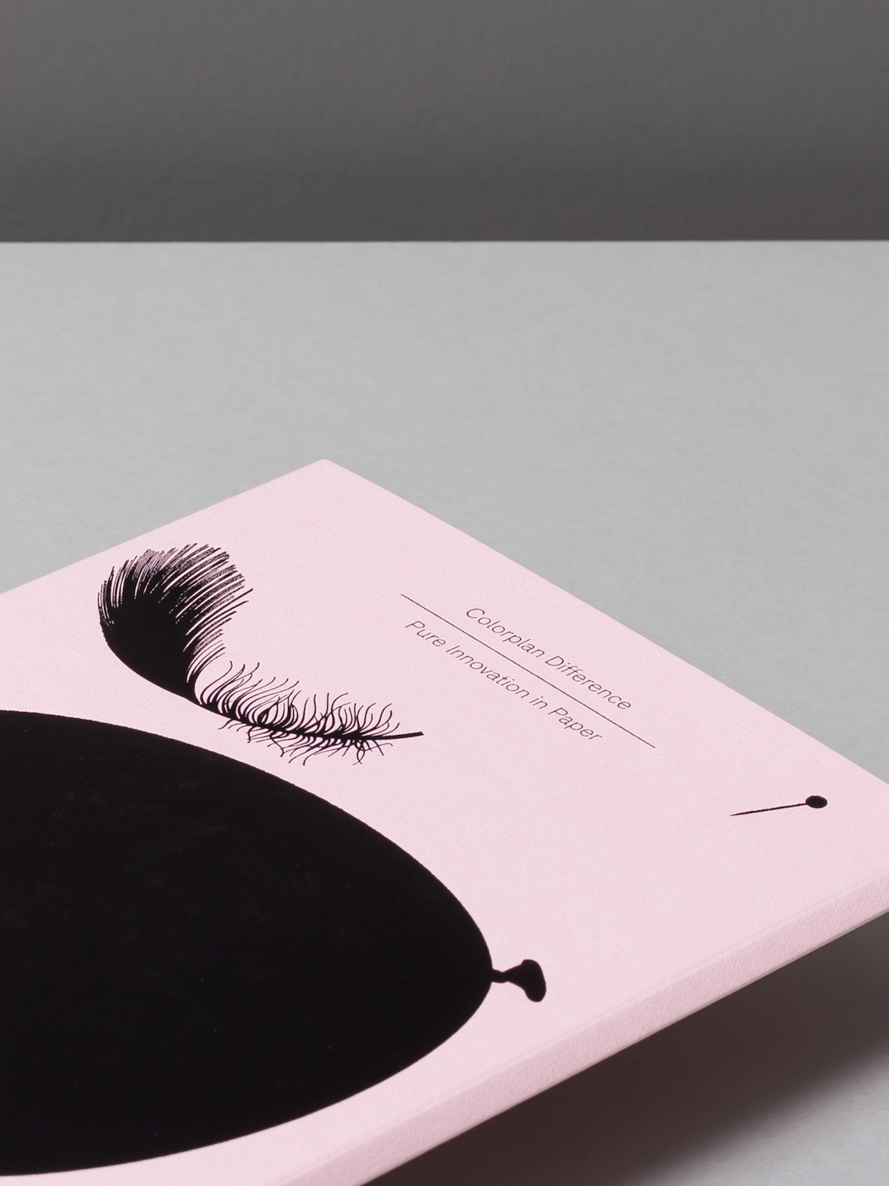
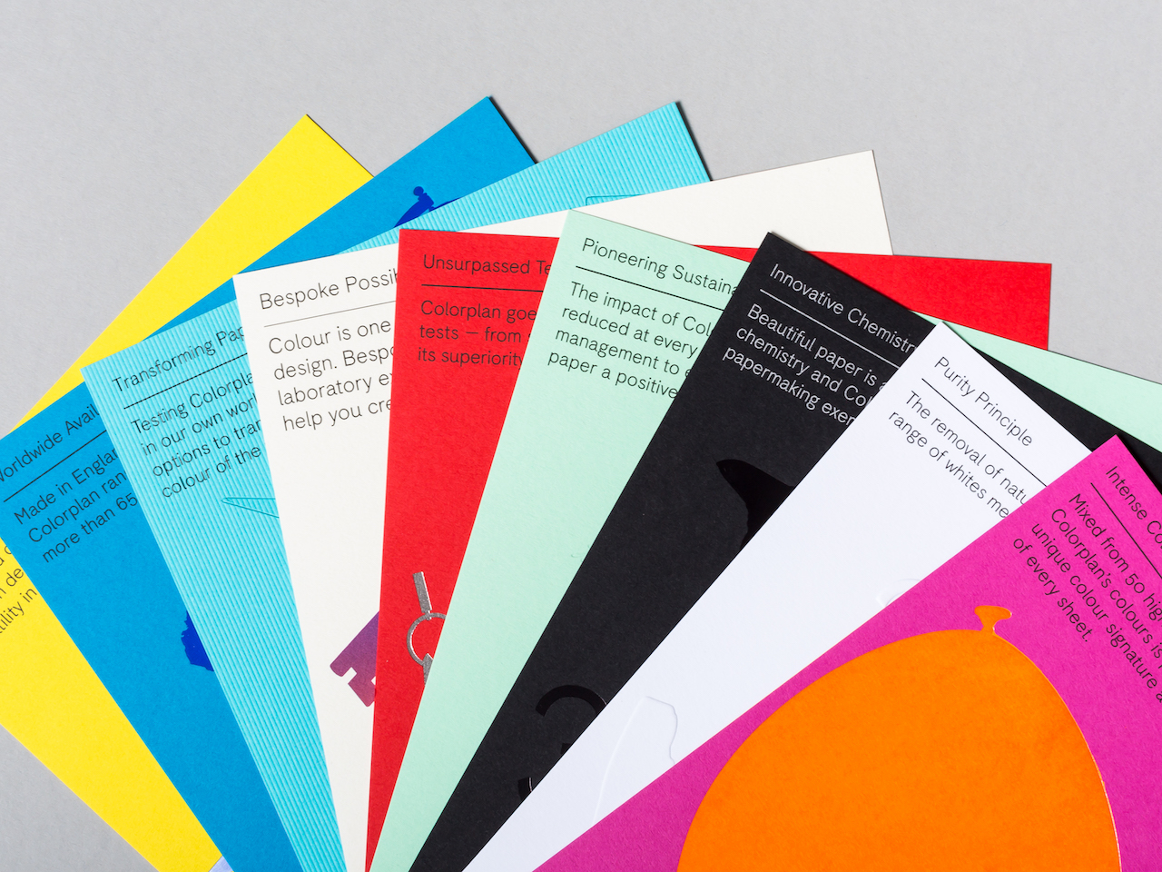
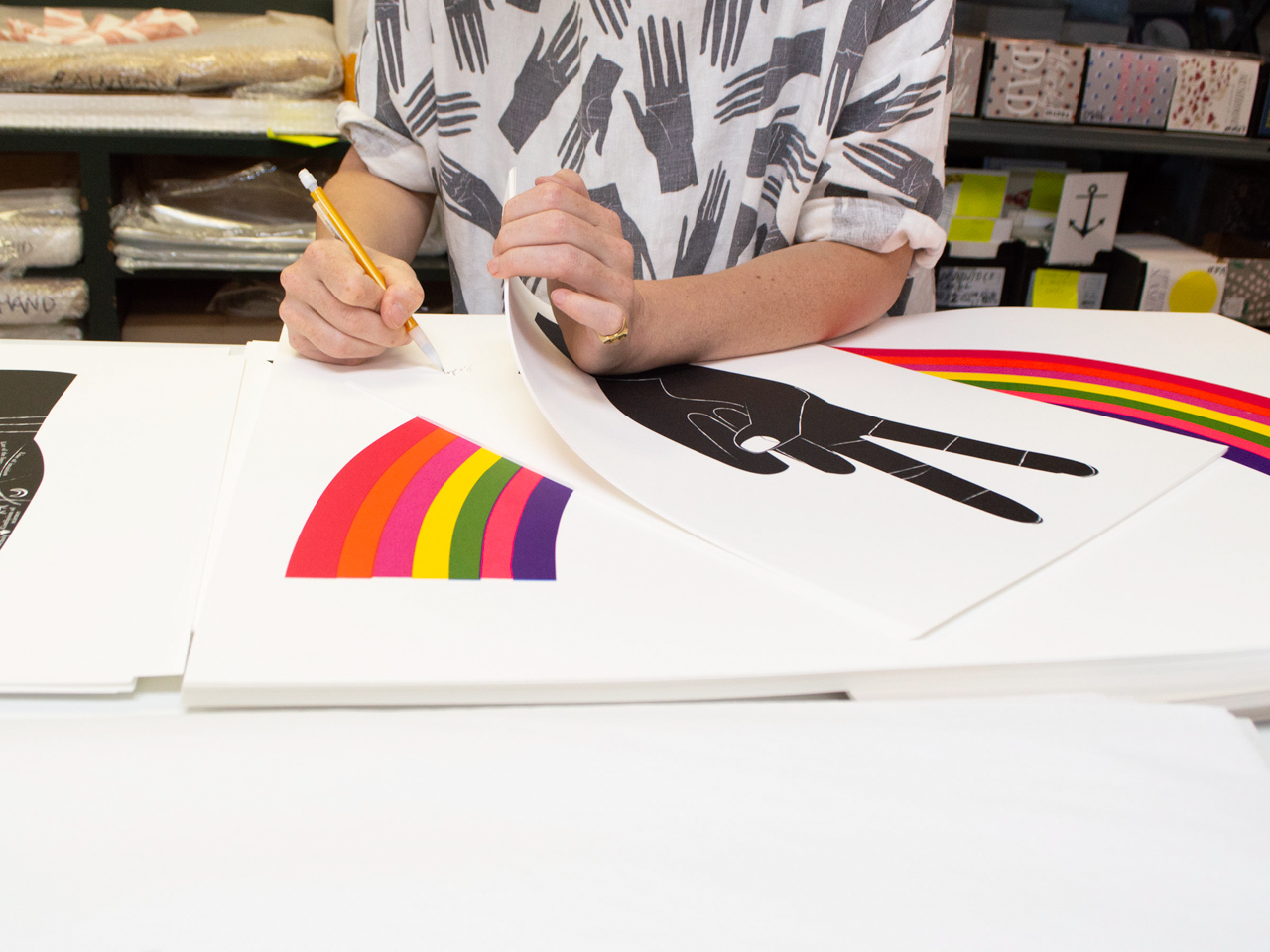
Alright designers and stationers, this giveaway is for you! I’ve been so excited to see more and more colorful papers being used in stationery, from wedding invitations to greeting cards. There are so many great colorful paper options, but my absolute favorite is Colorplan. The colors are just SO GOOD. You might remember that we used Forest Green Colorplan paper and Candy Pink envelopes for our gorgeous Paper Party 2018 invitations, and we also used Colorplan Lavender paper for this fun hologram foil art print for Paper Party 2016! I’m a huge, huge fan of colorful paper and can’t wait to see more of it in the years to come. If you’re a designer interested in possibly using Colorplan papers for your own work, you’re in luck – we’re giving away a really fun and colorful Colorplan demo piece with nine printed sheets from the wonderful folks at Legion Paper!

Paper Party 2016 Art Print on Colorplan Lavender Paper

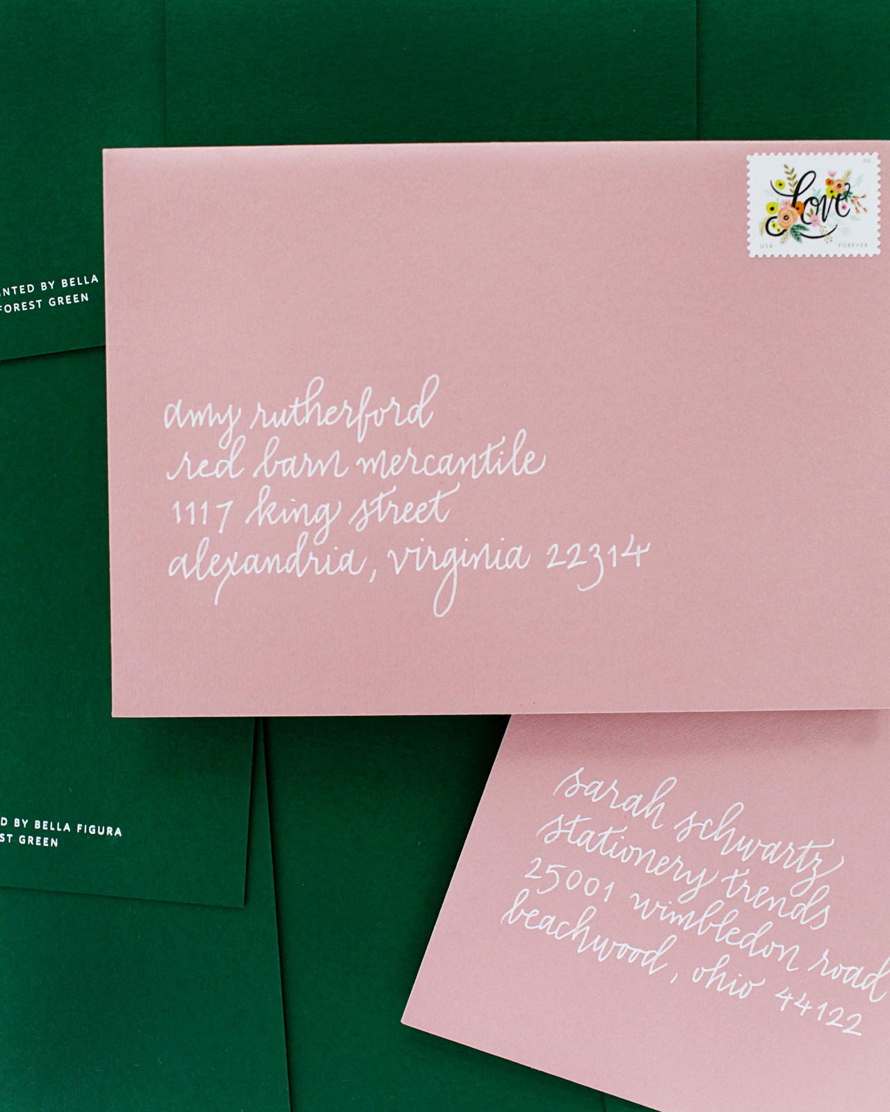
Paper Party 2018 Invitations on Colorplan Forest Green Paper

Paper Party 2018 Invitations on Colorplan Forest Green Paper

Paper Party 2018 Invitations on Colorplan Forest Green Paper

If you’re unfamiliar with Colorplan, it’s a paper range of 50 colors, 8 weights and 25 embossings, all made in the United Kingdom. The colors range from bright yellows to deep blues and greens to pastel pink and lavender, along with a beautiful range of colorful neutrals. Colorplan is obviously totally gorgeous paired with foil and letterpress printing, but there is also a brand new collection of digital Colorplan papers! Colorplan digital includes the most popular colors, including Azure Blue, Lockwood Green, and Pale Gray, treated specifically for the digital press in order to meet the demands of the growing market. You can check out the full Colorplan digital collection right here. I’m imagining greeting cards and wedding invitations with beautiful floral illustrations printed on these gorgeous colorful papers and I am TOTALLY here for it.

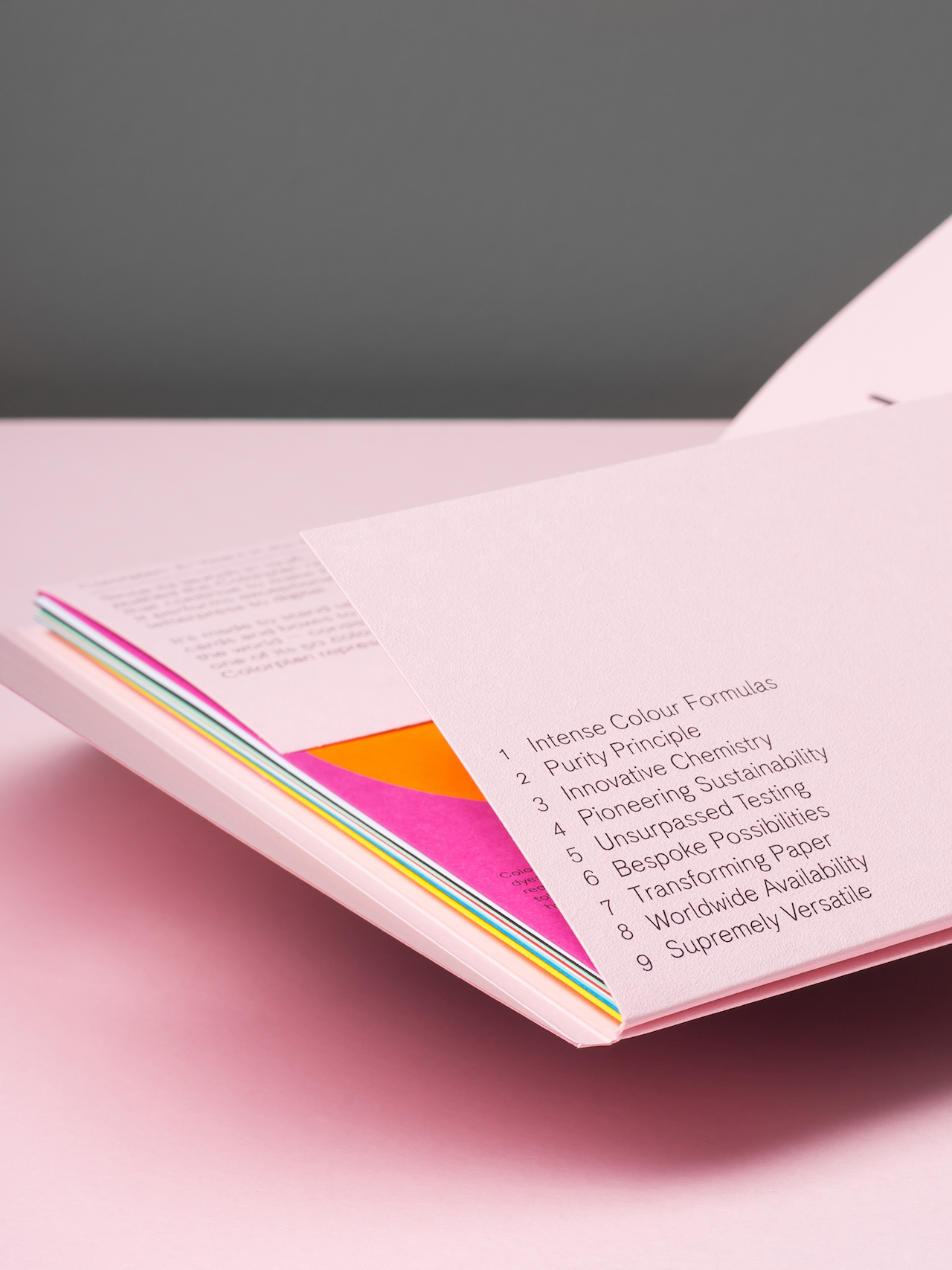
Colorplan Digital Papers

The Colorplan piece that we’re giving away today showcases all of the features that make Colorplan unique, including Colorplan’s intense color formula, innovative chemistry, environmental sustainability, and versatility. Colorplan’s 50 colors are a unique blend, mixed from more than 50 high-intensity dyes and pigments. The removal of natural acids from Colorplan’s range of white papers means they stay brighter and last longer, while innovations in papermaking are exemplified in Ebony, an intense carbon-free black that won’t rub against other surfaces or tarnish when foil printed. The impact of Colorplan’s production is measured and reduced at every possible opportunity – from forest management to energy use – making it a positive force toward a balanced environment. On press, Colorplan has been optimized for use with digital printing, letterpress, lithography, foil, and embossings, as well as packaging and envelopes. You can do pretty much anything with it!

Colorplan Digital Papers

To enter, just follow the options on the Rafflecopter below – there are three different ways to enter! You have until midnight EST on Friday, August 3 to enter!

Colorplan Digital Papers

a Rafflecopter giveaway

*Sorry, limited to U.S. readers only. $50 approximate total retail value. Winners will be contacted via email after comments close.

This post is sponsored by Legion Paper. All opinions are my own. Thank you for supporting the sponsors that make Oh So Beautiful Paper possible!

Behind the Stationery: Banquet Workshop

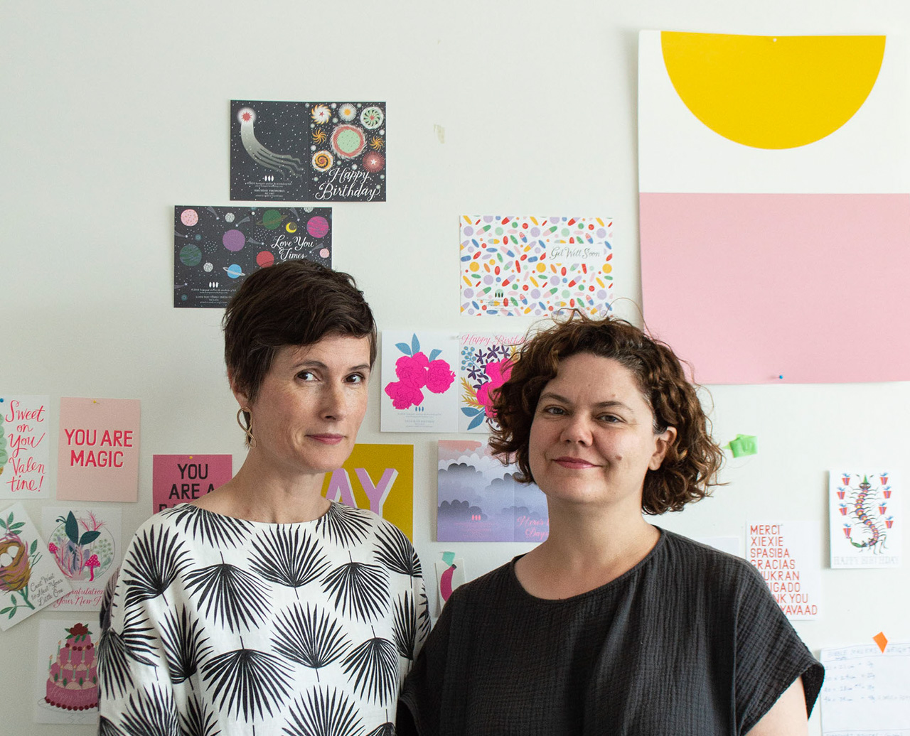
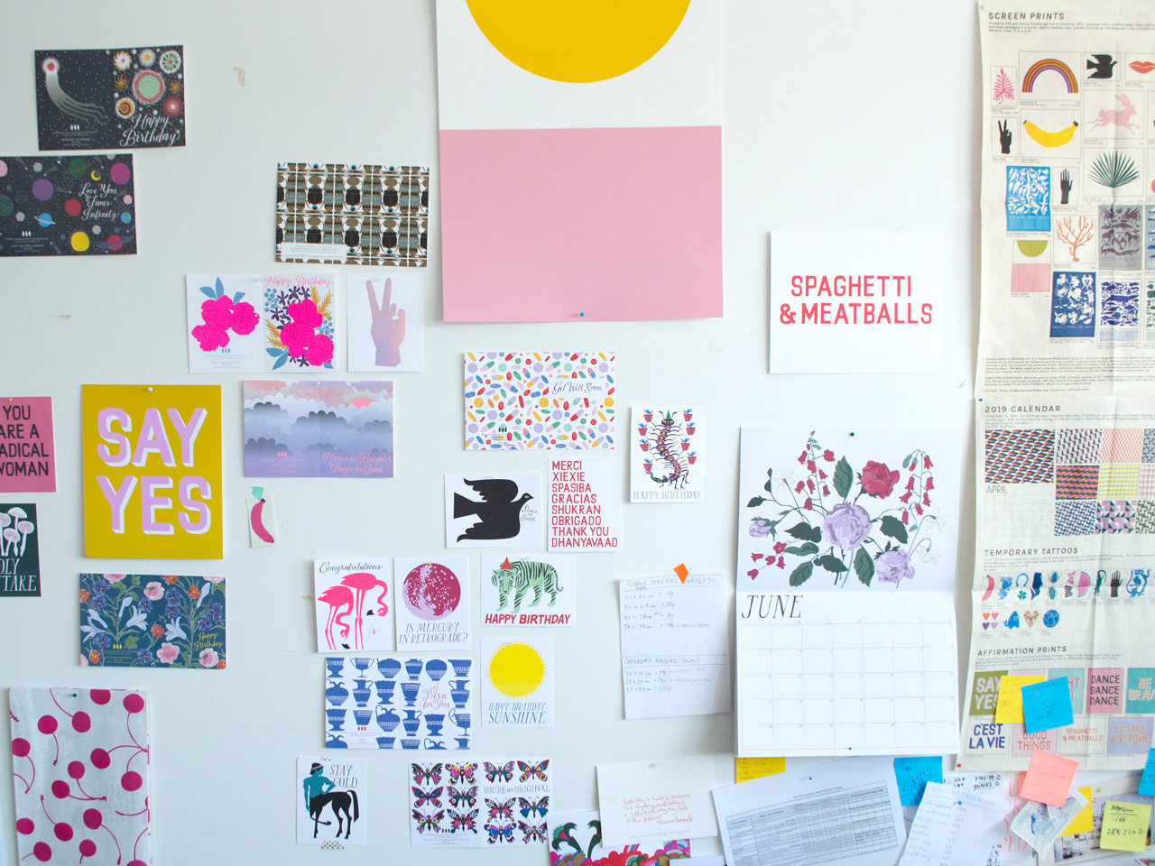
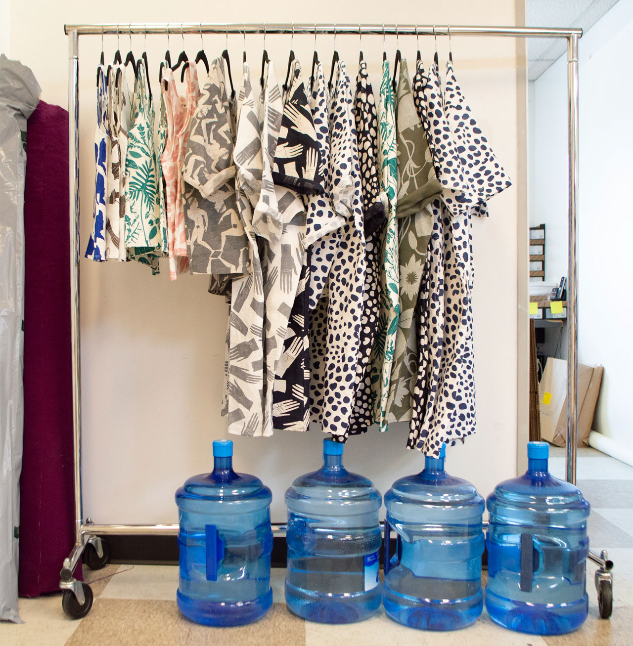
For our next installment of Behind the Stationery, we’re headed to Vancouver to talk with Sarah and Tammy of Banquet Workshop! A mainstay in the stationery world for 8 years and counting, Banquet Workshop’s graphic illustrations are bright and bold (and never quiet) have been translated into everything from art prints and everyday stationery to clothing and jewelry. Sharing about their lives before Banquet Workshop, the strong influences in their work and the importance of staying flexible, here is Sarah and Tammy! —Megan Soh

Behind the Stationery: Banquet Workshop

Tammy: Before Sarah and I started working on Banquet Workshop together I was working in development for a television production company whose main focus was documentary and reality-type television. Think adventure cooking shows, family swaps, life a fighter pilot as well as documentaries that tackle issues around homelessness, political prisoners, civil rights cold cases and local food movements. It was definitely interesting and fun work, but once I had my first child I realized that a more flexible job would be in my family’s best interest. I also always loved being my friend’s hypewoman and had a love of stationery since I was young. It seemed like a natural jump to work with Sarah on Banquet where I can combine both these things!

Sarah: I had worked as an artist and in both commercial and not-for-profit galleries, but had always done design and hand-work on the side. Banquet started with our Sea Animals of the Pacific Northwest screen print, and from there it was a natural segue to partner with Tammy and move into stationery.

We met through a friend when Tammy moved back to Vancouver from living in Montreal and Sarah was working at an artist run centre. We had many (too many!) ideas that we wanted to work on including sun suits for kids, becoming hand bag designers, making kid’s craft kits (which we did do!), but Sarah had already been making prints and cards. We realized quickly that we could build something bigger with making paper products that could potentially support our families. That said, we still freelanced for the first four years or so of starting our business – Sarah doing design and Tammy working in TV.

Behind the Stationery: Banquet Workshop

We are located in beautiful Vancouver on the west coast of Canada where we are surrounded by oceans and mountains. Our location definitely informs our work. When you are 20 minutes to the beach and forest there is definitely no way to avoid the influence. We also have a strong community of creative women that are forever discussing business, art, fashion, colour theory as well as the politics of the day, and they really motivate us as mothers, creatives, and entrepreneurs.

We have a good sized studio with a view of a luxury car dealership and the mountains, where we pack and ship our orders. Tammy works here mainly with our awesome employees. A lot of the magic happens at Sarah’s house in her home-based studio where she can focus on the creative inspired by her garden, a vast collection of vintage books and textiles, and fueled by too much coffee.

Behind the Stationery: Banquet Workshop

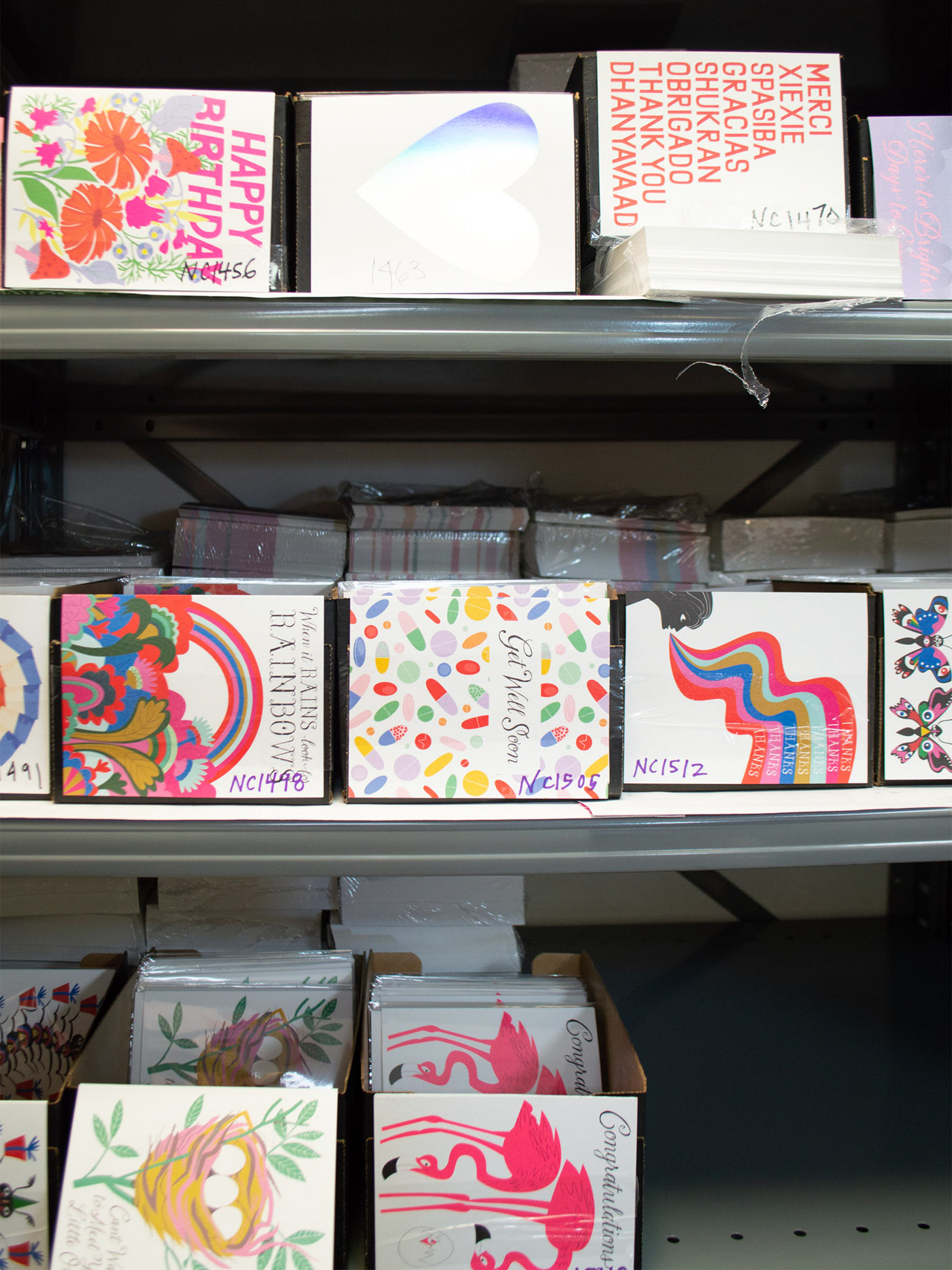
We print a few different methods: screen printing for posters and yardage, offset printing for cards, and letterpress for our garlands/ gift tags. All of our printers are truly passionate about what they do and we love the collaborative production process.

If we had to say what makes us unique (such a hard question for two humble Canadians to answer!) it would be our flair for colour and a distinct graphic style. We are also able to charge ahead when inspiration hits and are not often tied to trends. We really do what we want to do and are always looking to make our business more sustainable and interesting. We have now been in business for over 8 years and haven’t run out of new ideas that we want to do! The list grows longer by the day.

Behind the Stationery: Banquet Workshop

Every day is different for each of us but the main things that need to happen always are new products and sales!!! All the other tasks lead back to this—whether it’s reaching out to new retailers or making sketches for new products. We are always trying to figure out if what we want to make fits into the brand. At the heart of everything we do is a desire to put quality goods into the world that are useful, bring happiness, and make people feel good.

We do not really have a daily/weekly schedule but we talk about it all the time! We do need to have Christmas cards ready in May and are tied to the yearly holiday and tradeshow schedule but I think having variety and fluidity is the key for us being able to be flexible.

Behind the Stationery: Banquet Workshop

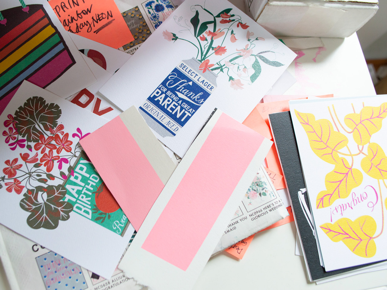
Part of the creative process is always looking and being open to inspiration no matter where we are. Some of our best sellers have come from a hand-lettered sign spotted at the mechanics, a hilarious anecdote from one of our kids, or an amazing new-to-us houseplant at a friend’s house. Getting outdoors is everything, but then actual libraries are of course our happy place, and colour is always a favourite. It’s amazing what a hit of neon pink can do!

Behind the Stationery: Banquet Workshop

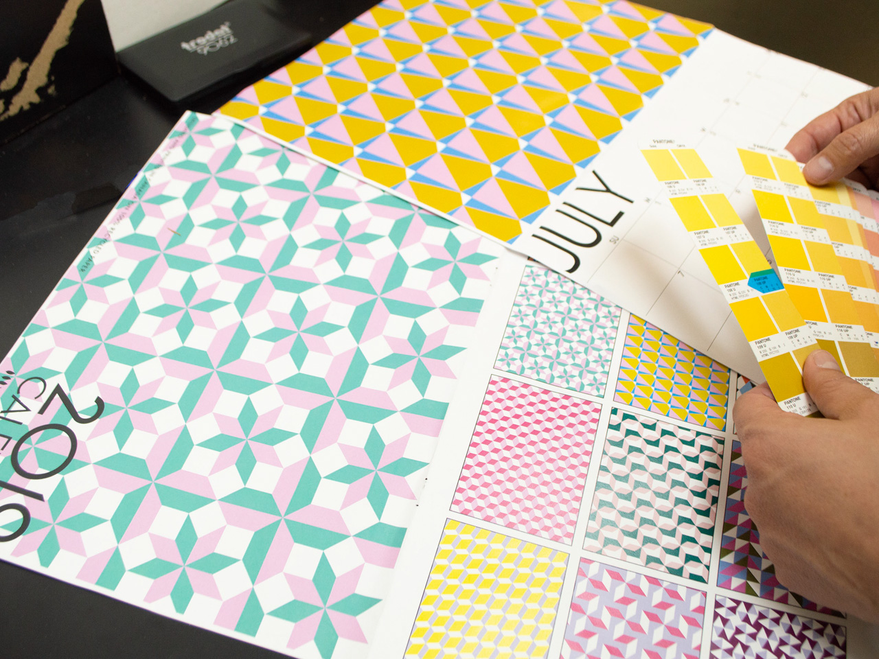
Then it’s a lot of drawing: because we work mostly with vector-graphics, we draw a lot by hand as the initial process and to try and keep things warm. Even with the computer we try to keep that loose feel, quirks and all. All of our type is hand drawn too, with fonts kept as libraries within Illustrator. Colour is where we really get to play, with a specific palette we go back to again and again, dropping in new favourites as we see fit.

Behind the Stationery: Banquet Workshop

Jumping around is an important part of the process too. Sometimes we need to focus on finding a new way to say happy birthday (not so easy!), where at other times we get to work on repeat patterns and styling an entire table setting with our linens, or doing special projects like a recent 4 x 22 metre banner for the Vancouver Board of Parks and Recreation featuring eight specific water-birds spotted in False Creek, a central Vancouver waterway. Variety is what keeps the design process interesting.

Photos courtesy of Banquet Workshop.

Want to be featured in the Behind the Stationery column? Reach out to Megan at megan [at] ohsobeautifulpaper [dot] com for more details.

Behind the Stationery: 1Canoe2

Happy Tuesday! We’re back with another installment of Behind the Stationery featuring one of the best in the business, Beth Snyder of 1Canoe2! Beth moved back to her small town roots and shares how this is so important to her daily life and business. Having been in the business for 10 years and now managing 10 employees, Beth is here to share how she keeps the look and feel of 1Canoe2 consistent and each collection consistent across the brand after all this time. Take it away, Beth! —Megan Soh
Behind the Stationery: 1canoe2

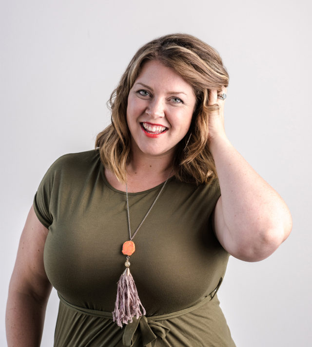
Photo by Drew Piester Photography

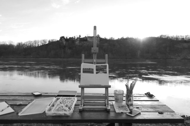
From Beth: I have always been a visual person. I don’t remember a time when I didn’t love to draw, look at photos of far away lands in my parents’ National Geographic magazine, do crafts, and generally “make stuff.” This love of art mixed with my tendency to dream really big led me to start several little companies which served as a vehicle to sell my creations and enhanced the planner side of my personality.

I got a BFA in Graphic Design and Fibers from the University of Missouri (Mizzou) and while I was there, I worked almost full time at the local NBC affiliate TV station doing every kind of design work you can imagine. And when you work at a small company and show some initiative, you get to have a lot of responsibility! I designed TV sets, graphics for the news, logos, signage, and marketing materials. When I graduated I looked around and didn’t think I could find a creative job close to home, so I headed to Nashville, Tennessee (before it was the hot thing to do) and worked at the CBS affiliate there for 6 years. I won an Emmy for graphic design in television, and I also met my husband!
Behind the Stationery: 1canoe2

I never lost my intense sense of homesickness for gravel roads, big open skies, and being a small town dweller. We moved “back home” to our sweet little town of Fulton, Missouri (population: 12,000).

I’ve always had a penchant for selling a little something that I made. At the end of my stay in Nashville, I got a tiny Kelsey Excelsior 5×8 letterpress and learned everything I could from blogs, a friend, and internet forums. Pretty soon, I called up my childhood friend who was a talented artist and told her to send me some of her drawings and I would make plates which we could print together. 1canoe2 was born! That was almost 10 years ago, and studio locations and iterations of the business structure have come and gone. Now we have 10 employees, our own building in our historic town, and a following of really devoted fans who love to see what we’re up to on Instagram!

Behind the Stationery: 1canoe2

I’d love to tell you a little bit about our corner of the world, because we believe it’s at the very center of our success. We’re based in the middle of a rural part of the Midwest. There’s a grand total of 40,000 people who live in our county. A mile from my house in the middle of town, you’ve got dirt roads and corn fields—and I love it! I can go out rainbow chasing and post it on Instagram before it’s faded.
Behind the Stationery: 1canoe2

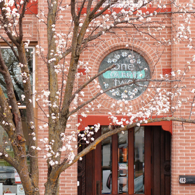
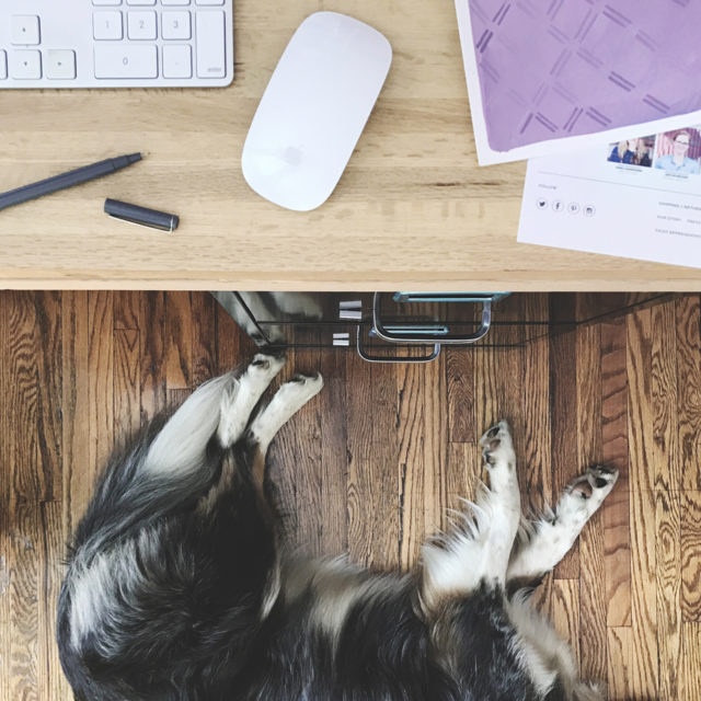
I live just 4 blocks from our studio/warehouse/paperie, on the same street which allows me to walk or ride my bike to work. It’s in an historic home near the downtown Brick District and we love it a lot. My husband, daughter, and our dog Trixie and I walk downtown at least once almost every day. All the little small town parades go right past our front porch. If you’re gonna go small town, do it up!
Behind the Stationery: 1canoe2

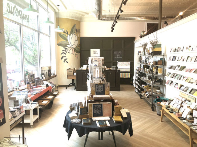
Our studio space is 5,000 square feet right in the middle of the historic business district and it was built in 1902. When I purchased the building in 2016, it hadn’t been inhabited for about 9 years, but in previous lives it had been a bank, a lawyer’s office, and an insurance company. It was definitely a space that required major vision to see through the 12 (!) layers of wallpaper, drop ceilings, maroon carpet, and the 1980s wallpaper. But from the moment I first stepped in the building, I saw a few architectural details that hinted to the treasures that had been concealed with generations of bad taste and small budgets. My favorite discoveries were the intact 14-foot pressed tin ceiling that was actually hidden above an 8 foot ugly fluorescent light drop ceiling, and the curved corner wall on which we painted a mural in the Paperie.
Behind the Stationery: 1canoe2

Now we have a bright sunny office for our team, and a little shop that is a benefit to the community, that is also the most incredible playground for me as a designer and product developer. It’s also amazing to experience the wholesale industry from the side of the buyer – who is our main customer! It’s made us much better at customer experience for sure.
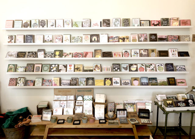
Behind the Stationery: 1canoe2

We are artists and, first and foremost, an illustration company. We happen to sell our artwork on stationery like cards, calendars, planners, etc., because paper is our passion. We started out as a letterpress company with a couple of presses in a barn, and now we use an offset printer to produce our full-color illustrations.
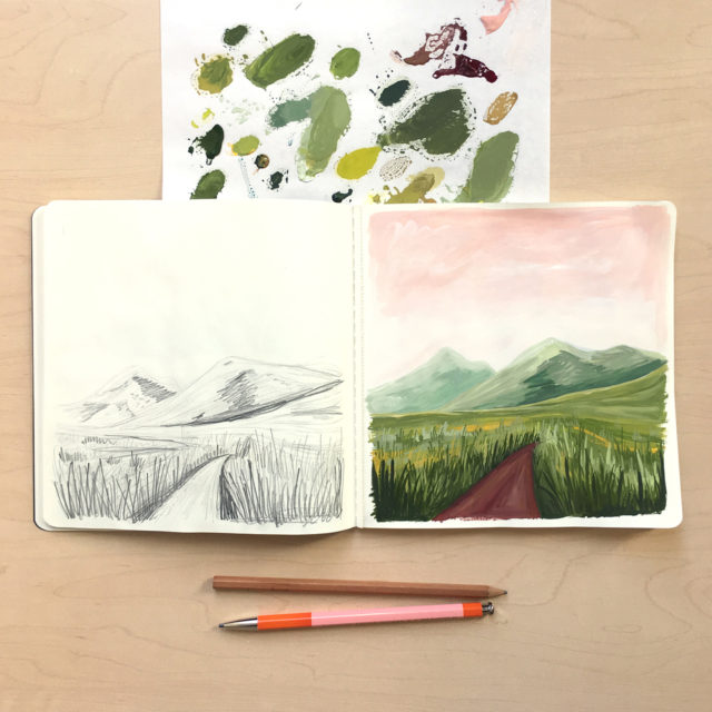
Behind the Stationery: 1canoe2

Our business is unique because of our signature style and the influences that surround us here in the rural Midwest. We hope that our fans could see a card in a shop and immediately know it’s ours. We put a lot of heart and soul into the artwork, and we lead with our paintbrushes.
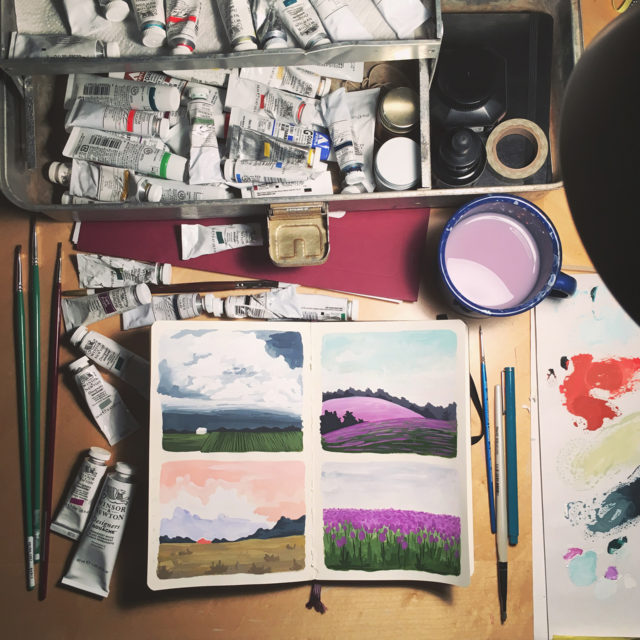
Behind the Stationery: 1canoe2

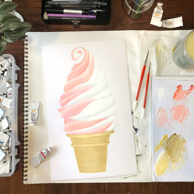
Our creative process is collaborative, and starts with a brainstorming session with every member of the team from shipping and production up to me. We all throw out ideas that we think might make interesting cards — either visuals or wording. The actual design process then goes to the art team, which consist of me as the creative director (and I do a little of the art) and two artists who paint to their individual strengths.
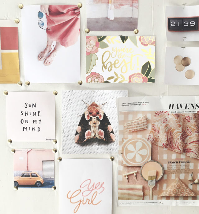
Behind the Stationery: 1canoe2

Behind the Stationery: 1canoe2

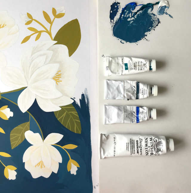
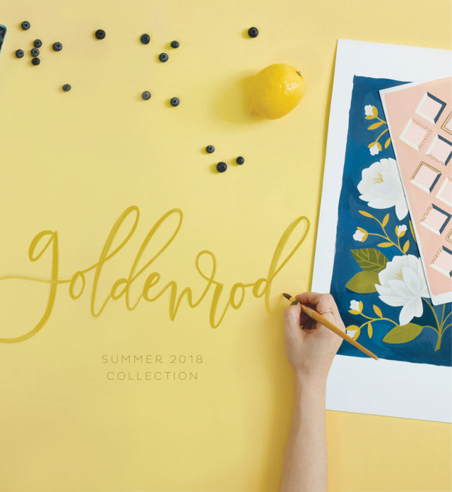
Since we’re three individuals working as a team to create a cohesive look, we have had to hone our process. For our big collections, like the new Goldenrod which we just launched, we work for about a year from a creative brief. Last summer I was really inspired by all the warm, peachy-golden light at the end of August; so I created a creative brief that listed out all the visuals that came to mind and created a vision board of sorts. During one of our art meetings, I presented the concept to Haley and Kate and over the next couple of weeks they went out and pulled their own inspiration images and phrases and added to the brief. We reconvened, and started making artwork based on this creative brief.
Behind the Stationery: 1canoe2

Behind the Stationery: 1canoe2

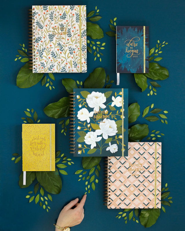
It’s definitely a fluid process, and we’re fine tuning it for our next collection, but I think we achieved our goals of creating an exciting, cohesive collection that has a clear intention. As we’re working on new products for the year, we’re painting new artwork and also using other artwork from the collection to put onto sketchbooks, notepads, cards, etc. But when it’s time to release all the new products, we have a massive library of artwork that can be used for future projects.
Behind the Stationery: 1canoe2

We thrive on a flexible work environment, but we have a lot of projects and we work as a team, so we have meetings. Generally, everyone is at the office on Mondays. We have staff meeting in the morning, and creative meetings in the afternoon. I personally spend a lot of time on big ideas and licensing partnerships. I think it’s my job to keep the company moving forward and creating amazing new things for our audience. I don’t know if it’s possible to accomplish all the big dreams we have, but our team is dedicated to trying!
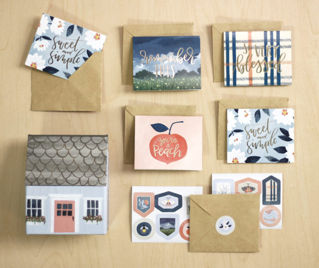
Behind the Stationery: 1canoe2

All photos courtesy of 1Canoe2 except where noted.

Want to be featured in the Behind the Stationery column? Reach out to Megan at megan [at] ohsobeautifulpaper [dot] com for more details.
Paper Party 2018 Modern Minimalist Invitations

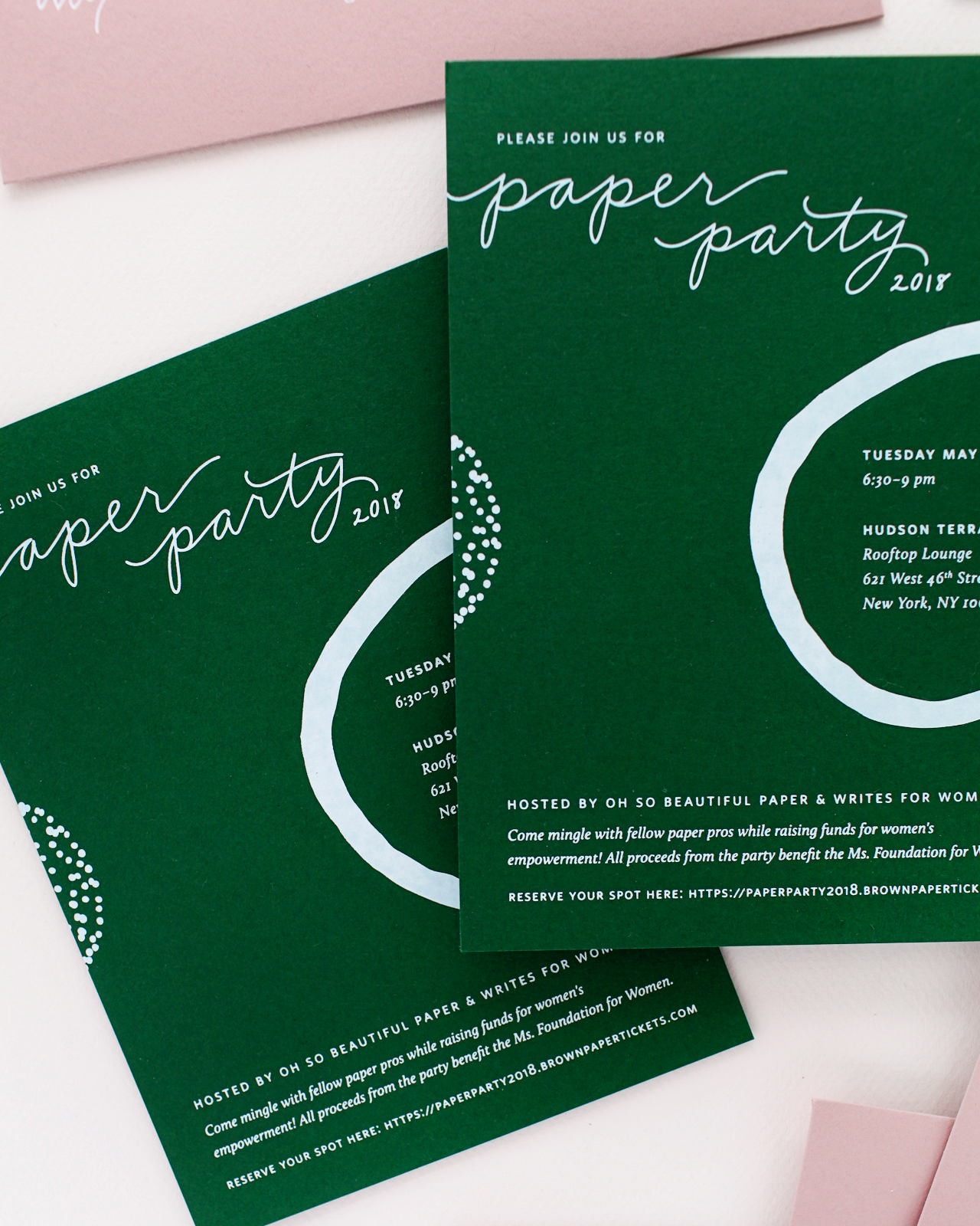
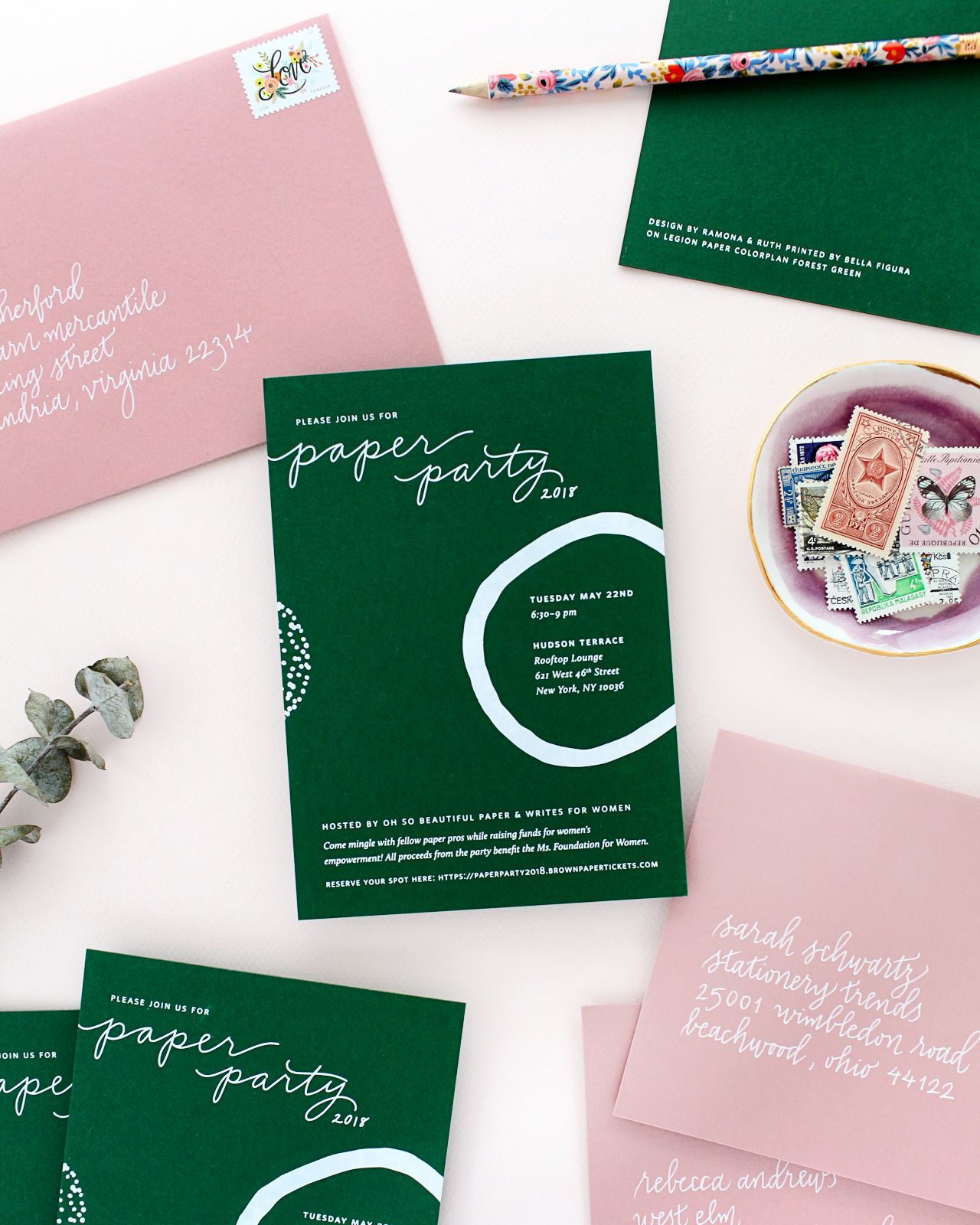
Welcome to Paper Party week! If you’re a longtime reader, you probably know that I host a party for members the stationery industry during the National Stationery Show in New York each May – and this week I’m sharing the invitations and photos from this year’s party! The party is just a fun evening for everyone to come hang out and socialize in a way that isn’t really possible at the show, but this year I also partnered with the stationery industry’s advocacy organization, Writes for Women, to raise money for charity. And you guys! We raised more than seven THOUSAND dollars! Pretty good for our first try, huh? I’ll share photos from the party in another post, and then we’ll wrap up the week with a big giveaway just for OSBP readers of a few goodie bags from Paper Party 2018 filled with amazing stationery. But since we’re all about the paper around here, I thought that I’d start by sharing the amazing Paper Party 2018 modern minimalist invitations. I was lucky to work with an amazingly talented team, including Ramona & Ruth, Bella Figura, Legion Paper, Cards & Pockets, and Meant to Be Calligraphy â€“ this year’s design features modern abstract shapes in matte white foil on a deep green paper. It’s seriously the most dreamy combination!
Paper Party 2018 Modern Minimalist Invitations with Abstract Shapes / Design by Ramona & Ruth / Printed by Bella Figura on Legion Paper Colorplan Forest Green

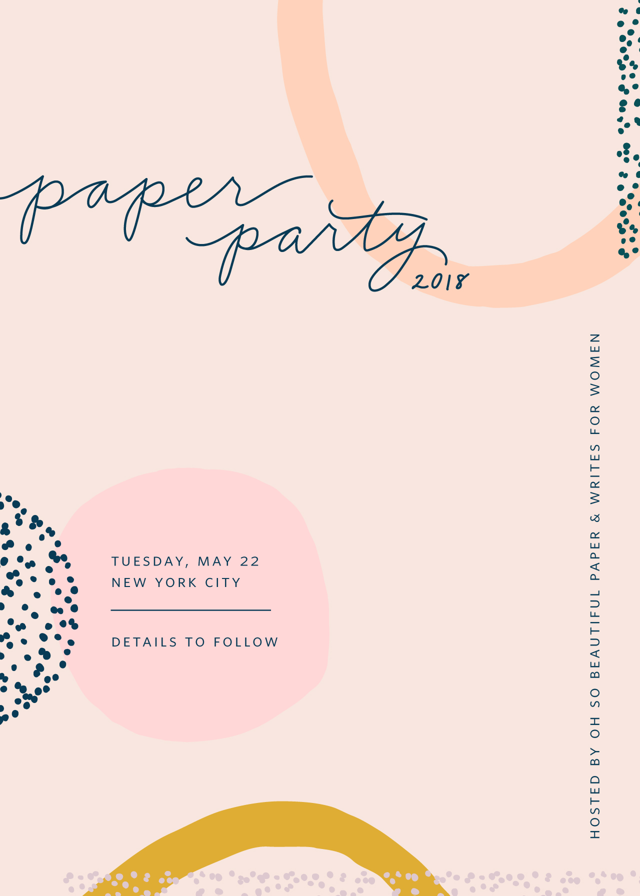
I’ve been feeling really inspired by modern abstract shapes this year, so I immediately turned to Kim of Ramona & Ruth to create the invitation design. I’ve been loving the direction of her recent collections, and this seemed like the perfect opportunity to collaborate! I came up with a color palette of mustard yellow, pale pink, lavender, and forest green and sent that to Kim along with a mood board that I created for the party. We started with a digital save the date that incorporated pretty much every color in the mood board, along with plenty of fun shapes and Kim’s beautiful monoline hand lettering.

Paper Party 2018 Modern Minimalist Save the Date / Design by Ramona & Ruth

Paper Party 2018 Modern Minimalist Invitations with Abstract Shapes / Design by Ramona & Ruth / Printed by Bella Figura on Legion Paper Colorplan Forest Green

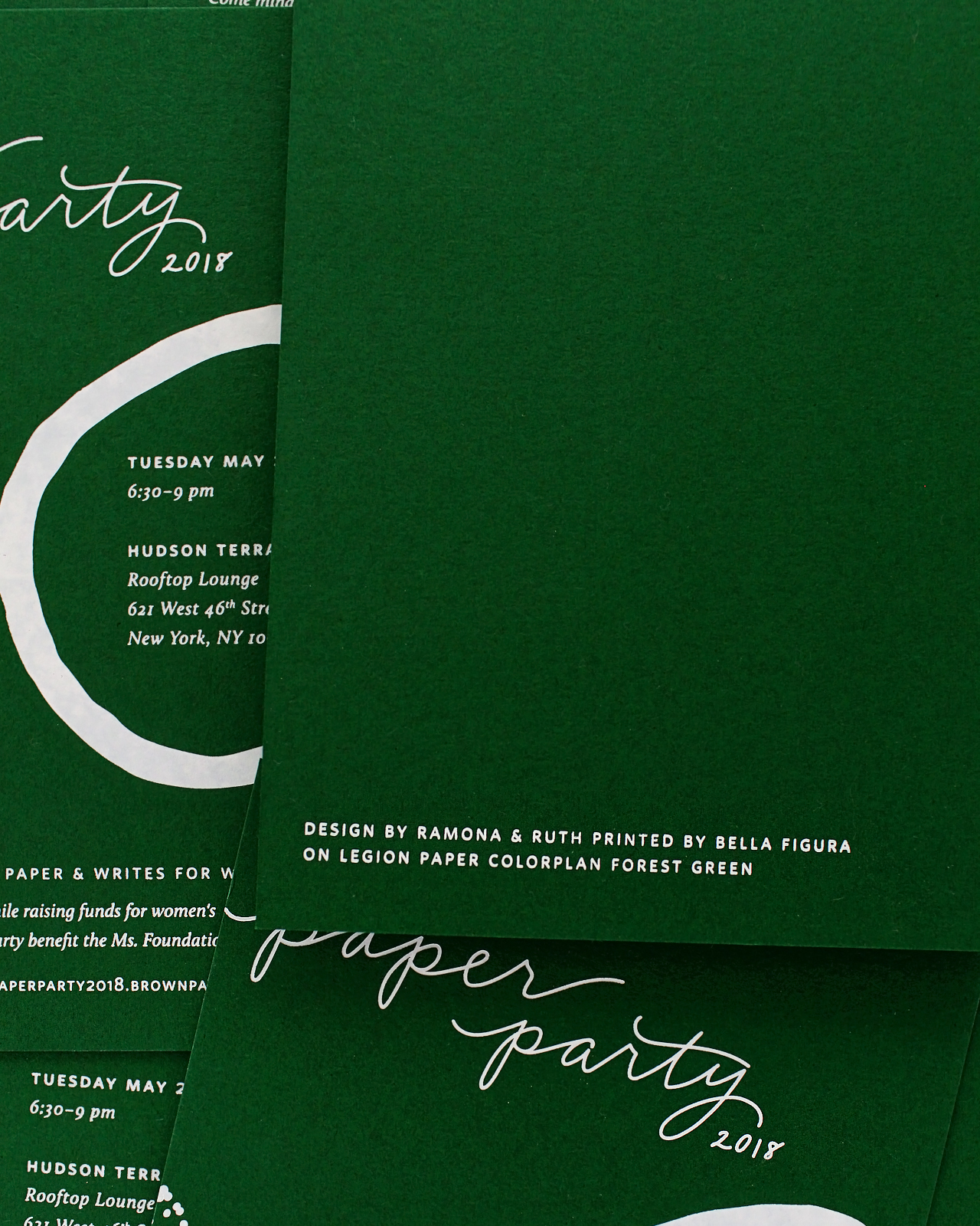
We knew we needed to streamline the design a bit for the printed invitations. I fell in love with a gorgeous forest green Colorplan paper from Legion Paper, so Kim suggested printing the design in matte white foil. It was perfect! Bella Figura handled the printing, duplexing two sheets of the forest green paper for an extra thick invitation that also allowed us to add design and printing credits on the back of the invitation. Duplexing means pasting two sheets of paper together, creating one thick sheet of paper – and it’s the best way to letterpress or foil print on both sides of an invitation without having the text or graphics show through on the other side. This was our first time duplexing the paper party invitations, and the thicker sheet of paper definitely felt more substantial!

Paper Party 2018 Modern Minimalist Invitations with Abstract Shapes / Design by Ramona & Ruth / Printed by Bella Figura on Legion Paper Colorplan Forest Green

Paper Party 2018 Modern Minimalist Invitations with Abstract Shapes / Design by Ramona & Ruth / Printed by Bella Figura on Legion Paper Colorplan Forest Green

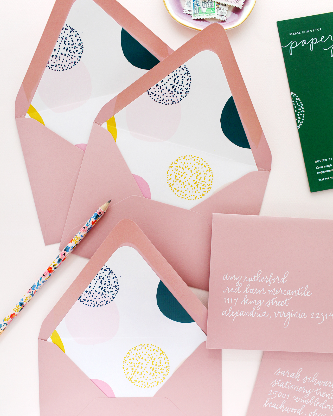
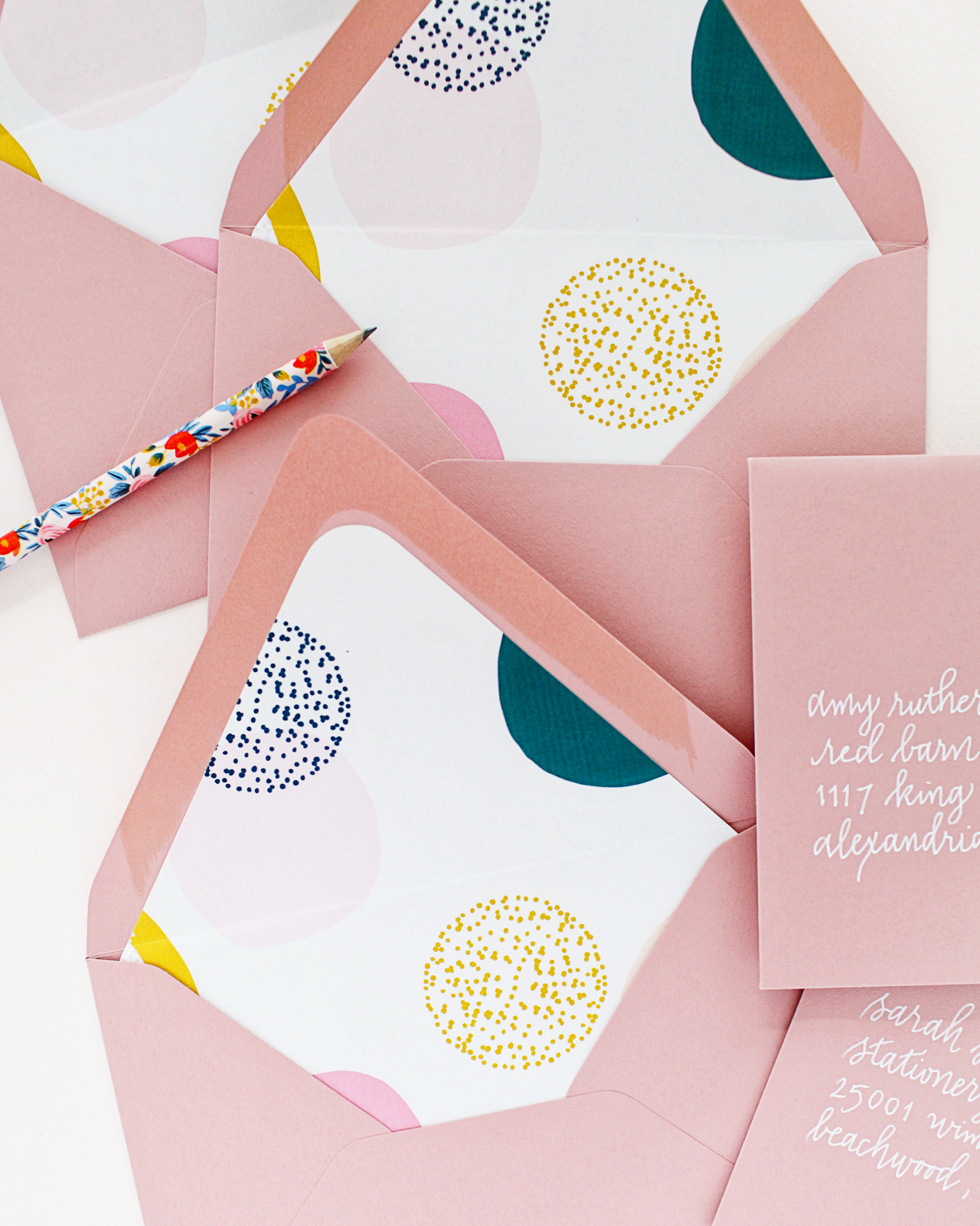
For the envelopes, I turned to Cards & Pockets – they have the largest selection of colorful envelopes I’ve ever seen! We went with a gorgeous dusty rose pink envelope and added a digitally printed envelope liner featuring some of the shapes and colors from the original save the date. I love seeing all these colors together!

Paper Party 2018 Modern Minimalist Invitations with Abstract Shapes / Design by Ramona & Ruth / Printed by Bella Figura on Legion Paper Colorplan Forest Green

Paper Party 2018 Modern Minimalist Invitations with Abstract Shapes / Design by Ramona & Ruth / Printed by Bella Figura on Legion Paper Colorplan Forest Green

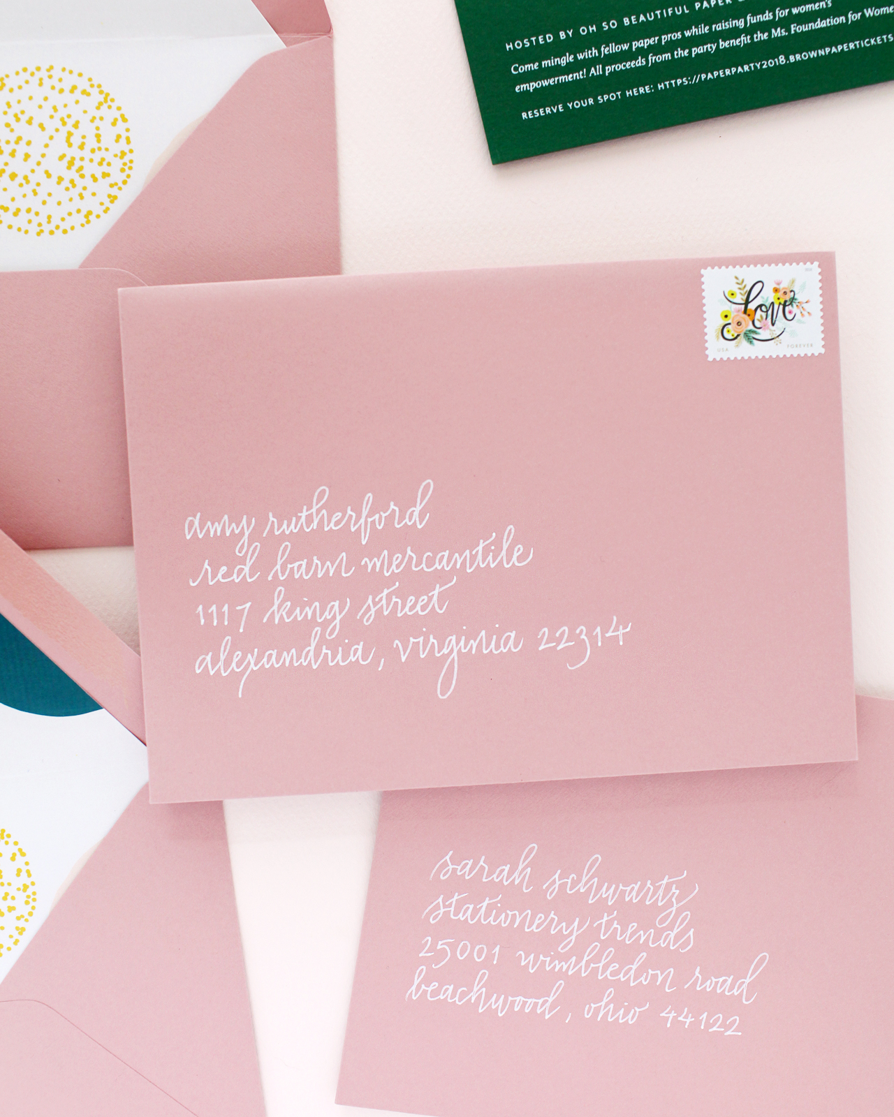
Michele from Meant to Be Calligraphy addressed the envelopes in white ink in her monoline script style to complement Kim’s hand lettering. I love the relaxed feel of the monoline lettering with the modern minimalist vibes of the invitation design. And of course I couldn’t resist the new forever stamps designed by Rifle Paper Co.!

Paper Party 2018 Modern Minimalist Invitations with Abstract Shapes / Design by Ramona & Ruth / Printed by Bella Figura on Legion Paper Colorplan Forest Green

Paper Party 2018 Modern Minimalist Invitations with Abstract Shapes / Design by Ramona & Ruth / Printed by Bella Figura on Legion Paper Colorplan Forest Green

Paper Party 2018 Modern Minimalist Invitations with Abstract Shapes / Design by Ramona & Ruth / Printed by Bella Figura on Legion Paper Colorplan Forest Green

Modern Minimalist Invitation Inspiration with Abstract Shapes / Design by Ramona & Ruth / Printed by Bella Figura on Legion Paper Colorplan Forest Green

There you have it! Our Paper Party 2018 modern minimalist invitations created with the most amazing paper team! If you’d like to see the invitations from past paper parties, you can check them out here, here, here, and here. Photos from Paper Party 2018 coming up next! 


Design: Ramona & Ruth

Printing: Bella Figura

Paper: Legion Paper Colorplan Forest Green

Envelopes: Cards & Pockets

Envelope Calligraphy: Meant to Be Calligraphy


Photo Credits: Nole Garey for Oh So Beautiful Paper