NSS 2016 Sneak Peek: Inclosed Letterpress Co.

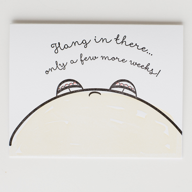
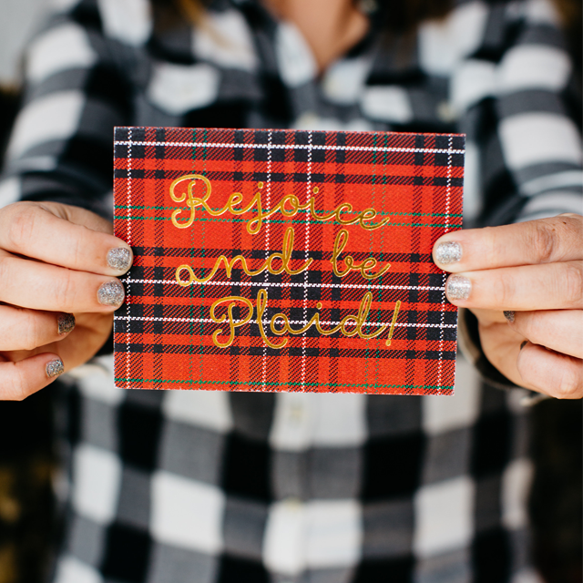
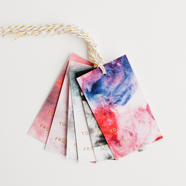
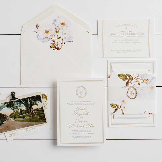
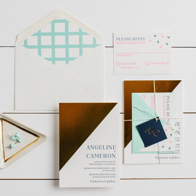
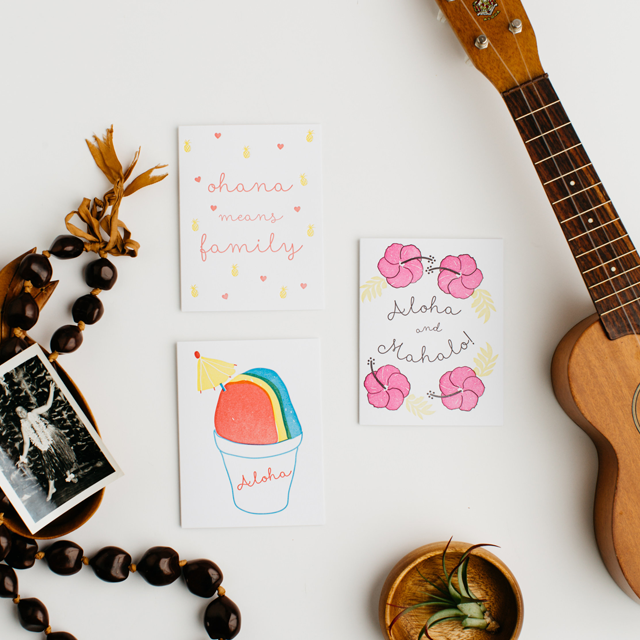
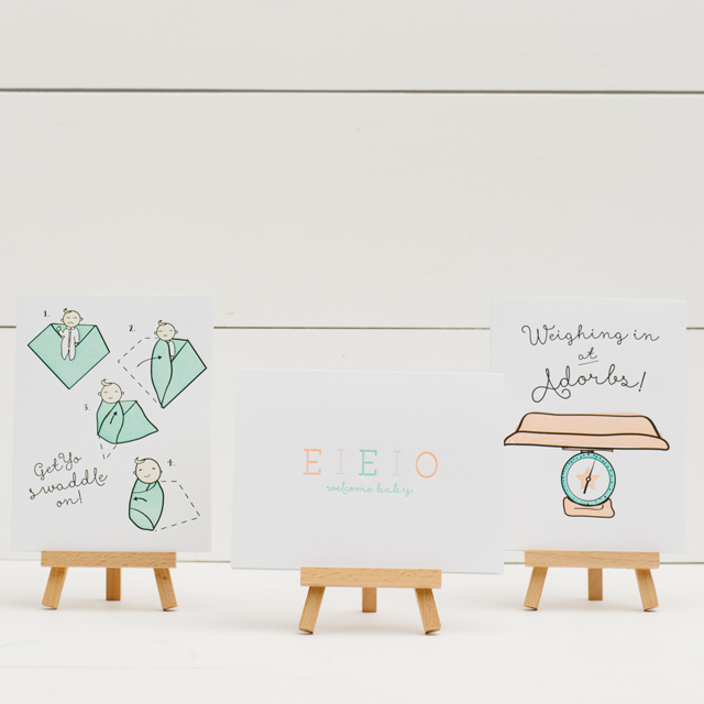
I’m super excited about some of the companies exhibiting for the very first time at this year’s National Stationery Show, including Inclosed Letterpress Co. (booth #1626)! Lesley of Inclosed Letterpress Co. is going all out with her debut appearance, with more than 50 (!!!) greeting cards, art prints, notepads, gift tags, and decorative sticker packs, along with a custom wedding album! The greeting cards are letterpress and foil printed, with an entire line inspired by Lesley’s mom’s hometown in Hawaii and dedicated to the aloha spirit. The wedding album features 20 invitation suites and offers the best of letterpress, foil, and digital printing along with handmade papers, watercolor treatments and many other unique custom upgrades desired by today’s modern couple.

NSS 2016 Sneak Peek: Inclosed Letterpress Co. / Oh So Beautiful Paper

NSS 2016 Sneak Peek: Inclosed Letterpress Co. / Oh So Beautiful Paper

NSS 2016 Sneak Peek: Inclosed Letterpress Co. / Oh So Beautiful Paper

NSS 2016 Sneak Peek: Inclosed Letterpress Co. / Oh So Beautiful Paper

NSS 2016 Sneak Peek: Inclosed Letterpress Co. / Oh So Beautiful Paper

NSS 2016 Sneak Peek: Inclosed Letterpress Co. / Oh So Beautiful Paper

NSS 2016 Sneak Peek: Inclosed Letterpress Co. / Oh So Beautiful Paper

NSS 2016 Sneak Peek: Inclosed Letterpress Co. / Oh So Beautiful Paper


More from Inclosed Letterpress Co. right here!

Photo Credits: Daniel Muller of Mullers Photo Co.

Seasonal Stationery: Mother’s Day Cards, Part 4

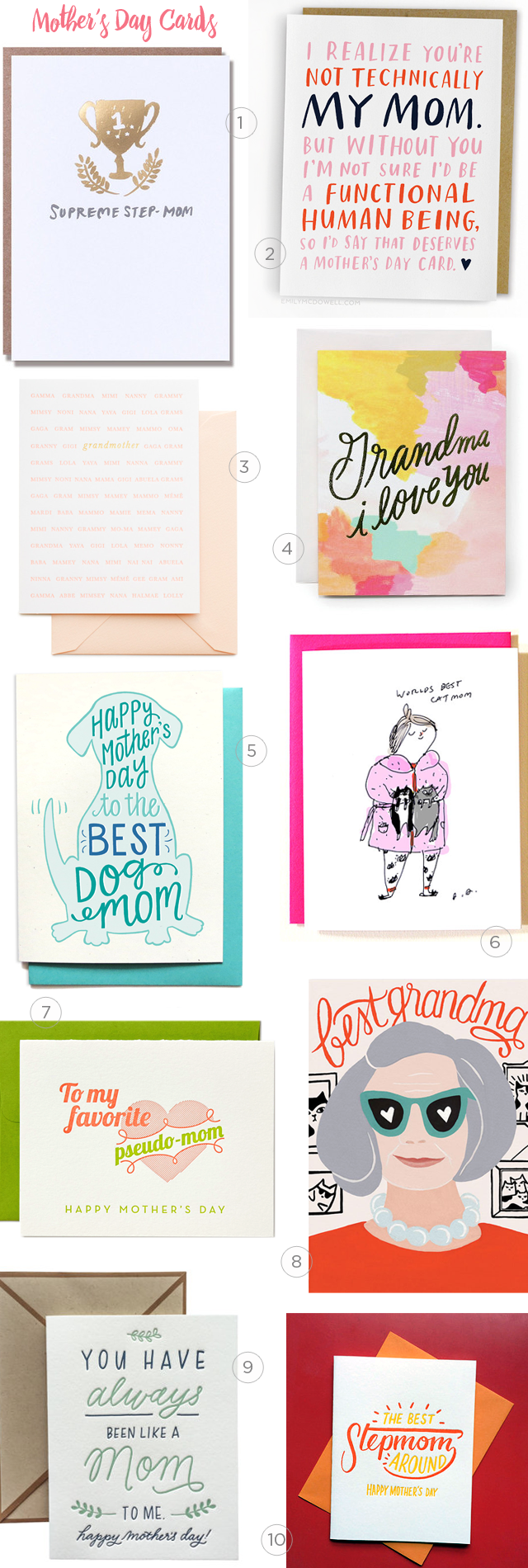
When sharing the love this Mother’s Day, we didn’t want to  forget the other mother figures in your life: grandmothers, step-moms, and even pet moms deserve appreciation, too. Or maybe there’s someone in your life who isn’t related to you by blood or marriage, but has a major role in your life. Here are ten perfect cards for the women in your life who are just like a mom.

Mother's Day Card Round Up for Step-moms, Grandmothers, and other mother figures / Oh So Beautiful Paper

1. A trophy in shiny gold foil for an awesome stepmom from Egg Press

2. For the mother figure in your life that holds it all together from Emily McDowell Studio

3. + 4. Beautiful cards for Grandma from Sugar Paper and Moglea

5. Dog moms get a Mother’s Day nod from Hennel Paper Co.

6. And don’t forget cat moms! Send an illustrated card from (who else??) The Dancing Cat

7. Pretty pops of lime green in this card for pseudo-moms from Farewell Paperie

8. Let Grandma know she’s the best with this lovely card from Wild Wagon Co.

9. A sweet card for the person you’ve always thought of like a mom from Ink Meets Paper

10. For the best Stepmom around from Bench Pressed

p.s. You can find more Mother’s Day cards in the Market List!

Behind the Stationery: Atheneum Creative

We’re headed down south for today’s Behind the Stationery feature. Melissa of Atheneum Creative is a rockstar at custom invitations and pretty event trinkets of all kinds! Working with and beyond the paper medium, Melissa collaborates with other vendors and artists to create something special and unique for her clients. Take it away, Melissa! –Megan
Behind the Stationery: Atheneum Creative / Oh So Beautiful Paper

Hello! I’m Melissa, creative director and owner of Atheneum Creative in Charlotte, North Carolina. Atheneum was established in 2011 with the idea of bringing stories to life through a unique branded experience. I have always had a passion for pretty things, paper, and pushing the envelope. With my background in branding, it was a natural fit to bring that process into the wedding world.
Behind the Stationery: Atheneum Creative / Oh So Beautiful Paper

Prior to the start of Atheneum, I was working for a small boutique design shop based in Chicago. Over the years, I had the opportunity to collaborate with some of the most challenging and inspiring industries in the field, creating nationally recognized work and truly building a love for this profession. Working with a lot of non-profits, educational institutions and hospitals, my everyday was filled with annual reports, branding and promotional collateral. Don’t get me wrong, I love working on all of that especially with the non-profits who have such great stories to tell, but it was always the special invitations and events that would grace our door that really light the fire in me. Picking papers, materials, and thinking about unique ways to mail always got me excited and I knew where my heart was.
Behind the Stationery: Atheneum Creative / Oh So Beautiful Paper

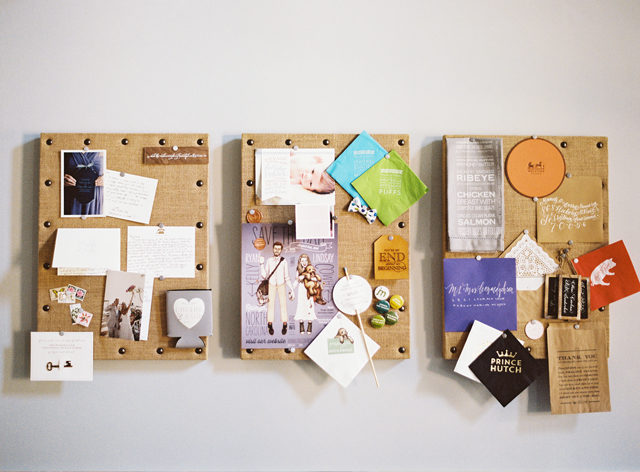
So from there, Atheneum was born. I love a challenge. It is always a little scary to be experimental (I never tell the clients I’m scared), but I love when a client comes in for a meeting and says, “I want something no one has ever seen before.” It makes my heart race a little, but that’s the fun part, right?
Behind the Stationery: Atheneum Creative / Oh So Beautiful Paper

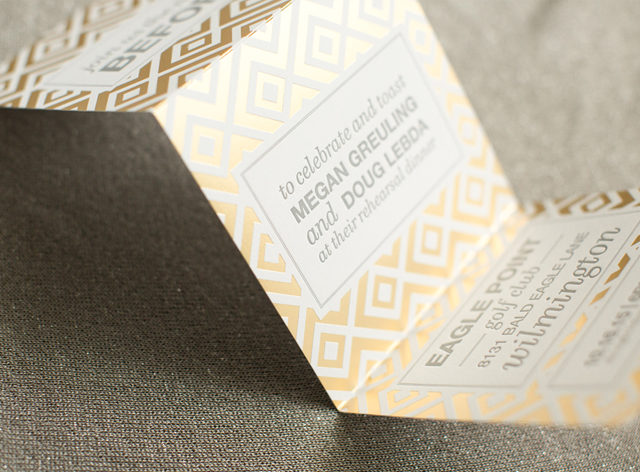
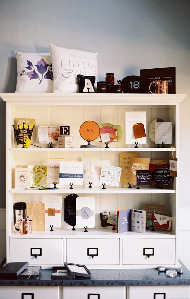
I incorporate almost all printing methods into our work: digital, offset, letterpress, foil, engraving, screen, vinyl, etc. I especially love when a client wants to bring in something more three dimensional — bowties on a stick, keys, or wood blocks — or when we push the materials and print on wood, glass, metal, copper, leather, silk, etc. I think that is what makes Atheneum Creative a bit more unique: I love to challenge myself to make something really unique and help tell the story of our clients.
Behind the Stationery: Atheneum Creative / Oh So Beautiful Paper

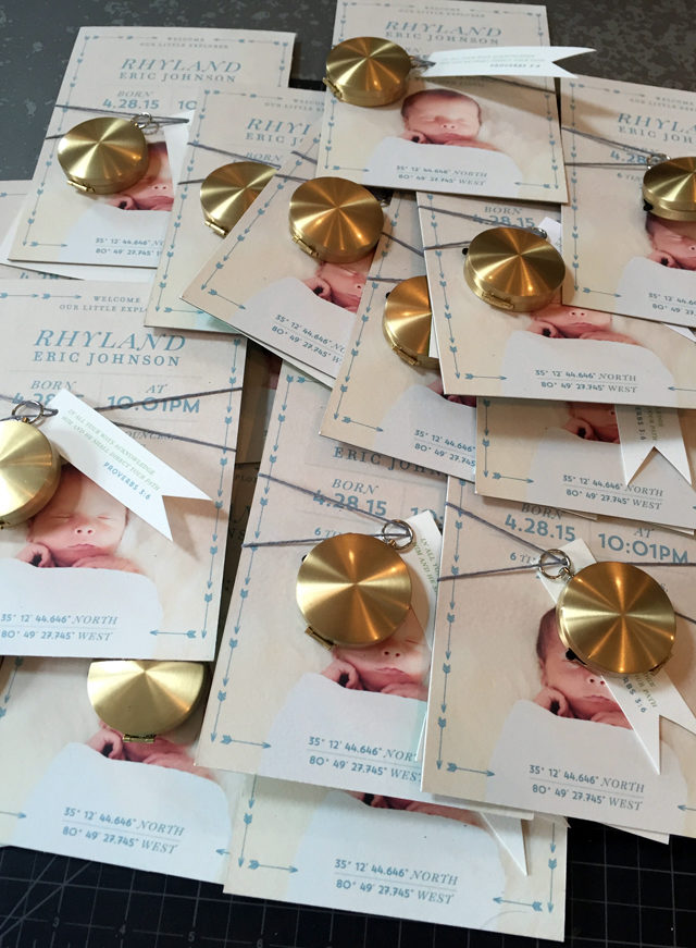
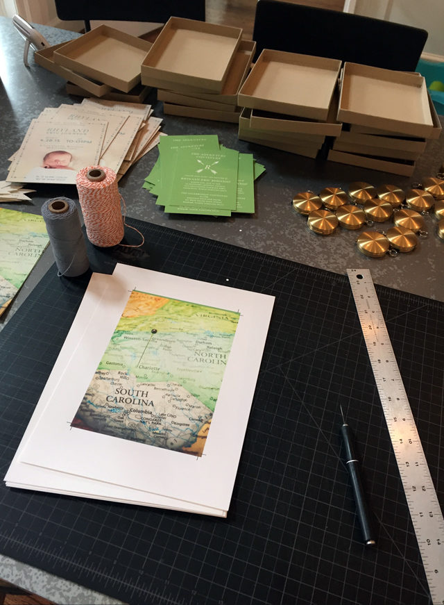
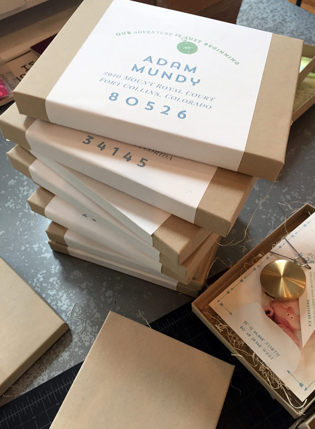
I recently sat down with a client to brainstorm a birth announcement / baptism announcement and she showed me the bible verse she wanted to use, but didn’t know how to tie it all together to tell her story. I came up with the idea of exploration and adventure to pull you through his birth and life moments to the baptism. We even brought in a real compass to include in the announcement, which we printed on the inside cover. I am hoping to shoot this soon so we will have some photos to share, but for now, I included some iPhone process shots.
Behind the Stationery: Atheneum Creative / Oh So Beautiful PaperBehind the Stationery: Atheneum Creative / Oh So Beautiful Paper

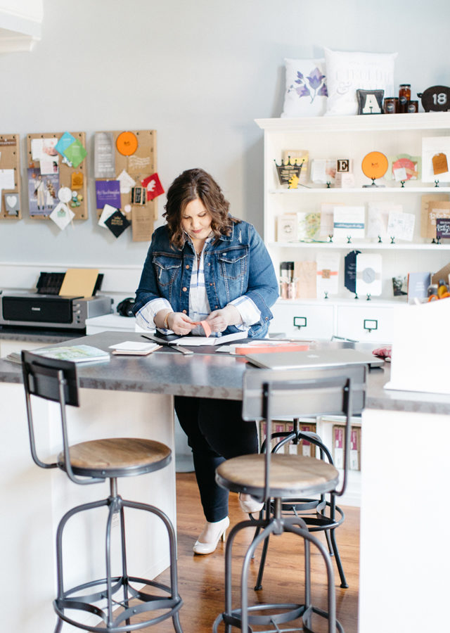
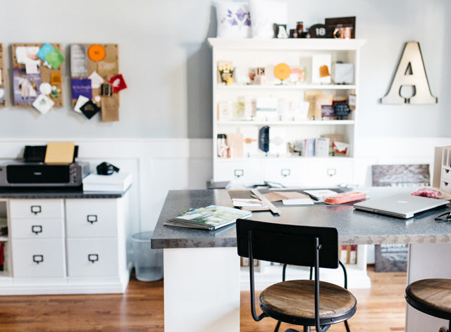
I am the creative director for all of the work, but we do have a great team we collaborate with including graphic designers, calligraphers, illustrators and photographers. Collaborating is one of the best parts of being a designer. My typical day is usually broken up by a few hours of design work and a few hours of assembly.
Behind the Stationery: Atheneum Creative / Oh So Beautiful Paper

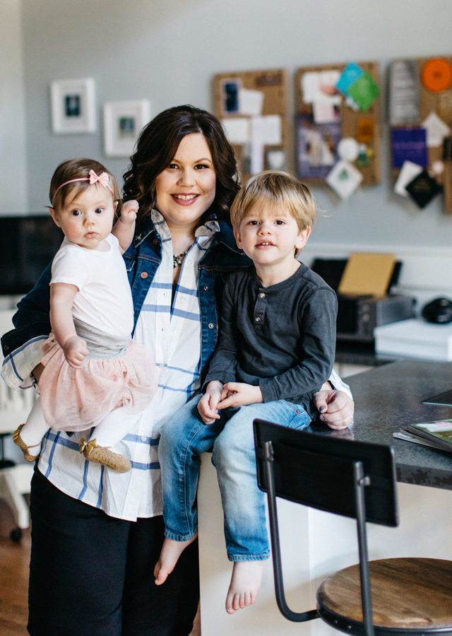
There is almost always a trip to some of the local printers we use for a press check or pick-up. Everyone at the post office knows me! I call that my second home as I spend so much time there! For example, this morning, after dropping the kids off, I was on a foil press check at 8:30 am with the client, approved a digital sheet at another printer at 9:15 am, dropped off envelopes to a calligrapher at 10 am and then wrapped up my morning at the post office to purchase 920 stamps for an assembly job tomorrow. I don’t have a set schedule as every day is different, but I am usually in the office from 8am – 6pm (with my dog sitting by my side all day long). My kids also love to visit me when I am working!
Behind the Stationery: Atheneum Creative / Oh So Beautiful Paper

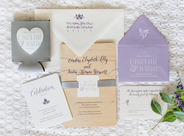
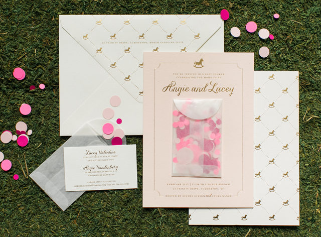
A lot of our clients are not local and a good handful of them are overseas. I typically start every project with a call or in person meeting to discuss the look of the wedding day. Sometimes brides have a good idea of what they are after and others have no idea—which is not a problem! We take the look and feel of the day and carry it over into their stationery. We might start with a logo or monogram, or just colors and patterns that will pull everything together.
Behind the Stationery: Atheneum Creative / Oh So Beautiful Paper

From there we work on various design options to give clients a nice range to choose from. We also work with creative language to ensure a wedding brand fully expresses the client’s personality. Once we go a few rounds of revisions, we are off to print. We are usually assembling in about three weeks. Then we shoot it and submit it to OSBP 🙂

I know everyone always says this, but our clients are truly the best! They trust us and allow us to get creative and unique with their work and if it was not for clients like that, we would not have the super fun portfolio we do today!
Behind the Stationery: Atheneum Creative / Oh So Beautiful PaperThanks, Nole and Megan!

Photos by Allison Kuhn (office), Chelsea Davis (new work), and Melissa Broderick (compass work).

Interested in participating in this column? Email Megan at megan [at] ohsobeautifulpaper [dot] com.
Seasonal Stationery: Mother’s Day Cards, Part 3

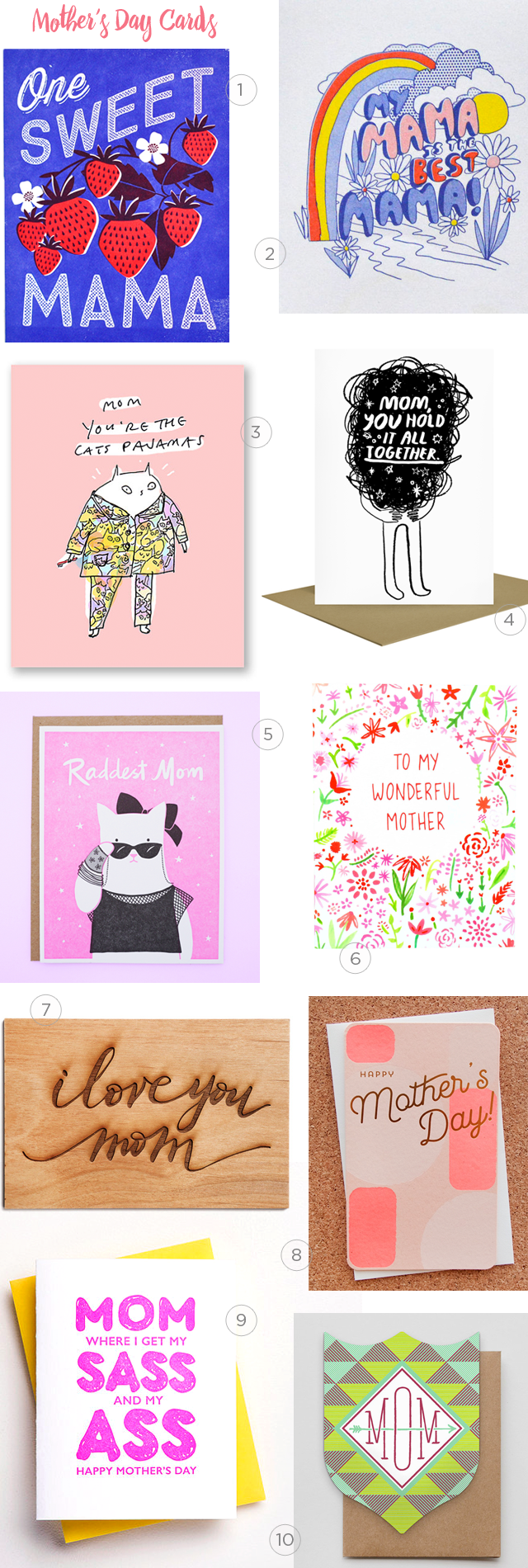
I’ve been having so much fun finding Mother’s Day cards this year – I just couldn’t resist sharing a few more this week! This group of cards has a little bit of everything, from bright and colorful illustrated cards to laser cut wood to quirky and sassy cards. You’ll have no trouble finding a card with the perfect personality for your unique mama!

2016 Mother's Day Card Round Up / Oh So Beautiful Paper

1. A bright and colorful card with a sweet message from Hello!Lucky

2. I absolutely ADORE this risograph mama card from Yellow Owl Workshop

3. This card from The Dancing Cat is perfect for a cat-loving mom!

4. Mom truth from People I’ve Loved

5. For all the rad moms from Lucky Horse Press

6. A beautiful hand drawn floral pattern and hand lettering from Happy Cactus

7. I love the combination of script and wood in this laser cut card from Cardtorial

8. Pretty neon pink and gold foil on peach kraft paper from Anemone Letterpress

9. A sassy Mother’s Day card from Richie Designs

10. Such great colors and patterns in this die cut card from Hammerpress

p.s. Lots more Mother’s Day cards in the Market List right here!

Brick + Mortar: What retailers won’t tell you when they reject your line.

I spent the better part of this week tending to my submissions folder. This task is exhausting. I want to provide a thoughtful reply to each submission, but I can’t. I don’t have the time, and I fear that my feedback – even if well intentioned – will be taken as an insult. I’ve given feedback that has been taken as an insult. I never want to be the reason a line stops growing and I’ve used that to justify my short replies. But I always have more to say. Today, I want to share a few of the potentially tender reasons I don’t accept lines. I hope you’ll take them in the manner they’re meant: as true constructive fuel that can help a line grow. ~ Emily of Clementine.

OSBP-Hello-Brick-and-Mortar-Clementine-by-Emily-McDowell-Illustration

Illustration by Emily McDowell for Oh So Beautiful Paper

Many of you already run strong, stunning, professional lines that are carried by many shops. This post isn’t for you. You may apply to shops like mine and not get picked up and it really is because the timing isn’t right, or I admire what you do, but it’s just not a fit. However, there are other lines who are new and growing, in the early stumbling stages, getting rejected or simply hearing crickets after you apply. This post is for you. There are some concrete, fixable reasons that you may be rejected. This feedback can be awkward to give one-on-one, but I believe our creative community could use a little constructive criticism.

So here goes:

  • Your line lacks an understanding of design and/or a compelling aesthetic. Let’s be blunt, not everyone is fit to run a successful wholesale stationery line. You may love to draw. You may have always dreamed of having a card line. These things should propel you forward, but they don’t compel me to order from you. I’m overwhelmed by the number of submissions I receive that seem to lack a basic understanding of design (borders, type, color, pattern). Retailers can, and should, disagree on the aesthetics that they choose for their store, but we all want lines that meet basic standards of design. If you have no idea what I’m talking about, it’s time to invest in some course work: visual art and graphic design. There are some incredible online options these days, and continuing education courses you can take. Hone your skills, sharpen your eye. Get excited about what you don’t know.
    • Beyond good design, of course, is the overall look: the art and sentiments themselves. I have seen many early attempts that are very heartfelt, but simply not very good. This is a hard area to receive feedback on, because it hurts and it’s hard to solicit feedback on because your friends and family will lie. It’s time to explore Etsy, craft fairs, and other sales venues where you see if there’s a market for your work. In other words, send your submission to retailers after your dream of having a card line has actually taken root and begun to grow.
  • Your line doesn’t look professional. On the other hand, you may be a really talented artist, but you don’t seem to care about how to sell. You may, for example, decide to turn your [fine art, photography, doodles, etc] into cards, and you didn’t give much thought to how to present it. Major tells in this area are: poor printing quality, inconsistency in paper, poor envelope quality, and poor packaging. Bottom line: printing quality matters, packaging matters. If you’re not willing to invest in your line, I’m unlikely to invest in you. Go to the stores where you envision your line and look critically at the items that are already there. Your line should not mimic what has already been picked, but it should be able to stand along side the current lines.
  • You don’t seem to understand what wholesale is. I get it – wholesale talk can seem like a big secret society when you’re on the other side. But the truth is, there’s very little you can’t Google your way into. For that reason, if you submit your line without the basics: a catalog and line sheet and some industry standards around pricing, minimums, and policies – it’s a red flag that working with you may mean more work for me.
  • Your line isn’t extensive or cohesive enough. Early on, many talented crafters take a spaghetti-against-the-wall approach to see what sticks. Are you a designer, a potter, a seamstress? Do you want your cards to be letterpress or flat printed? Are you offering custom items? It’s ok to try out different product lines and methods, but when you present your line to retailers, it should feel cohesive and it should be extensive enough to convey that I’ll be able to rely on you for fresh products as the seasons change.
  • Your submission seems careless or spammy. I always recommend taking 5 minutes on each retailer’s site to learn their name and any submission guide lines. It takes very little time to be thoughtful and most retailers I know receive so many submissions that if it’s not addressed to us by name, we feel permission not to respond.
  • Your intro is too long, too casual, or off-color. I offered a template for email submissions here and I plan to write another about mail submissions. In short: your submission should be short, sweet and professional. It should not be seven paragraphs. It should not be too personal unless we actually know each other. You may assume I’m laid back, don’t mind a well placed curse word, and love to laugh (all true), but your submission email should still err on the side of business casual, not casual Friday. We’ll get to know each other later.
  • Your photos and collateral aren’t appealing. Assume I have 30-90 seconds to look at your submission. Good photos and collateral (business cards, and other marketing extras) are often the only reason I linger. They also give a nod to the fact that you understand that our business is visual and that I can rely on you for quality presentation going forward.
  • Your line looks too much like another line. In private conversation, this is a frequent topic. My friends and colleagues often disagree on who may be copying who. But for the purposes of picking a line, it’s not the copying that I’m focused on, it’s that your similarity to another line is either a distraction (because all I can think of is whether you’re copying someone else) or it means you don’t stand out on your own. If you want to sell professionally, you should be aware of the work of your peers and step back to critique how and when you may need to veer away from a design that seems played out. Please don’t hop on a new trend after you see it on line. The world only needs more gold foil pineapples if yours are spectacular. What retailer’s really want is to find something we’ve never seen that only you can show.
  • You don’t stand out. Lately, I’ve seen an increase in submissions from designers who really do seem to understand the format of a good card, but I flip through the catalog and it’s immediately indistinguishable from dozens of others: the designs seem safe, the colors bland, the sentiments re-hashed versions of what’s out there. It’s hard to truly trust your gut and make the cards that you’re meant to make, but there’s nothing I love more than finding lines that do. You should cringe a little at your prior efforts, and then use them as a springboard to try something new.

If you feel like maybe I’m talking directly to you, rest assured, I’m probably not. These nine bullet points represent issues that I see repeatedly in hundreds of submissions each year. But now, I’m curious to hear from you – if you don’t get an order in response to a submission, do you want to know why? Do you want details? Do you want a dialogue? What more would you want from retailers? I’ve been investigating ways (periscope? Facebook live?) that we could turn this into a discussion. I await your suggestions and promise, when asked, to give true feedback to your line, if (and only if) you request it. I would also love to hear from my fellow retailers – tell me what I might have missed.

Clementine Greeting Card Wall / Oh So Beautiful Paper

I’ll leave you with my current view at Clementine: Mother’s Day + a few other favorite cards on some shoddy shelves that I made, which are basically held together with dreams and wood glue. We all have our strenghts and weaknesses. I always welcome your constructive construction criticism and your feedback…xoxo, Emily