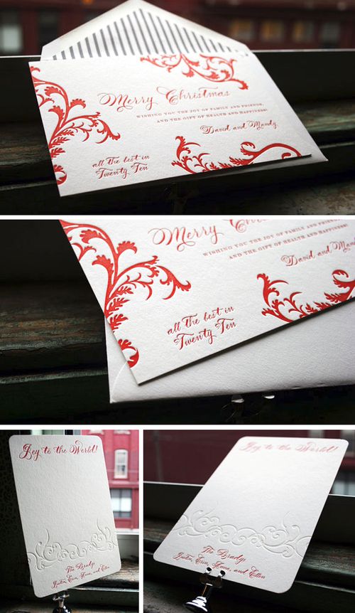
Jen + Dan — Lobster Bake Rehearsal Dinner Invitations

Hello, hello!  This is Jen with the haystack needle again.  Thanks for following along this week as I guest post for Nole, who’s moving into her new home.  Today is all about the invitations for our wedding rehearsal dinner:

CL77a22-R01-001

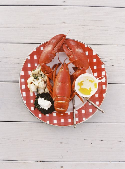
We hosted a small wedding with a simple ceremony (no wedding party and our friend Erin married us.)  So the day before the wedding (after a big morning of decorating the barn with the help of friends), we invited everyone to Dan’s family’s camp for a classic lobster bake.  Dan and I get lobster every time we’re up in Maine, but we got really lucky that day.  His dad picked up a crate of lobsters straight from a fisherman’s boat.  Fantastic.

CL77a21-R01-019

Jafarzadeh_l'italien_09.20.08_0400

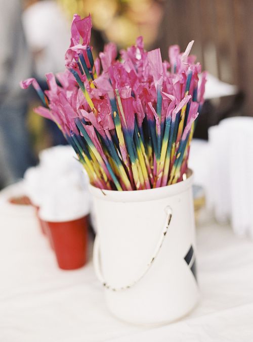
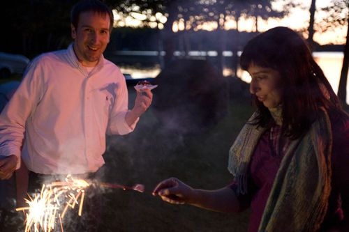
Most of our friends and my family had never been up to camp, so it was a treat to have everyone together in such a special place for us.  My mom contributed a couple favorite dishes that represent my background: German potato salad and Persian spinach patties.  Dan picked up sparklers which were a perfect way to close the night with our whoopie pies.

lobster bake

scrapbook

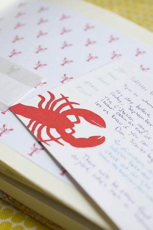
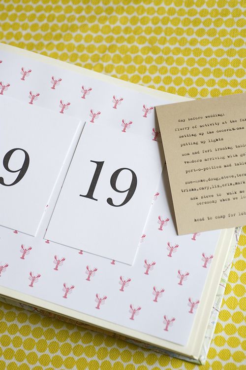
For the invites, I used letterpress flats with lobsters (of course!) by Linda & Harriett.  L&H designer Liz Libré and I share a love for Maine.  When I met Liz at the National Stationery Show years ago, we discovered she and her huz went to college in the Maine town where Dan grew up!  How fun, right?!  I wish I had figured out how to run the flats through my printer rather than writing them out by hand (since my handwriting would not be mistaken for calligraphy, let’s be honest.)  But live and learn.  In my scrapbook, the background paper is part of a lobster placemat by Carrot & Stick Press.

All photographs by the lovely Charlotte Jenks Lewis.

Jen + Dan’s Wedding – Crafting with Rubber Stamps

Hi everyone! I'm Jen with the haystack needle. I'm so happy to be guest blogging this week here on Oh So Beautiful Paper while Nole moves into her new apartment!  I'm a huge fan of OSBP, and there are few things (besides homemade gelato) that I love more than stationery and pretty paper goodness.  To kick off the week, I thought I'd share some details from my wedding. 
CL77a08-R01-023A

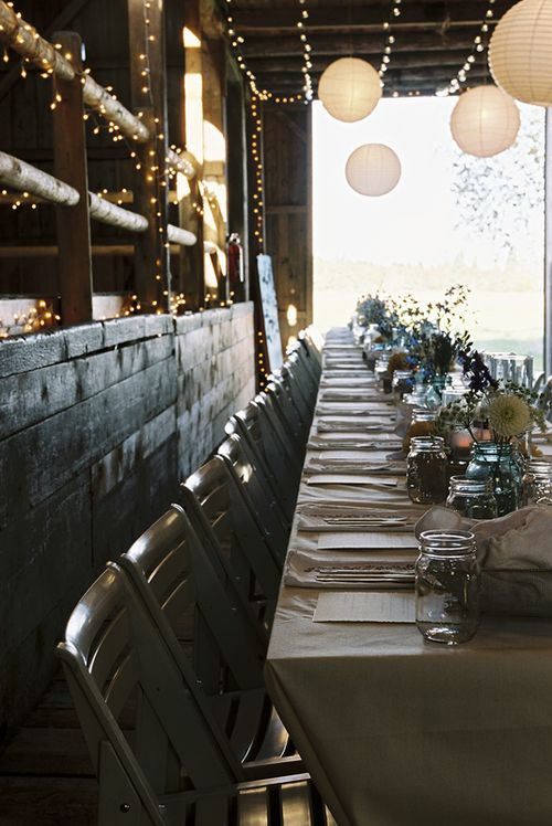
I had so much fun planning and crafting the elements of our wedding — for seven months I was stamping, snipping, and sewing on our living room floor.  Dan and I got married on a farm in Maine (his home state), so I let the natural setting inspire all the details.
CL77a14-R01-013

CL77a12-R01-008

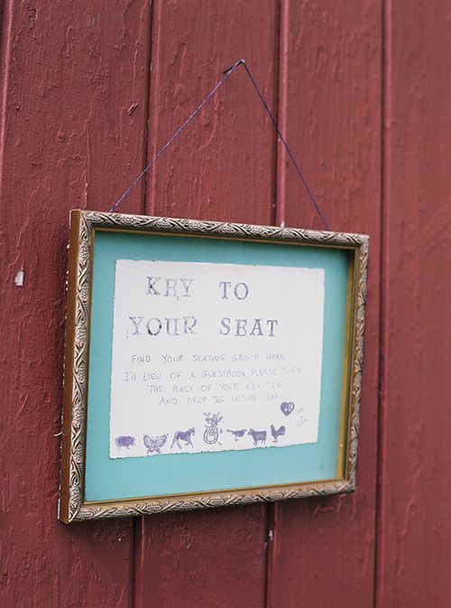
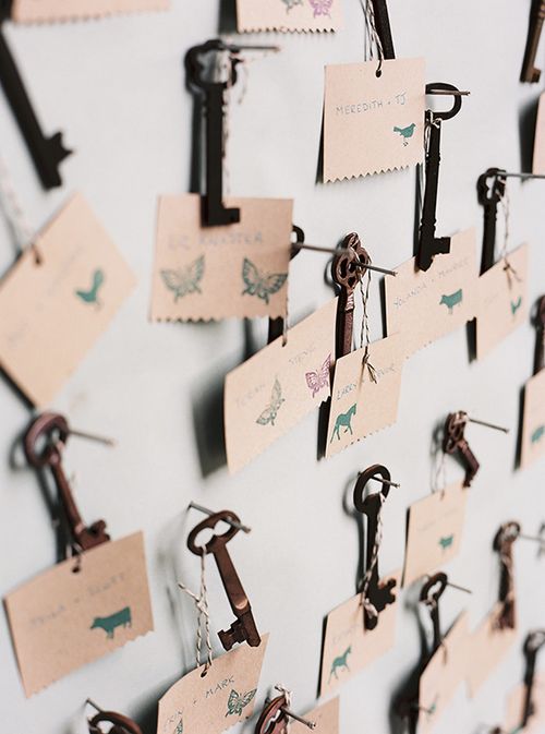
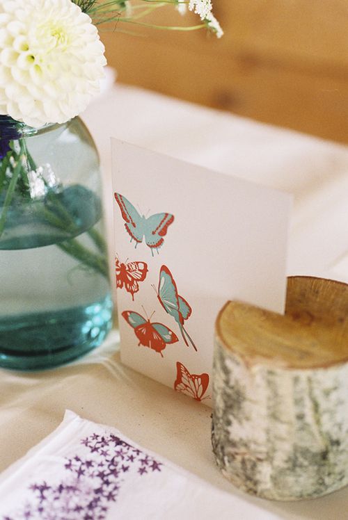
I've always loved skeleton keys, and I liked the idea of having guests pick up a key to find their seat. I organized our 60 guests into seating groups by animals (and the butterfly, my favorite).  These key tags also served as an alternative guestbook.  I made a sign telling everyone to sign the back of their tag, and then my friend Sue-Anne picked them all up.  I have a vintage blue mason jar filled with the key tags now on our dresser.  It's fun to read the messages every once in a while.  By the way, the keys I used were actually wooden skeleton keys I found on Etsy.  I couldn't find a lot of skeleton keys for a good price on eBay, and I liked the idea of wooden keys.
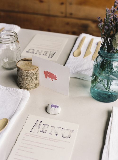
menu cards wedding

CL77a05-R01-001

The table cards were everyday letterpress cards by Pancake & Franks (who also designed our custom wedding invitations, which I'm sharing tomorrow!).  I brought the cards to a local rubber stamp maker who created custom stamps from the images of the cow, horse, pig, bird, butterfly, and rooster on the cards.  Then I stamped river rocks at each place setting to make the seat groupings
clear, since we were using long communal tables rather than separate
round tables.  I loved Stacy Pancake's horseshoe card, so Dan and I used the good luck horseshoe to mark our seats.
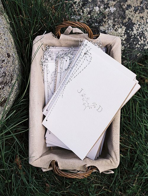
CL77a15-R01-001

The photo above is of our handmade ceremony programs.  Here's what I used: bakers twine, rubber stamps, faux bois paper, Japanese screw punch, and I printed out the program text on kraft brown paper.
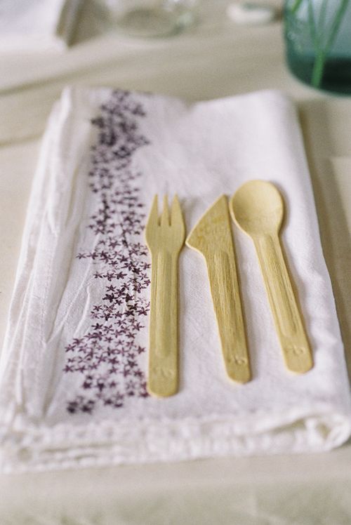
CL77a05-R01-003

I like to use my ever-growing collection of rubber stamps whenever possible.  So the stamping didn't stop with the paper.  I bought floursack towels from Kmart and dressed them up with a little pattern using stamps and fabric paint, and we used the printed tea towels at each place setting. (Do not try this with a large wedding!)  In hindsight, I should have figured out how to silkscreen the pattern, which would have saved a ton of time.  After the wedding, the tea towels were a sweet way to say thanks to my friends who were a tremendous help pulling everything together with me.  We went with biodegradable bamboo forks, knives, spoons, and plates — I saved a ton of money on rentals and didn't need to hire a dishwasher. 
CL77a12-R01-009

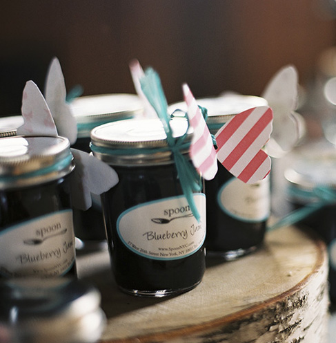
It was blueberry season in Maine in September when we got married.  Early on, we decided our favor should be a food treat and we fell in love with the idea of blueberry jam.  I sampled a bunch of Maine blueberry jams and found them to be too sweet, too jiggly, too pasty, or just not quite right.  Spoon had just debuted their collection of homemade jams, and after sampling their blueberry jam, I knew it was the one.  And it was sweet that Spoon packages their jams in pretty jars  — even the turquoise blue label coincidentally fit in my wedding color palette.  I made paper butterfly tags to dress up the jars.  I love how the butterflies look like they're about to take flight. 
CL77a06-R01-019

More details on our wedding tomorrow — including our invitations!  See you soon.  

All photographs by our wedding photographer, Charlotte Jenks Lewis.  She's amazing!
2010 Calendar Round-Up, Part 4

It seems like every time I do one more little calendar round-up, a new calendar pops up that I just have to find a way to include!  But since we’re get closer and closer to 2010, this time I really think this might be the last big batch of 2010 calendars.  Enjoy!

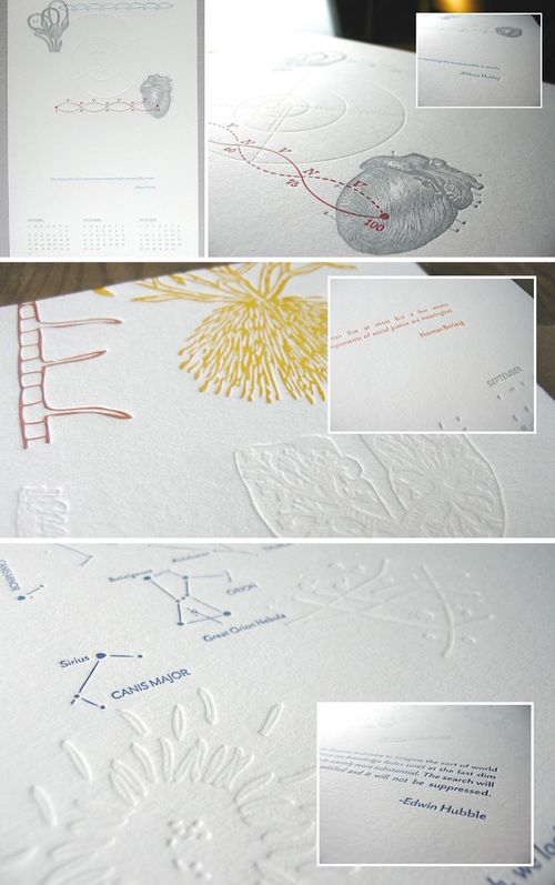
First up, an amazing seasonal calendar from Papered Together featuring totally cool academic- and science-inspired design details — from astronomy to anatomy — and quotes from notable personalities like Buckminster Fuller, Norman Borlaug, Aldous Huxley, and Edwin
Hubble:

Papered-Together-2010-Calendar{papered together}

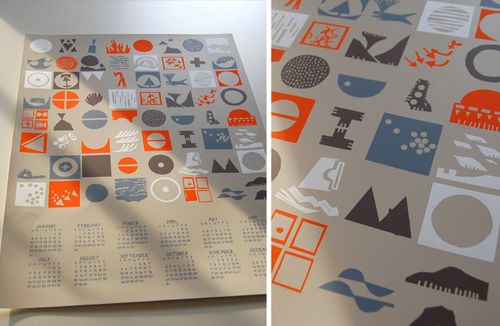
I’ve been patiently waiting for the 2010 collaborative calendar from Lena Corwin and Caitlin Mociun — and it’s finally here!  The calendar features paper-cut designs inspired by the four elements and screen printed in four colors:

Mociun-corwin-2010-calendar

{corwin + mociun}

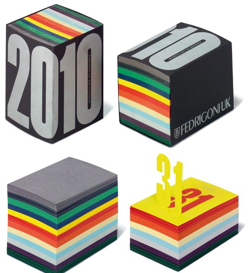
Krissy found this fantastic post-it inspired calendar from Fedrigoni UK, which features laser-cut pop-up numbers for each day of the year (love that idea!):

Fedrigoni-2010-pop-up-calendar

{fedrigoni uk}

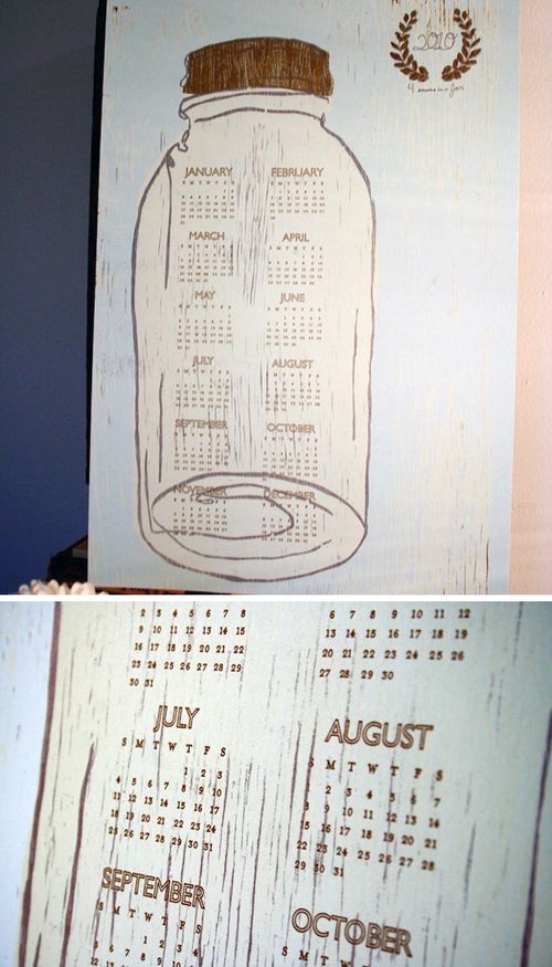
This lovely mason jar calendar from Brown Parcel Press is printed from a single hand-carved wood block onto a large (12.5 x 19″) sheet of recycled paper:

Brown-Parcel-Press-Mason-Jar-Calendar

{brown parcel press}

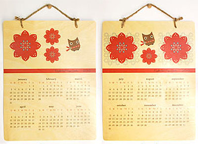
As if the totally adorable critters and pattern desk calendars weren’t enough, Night Owl Paper Goods went and released a double-sided hanging calendar, printed as always on beautiful wood veneer:

Night-owl-press-hanging-2010-calendar

{night owl paper goods}

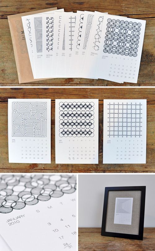
This beautiful twelve-month calendar from Pawling Print Studio features simple patterns and minimalist shapes from their geometric series of stationery, textiles and prints:

Pawling-Print-Studio-2010-calendar

{pawling print studio}

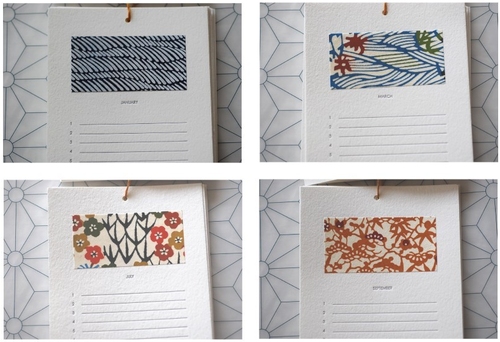
Also in the over-achiever category for this holiday season, Lynn from Satsuma Press recently released two gorgeous perpetual calendars — one featuring beautiful Japanese washi paper, and the other with her signature letterpress illustrations:

Satsuma-Press-Perpetual-Calendar-Washi

{satsuma press}

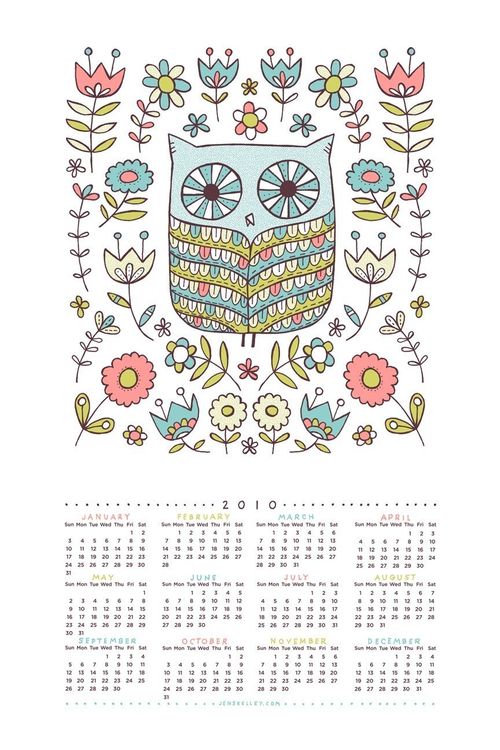
I’m pretty sure I’m in love with this four-color screen printed calendar from Jen Skelley, featuring a too-cute-for-words hand-illustrated owl:

Jen-Skelley-Illustrated-Owl-Calendar

{jen skelley}

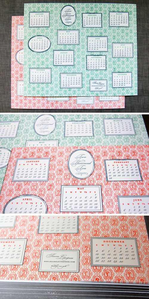
Wow.  If you’re a fan of letterpress, you’re going to love this brand-new calendar from Sesame Letterpress!  Printed on a single 9.5 x 12″ sheet of super-thick (220#) with silver painted (aka gilded) edges, and available in either green or persimmon orange:

Sesame-Letterpress-2010-calendar

{sesame letterpress}

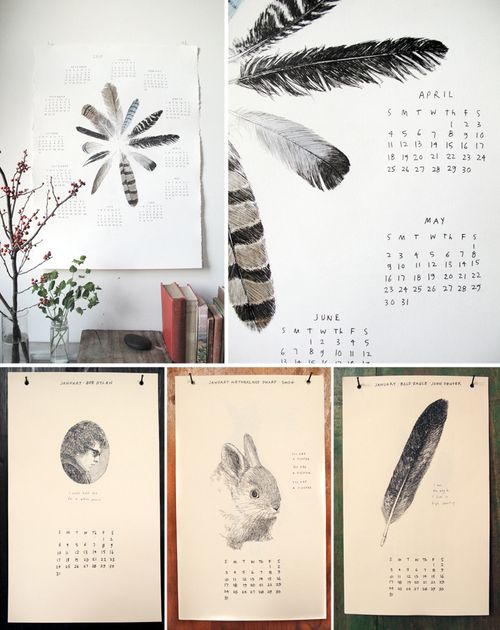
This limited-edition poster-style feather calendar from The Wild Unknown is printed using two different methods — screen printing for the calendar text, followed by watercolor painting for the feathers — resulting in a completely unique print for each calendar.  The smaller hanging calendars are also quite lovely:

Wild-Unknown-2010-Calendars

{the wild unknown}

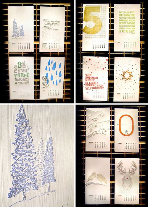
Also for the letterpress enthusiast, this twelve-month calendar from Meadowlark Creative features two-color prints for each month, which can be trimmed down and kept as artwork at the end of each month:

Meadowlark-Creative-2010-calendar

{meadowlark creative}

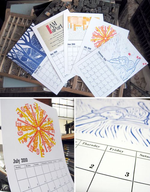
And, last up for today at least, this hanging calendar from the Genesee Center for the Arts and Education in Rochester, New York features a collaborative effort from 12 different artists who work out of the Genesee Book Arts Center, including Rachael of Pistachio Press and Amy of Green Girl Press.  Each month features a slightly different technique of letterpress printing — from using linoleum plates to photopolymer, and from creating deep impressions in the paper to a slight kiss using vintage wood type:

Genesee-Arts-2010-calendar

{genesee center for the arts}

{images from their respective sources}

College Ruled + Edge Painted Business Cards

I thought I’d take a quick break from holiday stationery this morning to share a couple of business cards printed by Michael from Czar Press.  Michael printed the first set of business cards for Meg Sutton with a design that emulates college ruled paper, and since Meg couldn’t decide which kind of paper she liked best, Michael split the print run on her two top choices — super-thick (220#/600 gsm!) cotton lettra paper and chipboard:

Czar-Press-Ruler-Lined-Business-Cards

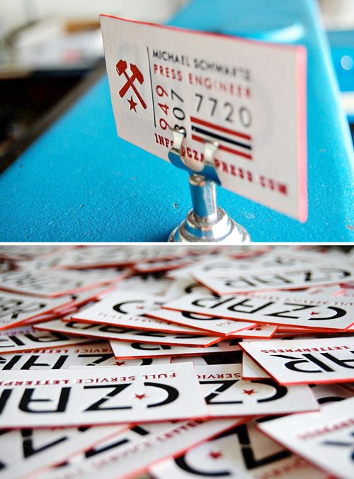
Michael also printed a few new cards for himself — also on the super-thick cotton lettra — complete with vibrant red edge painting.  The thickness of the paper both allows a full letterpress impression on both sides of the paper without showing through on the other side, and really helps the red edges stand out:

Czar-Press-Edge-Painting-Business-Cards

 {image credits: czar press}

*Czar Press is one of my fabulous sponsors, but provided no financial compensation or incentives for this post. I feature his work solely because I think it’s awesome. For information on my editorial policy, click here.

Custom Holiday Card Designs

So far I've been focused on all the yummy holiday stationery collections, but I'm sure there are a bunch of you planning to order custom cards this season.  I've got a fun giveaway coming up on that a bit later today, but in the meantime I thought I'd gather a quick round-up of a few lovely custom holiday cards!

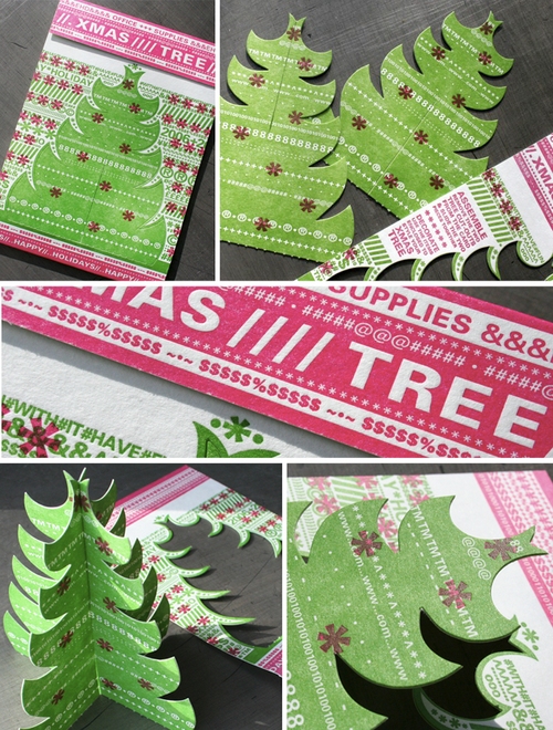
First up, these incredibly detailed die cut letterpress cards printed by Studio on Fire for Eight Hour Day.  I love the typography details and the way the trees can be punched out of the main card to create a desktop Christmas tree:

Beast-Pieces-Custom-Holiday-Card4{studio on fire}

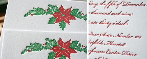
On the more traditional side, Moontree Letterpress printed these holiday invitations with a beautiful poinsettia illustration by calligrapher Jennifer Nicholson:

Moontree{moontree letterpress}

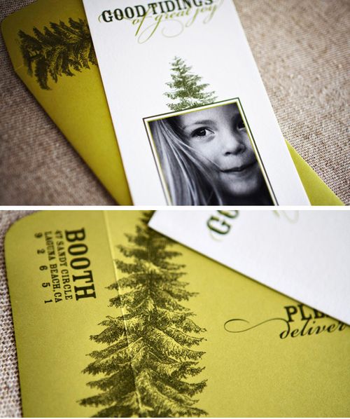
Of course, if you're looking to include a family photo with your holiday cards, these cards from Wiley Valentine printed on cotton paper maintain a beautiful balance between the photo and holiday design details:  

Wiley-Valentine-Holiday-Card{wiley valentine}

And finally, these custom holiday cards by Smock show how a single-color letterpress holiday card can be both simple and beautiful:

Smock-Custom-Holiday-Cards{smock}

Do you have a tradition of custom holiday cards in your family?  Are any of you planning to create your own holiday cards this season?

{images from their respective sources}