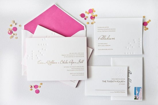
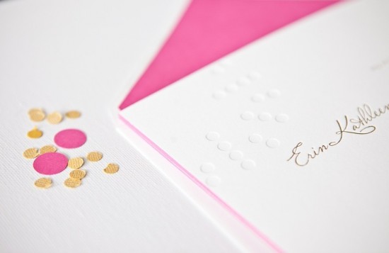
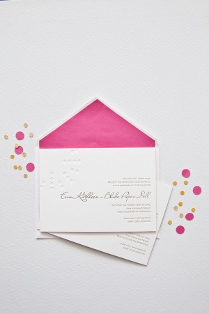
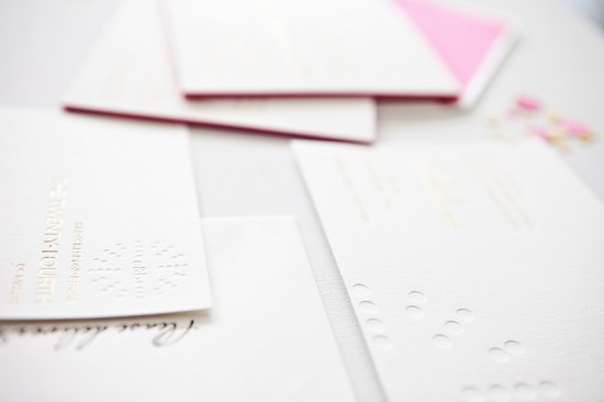
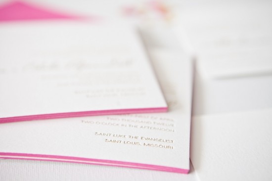
The resurgence of metallics – and gold foil in particular – has been one of my favorite design trends over the last couple of years.  I love the subtle way gold foil text is paired with a letterpress blind impression (no ink) pattern in these wedding invitations from Courtney Callahan Paper.  Modern, fresh, and sophisticated all at the same time!
From Courtney: Â Erin and Blake are a modern couple with a keen sense of style, and they each had opinions on how they wanted their invitation suite to look. Â For the blind impression pattern, we decided to mimic the circles used in the logo of their wedding venue, the Palladium;Â this element was carried throughout each piece of the suite and the materials used on their wedding day.
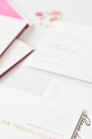
Printed on Crane’s Lettra in pearl, the invitation suite was produced using metallic gold foil stamping and a letterpress blind emboss. Â The suite included an invitation with hot pink edge painting, along with a reception card and response card with a custom monogram detail. Â Inner envelopes were lined in hot pink to match the edge painting on the invitation.
Thanks Courtney!
Design:Â Courtney Callahan Paper
Letterpress Printing:Â Accucolor
Check out the Designer Rolodex for more talÂented wedÂding inviÂtaÂtion designÂers and the real inviÂtaÂtions gallery for more wedding invitation ideas!
Photo Credits:Â Jennifer Kathryn Photography

