Todd + Sasha’s 1920s-Inspired Elegant Hand Lettered Wedding Invitations

Hi Again! Today we’d like to share with you a recent invite we did for an amazing couple who was having a sophisticated ’20s-era wedding. Although “Gatsby” was one of the words they used to convey the feeling they were going for, their suite was more about capturing the elegance and modernism of the era rather than trying to replicate the cues taken from the recent Baz Luhrmann movie. –Arley-Rose and Morgan of Ladyfingers Letterpress

1920's-inspired Elegant and Modern Letterpress Suite

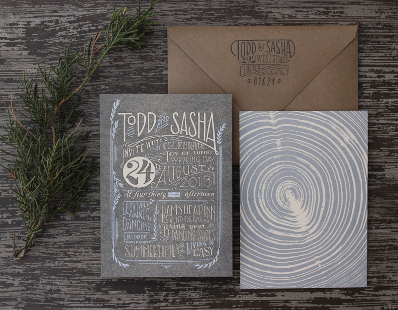
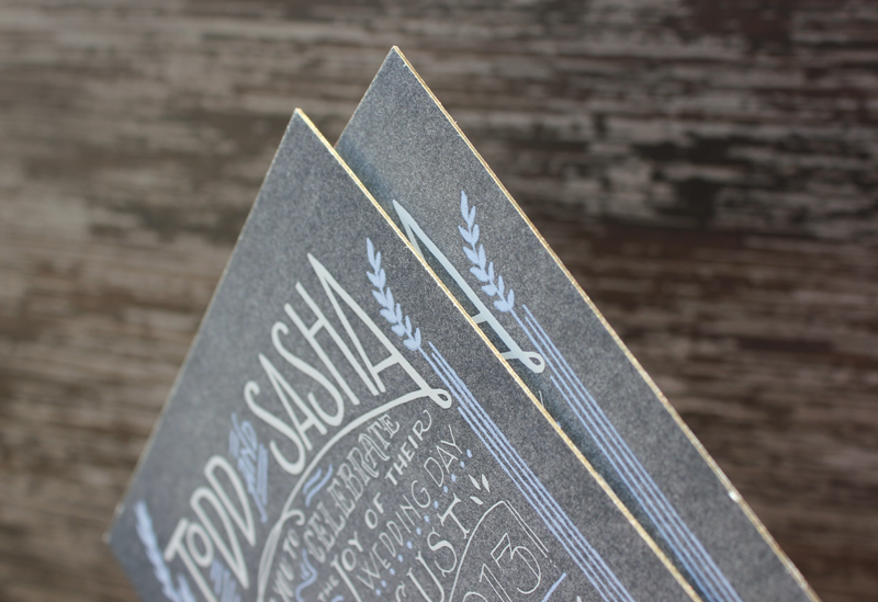
The suite features a two-sided, super thick invite that’s letterpress printed on both sides, with an application of silkscreen on the front, and edge painted in antique gold. If you’re familiar with letterpress printing at all, you may be aware that printing flats are a little more challenging than printing line work. We wanted to try a new approach where we attempted to letterpress a silver layer on top of the charcoal base flat layer, with the cream text knocked out of the charcoal layer. We had done a test in the studio before we pitched the idea to the client and it looked great. Somehow, by the time we were ready to print the silver layer, it didn’t look as legible as the tests and we had to come up with a new approach. We opted for silkscreen since it’s more viscous than letterpress ink. Another solution could have been hot foil stamping.

1920's-inspired Elegant and Modern Letterpress Suite

On the back of the invitation, we letterpress printed a cross section of a piece of wood, since the groom-to-be was an avid wood worker.

1920's-inspired Elegant and Modern Letterpress Suite

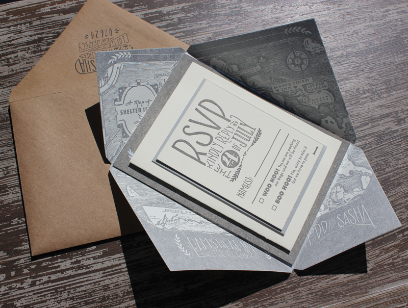
Their wedding was set to take place on Shelter Island, and features a letterpress print of a vintage map that acts as an inner envelope. These were then addressed in gold guache by our in-house calligrapher Tammy Ann Tan.

1920's-inspired Elegant and Modern Letterpress Suite

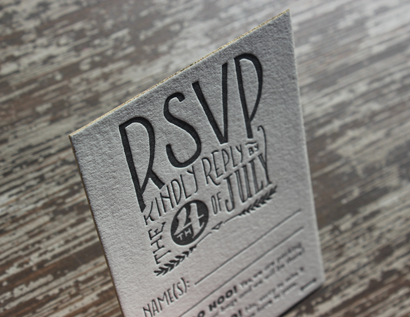
Their RSVP is also letterpress printed on thick cotton paper, edge painted and is double sided to accommodate menus, events and additional info. Their folded letterpress Info Card features directions, accommodations and vintage illustrations of Planes, Trains, and Automobiles.

1920's-inspired Elegant and Modern Letterpress Suite

1920's-inspired Elegant and Modern Letterpress Suite

1920's-inspired Elegant and Modern Letterpress Suite

p.s. Ladyfingers Letterpress is a member of the Designer Rolodex – check out more of their beautiful work right here or visit the real invi­ta­tions gallery for more wedding invitation ideas!

Photo Credits: Ladyfingers Letterpress

9TH LETTER PRESS: Trade Show Lessons Learned from a Rookie Exhibitor

Hello, all. Today’s guest post consists of all the “ah ha!” moments Sheli and I had while exhibiting at the 2013 National Stationery Show. If you’re planning on exhibiting or are just curious in general, this post is for you. –Isabel of 9th Letter Press

9th Letter Press at the 2013 National Stationery Show by Oh So Beautiful Paper

The 9th Letter Press booth at the 2013 National Stationery Show

I tend to think in “lists” (which is the extent of my organization talents) so I thought I’d provide one for you all with the most important lessons worth sharing:

  1. Absolutely research, prep, and plan for the show. The best resources available come from Trade Show Bootcamp, Show Time and Pushing the Envelope. Grab a highlighter and take lots of notes. I can’t tell you how useful these resources were!
  2. Excited to fill out order forms at the show? Get equally excited about printing inventory before you leave. You’ll be so happy doing the legwork beforehand and not afterward. Make your best educated guesses of what your bestsellers might be and have those printed, packaged and ready to go for when you come back. If you letterpress print your products, I would suggest having twice as much of everything printed before hand, because you may be surprised what gets ordered. We were shocked by how much more we needed to print once we got home! We will certainly be printing more inventory ahead of time in the future!
  3. Make sure you have a good selection for the most popular card-giving occasions. Ex: birthday, thank you, sympathy, etc.
  4. Make sure to bring extras! By the end of the show your cards will not be in the pristine shape that you brought them in. It will give you peace of mind knowing you can switch out a card that has suffered from being dropped, stolen or gotten dirty in some way throughout the show.
  5. Ship and pack a set: we ended up shipping a set of our products directly to our hotel and also packing two carry ons full of our products. If something happened to either set, we figured we’d be covered. (We were).
  6. Don’t forget to decorate your booth! Adding little touches of your brand throughout your display will go a long way.
  7. No matter how cute they are, leave your wedges and heels at home. Your feet will thank you.
  8. Make sure to have something to send to your retailers before and after the show. The first should arrive somewhere between two to three weeks before the show. We opted to do a more elaborate mailer to a smaller group of retailers so that we could focus on stores that we knew were a good fit for us. I also liked the idea of the mailer being personal with lots of detail and an accurate representation of our brand. Doing a mass run can limit just how creative you can be.
  9. You might consider getting an app like Handshake that will consolidate orders, information and reports to help with turnaround time after the show.

Here are a few pictures of our booth building out in New York, which was an adventure in of itself:

Sheli posing with 9th letter press wrapped pallet

Meet Sheli, the left brain of 9th Letter Press. She’s the person who puts into motion my big ideas. Without her, I’m not sure how anything would have come together, let alone have gotten to New York. We packed up our booth on an 8 foot pallet, which we packed with lots of care in the studio parking lot. When the freight company came to pick up our wrapped up pallet, we said goodbye, and crossed our fingers it would arrive safely in New York — it did!

Isabel putting together 9th Letter Press sign

That’s me working on our signage! I wanted the booth to match the look of our studio in Winter Park, Florida, which has a very old New York meets the industrial revolution feel. In order to keep with that aesthetic, we built a super tall bar complete with purse hooks and a brass rail, added dark walnut shelves, and found foam “wood” floors.

9th letter press booth at NSS

And here’s the end result! Sheli and I were thrilled with how everything turned out. We did spend a few late nights at the convention center to get it done, but it was well worth it. I really hope all or at least part of that was helpful!

Our mailers were travel themed so we included an old fashioned train ticket, a packing list, gold foil pressed luggage tags, and a gold pen to write down their information on the tag. After the show, we followed up with sending sweet little cards with an illustrated lady liberty on them.

NSS booth mailer letterpress

letter press mailer

letter press mailer from NSS

Photo Credits: 9th Letter Press Team

Alexia + Marco’s Colorful Miami Art Deco Wedding Invitations

Happy Monday everyone! I hope you all had a wonderful holiday and weekend! I always have trouble getting back into a groove after a long weekend, so I thought these bright and colorful wedding invitations from Nicole at Umama were the perfect way to start the week. Bride Alexia wanted Art Deco-inspired design mixed with vibrant Miami colors – such a fun combination! I love the tiny flamingo motif incorporated throughout the design, from the invitation to the envelope liner. So cute!

Colorful Miami Art Deco Wedding Invitations by Umama via Oh So Beautiful Paper (9)

From Nicole: Alexia and Marco’s wedding has an Art Deco theme, but will take place in Miami. Alexia said she envisioned Art Deco style with slightly more flair, brighter colors, and gold foil. She sent along some inspiration from the Art Deco era and we worked from her vibrant color palette. The combination of clean lines, bold colors, and gold foil made this one of my favorites!

Colorful Miami Art Deco Wedding Invitations by Umama via Oh So Beautiful Paper (1)

Colorful Miami Art Deco Wedding Invitations by Umama via Oh So Beautiful Paper (3)

Colorful Miami Art Deco Wedding Invitations by Umama via Oh So Beautiful Paper (8)

Thanks Nicole!

Check out the Designer Rolodex for more tal­ented wed­ding invi­ta­tion design­ers and the real invi­ta­tions gallery for more wedding invitation ideas!

Photo Credits: Umama

Stephanie + Jared’s Modern Art Deco Save the Dates

When it came time to design his own save the dates, designer Jared from TENNINETEEN combined inspiration from his 1920s wedding venue with his own modern style. The result is a combination of beautiful linear patterns with vintage-inspired text and a punch of red metallic foil. So fun!

Modern Art Deco Foil Stamped Save the Dates by TENNINETEEN via Oh So Beautiful Paper (7)

From Jared: While searching for our event space in the Kansas City area, Stephanie and I fell in love with a venue that had a 1920s feel. It has beautiful subway tile and an enormous 12-foot chandelier that centered the space. We wanted to touch on the Art Deco style in our Save the Dates, but give it a modern flair while maintaining our color palette.

Modern Art Deco Foil Stamped Save the Dates by TENNINETEEN via Oh So Beautiful Paper (2)

Traditionally, you see quite a bit of black and gold used for this era, but we wanted to mimic the style with our colors and see where it would take us. My design style is very modern and I wanted to be sure that was apparent in the design. Thus, we adopted the “Modern Art Deco” theme.

Modern Art Deco Foil Stamped Save the Dates by TENNINETEEN via Oh So Beautiful Paper (6)

Printed on Avon Brilliant White 100C, we first ran a pass of silver metallic ink, then punched it with a Pomegranate red foil. We had a custom stamp made that fell in line with the look and my fiancée, Stephanie, took care of all the hand-lettering on the envelopes.

Modern Art Deco Foil Stamped Save the Dates by TENNINETEEN via Oh So Beautiful Paper (4)

I love the linear lines and geometric shapes of the Art Deco style and used that as my inspiration. There wasn’t any single piece that I drew inspiration from, but instead I dove head first into the era and soaked in all of the patterns, shapes, and lines. Since I love clean design, I made sure not to go crazy, but include just enough so you get a taste.

Modern Art Deco Foil Stamped Save the Dates by TENNINETEEN via Oh So Beautiful Paper (1)

Thanks Jared!

Design: TENINETEEN

Printing: Boelte-Hall

Calligraphy: Stephanie Morris

Check out the Designer Rolodex for more tal­ented wed­ding invi­ta­tion design­ers and the save the date gallery for more beau­ti­ful cus­tom save the dates!

Photo Credits: TENINETEEN

{happy weekend!}

Happy Friday everyone! Do you have fun plans for this summer weekend? I’ve been daydreaming of a weekend trip to the beach – it’s been way too long since I last saw the ocean. Hopefully soon! In the immediate future, I’m looking forward to celebrating Andy’s first Father’s Day this weekend (yay!).  But in the meantime…

Sailboat: First Mate Photo Co.

Photo Credit: First Mate Photo Co.

…a few links for your weekend!

This week on Oh So Beautiful Paper:

Check back soon for this week’s cocktail! I hope you all have a wonderful weekend, and I’ll see you back here next week! xoxo