The Speckled Egg is one of my favorite blogs – Jane has great taste and always finds the best items to share with her readers. Today she found this letterpress gift list book from Russel + Hazel — and I really want one…

{via The Speckled Egg}

The Speckled Egg is one of my favorite blogs – Jane has great taste and always finds the best items to share with her readers. Today she found this letterpress gift list book from Russel + Hazel — and I really want one…

{via The Speckled Egg}
I love this embossing detail featured today over at Bridal Buzz. It's such a simple, yet classic, element that helps tie all the wedding stationery together:
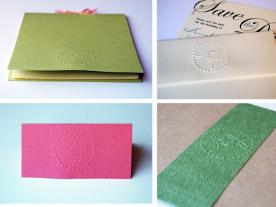
{Photos via Bridal Buzz — click here for the full post. Thanks Kristin!}
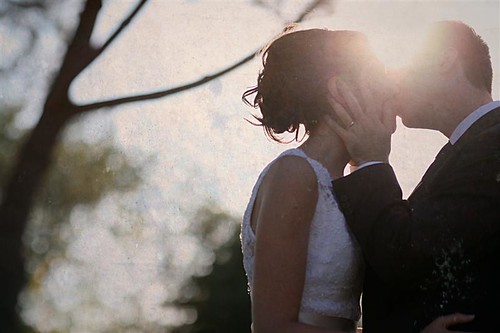
A few months ago, my very first client for custom wedding programs was Natalie. She'd seen pictures from our wedding and loved our programs, so she sent me an e-mail to ask if I could do something similar for her wedding.
Of course I was happy to oblige, and our little custom project eventually came to include "reserved" cards for the ceremony, table numbers, a few signs, and place cards in addition to the programs. I had so much fun working on this project, and the best part was getting to know Natalie during the process! Natalie and Matt had an absolutely beautiful wedding in California, and here are a few shots of my work in action at her wedding:
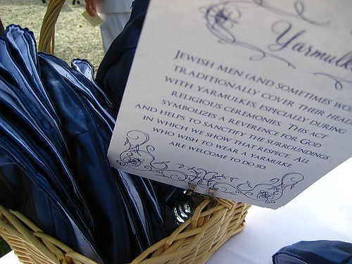
{signs explaning the Jewish tradition of yarmulkes}
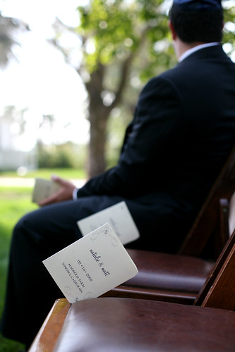
{the ceremony programs, placed in each guest chair for the ceremony}
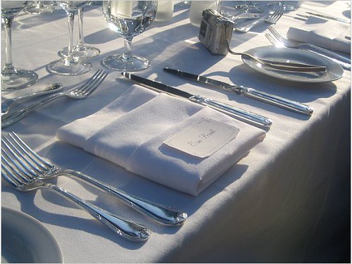
{place cards ready for the reception}
And here are a few pictures that I took on my own:
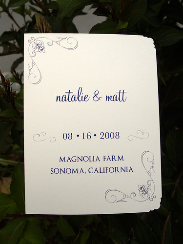
{the front cover of the programs}
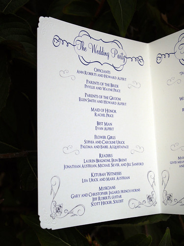
{the inside of the first page}
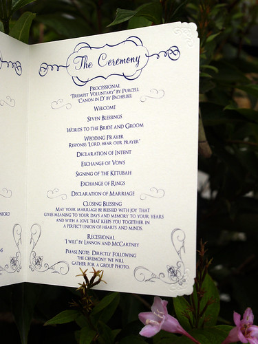
{the inside of the second page}
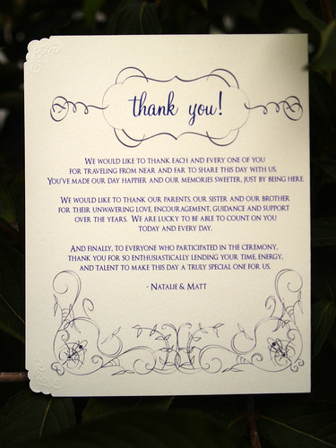
{the back cover}
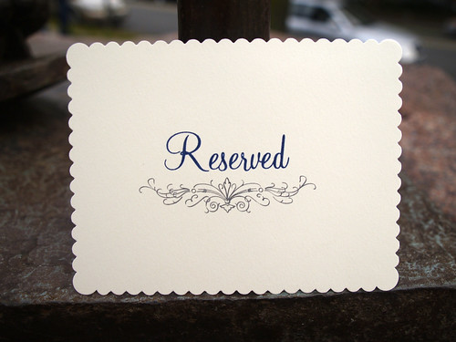
{the "reserved" seating card for the ceremony}
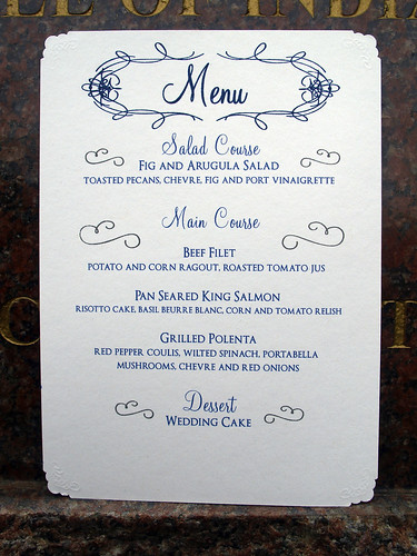
{the menus for the reception}
The programs and reserved cards were printed on cream card stock with navy and charcoal gray ink, while the menus, place cards, table numbers, and signs (like the one for the yarmulkes) were printed on white card stock. Check out my flickr site for more detail shots of the programs and menus – and definitely head on over to Natalie's lovely wedding recap for more gorgeous photos from her wedding!
{top photos via Natalie's wedding recap, all other photos by me}
I’m so glad that Martha Stewart has created an online database for the amazing real weddings featured in the magazine over the years. The wedding of Tasha and DW Gibson, particularly the wedding stationery, is one of my all-time favorites. It’s even more amazing when you consider that they planned the wedding in only five months:
I adore the fold-out layout of this invitation and subtle use of pattern. Â According to MS Weddings, “the bride wanted her wedding to feel like a garden in sunshine, so the invitation and itinerary (with perforated RSVP card) were letterpressed in moss green and golden yellow ink.”
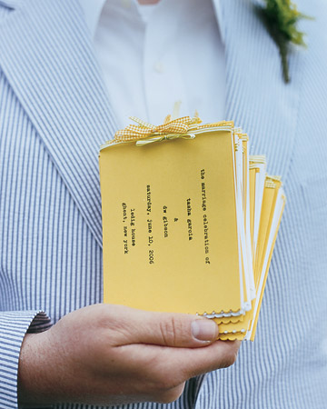
I love the use of detail – the scallop edge and ribbon are just too cute…
For those of you looking for escort card or place card ideas, this is a great one! And even if typewriter keys aren’t your thing, you could easily use vintage buttons or another small object and type or hand-write the table number assignment at the end of the paper.
Check out the Designer Rolodex for more talÂented wedÂding inviÂtaÂtion designÂers and the real inviÂtaÂtions gallery for more wedding invitation ideas!
{All images via Martha Stewart Weddings. For more photos from this wedding, click here for the full slideshow.}
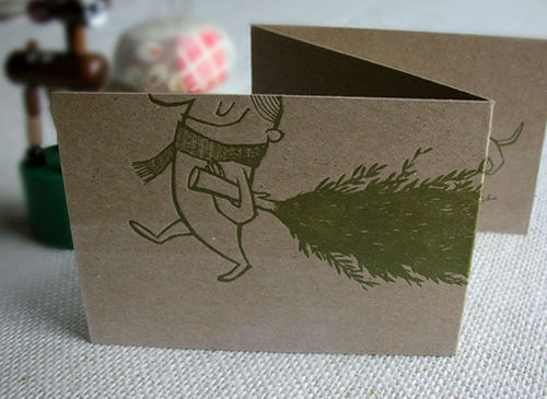
As promised, here are a few more favorites from letterpress design studio Mok Duk, this time featuring a few non-wedding related projects. The illustration in these cards and prints is truly stunning, and you can see how Anne’s artistic sense translates from wedding invitations into these fun, and more informal, designs:
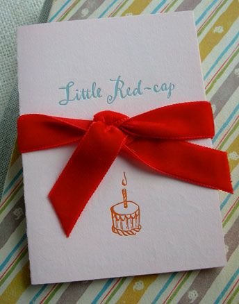
{an invitation to a baby shower}