Fletcher’s Simple and Scented Birth Announcements

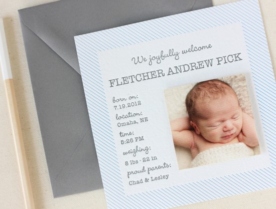
I’ve heard of scented paper, but this is the first time I’ve seen baby powder scented paper! Lesley from Inclosed Studio used this subtly scented paper for her son Fletcher’s birth announcements, keeping the rest of the design classic and simple with clean blue stripes and gray text. Such a wonderful announcement for a sweet little man!

Simple Baby Powder Scented Birth Announcements by Inclosed Studios via Oh So Beautiful Paper (2)

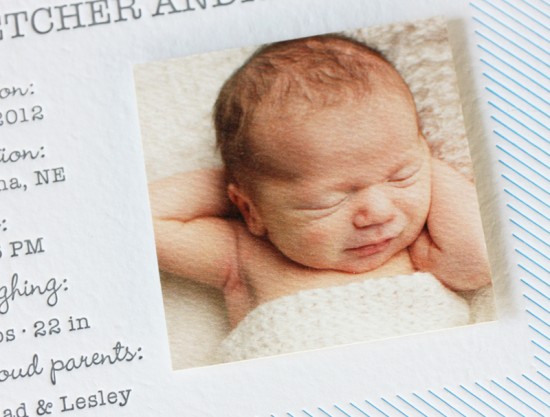
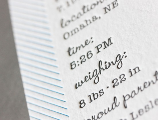
From Lauren of Inclosed Studio: When Lesley created these announcements for her newborn son, Fletcher, she knew she wanted to use baby powder scented paper. She kept the design clean and simple to match the subtle scent. The design was then letterpress printed in gray and light blue inks on the custom handmade paper. The photo was digitally printed on a felt weave paper to match the texture of the paper.

Simple Baby Powder Scented Birth Announcements by Inclosed Studios via Oh So Beautiful Paper (3)

Simple Baby Powder Scented Birth Announcements by Inclosed Studios via Oh So Beautiful Paper (4)

Thanks Lauren and Lesley!

Design: Inclosed Studio

Paper: Porridge Papers

Inclosed Studio is a member of the Designer Rolodex – you can see more of their fabulous work right here!

Photo Credits: Linda Gentry Photography

Sarah + Chase’s Texas Garden Party Wedding Invitations

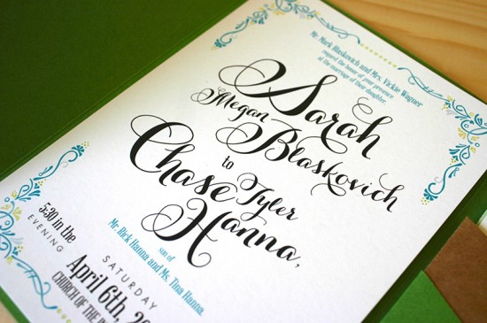
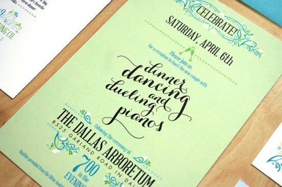
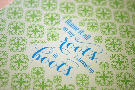
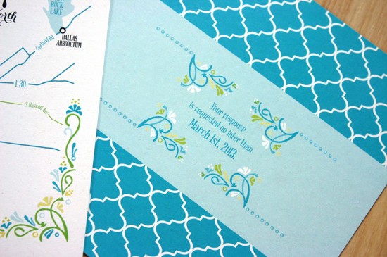
These wedding invitations are such spring fun! Created by Kristen of Mountain Paper for a spring wedding in Dallas, the suite features a color palette of green and blue along with pretty vintage-inspired floral ornaments. My favorite part? The playful quotes that the bride included throughout the invitation suite!
Green + Turquoise Garden Party Wedding Invitations by Mountain Paper via Oh So Beautiful Paper (2)

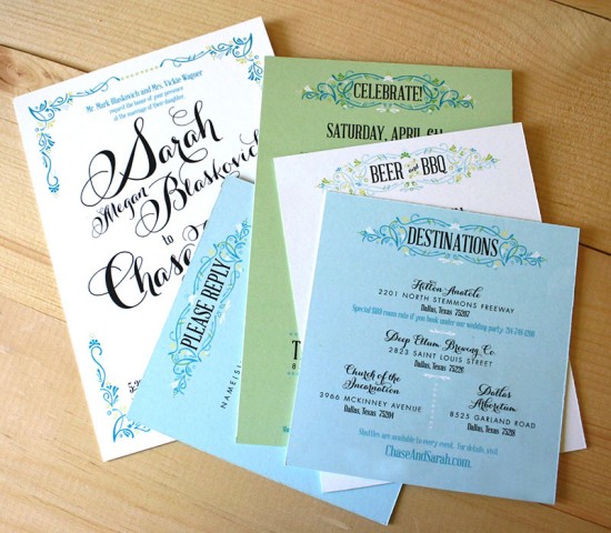
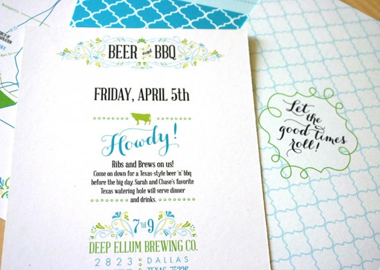
From Kristin: These invitations were created for Sarah and Chase, who are getting married in Dallas this spring. Sarah’s wedding palette of vibrant, springy blues and greens really shines on the printed page. The colors in combination with the curlicue typography is perfect for this fun couple. Sarah’s pension for dance moves that involve finger snapping and Chase’s hilarious Jay Cutler impression are just the tip of the entertaining iceberg!
Green + Turquoise Garden Party Wedding Invitations by Mountain Paper via Oh So Beautiful Paper (14)

Green + Turquoise Garden Party Wedding Invitations by Mountain Paper via Oh So Beautiful Paper (3)

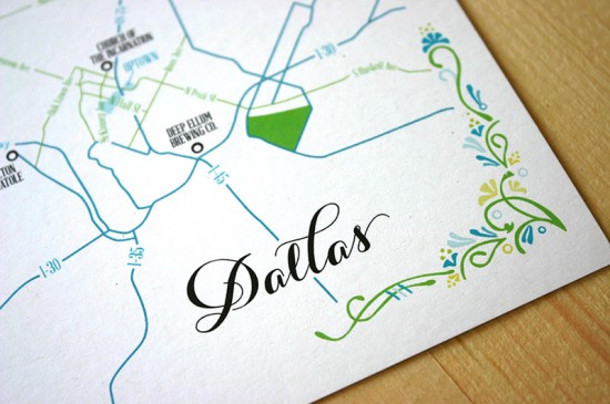
The mix ‘n’ match look of the suite reflects the bride’s bold personal style and incorporates a touch of vintage. Sarah’s vision for her event is an upscale garden party with all the familiar trappings of a classic Texas affair, so the design needed to reflect both the refined side as well as the fun, old-world southern side. We spent a lot of time creating the filigree elements that frame each piece. They needed to look just a tad imperfect while still lending structure to the page.
Green + Turquoise Garden Party Wedding Invitations by Mountain Paper via Oh So Beautiful Paper (12)

Green + Turquoise Garden Party Wedding Invitations by Mountain Paper via Oh So Beautiful Paper (10)

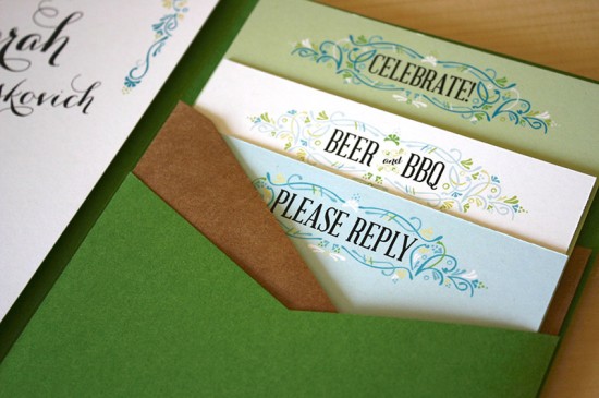
Sarah’s favorite piece is the rehearsal dinner card, which invites guests to a shindig of microbrews and barbecue. My favorite pieces, on the other hand, are the clever quotes she decided on for the reverse of two cards.
Green + Turquoise Garden Party Wedding Invitations by Mountain Paper via Oh So Beautiful Paper (7)

Green + Turquoise Garden Party Wedding Invitations by Mountain Paper via Oh So Beautiful Paper (9)

We stacked each enclosure snugly in a moss-green pocketfold and wrapped the whole packet with a garter printed with a matching filigree frame. (Sarah is a news editor by day and self-admittedly loves organization, so the pocketfolds were a given from the very start.) We printed all her recipient addresses on hefty, turquoise envelopes with more fun graphics on the back for the return address, too.
Green + Turquoise Garden Party Wedding Invitations by Mountain Paper via Oh So Beautiful Paper (13)

Green + Turquoise Garden Party Wedding Invitations by Mountain Paper via Oh So Beautiful Paper (4)

Thanks Kristin!

Check out the Designer Rolodex for more tal­ented wed­ding invi­ta­tion design­ers and the real invitations gallery for more wedding invitation ideas!

Photo Credits: Mountain Paper

Sarvenaz + Graig’s Art Nouveau Wedding Invitations

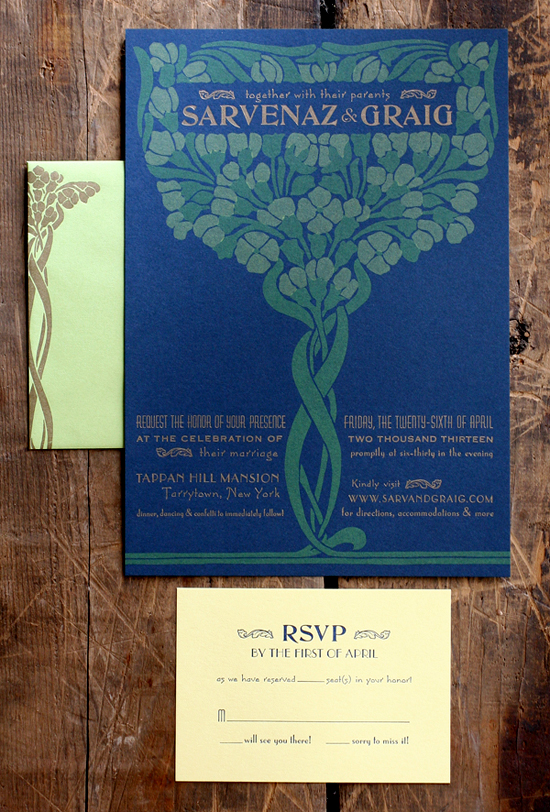
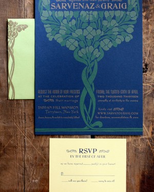
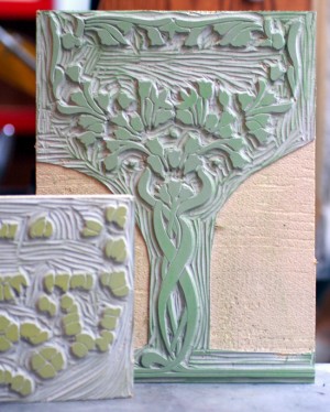
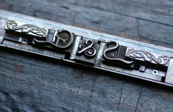
I love it when designers experiment with different printing methods to achieve a unique look – and that’s exactly what Jen from Starshaped Press did with these beautiful Art Nouveau-inspired invitations! Jen mixed a linoleum cut illustration with antique metal letterpress type to bring the couple’s vintage book cover inspiration to life in their wedding invitations. So lovely!

Art Nouveau Wedding Invitations by Starshaped Press via Oh So Beautiful Paper (9)

From Jen: Sarv and Graig were keen on wedding invitations that would resemble mini posters and they had great inspiration in the form of a vintage book cover. Given that letterpress printing doesn’t have the opaque vibrancy of screen printing, we ran a few tests to see if we could successfully achieve two light colors on dark blue paper and were happy with the result; the colors were muted in a faded, old fashioned way.

Art Nouveau Wedding Invitations by Starshaped Press via Oh So Beautiful Paper (1) Art Nouveau Wedding Invitations by Starshaped Press via Oh So Beautiful Paper (3)

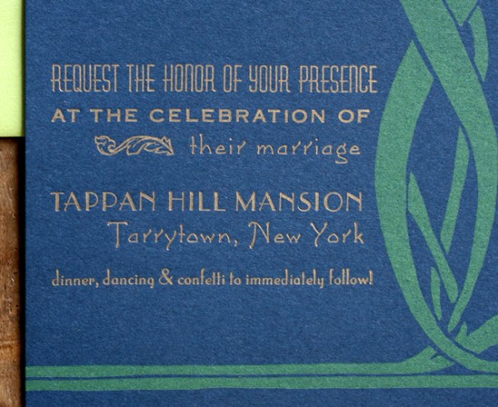
We decided on creating a piece that was 7×10″ so that it would fold to 5×7″ and mail in a standard A7 envelope. The image worked perfectly as a two-color linoleum cut after a little adjustment to the overall size and placement. The type is set in a mix of deco-meets-nouveau styles to pull the overall design into a more cohesive and streamlined form. It is printed in gold to pop out from the navy paper.

Art Nouveau Wedding Invitations by Starshaped Press via Oh So Beautiful Paper (8)

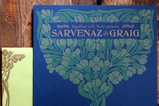
The typesetting was very particular to achieve a subtle curve along the artwork. I loved having an opportunity to use our DeVinne type for their names; it’s a lovely and quirky typeface from the turn of the century that sadly doesn’t get enough play in the studio.

Art Nouveau Wedding Invitations by Starshaped Press via Oh So Beautiful Paper (6)

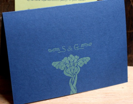
The invitation folds in half, and on the front panel (what you see when you pull it out of the envelope) is a snippet of the overall artwork with their initials rendered in our mortised initial caps and an ampersand from the 19th century typeface, Dakota.

Art Nouveau Wedding Invitations by Starshaped Press via Oh So Beautiful Paper (5)

The envelopes are sour apple green and the reply cards are pale yellow to give a little pop to the color palette. We continued the abridged image on the envelopes in gold (the return address is on the back flap) and carried through the multiple typefaces on the reply.

Art Nouveau Wedding Invitations by Starshaped Press via Oh So Beautiful Paper (4)

Thanks Jen!

Check out the Designer Rolodex for more tal­ented wed­ding invi­ta­tion design­ers and the real invi­ta­tions gallery for more wedding invitation ideas!

Photo Credits: Starshaped Press

Eco-Industrial Chalkboard + Linen Wedding Invitations

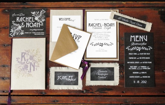
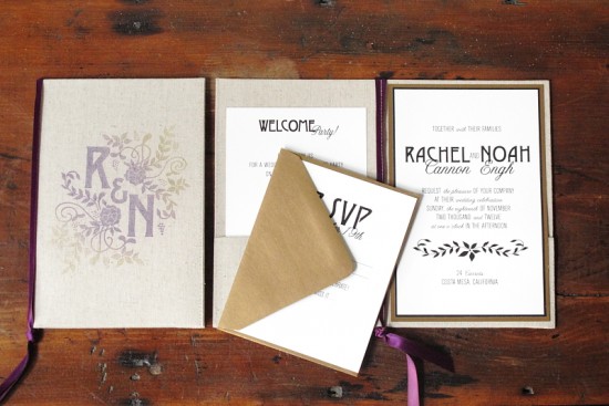
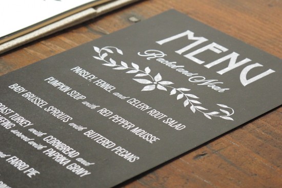
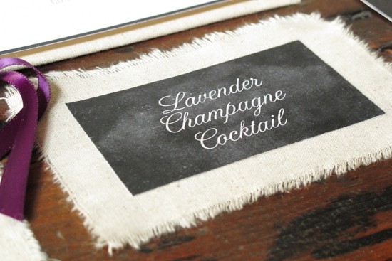
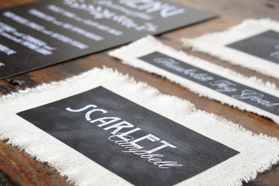
I’ve been drawn to some of the more industrial design trends for a while now, particularly when it comes to interior design, so I was thrilled when Jeannine from Blue Magpie sent over these industrial-inspired wedding invitations. Jeannine combined chalkboard effects with a lovely natural linen and floral accent elements. Pretty!

Linen + Chalkboard Wedding Invitations by Blue Magpie (8)

From Jeannine: I’m drawn to the strong, industrial look of chalkboard signage and really wanted to incorporate this into the paper suite. I thought the natural linen fabric was the perfect way of bringing in a natural “eco” feel.

Linen + Chalkboard Wedding Invitations by Blue Magpie (7)

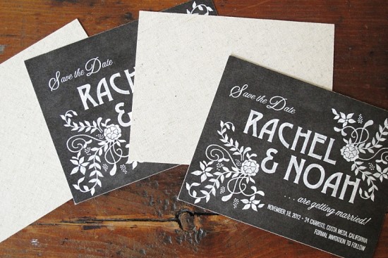
I ended up applying a layer of linen to the back of the save the dates, making linen folders for the invitations, and even incorporated pieces of torn linen into the event pieces as well!

Linen + Chalkboard Wedding Invitations by Blue Magpie (5)

With so much focus on chalkboard and linen, I really wanted to balance this eco-industrial look with something very soft and pretty. I decided to bring in some very organic looking florals both on the save the dates and on the monogram, which was made into a stamp.

Linen + Chalkboard Wedding Invitations by Blue Magpie (6)

I applied layers of metallic purple and gold ink to create an ombre effect to stamp on the front of the linen folders that hold the wedding invitation pieces. Some more of the metallic gold was brought in with the invitation border and response envelopes.

Linen + Chalkboard Wedding Invitations by Blue Magpie (3)

Linen + Chalkboard Wedding Invitations by Blue Magpie (1)

Linen + Chalkboard Wedding Invitations by Blue Magpie (2)

Thanks Jeannine!

Blue Magpie is a member of the Designer Rolodex – you can see more of Jeannine’s beautiful work right here or visit the real invi­ta­tions gallery for more wedding invitation ideas!

Photo Credits: Blue Magpie

{happy weekend!}

Happy Friday everyone – and yay for a long weekend! I hope you all had a nice Valentine’s Day. Sadly, my husband was on a late night shift this week, so there wasn’t much celebrating over here. Hopefully we’ll find some time to do something nice this weekend instead. We’ve had a few glimpses of spring here in DC this past week, which has me so so so excited for the real thing to arrive soon! Last year I was so overwhelmed with first trimester sickness that I was barely able to enjoy my favorite season, but this year I’m so excited to introduce Sophie to our favorite spring activities (like visiting Dumbarton Oaks and the National Arboretum). But in the meantime…

Maple and Belmont

Photo Credit: Maple & Belmont

…a few links for your weekend!

This week on Oh So Beautiful Paper:

Also, there a LOT of new Designer Rolodex members to welcome!

That’s it for me this week! I hope you enjoy your long President’s Day weekend and I’ll see you back here on Tuesday! xoxo