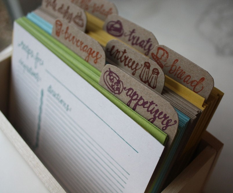
La Brocante Rose

Thank you , Nole + lovely readers for letting me share a few of my obsessions this week on Oh So Beautiful Paper!

One of my favorite blog friends, Melissa of Ruby Press just launched an Etsy shop selling her vintage finds. I couldn’t be more thrilled because Melissa has flawless taste. Check out these paper lovelies from her shop, La Brocante Rose.


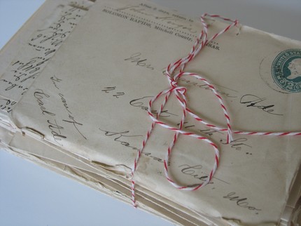
A lovely bundle of vintage letters!

Whimsical envelopes.

Old envelopes (1901-1923) with beautiful handwriting.

These gold star stickers have to be the best, though!

The New Monograms

Hello fellow Oh So Beautiful Paper readers! I'm so excited that Nole invited me to guest blog while she's away on a little Spring Break – I rarely get to focus just on pretty paper things on Snippet & Ink, so I'm thrilled to share some of my favorites with you this week…

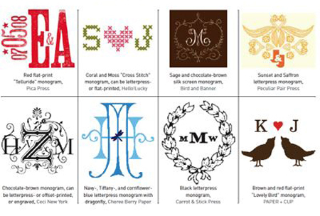
Personally, I love monograms, but I think for a lot of people, the word "monogram" probably conjures up images of preppy sweaters, vintage hankies, and fussy silverware. But these days, there are so many options out there, anyone can find a monogram to fit their personal style. Here are some of my favorites…

Hellolucky(brideschicago)
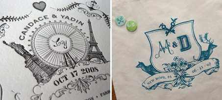
Brides Chicago printed an article featuring some clever and creative monograms. I especially love the kitschy cross-stitch one by Hello! Lucky. In case you can't read the designers' names, clockwise from the top left: Pica Press, Hello! Lucky, Bird and Banner, Peculiar Pair Press, Paper + Cup, Carrot & Stick Press, Cheree Berry Paper, and Ceci New York. {via Hello! Lucky}

Icecreamsocial
How about a wedding logo instead of just a monogram? I love this idea, and I love the ones that the ladies at Ice Cream Social create.

TBGmonogram
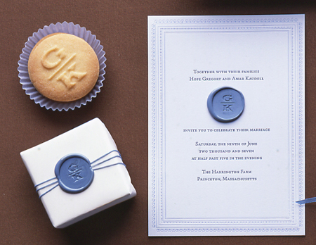
But, then again, there's something to be said for a simple, traditional monogram. Especially when you can stamp it into a wax seal, or even shortbread cookies! {via The Bride's Guide}

Are you incorporating a monogram into your wedding stationery? Or your registry? Or looking for something perfect to reflect your own personal style? What monograms have you found that you just love?

{this week}

Hey everyone! This week I’ll be taking a small blogging leave of absence as I’m both preparing for my final French test and then heading out to L.A. for my nephew’s Bar Mitzvah at the end of the week.  But since I didn’t want to leave you all hanging for an entire week, I asked the authors of two of my favorite blogs, the always-fabulous Chelsea and Kathryn, to help out here while I’m away.  So don’t forget to check in every day next week to see what they’ll be sharing, and I’ll see you all back here next Monday!

{image found here}

Tara + Michael’s Illustrated Jewish Wedding Invitations

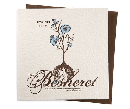
I just love seeing the way that real couples and designers work together to produce an invitation design that represents the bride and groom as a couple and suits their unique wedding style.  Today’s real wedding invitations were created by Tara, half of the design duo behind Paperwink, for her own wedding in 2006.  The invitation design is based on the Jewish concept of Besheret, a concept that definitely played a role in my own wedding last year.  I just love the way that Tara used the images of a flower and bulb throughout the invitation suite as a visual representation of the concept.
Inv_Besheret_1

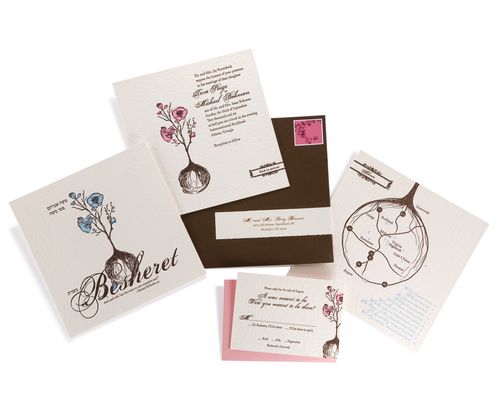
Tara’s invitation suite conveys the Jewish concept of Besheret, or fate – in Tara’s case, the fate that brought the bride and groom together originally, as well as the fate that would bring their loved ones together on their wedding day.  The invitation also included a quote, which says “man and wife ‘are the roots to one complete soul’.”

Inv_Besheret_2

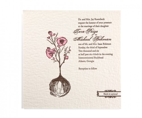
The quote served as the inspiration for the mail visual elements of the invitation design. Paperwink used a hand-drawn flower and bulb as the central design elements throughout the invitation suite to visually represent the concepts of roots and fate.  The invitations were letterpress printed on ultra-thick coaster stock to add an organic texture.
tara-paperwink-besheret-wedding-invitation

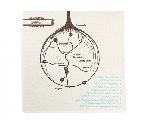
In addition to the main invitation, the suite included a custom map of the area and rsvp card.  In the map, the roots of the bulb were converted into the highways and streets of Atlanta, giving out-of-town guests a sense of the city as well as taking guests on a journey through Tara and Michael’s relationship and places that brought them together:
tara-paperwink-besheret-wedding-invitation-roots

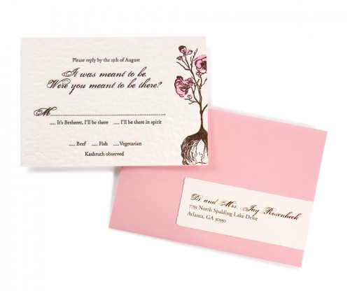
The rsvp card even chimes in with a “It was meant to be. Were you meant to be there?” Guests were given two reply options – “It’s Besheret, I’ll be there” or “I’ll be there in spirit:”

tara-paperwink-besheret-wedding-invitation-rsvp

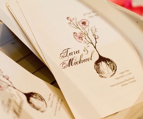
Finally, the concept of Besheret and the visual image of a bulb was carried through to the wedding itself.  The ceremony programs incorporated design elements from the invitation suite:
BE_Beshseret_3

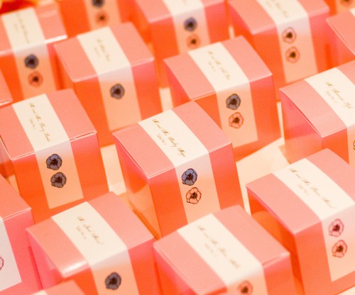
Escort cards (actually small boxes) played double duty as favors, containing flower bulbs for guests to take home and plant.  Tara placed color-coded hand-drawn flowers on the outside of the boxes to indicate the guests’ previously chosen entree preferences:
tara-paperwink-besheret-wedding-invitation-favors

Can I just say how much I love this invitation suite?!  The entire suite is so beautiful, and I love the way Tara incorporated the concept of Besheret throughout the invitations and wedding – creating a meaningful design that represents Tara and Michael as a couple as well as their new life together.  To see more of the incredible creativity over at Paperwink, click here to head on over to the Paperwink wedding collection.

{images via Paperwink – thanks Tara!!}