I love this new letterpress print, titled Peony and the Bee, from Parrott Design Studio.
So lovely – and so completely perfect for Spring. Get yours right here.
{images via Parrott Design Studio}

I love this new letterpress print, titled Peony and the Bee, from Parrott Design Studio.
So lovely – and so completely perfect for Spring. Get yours right here.
{images via Parrott Design Studio}
Today over at EAD I'm featuring the lovely calligraphy of Jenna Hein – I hope you'll come on over to check it out!

{photo via Love, Jenna}
p.s. I'm having one of those days where I just can't seem to catch up with the pace of the day. Anyone else have those days?
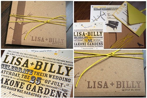
I'm loving these fun yellow + kraft paper invitations, created by Rachel and Lisa from Jolie Jolie for Lisa's upcoming wedding:


{images from bliss'd blog, via jolie jolie}
You’ll be seeing these invitations all over the blogosphere this week – but for very good reason, they’re amazing! Erica from Thoughtful Day, whose wedding invitations I featured last year, just launched her own wedding invitation line, called the Melodie Collection. We got a sneak peek at these gorgeous invitations at The B List meet up last weekend, and let me tell you, these invitations are even more lovely in person!


The idea behind the Melodie Collection is that couples can select their own colors and patterns to mix and match their letterpress wedding invites, creating a completely unique invitation suite that also fits their budget.  Erica currently offers four Melodie themes, each available in three color combinations.  Erica truly has a wonderful gift when it comes to pattern and color, and each piece coordinates perfectly both within and across design themes.
In addition to the Melodie Collection, Erica also offers custom invitation design:


And, as if that wasn’t enough, Erica also designs cutsom tote bags – Â she even did the tote bag for The B List meet up!
Congratulations Erica!
{images via Thoughtful Day}
I’m completely thrilled to be featuring this week’s set of real invitations. Allison and Mark were married last July, and when I saw their wedding on Snippet & Ink a couple of months back I immediately fell in love with their unique wedding programs, and so I asked if they would be willing to share their invitations as well.  Allison and Mark’s wedding was just brimming with creativity, and their wedding invitations and ephemera are definitely a reflection of their combined creative talents!
From Allison: We got married at Atwood Ranch, a horse ranch in Glen Ellen, California surrounded by mountains and trees (including wandering cats) and had our reception in the property’s barn (filled with chirping swallows). Since the location was such an important part of the day, it seemed only natural that our elements really reflect the spirit of the ranch, the warmth of the day and just the genuine joy the both of us felt about each other.
We didn’t start out with a theme or an idea, and because each piece was done at different time during our planning the variety became part of the charm and the colors and hand-lettering tied it all together. All we knew was that we weren’t into anything that looked too perfect or “designed” or into just stamping our monogram onto each piece.
Originally we started out with a tighter color palette of yellows and greys, but the fabric we bought to use for the table runners became a big part of our designs and our color palette grew to include about every shade of yellow and orange and some gray. We chose about 10 different fabrics to be sewed into table runners and we scanned them to use on the save the dates as part of the letterforms and they became the envelope liners for the invites.
All the hand-lettering was done by both of us, which is why not all of it matches. Also, we designed so many things so close to our wedding date, hand-lettering was our only option in terms of time and budget!
When we got to the chair labels, we decided upon a loopy cursive because we hadn’t done that type of lettering before and it was faster to write than the painstakingly printed escort cards we had made earlier (in the week!).
Mark and I are graphic designers, but we also do a lot of copywriting, so we paid a lot of attention to how everything was written so that it sounded like us (meaning there was some humor or sweetness in everything). Â For instance, the brunch invites were designed and worded exactly like the wedding invites except our names were reversed and Mark’s parents’ names were put first since they were hosting it.
However we also made other cute changes that you had to read it carefully to notice (on the wedding day invitation my parents invited guests to the wedding with “happy hearts” while Mark’s parents invited guests to the brunch with “hungry hearts.” Â It also featured a stack of pancakes instead of hearts.
Designing all of our materials was probably one of the most stressful parts of our wedding, but we wouldn’t have been happy with anything that didn’t have our stamp on it. Everyone commented that the wedding really felt like us and I think it did.
I definitely agree Allison! I love how the design throughout the wedding stationery, from the Save the Dates to the invitations to the programs and seating cards, feels completely personal while maintaining a consistent, even if slightly mis-matched, design approach. Everything is just so, so lovely.
If you haven’t already seen the photos from Allison and Mark’s wedding, don’t forget to swing by Snippet & Ink to check out the rest of the beautiful photos.
{all photos by Shelly Kroeger from Union Photography – thanks so much Allison and Shelly!}