Trimming the Budget without Sacrificing the First Impression

Labels

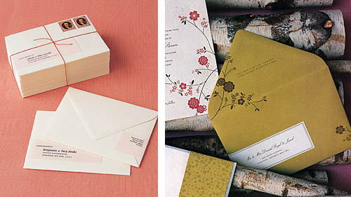
Images from Martha Stewart Weddings (right styled by Rebecca Thuss)

Hello, everyone! It's Maddy from the Inspired Bride blog, here to once again fill in for Nole.

Everybody is thinking of ways to save money nowadays, and the first things to go are the ones that aren't in the "absolutely necessary" column. For a lot of brides, that means sacrificing hand calligraphy – while it's gorgeous, it also can rack up quickly if you have lots of guests. Here are some suggestions on how to cut the calligraphy without losing the great first impression it makes.

Make an investment in a commercial calligraphy face and print your envelopes. Please don't go down the free font route! I've pleaded this case on my blog before because, as a graphic designer, it can be a little painful to see. There's a reason they're free – typographically, they're generally not up to par with pay fonts, and when that craftsmanship is not there from the get go, you won't be leaving the impression with your guests that you want. There are plenty of typefaces available for affordable prices, and I've covered some on the Inspired Bride. A great resource for affordable fonts is MyFonts – I would recommend you start there. Remember that the more you use the fonts, the better deal you're getting, so consider using them on favors, place cards, and programs, as well – anywhere you would have originally considered using calligraphy.

Do the wrapping label. Normally, it's considered a faux pas to put labels on an invitation, and in most cases I'd agree – however, the trend of making a wrapping label (as shown above), I think, is incredibly modern and gives an added element of "specialness". Plus, it just looks great – I loved the look so much, I nixed the hand calligraphy on the envelopes of my escort cards and used wrap labels instead in my own wedding two months ago.

DIY, literally. I came across a brilliant idea a few months back, but I definitely would recommend this only for those of you with steady hands and a heck of a lot of time and patience. This blogger had the brilliant idea to print her envelopes with a slightly darker ink on dark envelopes to use as a "trace line". She then went back over the slightly visible letters with an opaque white ink pen to give the quirkiness of hand calligraphy to the letters without being a trained professional.

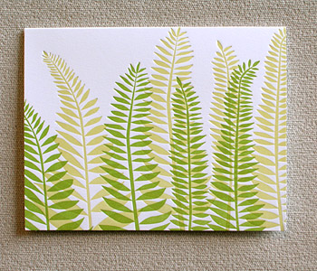
DIY scratch pad notebooks

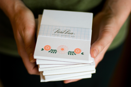
postal-press-DIY-letterpress-scratch-pad

hi there!  this is Alyson again with Unruly Things and I’m so happy to be here blogging for Nole while she’s out this week.  on Unruly Things I’ve been talking about my newest venture called Postal Press.  Postal Press is a little shop I’ve been working on stocked with letterpress stationery and packaging goodies.

last weekend, I participated in the Summer Social Sale, hosted by Abby of Abby Try Again, and debuted my collection of goods.  one of the hottest sellers was this little scratch pad, letterpressed and assembled by me.  and today is your lucky day because I’m here to share with you how you can make your very own scratch pad notebooks.

diy-scratch-pads

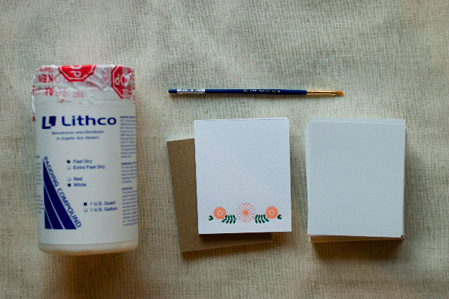
here are the supplies you’ll need:

  • padding compound – the consistency of elmer’s glue and available in white or red.
  • scratch pad covers – for mine I used Crane’s 110lb Lettra paper, letterpressed with my own design and cut to size.
  • interior paper – unless you have a high power paper cutter, I’d suggest having it professionally trimmed.
  • cardboard backing – I used a thin piece of kraft colored cardboard backing, also pre-cut to fit my pads.
  • a small paint brush.
  • a big working table with a good edge.
  • something heavy like a small book, glass jar or that insanely huge quart of padding compound that you have.

DSC_6107

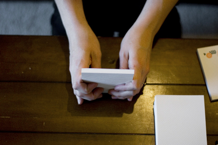
1.  start by gathering all of the paper together for the scratch pad, including the cover and backcover, and make sure that all of the sides match up evenly by striking it on your table or workspace.

DIY-scratch-pad-step-1

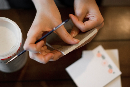
2.  next, grip the paper with your pointer finger and thumb on one side and your other fingers on the back for support.

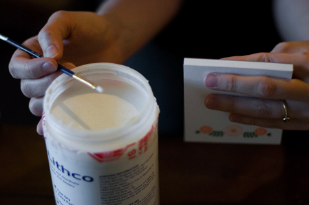
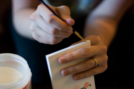
3.  take a small amount of padding compound on your brush {seriously, this stuff will last you forever} and lightly brush it onto the edge of your scratch pad.

DIY-scratch-pad-step-3

4.  brush the padding compound on in a light layer.  {you’ll do a second coat so don’t feel like you need to pile it on there}

DIY-scratch-pad-step-4

5.  wipe off any excess padding compound from the edges of the scratch pad.

DIY-scratch-pad-step-5

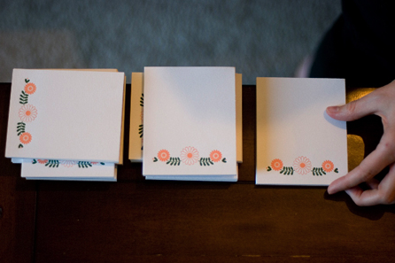
6.  set your scratch pads on the edge of your working surface, as close to the edge as you can get them without smearing the compound.  place something heavy on top of them to keep the pages from popping up.  make sure to keep the pressure even over the edge where you’ve brushed the compound.  I like to stagger my scratch pads on top of one another so that I don’t use up too much of my workspace.

7.  once the padding compound has dried, repeat with another light layer.  allow to dry completely.

DSC_6120

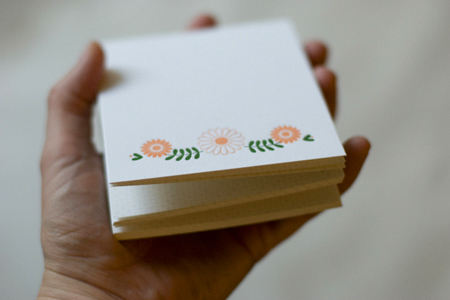
et voilà!  you have a handmade scratch pad, ready for use!  and pretty darn cute scratch pad at that.  I’m sold out of these scratch pads at the moment, but I hope to have more ready to put in the Summer Social online shop, which opens this Friday July 31 at 10am PST.  the Postal Press online shop will open in August.

Decorating with Paper: Not Just for Kids’ Birthdays Anymore

Martha

Image from Martha Stewart Weddings

Hello, guys! It's Maddy from the Inspired Bride again, popping in once more to cover for Nole while she's out.

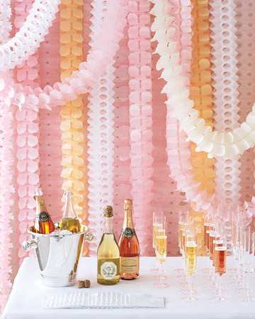
Slowly but surely, I'm starting to see more and more couples stop thinking about paper details in their weddings as favor tags and programs. I'm obviously thrilled about this emerging trend, as a paper fan girl and as a wedding blogger always looking for fresh ideas for her budget-minded readers. Martha showed us how to blow it out with her fantastic paper decor wedding in this summer's issue of Martha Stewart Weddings, but not all of us have a host of stylists at our command to help us decide when we're crossing that really fine line between "fashionable" and "five year old's birthday party". Here's some thoughts I have, from a full time art director's perspective:

Choose a sophisticated color palette. It sounds obvious, but it's important. I think the fact that the image from Martha above is toned down in color and uses picks from a similar family with fresh pops of white helps it read more "classy festive". That's not to say you can't use bright colors, but think about editing – for example, your color palette may be the oh-so-hip red, white and aqua, but if you use all three colors, your guests might start wondering where the Patriotic Pin the Tail on the Donkey is. Instead, consider the aqua and white only – calm and refreshing, and still ties in. If you're looking for more depth, consider using a similar color like a deeper aqua shade in the case of the example scenario.

Thuss

Image from Rebecca Thuss for Simple Silhouettes


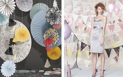
Play with scale shifts. Bigger isn't always better. Try incorporating paper decorations in similar shapes but different sizes to add variety and texture without going overboard. The change in size will help break the decor apart visually, too, so it won't be aesthetically overwhelming.

Layer. While it's true you don't want to go overboard, it's not good to underwhelm either. I think the best example is Martha's wall of paper garlands in pink, peach and white above – if you have only a few hanging up, they'll look like sad little streamers. Layered the way they are, they start to mesh together and become an interesting visual of color and texture. You stop reading them as paper garlands and start seeing them as more abstract forms. In the case of Rebecca Thuss' bunting set she did for Simple Silhouettes, the dynamically strung layers helped break up the strong graphic quality of the flag shape that helps make it look surprisingly sophisticated and festive.

Don't be afraid to incorporate pattern. To take it to another level, try using papers with prints on them. Solids are great staples, but to add a little more personality and to take it one step further away from the dreaded "birthday party aesthetic", try bolder, modern patterns that tie back into your event.

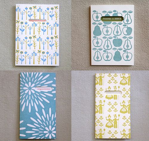
hello + egg press

Eggpress

hello!  this is Alyson from Unruly Things.  I’m so thrilled that Nole asked me to guest blog here on her beautiful blog Oh So Beautiful Paper.  I’ve got some paper eye candy in store for you this week, and first up is one of my absolute favorite letterpress companies, Egg Press.  located right here in Portland Oregon, Egg Press always has such beautiful and perfectly printed letterpress cards.

Egg Press is currently celebrating 10 years of printing!  they shot a cute video on location in their Portland shop, including behind the scenes view of the design and printing process.  check it out.

Sh1506A

{images via Egg Press}