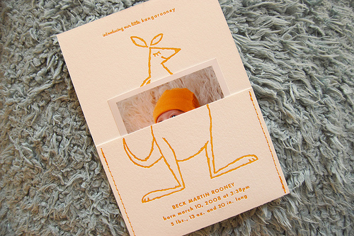
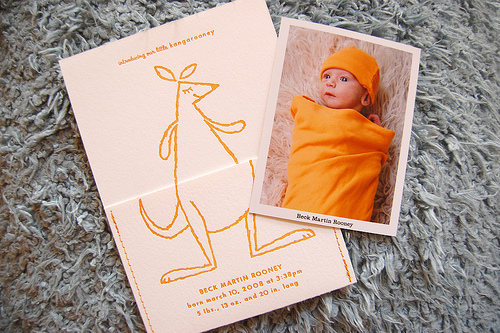
Rachel from Jolie Jolie found these adorable letterpress kangaroo baby announcements from designer and illustrator Chris Rooney:
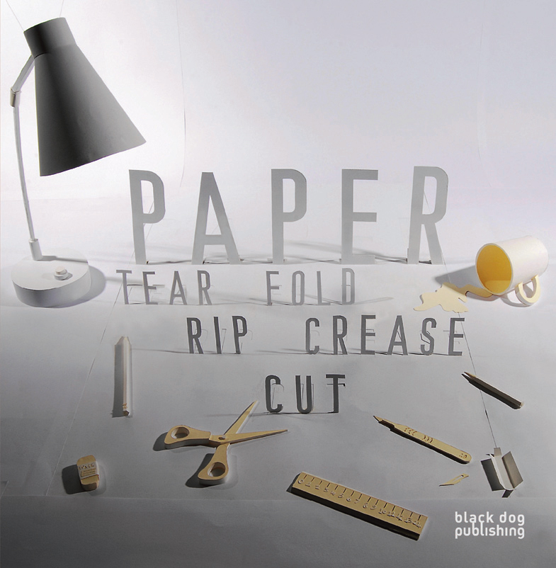
Paper – Tear, Fold, Rip, Crease, Cut
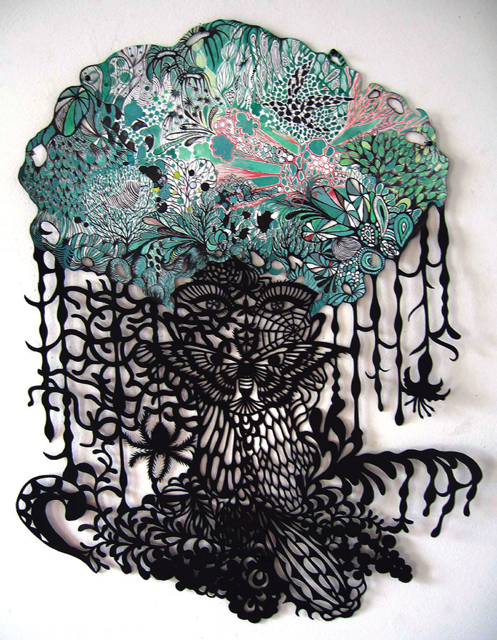
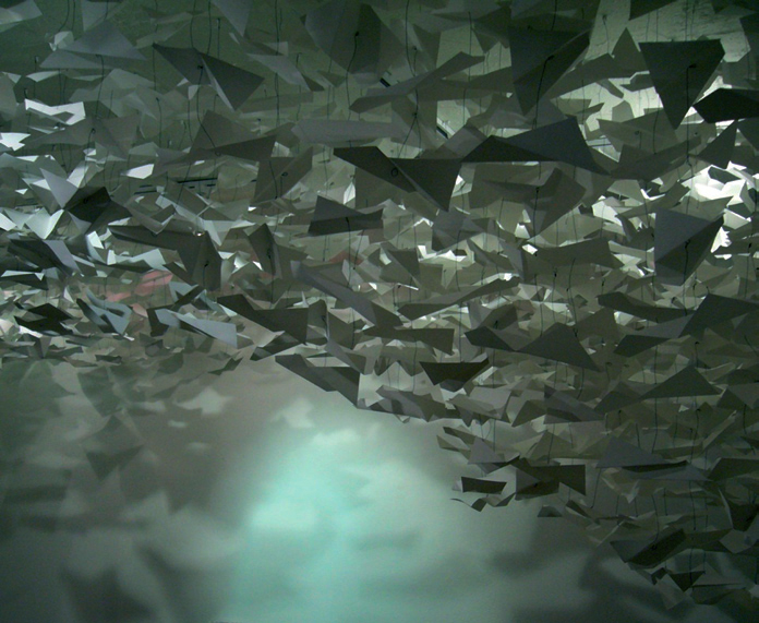
Jess from Black Dog Publishing contacted me earlier this week to let me know about a new book called Paper: Tear, Fold, Rip, Crease, Cut by Hatori Koshiro – which features a number of the artists that I've previously featured here, including Mia Pearlman, Rob Ryan, and Peter Callesen, along with many other paper artists. And just based on a few of the photos I've seen so far, it looks like the author has assembled a beautiful collection of paper artwork, from papercuts to installations to illustrations:
Here's the book description from the publisher: Paper: Tear, Fold, Rip, Crease, Cut shines a light on the beautiful world of paper in art, fashion and design. From the traditional art of origami and paper cutting through to contemporary experiments in conceptual paper installations and modular folding, Paper celebrates one of the world’s oldest and most widely used materials in all its visual glory.
Embroidered Fabric Calendar
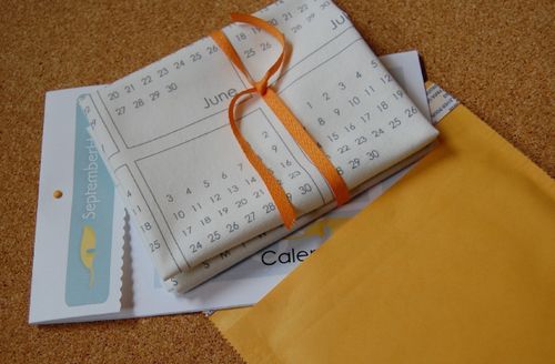
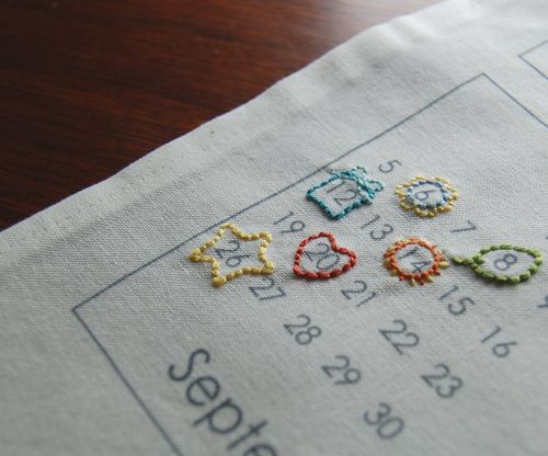
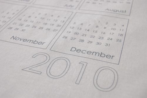
I'm not planning to do full calendar round-ups until later in September, but I came across this beautiful fabric calendar on Avie Designs and just couldn't resist posting just this one a bit early:
The calendars are pre-printed on cotton panels – the idea is that you embellish the cotton fabric with embroidery, fabric, or screen printing before giving it to someone else (or I suppose keeping it for yourself). Such a sweet idea!
The calendar panels are available for purchase from September House, which also offers a number of embroidery patterns that can be used along the edges of the calendar. Check them all out right here.
{photos via September House, found via Avie Designs}
Bird and Banner + Vintage Stamps
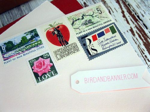
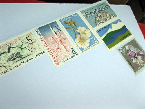
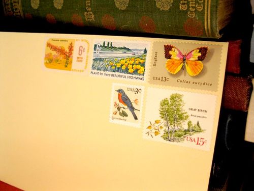
I love this series of note cards with matching envelopes and vintage stamps from Bird and Banner - the vintage stamps alone are completely gorgeous:
There are only three cards at the moment – but you can find them all here.
And have you checked out the new Bird and Banner blog yet? I've really enjoyed the sneek peek into Erin and Nicole's work and inspiration – you can follow along right here.
{photos via Bird and Banner}
Jennifer +Â James Sunflower Wedding Invitations
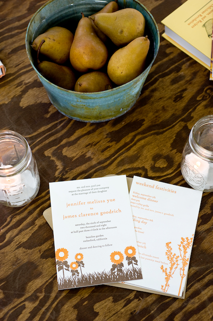
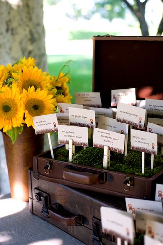
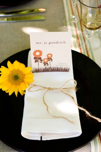
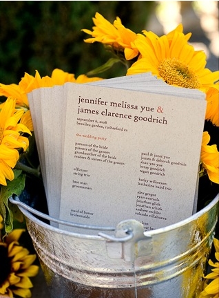
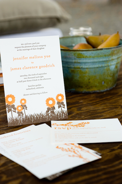
I am so excited to be featuring today’s real invitations and wedding stationery, designed by Lisa from Good on Paper for James and Jennifer’s beautiful sunflower-filled wedding:
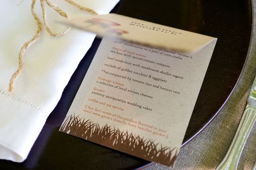
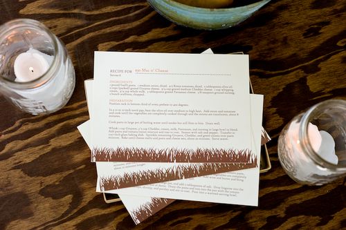
You might have seen this wedding, designed by the amazing Gloria Wong, in the latest issue of MS Weddings, but Heidi and Judy from Gertrude + Mabel Photography were kind enough to send over photos specifically of the paper elements:
The bride, Jennifer, also shared the inspiration behind Lisa’s beautiful designs:
We loved the casual, rustic style of an outdoor wedding. We definitely wanted a beautiful outdoor setting that made our guests feel like they were on a mini vacation (even if they only drove up from San Francisco). Beaulieu Gardens was a perfect romantic choice for us since it had so many different locations for the ceremony, cocktail hour, and reception (where we loved dining underneath a canopy of trees).
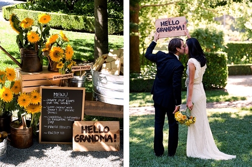
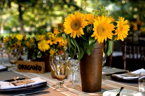
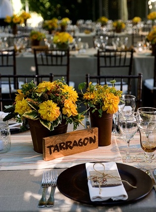
Also, it had a very vintage feel to it, and so we were inspired by the look and feel of the South of France. Our planner used old vintage suitcases as props, a lot of wooden signs, rusted copper and tin containers to hold the flower arrangements, casual french-inspired table cloth runners, mason jars, and sunflowers.
Nancy also did a great job weaving in elements of the two of us. For example, I love to eat and cook. For setting arrangements, we labeled each of the tables an herb that I normally use in my cooking.
We also created a “marketplace” that looked like a farmer’s market (since I love to frequent them) and gave away sunflowers, fresh fruits, flip flops, and a recipe box filled with 12 of my favor recipes to make and a little package of thyme (my favorite herb).
For the invitations specifically, we worked with Lisa to incorporate the wedding themes too. The main page had sunflowers that were drawn on them (which was the main flower we used in the wedding).
Lisa also incorporated herbs into the other cards such as the reply card since it tied back to my love of cooking. We had purchased a herb picture book so that Lisa could get inspired.  Also, everything was very casual with the invitation. We chose to write everything in lower case for the invitations and all other printed material at the wedding.
I love that Jenny’s love for cooking is reflected throughout the invitations and wedding – resulting in a very personal design and feel to the invitation – and the way Lisa designed the invitation suite to convey central theme without each element being too matchy-matchy.  Plus, the sunflower and herb motif seems like a perfect fit for a wedding taking place just as summer transitions into fall.  So lovely!  Thank you so much to Jennifer and Lisa for sharing these invitations – and to Heidi and Judy from Gertrude + Mabel for providing such lovely photos!
{all photos by Gertrude + Mabel}

