Afternoon at the Athenaeum

A few weeks ago, I had the opportunity to collaborate on a photo shoot with the ever-fabulous Kate Headley and a few of my other favorite DC-area wedding professionals — and since it offered me a chance to wear my wedding dress again (yay!), I convinced my husband to come along and get all dressed up for an afternoon at the Athenaeum in Old Town, Alexandria.

Athenaeum-Rustic-Elegance-Wedding-Floral-Arrangements

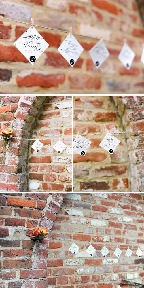
The style inspiration for the photo shoot was rustic elegance, with a color palette of soft peaches and creams, browns, and classic black and white.  My contribution (aside from being in the photos) was the stationery — I designed these square escort cards, which we hung from natural jute twine along a brick archway in the back garden patio of the venue:

Athenaeum-Script-Escort-Cards

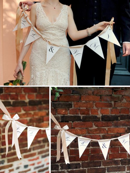
Just for fun, I created this “Mr & Mrs” bunting — which you can download and use yourself (for personal use only, please) right here.  We hung the bunting from a small tree, but you could string up over the guestbook table or on the path to your reception location:

Athenaeum-Bunting

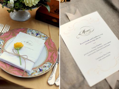
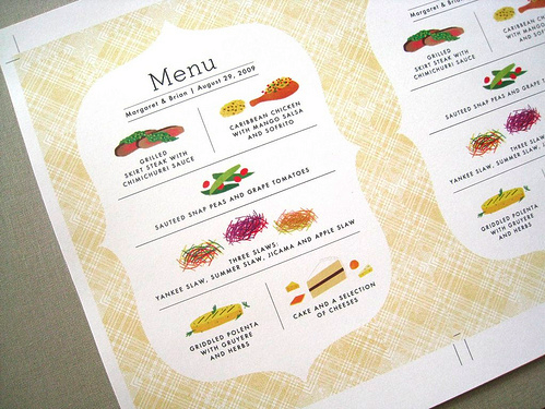
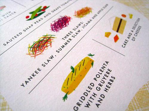
I also created these dinner menus, which Kelly from Design Cuisine and Maria from Ritzy Bee Events wrapped in a white cloth napkin along with a simple flower and more jute twine for each table place setting:

Athenaeum-Menus

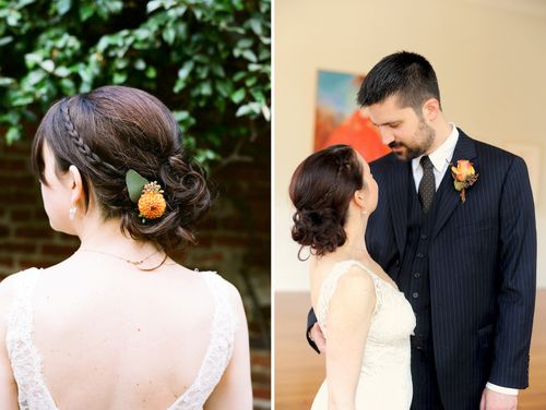
In keeping with our rustic elegance theme for this shoot, my amazing stylist Abbey from Parlour Salon created a beautiful hairstyle with two braids leading back to a messy bun with a cute little button dahlia tucked in:

Nole-Wedding-Hair-Style-Braid

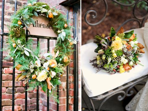
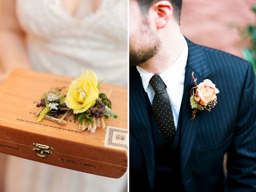
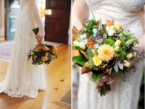
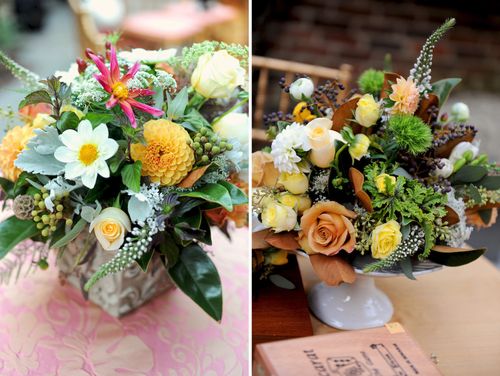
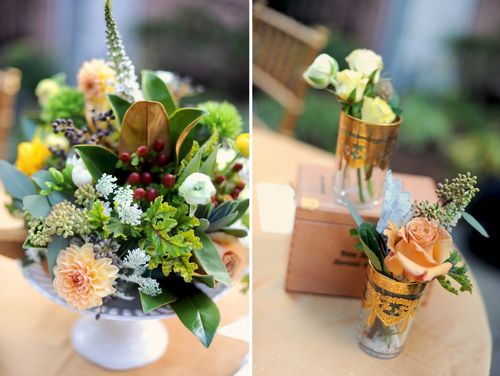
I was so happy to finally have the chance to work with Holly Chapple!  I had desperately wanted to work with Holly for my wedding last year, but sadly she was already booked on my date.  For this shoot, Holly created some truly beautiful floral arrangements, from boutonnieres to centerpieces and lush bouquets:

Athenaeum-Rustic-Elegance-Boutonnieres
Athenaeum-Rustic-Elegance-Bouquet
Athenaeum-Rustic-Elegance-Wedding-Centerpieces
Athenaeum-Rustic-Elegance-Wedding-Centerpieces2

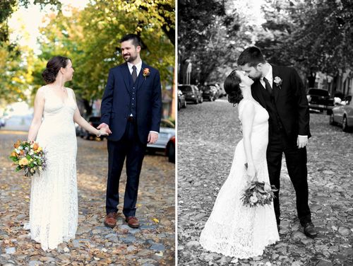
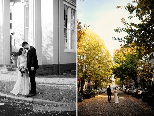
My husband and I spent some time walking around Old Town near the Athenaeum with Kate — it was an absolutely beautiful autumn afternoon:

Nole-Andy
Nole-Andy2

Here’s a full list of everyone who participated in this photo shoot:

Location: The Athenaeum

Flowers: Holly Chapple Flowers

Hair: Abbey Castellano Parlour Salon

Stationery: Me!

Photography: Kate Headley

Styling: Maria at Ritzy Bee Events 

Styling: Kelly Seizert, Design Cuisine 

{all photographs by Kate Headley}

Mixed Typography Wedding Invitation

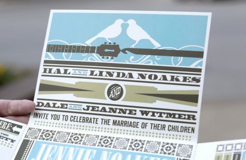
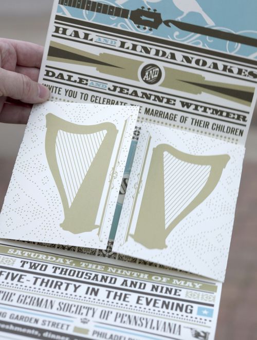
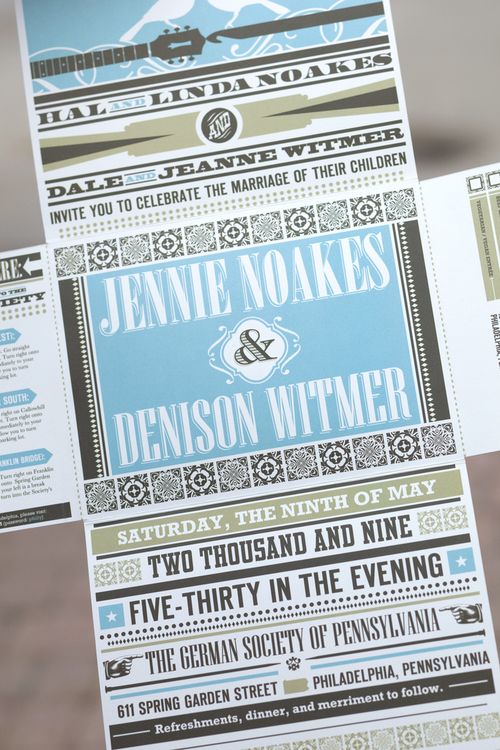
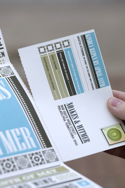
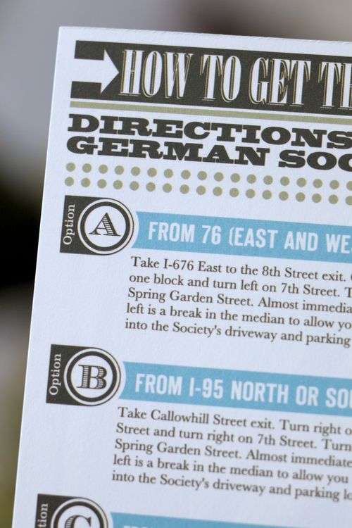
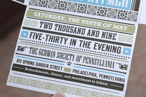
Lately I've found myself drawn to wedding invitations that combine different typefaces as the main design element, or at least one of the primary design elements.  Like these fold-out poster-style wedding invitations by Jordan Gray Creative:

Typography-poster-wedding-invitations 
Typography-poster-wedding-invitations3

Typography-poster-wedding-invitations7
Typography-poster-wedding-invitations5
Typography-poster-wedding-invitations6 
Typography-poster-wedding-invitations4
The guitar, harp, and bird details are all beautiful, but it's really the typography that gets me in this invitation design.  I also love the way the directions and rsvp card fold out from the main poster of the invitation – such a cool detail!  The entire invitation folds down to fit into a 5" x 7" envelope.  Check out a bit more right here.

{image credits: Gabe Hopkins for Jordan Gray Creative, found via freshly blended}  

Vintage-Inspired Wedding Certificates

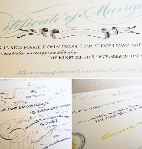
Wiley Valentine just released these beautiful vintage-inspired marriage certificates — a lovely option for any couple looking for a frame-worthy keepsake for their wedding ceremony:

Wiley-Valentine-Marriage-Certificate

The three designs above — each of which can be customized with your wording — are currently available in the Wiley Valentine shop right here.

{image credits: Wiley Valentine}


Oh, and in the interest of full transparency since the new FTC rules are now in effect, you can find my editorial policy right here.

Business Card Ideas and Inspiration #1

I have a slight (ok, more like a major) fascination with business cards.  I love the way people infuse their personality into the design and layout of the card.  I’ve found myself drawn to a few particular design details in business card designs, so I thought I’d share a few favorites with you!

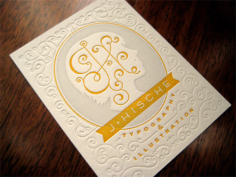
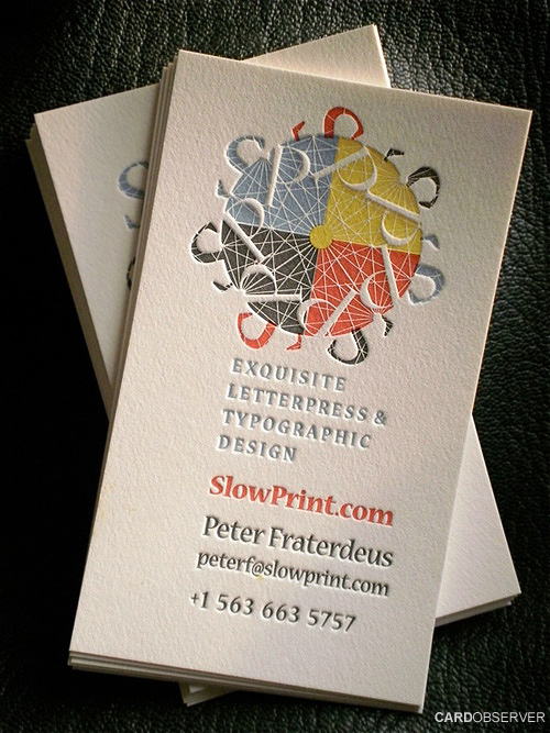
1. Cool use of pattern and negative space in the design:

Jessica-hische-pattern-business-cards{jessica hische via FPO}

Four-color-letterpress-business-card{amazing registration by SlowPrint Letterpress via card observer}

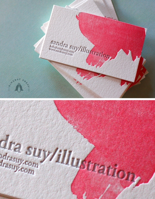
Watercolor-letterpress-business-card{watercolor letterpress business cards by dingbat press}

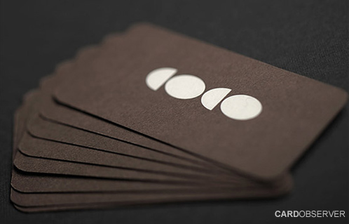
Negative-space-business-card{WallStreet via card observer}

2. Typography details and double-sided printing:

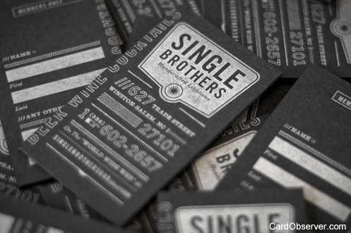
Vertical-typography-letterpress-business-card{shane cranford via card observer}

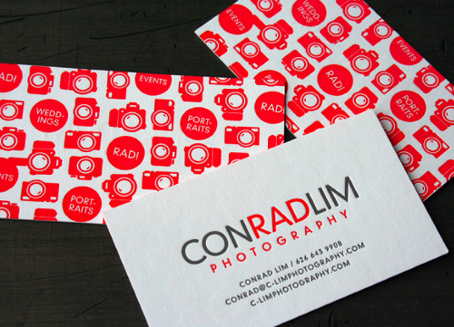
red letterpress photographer double-sided business card
{studio on fire}

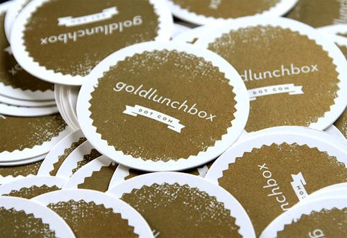
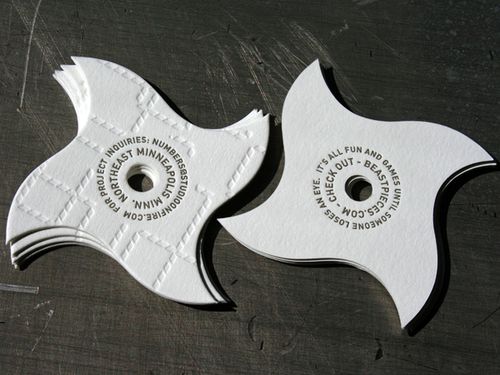
3. Unique shapes — from circles and squares to ninja stars:

Gold-round-circle-business-card{gold lunchbox via FPO}

Ninja-star-business-card{studio on fire}

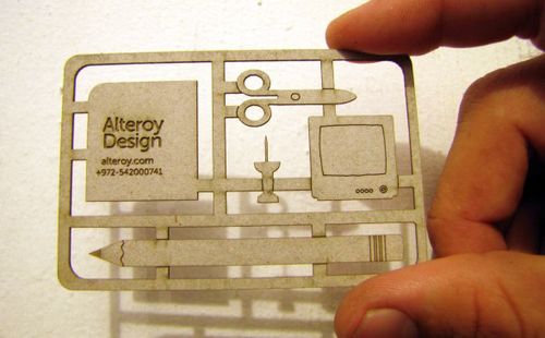
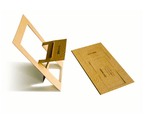
4. Laser-cut details and cards that transform into new shapes:

Laser-cut-business-card{laser-cut chipboard via jolie jolie}

Woodgrain-chair-business-card{woodgrain business card by emily berry via card observer}

Anyone else have business cards on the brain?  Or am I alone in this minor fascination?

{images from their respective sources}