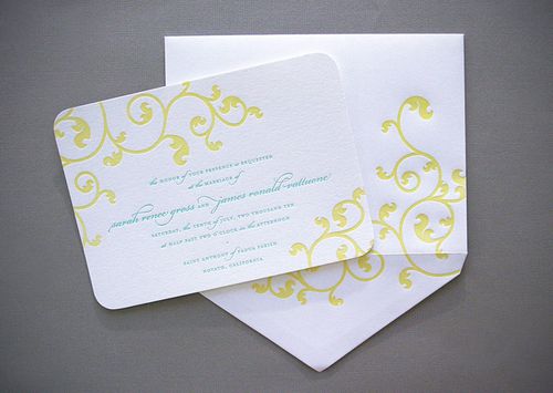
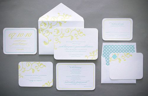
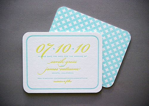
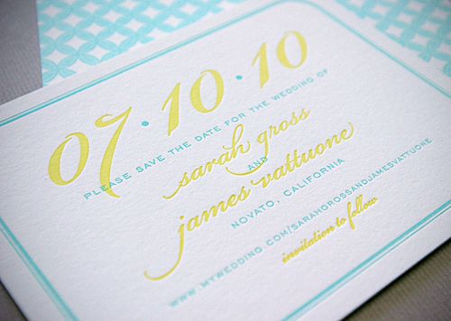
I thought I’d take a quick break from NSS previews this morning to share a gorgeous wedding invitation from Dauphine Press! Â Created for a July wedding, this invitation suite features bold pops of color and beautiful pattern details inspired by quilts made by the bride’s grandmother!
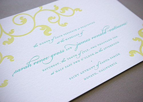
The design team at Dauphine Press set out to create a beautiful wedding invitation that balanced modern and feminine design elements, including a custom vine motif and crisp geometric pattern. Â They also chose to orient the invitation card horizontally instead of vertically for a less traditional approach.
The overall suite includes a mix of traditional and contemporary elements. Dauphine Press included inner and outer envelopes and center-aligned typography to represent the traditional church ceremony, while also adding pops of color and pattern details. Â The unexpected little details and the color palette made the design a perfect reflection of the couples’ warm and sunny personalities.
The color palette for the invitation suite incorporated the groom’s favorite color, blue, with contrasting shades of yellow.  The combination of light turquoise and bright yellow reminded the bride of summers spent at the beach or by the pool — perfect for a July wedding!
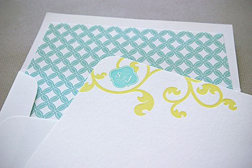
The geometric circular pattern used on both the back of the Save the Dates as well as the invitation envelope liners was inspired by one of the bride’s grandmother’s patterned quilts!
From the bride, Sarah:Â One of my Grandmother’s wedding quilts influenced the design. Having so many of her quilts in my life, I felt an instant connection to the pattern. Â I love how the clean geometric lines can also play into a stylized floral design, though while I love floral patterns, I wanted something that resonated with both James and me.
{image credits: dauphine press}

