Inspiring Calligraphers: Stephanie Hino of Double Dipped Calligraphy

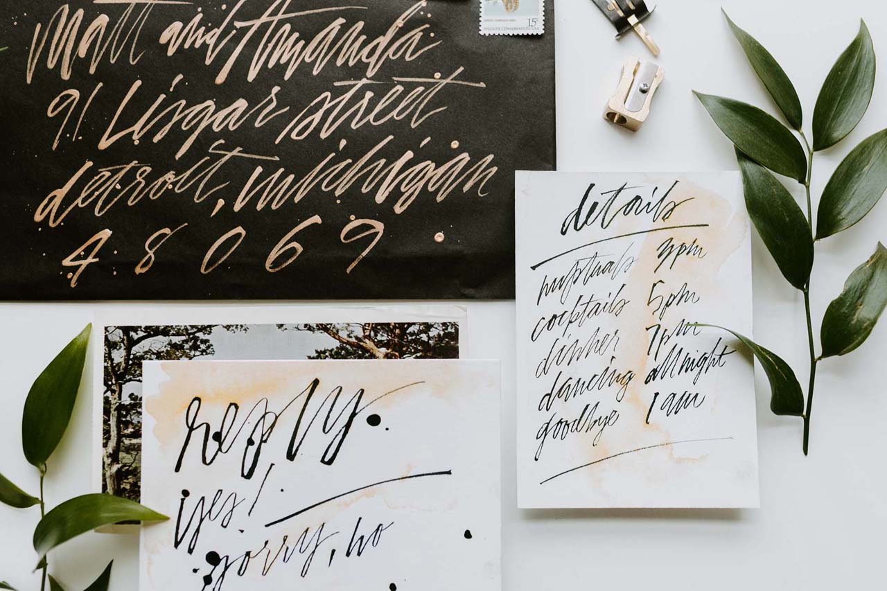
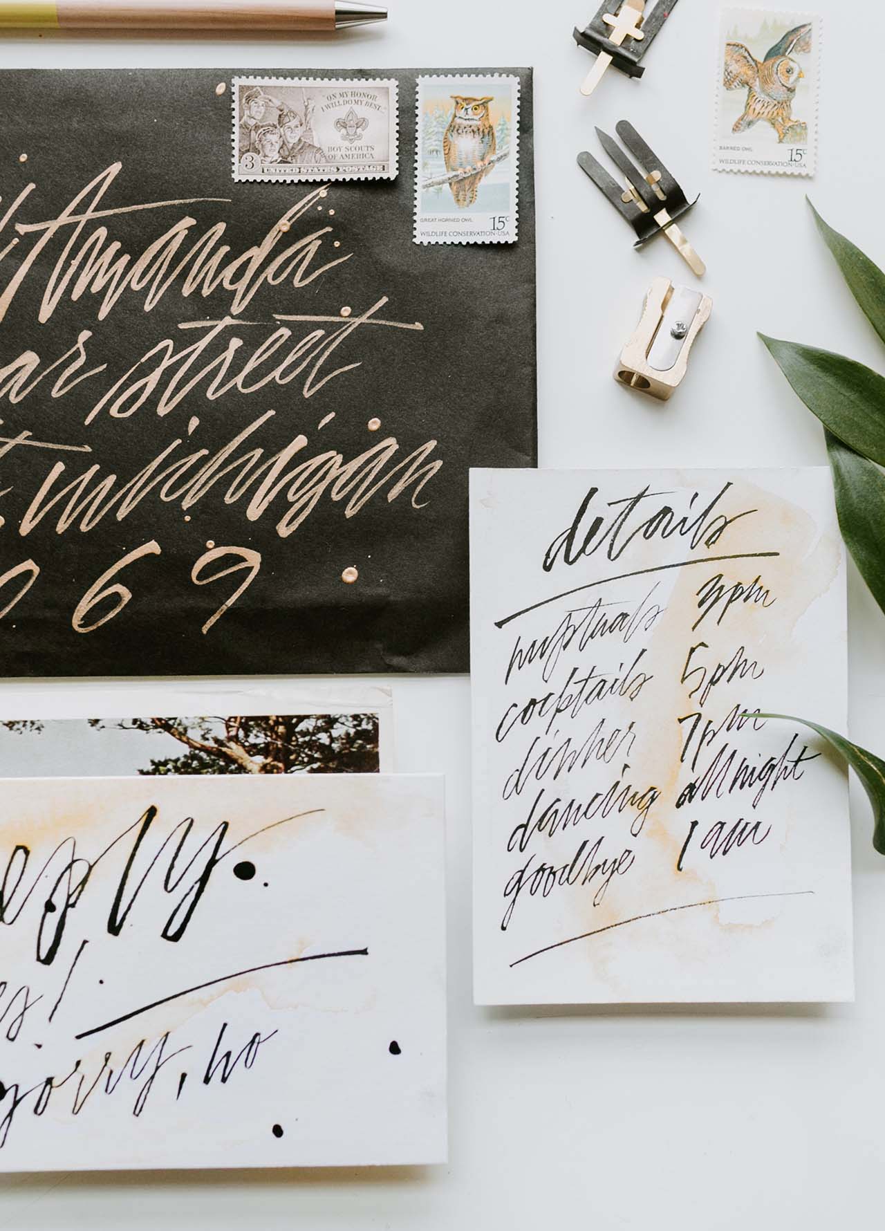
Hello everyone! We all know double dipping is a no-no when it comes to party dips, but when it comes to fancy lettering, let’s just say you’re going to say a big yes to the pretty work of Double Dipped Calligraphy. Stephanie Hino, the artistic force behind the collection, shares a peek at her work and her inspiration. Let’s dip in, shall we? Jen

Inspiring Calligraphers: Double Dipped Calligraphy

On what inspires her lettering style, Stephanie shares: “The thing that attracted me to modern calligraphy was the movement of the letters and words across a page. Whenever I’m working on something, my goal is to make my lettering look effortless and organic. The tension between creating free flowing words while also demonstrating restraint is a beautiful thing!”

Inspiring Calligraphers: Double Dipped Calligraphy

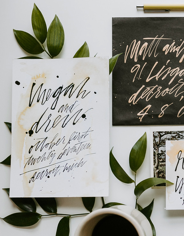
Photo Credit: Forty Eleven Photo

Inspiring Calligraphers: Double Dipped Calligraphy

Inspiring Calligraphers: Double Dipped Calligraphy

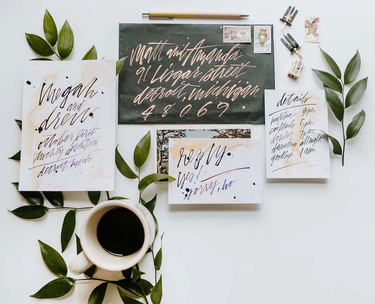
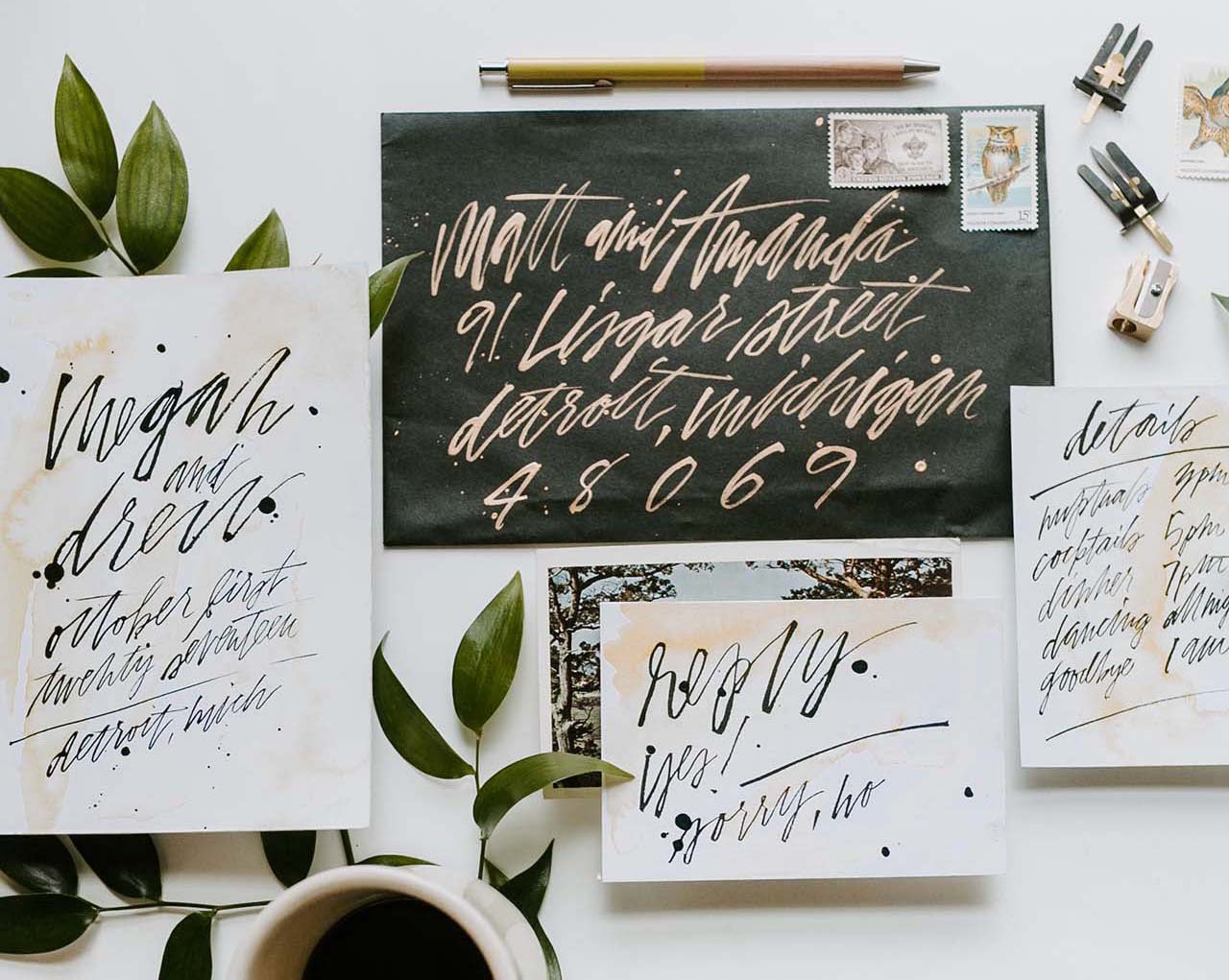
Photo Credits: Alexandria Monette Photography

On her favorite project, Stephanie shares: “I love trying new things that I haven’t seen before. One of my favorite projects was the Hangar 21 grand opening from last summer. There were several vignettes at the event that I was able to contribute to, each unique and so fun. The hand painted, clear acrylic chargers and tropical leaf menus were a couple of my favorites.”

Inspiring Calligraphers: Double Dipped Calligraphy

Inspiring Calligraphers: Double Dipped Calligraphy

On doing calligraphy on non-paper surfaces, Stephanie says: “While I’ll always be a paper lover, it is so fun to work on other surfaces. Some favorites have been greenery, leather jackets, and acrylic. I acquired a laser machine in the last year and it’s been a whole new journey of possibilities. Acrylic has especially been a popular choice recently, whether I’m writing directly on it, engraving, or cutting my lettering out of it.”

Inspiring Calligraphers: Double Dipped Calligraphy

On top of all the beautiful lettering work, can we talk about these amazing color palettes, too? So pretty! Thanks again to Stephanie for sharing a peek inside her work!

All images via Double Dipped Calligraphy except where noted.

Quick Pick: Party Sally

Party Sally made their debut at last year’s National Stationery Show, and with this year’s just a few weeks away I thought I’d revisit some of their beautiful offerings! Party Sally is known for watercolor illustrations paired with hand lettered text paired and quirky copywriting. You might be familiar with their Rihannakah card, which we featured in our holiday card round ups and also made the rounds on social media last year. I can’t wait to see what they have up their sleeves this year!

Quick Pick: Party Sally

Call Dad

Rainbows

La Croix Card

Coffee Card

Party On Disco Ball

Bobby Pins

Mylar Thanks

See-Through Phone


You can find more from Party Sally right here!

Soft Neutral Vineyard Wedding Invitations

Soft neutral hues never go out of style. Michelle of Honey Paper designed these soft neutral vineyard wedding invitations inspired by the gorgeous venue nestled in the California mountains. Add in some vinyeard-inspired botanical illustrations, gold wax seals, and curated vintage postage and you’ve got the recipe for one seriously elegant and refined wedding invitation!

Soft Neutral Vineyard Wedding Invitations by Honey Paper

From Michelle: Between the San Rafael and Santa Ynez Mountains the summers are warm and rainless, dense with thickets of shrub and stippled in gray pine, wild cotton and a long list of oaks. The narrow, steep ranges are considered young at five million years old. Alluvial soils of the valley bear the plants of myth: bay laurel, rosemary, grape and olive. The Santa Ynez Valley is vintner’s and an artist’s dream. Gravelly soil bakes white in the sun while the slender olive leaves shake and bristle like birds in flight. The villa at Sunstone Vineyards and Winery was built under a seafaring sky in the heart of this beautiful place.

Soft Neutral Vineyard Wedding Invitations by Honey Paper

Soft Neutral Vineyard Wedding Invitations by Honey Paper

When the Rice family founded Sunstone Vineyard and Winery it became one of the first organic vineyard estates in the region. Everything about their venture has remained true to the story of the land, from practicing sustainable viticulture to incorporating hillside caves among dense blankets of wild grasses and evergreen. Antique wooden beams, once privy to the smells and sounds of a Victorian lavender factory, were brought from England and integrated into the architecture. The villa is a testament to the materials and practices of the old world integrated seamlessly to meet modern standards. Thick walls of local stone were finished with imported French limestone and elegant terra cotta roof tiles. The villa is an architectural gem that simultaneously preserves the past and shapes the future.

Soft Neutral Vineyard Wedding Invitations by Honey Paper

We wanted the stationery to capture the essence of the light at Sunstone. We paired a pale clay-colored ink with soft white paper. Each piece of the suite and day-of details, including menu and escort cards incorporate the silhouette of slender olive leaves and branches. The subtle design is reminiscent of a sun print – light waves patiently breaking down the fragile color bonds leaving only traces of color. The envelope and invitation enclosure are a nod to sandstone – a rock whose only memory is of the sea. Each invitation was wrapped in a buttery white ribbon and completed with a golden wax initial seal.

Soft Neutral Vineyard Wedding Invitations by Honey Paper

Fine linens and freshly cut greenery were arranged on long tables with wooden benches and tawny pillows under the shade of the high walls. The wedding cake arrived: three tiered, quartz on sky on the softened teal of mountain bluebird. All of the details came together in this inspiring land of rocky outcroppings, sandstone, shale and limestone. A place where the sun leaves a trace of its brightness behind.

Soft Neutral Vineyard Wedding Invitations by Honey Paper

Thanks Michelle!

Design and Calligraphy: Honey Paper

Check out the Designer Rolodex for more tal­ented wed­ding invi­ta­tion design­ers and the real invi­ta­tions gallery for more wedding invitation ideas!

Photo Credits: Ashley and Erik Fine Art Photography

Modern Hand Painted Sumi Ink Invitations

There are lots of rules for wedding invitations, along with plenty of traditions, etiquette, and details to consider. But for a vow renewal, all rules go out the window! Megan and Drew chose to celebrate their marriage with an intimate ceremony and reception (with a super small guest list of close friends) that was a better reflection of their style than their wedding years before. They worked with Rachael of Hazel + Dolly to create these VERY cool and eclectic modern hand painted Sumi ink invitations. Each individual piece in this suite was hand painted, from the invitation to the RSVP card to the envelope! So creative and unique!

Modern Hand-Painted Sumi Ink Invitations by Hazel and Dolly

From RachaelThis invitation suite was for a vow renewal for a small group of friends of the couple. Each individual invitation, reply card, detail card, and envelope was hand painted. Every card had a unique watercolor wash using an amber-colored watercolor and lettering in dark black Sumi ink. Originally, I proposed this idea as a letterpress invitation suite, but when I found out how small the guest list was, we decided to do hand painted. The couple and I agreed that this added both a personalized and eclectic touch to the suite.

Modern Hand-Painted Sumi Ink Invitations by Hazel and Dolly

The couple, Megan and Drew, got married several years ago before the wedding industry really took off to become what it is today, and they were able to re-live that wonderful moment in their lives with an intimate ceremony and reception that was focused on their unique style. It truly evoked their love and the couple they’ve grown to be.

Modern Hand-Painted Sumi Ink Invitations by Hazel and Dolly

The paper used here is Savoy 236# (if you have familiarity with letterpress, this is my go-to for business cards and invitations because of its juicy thickness that allows for a deep impression). It’s also really wonderful for watercolor washes, which many of my brides want. The bright white offers a perfect background for the watercolor.

Modern Hand-Painted Sumi Ink Invitations by Hazel and Dolly

I used Sumi ink and a script liner brush for the lettering on the suite. For the envelopes, I used a script liner brush and Dr. Ph. Martin’s Gold Iridescent Ink – it has a gorgeous sheen but is still opaque enough for envelopes. The suite paired nicely with some stamps of my vintage stamp collection, and because so there were so few guests, I was able to add vintage postage to each envelope. I always consider envelopes with vintage postage to be mini art galleries, and always try to encourage my brides to go this route!

Modern Hand-Painted Sumi Ink Invitations by Hazel and Dolly

Thanks so much Rachael!

Design: Hazel + Dolly
Styling: Ever Ours Events
Paper: Savoy Bright White 236#

Check out the Designer Rolodex for more tal­ented wed­ding invi­ta­tion design­ers and the real invi­ta­tions gallery for more wedding invitation ideas!

Photo Credits: Sage + Fern Photo

Inspiring Calligraphers: Ciarra Claire Calligraphy

Hey everyone! Everyone knows branding is an important part of any business. So it was interesting to hear from calligrapher Ciarra Claire about her own recent journey with rebranding! In addition to creating beautiful calligraphed stationery for events and weddings, Ciarra also now has an online paper shop (including giftable art prints!). Oh, and did we mention that she’s one of the fabulous members of our Designer Rolodex? Yep, we love her work THAT much! Let’s take a peek at all the new things that Ciarra is up to! – Jen

Inspiring Calligraphers: Ciarra Claire Calligraphy

Inspiring Calligraphers: Ciarra Claire Calligraphy

Photo Credits: Live View Studios

In addition to rebranding her calligraphy business, originally named Silver Fox Calligraphy, Ciarra Claire also opened an online paper shop with art prints called Plein Air Paperie. She shares, “I am most excited about recently rebranding and standing on my own as an artist, and being able to offer a fine art paperie online to a wider audience beyond wedding stationery.”

Inspiring Calligraphers: Ciarra Claire Calligraphy

Inspiring Calligraphers: Ciarra Claire Calligraphy

Inspiring Calligraphers: Ciarra Claire Calligraphy

Ciarra is now dabbling in wax seals, too. “I also have a collaborative seal with Artisaire!” She adds that they carry beautiful wax sealing spoons worth checking out.

Credits: Wax Seals and Artisaire

Inspiring Calligraphers: Ciarra Claire Calligraphy

Photo Credit: Corey Weber / Styling by Sincerely Ginger / WaxSeals.com

Inspiring Calligraphers: Ciarra Claire Calligraphy

Photo Credit: Morning Light Photography / Styling by Lacy Geary

What inspires Ciarra? She finds inspiration in classic calligraphy, such as copperplate. “But I love the casual look of hand writing, such as the little notes you find inside old book covers,” says Ciarra. “And I try to blend historical calligraphy technique with organic movement. I love old hand written letters and the calligraphy notes on vintage botanical prints.” Here’s a peek at one of her art prints:

Inspiring Calligraphers: Ciarra Claire Calligraphy

Ciarra chose the name Plein Aire Paperie because the pieces are inspired by historical artwork and vintage prints. And she notes that they are also designed to be displayed “en plain air” free standing or in a floating frame to show the pretty deckled edges. “They come with a tag about the line and a little black card to write a short note to your loved one and a blind embossed envelope,” she shares.

Thanks to Ciarra for sharing all the many things she’s working on! You can also find her on Instagram and see more of her work in the Designer Rolodex!