Pascale + Maurice’s Colorful Cinco De Mayo Wedding Invitations

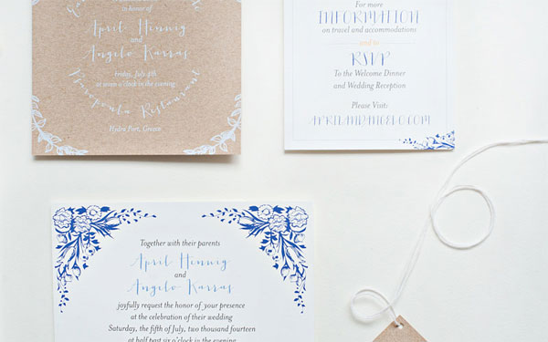
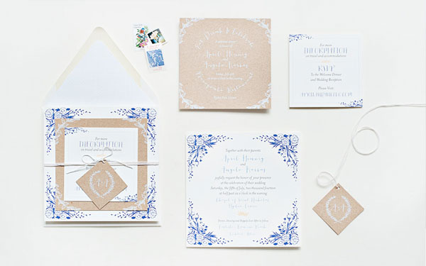
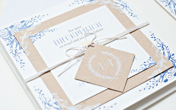
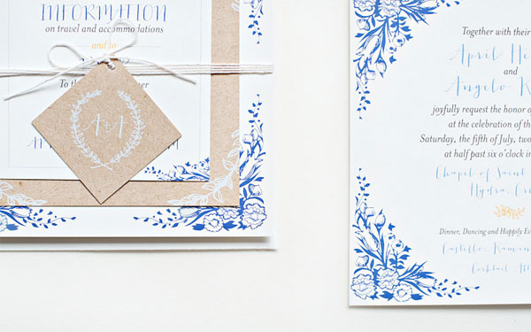
How about a little neon to brighten up your Wednesday? Heidi from idieh design sent over these vibrant invitations created for a Cinco de Mayo wedding, featuring neon fuchsia and neon orange paired with bright blue edge painting and kraft paper envelopes. So fun!

Cinco-De-Mayo-Wedding-Invitations-idieh-design

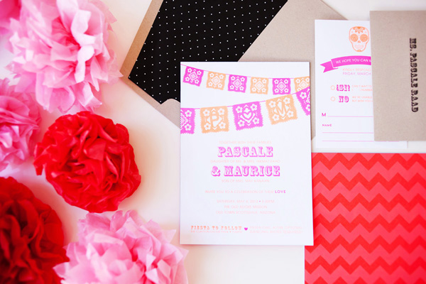
From Heidi: Pascale and Maurice wanted to merge tradition and trend in a fun and artistic way. Their wedding would take place on Cinco de Mayo weekend, so they chose to honor the Mexican holiday with a “fiesta-chic” theme. They wanted their invitation suite to incorporate a whimsical color scheme inspired by the very colorful Mexican culture.

Cinco-De-Mayo-Wedding-Invitations-idieh-design2

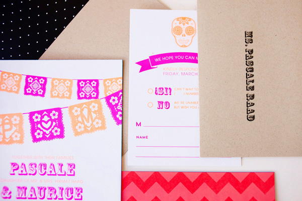
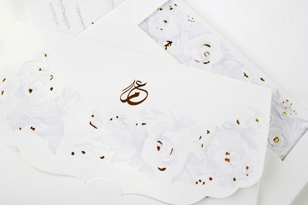
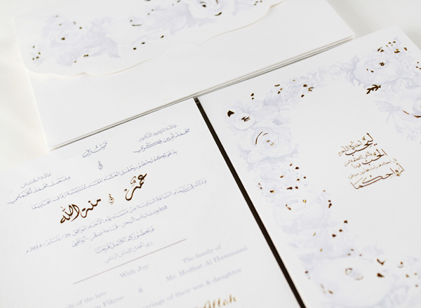
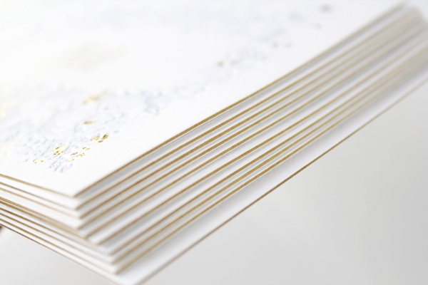
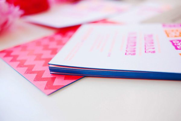
We decided on an extra-thick invitation with vibrant neon fuchsia and neon orange to let guests know it was going to be a fun, festive, and bold celebration. The graphic Mexican banner subtly enclosed the couple’s initials within the cuts of the design. The invitation was backed with a vibrant chevron pattern that utilized spot coating varnish for a glossy finish.

Cinco-De-Mayo-Wedding-Invitations-idieh-design3

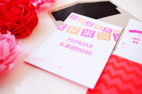
Bright blue edge painting on the main invitation provided a finishing touch. The entire suite, including the adorable response card, was packaged in a kraft envelope lined with a black and white polka dot patterned liner. 

Cinco-De-Mayo-Wedding-Invitations-idieh-design4

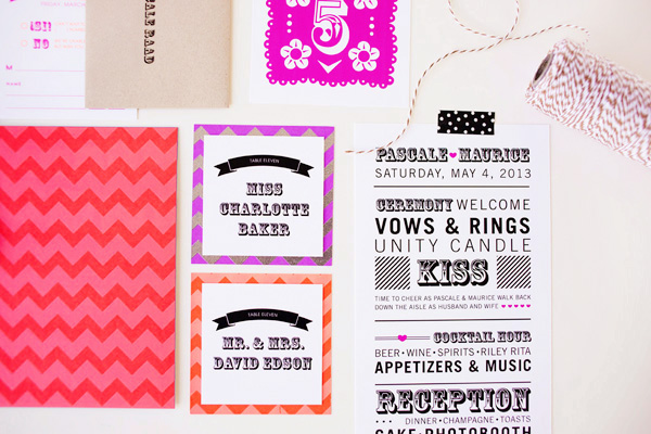
The bold graphics and colorful palette continued throughout the wedding day with the over-the-top playful ceremony programs, the whimsical table numbers, and the cheerful escort cards.

Cinco-De-Mayo-Wedding-Invitations-idieh-design8

Thanks Heidi!

Check out the Designer Rolodex for more tal­ented wed­ding invi­ta­tion design­ers and the real invi­ta­tions gallery for more wedding invitation ideas!

Photo Credits: Michelle Herrick Photography

April + Angelo’s Floral and Kraft Wedding Invitations

Becca from Suite Paperie sent over these beautiful invitations that she recently created for a destination wedding in Greece, inspired in part (naturally) by the groom’s Greek heritage. Becca paired blue floral details and text on white paper with kraft paper digitally printed in white ink. A stunning combination!

Blue-Floral-Kraft-Paper-Wedding-Invitations-Suite-Paperie

From Becca: Inspired by the groom’s Greek heritage, this blue, white, and kraft destination wedding suite is simply elegant. Floral details and a mix of whimsical typefaces are digitally printed on square double-mounted soft white card stock for the invitation and information cards.

Blue-Floral-Kraft-Paper-Wedding-Invitations-Suite-Paperie2

A rehearsal dinner insert and monogrammed tag are contrastingly printed in white ink on straw kraft stock, allowing the suite to stack beautifully. The pieces are tied together with cotton twine and tucked into a matching envelope that is lined with a subtle coordinating pattern.

Blue-Floral-Kraft-Paper-Wedding-Invitations-Suite-Paperie3

Blue-Floral-Kraft-Paper-Wedding-Invitations-Suite-Paperie5

Blue-Floral-Kraft-Paper-Wedding-Invitations-Suite-Paperie6

Blue-Floral-Kraft-Paper-Wedding-Invitations-Suite-Paperie7

Blue-Floral-Kraft-Paper-Wedding-Invitations-Suite-Paperie8

Thanks Becca!

Check out the Designer Rolodex for more tal­ented wed­ding invi­ta­tion design­ers and the real invi­ta­tions gallery for more wedding invitation ideas!

Photo Credits: Lindsay Nathanson

Lauren’s Ikat Baby Shower Invitations

Happy Monday everyone! I thought I’d shake things up a bit and start the week with these adorable baby shower invitations from Alaina at Cheer Up Press. Created for a good friend, the invitations feature a sophisticated ikat pattern and a color palette inspired by the nursery. The invitations were letterpress printed in mint and navy blue, then paired with blush pink envelopes. So cute!

Ikat-Gender-Neutral-Baby-Shower-Invitations-Cheer-Up-Press4

From Alaina: I was commissioned by a good friend to design and print her baby shower invitation. I was inspired by the color palette she chose for her nursery: mint and blush with navy blue accents. Overall we didn’t want the style of the invitation to scream “baby” like so many baby shower invitations do, but rather put off a more sophisticated vibe that definitely reflects my Lauren’s tastes.

Ikat-Gender-Neutral-Baby-Shower-Invitations-Cheer-Up-Press3

We landed on a pretty simple design with an ikat background and added a trendy bow at the top. I pulled in the blush color on the envelope and digitally printed the words “It’s a girl”on the front in navy blue.

Ikat-Gender-Neutral-Baby-Shower-Invitations-Cheer-Up-Press2

Thanks Alaina!

Photo Credits: Cheer Up Press

Mennat + Omar’s Bilingual English Arabic Wedding Invitations

These romantic floral wedding invitations come to us all the way from Dubai! Mariam from Natoof Design created bilingual invitations with a sophisticated light blue and gold color palette, combining English text and Arabic calligraphy – and lots of gold foil. So pretty!

Bilingual-English-Arabic-Parisian-Chic-Wedding-Invitations-Natoof10

From Mariam: The bride and groom wanted a Parisian chic invitation with peonies and roses, and for the color palette to reflect seductive light blue hues with a light romantic touch.

Bilingual-English-Arabic-Parisian-Chic-Wedding-Invitations-Natoof2

Bilingual-English-Arabic-Parisian-Chic-Wedding-Invitations-Natoof6

The invitation is bilingual with Arabic calligraphy and English typography, with an Arabic calligraphy monogram on the envelope flap. On the back of the invitation is a quote by Gibran Khalil Gibran which reads in English as following: “Love one another, but make not a bond of love. Let it rather be a moving sea between the shores of your souls.”

Bilingual-English-Arabic-Parisian-Chic-Wedding-Invitations-Natoof4

Bilingual-English-Arabic-Parisian-Chic-Wedding-Invitations-Natoof11

The bride expressed her love for the letterpress style; however, letterpress printing isn’t available in Dubai and generally in the Middle East region. So with the little time that we had before the wedding we worked with our local printer to mimic letterpress results with offset equipment.

Bilingual-English-Arabic-Parisian-Chic-Wedding-Invitations-Natoof5

Bilingual-English-Arabic-Parisian-Chic-Wedding-Invitations-Natoof7

We duplexed the cotton paper with a layer of gold paper sandwiched between two layers of white cotton paper. The design incorporates gold foil, embossing, and debossing to achieve a dream wedding invitation suite.

Bilingual-English-Arabic-Parisian-Chic-Wedding-Invitations-Natoof9

Bilingual-English-Arabic-Parisian-Chic-Wedding-Invitations-Natoof12

Thanks Mariam!

Check out the Designer Rolodex for more tal­ented wed­ding invi­ta­tion design­ers and the real invi­ta­tions gallery for more wedding invitation ideas!

Photo Credits: Natoof

Riley + Jimmy’s Bold Floral Wedding Announcements

When Riley and Jimmy decided to elope earlier this year, they knew they wanted to send fun and non-traditional wedding announcements to their friends and family. Riley also happens to be a lead designer at Papellerie, so she knew she didn’t want to sacrifice on her wedding stationery. The resulting announcements feature beautiful brush style calligraphy, a floral background pattern, and a bold hot pink and gold color palette. So lovely!

Floral-Pink-Gold-Wedding-Announcements-Papellerie2

From Riley: These are my own wedding announcements from earlier this year. Jimmy and I had started planning a wedding, and for me, the most important part of the whole thing (besides actually marrying him) were the flowers and paper goods. I had been gushing over my ideas with the other designers at Papellerie and had laid out plans for my save the dates with our in house calligrapher and illustrator, Alyssa. Then, kind of out of the blue, Jimmy and I decided to secretly elope and forgo the big wedding we were planning. I knew that I could still have my dream suite, even it if it was announcements instead of save the dates and invitations, and a floral background instead of actual flowers.

Floral-Pink-Gold-Wedding-Announcements-Papellerie5

Jimmy and I are both really non-traditional and like to have fun, so I knew right away I wanted hot pink and gold. I really had fallen in love with this style of brush script lettering and I wanted to make sure that was incorporated into the design. I worked with Alyssa on the calligraphy style and it’s exactly what I hoped for!

Floral-Pink-Gold-Wedding-Announcements-Papellerie3Floral-Pink-Gold-Wedding-Announcements-Papellerie4

The announcements were digitally printed on  pearl white Crane lettra cotton paper by Infovine here in Houston, and then hand mounted onto gold shimmer card stock. The envelopes pull in the hot pink of the floral background and feature a gold shimmer paper envelope liner.

Floral-Pink-Gold-Wedding-Announcements-Papellerie

Thanks ladies!

Design and Calligraphy: Papellerie

Printing: Infovine

Check out the Designer Rolodex for more tal­ented wed­ding invi­ta­tion design­ers and the real invi­ta­tions gallery for more wedding invitation ideas!

Photo Credits: Chelsea Davis Photography