Embroidery and Millinery Wedding Invitation Inspiration

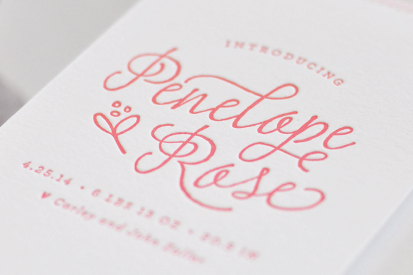
As promised, I’m back with more from the talented Kristy Rice of Momental Designs from her shoot at the Biltmore Estate in North Carolina! Kristy was inspired by cross-stitch embroidery and vintage millinery details to create two very different – but incredibly beautiful – wedding invitation designs that suit the antique beauty of the estate. Kristy incorporated an incredible level of detail into her designs, from watercolor cross-stitch inspired artwork to floral appliqués. Gorgeous!

Embroidery-Inspired-Wedding-Invitations-Momental-Designs-OSBP-2

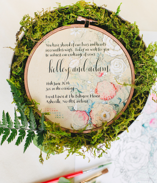
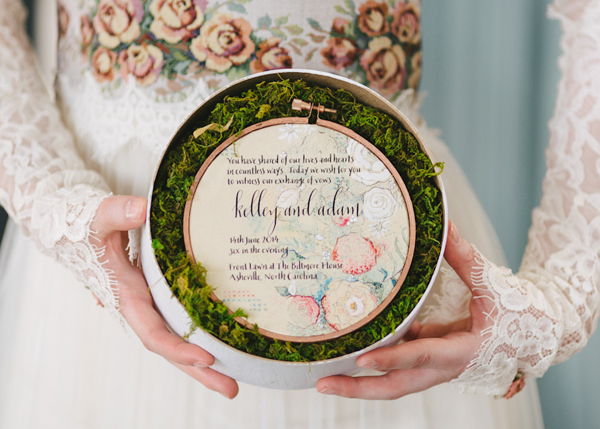
From Kristy: This embroidery-inspired invitation reinterprets the look of cross stitch in watercolor and pattern.

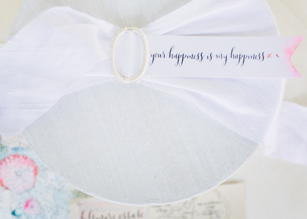
 Punchy blooms are made up of tiny watercolor “x” shapes in shades of coral, poppy, blue, and greens. The invitation is stretched into a copper painted embroidery hoop – all presented in a round box filled with fresh moss and tied up with white silk Dupioni ribbon.

Embroidery-Inspired-Wedding-Invitations-Momental-Designs-OSBP-1

Embroidery-Inspired-Wedding-Invitations-Momental-Designs-OSBP-7

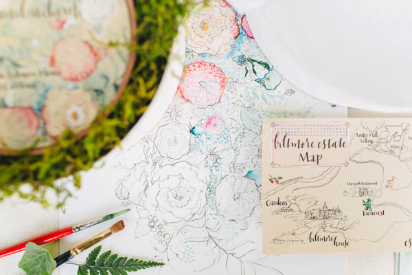
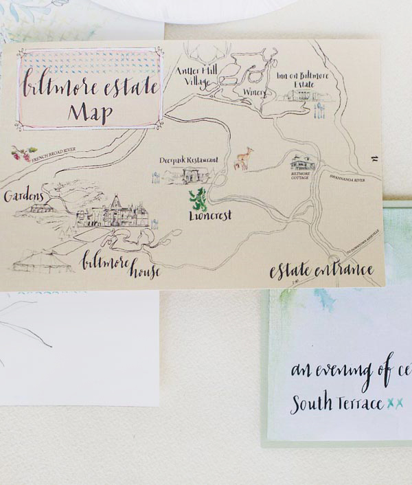
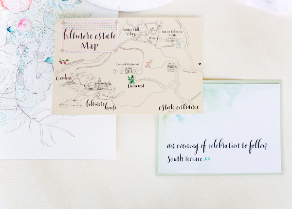
With acres of forest woven throughout the property to include restaurants, shops and a winery, a hand-drawn map was a necessity for the navigation of guests. Although George Vanderbilt constructed a stately home with miles of landscaping ingenuity, his desire to live in the simplicity of the North Carolina mountains inspired me to instill this nature-inspired approach in my artwork.

Biltmore-Estate-Wedding-Invitation-Inspiration-Momental-Designs-OSBP2

Embroidery-Inspired-Wedding-Invitations-Momental-Designs-OSBP-4

Embroidery-Inspired-Wedding-Invitations-Momental-Designs-OSBP-5

Embroidery-Inspired-Wedding-Invitations-Momental-Designs-OSBP-14

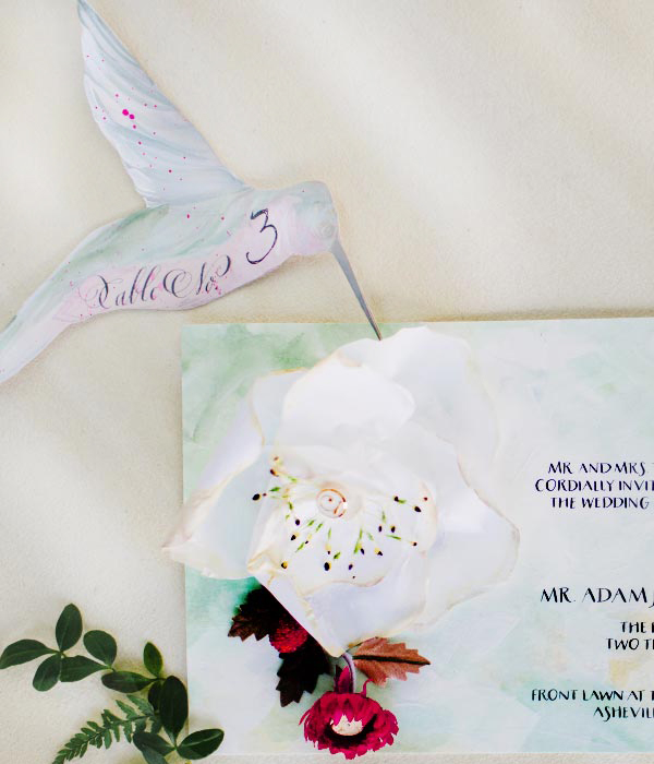
Next up – an invitation suite inspired by vintage millinery details!

Millnery-Wedding-Invitations-Momental-Designs-OSBP-7

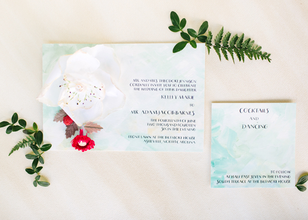
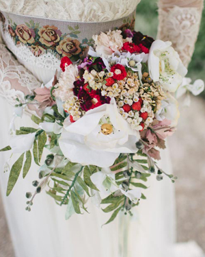
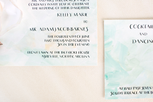
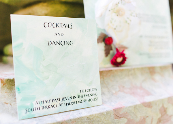
This invitation suite was inspired by vintage millinery and paper blooms in a beautiful bridal bouquet. Delicate rice paper magnolia blooms feature button centers and vintage millinery stamens. Sweet beaded strawberries peek out from behind the bloom. The invitation was hand painted in shades of fresh greens, gold, and white to mimic the textures of iconic oil paintings.


Biltmore-Estate-Wedding-Invitation-Inspiration-Momental-Designs-OSBP6Biltmore-Estate-Wedding-Invitation-Inspiration-Momental-Designs-OSBP

Millnery-Wedding-Invitations-Momental-Designs-OSBP-8

Biltmore-Estate-Wedding-Invitation-Inspiration-Momental-Designs-OSBP4

Millnery-Wedding-Invitations-Momental-Designs-OSBP-6

Millnery-Wedding-Invitations-Momental-Designs-OSBP-4

Thanks so much Kristy!

Design and Hand Painted Stationery: Momental Designs

Calligraphy: Meant to Be Calligraphy

Venue: Biltmore Estate, Asheville, North Carolina

Check out the Designer Rolodex for more tal­ented wed­ding invi­ta­tion design­ers and the real invi­ta­tions gallery for more wedding invitation ideas!

Photo Credits: With Love and Embers

Penelope’s Floral Letterpress Baby Announcements

Aaaah! How cute are these red, white, and kraft paper floral birth announcements for a sweet baby girl?!? Created by designer Lauren Chism for her new niece Penelope, the beautiful announcements feature simple letterpress printed text paired with a matte black and white photograph and floral envelope liners. So pretty!

Floral-Letterpress-Baby-Announcements-Lauren-Chism-OSBP

From Lauren: My sister, Carley, and her husband John welcomed their adorable daughter, Penelope, at the end of April and we all couldn’t be more in love with her. As Carley’s ‘personal stationer’ I was dreaming up ideas for the announcements the moment we found out they were having a girl. They are my favorite gift to give friends and family – quite a bit more fun to give than diapers and wipes!

Floral-Letterpress-Baby-Announcements-Lauren-Chism-OSBP2

When it came to the design, Carley was drawn to the clean look and simplicity of letterpress, which is my personal favorite form of printing. Penelope’s nursery incorporated brighter colors of red, blue and yellow with floral details, and I wanted to incorporate those things without being too literal. We ended up going with red letterpress text with a black and white photo, paired with kraft envelopes. The announcements were printed on 118# cotton Savoy and the gorgeous matte photos were attached to each card.

Floral-Letterpress-Baby-Announcements-Lauren-Chism-OSBP4

To balance the minimalist design of the announcement, I created a floral pattern for the envelope liners to add a little playful, feminine element to the suite. When doing custom announcements, I love trying something new, so I decided to have the liners letterpress printed as well. I was so torn about which color way to print: the red and white backgrounds both offered a unique look. With the red background, I love the salty texture and mottled look that resulted from flooding the press with so much ink, but also loved the contrast of white against the kraft envelopes. Indecision won out and I ended up using a mix of both – I still can’t decide which one I like best!

Floral-Letterpress-Baby-Announcements-Lauren-Chism-OSBP6

For the envelopes, instead of my usual go-to washi tape, I closed each with little heart stickers from Thatch and Thistle. They were so cute and tiny – the perfect final touch to the announcements.

Floral-Letterpress-Baby-Announcements-Lauren-Chism-OSBP9

Thanks Lauren!

Design: Lauren Chism

Baby Photography: Photography by Brea

Letterpress Printing: Elefant Press

Lauren Chism Fine Papers is a member of the Designer Rolodex – you can check out more of Lauren’s work right here!

Photo Credits: Lauren Chism Fine Papers

DIY Wedding Reception Table Numbers

Summer brings wedding galore, and for us…that means party decor! We’ve been helping clients create gorgeous day of stationery and in the process have come up with some fun and festive table numbers that you can do yourself! We know that by the time couples usually think about reception stationery, they’re usually over their budget and are short on time. Luckily, these table numbers are not costly or time consuming. You could easily knock them out in an afternoon. There are endless options once you have the basics of creating them…so the only limit to the project is your imagination! We’ll show you three different styles to kick start your creativity. To complete your tablescape, we’ll also show you place cards to complement to each design. – Bailey and Emma of Antiquaria

DIY Tutorial: Wedding Reception Table Numbers by Antiquaria for Oh So Beautiful Paper

Up until adding the actual numbers to the cards, the process is exactly the same. We will be making 5.5″ square tented cards (showing the pattern on both sides) and the size works perfectly with a standard 8.5″ x 11″ piece of card stock.

DIY Tutorial: Wedding Reception Table Numbers by Antiquaria for Oh So Beautiful Paper

Step One: Select your paper and cut the cards to size. Cut a rectangle measuring 5.5″ x 11″. If you’re using a standard sheet of paper like we did, that is only one cut (since the length is already 11″).

DIY Tutorial: Wedding Reception Table Numbers by Antiquaria for Oh So Beautiful Paper

Step Two: To make the tented card and have a clean fold, you’ll want to score the paper at the 5.5″ mark on a score board. Repeat steps one and two until you have enough cards to accommodate all of your tables (usually between 8-25 for a standard wedding).

Option One: Painted Script Floral

For the first version that we put together, we used our “Paloma” Blue Floral Card Stock and painted the table numbers (spelled out) in navy blue acrylic paint. The effect is playful and traditional at the same time.

DIY Tutorial: Wedding Reception Table Numbers by Antiquaria for Oh So Beautiful Paper

With a small pointed paint brush, write out the table number in cursive across the middle of the card. Go back over the letters, adding weight to the lines (as shown above). If you need help finding out where the weights should go or what shape to paint the letters, refer to a favorite script font or perhaps your invitation suite! That way, everything will coordinate.

DIY Tutorial: Wedding Reception Table Numbers by Antiquaria for Oh So Beautiful Paper

DIY Tutorial: Wedding Reception Table Numbers by Antiquaria for Oh So Beautiful Paper

Option Two: Modern Neon Geometric

In this interpretation, we’ve put a modern spin on the technique. We used our “Geo” patterned card stock and wrote the number in a simplistic style to create the look. Pops of neon pink painted on help add some punch to the cards.

DIY Tutorial: Wedding Reception Table Numbers by Antiquaria for Oh So Beautiful Paper

First you’ll write the table number in the center using a permanent black marker. Fill in and bulk up the number as needed (shown above).

DIY Tutorial: Wedding Reception Table Numbers by Antiquaria for Oh So Beautiful Paper

Next you’ll add the final touch of neon using hot pink gouache. We painted into different shapes already printed on the paper making sure they all balanced with one another.

DIY Tutorial: Wedding Reception Table Numbers by Antiquaria for Oh So Beautiful Paper

DIY Tutorial: Wedding Reception Table Numbers by Antiquaria for Oh So Beautiful Paper

Option Three: Autumn Garden Floral

For our final interpretation, we used our “Diana” floral card stock to create the perfect garden inspired table decor. The gorgeous rich shades of the pattern mean that this style would just as easily work for fall and winter weddings.

DIY Tutorial: Wedding Reception Table Numbers by Antiquaria for Oh So Beautiful Paper

With a small pointed paint brush, paint the word “TABLE” about 1 inch from the fold with white acrylic paint. Below that, in cursive, paint the word “Number,” trying to center it as much as possible. Finally, you’ll add the numeral centered below. Go back over the number, adding weight to the lines (as shown above). It would be extremely helpful to have these cards planned out on a separate sheet of paper before painting on the lettering. That way, you can know exactly how to center the text, and how large you should make it.

DIY Tutorial: Wedding Reception Table Numbers by Antiquaria for Oh So Beautiful Paper

TableNumberDIY-Diana-Placecard-2

TableNumberDIY-Diana-Final-2

Materials

Patterned Paper

Self Healing Mat

Craft Knife

Metal Ruler

Scoreboard

Acrylic paints

Permanent Marker

Anti­quaria is a mem­ber of the Designer Rolodex – you can see more of their beau­ti­ful work right here!

Photo Credits: Antiquaria for Oh So Beautiful Paper

Modern Tiki Party Ideas

Tiki is making a comeback in a very big way – and we couldn’t be more excited! From bright colors to tropical design motifs (hello pineapples and flamingos!) – and of course the refreshing iced cocktails – a tiki party is the perfect way to celebrate summer with friends. Today we’re partnering with St-Germain to continue our summer cocktail party series with a modern tiki party!

Tiki-Cocktail-Party-Inspiration-OSBP-Bacardi-StGermain-220

Let’s start with my favorite part: the invitations! Watercolor is the perfect complement for this laid back tropical party theme. Watercolor artist Courtney Khail created the most beautiful watercolor party invitations and Michele from Meant to Be Calligraphy worked her calligraphy magic in white ink on grass green envelopes in a very loose and informal lettering style. Such a gorgeous combination!

Tiki-Cocktail-Party-Inspiration-OSBP-Bacardi-StGermain-113

We wanted a modern and sophisticated approach for our Tiki party – so we started with a clean white setting and layered in bright pops of color, wood elements, vintage midcentury modern glassware with gold details for sparkle – and brought in some exotic elements in the floral arrangements. Michele was also kind enough to allow us to use her beautiful midcentury home as our venue – thanks Michele!! I made a simple tassel backdrop from colorful ribbons in shades of blue, yellow, and purple to add a bit of color without overpowering the bar and cocktail display.

Tiki-Cocktail-Party-Inspiration-OSBP-Bacardi-StGermain-8

Tiki-Cocktail-Party-Inspiration-OSBP-Bacardi-StGermain-14Tiki-Cocktail-Party-Inspiration-OSBP-Bacardi-StGermain-180

Tiki-Cocktail-Party-Inspiration-OSBP-Bacardi-StGermain-9

Tiki-Cocktail-Party-Inspiration-OSBP-Bacardi-StGermain-34Modern-Tiki-Cocktail-Party-Inspiration-OSBP-Bacardi-StGermain-Mai-Tai5

Our drink menu included our spin on two classic Tiki cocktails – the Mai Tai and the Hurricane – and our take on rum punch (with coconut milk!) that we’re calling Shipwrecker’s Rum Punch. We’ll have all the recipes for you a bit later!

Modern-Tiki-Cocktail-Party-Inspiration-OSBP-Bacardi-StGermain-Shipwreck-Rum-Punch8Modern-Tiki-Cocktail-Party-Inspiration-OSBP-Bacardi-StGermain-The-Hurricane2

Tiki-Cocktail-Party-Inspiration-OSBP-Bacardi-StGermain-55

Tiki-Cocktail-Party-Inspiration-OSBP-Bacardi-StGermain-191

The floral arrangements were so much fun to create! Since local flowers wouldn’t give me the tiki vibe we were going for, I focused on creating arrangements with a consistent color palette – in this case shades of pink and orange – and lots of texture. Our main arrangement (created in a coconut shell that I found at Party City) featured two kinds of protea, garden roses, cafe au lait dahlias, and eucalyptus leaves for extra texture. Smaller arrangements featured pink ginger flowers, orange pincushion protea (in wine glasses), more garden roses mixed with ferns to add some wild texture, banana leaves, and even a potted palm (which you can easily find at your local hardware store).

Tiki-Cocktail-Party-Inspiration-OSBP-Bacardi-StGermain-163Tiki-Cocktail-Party-Inspiration-OSBP-Bacardi-StGermain-180

Tiki-Cocktail-Party-Inspiration-OSBP-Bacardi-StGermain-208

Tiki-Cocktail-Party-Inspiration-OSBP-Bacardi-StGermain-215

Tiki-Cocktail-Party-Inspiration-OSBP-Bacardi-StGermain-244

Full cocktail recipes are coming up in just a bit!

Watercolor Invitations: Courtney Khail

Calligraphy: Meant to Be Calligraphy

Styling & Floral Design: Nole Garey for Oh So Beautiful Paper

Photo Credits: Nole Garey for Oh So Beautiful Paper

This post is brought to you in collaboration with Bacardi and St-Germain. All content, photos, recipes, and words are our own. Thank you for supporting the sponsors that help make Oh So Beautiful Paper possible!

Cute Toddler Bedding

We’re getting ready to make some big changes to the nursery: preparation both for a shared nursery after baby no. 2 arrives in September and for Sophie to move to a toddler bed! Sophie isn’t quite ready just yet, but we’re pretty sure she’ll be there in a couple of months so I’ve been keeping an eye on cute toddler bedding in anticipation. Today I thought I’d round up a few of my favorite finds!

Cute Toddler Girl Bedding Round Up by Oh So Beautiful Paper

1. Bonjour! pillow by Erin Jang for Land of Nod (absolutely loving this new capsule collection!); 2. Auggie Pretty with Pink Collection bedding; 3. Farmer’s Market Bedding by Erin Jang for Land of Nod; 4. Colette Bream toddler bedding; 5. + 6. Sundae Best duvet cover and ice cream pillow by Oh Joy for Land of Nod; 7. Ferm Living neon raindrop pillow; 8. Land of Nod Surprise Party Bedding; 9. Dwell Studio galaxy pillow; 10. Ko-ko-ko shop knit cloud pillow

{images via their respective sources}