Heirloom Wedding Guestbooks

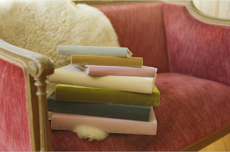
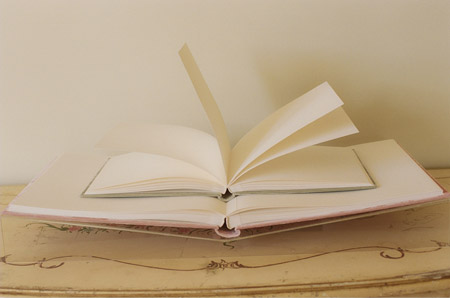
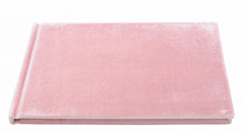
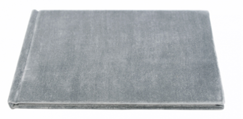
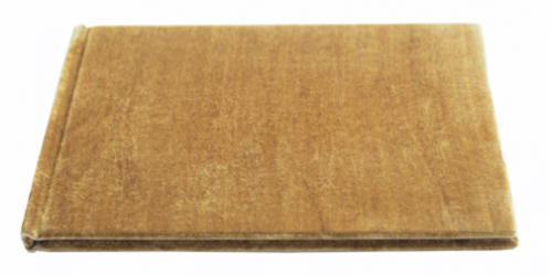
Kathryn posted about these gorgeous velvet wedding albums earlier this week, and I just haven’t been able to get them out of my head since.  Kathryn plans to use one as an album for her wedding photos, but they also come in smaller sizes for use as a wedding guestbook.  So pretty!

Velvet-Raptor-Heirloom-Wedding-Guestbook

Velvet-Raptor-Elegant-Wedding-Guestbook

Velvet-Raptor-Heirloom-Wedding-Guestbook-Pink


Velvet-Raptor-Heirloom-Wedding-Guestbook-Gray


Velvet-Raptor-Heirloom-Wedding-Guestbook-Gold

Check out the full collection right here!

{image credits: velvet raptor via snippet & ink}

Spring Wedding Invitations from Campbell Raw Press

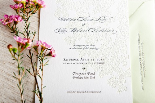
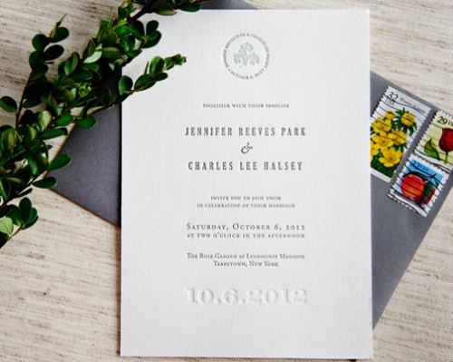
Maggie from Campbell Raw Press sent me a little sneak peek at the new designs in her wedding invitation collection, and I’m loving the spring inspired botanical elements!  Maggie included a little background behind each invitation design, so scroll down for more info…

Spring-Letterpress-Blind-Impression-Wedding-Invitations-Leaves

Leaves:  I used one of my own drawings, giving the text a bright cushion of leaves printed in pale green under gray lettering. This invite suite pairs with pale green envelopes that match the ink color on the vine background.  These would be perfect for a spring or summer wedding – airy and natural.

pring-Letterpress-Blind-Impression-Wedding-Invitations-Entwined

Entwined:  This suite is all about taking advantage of the sculptural, tactile nature of letterpress printing.  The couple’s initials are blended and printed as a blind deboss – just impression, no ink.  The invitation text is just a simple black, making this design spare and elegant and sophisticated.  Available with or without a chiyogami (Japanese silkscreened paper) envelope liner to dress up the invitation suite.

Spring-Letterpress-Blind-Impression-Wedding-Invitations

Signature:  I used a delicate vine drawing of mine with elegant text.  A tiny sprig is encircled by the couple’s name and wedding date, and the text of the invitation itself is set in simple, serif font.  The wedding date is blind debossed along the bottom and  I just love the invitation with gray envelopes.

You can check out the entire collection right here – thanks Maggie!

{image credits: campbell raw press}

Home Sweet Home Papercut Artwork

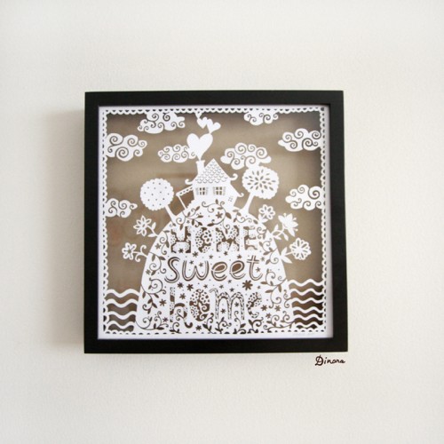
Heeelllloo gorgeousness!  Uzbekistan-born artist (and current Ohio resident) Dinara Mirtalipova sent over some images of a recent papercut project – all created painstakingly by hand – and it’s definitely up there as one of the prettiest things I’ve seen in a long time!

Home-Sweet-Home-Paper-Cut-Dinara-Mirtalipova

Home-Sweet-Home-Paper-Cut-Dinara-Mirtalipova-Detail

The final framed version:

Home-Sweet-Home-Paper-Cut-Dinara-Mirtalipova-Framed

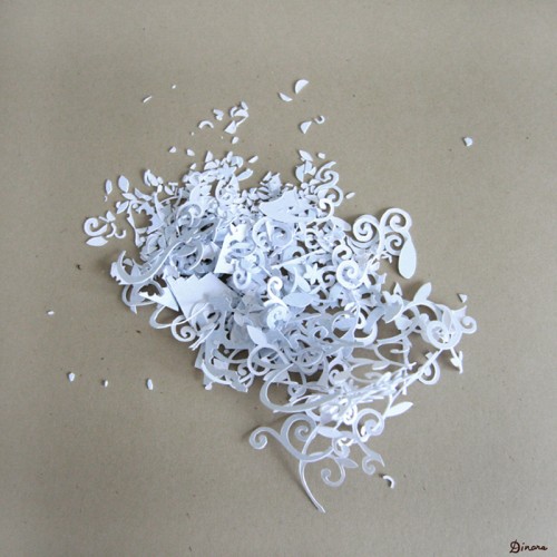
Even the remnants are pretty!

Home-Sweet-Home-Paper-Cut-Dinara-Mirtalipova-Remnants

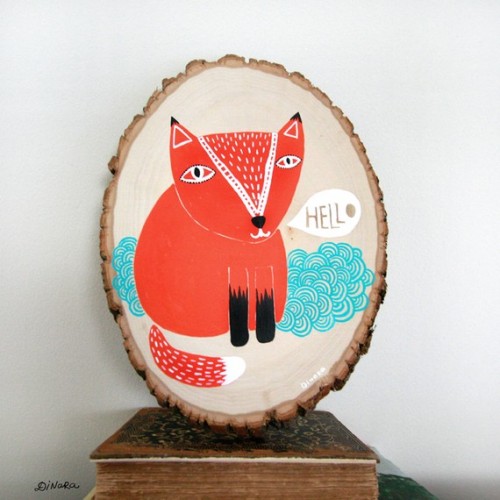
Dinara hasn’t listed any of her papercuts for sale just yet (please Dinara!), but she has these adorable acrylic paintings available in her etsy shop:

Love-Me-Acrylic-Painting-On-Wood-Dinara-Mirtalipova

Fox-Painting-on-Wood-Dinara-Mirtalipova

So unbelievably beautiful!  You can see more from Dinara on her blog – she creates some incredibly sweet illustrations!

{image credits: dinara mirtalipova}

Whimsical Calligraphy from Barbara Kua

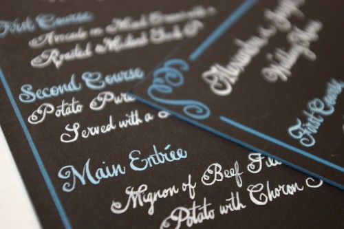
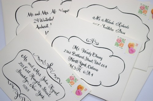
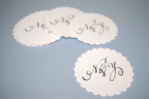
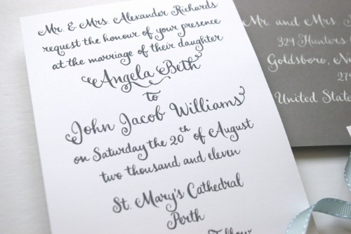
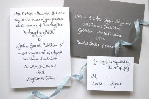
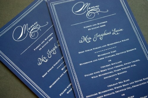
Toronto-based calligrapher Barbara Kua sent over some of her recent work, and I couldn’t resist sharing it with all of you!  Barbara has a lovely and whimsical calligraphy style, with lots of cute little swirls and hand drawn frames to give envelopes, menus, and wedding invitations a little something extra.

Swirly-Romantic-Calligraphy-Brown-Blue-Wedding-Menu

Swirly-Romantic-Calligraphy-With-Frames

Swirly-Romantic-Calligraphy-Scallop-Coasters

Swirly-Romantic-Calligraphy-Gray-White-Wedding-Invitations

Swirly-Romantic-Calligraphy-Gray-White-Wedding-Invitations

Swirly-Romantic-Calligraphy-Blue-White-Wedding-Menu

Thanks Barbara!  You can check out more of Barbara’s beautiful calligraphy right here!

{image credits: barbara kua}

Clayton’s Elegant Letterpress Thank You Cards

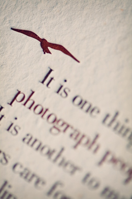
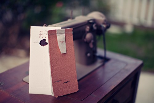
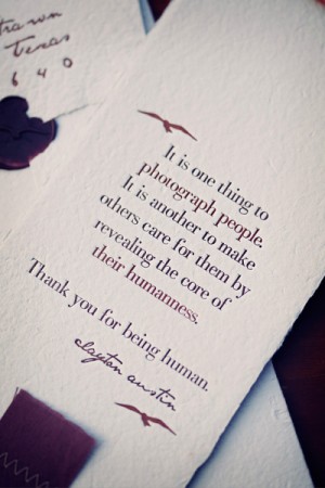
Matthew from A Fine Press recently created these amazing thank you cards for photographer Clayton Austin, and from the beautiful letterpress to the stitching details to the elegant wax seal these cards are seriously a work of art.  I’m particularly loving the simple bird illustrations that make an appearance in a few different spots throughout the card.
Letterpress-Thank-You-Cards

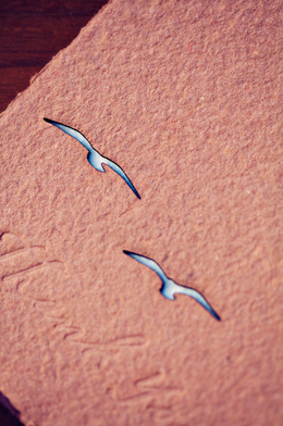
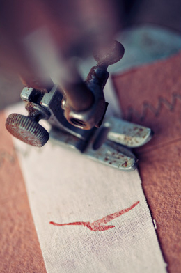
From Matthew:  We had the paper handmade with full deckled edges by Porridge Papers in their classic ecotan and a custom rust/brown.  They did the letterpress work in a matching rust and deep brown, and a blind pass for the front.  I hand-dyed the muslin to match the dark brown ink and stamped one of Clayton’s classic birds in a brown ink that, quite fortuitously, came out in a rust color almost identical to the front of the envelope.  The birds on the front piece were laser cut – one at a time – by Image Creations.
Letterpress-Thank-You-Cards-Detail Letterpress-Thank-You-Cards-Detail

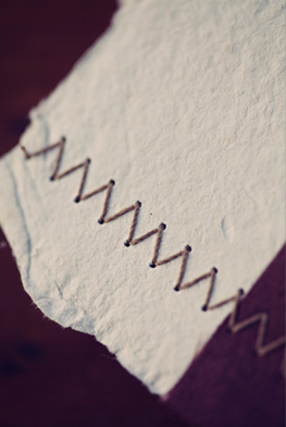
Thanks goes to my wife for allowing me to borrow her (modern) Singer to bind the entire card.  Clayton and I vacillated between a zig-zag stitch and long, straight stitch for the bindery and have settled on a long, straight stitch for the remainder of the the cards to keep things simple and understated.
Letterpress-Thank-You-Cards-Wax-Seal Letterpress-Thank-You-Cards-Singer-Sewing-Machine

Letterpress-Thank-You-Cards-Zig-Zag-Stitching Letterpress-Thank-You-Cards-Bird-Detail

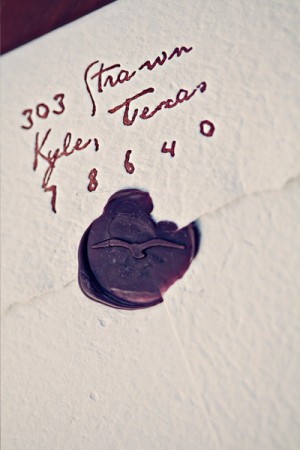
I had a custom wax seal made with another of Clayton’s birds and sealed each with Atelier Gargoyle’s Espresso Brown sealing wax.  These were early attempts; it takes a while to get used to the way this wax sets.  The key is a cool seal with a vapor barrier on it (when I completed the run, I kept the seal on an ice cube and dabbed it on a damp rag before each impression – the results were remarkable).
Letterpress-Thank-You-Cards Letterpress-Thank-You-Cards-Sewing-Machine-Detail

From the paper to finish work, this was truly a hand-made project.  The paper was hand-made and printed one-by-one.  The bindery was completed at my dining room table one at a time.  It was great to work with a client like Clayton, who places so much value on process and craft.

Such gorgeous cards!  You can check out more of Matthew’s awesome work right here!

{image credits: clayton austin}

*A Fine Press is one of my fabulous sponsors; for more on my editorial policies, please click here.