Pimm’s Cup

Summer in England means Pimm’s Cups, earthy and delicious and perfect for sipping the heat away. I think it’s a tradition we should all take up here too. –Andrew

Pimm's Cup Cocktail Recipe / Liquorary for Oh So Beautiful Paper

Pimm’s Cup

2 oz Pimm’s No. 1
1/2 oz Sweet Vermouth
1/2 oz Lemon-Mint Shrub
Ginger Beer

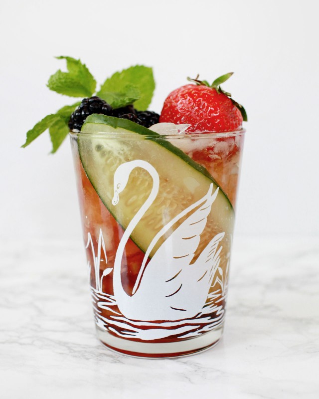
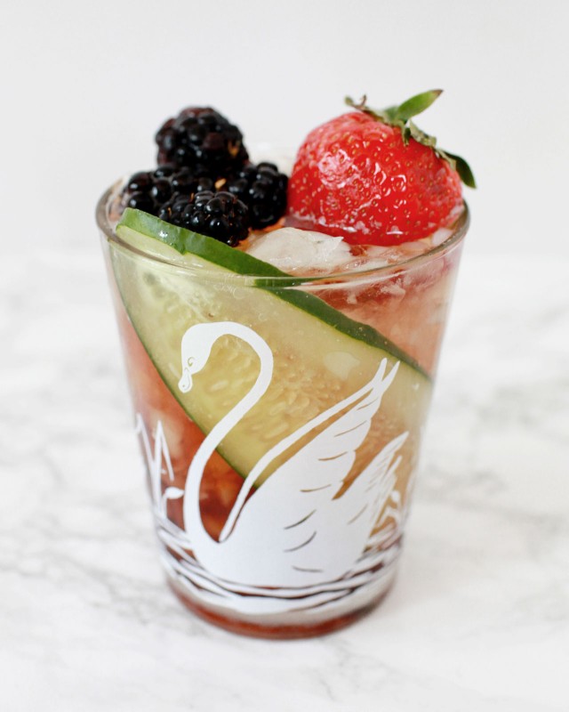
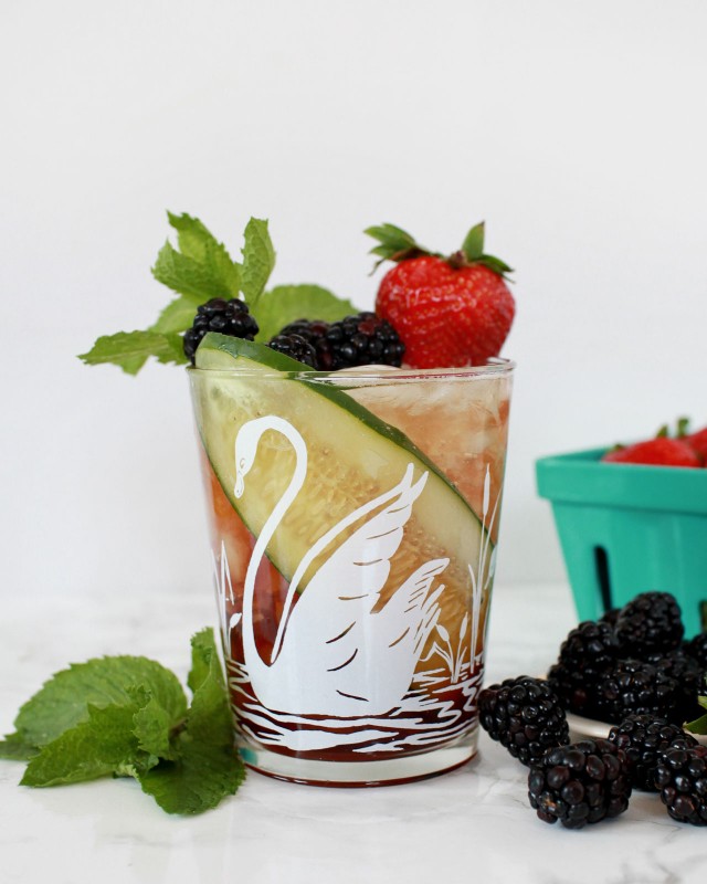
Using a sharp knife or a mandolin, cut a very thin slice of cucumber lengthwise, then wrap it around the inside of the glass. Fill the glass with crushed ice to keep the cucumber in place, then add the Pimm’s, Sweet Vermouth, and lemon-mint shrub. Top with ginger beer and give it a stir. Then go wild with garnishes: fresh berries, lemon and lime wheels, mint, whatever you can find that’s ripe and verdant.

Pimm's Cup Cocktail Recipe / Liquorary for Oh So Beautiful Paper

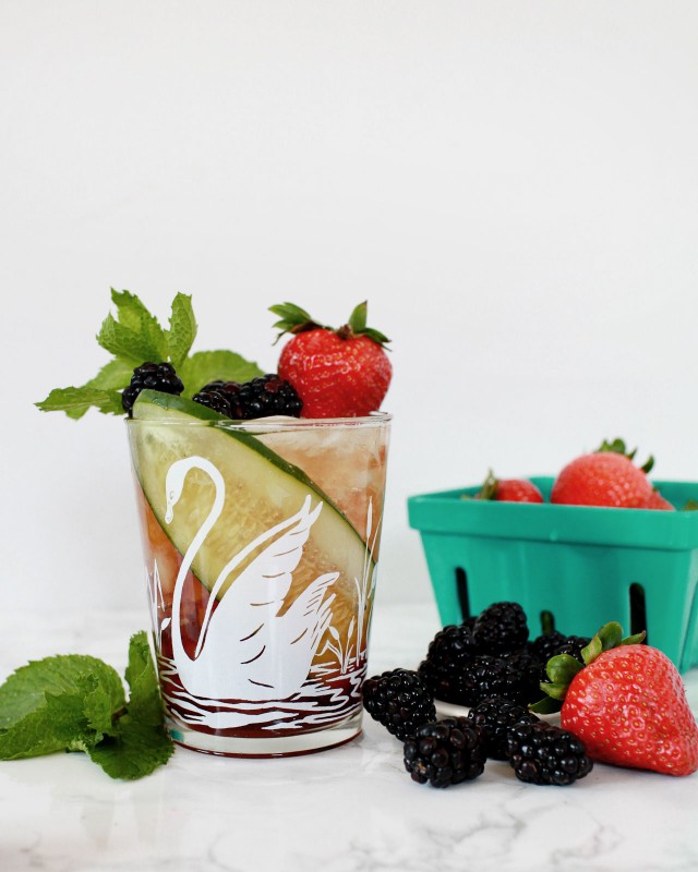
Verdant is really key here. You want your Pimm’s to feel like the world blooming from spring to summer in a glass. Pimm’s No.1 is essentially a bottled cocktail, gin-based and flavored with a secret blend of herbs that dates back to 1823. It is dark reddish-brown and it both looks and tastes like something primal. Combine it with ginger and citrus and more herbs and you have something that’s both a little mysterious and really perfect for a hot summer’s day.

Pimm's Cup Cocktail Recipe / Liquorary for Oh So Beautiful Paper

This isn’t exactly the classic recipe. A traditional Pimm’s Cup is pretty simple, just Pimm’s No. 1 and some English lemonade (carbonated and citrusy) or ginger ale, a straightforward highball. And you won’t go wrong if you take the simpler route. I wanted to play with the framework of a Pimm’s Cup, rearranging the ginger and lemon and adding in a few extra layers of flavor while sticking to the spirit of the original. When you’re making your own Pimm’s Cup, don’t worry too much about the specifics, but do think about all these flavors and the ways you can combine them – maybe lemon juice instead of shrub, or ginger liqueur in place of ginger beer. It’s hard to go wrong here.

Pimm's Cup Cocktail Recipe / Liquorary for Oh So Beautiful Paper

(Don’t forget to follow us on Instagram!)

Glassware by Liquorary

Photo Credits: Nole Garey for Oh So Beautiful Paper

Brick + Mortar: What retailers won’t tell you when they reject your line.

I spent the better part of this week tending to my submissions folder. This task is exhausting. I want to provide a thoughtful reply to each submission, but I can’t. I don’t have the time, and I fear that my feedback – even if well intentioned – will be taken as an insult. I’ve given feedback that has been taken as an insult. I never want to be the reason a line stops growing and I’ve used that to justify my short replies. But I always have more to say. Today, I want to share a few of the potentially tender reasons I don’t accept lines. I hope you’ll take them in the manner they’re meant: as true constructive fuel that can help a line grow. ~ Emily of Clementine.

OSBP-Hello-Brick-and-Mortar-Clementine-by-Emily-McDowell-Illustration

Illustration by Emily McDowell for Oh So Beautiful Paper

Many of you already run strong, stunning, professional lines that are carried by many shops. This post isn’t for you. You may apply to shops like mine and not get picked up and it really is because the timing isn’t right, or I admire what you do, but it’s just not a fit. However, there are other lines who are new and growing, in the early stumbling stages, getting rejected or simply hearing crickets after you apply. This post is for you. There are some concrete, fixable reasons that you may be rejected. This feedback can be awkward to give one-on-one, but I believe our creative community could use a little constructive criticism.

So here goes:

  • Your line lacks an understanding of design and/or a compelling aesthetic. Let’s be blunt, not everyone is fit to run a successful wholesale stationery line. You may love to draw. You may have always dreamed of having a card line. These things should propel you forward, but they don’t compel me to order from you. I’m overwhelmed by the number of submissions I receive that seem to lack a basic understanding of design (borders, type, color, pattern). Retailers can, and should, disagree on the aesthetics that they choose for their store, but we all want lines that meet basic standards of design. If you have no idea what I’m talking about, it’s time to invest in some course work: visual art and graphic design. There are some incredible online options these days, and continuing education courses you can take. Hone your skills, sharpen your eye. Get excited about what you don’t know.
    • Beyond good design, of course, is the overall look: the art and sentiments themselves. I have seen many early attempts that are very heartfelt, but simply not very good. This is a hard area to receive feedback on, because it hurts and it’s hard to solicit feedback on because your friends and family will lie. It’s time to explore Etsy, craft fairs, and other sales venues where you see if there’s a market for your work. In other words, send your submission to retailers after your dream of having a card line has actually taken root and begun to grow.
  • Your line doesn’t look professional. On the other hand, you may be a really talented artist, but you don’t seem to care about how to sell. You may, for example, decide to turn your [fine art, photography, doodles, etc] into cards, and you didn’t give much thought to how to present it. Major tells in this area are: poor printing quality, inconsistency in paper, poor envelope quality, and poor packaging. Bottom line: printing quality matters, packaging matters. If you’re not willing to invest in your line, I’m unlikely to invest in you. Go to the stores where you envision your line and look critically at the items that are already there. Your line should not mimic what has already been picked, but it should be able to stand along side the current lines.
  • You don’t seem to understand what wholesale is. I get it – wholesale talk can seem like a big secret society when you’re on the other side. But the truth is, there’s very little you can’t Google your way into. For that reason, if you submit your line without the basics: a catalog and line sheet and some industry standards around pricing, minimums, and policies – it’s a red flag that working with you may mean more work for me.
  • Your line isn’t extensive or cohesive enough. Early on, many talented crafters take a spaghetti-against-the-wall approach to see what sticks. Are you a designer, a potter, a seamstress? Do you want your cards to be letterpress or flat printed? Are you offering custom items? It’s ok to try out different product lines and methods, but when you present your line to retailers, it should feel cohesive and it should be extensive enough to convey that I’ll be able to rely on you for fresh products as the seasons change.
  • Your submission seems careless or spammy. I always recommend taking 5 minutes on each retailer’s site to learn their name and any submission guide lines. It takes very little time to be thoughtful and most retailers I know receive so many submissions that if it’s not addressed to us by name, we feel permission not to respond.
  • Your intro is too long, too casual, or off-color. I offered a template for email submissions here and I plan to write another about mail submissions. In short: your submission should be short, sweet and professional. It should not be seven paragraphs. It should not be too personal unless we actually know each other. You may assume I’m laid back, don’t mind a well placed curse word, and love to laugh (all true), but your submission email should still err on the side of business casual, not casual Friday. We’ll get to know each other later.
  • Your photos and collateral aren’t appealing. Assume I have 30-90 seconds to look at your submission. Good photos and collateral (business cards, and other marketing extras) are often the only reason I linger. They also give a nod to the fact that you understand that our business is visual and that I can rely on you for quality presentation going forward.
  • Your line looks too much like another line. In private conversation, this is a frequent topic. My friends and colleagues often disagree on who may be copying who. But for the purposes of picking a line, it’s not the copying that I’m focused on, it’s that your similarity to another line is either a distraction (because all I can think of is whether you’re copying someone else) or it means you don’t stand out on your own. If you want to sell professionally, you should be aware of the work of your peers and step back to critique how and when you may need to veer away from a design that seems played out. Please don’t hop on a new trend after you see it on line. The world only needs more gold foil pineapples if yours are spectacular. What retailer’s really want is to find something we’ve never seen that only you can show.
  • You don’t stand out. Lately, I’ve seen an increase in submissions from designers who really do seem to understand the format of a good card, but I flip through the catalog and it’s immediately indistinguishable from dozens of others: the designs seem safe, the colors bland, the sentiments re-hashed versions of what’s out there. It’s hard to truly trust your gut and make the cards that you’re meant to make, but there’s nothing I love more than finding lines that do. You should cringe a little at your prior efforts, and then use them as a springboard to try something new.

If you feel like maybe I’m talking directly to you, rest assured, I’m probably not. These nine bullet points represent issues that I see repeatedly in hundreds of submissions each year. But now, I’m curious to hear from you – if you don’t get an order in response to a submission, do you want to know why? Do you want details? Do you want a dialogue? What more would you want from retailers? I’ve been investigating ways (periscope? Facebook live?) that we could turn this into a discussion. I await your suggestions and promise, when asked, to give true feedback to your line, if (and only if) you request it. I would also love to hear from my fellow retailers – tell me what I might have missed.

Clementine Greeting Card Wall / Oh So Beautiful Paper

I’ll leave you with my current view at Clementine: Mother’s Day + a few other favorite cards on some shoddy shelves that I made, which are basically held together with dreams and wood glue. We all have our strenghts and weaknesses. I always welcome your constructive construction criticism and your feedback…xoxo, Emily

Post-it Brand Celebrates 35 Years!

I’m always writing little notes. Notes with little reminders, favorite quotes, and even little love notes to my husband and my kids. I’ve been writing little notes – to myself, to my family, to friends and co-workers – for as long as I can remember. And so many of those notes have been on Post-it® Notes! I usually keep a few Post-it® Note pads scattered around my office, and I love the bright pop of color on my desk. Post-it® Brand products have been a huge part of my life – from student to creative entrepreneur – and I’m thrilled to help them celebrate 35 years of helping great ideas take shape!

Post-it Brand Celebrates 35 Years! / Oh So Beautiful Paper

Believe it or not, Post-it® Brand launched in 1980 with the introduction of the original Canary Yellow Post-it® Note! Fun fact: To help introduce the brand new product, Post-it® Brand mailed packs of the original notes to Fortune 500 CEOs and their secretaries. Pretty smart, huh? Since then, Post-it® Brand has introduced everything from Post-it® Notes in new colors, shapes, and sizes to help us all create and collaborate, to Post-it® Note Flags and Tabs to help keep us all organized, to fun Post-it® Note Big Pads that help us when we need to dream a little bigger. Post-it® Brand products are an indispensable tool for anyone trying to create or stay organized, whether in the office, at school, or at home.

Post-it Brand Celebrates 35 Years! / Oh So Beautiful Paper

Post-it Brand Celebrates 35 Years! / Oh So Beautiful Paper

Last year, I partnered with Post-it® Brand to create a fun cocktail party menu made entirely of Post-it® Notes from the World of Color Collection! The Post-it® Notes come in a range of bright colors with 9 color palettes inspired by global design. We used the tropical-inspired colors of the Bora Bora collection, but I also love the bright neons of the Rio de Janeiro collection, the soft pastels of the Bali collection, and the candy colors of the Cape Town collection. It was such a fun challenge to think of a new way to use a product that has been a constant presence on my desk for so many years!

Post-it Brand Celebrates 35 Years! / Oh So Beautiful Paper

Post-it Brand Celebrates 35 Years! / Oh So Beautiful Paper

Post-it Brand Celebrates 35 Years! / Oh So Beautiful Paper

Post-it® Brand products have transformed the way we work, create, and even inspire achievement over the last 35 years – I’d love to hear the creative ways that you’ve used Post-it® Notes and other Post-it® Brand products in your life!

This post is sponsored by Post-it® Brand, helping great ideas take shape for 35 years. All content and opinions are my own. Follow Post-it® Brand on Twitter, Facebook, Instagram, and Pinterest. Thank you for supporting the sponsors that make Oh So Beautiful Paper possible!

DIY Warhol-Inspired Shoe Table Runner

My love for Warhol is not a secret. His early illustrations of shoes – though not his most famous – will always be one of my favorite things in the world. So, when we were looking for fresh ideas of how to interpret a table runner for a girly party, his shoe imagery immediately came into my head. I love the pops of color and the lovely unique shapes of the shoes against a black background, giving a table setting an instant wow factor. And although Laura and I styled this with Warhol’s famous red lips, bananas, and striking black and white houndstooth, you can also do this look with pastel colors (maybe a bit of metallic or glitter), because, well, a shoe-themed party is the best kind of party! –Erin from BerinMade Paper Goods

DIY Warhol-Inspired Shoe Table Runner / BerinMade Paper Goods for Oh So Beautiful Paper

Supplies

Shoe Template (pdf)

Silhouette CAMEO or x-acto knife & cutting mat

Glue Stick

Black Kraft Paper or black card stock to the length of your runner

Colored Paper (assorted colors)

DIY Warhol-Inspired Shoe Table Runner / BerinMade Paper Goods for Oh So Beautiful Paper

To make the runner:

Step 1. Cut out your shoe shapes from the downloadable templates. Our templates can be used on any paper cutting machines, or you can use good old fashioned scissors and a cutting knife.

Step 2. Lay out your black kraft paper – or tape several sheets of black card stock together to make a strip the length of your table.

Step 3. Lay out all your shoe shapes and arrange until you’re happy with how it looks. Stick down using a glue stick and let dry!

DIY Warhol-Inspired Shoe Table Runner / BerinMade Paper Goods for Oh So Beautiful Paper

Ta-daa!

DIY Warhol-Inspired Shoe Table Runner / BerinMade Paper Goods for Oh So Beautiful Paper

DIY Warhol-Inspired Shoe Table Runner / BerinMade Paper Goods for Oh So Beautiful Paper

DIY and Art Direction: BerinMade Paper Goods | Styling: Laura Burkitt | Cake and Cookies: Cakes by Robin | Photo Credits: Jeremy Tan

Winter Foliage Wedding Invitations

Happy Tuesday everyone! We ended up getting a few inches of snow (and ice) over the President’s Day weekend, so I thought it would be perfectly appropriate to start with these winter foliage wedding invitations from Julie of Hollyhock Lane for our first post of the week! The invitation suite features hand painted portraits of the bride and groom, along with colorful illustrations and modern brush lettering!

Hand Lettered & Illustrated Winter Foliage Wedding Invitations by Hollyhock Lane / Oh So Beautiful Paper

From Julie: This invitation suite was actually a special commission for my sister-in-law. When she got engaged, she knew immediately that she wanted to have a winter wedding. Being so close in timing to Christmas, Kate and Ben wanted to have a glitzy golden feel about their wedding, but they also wanted the design to include firs and winter berry foliage to tie in with the rustic theme of the rural barn where they would be holding their reception.

Hand Lettered & Illustrated Winter Foliage Wedding Invitations by Hollyhock Lane / Oh So Beautiful Paper

Kate and Ben liked the idea of having their own painted portraits within the stationery, and they liked the idea of being dressed in their signature casual clothes, hinting at their personality and interests (Kate herself being a fashion designer). However, we all decided this might not work for their actual invitations as it could look a bit too informal. So we decided to include the informal portraits on their save the dates, paired with some simple modern hand lettered script, giving the save the dates a slightly cheeky, relaxed feel.

Hand Lettered & Illustrated Winter Foliage Wedding Invitations by Hollyhock Lane / Oh So Beautiful Paper

For the invitations, I adapted the same portraits to feature the head and shoulder shots of the couple, but this time capturing a glimpse of their wedding attire without giving away too many secrets of ‘the dress’.

Hand Lettered & Illustrated Winter Foliage Wedding Invitations by Hollyhock Lane / Oh So Beautiful Paper

In terms of format, Kate and Ben loved the idea of a concertina folded invitation, which could include the invitation wording, a map of the church, reception venue and a few informative details, as well as a perforated reply slip which could be removed and sent as a postcard separately.

Hand Lettered & Illustrated Winter Foliage Wedding Invitations by Hollyhock Lane / Oh So Beautiful Paper

The whole design was framed with illustrated winter foliage of evergreens, firs, and berries in keeping with the wedding colours and which also repeated on the rest of the stationery. To give it a bit of wow factor and to match the gold used throughout the decorations on the day, we printed the invitation text in gold foil – which was also hand lettered in the same modern brush lettering that I had developed for their save the dates. The stationery was printed on GFSmith Callisto Pearl card, a beautiful off white colour somewhere between warm white and ivory, and with a soft delicate texture which lends itself so well to hand painted illustrations.

Hand Lettered & Illustrated Winter Foliage Wedding Invitations by Hollyhock Lane / Oh So Beautiful Paper

Hand Lettered & Illustrated Winter Foliage Wedding Invitations by Hollyhock Lane / Oh So Beautiful Paper

Hand Lettered & Illustrated Winter Foliage Wedding Invitations by Hollyhock Lane / Oh So Beautiful Paper

Hand Lettered & Illustrated Winter Foliage Wedding Invitations by Hollyhock Lane / Oh So Beautiful Paper

Thanks Julie!

Design: Hollyhock Lane

Printing: Century Studios

Check out the Designer Rolodex for more tal­ented wed­ding invi­ta­tion design­ers and the real invi­ta­tions gallery for more wedding invitation ideas!

Photo Credits: Holly Booth Photography