Jason’s Modern Nursery Alphabet Blocks

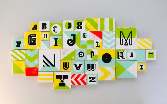
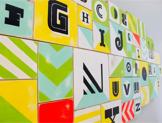
We’re starting today off with something a little different – this very cool alphabet installation that designer Jason Gomez created for his daughter’s nursery.  Jason and his wife didn’t know the gender of their baby, Jason wanted to keep the color palette neutral while incorporating lots of pattern and interesting letter shapes.  The result is very cool – and something that his baby girl will enjoy for years to come!

From JasonThis is somewhat a big project for a small person that is now the love of our lives in our new family.  I decided to create a custom alphabet painting for our first baby girl Alena to hang in her room.  Since we didn’t want to know the gender of our baby until she was born I wanted to keep the colors neutral to work for either a boy or a girl but to keep it bright and fun.

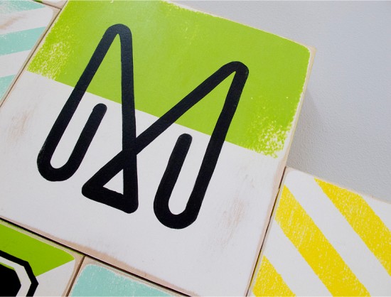
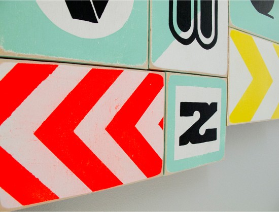
Since I love typography I wanted to showcase various type styles for each letter form along with some simple colorful shapes and patterns.  It was a labor of love for me, incorporating various sizes of wood canvases and various types of mediums from house paint to acrylic and paint pens.  In the end the overall piece measured up to 67″ wide to 32″ high, a big bold colorful piece for our beautiful little girl.

Thanks Jason!

Photo Credits: Jason Gomez

Simple and Elegant Letterpress Moving Announcements

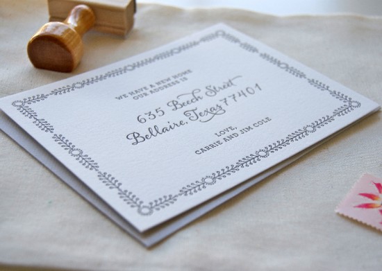
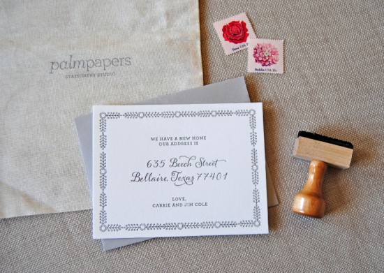
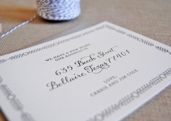
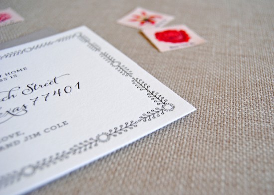
Lauren Chism Fine Papers sent over these beautiful moving announcements that she created to help her best friend celebrate the purchase of her first home.  I’m loving the classic design and feminine border detail – such a sweet and simple way to help spread the happy news to family and friends!

Simple-Elegant-Letterpress-Moving-Announcements

From LaurenMy best friend and her husband recently purchased their first home, and I wanted to create a moving announcement for her that was feminine, clean and impeccably printed.  The frame paired with a beautiful script address achieved the simple elegance I was going for.  They were printed by Spark Letterpress on thick 100% cotton paper.  I also created a coordinating address stamp, in the same script font for her to use long after the announcements are sent out.

Simple-Elegant-Letterpress-Moving-Announcements

Simple-Elegant-Letterpress-Moving-Announcements

Simple-Elegant-Letterpress-Moving-Announcements

So pretty!  Thanks Lauren!

Design: Lauren Chism Fine Papers

Letterpress Printing: Spark Letterpress

Photo Credits: Lauren Chism Fine Papers

Red and White Modern Letterpress Wedding Invitations

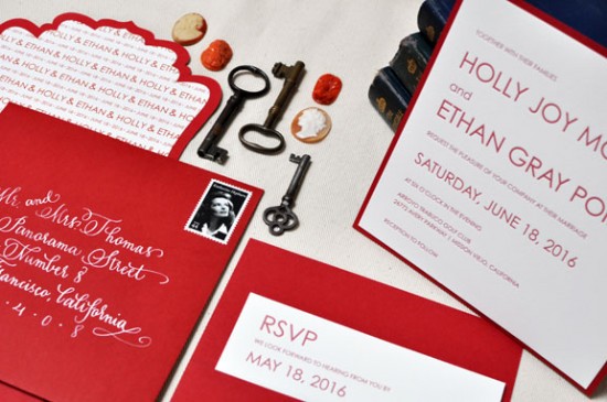
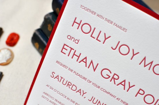
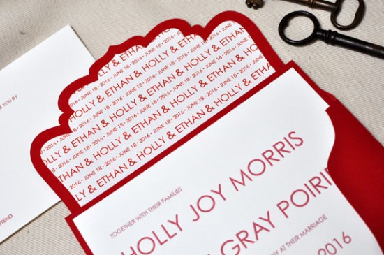
Theresa from b.t. elements sent over these beautiful red and white invitations from her brand new letterpress collection.  Theresa chose a minimalist and crisp design for the main invitation while bringing in a unique die cut outer envelope and bold white calligraphy.  Theresa even did the beautiful calligraphy herself – so pretty!

From Theresa: I love the beauty of the letterpress printing process and wanted to design an invitation that was clean and simple, working with just the relationship of small and large type.  The crisp design of this invitation was really inspired by the printing method itself.  I’m always inspired by strong bold colors that stand well on their own – red is one of those colors.  It’s bold, striking, and just a timeless color.

At b.t. elements we’re known for our custom pockets and folders, so I added in a very simple back pocket – you always need a place to tuck in those extra enclosures.  And we never overlook the envelope.  Our fancy cut envelopes are new this year and a big hit.  It’s so wonderful to see that envelope come in the mail.

The handwriting on the envelope is my own; I’ve been trying to teach myself calligraphy so I’ll take any practice I can get.  I love the contrast of the white on red.

Lovely!  Thanks Theresa!

Photo Credits: b.t. elements

Watercolor Note Cards from Social Proper

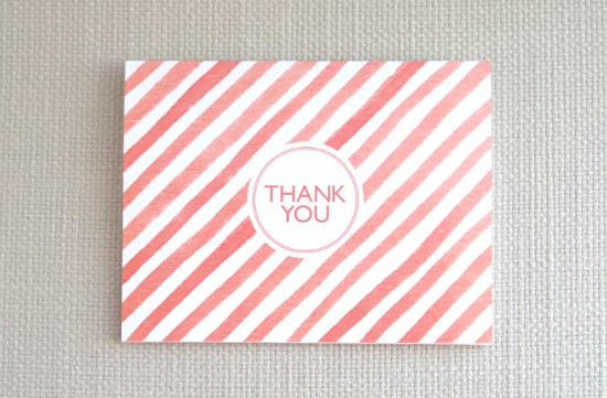
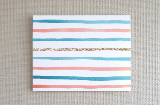
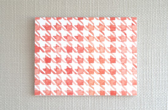
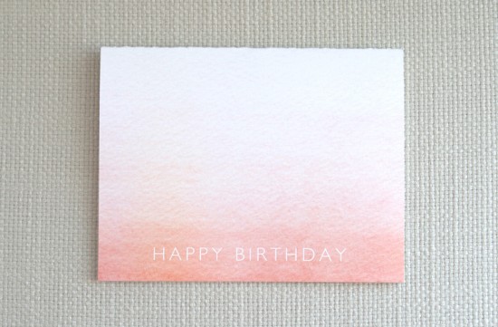
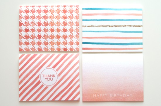
Elizabeth from Social Proper sent me a note introducing me to her brand new stationery collection – and I’m completely smitten.  The collection features Elizabeth’s hand painted designs, printed on textured paper.  The current collection features watercolor illustrations inspired by late summer days.  So sweet!

Thanks Elizabeth!

Photo Credits: Social Proper

Julianne + Philip’s Whimsical Letterpress Wedding Invitations

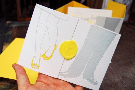
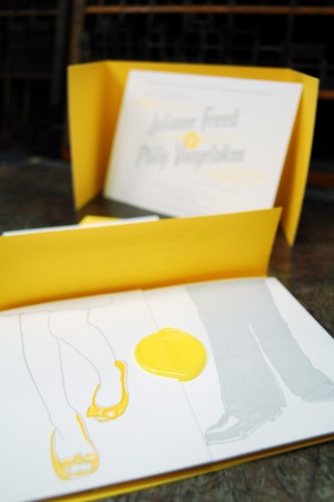
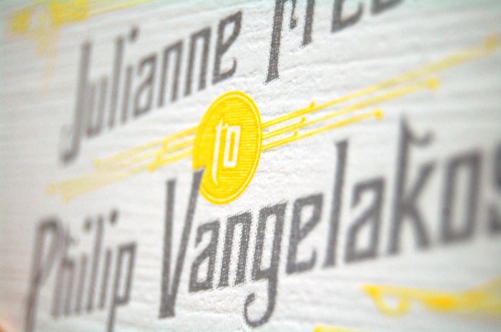
The folks down at Mama’s Sauce are really on a roll lately!  First they create some seriously cool business cards, and now these awesome wedding invitations.  Nick from Mama’s Sauce came up with the concept of basing the invitation design around an illustration of the couples’ shoes by Itchy Illustration, then incorporated the design into a horizontal tri-fold layout with a sunny yellow wax seal.  Love it!

From Nick: The couple wanted their printed materials to be a balance of playful & classic.  When it came time to design the wedding invitations months after our first consultation, Julianne’s love affair with her shoes was still stuck in my mind.  I quickly sketched a scene of the couple standing side by side with a bright popping yellow, highlighting Jewel’s shoes.  Not your typical wedding invitation, but typical isn’t what the couple wanted.

I am especially in love with the tri-fold wrap.  110# Pearl White Lettra Duplexed to French Paper Lemon Drop, we experimented with a type of die cut that allowed the wrap to fold and expose the yellow paper underneath creating a tri-colored edge.  A subtle detail that the most aesthetically sensitive recipients will surely appreciate.  Add a wax seal and the wrap is complete.

A collaboration with our friend & officemate, the talented Brian Boesch of Itchy Illustration, Julianne & Phil’s save the date and wedding suite are amongst our favorites that we’ve designed and printed this year.

Very cool – I love the layered effect with the yellow tri-fold die cut wrap, and of course that wax seal!  Thank you so much Nick!


Concept and Letterpress Printing: Mama’s Sauce
Illustration: Itchy Illustration


Photo Credits: Mama’s Sauce