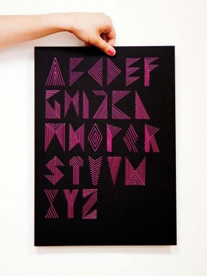
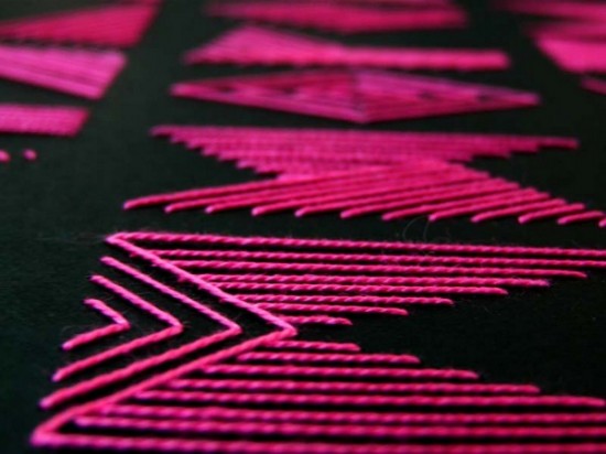
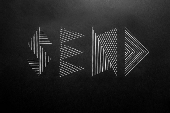
Embroidered Business Cards and Artwork by Nina Gregier

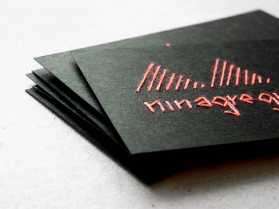
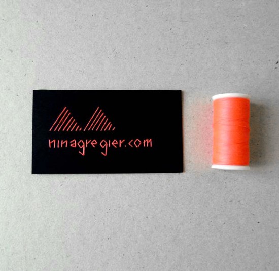
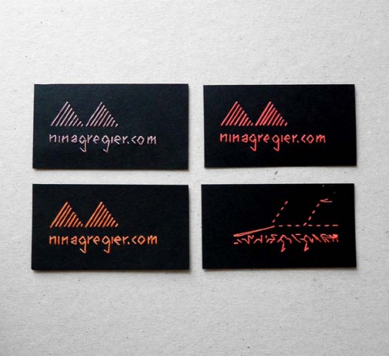
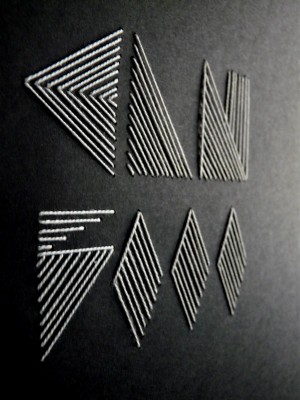
These embroidered business cards from designer and illustrator Nina Gregier are so incredibly cool – simple in design, but with a huge impact!  I couldn’t resist checking out Nina’s website; she has a number of additional embroidered typography projects in her portfolio, including a beautiful embroidered alphabet and art prints.

Check out lots more over on Nina’s website right here.

Photo Credits: Nina Gregier, found via Lovely Stationery

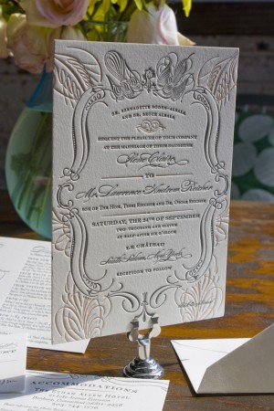
Ilene + Lawrence’s Chateau-Inspired Formal Wedding Invitations

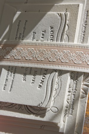
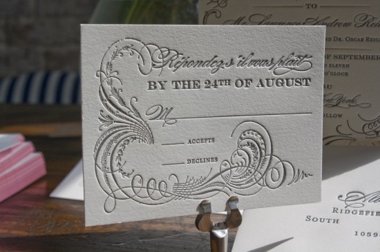
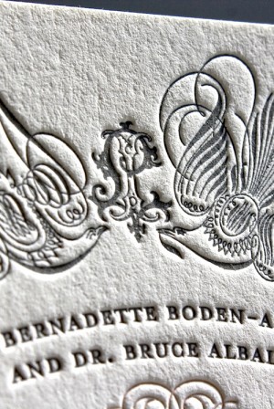
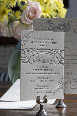
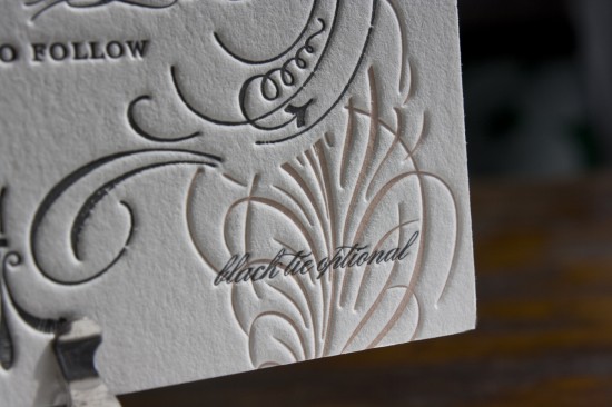
The ladies from Lucky Luxe Couture Correspondence sent over these gorgeous wedding invitations created for a black tie wedding.  The ladies of Lucky Luxe are known for their romantic and ornate designs, and this invitation is perfectly suited for a formal wedding.  The full suite includes a formal invitation, accommodations card, rsvp, and an invitation to Sunday brunch, all packaged together with a beautiful letterpress belly band and printed on thick cotton paper.  So pretty!

From Annalee: This wedding is going to be at the Chateau in New York and is very much inspired by classic French romance and calligraphic elements.  The bride was originally interested in the Deco and L’Oiseau designs from our collection but ultimately decided on a bespoke invitation that combined elements from both designs.


Thanks ladies!  You can check out more from Lucky Luxe right here!

Photo Credits: Lucky Luxe Couture Correspondence

Colorful Screen Printed Artwork from coniLab

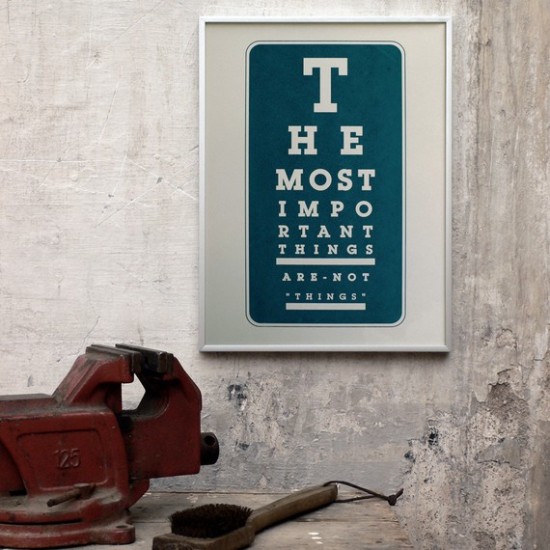
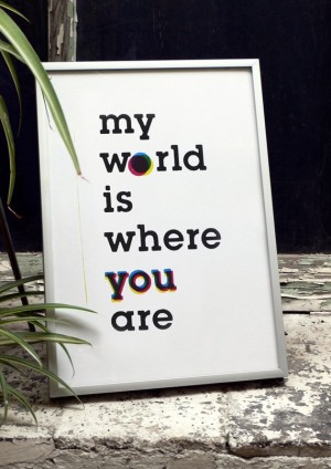
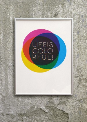
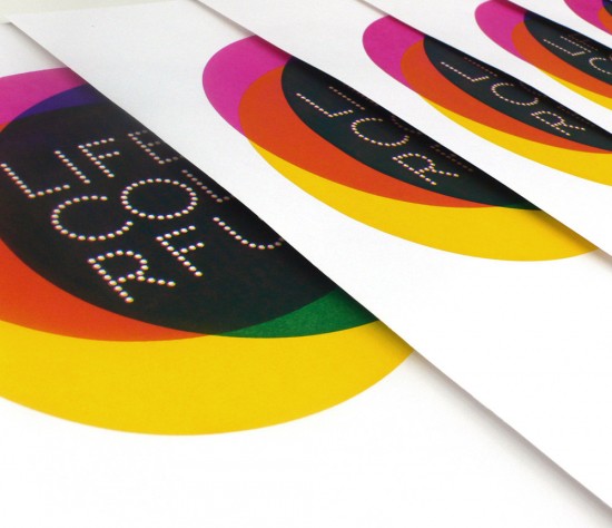
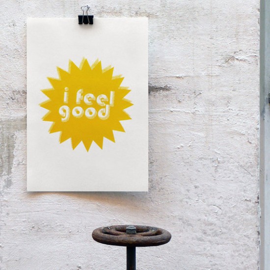
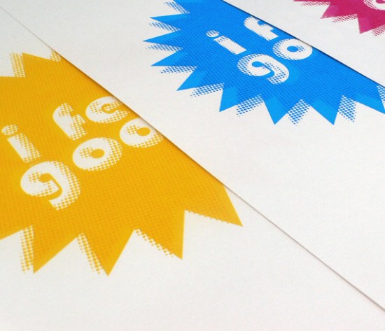
Today I’m loving these colorful screen prints from Barcelona-based coniLab.  Each print is hand screened on archival paper by designer Coni Della Vedova.  The entire shop is full of bold graphic designs, from simple black and white prints to bright three-color designs.


Check out more over at coniLab!

Photo Credits: coniLab

p.s. Have you entered our giveaway with Moontree Letterpress?  The winner will receive 50 personalized notecards – the contest ends on Friday, so enter now!


Lauren + John’s Vintage-Inspired Rock n’ Roll Wedding Invitations

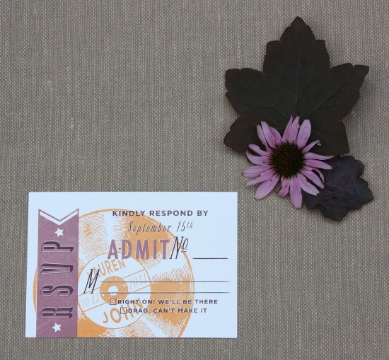
I’m loving these wedding invitations inspired by classic rock n’ roll, sent over by Molly from Paisley Quill.  The subtle floral background helps to soften the bold text, creating an overall feel that is both elegant and a lot of fun.  And with only two pieces and an envelope comprising the entire suite, Molly was able to pack a big statement into a sweet and simple invitation package!
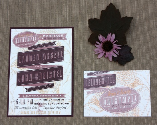
From Molly: Lauren and John had a very clear vision about what they wanted for their wedding invitations.  They are both huge fans of classic rock n’ roll and wanted that to play a big part of their wedding invitations.  Earlier this year, I designed their save the dates for them.  They had really cute engagement photos taken and I used them to design a vintage looking concert poster.
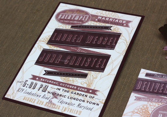

The wedding invitations were also intended to resemble a concert poster.  It was offset printed on 100% cotton paper.  Large sections of solid ink printed on cotton paper tends to get a mottled look, which helped give the invitation a vintage look and feel.  I also added a “distressing” layer in photoshop to help with the faded, roughed-up look. My favorite part of the response postcard are the response options. They read: “Right on, we’ll be there” and  “Drag, I can’t make it.”  Your typical ’60s speak.
Thanks Molly!

Photo Credits: Paisley Quill

*Paisley Quill is one of my fab­u­lous spon­sors; for more on my edi­to­r­ial poli­cies please click here.
Claudine + Michael’s Unique California Wedding Invitations

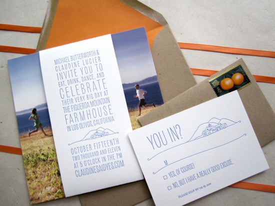
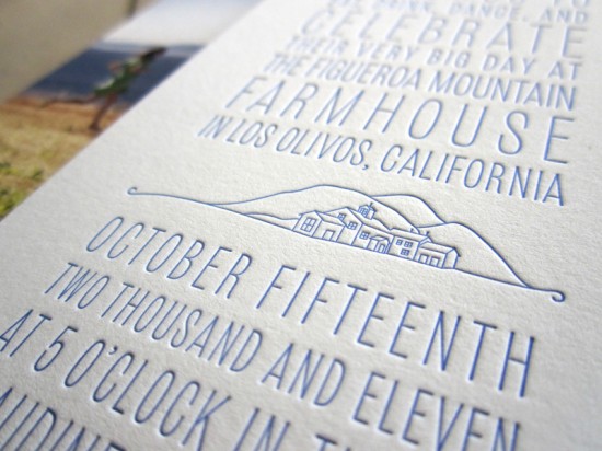
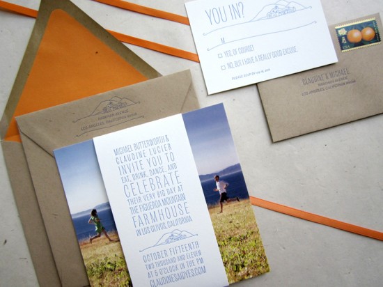
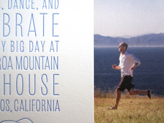
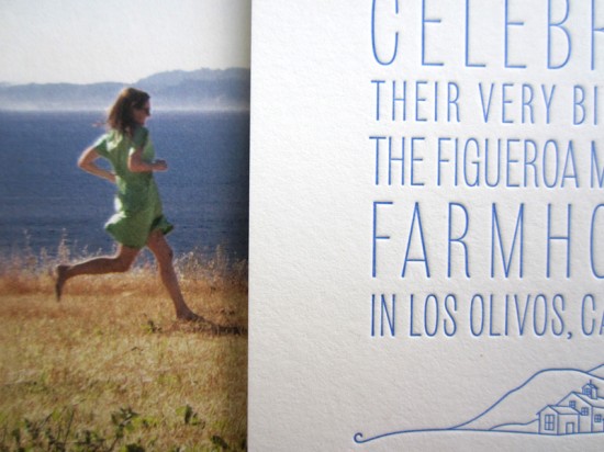
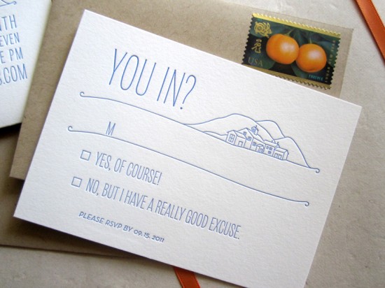
Sarah from Studio SloMo sent over these cool and quirky wedding invitations for an upcoming wedding in California.  I love that the belly band over the photo is actually the invitation – such a great idea!  Sarah letterpress printed the invitation and rsvp card in a rich cornflower blue, which contrasts nicely with the kraft paper envelopes and orange envelope liner.

From Sarah: This couple has the best ideas.  They had some pictures taken of them running towards each other and wanted a belly band with the wedding invitation going through the center.  I helped make their idea a reality and we were all pleased with the result.  The belly band as well as the RSVP card is letterpress printed in one color on 100% cotton paper.

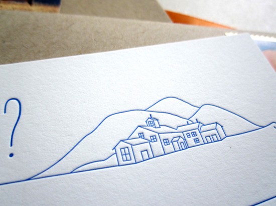
To keep with the rustic, modern feel of the wedding, I did a little illustration of the farmhouse where they are getting married.  The type as well as the the illustration have a clean look but still stay a little loose and casual.  We decided to finish the suite off with a pumpkin colored envelope liner which really allows the blue to pop.

Thanks Sarah!

Photo Credits: Studio SloMo

*Studio SloMo is one of my fab­u­lous spon­sors; for more on my edi­to­r­ial poli­cies please click here.