Camille + Andrew’s Red Chevron and Linen Wedding Invitations

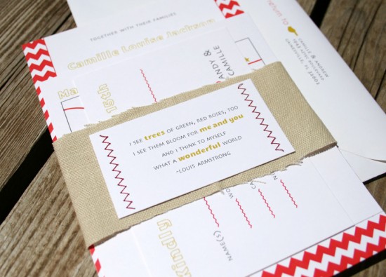
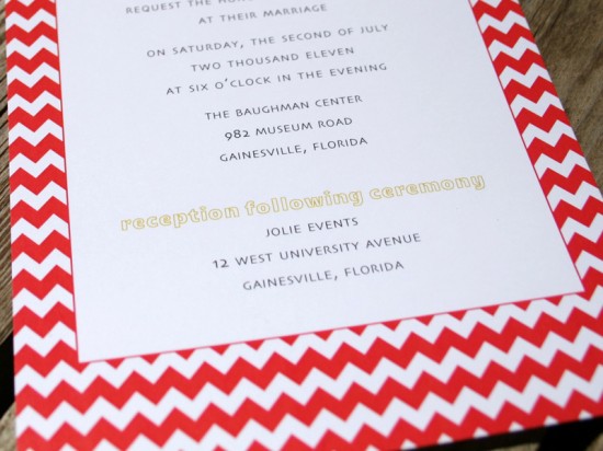
I thought I would help kick off the last day of the week with something bright and bold – and these red chevron stripe wedding invitations from Nathalie at 120 Water Street definitely fit the bill!  Nathalie mixed the bold red pattern with a linen belly band and stitched verse card to bring texture into the playful and modern invitation suite.

From Nathalie: This invitation suite was inspired by the bride’s love of color, pattern, and texture.  When she first contacted me, she hadn’t picked her color palette but knew she wanted something bold and non-traditional.  I sent her a few playful combinations of different colors and patterns, and she quickly picked mustard and red.

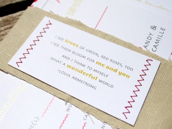
We digitally printed the invitations, then created a pretty belly band with linen to add texture.  When we settled on the chevron pattern we decided it would be fun to zigzag sew the Louis Armstrong verse card to the belly band.  I think the linen does a great job of slightly softening the pattern without overpowering it!

Thanks Nathalie!

Check out the Designer Rolodex for more tal­ented wed­ding invi­ta­tion design­ers and the real invi­ta­tions gallery for more beau­ti­ful cus­tom invitations!

Photo Credits: 120 Water Street

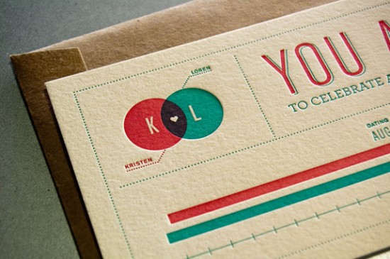
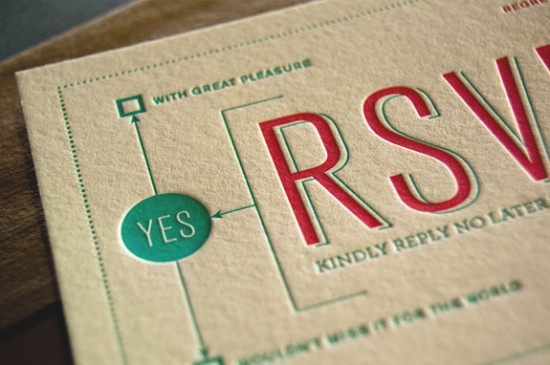
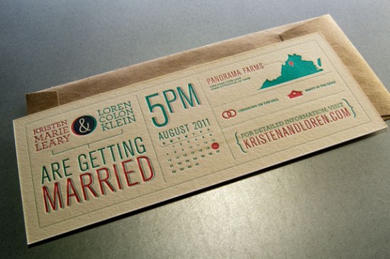
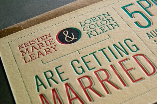
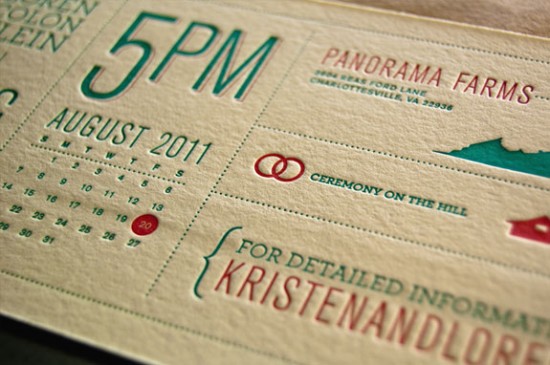
Kristen + Loren’s Modern Diagram Letterpress Wedding Invitations

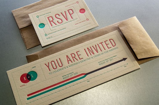
It was love at first sight when I spotted Kristen and Loren’s wedding invitations over at Rise & Shine Paper.  Designed by the groom, the invitations feature cute diagrams and letterpress overprinting – all within a super clean and modern horizontal layout.   Stunning!

You can chck out more photos over at Rise & Shine Paper!

Concept & Design: Loren Klein

Letterpress Printing: Rise & Shine Paper

Check out the Designer Rolodex for more tal­ented wed­ding invi­ta­tion design­ers and the real invi­ta­tions gallery for more beau­ti­ful cus­tom invitations!

Photo Credits: Rise & Shine Paper

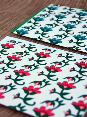
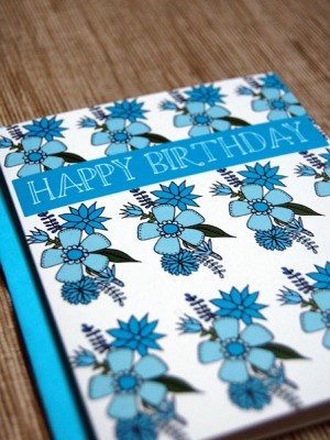
Floral & Pattern Notecards from Happy Cactus Designs

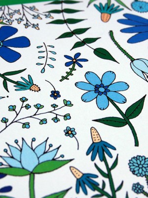
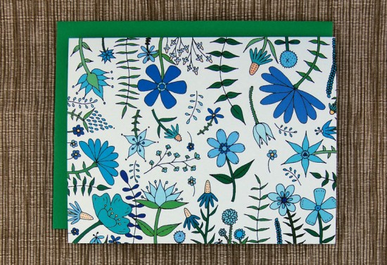
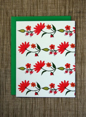
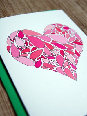
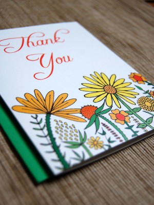
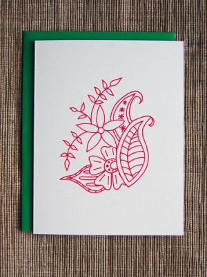
I love a pretty pattern, and today I’m completely smitten with these beautiful patterned cards from Happy Cactus Designs.  Brannon at Happy Cactus draws her inspiration from flora and fauna, traditional Indian textiles, and Batik block prints, incorporating those influences into colorful and unique cards featuring Brannon’s hand drawn illustrations.

Thanks Brannon!

Photo Credits: Happy Cactus Designs

Jenna + Asa’s Floral Wedding Invitations from Rifle Paper Co.

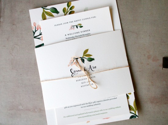
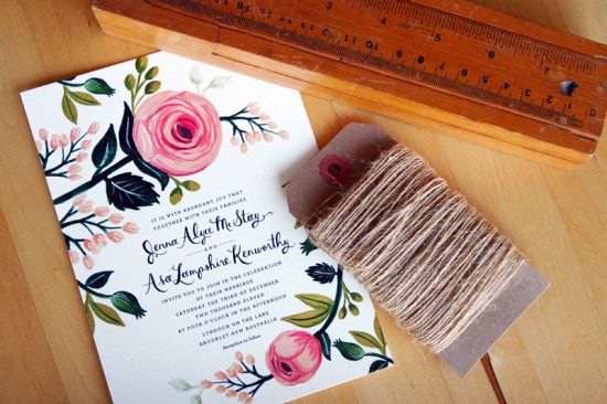
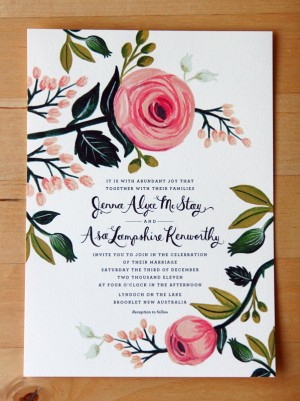
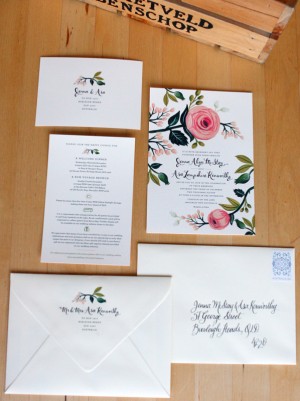
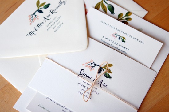
Back in March, a longtime reader in Australia sent over her beautiful save the dates for her summer garden wedding.  Well, today Jenna and Asa are back with their wedding invitations!  Like the save the dates, the wedding invitations were designed by Rifle Paper Co. and feature Anna’s signature floral illustrations and beautiful hand lettering.  Just perfect for a garden wedding!

The full suite includes the main invitation, an invitation to the welcome dinner and farewell brunch, and RSVP postcard, all tied together with an understated piece of twine.  Jenna commissioned Danielle from Freestyle Calligraphy to address the outer envelopes.

Thanks Jenna!

Photo Credits: Daniel McStay

Mexican Tile-Inspired 50th Wedding Anniversary Party Invitations

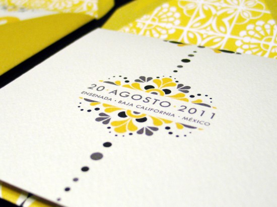
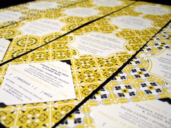
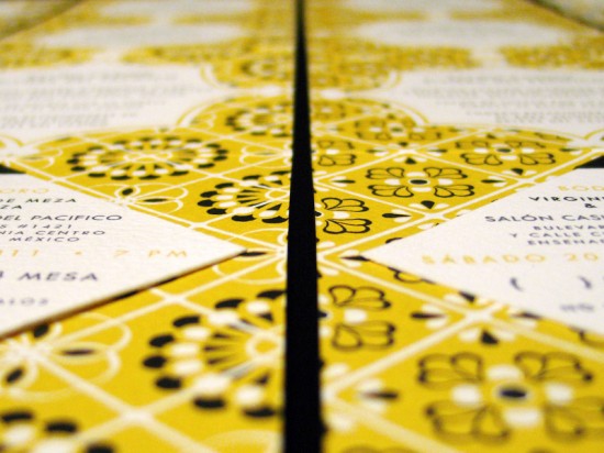
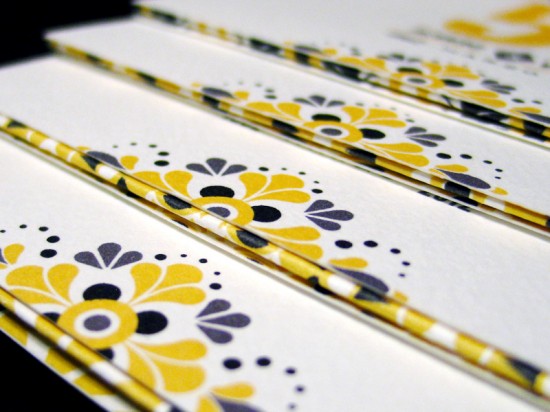
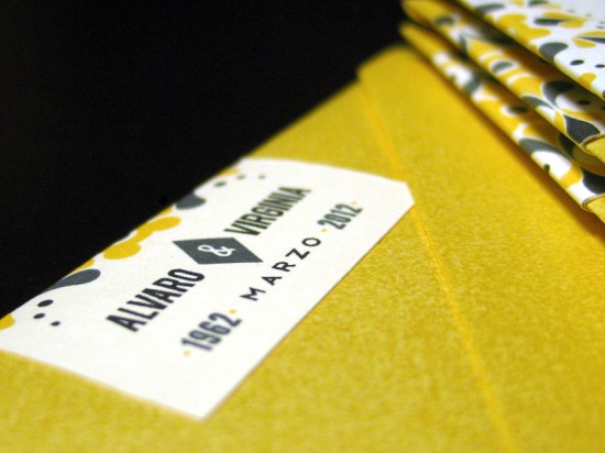
A 50th wedding anniversary is most definitely an occasion to be celebrated!  Lizzely from LizzyB Loves had the pleasure of designing her in-law’s 50th anniversary party invitations earlier this summer.  Lizzely drew her inspiration from the traditional tile work surrounding the celebration venue, a 1930s hotel in Mexico, and mid-century modern design.

From Lizelly:  The anniversary celebration will be held in Ensenada, Mexico in a circular ballroom dating back to the 1930s, which used to be a casino and hotel in its prime and later a military fort during WWII.  I took inspiration from the various tile work surrounding the venue and created an assortment of pattern motifs used throughout the invitation suite.

My brother-in-law served as the client for this project, and early on he said that he wanted the tile motifs surrounding the venue to be used in the design.  He also wanted to give the invitations a Mad Men feel, so I came up with a Mad-Mex theme with the use of clean and modern text paired with the Mexican tile designs.

Thanks Lizelly!

Photo Credits: LizzyB Loves