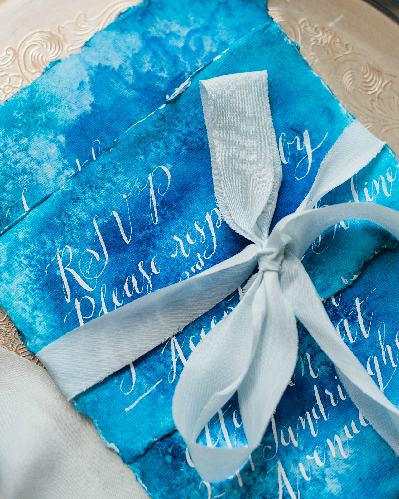
A bit of agate-inspired prettiness to brighten your Wednesday! Agate slices and jewel tones are having quite a moment these days, don’t you think? First these gorgeous purple-hued agate-inspired invitations a few weeks ago, and now these vibrant blue agate-inspired watercolor wedding invitations from Debbie Wong Design! The watercolor does a great job of mimicking the unique and varied nature of agate stones. And the hand painted watercolor is even more beautiful when paired with deckle edge paper and modern calligraphy in white ink!
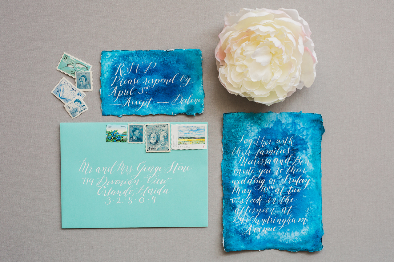
From Debbie: The aesthetic and rich jewel tones of agate were the main inspiration for this invitation suite. Blue is incredibly versatile and a beautiful color to use year-round, no matter how seasonal trends may change.
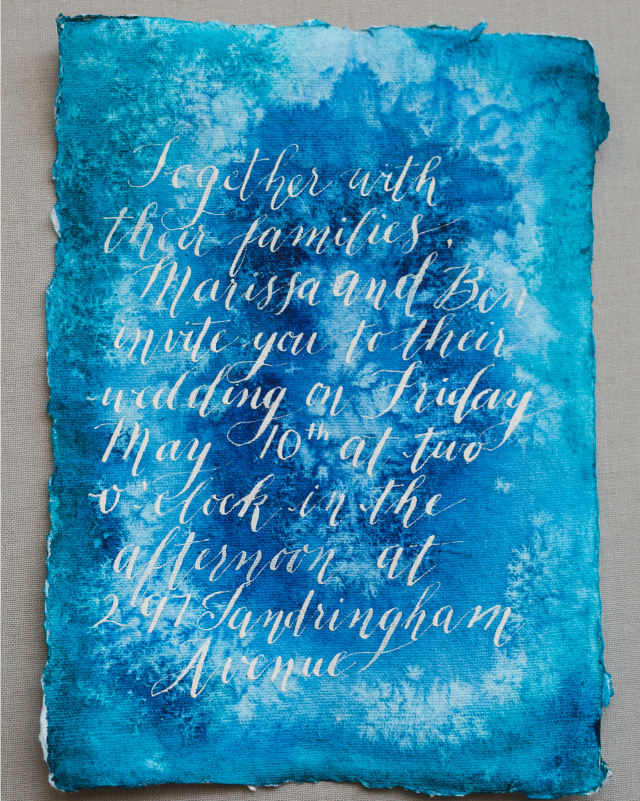
Since agate stones come in so many different patterns, the background for the invitation and response card were also unique from one to another, due to the handmade nature of watercolors. Another unique element of agate slices that we wanted to highlight was the unique crystal design at the center of each stone.
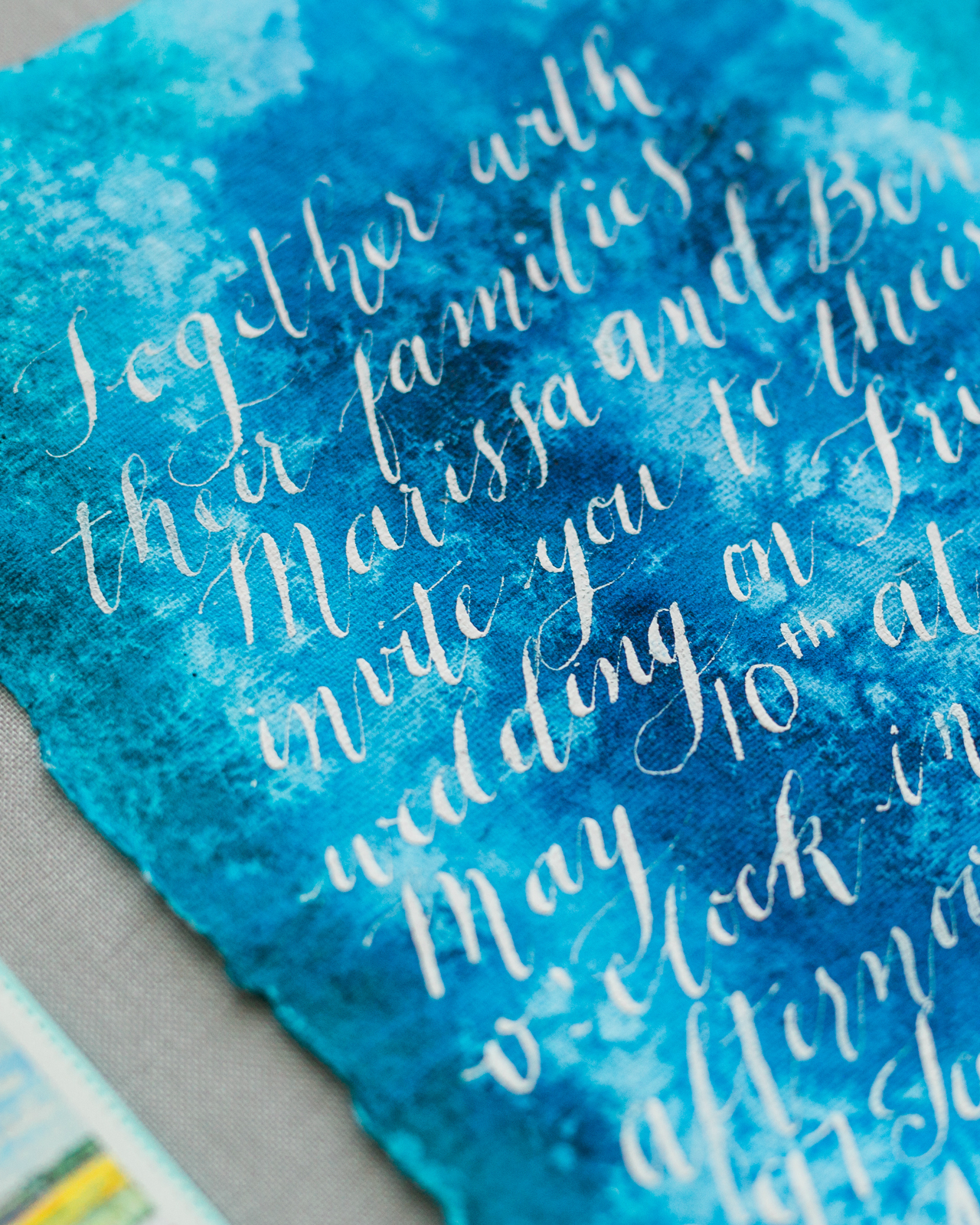
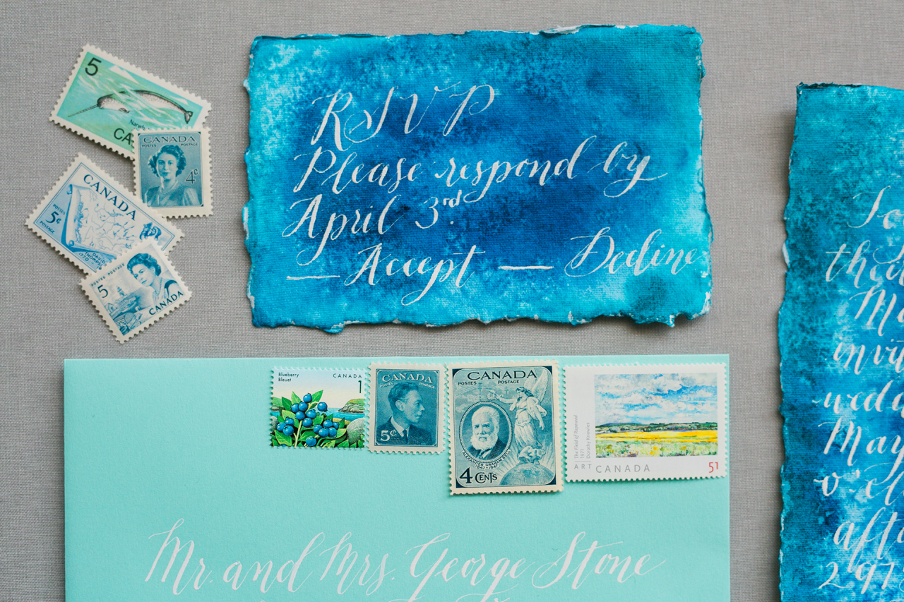
I decided modern calligraphy was an appropriate style to use for this fun invitation suite, and white ink was the perfect choice to stand out the most against the dark blue tones of the suite. The invitation suite was created on hand deckled cotton rag paper to get a gorgeous texture. Then, the invitation and the response card were tied together with a soft dusty blue silk ribbon from Silk and Willow, before inserting them into a light blue envelope.
Vintage stamps were another fun detail we incorporated. Blue stamps fit the theme, but we added a couple of brightly colored stamps to make the envelopes stand out in a fun and vibrant. A blueberry stamp was also incorporated, and this motif tied in with the menu card.
The reception was going to be a cocktail style affair, so the menu items were hors d’oeuvres instead of a full seated dinner. The menu was also made on the same hand deckled cotton paper, with a little blueberry painted on the top as the header. We used watercolor to write the appetizer names onto these cards. I knew using watercolor would give the menu cards an organic look with the colors varying slightly from word to word.
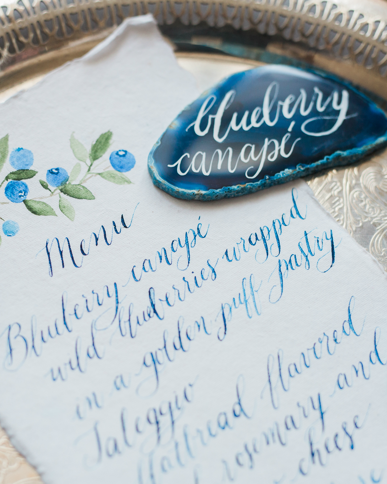
We used actual agate slices as food labels for the stations at the reception. Brilliant white ink with modern calligraphy was used to match the invitation suite’s calligraphy. I purposely chose three distinctive looking agate stones for the appetizer cards, as no two agates are exact, just like a hand painting. This was such a fun project to orchestrate and I love how it came together!

Thanks Debbie!
Design, calligraphy, & hand painting: Debbie Wong Design
Ribbon: Silk and Willow
Check out the Designer Rolodex for more talÂented wedÂding inviÂtaÂtion designÂers and the real inviÂtaÂtions gallery for more wedding invitation ideas!
Photo Credits: Debbie Wong

