Wood Veneer Bar + Bat Mitzvah Invitations

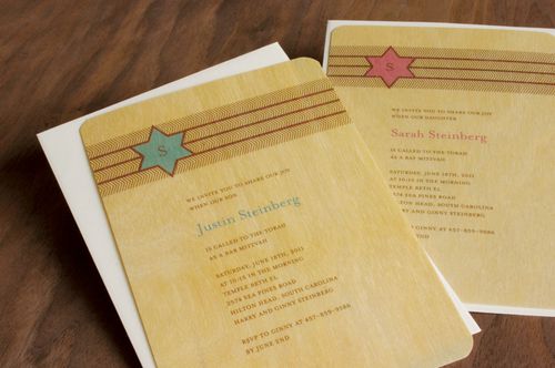
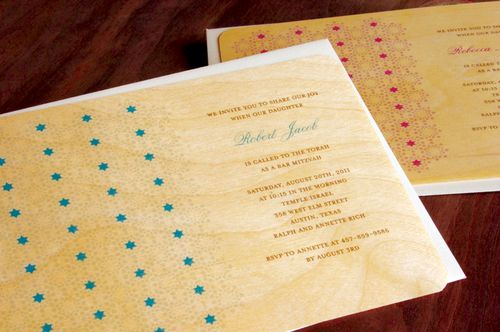
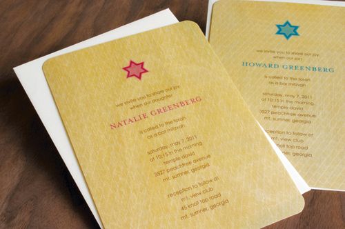
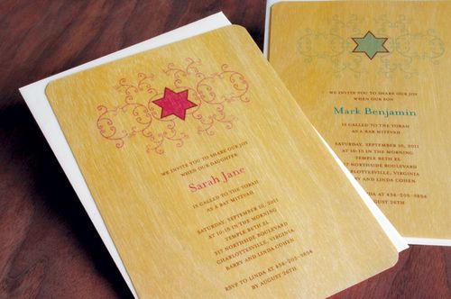
I'm always thrilled to see my favorite design studios doing their own take on modern Bar and Bat Mitzvah invitations, which can often leave parents totally frustrated as they search for something different yet still respectful of the event itself.  These wood veneer invitations from Night Owl Paper Goods do just the trick:

Night-Owl-Paper-Bar-Mitzvah-Herringbone-Stripes
Night-Owl-Paper-Bar-Mitzvah-Dotted-Stars
Night-Owl-Paper-Bar-Mitzvah-Diagonal-Tiles
Night-Owl-Paper-Bar-Mitzvah-Star-Flourish

Herringbone strips and ornamental flourishes?  Awesome.  Check out the full Bar and Bat Mitzvah invitation collection from Night Owl Paper Goods right here.

{image credits: night owl paper goods}

{happy weekend!}

Happy Friday everyone!  Whether your neighborhood is filled with snow or sunshine, I hope you have a lovely weekend.  I'm still dreaming about spring (please get here soon!) and am hoping to sketch out my garden plan this weekend.  But in the meantime…

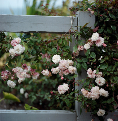
Climbing-roses

…a few links for your weekend:

That's it for me – thank you so much for stopping by this week.  I'll see you all here again on Monday!

{image credits: from me to you}

Kelli + Sam Romantic Vintage-Inspired Wedding Invitations

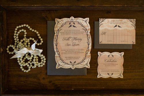
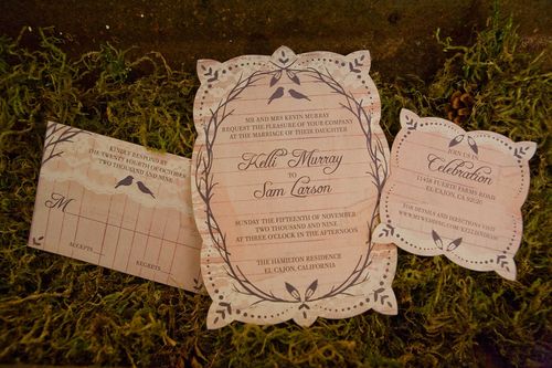
As promised, here are Kelli + Sam’s wedding invitations!  For her invitations, Kelli went for a rustic and vintage-inspired design, incorporating images of lace and worn paper with birds and branches for a romantic garden feel.  Kelli also worked with a local printer to create a mold and die cut the main invitation and reception card, giving those pieces a lovely unique shape.
Kelli-Sam-Vintage-Garden-Romance-Invitations-Suite

From Kelli: The theme of my wedding was Vintage Garden Romance, and I wanted my invitations to reflect that theme.  Being a graphic designer myself, I always knew I would create my own wedding invitations, so I began my inspiration folder early!
Kelli-Sam-Vintage-Garden-Romance-Invitations-Rustic

I decided that much of my decor would be very delicate and romantic, mixing natural fabrics with pearls, lace and feathers.  I planned on using a lot of twigs and branches and “woodsy decor” as well in design and decoration, and because it was an outdoor wedding in the middle of November, I wanted it to have a taste of Fall (without being too predictable).
Kelli-Sam-Vintage-Garden-Romance-Invitations

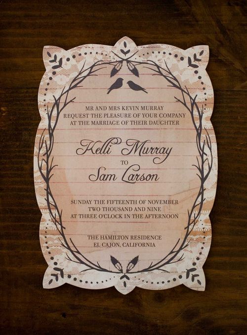
I opted for a very light color palate, with soft and natural hues.  The main color being a pale peach.  I created a branch frame as my foundation for the invitation and worked from there.  I have always loved the  look of aged paper, whether it be coffee stained or torn or burnt around the edges, so I scanned in some old tattered lined paper and used that as my background.
Kelli-Sam-Vintage-Garden-Romance-Invitations-Detail

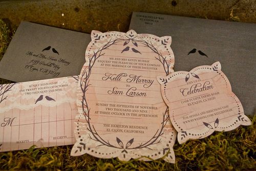
I then layered strips of lace across the top to give it that bit of romance I was going for.  Finally, the silhouetted lovebirds and feather accents served as the “garden” inspiration.

For more from Kelli’s wedding – including her ceremony programs and wedding photos – check out her blog right here. Thanks Kelli!

{image credits: sarah shreves}

Kelli + Sam’s Illustrated Save the Dates

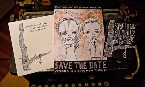
Illustrator and painter Kelli Murray Larson sent over her wedding stationery — both which of course feature her beautiful illustrations!  Naturally, I thought I’d start off with the Save the Dates!

Sam-kelli-illustrated-save-the-date

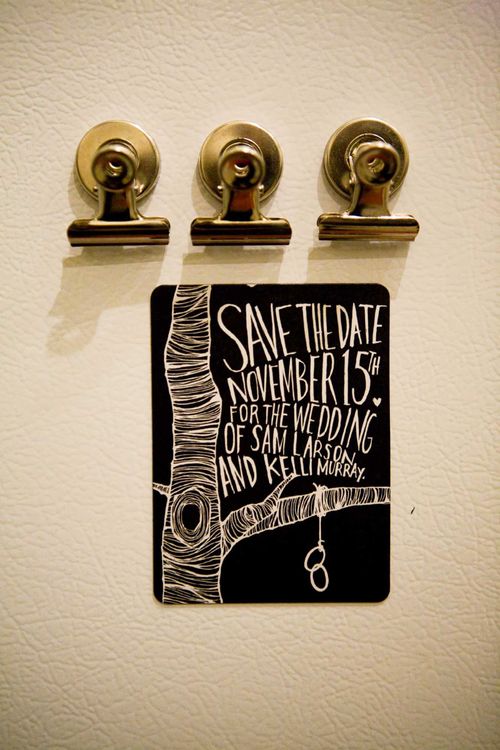
I love Kelli’s fresh approach to a magnet Save the Date — a graphic black + white magnet featuring Kelli’s hand lettering and an illustration of a tree:

Sam-kelli-illustrated-save-the-date-tree

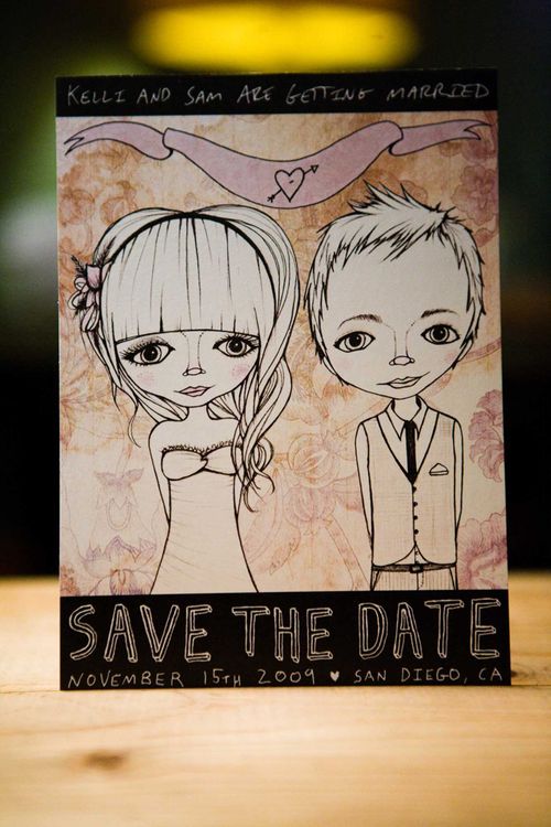
For the main Save the Date, Kelli started with this portrait drawing of herself + Sam:

Sam-kelli-illustrated-save-the-date-drawing
Sam-kelli-illustrated-save-the-date-portrait

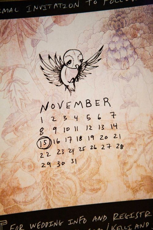
And on the reverse side was a calendar to remind guests of the wedding date:

Sam-kelli-illustrated-save-the-date-calendar2

Coming up next… Kelli’s wedding invitations!

{image credits: Sarah Shreves}

Beautiful Brand Identity

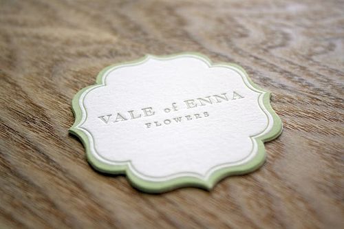
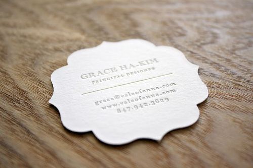
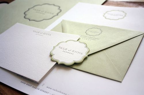
I just can't get over this gorgeous brand identity from Truly Smitten for floral design studio Vale of Enna.  From the elegant and unique die-cut shape to the soft green and gray color palette, the entire suite reminds me of blooming flowers in spring — perfect for a floral designer!

Letterpress-Die-Cut-Business-Card
Letterpress-Die-Cut-Business-Card2
Letterpress-Florist-Business-Collateral

Check out the rest of the suite right here!

{image credits: truly smitten studio}

*truly smitten is a sponsor on oh so beautiful paper but provided no financial compensation for this post. for information on my editorial policy, please click here.