Chinese New Year Cards from Twig + Fig

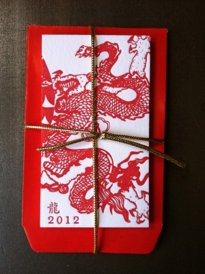
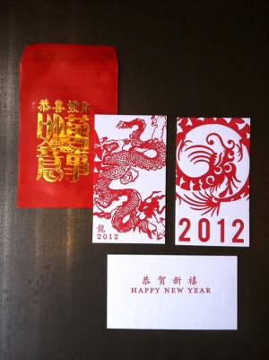
Happy Friday everyone!  As I’m sure most of you know, Monday marked the Chinese New Year and the beginning of the Year of the Dragon.  Designer Stephanie Laursen sent over some fun letterpress cards that she helped to create at Twig + Fig in Berkley, California to commemorate the occasion.  Stephanie created two versions: one on the more traditional side and another with a more modern and stylized design – both paired with classic red envelopes with gilded gold characters.


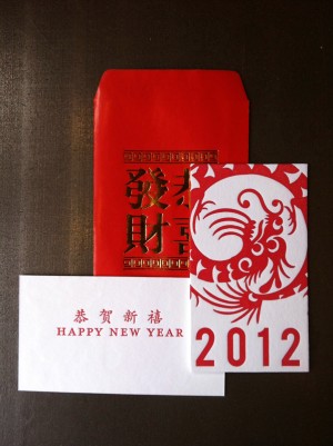
From Stephanie: We wanted the cards to have a dragon theme (since it’s the year of the dragon).  We also wanted them to fit into coin envelopes, as it’s traditional to give money in small red envelopes.  We decided to pick two different dragons, one in a more traditional Chinese art style, and one that was a bit more graphic and modern.  The typography for each design reflects two aesthetics: the more modern dragon has large bold ‘2012’ typography, and the more traditional one is paired with a classic, smaller ‘2012’ and the Chinese character for dragon.


We wanted the back of each to say ‘Happy New Year’, but in a more simplified way to give people room to write if they chose, and we decided to make the back the same for each for ease of printing.  I also chose to pair the Chinese characters for ‘Happy New Year’ (“gung hay fat choy”) to tie the Chinese theme into the back of the card.

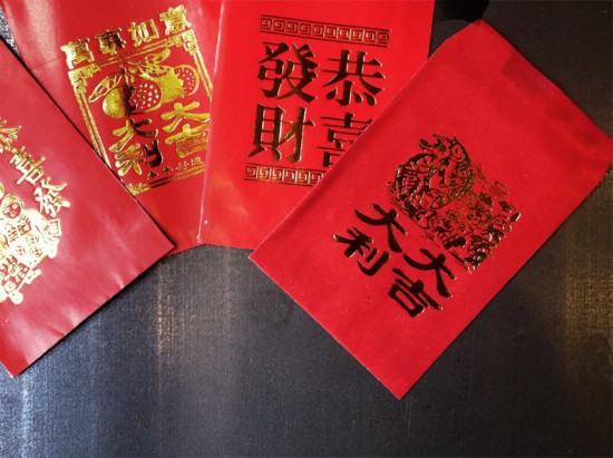
Of course, the red printing ink and the gilded gold envelopes were the finishing touches to really make it appropriate for the Chinese New Year. (We learned that the envelope to give money in should traditionally have gold characters on it, for luck).

Thanks Stephanie!  For those of you in the Bay area, you can pick up these cards at Twig + Fig in Berkley, California!

Photo Credits: Stephanie Laursen

Seasonal Stationery: Valentine’s Day Cards, Part 5

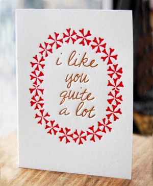
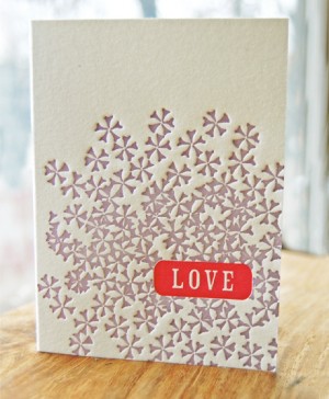
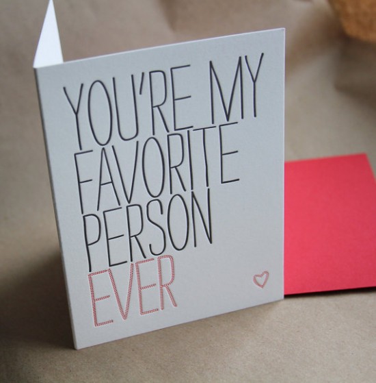
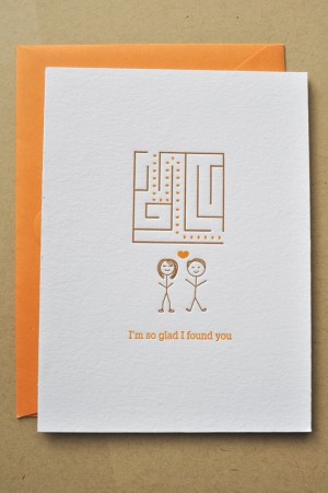
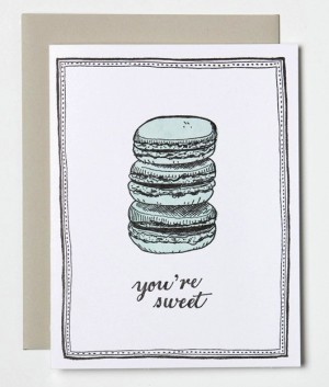
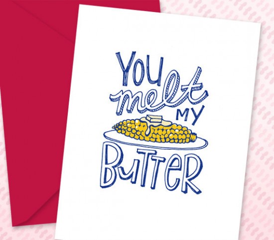
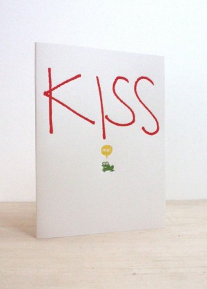
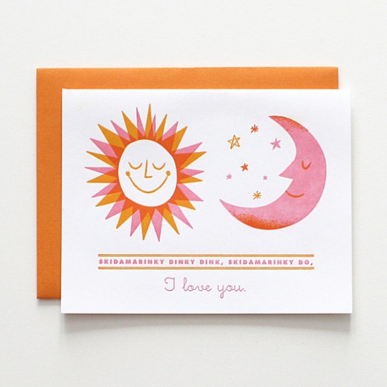
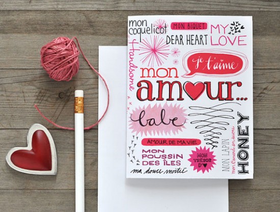
I have just a few more Valentine’s Day cards that I’d like to share with you.  So today I have one final round up for you – full of some of the sweetest Valentine’s Day cards yet!


Studio Olivine

Wishbone Letterpress

Satsuma Press


Impressed Design


Sycamore Street Press

Echo Letterpress


Fugu Fugu Press

Lulu Dee

Eva Juilet


Our Paper Shop

Valentine’s Day artwork from Akimbo

In case you missed them, you can check out the previous round ups right here!

{images via their respective sources}

Inspired By: Papercuts!

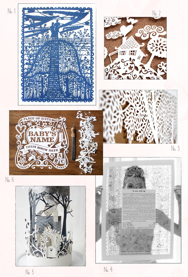
I’ve been in love with papercut pieces as long as I can remember, as any longtime readers will know from my love for all things Rob Ryan.  I’m completely in awe of this stunning technique (the precision! the patience!) and the even more stunning results.  So today I’m rounding up a few of my favorite papercut pieces, from artwork to baby announcements.

No. 1 Rob Ryan; No. 2 Dinara Mirtalipova (originally posted here); No. 3 Woodland Papercuts; No. 4 Elizabeth Messina; No. 5 Helen Musselwhite; No. 6 Julene Harrison

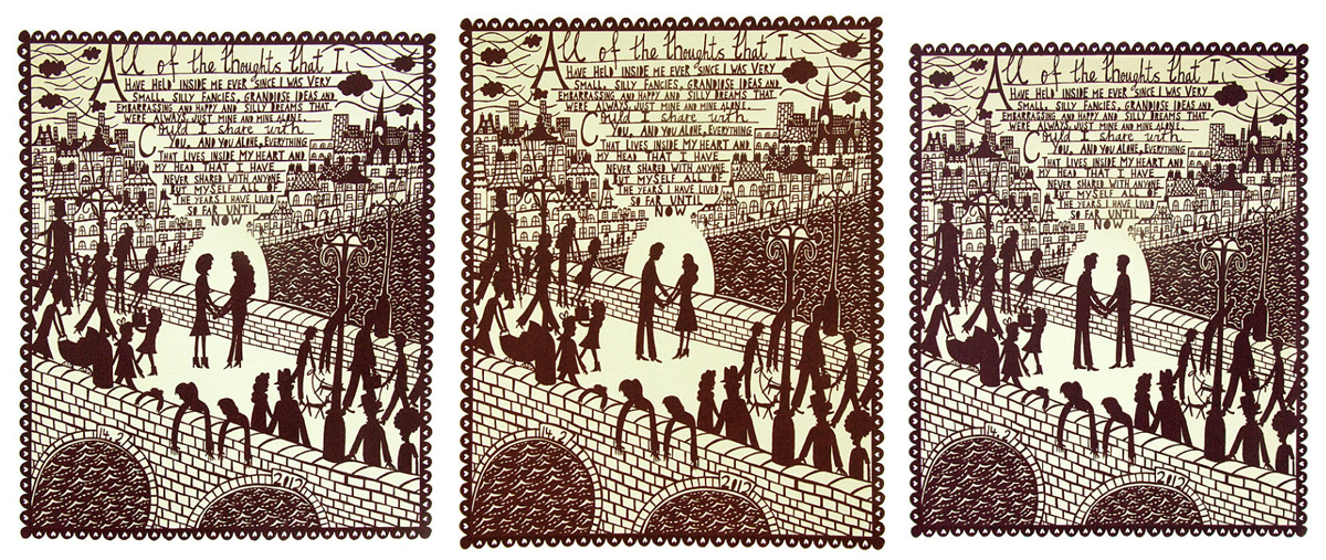
And speaking of Rob Ryan, he just released his 2012 Valentine’s Day print!  This year, Rob is offering a beautiful screen print in burgundy ink on off-white paper.  Check out all three designs right here.  So gorgeous!

Woodland Papercuts is a mem­ber of the Designer Rolodex â€“ you can see more of Naomi’s beau­ti­ful work right here!

{images via their respective sources}


Amanda + David’s Whimsical Accordion Fold Wedding Invitations

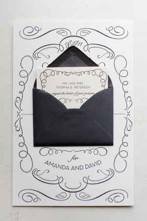
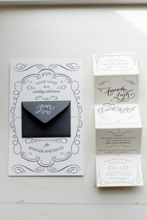
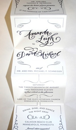
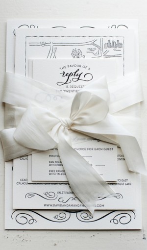
Amanda sent over the invitations from her wedding in Minnesota last summer – I absolutely adore the whimsical calligraphy and accordion fold layout!  Amanda worked with local stationers Watermark Stationery to create an invitation that was elegant yet non-traditional, ultimately settling on a sophisticated design with a playful pop-out for the main invitation.  The entire suite was letterpress printed in a single color and embellished with gorgeous calligraphy from Crystal Kluge.  So pretty!


From Amanda: The invitation sets the tone for a wedding, so we wanted to show our invited guests what type of event we had planned: formal, fun, glamorous and somewhat whimsical.  I worked with Gretchen Berry of Watermark Stationery in Excelsior, Minnesota to come up with a fun, unique way to present our wedding invitation.  We knew we didn’t want a traditional invitation; we wanted something unique, different and fun.  


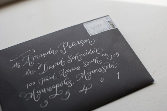
Once we came up with a design that we loved, we had some of the text elements custom done by local calligrapher, Crystal Kluge.  We loved the combination of the whimsical, yet formal letterpress calligraphy paired with our over-sized main invitation.  The invitation was paired with a mini envelope and fold-out accordion invitation, reply and direction cards, and a dark gray outer envelope with white ink calligraphy – all tied together with a white silk ribbon.  It was truly our dream wedding invitation.

Thanks Amanda!

Design and Letterpress Printing: Gretchen Berry, Watermark Stationery
Calligraphy: Crystal Kluge

Check out the Designer Rolodex for more tal­ented wed­ding invi­ta­tion design­ers and the real invi­ta­tions gallery for more wedding invitation ideas!

Photo Credits: Matt Blum Photography