Wedding Stationery Inspiration: Watercolor Details

It’s no secret that we’re big fans of watercolor details around here, from wedding invitations to day-of wedding stationery. There are so many ways to use watercolor to add color, texture, and personality to your big day! Illustrated menus, watercolor place cards… even watercolor envelopes and hand painted backdrops! We’ve rounded up a few gorgeous watercolor details below to spark some inspiration! – Annie

Wedding Stationery Inspiration: Watercolor Details / Oh So Beautiful Paper

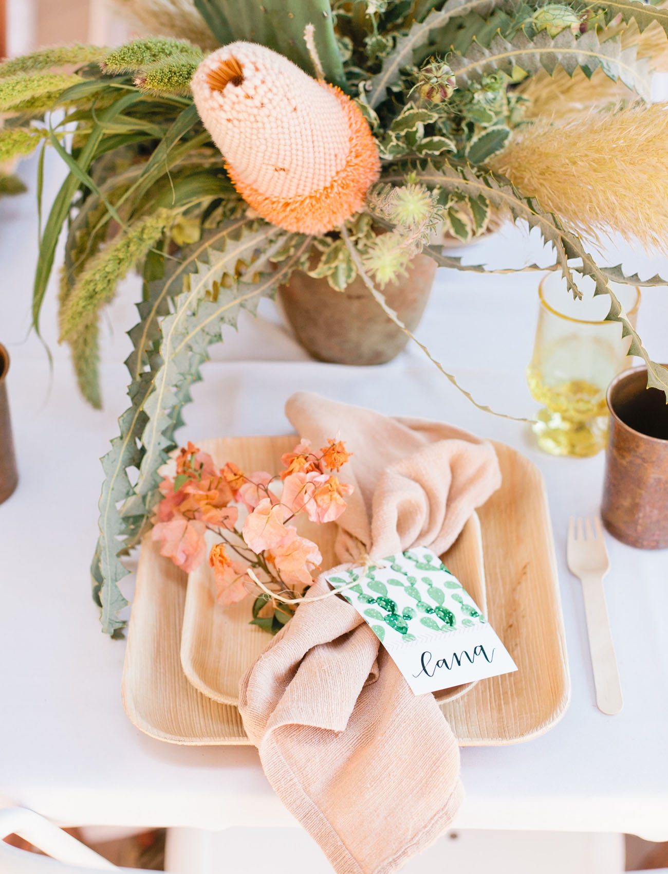
Repeat watercolor details throughout your wedding. Wouldn’t this cactus pattern look great as an envelope liner? | Photography: Megan Welker, Event Design & Planning: Beijos Events, Paper Goods & Calligraphy: Poppy Jack Shop via Green Wedding Shoes

Wedding Stationery Inspiration: Watercolor Details / Oh So Beautiful Paper

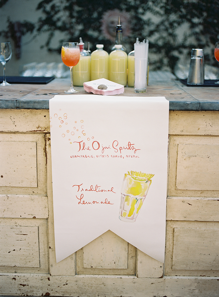
I love the watercolor illustrations on this bar sign! | Photography: Tec Petaja, Event Design & Planning: Bash Please, Stationery: Happy Menocal via Style Me Pretty

Colorful DIY Watercolor Envelopes!

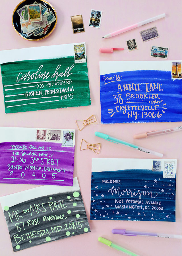
You can even use watercolors to add some color to your invitation envelopes! Check out our DIY tutorial right here!

Wedding Stationery Inspiration: Watercolor Details / Oh So Beautiful Paper

Black calligraphy pops against a soft watercolor background. | Photography: Max Wanger, Event Design & Planning: Bash Please via Bash Please

Wedding Stationery Inspiration: Watercolor Details / Oh So Beautiful Paper

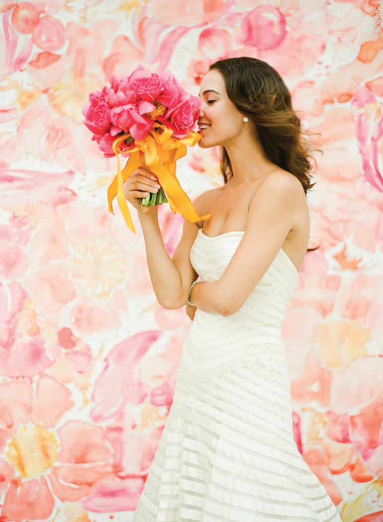
How gorgeous is this hand-painted backdrop?! | Photography: KT Merry, Backdrop: Momental Designs via Southern Weddings

Wedding Stationery Inspiration: Watercolor Details / Oh So Beautiful Paper

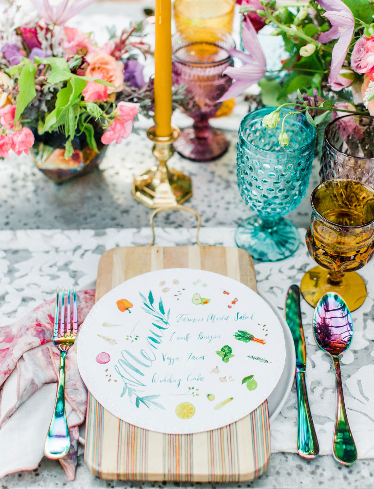
Add a splash of color in unexpected places, like these personalized coasters. | Photography: Ryan Ray Photography, Event Design & Planning: Stefanie Miles Events, Stationery: Meldeen via Style Me Pretty

Wedding Stationery Inspiration: Watercolor Details / Oh So Beautiful Paper

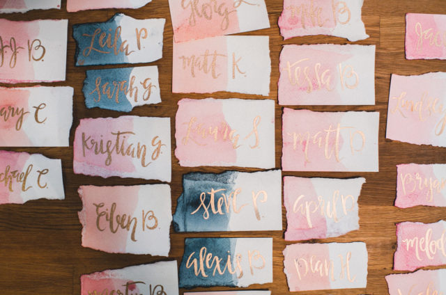
Take your escort cards to the next level with watercolor and metallic calligraphy. | Photography: Studio Castillero, Event Design & Planning: Lace & Likes, Paper Goods: Ben Todd via Green Wedding Shoes

Wedding Stationery Inspiration: Watercolor Details / Oh So Beautiful Paper

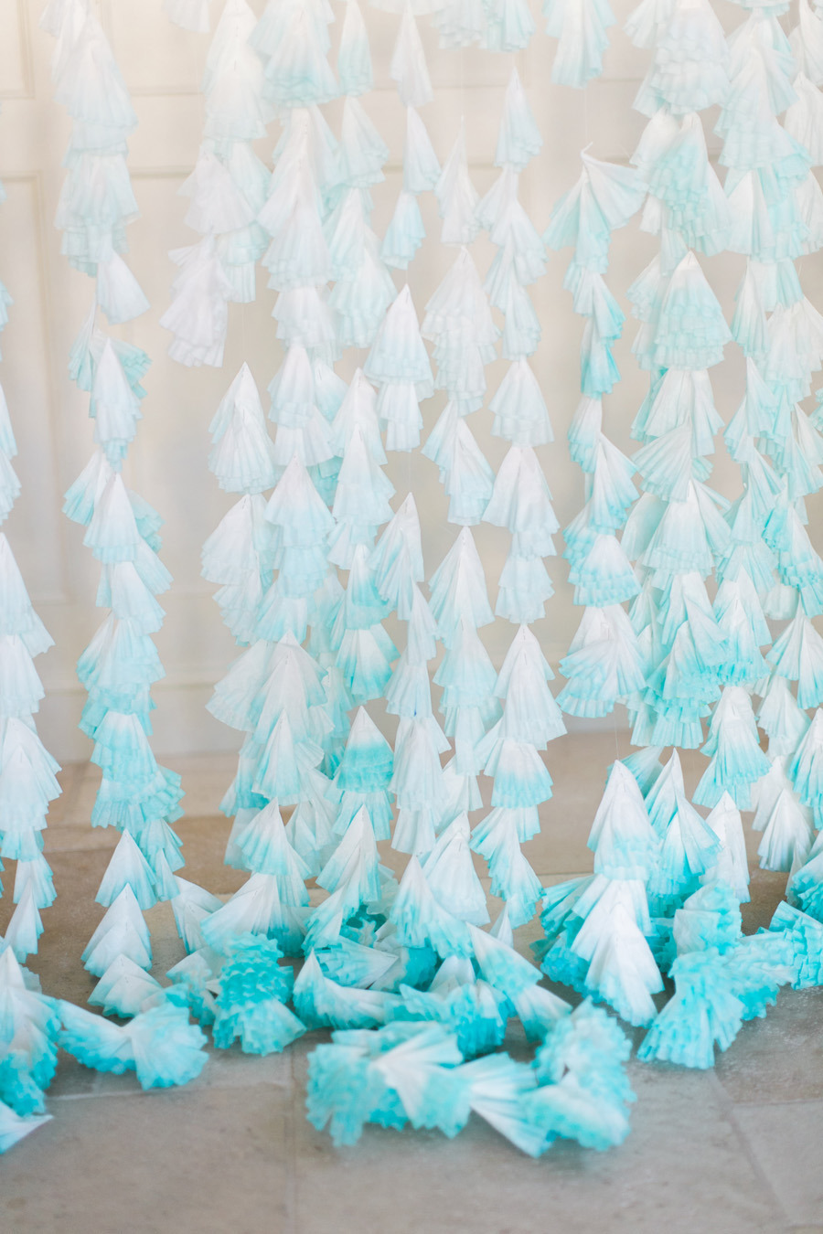
These dip-dyed coffee filters would make a great photo booth backdrop. | Photography: Ruth Eileen Photography via Style Me Pretty

Wedding Stationery Inspiration: Watercolor Details / Oh So Beautiful Paper

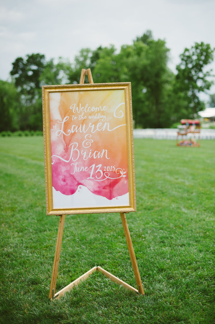
Make a statement with bright, oversized signs… | Photography: Ashley West Photography, Paper Goods: Claire Magnolia via The Knot

Wedding Stationery Inspiration: Watercolor Details / Oh So Beautiful Paper

… Or if subtle is more your style, stick to smaller details, like the watercolor trim on this table number. | Photography: Jessica Lorren Organic Photography, Event Design & Planning: Jessica Sloane via Style Me Pretty

Wedding Stationery Inspiration: Watercolor Details / Oh So Beautiful Paper

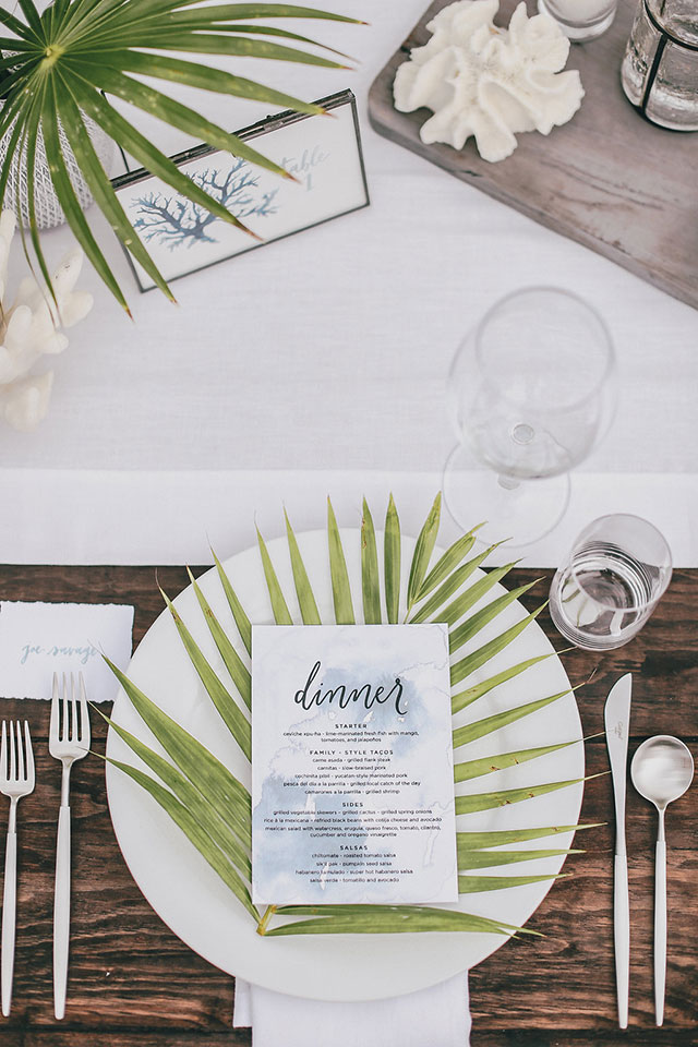
Illustrated menus add whimsy to your table. | Photography: Anna Delores Photography, Event Design & Planning: Wild Heart Events, Paper Goods & Calligraphy: Pigment & Parchment via Green Wedding Shoes

Are you loving watercolors as much as we are? Let us know if you’re planning to incorporate watercolor details into your wedding! xoxo

Blackberry Aperol Spritz

Sometimes, you want a complicated drink: lots of ingredients, fancy garnishes, intricate preparations. But sometimes it’s August and it’s hot and you want a cold drink without a lot of fuss and that’s ok, too. I always try to stick with Peggy Olson’s definition of a cocktail: you need at least three ingredients, because anything less isn’t a real cocktail, it’s an emergency. (This isn’t really what makes a cocktail – that’s spirits, bitters, sugar, and ice – but that’s neither here nor there.) And there are few drinks more simple than an Aperol Spritz, especially when it includes one of our favorite summer ingredients: blackberries! Let’s make a Blackberry Aperol Spritz. – Andrew

Blackberry Aperol Spritz

Blackberry Aperol Spritz

3 oz Sparkling Wine (we used a sparkling Rosé!)
2 oz Aperol
1 oz Soda Water
Blackberries

Add a handful of blackberries to the bottom of a glass, then add the Aperol and muddle the blackberries. Add ice and top with the soda water and sparkling wine. Give it a stir and enjoy!

Blackberry Aperol Spritz

Aperol is a bright red, mildly bitter Italian amaro. It’s filled with bright flavors of orange and rhubarb, and it clocks in at a gentle 11% alcohol by volume. Combined with sparkling wine – we used a sparkling rosé – and a splash of soda water, you have a refreshing, effervescent cocktail with lots of bright orange flavors and a low proof that won’t knock you out on a hot day. You might even have two, if you’re feeling adventurous.

Blackberry Aperol Spritz

The Aperol Spritz, the flagship drink of the Aperol brand, is a simple affair that officially includes just three ingredients: Aperol, sparkling wine, and soda water. But what do we do when we find a simple drink? We play with it. Cocktail recipes are templates; they’re not carved into stone. They’re not meant to sit pretty on a mantle and never change: they’re meant to make you happy, whatever that means today. So we added some muddled blackberries because they’re in season right now and when blackberries are in season, wow, you should be eating them by the handful and throwing them into every drink in sight. Bursting with juice and dark fruit flavor, they’re perfect for adding notes of stone fruit to any drink.

So muddle in some blackberries, or whatever you have on hand, as long as it’s fresh and in season – and see what that does to your drinking.

Glassware by Liquorary

(Don’t forget to follow us on Instagram!)

Photo Credits: Nole Garey for Oh So Beautiful Paper

This post contains affiliate links. By clicking on these links, you’ll help support Oh So Beautiful Paper while also purchasing some fantastic products. We only recommend products that we truly love and trust that you’ll love, too. Our full disclosure policy can be found here.

Quick Pick: Good Juju Ink

Before I get into today’s post, I want to acknowledge that our hearts are still heavy hearts after the horrible events in Charlottesville this past weekend. It feels wrong to just jump back into talking about pretty paper without addressing what many of us are thinking and feeling right now. I don’t have all the right words, but I’m completely disgusted by both the hatred and bigotry on display over the weekend and the administration’s deplorable watered-down reaction. There are not many sides to this issue. This is about right and wrong. White supremacists are wrong. Neo-Nazis are wrong. It’s up to us to fight against those views and deny them the space to fester and grow. That means speaking up and standing up for what is right. Racism and hate have no place here. We need to say it, over and over and over. You can find some other ideas for fighting hate in our community at the Southern Poverty Law Center. And now back to your regularly scheduled distractions. Thank you for understanding.

Good Juju Ink: Into the Woods Collection

Okay! So today I thought I’d share a few favorites from Good Juju Ink’s brand new Into the Woods collection! I got to see this collection in person at the 2017 National Stationery Show a couple months ago, and it’s full of fun things like beautiful nature-inspired illustrations, copper foil, and quotes to inspire reflection, organization, and observation. The entire collection is inspired by the meditative, woodland whimsy of Thoreau’s Walden and includes copper foil-kissed folders, boxed note cards, notebooks, journals, and notepads. Plus, a portion of the proceeds from Into the Woods will benefit the Nature Conservancy’s Plant a Billion Trees initiative! Let’s take a look.

Good Juju Ink: Into the Woods Collection

Good Juju Ink: Into the Woods Collection

Good Juju Ink: Into the Woods Collection

Good Juju Ink: Into the Woods Collection

Good Juju Ink: Into the Woods Collection

Good Juju Ink: Into the Woods Collection

Good Juju Ink: Into the Woods Collection

Check out more from Good Juju Ink’s Into the Woods collection right here!

Happy Weekend!

Happy Friday everyone! I survived my first week of Mama Camp with my two girls – hooray! So far, we’ve been blackberry picking, visited some farm animals, visited our local splash pad and a few playgrounds, and went to check out the Hive installation and kid-friendly exhibits at the National Building Museum. I’m super excited for our adventures next week! But in the meantime…

Caladium Illustration // Juliet Meeks

Illustration by Juliet Meeks via #dailydoseofpaper

…a few links for your weekend!

A huge congrats to the ladies of Gus & Ruby Letterpress on their second store in Portland, Maine! They open at noon TODAY – Portland, go say hello for me!

I feel like I need this sequin top in my life ASAP

I really appreciated this post on Design Mom about having a big family. I constantly feel overwhelmed as the mom of two kids under 5 – but maybe it’s just because of their young age? I don’t plan to have more children, but I’m curious to see if I’ll feel less overwhelmed once both of my kids are over the age of 4.

Stationers and printers: have you seen this gorgeous new Strathmore letterpress paper?? It even comes in pale gray and pink!

Loving Knot & Bow’s latest rainbow-inspired collection, which includes party plates, napkins, and double-sided gift wrap

Did you see that West Elm is having a huge lighting sale this weekend?? This is one of my all-time favorite chandeliers, and I really love these sconces for bedroom reading lights. 

MAKE: Elote queso dip

Card of the week!


This week on Oh So Beautiful Paper:

Here’s how I’m staying organized during back to school season with the Pilot G2 pen

Going Behind the Stationery with Meghan of And Here We Are!

A few favorite punny greetings from the 2017 National Stationery Show…

…and some favorite notebooks, notepads, file folders, and more from the show!

The gorgeous and ethereal calligraphy of Kelsey Malie Calligraphy


That’s it for me this week! I’ll see you back here on Monday! xoxo

NSS 2017: Puns!

It’s pretty hard to resist a good pun. Cute little animals and funny food illustrations? Yes, please! Today I thought I’d round up a few favorite pun cards from this year’s National Stationery Show, from toucans and sheep to pizza and tacos. I think ilootpaperie might take the prize for the most puns in a single booth, including the first cards for the Jewish High Holidays (Rosh Hashanah and Yom Kippur) that I’ve EVER seen at the Stationery Show. We’ve also got some colorful options from Meeschmosh, Hello!Lucky, Wild Hart Paper, and more! Let’s take a look!

NSS 2017: Meeschmosh

Meeschmosh (check out the full booth here!)

NSS 2017: ILOOTPAPERIE

NSS 2017: ILOOTPAPERIE

ILOOTPAPERIE (check out the full booth here!)

NSS 2017: Craftedvan

Craftedvan (check out the full booth here!)

NSS 2017: Farmwood Press

Farmwood Press (check out the full booth here!)


NSS 2017: Hello!Lucky

Hello!Lucky (check out the full booth here!)


NSS 2017: Mr. Boddington's Studio

Mr. Boddington’s Studio (check out the full booth here!)

NSS 2017: There Will Be Cake

There Will Be Cake (check out the full booth here!)

NSS 2017: Wild Hart Paper

Wild Hart Paper (check out the full booth here!)

NSS 2017: Green Bean Studio

Green Bean Studio (so many puns! – check out the full booth here!)

More recaps from the 2017 National Stationery Show here – and you can find photos from all the NSS 2017 exhibitors right here!

Photo Credits: Nole Garey and Hannah Nowack for Oh So Beautiful Paper